Shadcn CLI has become an important tool for developers. With version 3.0, it gets even more powerful. In this article, I’ll explore the latest additions that will help you streamline your workflow. I’ll detail out these additions to Shadcn CLI 3.0 — namespaced registries, private registry, enhanced search and discovery, and MCP server integration.

Let’s get right into it.
The Replay is a weekly newsletter for dev and engineering leaders.
Delivered once a week, it's your curated guide to the most important conversations around frontend dev, emerging AI tools, and the state of modern software.
Think of a registry as a component library store. It’s a place where UI components (like buttons, forms, cards) are stored and can be downloaded. Before 3.0, Shadcn only had one “store” (the default Shadcn registry). Now you can have multiple stores.
To demonstrate the new features in Shadcn CLI 3.0, I’ll set up a React project using Vite.
npm create vite@latest
npm install tailwindcss @tailwindcss/vite
Next, replace the contents of index.css with this:
@import "tailwindcss";
baseUrl and paths properties to the compilerOptions section of the tsconfig.json file:{
"files": [],
"references": [
{
"path": "./tsconfig.app.json"
},
{
"path": "./tsconfig.node.json"
}
],
"compilerOptions": {
"baseUrl": ".",
"paths": {
"@/*": ["./src/*"]
}
}
}
Next, add this to the content of tsconfig.app.json file:
"baseUrl": ".",
    "paths": {
      "@/*": [
        "./src/*"
      ]
    },
npm install -D @types/node
This command installs TypeScript type definitions for Node.js. This is a path utility that we need in the vite.config.ts file.
vite.config.ts file:import path from "path";
import tailwindcss from "@tailwindcss/vite";
import react from "@vitejs/plugin-react";
import { defineConfig } from "vite";
export default defineConfig({
plugins: [react(), tailwindcss()],
resolve: {
alias: {
"@": path.resolve(__dirname, "./src"),
},
},
});
The vite.config.ts file is a TypeScript configuration file that tells Vite how to build and run our project.
npx shadcn@latest init
Proceed by typing y. You will then need to choose a base color.
From the installation, Shadcn will add CSS variables to our index.css file. It will also create a components.json file for us. We will be using the components.json file to set up our registry configuration.
Think of a namespace registry as a label or prefix that helps organize and identify where components come from. It’s like having different “stores” or “brands” for your components.
Namespaced registries fundamentally change how you interact with and manage your component sources.
Let’s explore how you can start using it.
You can define and reference registries using the @registry/name format.
For example, you might have 3 registries like so:
You can then define repositories for the above with:
@shadcn@my-company@design-system-v2When you want to install a component, you prefix it with the registry name like so:
npx shadcn@latest add @my-company/button
If you don’t specify a registry, the CLI will fallback to the default, which is @shadcn.
We will set up a registry configuration shortly.
You need the Shadcn namespace registry if your workflow involves any one of the following:
You do not need to create a component.json file manually; it gets created when you initialize Shadcn in your project.
To set up your registry configuration, add this to your component.json file:
"@wds": "<https://wds-shadcn-registry.netlify.app/r/{name}.json>",
"@aceternity": "<https://ui.aceternity.com/registry/{name}.json>"
The registry object in your component.json file will now look like this:
"registries": {
    "@wds": "<https://wds-shadcn-registry.netlify.app/r/{name}.json>",
    "@aceternity": "<https://ui.aceternity.com/registry/{name}.json>"
  }
In the above configuration, we’ve defined two registries, @wds registry and another registry named @aceternity. The name property is the identifier you’ll use in the CLI, and the url property points to the registry’s location.
Installing a component remains as straightforward as it has always been, but now with the added option of specifying a registry.
Let’s go ahead and install a typewriter effect component from the @aceternity registry to our little demo project.
First, run the following command to add the typewriter effect:
npx shadcn@latest add @aceternity/typewriter-effect
Now we will go ahead and import this component into our demo:
import { TypewriterEffect } from "./components/ui/typewriter-effect";
Next, add the typewriter effect component to the App.tsx file:
import './App.css'
import { TypewriterEffect } from "./components/ui/typewriter-effect";
const words = [
{
text: "We",
},
{
text: "can",
},
{
text: "help",
},
{
text: "you",
},
{
text: "spend",
},
{
text: "your",
},
{
text: "money.",
className: "text-blue-500 dark:text-blue-500",
},
];
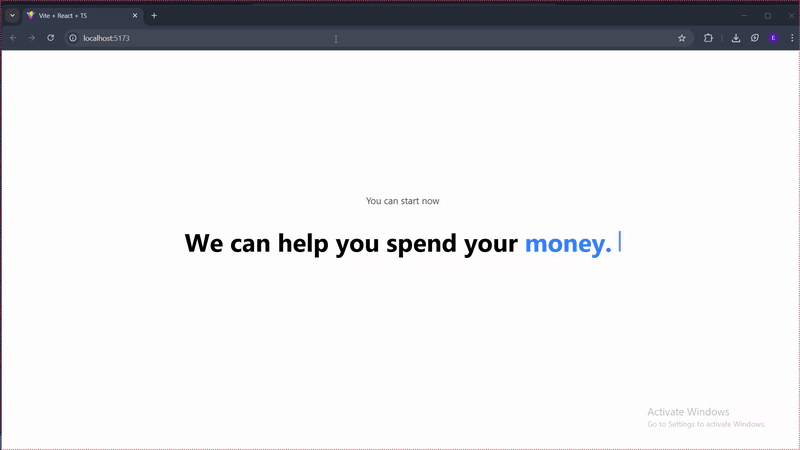
function App() {
return (
<div className="flex flex-col items-center justify-center h-[40rem] ">
<h1 className="text-neutral-600 dark:text-neutral-200 mb-10 text-lg">
You can start now</h1>
<TypewriterEffect words={words} />
<div className="flex flex-col md:flex-row space-y-4 md:space-y-0 space-x-0 md:space-x-4 mt-10">
</div>
</div>
);
}
export default App
Let’s check it out in the browser:
Namespaced registries power is unlocked when you start working with multiple component sources. With it, you can now mix and match components from different registries in the same project.
For example, you could use the public @shadcn registry for some part of the UI components and a private @my-company registry for your organization’s specific business components. This separation of concerns makes your project easier to manage and scale.
When you run the add command, the CLI will resolve the component from the specified registry and install it into your project, handling any dependencies that might exist within that registry. How cool is that?
Let’s now see it in action. Run the following command:
npx shadcn@latest add @wds/action-button
In the above command, we installed the action button component from the second registry we configured.
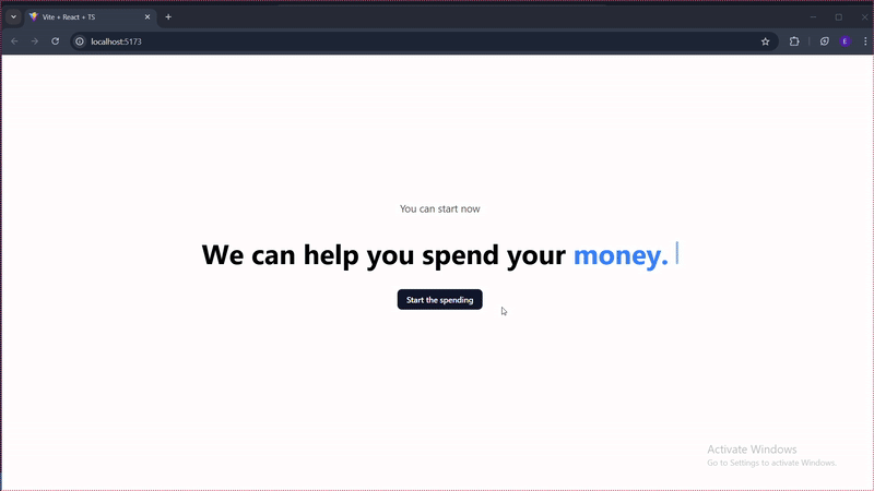
Let’s now go ahead and add it to our App.tsx file.
First, we import it into the App.tsx file:
import { ActionButton } from "@/components/ui/action-button"
Then we add the following to the file:
const serverAction = async () => {
  await new Promise(resolve => setTimeout(resolve, 1000))
  return { error: false }
}

 <ActionButton
      action={serverAction}
      requireAreYouSure
      areYouSureDescription="There's no going back!!"
    >
      Start the spending
  </ActionButton>
  )
}
Let’s see it in the browser:
If we had to use similar components from different namespace registries, the CLI will separate them so they coexist in your project without conflict.
For example, if we had to add button components from @company and @shadcn registries:
shadcn add @shadcn/button @company/button
Here’s what your project structure will look like:
apps/web/app/components/
├── ui/

│   └── button.tsx          # From @shadcn/button

├── company/

│   └── button.tsx          # From @company/button

└── lib/

└── utils.ts
Notice how they go into different folders to avoid conflicts!
Part of the new addition to Shadcn CLI 3.0 is the capability to manage a private component library. You can now keep your company’s private component library safe from unauthorized access with the new private registry.
Shadcn CLI now supports the following authentication methods:
Let’s look at how the registry object in component.json will look like if you were to set up a private registry.
{
  "registries": {
    "@private": {
      "url": "<https://api.company.com/registry/{name}.json>",
      "headers": {
        "Authorization": "Bearer ${REGISTRY_TOKEN}"
      }
    }
  }
}
In the above example, Bearer token is used for the private registry.
When using private repositories, these are some of the things you should consider.
components.json fileShadcn CLI now comes with search and discovery tools to make working with registries easier.
There is now provision for the following commands:
The view command makes it possible to inspect a component without installing it. This is very useful in previewing a component’s code and dependencies.
Below is an example of how to run the code:
npx shadcn view @aceternity/typewriter-effect
With the view command, we can see the component’s source code, styles, and any dependencies it has, giving us a complete picture of what we’re about to add to our project.
There is also a search command that allows you to search for components across your configured registries.
npx shadcn search @aceternity -q "typewriter-effect"
The above command will return a list of all components that match the search term.
Finally, the list command.
npx shadcn list @aceternity
This lists all the items in a registry.
In line with the recent AI craze, Shadcn CLI recently released its MCP server. This MCP server is even better in version 3.0.
Shadcn CLI MCP server allows you to browse, search, and install components from registries using natural language.
Let’s look at setting up the MCP client in the following code editors:
In your project, run the following command to initialize the MCP server:
npx shadcn@latest mcp init --client claude
Next, create a .mcp.json file in your project’s root folder and add the following content to it:
{
  "mcpServers": {
    "shadcn": {
      "command": "npx",
      "args": ["shadcn@latest", "mcp"]
    }
  }
}
After setting up the configuration file, restart Claude Code and run /mcp .
If everything goes well, you will see connected.
For Cursor, create a .cursor folder in your project’s root folder, then create a mcp.json file and add the following content:
{
  "mcpServers": {
    "shadcn": {
      "command": "npx",
      "args": ["shadcn@latest", "mcp"]
    }
  }
}
After setting up the configuration file, enable the shadcn MCP server in Cursor Settings.
If successful, you should see a green dot next to the Shadcn server in the MCP server list and a list of available tools.
For VS code, create a .vscode folder and inside the folder, create a mcp.json configuration file, then add the following to it:
{
  "mcpServers": {
    "shadcn": {
      "command": "npx",
      "args": ["shadcn@latest", "mcp"]
    }
  }
}
After adding the configuration file, open mcp.json file and click Start next to the shadcn server.
Shadcn CLI has come a long way and has been helping developers build. With the recent additions in Shadcn CLI 3.0, Shadcn is even more useful to developers. In this article, we provide an overview of how these new updates can benefit developers in their workflows and how to utilise some of the key features.
Now you can set up Shadcn to use components from multiple repositories and configure it to use a private repository, which provides extra security. The enhanced search and discovery feature allows you to search, view, and list components in your repository. The improved MCP Server Integration makes component search more natural.
Install LogRocket via npm or script tag. LogRocket.init() must be called client-side, not
server-side
$ npm i --save logrocket

// Code:

import LogRocket from 'logrocket';
LogRocket.init('app/id');
// Add to your HTML:

<script src="https://cdn.lr-ingest.com/LogRocket.min.js"></script>
<script>window.LogRocket && window.LogRocket.init('app/id');</script>

Memory leaks in React don’t crash your app instantly, they quietly slow it down. Learn how to spot them, what causes them, and how to fix them before they impact performance.

Build agent-ready websites with Google Web MCP. Learn how to expose reliable site actions for AI agents with HTML and JavaScript.
Build a CRUD REST API with Node.js, Express, and PostgreSQL, then modernize it with ES modules, async/await, built-in Express middleware, and safer config handling.

Discover what’s new in The Replay, LogRocket’s newsletter for dev and engineering leaders, in the March 25th issue.
Would you be interested in joining LogRocket's developer community?
Join LogRocket’s Content Advisory Board. You’ll help inform the type of content we create and get access to exclusive meetups, social accreditation, and swag.
Sign up now

 Learn more →
