TanStack Table, formerly known as React Table, is a headless UI for building tables and datagrids across multiple frameworks, including React, Solid, Vue, and even React Native. Being “headless” means it doesn’t provide pre-built components or styles, giving you full control over markup and design. It’s perfect if you want a customizable and lightweight table solution that can be used with any JavaScript framework, thanks to it being framework agnostic.

In July 2022, Tanner Linsley, creator of TanStack, announced the release of TanStack Table, which offers a major upgrade from React Table v7. TanStack Table v8 was completely rewritten in TypeScript to be more performant and feature-rich, while also expanding support to frameworks like Vue, Solid, and Svelte.
The react-table NPM package is no longer stable or maintained. The new version is published under the @tanstack scope, with the @tanstack/react-table adapter handling React-specific state management and rendering.
Editor’s note: This article was last updated by Saleh Mubashar in March 2025 to explain TanStack Table’s emergence over the now-outdated React Table, and provide a direct comparison between TanStack Table, Material React Table, and Material UI table.
Tables are useful in React for displaying structured data, such as financial reports, sports leaderboards, and pricing comparisons:
Popular products like Airtable, Asana List View, Google Sheets, and Notion rely heavily on tables, while major companies like Google, Apple, and Microsoft use TanStack Table in their applications.
Below, we’ve listed the most important features present in TanStack table. These are some of the many reasons why TanStack Table is one of the top React table libraries:
In case you are still wondering which React table library to use, you’ll find a detailed comparison with Material UI Table and Material React Table later in the article.
If you’re upgrading from React Table v7 to TanStack Table v8, follow this migration guide. Below is a summary of the key steps.
Start by uninstalling React Table and installing TanStack Table using the following commands:
npm uninstall react-table @types/react-table
npm install @tanstack/react-table
Next, rename all instances of useTable to useReactTable and update the syntax where needed. Table options like disableSortBy have been renamed to enableSorting. Column definitions now use accessorKey for strings and accessorFn for functions, while Header has been renamed to header.
Markup changes include replacing cell.render('Cell') with flexRender(), manually defining props like colSpan and key, and using getValue() instead of value for cell rendering. Column definitions have been reorganized, and custom filters now return a boolean instead of filtering rows directly. Overall, the migration requires minor adjustments, but the core concept and functionality remain the same.
If you are starting from scratch, the installation process is quite straightforward. Install the TanStack Table adapter for React using the following command:
npm install @tanstack/react-table
The @tanstack/react-table adapter is a wrapper around the core table logic. It will provide a number of Hooks and types to manage the table state. The package works with React 16.8 and later, including React 19 (though compatibility with the upcoming React Compiler may change in future updates).
Let’s create a basic table using TanStack Table and some dummy data. We first define the data and column structure:
import * as React from "react";
import {
  createColumnHelper,
  flexRender,
  getCoreRowModel,
  useReactTable,
} from "@tanstack/react-table";
import "./styles.css";

// Define the type for our table data
type Person = {
  name: string;
  age: number;
  status: string;
};

// Sample dataset
const data: Person[] = [
  { name: "Alice", age: 25, status: "Active" },
  { name: "Bob", age: 30, status: "Inactive" },
  { name: "Charlie", age: 35, status: "Pending" },
];

// Create a column helper to ensure type safety
const columnHelper = createColumnHelper<Person>();

// Define columns for the table
const columns = [
  columnHelper.accessor("name", {
    header: "Name",
    cell: (info) => info.getValue(),
  }),
  columnHelper.accessor("age", {
    header: "Age",
    cell: (info) => info.getValue(),
  }),
  columnHelper.accessor("status", {
    header: "Status",
    cell: (info) => info.getValue(),
  }),
];
Now, we use useReactTable to manage the table’s data and structure.
export default function App() {
  const table = useReactTable({
    data,
    columns,
    getCoreRowModel: getCoreRowModel(),
  });

  return (
    <div>
      <table>
        <thead>
          {table.getHeaderGroups().map((headerGroup) => (
            <tr key={headerGroup.id}>
              {headerGroup.headers.map((header) => (
                <th key={header.id}>
                  {flexRender(header.column.columnDef.header, header.getContext())}
                </th>
              ))}
            </tr>
          ))}
        </thead>
        <tbody>
          {table.getRowModel().rows.map((row) => (
            <tr key={row.id}>
              {row.getVisibleCells().map((cell) => (
                <td key={cell.id}>
                  {flexRender(cell.column.columnDef.cell, cell.getContext())}
                </td>
              ))}
            </tr>
          ))}
        </tbody>
      </table>
    </div>
  );
}
You can view the demo here. Here’s the basic rundown of how everything works. You can always read the docs for a detailed explanation of individual Hooks/properties:
createColumnHelper ensures type safety when defining column headers and cell contentuseReactTable sets up the table structuretable.getHeaderGroups() generates table headers, while table.getRowModel().rows dynamically renders table rowsInstead of using static data, we can populate our table dynamically using an API. Here is the TanStack Table example we’ll be working with.
For our application, we’ll use Axios to retrieve movie information with the search term snow from the TVMAZE API. Below is the endpoint for this operation:
https://api.tvmaze.com/search/shows?q=snow
To call the API, let’s install Axios:
npm install axios
Modify App.tsx to fetch data when the component loads:
import { useEffect, useState } from "react";
import axios from "axios";
import "./App.css";

function App() {
  const [data, setData] = useState([]);

  const fetchData = async () => {
    try {
      const response = await axios.get("https://api.tvmaze.com/search/shows?q=snow");
      setData(response.data);
    } catch (error) {
      console.error("Error fetching data:", error);
    }
  };

  useEffect(() => {
    fetchData();
  }, []);

  return <></>;
}

export default App;
Above, we created a state called data. Once the component gets mounted, we fetch movie content from the TVMAZE API using Axios and save the returned result in the data state variable.
This API returns an array of TV shows, each containing properties like name, type, and language:
// the API gives an array of TV Shows. Here is one item:
// we will later use this response to create a TypeScript object..
//that will help us model the Show interface
[
  {
    "score": 0.86069167,
    "show": {
      "id": 10412,
      "url": "...",
      "name": "Snow",
      "type": "Scripted",
      "language": "English",
      "genres": [
        "Comedy"
      ],
      "status": "...",
      "runtime": 120,
      "averageRuntime": 120,
      "premiered": "...",
      "ended": "...",
      "officialSite": "..",
      "schedule": {
        "time": "..",
        "days": [
          ".."
        ]
      },
      "rating": {
        "average": null
      },
      "weight": 40,
      "network": {
        "id": 26,
        "name": "..",
        "country": {
          "name": "..",
          "code": "..",
          "timezone": "..."
        },
        "officialSite": ".."
      },
      "webChannel": null,
      "dvdCountry": null,
      "externals": {
        "tvrage": null,
        "thetvdb": null,
        "imdb": null
      },
      "image": {
        "medium": "..."
      },
      "summary": "...",
      "updated": 1670595447,
      "_links": {
        "self": {
          "href": ".."
        },
        "previousepisode": {
          "href": "...",
          "name": "..."
        }
      }
    }
  },
  //other TV shows..
]
The data prop is the data we got through the API call, and columns will be an object that configures our table columns.
In the /src folder, create a new Table.tsx file and paste the following code:
// src/Table.tsx

//create a Show object for TypeScript(see API response above for reference):
//only these properties are relevant to us:

export type Show = {
  show: {
    status: string;
    name: string;
    type: string;
    language: string;
    genres: string[];
    runtime: number;
  };
};

// now create types for props for this Table component(https://tanstack.com/table/latest/docs/framework/react/examples/sub-components)
type TableProps<TData> = {
  data: TData[];
  columns: GroupColumnDef<TData>[];
};

export default function Table({ columns, data }:TableProps<Show>) {
  // Table component logic and UI come here
  return <></>;
}
Let’s modify the content in App.tsx to include the columns for our table and also render the Table component:
// src/App.tsx
import { useEffect, useMemo, useState } from "react";
import axios from "axios";
import { createColumnHelper } from "@tanstack/react-table";
import Table, { Show } from "./Table";

function App() {
  const [data, setData] = useState<Show[]>();
  const columnHelper = createColumnHelper<Show>();
  //define our table headers and data
  const columns = useMemo(
    () => [
      //create a header group:
      columnHelper.group({
        id: "tv_show",
        header: () => <span>TV Show</span>,
        //now define all columns within this group
        columns: [
          columnHelper.accessor("show.name", {
            header: "Name",
            cell: (info) => info.getValue(),
          }),
          columnHelper.accessor("show.type", {
            header: "Type",
            cell: (info) => info.getValue(),
          }),
        ],
      }),
      //create another group:
      columnHelper.group({
        id: "details",
        header: () => <span> Details</span>,
        columns: [
          columnHelper.accessor("show.language", {
            header: "Language",
            cell: (info) => info.getValue(),
          }),
          columnHelper.accessor("show.genres", {
            header: "Genres",
            cell: (info) => info.getValue(),
          }),
          columnHelper.accessor("show.runtime", {
            header: "Runtime",
            cell: (info) => info.getValue(),
          }),
          columnHelper.accessor("show.status", {
            header: "Status",
            cell: (info) => info.getValue(),
          }),
        ],
      }),
    ],
    [],
  );
  const fetchData = async () => {
    const result = await axios("https://api.tvmaze.com/search/shows?q=snow");
    setData(result.data);
  };
  useEffect(() => {
    fetchData();
  }, []);

  return <>{data && <Table columns={columns} data={data} />}</>;
}

export default App;
In the code above, we used the useMemo Hook to create a memoized array of columns; we defined two level headers, each with different columns for our table heads.
We’ve set up all of the columns to have an accessor, which is the data returned by the TVMAZE API set to data.
Now, let’s finish our Table component:
// src/Table.tsx
//extra code removed for brevity..
import {
  flexRender,
  getCoreRowModel,
  GroupColumnDef,
  useReactTable,
} from "@tanstack/react-table";

export default function Table({ columns, data }: TableProps<Show>) {
  //use the useReact table Hook to build our table:
  const table = useReactTable({
    //pass in our data
    data,
    columns,
    getCoreRowModel: getCoreRowModel(),
  });
  // Table component logic and UI come here
  return (
    <div>
      <table>
        <thead>
          {/*use the getHeaderGRoup function to render headers:*/}
          {table.getHeaderGroups().map((headerGroup) => (
            <tr key={headerGroup.id}>
              {headerGroup.headers.map((header) => (
                <th key={header.id} colSpan={header.colSpan}>
                  {header.isPlaceholder
                    ? null
                    : flexRender(
                        header.column.columnDef.header,
                        header.getContext(),
                      )}
                </th>
              ))}
            </tr>
          ))}
        </thead>
        <tbody>
          {/*Now render the cells*/}
          {table.getRowModel().rows.map((row) => (
            <tr key={row.id}>
              {row.getVisibleCells().map((cell) => (
                <td key={cell.id}>
                  {flexRender(cell.column.columnDef.cell, cell.getContext())}
                </td>
              ))}
            </tr>
          ))}
        </tbody>
      </table>
    </div>
  );
}
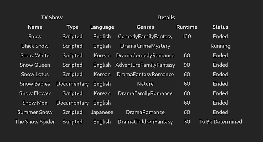
Above, we passed columns and data to useReactTable. The useReactTable Hook will return the necessary props for the table, body, and the transformed data to create the header and cells. React will then generate the header by iterating through the headers using the getHeaderGroups function, and the table body’s rows will be generated via the getRowModel() function.
You’ll also notice that the genre field is an array, but React will render it to a comma-separated string in our final output.
If we run our application at this point, we should get the following output:
While this table is adequate for most applications, what if we require custom styles? With TanStack Table, you can define custom styles for each cell; it’s possible to define styles in the column object, as shown below.
For example, let’s make a badge-like custom component to display each genre:
// src/App.tsx
//extra code removed for brevity
type GenreProps = {
  genres: string[];
};

const Genres = ({ genres }: GenreProps) => {
  // Loop through the array and create a badge-like component instead of a comma-separated string
  return (
    <>
      {genres.map((genre, idx) => {
        return (
          <span
            key={idx}
            style={{
              backgroundColor: "green",
              marginRight: 4,
              padding: 3,
              borderRadius: 5,
            }}
          >
            {genre}
          </span>
        );
      })}
    </>
  );
};

//this function will convert runtime(minutes) into hours and minutes
function convertToHoursAndMinutes(runtime: number) {
  const hour = Math.floor(runtime / 60);
  const min = Math.floor(runtime % 60);
  return `${hour} hour(s) and ${min} minute(s)`;
}

function App() {
  const columns = useMemo(
    () => [
      //...
      columnHelper.group({
        //..
        columns: [
          ,
          //...
          columnHelper.accessor("show.genres", {
            header: "Genres",
            //render the Genres component here:
            cell: (info) => <Genres genres={info.getValue()} />,
          }),
          columnHelper.accessor("show.runtime", {
            header: "Runtime",
            //use our convertToHoursAndMinutes function to render the runtime of the show
            cell: (info) => convertToHoursAndMinutes(info.getValue()),
          }),
          //...
        ],
      }),
    ],
    [],
  );
  //further code..
}

//...
We updated the Genres column above by iterating and sending its values to a custom component, creating a badge-like element. We also changed the runtime column to show the watch hour and minute based on the time. Following this step, our table UI should look like the following:
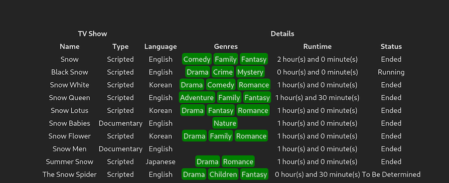
As you can see, TanStack Table has successfully styled our table with relative ease! If you need more help rendering custom cells, refer to the documentation.
We’ve seen how we can customize the styles for each cell based on our needs; you can show any custom element for each cell based on the data value.
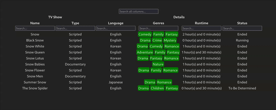
getFilteredRowModelUsing the guide for global filtering, we can extend our table by adding global search capabilities. The getFilteredRowModel property in the useReactTable Hook will let TanStack Table know that we want to implement filtering in our project.
First, let’s create a search input in Table.tsx:
// src/Table.tsx
//Create a searchbar:
function Searchbar({
  value: initialValue,
  onChange,
  ...props
}: {
  value: string | number;
  onChange: (value: string | number) => void;
} & Omit<React.InputHTMLAttributes<HTMLInputElement>, "onChange">) {
  const [value, setValue] = useState(initialValue);
  useEffect(() => {
    setValue(initialValue);
  }, [initialValue]);
  //if the entered value changes, run the onChange handler once again.
  useEffect(() => {
    onChange(value);
  }, [value]);
  //render the basic searchbar:
  return (
    <input
      {...props}
      value={value}
      onChange={(e) => setValue(e.target.value)}
    />
  );
}

export default function Table({ columns, data }: TableProps<Show>) {
  const [globalFilter, setGlobalFilter] = useState("");
  const table = useReactTable({
    data,
    columns,
    getCoreRowModel: getCoreRowModel(),
    filterFns: {},
    state: {
      globalFilter, //specify our global filter here
    },
    onGlobalFilterChange: setGlobalFilter, //if the filter changes, change the hook value
    globalFilterFn: "includesString", //type of filtering
    getFilteredRowModel: getFilteredRowModel(), //row model to filter the table
  });
  return (
    <div>
    {/*Render the searchbar:*/}
      <Searchbar
        value={globalFilter ?? ""}
        onChange={(value) => setGlobalFilter(String(value))}
        placeholder="Search all columns..."
      />
      {/*Further code..*/}
    </div>
  );
}
Let’s break this code down:
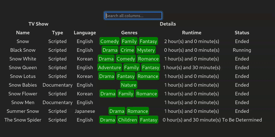
Searchbar component. As the name suggests, this component will send user input to TanStack Table. The library will then filter the table rows to match the user inputgetFilteredRowModel method and passed our globalFilter Hook to the state property in the useReactTable HookSearchBar componentThis will be the result:
Thanks to TanStack Table, column searching is also available to help the user filter out a specific column.
The code snippet below introduces column searching functionality in our app:
import { ColumnFiltersState } from "@tanstack/react-table";

export default function Table({ columns, data }: TableProps<Show>) {
  const [columnFilters, setColumnFilters] = useState<ColumnFiltersState>([]);
  const table = useReactTable({
    //....
    state: {
      columnFilters,
      globalFilter,
    },
    onColumnFiltersChange: setColumnFilters,
    //...
  });
  // Table component logic and UI come here
  return (
    <div className="p-2">
      {/*...further code..*/}
      <table>
        <thead>
          {table.getHeaderGroups().map((headerGroup) => (
            <tr key={headerGroup.id}>
              {headerGroup.headers.map((header) => (
                <th key={header.id} colSpan={header.colSpan}>
                  {header.isPlaceholder
                    ? null
                    : flexRender(
                        header.column.columnDef.header,
                        header.getContext(),
                      )}
                  <div>
                    {/*If the column can be filtered, render the Filter component.*/}
                    {header.column.getCanFilter() ? (
                      <div>
                        <Filter column={header.column} />
                      </div>
                    ) : null}
                  </div>
                </th>
              ))}
            </tr>
          ))}
        </thead>
        {/*further code..*/}
      </table>
      <div className="h-4" />
    </div>
  );
}
//create a Filter component to use for column searching:
function Filter({ column }: { column: Column<Show, unknown> }) {
  const columnFilterValue = column.getFilterValue();

  return (
    <Searchbar
      onChange={(value) => {
        column.setFilterValue(value);
      }}
      placeholder={`Search...`}
      type="text"
      value={(columnFilterValue ?? "") as string}
    />
  );
}
If you notice, the code above is similar to that of its global counterpart. The only difference is that we’re rendering a Filter component for those columns, which can be filtered.
This will be the result:
These are very basic examples for filters, and the TanStack Table API provides several options. Be sure to check out the API documentation for more information.
getSortedRowModelLet’s implement one more basic functionality for our table: sorting. TanStack Table allows sorting via the getSortedRowModel method:
// src/Table.tsx
import { SortingState, getSortedRowModel } from "@tanstack/react-table";
const [sorting, setSorting] = useState<SortingState>([]);
const table = useReactTable({
  //...
  getSortedRowModel: getSortedRowModel(),
  onSortingChange: setSorting,
  state: {
    sorting,
  },
  //...
});

return (
  <div>
    {/*Extra code to render table and logic..(removed for brevity)*/}
    <thead>
      {table.getHeaderGroups().map((headerGroup) => (
        <tr key={headerGroup.id}>
          {headerGroup.headers.map((header) => {
            return (
              <th key={header.id} colSpan={header.colSpan}>
                {header.isPlaceholder ? null : (
                  <div
                    //when clicked, check if it can be sorted
                    //if it can, then sort this column
                    onClick={header.column.getToggleSortingHandler()}
                    title={
                      header.column.getCanSort()
                        ? header.column.getNextSortingOrder() === "asc"
                          ? "Sort ascending"
                          : header.column.getNextSortingOrder() === "desc"
                            ? "Sort descending"
                            : "Clear sort"
                        : undefined
                    }
                  >
                    {flexRender(
                      header.column.columnDef.header,
                      header.getContext(),
                    )}
                    {{
                      //display a relevant icon for sorting order:
                      asc: " 🔼",
                      desc: " 🔽",
                    }[header.column.getIsSorted() as string] ?? null}
                  </div>
                )}
              </th>
            );
          })}
        </tr>
      ))}
    </thead>
  </div>
);
Here, we passed in our getSortedRowModel and onSortingChange properties to inform the library that we want to add sorting to our project.
After our sorting implementation, the UI looks like the following:
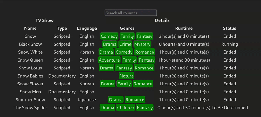
As you can see, the user can now click to enable sorting for any column. You can disable the sorting functionality for certain columns via the enableSorting flag:
//column related data in src/App.tsx:

columns: [
  columnHelper.accessor("show.name", {
    header: "Name",
    cell: (info) => info.getValue(),
    enableSorting: false, //disable sorting for this one
  }),
  columnHelper.accessor("show.type", {
    header: "Type",
    cell: (info) => info.getValue(),
  }),
]
//...
getGroupedRowModelWe can even add a grouping feature using the getGroupedRowModel method. This is great for cases where users want to group columns according to a certain category.
To start, first add the aggregationFn property to the show.language, show.name, and show.type columns:
//src/App.tsx
const columns = useMemo(
  () => [
    columnHelper.group({
      //...
      columns: [
        columnHelper.accessor("show.name", {
          //...
          aggregationFn: "count",
        }),
        columnHelper.accessor("show.type", {
          //...
          aggregationFn: "count",
        }),
      ],
    }),
    columnHelper.group({
      //...
      columns: [
        columnHelper.accessor("show.language", {
          //...
          aggregationFn: "count",
        }),
      ],
    }),
  ],
  //extra code removed for brevity..
  [],
);
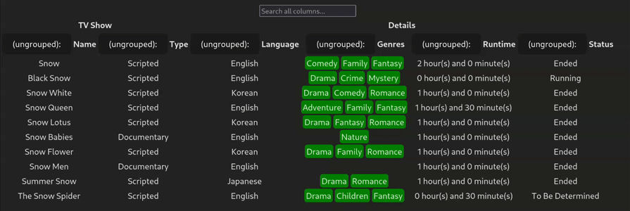
Here, we’re setting the aggregationFn property to count. This tells React to just use count-based aggregation for those columns.
Next, make these changes to the Table.tsx component:
//src/Table.tsx
import { GroupingState, getGroupedRowModel, getExpandedRowModel } from "@tanstack/react-table";

const [grouping, setGrouping] = useState<GroupingState>([]);

const table = useReactTable({
  //..
  getExpandedRowModel: getExpandedRowModel(),
  getGroupedRowModel: getGroupedRowModel(),
  onGroupingChange: setGrouping,
  state: {
    //..
    grouping,
  },
});
return (
  <div>
    {/*Further code..*/}
    <thead>
      {table.getHeaderGroups().map((headerGroup) => (
        <tr key={headerGroup.id}>
          {headerGroup.headers.map((header) => {
            return (
              <th key={header.id} colSpan={header.colSpan}>
                {header.isPlaceholder ? null : (
                  <div>
                    {header.column.getCanGroup() ? (
                      // If the header can be grouped, let's add a toggle
                      <button
                        {...{
                          onClick: header.column.getToggleGroupingHandler(),
                          style: {
                            cursor: "pointer",
                          },
                        }}
                      >
                        {header.column.getIsGrouped()
                          ? `(grouped): `
                          : `(ungrouped):`}
                      </button>
                    ) : null}{" "}
                    {flexRender(
                      header.column.columnDef.header,
                      header.getContext(),
                    )}
                  </div>
                )}
              </th>
            );
          })}
        </tr>
      ))}
    </thead>
    {/*Further code..*/}
  </div>
);
Here’s what’s happening in this code block:
getExpandedRowModel and getGroupedRowModel properties to help us use sorting in our projectbutton for every column. When clicked, it will trigger the header.column.getToggleGroupingHandler() function. This will toggle grouping for the selected columnheader.column.getIsGrouped() methodThis will be the result:
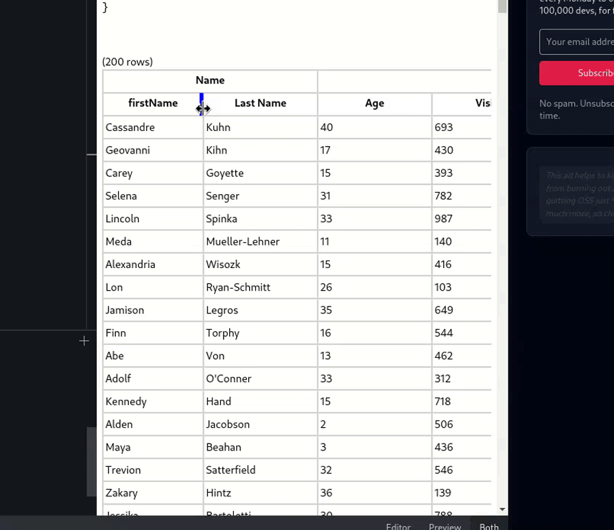
Tanstack Table also provides a ColumnSizing API to help users resize table columns. This is great for situations where a certain row has to be expanded to make their table use up extra available width on the screen.
This code block demonstrates how to implement resizing functionality:
//src/Table.tsx
const [columnResizeMode, setColumnResizeMode] =
  React.useState<ColumnResizeMode>("onChange");

const [columnResizeDirection, setColumnResizeDirection] =
  React.useState<ColumnResizeDirection>("ltr");

const table = useReactTable({
  data,
  columns,
  columnResizeMode, //specify that we'll use resizing in this table
  columnResizeDirection,
  getCoreRowModel: getCoreRowModel(),
  debugTable: true,
  debugHeaders: true,
  debugColumns: true,
});
return (
  <div style={{ direction: table.options.columnResizeDirection }}>
    <table
      {...{
        style: {
          width: table.getCenterTotalSize(),
        },
      }}
    >
      <thead>
        {table.getHeaderGroups().map((headerGroup) => (
          <tr key={headerGroup.id}>
            {headerGroup.headers.map((header) => (
              <th
                {...{
                  key: header.id,
                  colSpan: header.colSpan,
                  style: {
                    width: header.getSize(),
                  },
                }}
              >
                {header.isPlaceholder
                  ? null
                  : flexRender(
                      header.column.columnDef.header,
                      header.getContext(),
                    )}
                <div
                  {...{
                    onDoubleClick: () => header.column.resetSize(),
                    //when held down, enable resizing functionality.
                    onMouseDown: header.getResizeHandler(),
                    onTouchStart: header.getResizeHandler(),
                    className: `resizer ${
                      table.options.columnResizeDirection
                    } ${header.column.getIsResizing() ? "isResizing" : ""}`,
                    style: {
                    //keep on increasing/decreasing the column till resize mode is finished.
                      transform:
                        columnResizeMode === "onEnd" &&
                        header.column.getIsResizing()
                          ? `translateX(${
                              (table.options.columnResizeDirection === "rtl"
                                ? -1
                                : 1) *
                              (table.getState().columnSizingInfo.deltaOffset ??
                                0)
                            }px)`
                          : "",
                    },
                  }}
                />
              </th>
            ))}
          </tr>
        ))}
      </thead>
      <tbody>
        {table.getRowModel().rows.map((row) => (
          <tr key={row.id}>
            {row.getVisibleCells().map((cell) => (
              <td
                {...{
                  key: cell.id,
                  style: {
                  //set the width of this column
                    width: cell.column.getSize(),
                  },
                }}
              >
                {flexRender(cell.column.columnDef.cell, cell.getContext())}
              </td>
            ))}
          </tr>
        ))}
      </tbody>
    </table>
  </div>
);
The explanation of the code is in the comments.
Let’s test it out! This will be the output:
| TanStack Table | Material React Table | Material UI Table | |
|---|---|---|---|
| Type | Headless table library for building tables and data grids — framework agnostic | UI component library built on TanStack Table and using Material UI V6 design principles | A component within the broader Material UI (MUI) React component library |
| UI framework | No built-in UI | Uses Material UI V6 with Emotion styling | Uses Material UI styling |
| Customization | Fully customizable, requires manual UI implementation | Pre-styled with Material UI but still customizable | Limited customization using MUI styling options |
| Framework support | Works with TS/JS, React, Vue, Solid, Qwik, and Svelte | React-only | React-only |
| Dependencies | Fully independent | Requires Material UI and Emotion as peer dependencies | Requires Material UI |
| Advanced features | Filtering, sorting, resizing, pinning, reordering, visibility control, grouping, aggregation | Filtering, sorting, resizing, pinning, reordering, grouping, aggregation | Basic table columns with manual customization |
TanStack Table replaced React Table in July 2022, offering a TypeScript rewrite for better performance and multi-framework support. The react-table package is deprecated, with React-specific features now in @tanstack/react-table.
TanStack Table is a headless table library for building tables and data grids for any JavaScript framework, while Material React Table is a component library built on top of TanStack Table v8’s API. So basically, it is a combination of TanStack functionality and Material UI v6 design.
TanStack Table is a headless table library for building tables and data grids for any JavaScript framework, while Material UI Table is a component within the MUI React component library.
You can use @tanstack/react-table for a powerful, customizable table or the native HTML <table> element for simple use cases. For styled tables, you can also look at libraries like Material React Table, Material UI Table, or React Bootstrap.
In this article, we learned how to build a table UI using React and TanStack Table. It’s not difficult to create your own table for basic use cases, but make sure you’re not reinventing the wheel wherever possible.
I hope you enjoyed learning about table UIs. Let me know about your experience with tables in the comments below.
Install LogRocket via npm or script tag. LogRocket.init() must be called client-side, not
server-side
$ npm i --save logrocket

// Code:

import LogRocket from 'logrocket';
LogRocket.init('app/id');
// Add to your HTML:

<script src="https://cdn.lr-ingest.com/LogRocket.min.js"></script>
<script>window.LogRocket && window.LogRocket.init('app/id');</script>

Learn how contrast-color() automatically picks accessible text colors using native CSS, without JavaScript.

Learn how to build smooth staggered animations in CSS using modern features like sibling-index(), complete with practical examples, fallbacks, and accessibility tips.

Compare the top AI development tools and models of July 2026. View updated rankings, feature breakdowns, and find the best fit for you.

Learn how to detect unused and ghost dependencies in JavaScript projects using Knip, a project-level linter that keeps your dependency graph accurate.
Would you be interested in joining LogRocket's developer community?
Join LogRocket’s Content Advisory Board. You’ll help inform the type of content we create and get access to exclusive meetups, social accreditation, and swag.
Sign up now

 Learn more →