Editor’s note: This article was last updated on 15 December 2022 to include information about TanStack Table v8 and Ag Grid, as well as to reflect updates to the react-easy-edit and react-editext libraries.

As React client-side UI libraries become increasingly powerful, user interfaces become more complex. Nowadays, we can create even more exciting user experiences by experimenting with React inline editable UI components, like editable tables, lists, and text fields.
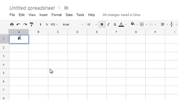
Below is an example of a basic React inline editable UI:

In this tutorial, we’ll build basic, inline editable UI components in React using a simplified version of the Asana Create a task function. Our editable UI will have only a task name and a description field.
We’ll cover the following:
Tab key navigationFeel free to check out the demo of the React editable UI we’ll build in this walkthrough. Let’s get started!
First, let’s review some of the most prominent products that use an inline editable UI with a clear UX.
Before getting started with our custom implementation of inline editable components, let’s consider some of the existing React component libraries that you can use to achieve various inline editable UI elements.
The react-easy-edit library allows for inline editing on HTML 5 input components, meaning you can customize the styling and functionality on top of the react-easy-edit library. Below is a simple example using the textbox component:
import React, { Component } from 'react';
import EasyEdit from 'react-easy-edit';

function App() {

  const save = (value) => {alert(value)}
  const cancel = () => {alert("Cancelled")}

  return (
    <EasyEdit
      type="text"
      onSave={save}
      onCancel={cancel}
      saveButtonLabel="Save Me"
      cancelButtonLabel="Cancel Me"
      attributes={{ name: "awesome-input", id: 1}}
      instructions="Star this repo!"
    />
  );
}
You can check out more examples on Stackblitz.
Atlassian, the team that built Jira, has a design system with inline-edit functionality. Although it depends on the Atlassian design system, it’s a solid library that you can consider if your application requires a reliable feature.
react-editext is an inline editing library that converts the textarea element into editable content. Below is a simple example of react-editext:
import React, { Component } from 'react'
2import EdiText from 'react-editext'
3
4export default class App extends Component {
5  onSave = val => {
6    console.log('Edited Value -> ', val)
7  }
8
9  render () {
10    return (
11      <EdiText
12        type='text'
13        value='What is real? How do you define real?'
14        onSave={this.onSave}
15      />
16    )
17  }
18}
react-editext also allows you to style EdiText with styled-components. To better understand it, you can refer to the example from Stackblitz.
react-contenteditable is arguably the most famous package for inline editable UI. The main difference between react-contenteditable and other component libraries is that it allows you to inline edit HTML, not just text content.
You can use react-contenteditable to edit both markup and markdown in the UI. You can also manage the height of the editable element to customize the look and feel of an input or a textarea element. Feel free to check out an example on Stackblitz.
React Table is one of the most popular UI libraries that allows you to build tables and data grids with the inline editable feature. You can create a UI that is similar to Google Sheets by customizing React Table library components.
In March 2020, React Table creator Tanner Linsley released React Table, which he described as “the culmination of over a years worth of work to refactor the entire library to a hooks-only UI/Style/Markup agnostic table building utility.” In July 2022, TanStack Table v8 was released, which includes a full rewrite to TypeScript. However, at the time of writing, the migration guide is not yet available.
For a closer look at what’s new in the most recent stable React Table release, check out our comprehensive guide to building and stying tables with React Table v7. Or, read on to learn how to render your own React table component with React Table. You can also check out the React Table kitchen sink to see how this editable UI works in the table layout.
Ag Grid is another popular library for building data grids with inline editable functionality. Libraries like ag-grid-react and React Table help us to build a data grid to visualize a large amount of data in a table structure. Inline editing is one of the functionalities included in it.
Below is a basic implementation of ag-grid-react:
//javascript
import { AgGridReact } from "ag-grid-react";

return( <AgGridReact
   rowData={mockTransactionData()}
   columnDefs={mockTransactionDataColumns()}
 />);
You can check out the complete example on Stackblitz.
Now that we’re familiar with some helpful component libraries, let’s explore how an editable UI works.
First, an editable UI displays a label. On hover, it will show the borders, making the UI look inline and editable. On click, it will transform the simple label into a custom input element. Some notable input elements are input fields, textarea, select components, date pickers, etc.
By clicking Enter or Escape, we’ll go back to the initial state and show the label. If you click Tab, it will once again switch to an input element and make the component accessible using the keyboard.
In this tutorial, we’ll build a simple version without the Tab functionality. You can easily add the Tab functionality, but I’ll leave that up to you. Feel free to create a pull request to my repo.
First, we’ll create a simple React app using Create React App. I’m using Tailwind CSS for styling. For more information, check out our article on Using Tailwind CSS in React to configure Create React App.
Now, let’s create the Editable React component with the following code:
// Editable.js
import React, { useState } from "react";

// Component accept text, placeholder values and also pass what type of Input - input, textarea so that we can use it for styling accordingly
const Editable = ({
  text,
  type,
  placeholder,
  children,
  ...props
}) => {
  // Manage the state whether to show the label or the input box. By default, label will be shown.
// Exercise: It can be made dynamic by accepting initial state as props outside the component
  const [isEditing, setEditing] = useState(false);

// Event handler while pressing any key while editing
  const handleKeyDown = (event, type) => {
    // Handle when key is pressed
  };

/*
- It will display a label is `isEditing` is false
- It will display the children (input or textarea) if `isEditing` is true
- when input `onBlur`, we will set the default non edit mode
Note: For simplicity purpose, I removed all the classnames, you can check the repo for CSS styles
*/
  return (
    <section {...props}>
      {isEditing ? (
        <div
          onBlur={() => setEditing(false)}
          onKeyDown={e => handleKeyDown(e, type)}
        >
          {children}
        </div>
      ) : (
        <div
          onClick={() => setEditing(true)}
        >
          <span>
            {text || placeholder || "Editable content"}
          </span>
        </div>
      )}
    </section>
  );
};

export default Editable;
The component is very straightforward. If the isEditing state is true, then it displays the children. Here, we pass the input or textarea elements. The input state will be managed outside of this component.
If the isEditing state is false, we display the simple label text or placeholder, depending on whether the text value is empty.
Let’s see what a simple input editable component looks like:
// App.js - Input editable UI

import React, { useState } from "react";
import Editable from "./Editable";

function App() {
  // State for the input
  const [task, setTask] = useState("");

  /*
    Enclose the input element as the children to the Editable component to make it as inline editable.
  */
  return (
    <Editable
      text={task}
      placeholder="Write a task name"
      type="input"
    >
      <input
        type="text"
        name="task"
        placeholder="Write a task name"
        value={task}
        onChange={e => setTask(e.target.value)}
      />
    </Editable>
  );
}

export default App;
In the code above, we enclosed input inside of the Editable component. You can enclose any custom form component to make it an editable UI.
This example is pretty simple. If you want to create a more complex example for an editable UI, you can create higher order components or custom Hooks to manage all of the states outside the editable component.
Let’s see how the editable component works for a textarea:
<Editable
text={description}
placeholder="Description for the task"
type="textarea"
>
<textarea
name="description"
placeholder="Description for the task"
rows="5"
value={description}
onChange={e => setDescription(e.target.value)}
/>
</Editable>
It’s that simple. We just swapped the input element with a textarea. As long as we provide the proper CSS based on the type we pass the Editable component, it will work.
However, we’ll run into a few problems:
Tab key. However, an inline editable UI can’t be navigated without manually implementing that functionalityTo solve the focus issue, we need to use a reference to the input element and focus it when the edit state is set:
// App.js
import React, { useRef, useState } from "react";
import Editable from "./Editable";

function App() {
  /*
    1. create a reference using use reference and add the ref={inputRef} to input element
    2. pass this reference to the Editable component, use different name than ref, I used `childRef`. Its basically a normal prop carrying the input element reference.
  */
  const inputRef = useRef();
  const [task, setTask] = useState("");

  return (
    <Editable
      text={task}
      placeholder="Write a task name"
      childRef={inputRef}
      type="input"
    >
      <input
        ref={inputRef}
        type="text"
        name="task"
        placeholder="Write a task name"
        value={task}
        onChange={e => setTask(e.target.value)}
      />
    </Editable>
  );
}
export default App;
Next, we’ll pass the input element reference to the Editable component, then focus when the isEditing state is true:
// Editable.js
import React, { useState, useEffect } from "react";
import "./Editable.css";

const Editable = ({ childRef, ... }) => {
  const [isEditing, setEditing] = useState(false);

  /*
    using use effect, when isEditing state is changing, check whether it is set to true, if true, then focus on the reference element
  */
  useEffect(() => {
    if (childRef && childRef.current && isEditing === true) {
      childRef.current.focus();
    }
  }, [isEditing, childRef]);

  const handleKeyDown = (event, type) => {
    ...
  };

  return (
    ...
};

export default Editable;
There are a few things to be aware of when dealing with keydown events. The input element’s keys, including Enter, Escape, and Tab will set the isEditing state to false.
For the textarea element, the Enter key has to add a new line inside of textarea, so we need to handle this use case separately:
const handleKeyDown = (event, type) => {
    const { key } = event;
    const keys = ["Escape", "Tab"];
    const enterKey = "Enter";
    const allKeys = [...keys, enterKey]; // All keys array

  /*
    - For textarea, check only Escape and Tab key and set the state to false
    - For everything else, all three keys will set the state to false
  */
    if (
      (type === "textarea" && keys.indexOf(key) > -1) ||
      (type !== "textarea" && allKeys.indexOf(key) > -1)
    ) {
      setEditing(false);
    }
}:
Tab key navigationBy default, input and textarea are hidden. As a result, we can’t navigate the form fields by just hitting the Tab key.
To achieve keyboard support, we need to monitor the Tab key event on the component or the whole page and set the state manually to each element. Then, we can navigate to the next form element on the next keypress.
We didn’t implement this in our example code, but it’s worth a try to make sure you can handle keypress events on a page in React.
You don’t need an inline editable UI for basic form needs. However, it’s best to build both view and edit in a single place for complex React applications where you have lots of content with edit options. If you don’t, you’ll have to maintain two different UIs.
The most significant challenges you may run into in inline editable UI involve showing errors. It would be best to account for this when thinking about the UX.
You may also have difficulty achieving the accessibility necessary to support mouse events. Touch events will likely also be an issue.
Finally, supporting mobile devices can be hard when form elements are hidden. This will be especially tricky if the UI has to support a mobile layout because there is no hover to show users whether the field is editable inline on touch screens.
This is a simple example and overview of creating inline editable components in React. Try to use existing components, but if none fit your needs, you can create custom ones. You can check out the demo here and the codebase here. Happy coding!
Install LogRocket via npm or script tag. LogRocket.init() must be called client-side, not
server-side
$ npm i --save logrocket

// Code:

import LogRocket from 'logrocket';
LogRocket.init('app/id');
// Add to your HTML:

<script src="https://cdn.lr-ingest.com/LogRocket.min.js"></script>
<script>window.LogRocket && window.LogRocket.init('app/id');</script>
Hey there, want to help make our blog better?
Join LogRocket’s Content Advisory Board. You’ll help inform the type of content we create and get access to exclusive meetups, social accreditation, and swag.
Sign up now
Not sure if low-code is right for your next project? This guide breaks down when to use it, when to avoid it, and how to make the right call.

Compare Firebase Studio, Lovable, and Replit for AI-powered app building. Find the best tool for your project needs.

Discover how to use Gemini CLI, Google’s new open-source AI agent that brings Gemini directly to your terminal.

This article explores several proven patterns for writing safer, cleaner, and more readable code in React and TypeScript.

 Learn more →

4 Replies to "How to build an inline editable UI in React"
to solve the focus issue you can just add autoFocus property to your input element
or you could use a library like this https://www.npmjs.com/package/react-easy-edit
Hey, nice tut – I was trying by adding the tab functionality but did succeeded yet, if you can give some tips how to implement it would be appreciated.
Cheers,
Andrea
Is there a comparison of react-easy-edit (Mark A) with the other tools listed, and also do these other solutions cost money?