Editor’s note: This article was updated by Mamta Dalal on 3 April 2024 to demonstrate the usage of popular icon sets like Entypo, Simple Line Icons, and Ionicon, as well as to cover some tips on troubleshooting issues when working with React Native Vector Icons.
When it comes to UI/UX, fonts and icons matter. Icons serve as a visual aid for users to navigate your app, and your choice of font (and font color) sets the tone for your app or brand.
Let’s be real: you’d be unlikely to purchase life insurance from a company that uses a cartoonish font such as Alloy Ink or Vegan Style in its contracts. And I couldn’t imagine an app without any icons. Seriously, if you know of one in the App Store, drop me a comment with a link — I’m curious!
In this React Native tutorial, we’ll show you how to:
The source code associated with this demo is available on GitHub here and here.
To initialize a React Native project, paste the following into your terminal:
npx react-native init yourAppNameHere --template react-native-template-typescript && cd yourAppNameHere
This will create a new React Native project with a TypeScript template. Navigate to the project folder.
The next step is to build our app for each OS:
yarn run ios

yarn run android
As software developers, anything that improves our workflow is a welcome change. React Native Asset makes linking and unlinking more straightforward than using react-native link.
First, install react-native-asset globally:
yarn global add react-native-asset
In your project folder, create a new folder called assets, then create another folder inside it called fonts. Or you can use the terminal:
mkdir -p assets/fonts
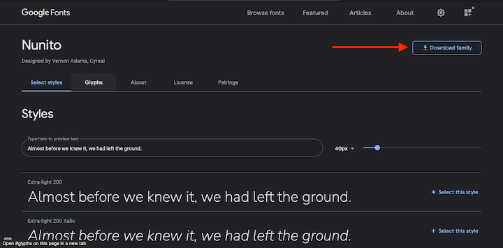
Head over to Google Fonts to download a font family. For this example, we’re going with Nunito, but feel free to diverge with a font of your choice.
Once you’ve downloaded the file, unzip it and add your chosen font weights to the fonts folder:
Now, create a new file in your project folder called react-native.config.js:
touch react-native.config.js
Then, add the following:
module.exports = {
  assets: ['./assets/fonts'],
};
Finally, use React Native Asset to link the font files. Type the following in your terminal:
react-native-asset
If you need to remove and unlink a font, simply delete it from the fonts folder, then run react-native-asset again. Simple as that.
Let’s create a custom text component to consume our new fonts. Create a folder called components with a file inside called Text.tsx, then add the following code:
import React from 'react';
import {
  Text as ReactText,
  StyleSheet,
  StyleProp,
  TextStyle,
} from 'react-native';

type TextProps = {
  children: React.ReactNode;
  style?: StyleProp<TextStyle>;
};

export const Text = ({style, children}: TextProps) => {
  return <ReactText style={[styles.font, style]}>{children}</ReactText>;
};

const styles = StyleSheet.create({
  font: {
    fontFamily: 'Nunito-Regular',
  },
});
The above code creates a Text component with a font-family of Nunito and a regular font-weight that we can use across our app. We get the children and style types (TextProps) from React Native.
Now that we have our Text component, let’s use it!
Replace your App.tsx file with the following:
import React from 'react';
import {SafeAreaView, StyleSheet, StatusBar} from 'react-native';
import {Text} from './components/Text';
const App = () => {
return (
<>
<StatusBar barStyle="dark-content" />
<SafeAreaView style={styles.container}>
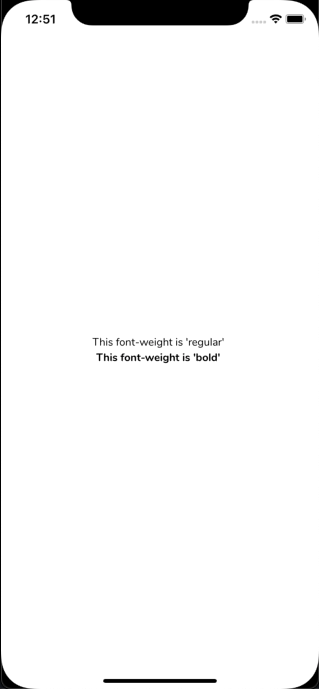
<Text>This font-weight is 'regular' </Text>
<Text style={styles.boldFont}>This font-weight is 'bold' </Text>
</SafeAreaView>
</>
);
};
const styles = StyleSheet.create({
container: {
flex: 1,
justifyContent: 'center',
alignItems: 'center',
},
boldFont: {
fontFamily: 'Nunito-Bold',
},
});
export default App;
Notice that we have two different font-weights. Our Text component on line 11 has a bold font-weight. To achieve this, override the font-weight settings with a bold font using StyleSheet.create (line 23), then pass the value to the style prop in the Text component:
With over 3,000 free icons and 15.7k GitHub stars, React Native Vector Icons is an excellent choice for all your icon needs. Many popular UI libraries, such as Magnus UI, React Native Paper, and React Native Elements, use React Native Vector Icons, so you’re in good company! And if you don’t find what you’re looking for, you can even make your own icons.
To use this package, you need to first install it. Head over to your terminal and type the following
yarn add react-native-vector-icons && yarn add -D @types/react-native-vector-icons
Install the React Native Vector Icons library and dev dependency in iOS, like so:
cd ios && pod install && cd .. && yarn run ios
Next, navigate to your iOS folder, install your project’s CocoaPods, and then navigate back to your project folder.
If you happen to run into trouble with auto-linking or updating errors while installing React Native Vector Icons on iOS, here’s a neat little trick to fix the issue. Run:
yarn react-native link react-native-vector-icons && yarn react-native unlink react-native-vector-icons && yarn ios
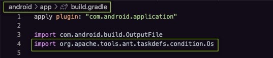
Install the React Native Vector Icons library and dev dependency on Android by opening android/app/build.gradle (not android/build.gradle) and adding this import statement:
import org.apache.tools.ant.taskdefs.condition.Os
Then, run the following command in the terminal:
yarn run android
Now we’re going to build a reusable icon component.
In your components folder, create a new file called Icon.tsx:
cd components && touch Icon.tsx && cd ..
Then, add the following code:
import React from 'react';
import MIcon from 'react-native-vector-icons/MaterialCommunityIcons';
MIcon.loadFont();
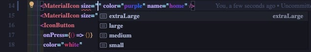
type IconSizeProps = {
iconSizes: keyof typeof IconSizes;
};
export interface IconProps {
size: IconSizeProps['iconSizes'];
name: string;
color: string;
}
export const IconSizes = {
small: 13,
medium: 18,
large: 23,
extraLarge: 27,
};
export const MaterialIcon = ({size, name, color}: IconProps) => (
<MIcon name={name} size={IconSizes[size]} color={color} />
);
For each icon bundle you want to use, import and load it as we have in line two (import Material Community Icons bundle set) and line four (load the icon bundle). Loading the icons this way eliminates the need to add any native code to use them.
We can export the components with three props that allow us to control the color, size, and type of icon:
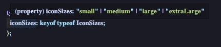
size is predefined by IconSizesname defines the icon typecolor defines the icon colorIf you’re new to TypeScript and wondering what’s happening on lines seven and 11, hover over iconSizes and you’ll see this:
keyofIn TypeScript, you can create types from JavaScript values. The keyof() operator takes an object type (IconSizes on line 16) and returns a string or literal union of its keys:
iconSizes: string | number | symbol
typeofTypeScript’s version of typeof() returns the types of the value of an object:
 iconSizes: {
    small: number;
    medium: number;
    large: number;
    extraLarge: number;
}
keyof typeofkeyof typeof indexes the keys of the object and returns a union of literal types:
iconSizes: "small" | "medium" | "large" | "extraLarge"
Now, thanks to the power of TypeScript, every time you use the size prop, your IDE will know what value should be provided and will display the options for you. To access autocomplete in VS Code on Mac, press CTRL and the spacebar simultaneously:
Let’s head back over to App.tsx to test our new Icon component:
import React from 'react';
import {SafeAreaView, StyleSheet, StatusBar} from 'react-native';
import {Text} from './components/Text';
// Import our icon component
import {MaterialIcon} from './components/Icon';

const App = () => {
  return (
    <>
      <StatusBar barStyle="dark-content" />
      <SafeAreaView style={styles.container}>
        <Text>This font-weight is 'regular' </Text>
        <Text style={styles.boldFont}>This font-weight is 'bold' </Text>
        {/* Add icons here */}
        <MaterialIcon size="large" color="purple" name="home" />
        <MaterialIcon size="extraLarge" color="black" name="github" />
      </SafeAreaView>
    </>
  );
};

const styles = StyleSheet.create({
  container: {
    flex: 1,
    justifyContent: 'center',
    alignItems: 'center',
  },
  boldFont: {
    fontFamily: 'Nunito-Bold',
  },
});

export default App;
For demonstration purposes, I’ve added a home icon and the GitHub logo below the text with different sizes and colors:
Buttons look great with icons, so let’s make one. For our button component, we’ll use the custom font that we built earlier with a new icon bundle.
In your components folder, create a new file called IconButton.tsx:
cd components && touch IconButton.tsx && cd ..
Add the following code:
import React from 'react';
import FontAwesomeIcon from 'react-native-vector-icons/FontAwesome';
import {Text} from './Text';
import {IconSizes, IconProps} from './Icon';

FontAwesomeIcon.loadFont();

type IconButtonProps = IconProps & {
  text: string;
  onPress: () => void;
};

export const IconButton = ({
  onPress,
  size,
  name,
  color,
  text,
}: IconButtonProps) => (
  <FontAwesomeIcon.Button
    onPress={onPress}
    name={name}
    size={IconSizes[size]}
    color={color}>
    <Text>{text}</Text>
  </FontAwesomeIcon.Button>
);
If we want to use an icon from material-ui-community-icons, we can import and use the icon component we already built. But this time, we’re going with Font Awesome’s icon bundle set, so we need to load the new icon bundle (line six).
Now, let’s import our IconButton into App.tsx:
import React from 'react';
import {SafeAreaView, StyleSheet, StatusBar} from 'react-native';
import {Text} from './components/Text';
// Import our icon component
import {MaterialIcon} from './components/Icon';
// Import our icon button component
import { IconButton } from './components/IconButton';

const App = () => {
  return (
    <>
      <StatusBar barStyle="dark-content" />
      <SafeAreaView style={styles.container}>
        <Text>This font-weight is 'regular' </Text>
        <Text style={styles.boldFont}>This font-weight is 'bold' </Text>
        {/* Add icons here */}
        <MaterialIcon size="large" color="purple" name="home" />
        <MaterialIcon size="extraLarge" color="black" name="github" />
        {/* Add icon button here */}
          <IconButton
          onPress={() => {}}
          color="white"
          size="extraLarge"
          name="facebook"
          text="Login in with Facebook"
        />
      </SafeAreaView>
    </>
  );
};

const styles = StyleSheet.create({
  container: {
    flex: 1,
    justifyContent: 'center',
    alignItems: 'center',
  },
  boldFont: {
    fontFamily: 'Nunito-Bold',
  },
});

export default App;
As with the MaterialIcon component we built earlier, you can set the color, size, and icon type with the provided props:
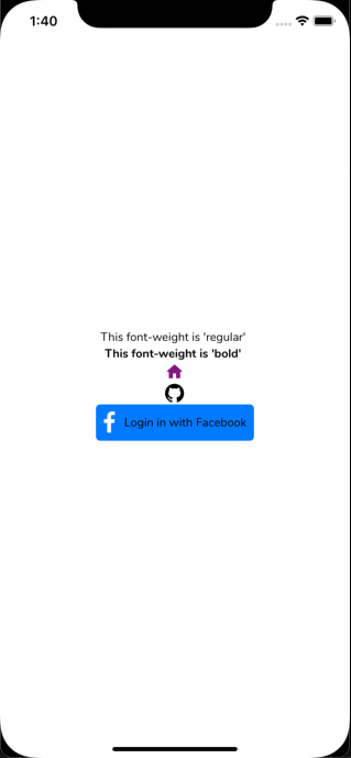
Besides material-ui-community-icons, you can also use popular icon sets such as EnTypo, Ionicon, or Simple Line Icons in your React Native applications.
The Entypo node module package contains the Entypo+ icon collection, which consists of 411 images packages as an SVG sprite:

Let’s use one of these icons in an application. Edit your icon.tsx file to add the following minimalistic code:
import React from 'react';
import Entypo from 'react-native-vector-icons/Entypo';
const Icons = {
    Entypo
    }
export default Icons
Then, replace the existing code in App.tsx with the following:
import React from 'react';
import {SafeAreaView, StyleSheet, Text, View} from 'react-native';

import Icons from './components/Icon';
const App = () => {
  return (
    <SafeAreaView style={styles.container}>
      <View style={styles.container}>
        <Text style={styles.titleText}>
          Example of Entypo Icon
        </Text>
         <Icons.Entypo name="camera" size={24} color="black"  />
      </View>
    </SafeAreaView>
  );
};
export default App;

const styles = StyleSheet.create({
   container: {
    flex: 1,
    justifyContent: 'center',
    alignItems: 'center',
    backgroundColor: 'white',
    padding: 10,
  },
  titleText: {
    fontSize: 20,
    fontWeight: 'bold',
    textAlign: 'center',
    paddingVertical: 20,
  },
});
The outcome will look like this:

Next up, we have Simple Line Icons. Some sample icons are shown below:

Let’s work with the plane icon. To render this in your application, follow the same process you did for Entypo. This is the code you’ll include in your icon.tsx file:
import React from 'react';
import SimpleLineIcons from 'react-native-vector-icons/SimpleLineIcons'

const Icons = {
    SimpleLineIcons
    }
export default Icons
And this is what will be included in your App.tsx file:
import React from 'react';
import {SafeAreaView, StyleSheet, Text, View} from 'react-native';
import Icons from './components/Icon';
const App = () => {
  return (
    <SafeAreaView style={styles.container}>
      <View style={styles.container}>
        <Text style={styles.titleText}>
          Example of SimpleLineIcon
        </Text>
           <Icons.SimpleLineIcons name="plane" size={24} color="black"  />
      </View>
    </SafeAreaView>
  );
};
export default App;

const styles = StyleSheet.create({
   container: {
    flex: 1,
    justifyContent: 'center',
    alignItems: 'center',
    backgroundColor: 'white',
    padding: 10,
  },
  titleText: {
    fontSize: 20,
    fontWeight: 'bold',
    textAlign: 'center',
    paddingVertical: 20,
  },
});
Upon executing, you will see the plane icon rendered:

Now, we’ll use Ionicons, which was built by the Ionic framework team:

For Ionicons, you will need to perform some additional installations:
npm install react-native-ionicons --save

npm i --save-dev @types/react-native-vector-icons

npx react-native-asset
Edit the Icon.tsx file as follows:
import React from 'react';
import Ionicons from 'react-native-vector-icons/Ionicons'
const Icons = {
Ionicons
}

export default Icons

Ionicons.loadFont();
type IconSizeProps = {
  iconSizes: keyof typeof IconSizes;
};

export interface IconProps {
  size: IconSizeProps['iconSizes'];
  name: string;
  color: string;
}

export const IconSizes = {
  small: 13,
  medium: 18,
  large: 23,
  extraLarge: 27,
};

export const IIcon = ({size, name, color}: IconProps) => (
<Ionicons size={IconSizes[size]} name={name} color={color} />
);
Then, edit App.tsx with the following:
import React from 'react';
import {SafeAreaView, StyleSheet, Text, View} from 'react-native';

import Icons, {IIcon} from './components/Icon';
const App = () => {
  return (
    <SafeAreaView style={styles.container}>
      <View style={styles.container}>
        <Text style={styles.titleText}>
          Example of Ionicon Icon
        </Text>
        <IIcon
          name="information-circle-outline"
          size="extraLarge"
          color="blue"
        />
         <IIcon name="bicycle" size="extraLarge" color="red" />
      </View>
    </SafeAreaView>
  );
};
export default App;

const styles = StyleSheet.create({
   container: {
    flex: 1,
    justifyContent: 'center',
    alignItems: 'center',
    backgroundColor: 'white',
    padding: 10,
  },
  titleText: {
    fontSize: 20,
    fontWeight: 'bold',
    textAlign: 'center',
    paddingVertical: 20,
  },
});
Upon execution of the application, you will see two Ionic icons on the screen:

Following this approach, you can experiment with a vast variety of bundled icons.
Beyond the use of icon bundle sets, you can craft custom icons for your application. Check out our guide to using SVGs in React for information about how to use SVGs as React components in order to create scalable and easily maintainable icons.
While working with React Native Vector Icons, Ionicons, or custom icons, you may often run into issues or errors.
On a system with low RAM, the Android Studio emulator can take a very long time to load. To bypass this, it is recommended to use a real smartphone device (iOS or Android). This will greatly speed up the application launch.
TypeError: cli.init is not a function for react native while creating a projectThis error indicates that an application creation won’t proceed. Sometimes, this is because there is a conflict between versions and scopes of the React Native modules. To resolve this, uninstall and re-install React Native global:
npm uninstall -g react-native-cli

npm install -g react-native-cli

npm install -g react-native
Then, create the project again.
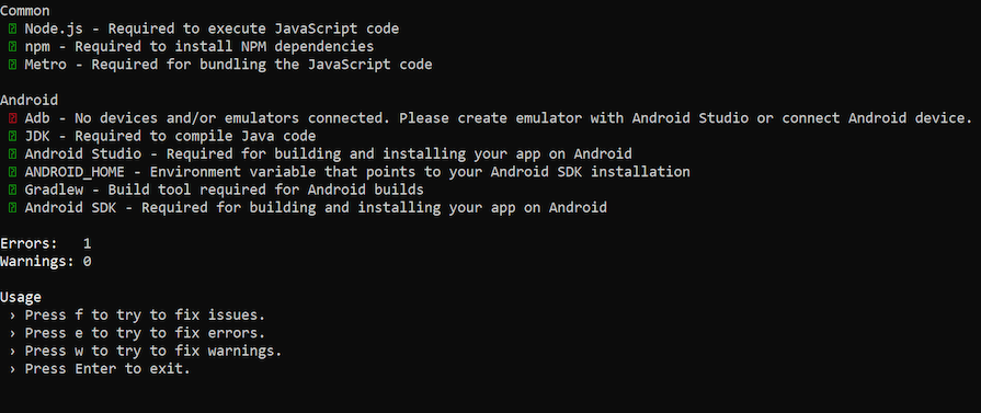
Error encountered: Missing setup packages or softwareFor this error, ensure you have the required setup in place correctly. The right version of Node, JDK, Android Studio, and Android SDK Build Tools must be present for the application to run.
Use npx react-native doctor to identify which part of the setup is incomplete and requires fixing.
Ensure you have the emulator or a real device connected. If you run npx react-native doctor, it will tell you if the emulator or device connectivity is missing:
Alternatively, you could use adb devices to determine currently active emulators or devices, before attempting to launch the application. If it shows blank, it means there are no emulators or devices connected:

Ensure you have all the required React Native packages installed correctly. Say a specific module like React Native Vector Icons is missing; the build will fail like this:
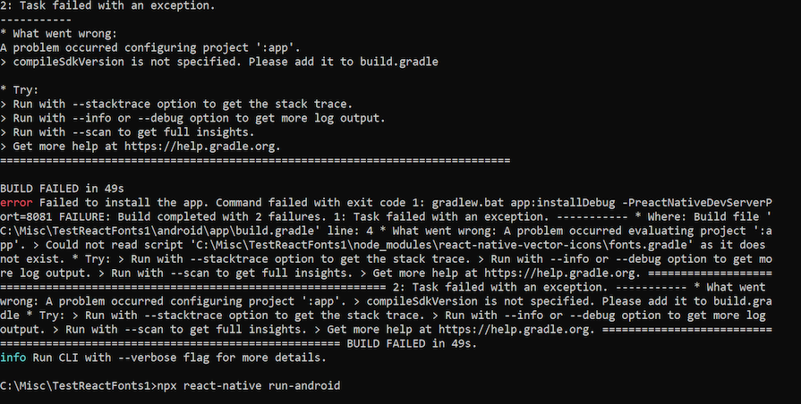
To determine what went wrong, you could examine the stack trace, and the log, or copy the error message to Google to search for a possible cause.
In this case, the emulator/device is connected correctly, the setup software is installed correctly, and all modules required for the application are in place. There is no error during the application launch either. Yet, upon launching, the application does not render the icons.
Many sites may contain an outdated tip to resolve this issue. They may advise you to use react-native link to fix this. However, in recent versions of React Native (greater than 6.0), the link will not work. Instead, you will use react-native-asset as follows: npx react-native-asset
This helps to associate the asset files with the project and will fix the icon rendering issue.
If icons do not render even after giving this command, ensure you have provided the correct name and properties.
Certain icon sets have to be specifically loaded with fonts. Check whether you are required to call loadFont() for the icon set. For instance, for Ionicons, you must do this.
The way of importing the items also makes a difference. Instead of importing like this: import {SimpleLineIcon} from "react-native-vector-icons";, try: import SimpleLineIcon from 'react-native-vector-icons/SimpleLineIcon;.
These are some of the most common issues/errors encountered when working with icons in React Native applications.
In this article, we demonstrated how to add icons and fonts to your iOS or Android app. We also explored how to work with popular icon sets bundled with the react-native-vector-icons library and create and consume custom icons in RN applications. Finally, we listed some tips on how to troubleshoot common errors when working with icons in RN applications.
It’s worth perusing the icons at the design stage of your app; there are some real gems in the icon bundle sets. If you’re looking for something specific, you should try several similar, descriptive keywords. For example, a search for “settings” will return a cog icon, but if you want an icon with multiple cogs, try searching “cogs.”
Now that you know how to customize your font, don’t be afraid to extend your text component with a nice font pairing — e.g., Nunito for headers and Roboto for paragraphs:
There you have it! You can customize your fonts and add bundled or custom icons to your heart’s content. Now go forth and build something amazing — just don’t use Vegan Style if you’re selling life insurance!

LogRocket's Galileo AI watches sessions for you and and surfaces the technical and usability issues holding back your React Native apps.
LogRocket also helps you increase conversion rates and product usage by showing you exactly how users are interacting with your app. LogRocket's product analytics features surface the reasons why users don't complete a particular flow or don't adopt a new feature.
Start proactively monitoring your React Native apps — try LogRocket for free.

Learn how to use Fallow to analyze AI-generated code, detect dead code, duplicate logic, and complexity issues, and integrate automated code quality checks into your AI-assisted development workflow.

Learn how to protect full-stack projects from NPM supply chain attacks with a practical security checklist.

Explore 15 essential MCP servers for web developers to enhance AI workflows with tools, data, and automation.

Learn how contrast-color() automatically picks accessible text colors using native CSS, without JavaScript.
Hey there, want to help make our blog better?
Join LogRocket’s Content Advisory Board. You’ll help inform the type of content we create and get access to exclusive meetups, social accreditation, and swag.
Sign up now

 Learn more →
