Editor’s note: This article was last updated by Nelson Michael on 29 November 2024 to cover applying rounded corners to View or other components in React Native, as well as to offer an introduction to styling text components in React.

React Native offers multiple approaches to styling mobile applications, giving developers flexibility in how they design their user interfaces. Here are the primary methods for styling in React Native:
The Replay is a weekly newsletter for dev and engineering leaders.
Delivered once a week, it's your curated guide to the most important conversations around frontend dev, emerging AI tools, and the state of modern software.
<View style={{ backgroundColor: 'red', padding: 10 }}>
  <Text>Hello world</Text>
</View>
StyleSheet.create()const styles = StyleSheet.create({
container: {
flex: 1,
backgroundColor: 'white'
}
});
You can apply styles to a React Native component by either using inline styles or the StyleSheet. Inline styles are used directly in the style prop of a component as a JavaScript object:
<Text style={{fontSize: 20, color: 'blue'}}>Hello LogRocket!</Text>
StyleSheet is used to create styles that are separate from React Native components. This approach makes it easier to maintain and reuse styles in multiple places:
// define styles
const styles = StyleSheet.create({
  text: {
    fontSize: 20,
    color: 'blue'
  }
});

// use them in component
<Text style={styles.text}>Hello LogRocket!</Text>
// can also be reused
<Text style={styles.text}>This is a React Native tutorial</Text>
const StyledView = styled.View`
  background-color: ${props => props.theme.backgroundColor};
  padding: 10px;
`;
NativeWind allows you to use Tailwind CSS’s utility-first styling in React Native. You can apply pre-defined classes directly to mobile app components:
 const myComponent = () => {
    return (
      <View className="flex-1 items-center justify-center bg-gray-200">
          <Text className="text-xl font-semibold text-blue-600"> Hello world!</Text>
      </View> );
};
const theme = {
  colors: {
    primary: '#007bff',
    secondary: '#6c757d'
  },
  spacing: {
    small: 8,
    medium: 16
  }
};
In this tutorial, we will guide you through styling components in React Native. By building a sample ecommerce mobile application, we will demonstrate the various styling techniques in React Native that allow you to design effective cross-platform applications.
To follow along with this React Native styling tutorial, you should have:
React Native is an open source mobile application framework that was launched by Facebook in 2015. Mobile developers worldwide use React Native to build apps for Android and iOS, as well as the web and macOS/Windows formats.
React Native’s key functions include:
The selling point of React Native is that it enables developers to use React’s framework along with native platform capabilities.
Before we dive deeper into styling our app, let’s get a better understanding of React Native styling.
An app’s look and feel are directly connected to the user experience. Using platform-specific style guidelines for iOS and Android, following consistent typography, and even handling layouts for multiple device sizes are very important to create an attractive, consistent, and intuitive app. These apps have a greater chance of users returning, which is an essential aspect of business.
React Native follows a CSS-in-JS approach for styling components instead of vanilla CSS. The syntax is very similar to what we are already familiar with in CSS, but let’s look at some key differences:
camelCased JavaScript properties instead of CSS syntax. For example, backgroundColor is written instead of background-colorstyle prop of components:hover or :active pseudo-classes. We can use the Pressable component from React Native to handle styles for hover and active state:
<Pressable
  style={({ pressed }) => [
    {
      backgroundColor: pressed ? "rgb(210, 230, 255)" : "white",
    },
  ]}
>
  {({ pressed }) => (
    <Text style={styles.text}>{pressed ? "Pressed!" : "Press Me"}</Text>
  )}
</Pressable>;
borderRadius for rounded corners and flex for flexbox layoutText is a fundamental component in React Native for displaying typography. Unlike on the web with the HTML <p> tag, React Native uses the <Text> component to provide control over text rendering, styling, and behavior.
Key text styling characteristics:
StyleSheet or inline styles for formattingHere is a basic text styling example:
const MyComponent = () => (
  <Text style={styles.baseText}>
    <Text style={styles.titleText}>Welcome</Text>
    <Text style={styles.bodyText}>to React Native!</Text>
  </Text>
);

const styles = StyleSheet.create({
  baseText: {
    fontFamily: 'Cochin',
  },
  titleText: {
    fontSize: 20,
    fontWeight: 'bold',
    color: 'blue'
  },
  bodyText: {
    fontSize: 16,
    color: 'black'
  }
});
We are going to use Expo to quickly bootstrap a React Native project. To set up the development environment for an Expo project, you will need to first install Node.js and npm. This is required to run the create-expo-app command and install dependencies.
Then, create a new app called my-ecommerce-app using the create-expo-app command:
npx create-expo-app my-ecommerce-app
Next, navigate to the project directory:
cd my-ecommerce-app
Start the development server using the following command:
npx expo start
This command will start a Metro Bundler server and an Expo Dev Client that you can use to run the app on a physical device or in the web browser.
To run the app on a physical device, install the Expo Go app from the Play Store or App Store and scan the QR code from the terminal using the app. To run the app in a web browser, press w in the terminal. This will open the web app in your default browser.
Units in React Native styles are a little different from CSS. React Native uses unitless numbers for properties like borderRadius, padding, fontSize, etc. For example, instead of saying 10px, we would just write 10, demonstrated as { fontSize: 10 }.
Units like dp, px, etc., are added automatically based on the platform. This use of unitless numbers ensures that scaling occurs uniformly across devices with different resolutions.
Additionally, React Native supports percentage-based units, but they have to be provided inside a string like { width: '100%' }. When it comes to defining colors and alignment, you can apply them as usual, using string values.
For this React Native styling demo, we will build an ecommerce mobile application that displays various products for users to make orders based on their preferences. In particular, we’ll walk through building a landing page and cart functionality to highlight some key React Native styling concepts.
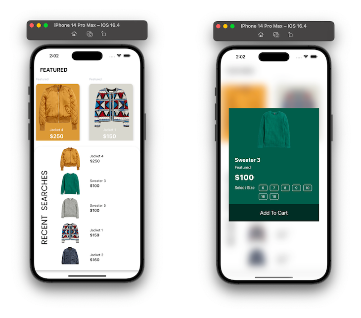
The finished application will look like this:
The ecommerce mobile application has two main functionalities built with two components: the Home component and the CartModal. To follow along, clone the starter repo here:
git clone https://github.com/iamshadmirza/logrocket-online-store.git
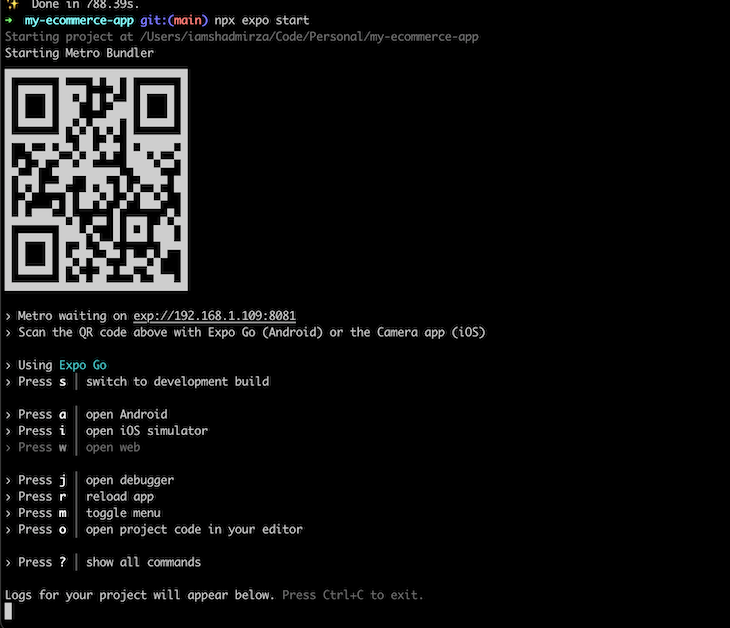
Navigate to the newly created log-rocket-online-store-starter directory and run npm install in your terminal/command prompt. Once installation is complete, run the command below to start the Metro bundler, which is a JavaScript bundler built by Facebook:
cd logrocket-online-store && npx expo start
If everything is set up correctly, you should have a new terminal window open, similar to the image below:
Now that we have our project set up and the Metro bundler running, let’s run a build for our starter project.
The folder structure for our React Native styling example is as follows:
assets contain all the application’s assets like images, icons, etc.constants contain images.ts, theme.ts, and index.ts. All assets are stored in JavaScript constantsscreens contains the Home.tsx and Home.finished.tsx files. Home.finished.tsx is for reference — it contains the final codesrc folder contains all of the aboveIn this tutorial, we’ll focus on styling the application and understanding when to use themes and when to use inline styling. Feel free to explore the codebase to understand how everything works behind the scenes.
borderRadius?To apply rounded corners to a View or other components, use the borderRadius property. There are some things to consider when using borderRadius:
borderRadius accepts unitless numbersHere’s an example of basic corner rounding:
const RoundedView = () => (
  <View style={{
    width: 200,
    height: 100,
    backgroundColor: 'blue',
    borderRadius: 20  // Applies uniform rounded corners
  }} />
);
Here’s an example of more specific corner rounding:
const SpecificRoundedView = () => (
  <View style={{
    width: 200,
    height: 100,
    backgroundColor: 'green',
    borderTopLeftRadius: 20,     // Top-left corner
    borderBottomRightRadius: 20  // Bottom-right corner
  }} />
);
The Home component has two sections: the featured product and recent searches.
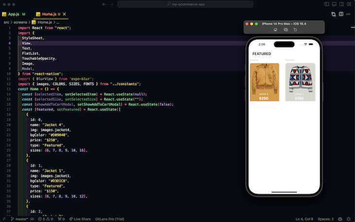
Navigate to the screens directory. Here, you’ll find the boilerplate code in the Home component:
import React from "react";
import {
  StyleSheet,
  View,
  Text,
  FlatList,
  TouchableOpacity,
  Image,
  Modal,
} from "react-native";
import { BlurView } from 'expo-blur';
import { images, COLORS, SIZES, FONTS } from "../constants";
const Home = () => {
  const [selectedItem, setSelectedItem] = React.useState(null);
  const [selectedSize, setSelectedSize] = React.useState("");
  const [showAddToCartModal, setShowAddToCartModal] = React.useState(false);
  const [featured, setFeatured] = React.useState([
    {
      id: 0,
      name: "Jacket 4",
      img: images.jacket4,
      bgColor: "#D09040",
      price: "$250",
      type: "Featured",
      sizes: [6, 7, 8, 9, 10, 16],
    },
    {
      id: 1,
      name: "Jacket 1",
      img: images.jacket1,
      bgColor: "#D3D1C8",
      type: "Featured",
      price: "$150",
      sizes: [6, 7, 8, 9, 10, 12],
    },
    {
      id: 2,
      name: "Jacket 2",
      img: images.jacket2,
      type: "Featured",
      bgColor: "#303946",
      price: "$160",
      sizes: [6, 7, 8, 9, 10],
    },
  ]);
  const [recentSearches, setRecentSearch] = React.useState([
    {
      id: 0,
      name: "Jacket 4",
      img: images.jacket4,
      bgColor: "#D09040",
      price: "$250",
      type: "Featured",
      sizes: [6, 7, 8, 9, 10, 16],
    },
    {
      id: 1,
      name: "Sweater 3",
      img: images.sweater3,
      type: "Featured",
      bgColor: "#0F5144",
      price: "$100",
      sizes: [6, 7, 8, 9, 10, 16, 18],
    },
    {
      id: 2,
      name: "Sweater 5",
      img: images.sweater5,
      type: "Featured",
      bgColor: "#888983",
      price: "$100",
      sizes: [6, 7, 8, 9, 10, 18],
    },
    {
      id: 7,
      name: "Jacket 1",
      img: images.jacket1,
      bgColor: "#D3D1C8",
      type: "Featured",
      price: "$150",
      sizes: [6, 7, 8, 9, 10, 12],
    },
    {
      id: 8,
      name: "Jacket 2",
      img: images.jacket2,
      type: "Featured",
      bgColor: "#303946",
      price: "$160",
      sizes: [6, 7, 8, 9, 10],
    },
    {
      id: 3,
      name: "Hat 1",
      img: images.hat1,
      type: "Featured",
      bgColor: "#26232A",
      price: "$100",
      sizes: [6, 7, 8, 9, 10, 16],
    },
    {
      id: 4,
      name: "Shirt 1",
      img: images.shirt1,
      type: "Featured",
      bgColor: "#575569",
      price: "$100",
      sizes: [6, 7, 8, 9, 10, 16],
    },
    {
      id: 5,
      name: "Shirt 2",
      img: images.shirt2,
      type: "Featured",
      bgColor: "#2B3A6B",
      price: "$100",
      sizes: [6, 7, 8, 9, 10, 16],
    },
    {
      id: 6,
      name: "Shoe 1",
      img: images.shoe1,
      type: "Featured",
      bgColor: "#9E7348",
      price: "$100",
      sizes: [6, 7, 8, 9, 10, 12],
    },
  ]);

  function renderFeaturedItems(item, index) {
    return (
      <TouchableOpacity
        style={{
          height: 300,
          width: 200,
          justifyContent: "center",
          marginHorizontal: SIZES.base,
        }}
        onPress={() => {
          setSelectedItem(item);
          setShowAddToCartModal(true);
        }}
      >
        <Text style={{ color: COLORS.lightGray, ...FONTS.h5 }}>
          {item.type}
        </Text>
        <View
          style={[
            {
              flex: 1,
              justifyContent: "flex-end",
              marginTop: SIZES.base,
              borderRadius: 10,
              marginRight: SIZES.padding,
              backgroundColor: item.bgColor,
              paddingRight: SIZES.padding,
              paddingBottom: SIZES.radius,
            },
            style.featuredShadow,
          ]}
        >
          <View style={style.featuredDetails}>
            <Text
              style={{ color: COLORS.white, ...FONTS.body4, marginTop: 15 }}
            >
              {item.name}
            </Text>
            <Text style={{ color: COLORS.white, ...FONTS.h2 }}>
              {item.price}
            </Text>
          </View>
        </View>
        <Image
          source={item.img}
          resizeMode="cover"
          style={{
            position: "absolute",
            top: 25,
            right: 20,
            width: "90%",
            height: 200,
          }}
        />
      </TouchableOpacity>
    );
  }

  // paste recent searches code

  // paste renderSizes

  return (
    <View style={style.container}>
      <Text
        style={{
          marginTop: SIZES.radius,
          marginHorizontal: SIZES.padding,
          ...FONTS.h2,
        }}
      >
        FEATURED
      </Text>
      {/* Featured */}
      <View style={{ height: 260, marginTop: SIZES.radius }}>
        <FlatList
          horizontal
          showsHorizontalScrollIndicator={false}
          data={featured}
          keyExtractor={(item) => item.id.toString()}
          renderItem={({ item, index }) => renderFeaturedItems(item, index)}
        />
      </View>
      {/* Recent Searches */}

      {/* Modal */}
    </View>
  );
};
const style = StyleSheet.create({
  container: {
    flex: 1,
    backgroundColor: COLORS.white,
  },
  featuredShadow: {
    shadowColor: "#000",
    shadowOffset: {
      width: 0,
      height: 5,
    },
    shadowOpacity: 0.29,
    shadowRadius: 4.65,
    elevation: 7,
  },
  featuredDetails: {
    position: "absolute",
    top: 160,
    left: 30,
    flexDirection: "column",
    marginLeft: 25,
    marginBottom: 8,
  },
});

export default Home;
If you run npm run ios, your app should now look like the image below:
Most of the font sizes, padding, and margins used above are declared in the theme.ts file located in the constant folder. Within the renderFeaturedItems function, notice that I combined inline styling and a prop approach to style the featured items. The react-native style prop accepts an array, so you can pass a second argument to style.
See the example below:
style = {
  [{
      flex: 1,
      justifyContent: "flex-end",
      marginTop: SIZES.base,
      borderRadius: 10,
      marginRight: SIZES.padding,
      backgroundColor: item.bgColor,
      paddingRight: SIZES.padding,
      paddingBottom: SIZES.radius,
    },
    style.featuredShadow,
  ]
}
In the code block above, the style prop value is wrapped in a bracket [], meaning the prop will accept an array of objects as values. The second argument of the style prop is created using Stylesheet.create(). As stated earlier, this approach is popular in complex React Native applications and is an excellent way to support multiple styles.
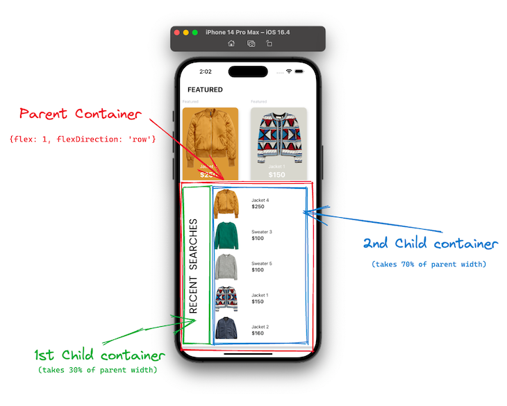
Now that we’ve built the first section of the Home component, let’s build the last one: the recent searches section.
Before we begin, let’s consider what the recent searches structure should look like. We need to first create a flex container with its flex direction set to row, and two columns that will act as direct children of the container. The first column contains an image, the other is a flex container that houses the product image, product name, and price:
Like in CSS, when styling in React Native, you should always map your UI components to CSS properties before you begin styling your app. These will give you a broader overview of how to style your entire application from the ground up.
To build the second section of the Home component, find the // paste recent searches code comment and copy and paste the code beneath the comment:
 function renderRecentSearches(item, index) {
    return (
      <TouchableOpacity
        style={{ flex: 1, flexDirection: "row" }}
        onPress={() => {
          setSelectedItem(item);
          setShowAddToCartModal(true);
        }}
      >
        <View
          style={{ flex: 1, alignItems: "center", justifyContent: "center" }}
        >
          <Image
            source={item.img}
            resizeMode="contain"
            style={{
              width: 130,
              height: 100,
            }}
          />
        </View>
        <View
          style={{
            flex: 1.5,
            marginLeft: SIZES.radius,
            justifyContent: "center",
          }}
        >
          <Text>{item.name}</Text>
          <Text style={{ ...FONTS.h3 }}>{item.price}</Text>
        </View>
      </TouchableOpacity>
    );
  }
Next, find the {/* Recent Searches */} comment in Home.ts and paste the code below under it:
<View
    style={[
      {
        flex: 1,
        flexDirection: "row",
        marginTop: SIZES.padding,
        borderTopLeftRadius: 30,
        borderTopRightRadius: 30,
        backgroundColor: COLORS.white,
      },
      style.recentSearchShadow,
    ]}
  >
    <View style={{ width: 70, height: "100%", marginLeft: SIZES.base }}>
      <Image
        source={images.searches}
        style={{ width: "100%", height: "100%", resizeMode: "contain" }}
      />
    </View>
    <View style={{ flex: 1, paddingBottom: SIZES.padding }}>
      <FlatList
        showsVerticalScrollIndicator={false}
        data={recentSearches}
        keyExtractor={(item) => item.id.toString()}
        renderItem={({ item, index }) => renderRecentSearches(item, index)}
      />
    </View>
  </View>
Adding shadows to a component in React Native is quite different from how it is done in CSS. You need to specify the shadowColor, ShadowOffset, ShadowOpacity, ShadowRadius, and elevation. Add the code below to StyleSheet.create to complete the styling of the recentSearches section of the Home component:
  recentSearchShadow:{
        shadowColor: "#000",
        shadowOffset:{
            width: 0,
            height: 5,
        },
        shadowOpacity: 0.29,
        shadowRadius: 4.65,
        elevation: 7
    },
    recentSearches: {
        width: "100%",
        transform: [{ rotateY: "180deg" }]
    },
This only works to create a shadow in iOS. To add shadows to a component in Android, see the official instructions here.
Finally, let’s create a modal to display each selected product. Find the // paste renderSizes comment in Home.tsx and copy and paste the following code underneath it:
function renderSizes() {
  return selectedItem.sizes.map((item, index) => {
    return (
      <TouchableOpacity
        key={index}
        style={{
          width: 35,
          height: 25,
          alignItems: "center",
          justifyContent: "center",
          marginHorizontal: 5,
          marginBottom: 10,
          backgroundColor:
            selectedItem.sizes[index] == selectedSize ? COLORS.white : null,
          borderWidth: 1,
          borderColor: COLORS.white,
          borderRadius: 5,
        }}
        onPress={() => {
          setSelectedSize(item);
        }}
      >
        <Text
          style={{
            color:
              selectedItem.sizes[index] == selectedSize
                ? COLORS.black
                : COLORS.white,
            ...FONTS.body4,
          }}
        >
          {item}
        </Text>
      </TouchableOpacity>
    );
  });
}
We need the blur effect in the modal background. Install the required package to use BlurView:
npx expo install expo-blur
Then you can import it like this:
import { BlurView } from 'expo-blur';
To add the modal when selectedItem is present, paste the following code beneath the comment {/* Modal */} in the Home component:
{selectedItem && (
  <Modal
    animationType="slide"
    transparent={true}
    visible={showAddToCartModal}
  >
    <BlurView
      style={style.blur}
      tint="light"
      intencity={20}
    >
      <TouchableOpacity
        style={style.absolute}
        onPress={() => {
          setSelectedItem(null);
          setSelectedSize("");
          setShowAddToCartModal(false);
        }}
      ></TouchableOpacity>
      {/* Modal content */}
      <View
        style={{
          justifyContent: "center",
          width: "85%",
          backgroundColor: selectedItem.bgColor,
        }}
      >
        <View>
          <Image
            source={selectedItem.img}
            resizeMode="contain"
            style={{
              width: "100%",
              height: 170,
            }}
          />
        </View>
        <Text
          style={{
            marginTop: SIZES.padding,
            marginHorizontal: SIZES.padding,
            color: COLORS.white,
            ...FONTS.h2,
          }}
        >
          {selectedItem.name}
        </Text>
        <Text
          style={{
            marginTop: SIZES.base / 2,
            marginHorizontal: SIZES.padding,
            color: COLORS.white,
            ...FONTS.body3,
          }}
        >
          {selectedItem.type}
        </Text>
        <Text
          style={{
            marginTop: SIZES.radius,
            marginHorizontal: SIZES.padding,
            color: COLORS.white,
            ...FONTS.h1,
          }}
        >
          {selectedItem.price}
        </Text>
        <View
          style={{
            flexDirection: "row",
            marginTop: SIZES.radius,
            marginHorizontal: SIZES.padding,
          }}
        >
          <View>
            <Text style={{ color: COLORS.white, ...FONTS.body3 }}>
              Select Size
            </Text>
          </View>
          <View
            style={{
              flex: 1,
              flexWrap: "wrap",
              flexDirection: "row",
              marginLeft: SIZES.radius,
            }}
          >
            {renderSizes()}
          </View>
        </View>

        <TouchableOpacity
          style={{
            width: "100%",
            height: 70,
            justifyContent: "center",
            alignItems: "center",
            marginTop: SIZES.base,
            backgroundColor: "rgba(0,0,0,0.5)",
          }}
          onPress={() => {
            setSelectedItem(null);
            setSelectedSize("");
            setShowAddToCartModal(false);
          }}
        >
          <Text style={{ color: COLORS.white, ...FONTS.largeTitleBold }}>
            Add To Cart
          </Text>
        </TouchableOpacity>
      </View>
    </BlurView>
  </Modal>
)}
You have to use absolute positioning to position the modal in the center of the application. Copy and paste the code below into the Stylesheet.create() object to position the modal at the center:
blur: {
  flex: 1,
  alignItems: "center",
  justifyContent: "center",
},
absolute: {
  position: "absolute",
  top: 0,
  left: 0,
  right: 0,
  bottom: 0,
},
Once you’re happy with the code, you can compare it with the finished code available in the GitHub repository here.
Now that we have a solid foundation of basic styling in a React Native application, it’s time to explore some advanced techniques that can enhance the look and feel of your app. These techniques may not be supported directly by React Native out of the box, but they are crucial for creating a scalable and efficient styling solution.
flexDirection, flexWrap, alignItems, justifyContent, etc.Media queries are not supported by default but we can use the react-native-media-queries package to get similar functionality:
import StyleSheet from 'react-native-media-query';
import { View, TextInput } from 'react-native'

const {ids, styles} = StyleSheet.create({
    example: {
        width: 100,
        height: 100,
        backgroundColor: 'green',
        '@media (max-width: 1600px) and (min-width: 800px)': {
            backgroundColor: 'red',
        },
        '@media (max-width: 800px)': {
            backgroundColor: 'blue',
        },
    },
    exampleTextInput: {
        paddingVertical: 27,
        backgroundColor: 'pink',
        '@media (max-width: 768px)': {
            paddingVertical: 13,
        },
        // example CSS selectors. these only work on web based platforms
        '::placeholder': {
            color: 'green',
        },
        ':hover': {
            backgroundColor: 'red',
        },
    }
})
Because React Native uses objects for styling, we can use any variable in place of the style of a property or we can use a function that returns some styles based on a specific parameter:
const getBackgroundColor = (colorScheme) => {
    return colorScheme === 'dark' ? '#000' : '#fff'
}

<View style={getBackgroundColor("dark")} />
All modern apps now support light and dark themes for enhanced accessibility. We can either detect the device’s default theme or allow users to set their preferences. Once we know their preference, we can adjust the rest of the app accordingly.
We’ll use the Appearance API to change our app’s theme:
import { useColorScheme } from 'react-native';

const colorScheme = useColorScheme();

const styles = {
 backgroundColor: colorScheme === 'dark' ? '#000' : '#fff'
};
Next, store the theme in state:
const [theme, setTheme] = useState('light');

const styles = {
 backgroundColor: theme === 'dark' ? '#000' : '#fff'
};

// Toggle theme
toggleTheme = () => {
 theme === 'light' ? setTheme('dark') : setTheme('light');
}
Then, use a theme provider:
const ThemeContext = createContext('light');

function ThemeProvider({ children }) {
 const [theme, setTheme] = useState('light');

 return (
   <ThemeContext.Provider value={{ theme, setTheme }}>
     {children}
   </ThemeContext.Provider>
 );
}

// Use context
const { theme } = useContext(ThemeContext);
const styles = {
 backgroundColor: theme === 'dark' ? '#000' : '#fff'
};
Define separate style sheets for each theme with the following code:
const lightTheme = {...};
const darkTheme = {...};

const currentTheme = theme === 'dark' ? darkTheme : lightTheme;

<View style={currentTheme.container} />
Let’s consider some of the best practices while styling a React Native application.
We used a theme object that acted as a single source of truth, which is the recommended approach. It allows you to save all the commonly used properties like font sizes, typography, spaces, sizes of components, colors, etc.
This theme can be accessed throughout the entire application using React Context, eliminating the need to update the theme file at every single usage.
Breaking down the user interface into smaller components helps you make them reusable and more manageable. Always break the screen into smaller components and reuse as much as possible.
This modular approach saves valuable development time and significantly improves the overall codebase’s maintainability. By organizing your app into distinct components, you can quickly locate and update the relevant code whenever there is a change in design specifications or functionality requirements.
Mobile apps are designed to cater to devices with different screen sizes and resolutions. It is crucial to avoid using hardcoded pixel values when defining the layout and styling to ensure that your app provides a seamless user experience across all devices. Instead, it is recommended to adopt a more flexible approach by using flexbox and percentage-based units for styles.
Please note that this is only the case for component layout and not font sizes. Font sizes should use unitless values, and the Platform API should be used to adjust font accordingly.
Inline styles not only make components more challenging to read but also hinder maintainability and the reusability of styles. It is recommended to use the StyleSheet object to define styles separately from functional components.
While inline styles can be employed to add conditional styles, StyleSheet should be the primary approach.
Styling in React Native can be straightforward if you understand the key differences discussed earlier. We explored building complex layouts using flexbox and percentage-based styles. Additionally, we examined using constants to reuse styles through a common theme object. You can find more information about style props in the React Native documentation.
I hope this article was a good start. We have some resources below if you’re interested in exploring further:

LogRocket's Galileo AI watches sessions for you and and surfaces the technical and usability issues holding back your React Native apps.
LogRocket also helps you increase conversion rates and product usage by showing you exactly how users are interacting with your app. LogRocket's product analytics features surface the reasons why users don't complete a particular flow or don't adopt a new feature.
Start proactively monitoring your React Native apps — try LogRocket for free.

Learn how to test Nuxt apps with Vitest, @nuxt/test-utils, runtime mocks, server route mocks, and Playwright e2e tests.

I had four weeks to build a complete app from scratch using AI tools like OpenCode and Claude Opus: here’s how it went.

Learn how to build a reusable Vue 3 table engine that powers tables, cards, and lists with shared sorting and pagination logic.

Compare the best React chart libraries for 2026, including Recharts, Nivo, visx, Apache ECharts, MUI X Charts, and more.
Hey there, want to help make our blog better?
Join LogRocket’s Content Advisory Board. You’ll help inform the type of content we create and get access to exclusive meetups, social accreditation, and swag.
Sign up now

 Learn more →
