Editor’s note: This article was reviewed for accuracy on 24 July 2024 by Chinwike Maduabuchi and updated to demonstrate new gesture handlers introduced in React Native Gesture Handler v2.0, show how to integrate React Native Gesture Handler with React Native Reanimated 2 for smoother gesture handling, and more.

Applications nowadays have become increasingly interactive, allowing users to interact with mobile components by swiping, panning, double-tapping, pinching, long-pressing, and more. When properly implemented in your mobile app, gestures provide users with an engaging, natural, and intuitive experience.
You can use several packages to implement gestures in a React Native app. The most popular and recommended library is React Native Gesture Handler (RNGH), which is the focus of this article.
This library exposes platform-specific (i.e., Android and iOS) native touch and gestures to React Native. Most native components, such as buttons, can be replaced with RNGH’s native gesture components for better accessibility and performance.
Although gestures in React Native can be handled using the built-in Gesture Responder System, this implementation has some limitations because it runs on the JavaScript thread. So every time a gesture event is carried out, it sends the data across the React Native bridge to the interface, which can lead to poor performance.
Conversely, React Native Gesture Handler is highly performant because the gestures run on the UI thread (often called the main thread) and follow platform-specific behavior, which leads to better performance.
Recently, RNGH 2.0 was released with a more declarative API. Previously, you had to create a separate gesture handler component for each gesture. Now, you can wrap your entire app with the GestureHandlerRootView component and use the GestureDetector component within your components to listen for any gesture.
The GestureDetector component accepts a gesture object created using the Gesture API, which includes gestures like Gesture.Pan, Gesture.Pinch, and more.
In this article, we’ll create a new React Native app with Expo and TypeScript, and cover the following gestures from RNGH 2.0:
You can find the project’s source code on GitHub. Now let’s create a fresh React Native app with Expo.
We can use the create-expo-app package to create a batteries-included Expo TypeScript app that comes with React Native Gesture Handler 2.0 and React Native Reanimated, both of which we’ll use to build our gestures.
Run the command below in your terminal:
npx create-expo-app@latest myapp
# for javascript do:
npx create-expo-app myapp --template blank
# then
cd myapp && npm i react-native-gesture-handler
Navigate into the new Expo project and run the start command to start your application. You’ll need the Expo Go app on your device to scan the code that runs the application on your phone:
npm start
This starter app gives us enough context to see Expo’s impressive features. The expo-router package lays the foundation for navigation in our app.
Similar to what you’ll see in a Next.js project, Expo Router has an app directory which is the entry point to the app. Within this directory is a special (tabs) folder representing the typical bottom navigation panel you see in every mobile application.
Let’s inspect the app/(tabs)/_layout.tsx file:
// app/(tabs)/_layout.tsx
import { Tabs } from 'expo-router'
import React from 'react'
import { TabBarIcon } from '@/components/navigation/TabBarIcon'
import { Colors } from '@/constants/Colors'
import { useColorScheme } from '@/hooks/useColorScheme'

export default function TabLayout() {
  const colorScheme = useColorScheme()

  return (
    <Tabs
      screenOptions={{
        tabBarActiveTintColor: Colors[colorScheme ?? 'light'].tint,
        headerShown: false,
      }}
    >

      <Tabs.Screen
        name='index'
        options={{
          title: 'Home',
          tabBarIcon: ({ color, focused }) => (
            <TabBarIcon
              name={focused ? 'home' : 'home-outline'}
              color={color}
            />
          ),
        }}
      />
      {/* ...explore tab */}
      {/* our gesture playground tab */}
      <Tabs.Screen
        name='gestures'
        options={{
          title: 'Gestures',
          tabBarIcon: ({ color, focused }) => (
            <TabBarIcon
              name={focused ? 'arrow-redo' : 'arrow-redo-outline'}
              color={color}
            />
          ),
        }}
      />
    </Tabs>
  )
}
Here, the Tabs component from expo-router is used to create the tab screens and their respective components. The template includes two pre-configured tabs: Index and Explore. And if you inspect them, you’ll find UI components like ThemedView , ThemedText and the fancy HelloWave component.
Let’s create a new Gestures tab to use as practice grounds for the gestures we’ll create with RNGH. Create a gestures.tsx file in the(tabs) folder — it has to match the value passed to the name property in Tabs.Screen:
// (tabs)/gestures.tsx
import { StyleSheet } from 'react-native'
import { ThemedText } from '@/components/ThemedText'
import { ThemedView } from '@/components/ThemedView'

export default function Gestures() {
  return (
    <ThemedView style={styles.container}>
      <ThemedText>Gestures Screen</ThemedText>
    </ThemedView>
  )
}
const styles = StyleSheet.create({
  container: {
    flex: 1,
    padding: 32,
  },
})
Now let’s get started implementing and managing gestures in our React Native app.
As mentioned earlier, we need to wrap the entire application with the GestureHandlerRootView component before listening for gestures in other components. The proper place to do this is in the _layout.tsx file:
// app/_layout.tsx
import {
  DarkTheme,
  DefaultTheme,
  ThemeProvider,
} from '@react-navigation/native'
import { useFonts } from 'expo-font'
import { Stack } from 'expo-router'
import * as SplashScreen from 'expo-splash-screen'
import { useEffect } from 'react'
import 'react-native-reanimated'
import { useColorScheme } from '@/hooks/useColorScheme'
import { GestureHandlerRootView } from 'react-native-gesture-handler'

export default function RootLayout() {
  {/* font logic */}

  return (
    <GestureHandlerRootView>
      <ThemeProvider value={colorScheme === 'dark' ? DarkTheme : DefaultTheme}>
        <Stack>
          <Stack.Screen name='(tabs)' options={{ headerShown: false }} />
          <Stack.Screen name='+not-found' />
        </Stack>
      </ThemeProvider>
    </GestureHandlerRootView>
  )
}
Now we can create the basic layout of our gestures.tsx component. It’ll contain a View with a red box positioned in the middle of the screen:
// (tabs)/gestures.tsx
import { ThemedText } from '@/components/ThemedText'
import { ThemedView } from '@/components/ThemedView'
import { StyleSheet } from 'react-native'

export default function Gestures() {
  return (
    <ThemedView style={styles.container}>
      <View style={styles.box}>
        <ThemedText style={styles.title}>Pan</ThemedText>
      </View>
    </ThemedView>
  )
}

const styles = StyleSheet.create({
  container: {
    flex: 1,
    alignItems: 'center',
    justifyContent: 'center',
  },
  box: {
    width: 100,
    height: 100,
    backgroundColor: '#dd2150',
    borderRadius: 20,
    alignItems: 'center',
    justifyContent: 'center',
  },
  title: {
    fontWeight: 'bold',
    fontSize: 18,
  },
})
To create a pan gesture (moving an object horizontally or vertically) with RNGH, start by wrapping the box with the GestureDetector component to listen for gesture events. The GestureDetector takes a gesture prop, which should be a gesture created with the Gesture object from RNGH.
Let’s create a pan gesture without any configurations for now:
import { Gesture, GestureDetector } from 'react-native-gesture-handler'
import { StyleSheet } from 'react-native'

export default function Gesture() {
  const pan = Gesture.Pan()

  return (
    <ThemedView style={styles.container}>
      <GestureDetector gesture={pan}>
        <View style={styles.box}>
          <ThemedText style={styles.title}>Pan</ThemedText>
        </View>
      </GestureDetector>
    </ThemedView>
  )
}
The Gesture object accepts various callbacks representing different stages of a gesture’s lifecycle. These callbacks can be attached to the gesture to handle specific events:
const pan = Gesture.Pan()
  .onUpdate((event) => {
    // This will be used to update the translation values of the square
    console.log(event.translationX) // 0
  })
  .onEnd((event) => {
    // This will be used to reset the translation values of the square
  })
While some gestures have unique callbacks, the recurring ones across all gestures are onBegin, onStart, onEnd, and onFinalize — see callbacks common to all gestures.
So how do we update the translation values of the square in the functions? Your first guess might be to hook the x and y translation values to useState and update them from the callback functions below.
But this won’t work, because using regular JavaScript numbers would require manually updating the component’s state and re-rendering the component on each gesture update. This would lead to performance issues and janky animations.
To tackle this, we’ll use React Native’s Animated.Value property, which ensures that animations are smooth and performant by updating the native layer directly. We’ll also convert the square to an Animated component to smoothly animate the box’s position in response to gesture events.
Here’s the solution:
// app/(tabs)/gestures.tsx
import { ThemedText } from '@/components/ThemedText'
import { ThemedView } from '@/components/ThemedView'
import React, { useRef } from 'react'
import { StyleSheet, Animated } from 'react-native'
import { Gesture, GestureDetector } from 'react-native-gesture-handler'

export default function PanGesture() {
  const translationX = useRef(new Animated.Value(0)).current
  const translationY = useRef(new Animated.Value(0)).current

  const pan = Gesture.Pan()
    .onUpdate((event) => {
      translationX.setValue(event.translationX)
      translationY.setValue(event.translationY)
    })
    .onEnd((event) => {
      // use spring animation to prevent box from quickly snapping back after gesture
      Animated.spring(translationX, {
        toValue: 0,
        useNativeDriver: true,
      }).start()
      Animated.spring(translationY, {
        toValue: 0,
        useNativeDriver: true,
      }).start()
    })
    .runOnJS(true)

  return (
    <ThemedView style={styles.container}>
      <GestureDetector gesture={pan}>
        <Animated.View
          style={[
            styles.box,
            {
              transform: [
                { translateX: translationX },
                { translateY: translationY },
              ],
            },
          ]}
        >
          <ThemedText style={styles.title}>Pan</ThemedText>
        </Animated.View>
      </GestureDetector>
    </ThemedView>
  )
}

{/* styles */}
Here’s the result:
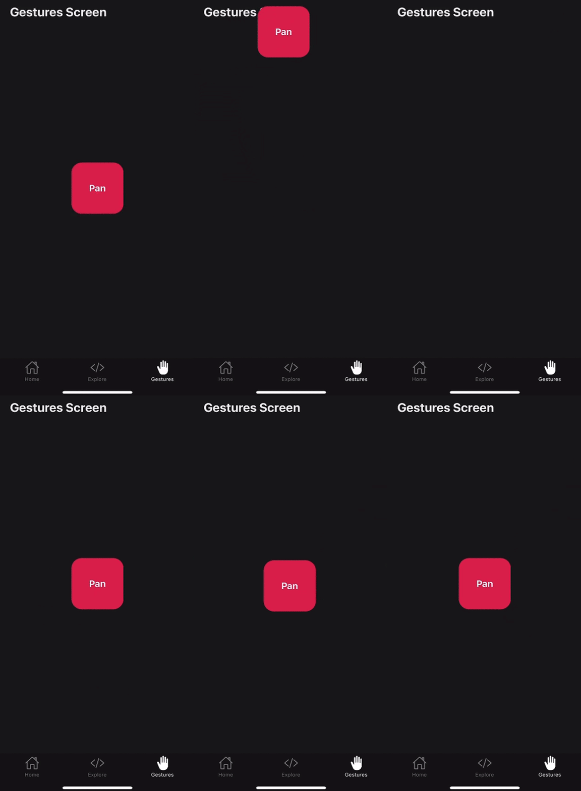
For simplicity, I’ve moved the pan gesture logic into a PanGesture.tsx file in components/gestures. Other subsequent gestures will be added to this folder. You can now import this component into the app/(tabs)/gestures.tsx file:
// app/(tabs)/gestures.tsx
import { StyleSheet } from 'react-native'
import { ThemedText } from '@/components/ThemedText'
import { ThemedView } from '@/components/ThemedView'
import PanGesture from '@/components/gestures/PanGesture'

export default function App() {
  return (
    <ThemedView style={styles.container}>
      <ThemedText style={styles.title}>Gestures Screen</ThemedText>
      <PanGesture />
    </ThemedView>
  )
}
const styles = StyleSheet.create({
  {/* ... */}
})
And here’s the full PanGesture component:
// components/PanGesture.tsx
import { ThemedText } from '@/components/ThemedText'
import { ThemedView } from '@/components/ThemedView'
import React, { useRef } from 'react'
import { StyleSheet, Animated } from 'react-native'
import { Gesture, GestureDetector } from 'react-native-gesture-handler'
export default function PanGesture() {
  const translationX = useRef(new Animated.Value(0)).current
  const translationY = useRef(new Animated.Value(0)).current
  const pan = Gesture.Pan()
    .onUpdate((event) => {
      translationX.setValue(event.translationX)
      translationY.setValue(event.translationY)
    })
    .onEnd((event) => {
      Animated.spring(translationX, {
        toValue: 0,
        useNativeDriver: true,
      }).start()
      Animated.spring(translationY, {
        toValue: 0,
        useNativeDriver: true,
      }).start()
    })
    // when react-native-reanimated is installed, gesture callbacks are automatically workletized and run on the UI thread, but this ensures all callbacks run on the JS thread instead
    .runOnJS(true)
  return (
    <ThemedView style={styles.container}>
      <GestureDetector gesture={pan}>
        <Animated.View
          style={[
            styles.box,
            {
              transform: [
                { translateX: translationX },
                { translateY: translationY },
              ],
            },
          ]}
        >
          <ThemedText style={styles.title}>Pan</ThemedText>
        </Animated.View>
      </GestureDetector>
    </ThemedView>
  )
}

{/* styles */}
Now let’s move on to a new gesture, the tap gesture.
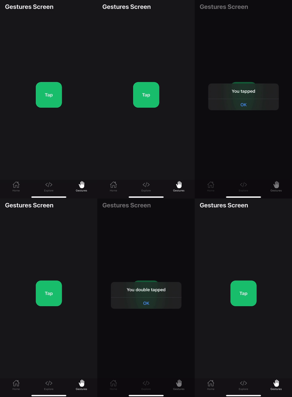
Here’s a preview of what we’ll build in this section:
A tap gesture is recognized when one or more fingers touch the screen in a series of taps. A tap must meet the following conditions to be recognized:
maxDuration property (default is 100ms)maxDistance)numberOfTaps property (defaults to 1)Let’s take a look at how to implement a single tap first:
// components/gestures/TapGestures.tsx
import { ThemedText } from '@/components/ThemedText'
import { ThemedView } from '@/components/ThemedView'
import { StyleSheet, Alert, Pressable } from 'react-native'
import { Gesture, GestureDetector } from 'react-native-gesture-handler'

export default function TapGesture() {
  const tap = Gesture.Tap()
    .onEnd(() => {
      Alert.alert('You tapped')
    })
    .runOnJS(true)

  return (
    <ThemedView style={styles.container}>
      <GestureDetector gesture={tap}>
        <Pressable
          style={({ pressed }) =>
            pressed ? [styles.box, styles.pressed] : styles.box
          }
        >
          <ThemedText style={styles.title}>Tap</ThemedText>
        </Pressable>
      </GestureDetector>
    </ThemedView>
  )
}

const styles = StyleSheet.create({
  container: {
    flex: 1,
    alignItems: 'center',
    justifyContent: 'center',
    height: '100%',
  },
  boxContainer: {
    gap: 10,
    flexDirection: 'row',
  },
  box: {
    width: 100,
    height: 100,
    padding: 10,
    backgroundColor: '#15c573',
    textAlign: 'center',
    borderRadius: 20,
    alignItems: 'center',
    justifyContent: 'center',
  },
  pressed: {
    backgroundColor: '#dd2150',
  },
  title: {
    fontWeight: 'bold',
    fontSize: 18,
  },
})
Creating a double-tap gesture is as straightforward as adjusting the numberOfTaps property to two:
const doubleTap = Gesture.Tap()
  .numberOfTaps(2)
  .onEnd(() => {
    Alert.alert('You double tapped')
  })
.runOnJS(true)
As you can see in the preview GIF above, we added an Alert to let us know when our tap gesture is successfully recognized.
In some scenarios, you may want to listen for multiple gestures on a single element. This is where gesture composition comes into play. Gesture composition allows you to combine multiple gestures to create more complex interactions.
RNGH 2.0 makes this easier by providing methods to handle gestures. You no longer need to create a reference for each dependent gesture. The Race, Simultaneous, and Exclusive methods on the Gesture object help manage these interactions efficiently.
Here’s an example:
const gesture1 = Gesture.Pan()
const gesture2 = Gesture.Tap()

const composedRaceGesture = Gesture.Race(gesture1, gesture2)
const composedSimultaneousGesture = Gesture.Simultaneous(gesture1, gesture2)
const composedExclusiveGesture = Gesture.Exclusive(gesture1, gesture2)

return (
  <View>
    <GestureDetector gesture={composedRaceGesture}>
      <Animated.View style={styles.box}></Animated.View>
    </GestureDetector>
  </View>
)
Let’s go over each method briefly.
Race — Only one of the provided gestures can become active at the same time. The first gesture to activate will cancel the others. Use Race when you need a single gesture to be recognized and cancel any competing gestures.
Here’s the syntax:
Gesture.Race(gesture1, gesture2, ...)
Simultaneous — All provided gestures can be activated simultaneously. The activation of one does not cancel the others. Use Simultaneous when multiple gestures should be recognized at the same time.
Here’s the syntax:
Gesture.Simultaneous(gesture1, gesture2, ...)
Exclusive — Only one gesture can become active, with a priority system determining which gesture gets activated. The first gesture has the highest priority, followed by the second, and so on. If the first gesture fails, the second one can activate.
Use Exclusive when you want a primary gesture to take precedence, but allow secondary gestures if the primary one fails. Here’s the syntax:
Gesture.Exclusive(gesture1, gesture2, ...)
For our scenario, where we want to differentiate between a single tap and a double tap, the Exclusive method is the appropriate choice. In this case, the doubleTap gesture should take priority over the tap gesture since a double tap inherently includes a single tap, but a single tap doesn’t accommodate a double tap.
By using Exclusive, we ensure that the doubleTap gesture will take precedence, allowing for the intended interaction where both gestures can be recognized appropriately:
import { ThemedText } from '@/components/ThemedText'
import { ThemedView } from '@/components/ThemedView'
import { StyleSheet, Alert, View, Pressable } from 'react-native'
import { Gesture, GestureDetector } from 'react-native-gesture-handler'

export default function TapGesture() {
  const tap = Gesture.Tap()
    .onEnd(() => {
      Alert.alert('You tapped')
    })
    .runOnJS(true)
  const doubleTap = Gesture.Tap()
    .numberOfTaps(2)
    .onEnd(() => {
      Alert.alert('You double tapped')
    })
    .runOnJS(true)

  return (
    <ThemedView style={styles.container}>
      <GestureDetector gesture={Gesture.Exclusive(doubleTap, tap)}>
        <Pressable
          style={({ pressed }) =>
            pressed ? [styles.box, styles.pressed] : styles.box
          }
        >
          <ThemedText style={styles.title}>Tap</ThemedText>
        </Pressable>
      </GestureDetector>
    </ThemedView>
  )
}

const styles = StyleSheet.create({
})
Here’s a preview of what we’ll set up in this section:
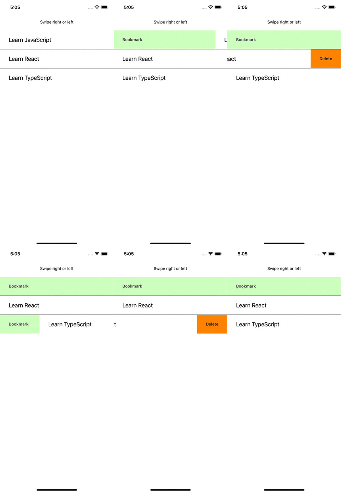
To demonstrate how to implement a swipeable gesture, let’s create a list of items where users can swipe right or left and certain events or methods are called.
Let’s create a FlatList component and pass in our data to the data props:
<FlatList
          data={todoList}
          keyExtractor={(item) => item.id}
          renderItem={({ item }) => <ListItem {...item} />}
          ItemSeparatorComponent={() => <Separator />}
        />
Notice that the renderItem props is returning a ListItem component. This represents our list todo items, as shown in the demo above.
Now let’s create our ListItem component and make it swipeable. First, import the Swipeable component from the react-native-gesture-handler package:
import Swipeable from 'react-native-gesture-handler/Swipeable';
Next, wrap the View in the ListItem component with the Swipeable component. This will automatically make elements in the list swipeable. However, it’d make more sense if some kind of event occurred after the swipe action. The Swipeable component makes provision for that with these two props that both accept a component:
renderLeftActions — Used to render a view on the left end of a swiperenderRightActions — Used to render a view on the right end of a swipeIn our case, we’ll have the delete action on a left swipe and a bookmark action on a right swipe.
Another handy property on the Swipeable component is the onSwipeableOpen. This function accepts an argument which is the direction the user swiped whose value is of type: "left" | "right". We can now use this to call the appropriate action like so:
const ListItem = ({ text }: { text: any }) => (
  <Swipeable
    renderLeftActions={LeftSwipeActions}
    renderRightActions={rightSwipeActions}
    onSwipeableOpen={(direction) => {
      console.log(direction) // "left" | "right"
      direction === 'left' ? swipeFromLeftOpen : swipeFromRightOpen
    }}
  >
    <View
      style={{
        paddingHorizontal: 30,
        paddingVertical: 20,
        backgroundColor: 'white',
      }}
    >
      <Text style={{ fontSize: 24 }}>{text}</Text>
    </View>
  </Swipeable>
)
Here is the full code for the swipeable gesture:
import React from 'react'
import {
  SafeAreaView,
  StyleSheet,
  View,
  Text,
  Alert,
  StatusBar,
  FlatList,
} from 'react-native'
import Swipeable from 'react-native-gesture-handler/Swipeable'
const todoList = [
  { id: '1', text: 'Learn JavaScript' },
  { id: '2', text: 'Learn React' },
  { id: '3', text: 'Learn TypeScript' },
]
const Separator = () => <View style={styles.itemSeparator} />
const LeftSwipeActions = () => {
  return (
    <View
      style={{ flex: 1, backgroundColor: '#15c573', justifyContent: 'center' }}
    >
      <Text
        style={{
          color: '#000503',
          paddingHorizontal: 10,
          fontWeight: '600',
          padding: 20,
        }}
      >
        Bookmark
      </Text>
    </View>
  )
}
const rightSwipeActions = () => {
  return (
    <View
      style={{
        backgroundColor: '#dd2150',
        justifyContent: 'center',
        alignItems: 'flex-end',
      }}
    >
      <Text
        style={{
          color: '#fff',
          paddingHorizontal: 10,
          fontWeight: '600',
          padding: 30,
        }}
      >
        Delete
      </Text>
    </View>
  )
}
const swipeFromLeftOpen = () => {
  Alert.alert('Swipe from left')
}
const swipeFromRightOpen = () => {
  Alert.alert('Swipe from right')
}
const ListItem = ({ text }: { text: any }) => (
  <Swipeable
    renderLeftActions={LeftSwipeActions}
    renderRightActions={rightSwipeActions}
    onSwipeableOpen={(direction) => {
      console.log(direction) // "left" | "right"
      direction === 'left' ? swipeFromLeftOpen() : swipeFromRightOpen()
    }}
  >
    <View
      style={{
        paddingHorizontal: 30,
        paddingVertical: 20,
        backgroundColor: 'white',
      }}
    >
      <Text style={{ fontSize: 24 }}>{text}</Text>
    </View>
  </Swipeable>
)
const SwipeGesture = () => {
  return (
    <>
      <StatusBar />
      <SafeAreaView style={styles.container}>
        <Text
          style={{
            textAlign: 'center',
            marginVertical: 20,
            color: '#cdcdcd',
            fontSize: 20,
          }}
        >
          Swipe right or left
        </Text>
        <FlatList
          data={todoList}
          keyExtractor={(item) => item.id}
          renderItem={({ item }) => <ListItem {...item} />}
          ItemSeparatorComponent={() => <Separator />}
        />
      </SafeAreaView>
    </>
  )
}
const styles = StyleSheet.create({
  container: {
    flex: 1,
  },
  itemSeparator: {
    flex: 1,
    height: 1,
    backgroundColor: '#444',
  },
})
export default SwipeGesture
As seen with the pan gesture, animations are crucial for making gestures feel responsive and engaging.
React Native Reanimated is a powerful animation library that creates smooth animations in React Native apps. It was developed by Software Mansion, the same company that built RNGH. This helps in the API integration.
RNGH 2.0 automatically detects if Reanimated is installed, and starts using it to workletize (that is, run on the UI thread) the callbacks passed to the gesture object.
The core concept in Reanimated is the use of shared values to orchestrate your animations. It is identical to Animated.Value() we used on the Pan gesture. According to the documentation:
You can think of it (a shared value) as a React state which is automagically kept in sync between the “JavaScript” and the “native” side of your app (hence the name).
This synchronization makes your animations highly performant. It’s no wonder Reanimated is the de facto animation library in the React Native ecosystem.
You create shared values using the useSharedValue Hook. Values stored in shared values are accessed and modified by their .value property. There’s no setter or anything, you simply mutate the .value property:
import { Button, View } from 'react-native';
import Animated, { useSharedValue } from 'react-native-reanimated';

export default function App() {
  const width = useSharedValue(100);

  const handlePress = () => {
    width.value = width.value + 50;
  };

  return (
    <View style={{ flex: 1, alignItems: 'center' }}>
      <Animated.View
        style={{
          width,
          height: 100,
          backgroundColor: 'violet',
        }}
      />
      <Button onPress={handlePress} title="Click me" />
    </View>
  )
}
We can animate our gestures with Reanimated by modifying shared values in the onBegin, onChange, onUpdate, or onFinalize callbacks. These shared values can represent anything from the pressed state of a UI element to CSS properties like transform, width, and height. Additionally, we’ll use the useAnimatedStyle Hook to encapsulate our animation logic.
Next, we’ll animate the subsequent gestures in this post with Reanimated, starting with the long press gesture.
A long press gesture is a discrete interaction that activates when a view is pressed and held for a sufficient duration. The gesture completes as soon as the finger is released. It will not register if the finger is lifted too soon or moved beyond a certain distance before the specified minimum time is met:
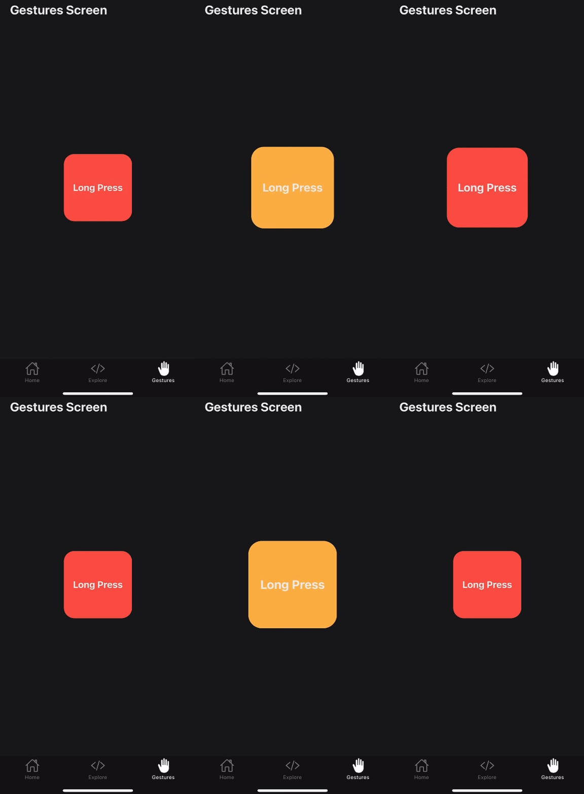
The LongPress gesture has two primary configurations: maxDistance and minDuration. The minDuration setting specifies the minimum time (in milliseconds) that the press must last to be recognized as a long press, with a default value of 500ms.
Here’s an example:
import { StyleSheet } from 'react-native'
import { ThemedView } from '../ThemedView'
import { ThemedText } from '../ThemedText'
import { Gesture, GestureDetector } from 'react-native-gesture-handler'
import Animated, {
  useAnimatedStyle,
  useSharedValue,
  withTiming,
} from 'react-native-reanimated'

export default function LongPressGesture() {
  const pressed = useSharedValue(false)

  const longPress = Gesture.LongPress()
    .minDuration(700)
    .onBegin(() => {
      pressed.value = true
    })
    .onFinalize(() => {
      pressed.value = false
    })
    .runOnJS(true)

  const animatedStyles = useAnimatedStyle(() => ({
    backgroundColor: pressed.value ? '#ffb74b' : '#ff574b',
    transform: [{ scale: withTiming(pressed.value ? 1.3 : 1) }],
  }))

  return (
    <ThemedView style={styles.container}>
      <GestureDetector gesture={longPress}>
        <Animated.View style={[styles.box, animatedStyles]}>
          <ThemedText style={styles.title}>Long Press</ThemedText>
        </Animated.View>
      </GestureDetector>
    </ThemedView>
  )
}
const styles = StyleSheet.create({
})
A pinch gesture is a continuous interaction that detects the movement of two fingers on the screen to track the distance between them. This gesture is commonly used to scale or zoom content:
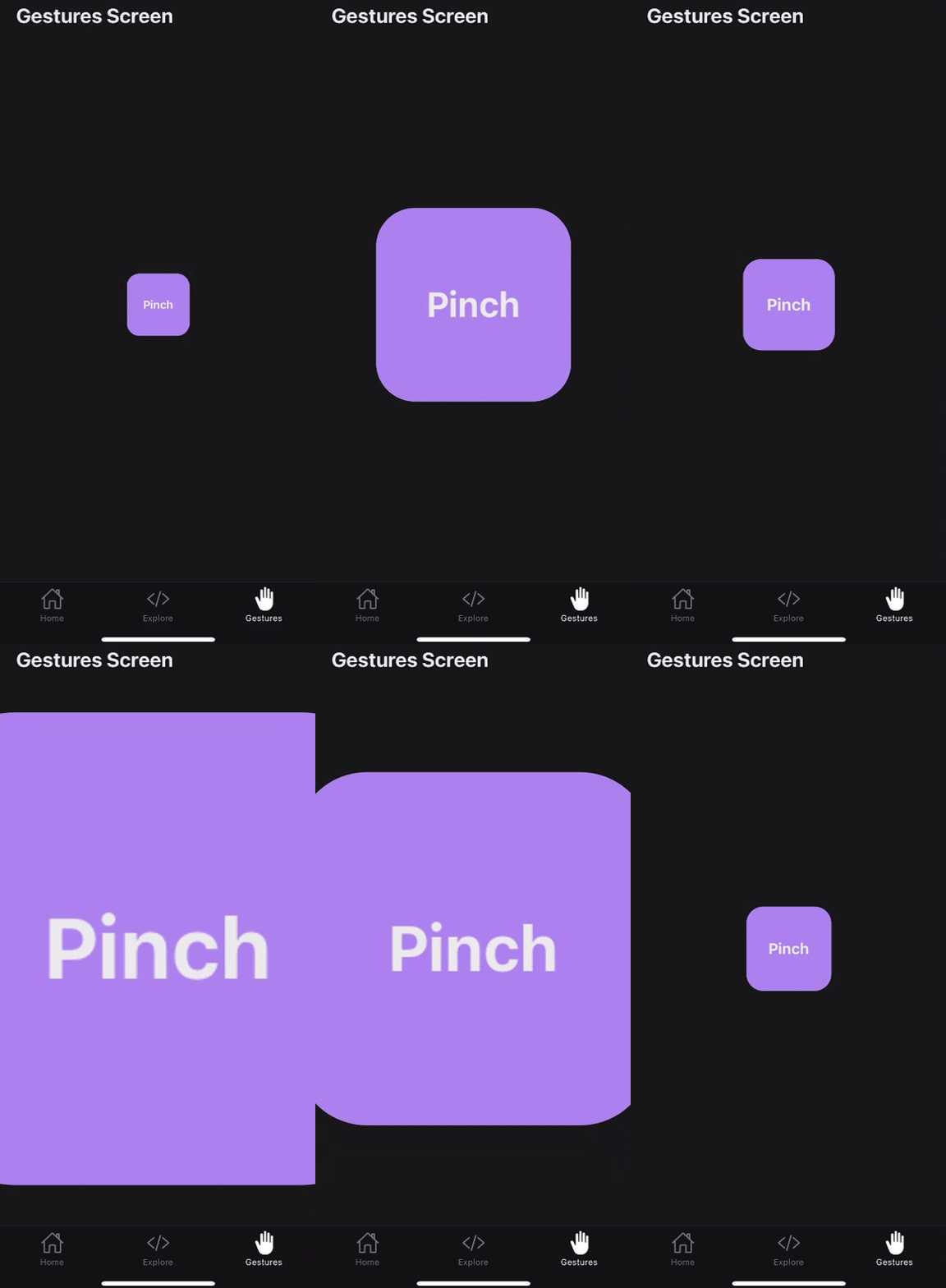
It activates when two fingers are placed on the screen and move relative to each other. The gesture callback continuously monitors this movement, providing details about the velocity, the focal point (where the fingers meet), and the scale of the pinch.
Here’s the code for this example:
import React from 'react'
import { StyleSheet } from 'react-native'
import {
  Gesture,
  GestureDetector,
  GestureHandlerRootView,
} from 'react-native-gesture-handler'
import Animated, {
  useSharedValue,
  useAnimatedStyle,
} from 'react-native-reanimated'
import { ThemedText } from '../ThemedText'

export default function PinchGesture() {
  const scale = useSharedValue(1)
  const startScale = useSharedValue(0)

  const pinch = Gesture.Pinch()
    .onStart(() => {
      startScale.value = scale.value
    })
    .onUpdate((event) => {
      scale.value = startScale.value * event.scale
    })
    .runOnJS(true)

  const animatedStyles = useAnimatedStyle(() => ({
    transform: [{ scale: scale.value }],
  }))

  return (
    <GestureHandlerRootView style={styles.container}>
      <GestureDetector gesture={pinch}>
        <Animated.View style={[styles.box, animatedStyles]}>
          <ThemedText style={styles.title}>Pinch</ThemedText>
        </Animated.View>
      </GestureDetector>
    </GestureHandlerRootView>
  )
}
const styles = StyleSheet.create({
})
Incorporating React Native Gesture Handler into your React Native projects significantly enhances the user experience by offering smooth and responsive touch interactions. The latest version, RNGH 2.0, brings a more declarative API that simplifies gesture handling, making it easier to implement complex gestures like swiping, pinching, and long-pressing.
RNGH runs gestures on the UI thread, which ensures optimal performance, providing a seamless and engaging interface for users. If you’re interested in reading further, here are some helpful resources:
Thanks for reading!

LogRocket is a React Native monitoring solution that helps you reproduce issues instantly, prioritize bugs, and understand performance in your React Native apps.
LogRocket also helps you increase conversion rates and product usage by showing you exactly how users are interacting with your app. LogRocket's product analytics features surface the reasons why users don't complete a particular flow or don't adopt a new feature.
Start proactively monitoring your React Native apps — try LogRocket for free.
Would you be interested in joining LogRocket's developer community?
Join LogRocket’s Content Advisory Board. You’ll help inform the type of content we create and get access to exclusive meetups, social accreditation, and swag.
Sign up now
Consider using a React form library to mitigate the challenges of building and managing forms and surveys.

In this article, you’ll learn how to set up Hoppscotch and which APIs to test it with. Then we’ll discuss alternatives: OpenAPI DevTools and Postman.

Learn to migrate from react-native-camera to VisionCamera, manage permissions, optimize performance, and implement advanced features.

SOLID principles help us keep code flexible. In this article, we’ll examine all of those principles and their implementation using JavaScript.
2 Replies to "React Native Gesture Handler: Swipe, long-press, and more"
What is the difference between LongPressGestureHandler and onLongPress event handler in TouchableWithoutFeedback?
Muito obrigado, ajudou muito o seu post!