children correctly in TypeScript
Editor’s note: This article was last updated by Chinwike Maduabuchi in December 2025 following breaking changes in the TypeScript typing ecosystem around React.FC and its relationship with the children prop. The update revises earlier guidance that relied on implicit children typing and adds modern recommendations for correctly typing both simple application components and library-style components.

Typing the children prop in React can be confusing at first. If you try typing them as specific JSX types, you may run into issues rendering the child components. We also face the paradox of choice, as there are multiple available options to type the children prop, which may lead to decision fatigue.
In this article, I’ll provide recommended solutions to effectively type the children prop, addressing common issues and helping you avoid any analysis paralysis.
The Replay is a weekly newsletter for dev and engineering leaders.
Delivered once a week, it's your curated guide to the most important conversations around frontend dev, emerging AI tools, and the state of modern software.
The basic usage of the children prop is to receive and manipulate the content passed within the opening and closing tags of a JSX expression. When you write a JSX expression with opening and closing tags, the content passed between them is referred to as their child:
Consider the following example:
<Border> Hey, I represent the JSX children! </Border>
In this example, the literal string Hey, I represent the JSX children! refers to the child rendered within Border.
Meanwhile, to gain access to the content passed between JSX closing and opening tags, React passes these in a special prop: props.children. For example, Border could receive the children prop as follows:
const Border = ({children}) => {
   return <div style={{border: "1px solid red"}}>
      {children}
   </div>
}
Border accepts the children prop, then renders children within a div with a border style of 1px solid red.
Strictly speaking, there are a handful of supported content types that can go within the opening and closing tags of your JSX expression. Below are some of the most commonly used ones.
Literal strings are valid children types. The example below shows how to pass one into a component:
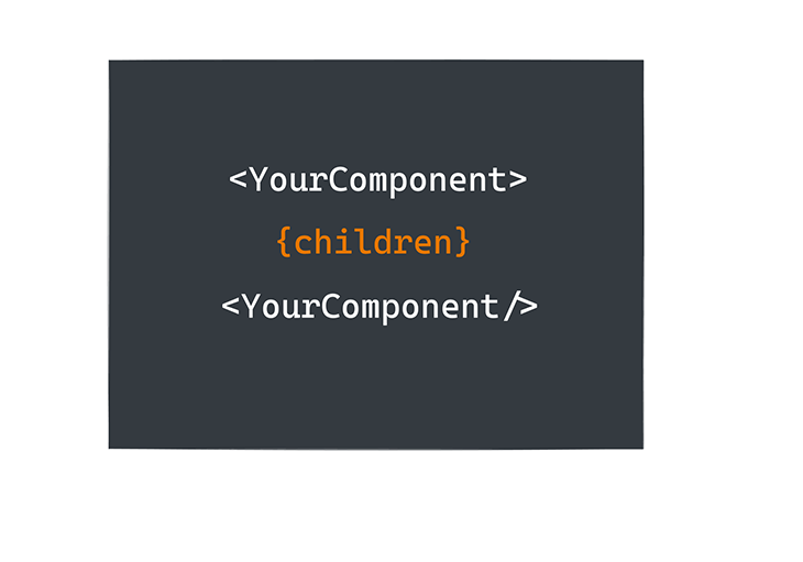
<YourComponent> This is a valid child string </YourComponent />
Note that in YourComponent, props.children will be the string This is a valid child string.
You can also pass other JSX elements as valid children types. This is usually helpful when composing different nested components. Below is an example:
<Wrapper>
  <YourFirstComponent />
  <YourSecondComponent />
</Wrapper>
It is also completely acceptable to mix children types, as seen here:
<Wrapper>
  I am a valid string child
  <YourFirstComponent />
  <YourSecondComponent />
</Wrapper>
Expressions are equally valid children types. As shown below, myScopedVariableReference can be any JavaScript expression:
<YourFirstComponent> {myScopedVariableReference} </YourFirstComponent>
Remember that expressions in JSX are written in curly braces.
Functions are equally valid children types, as shown below:
<YourFirstComponent>
  {() => <div>{myScopedVariableReference}</div>}
</YourFirstComponent>
As you can see, the children prop can be represented by a large range of data types. Your first inclination might be to type these out manually, like so:
type Props = {
  children: string | JSX.Element | JSX.Element[] | () => JSX.Element
}

const YourComponent = ({children} : Props) => {
  return children
}
But this doesn’t fully represent the children prop. What about fragments, portals, and ignored render values, such as undefined, null, true, or false ?
The point I’m trying to make is that, in practice, you don’t want to manually type the children prop. Instead, I suggest using the officially supported types discussed below.
ReactNode superset typeReactNode is a superset type that includes every value React can render. If your goal is simply to type children correctly, this is the type you should use:
children: React.ReactNode;
This type covers:
Simply put, if you can wrap it between JSX tags and React can render it, it fits inside ReactNode.
Here’s how ReactNode is defined in TypeScript:
type ReactText = string | number;
type ReactChild = ReactElement | ReactText;

interface ReactNodeArray extends Array<ReactNode> {}
type ReactFragment = {} | ReactNodeArray;
type ReactNode = ReactChild | ReactFragment | ReactPortal | boolean | null | undefined;

type Props = {
  children: ReactNode
}

// source: https://github.com/DefinitelyTyped/DefinitelyTyped/blob/d076add9f29db350a19bd94c37b197729cc02f87/types/react/index.d.ts
ReactNode is at the top of the hierarchy. It directly includes ReactChild, ReactFragment, and ReactPortal, as well as boolean, null, and undefined for conditional and empty renders. ReactChild covers the simplest renderable units, like a ReactElement (JSX like or ) or plain text (string and number). ReactFragment expands this to groups of nodes, such as arrays and fragments (<>…</>).
React portals are also covered to represent elements that render outside the normal DOM tree.
PropsWithChildren typeIf your component already has its own pros and you just want to add children without explicitly typing it, React offers the React.PropsWithChildren type for that.
PropsWithChildren takes your existing component prop and returns a union type with the children prop appropriately typed. No extra work from you is needed.
Here’s the actual definition of the PropsWithChildren type:
type PropsWithChildren<P> = P & { children?: ReactNode };
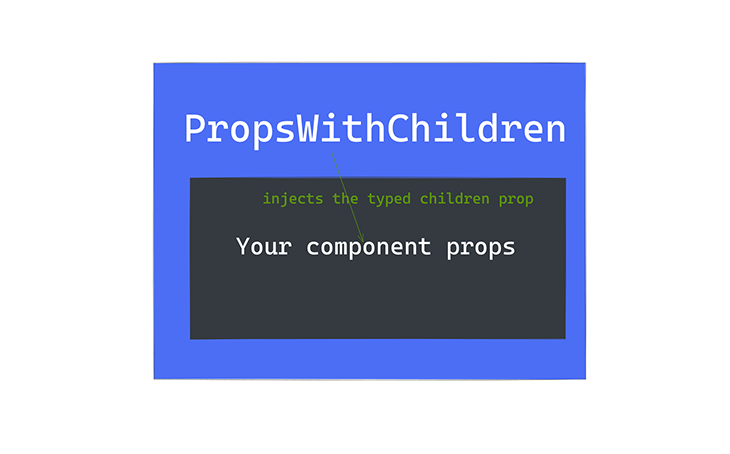
Essentially, it merges your props with an optional children field typed as ReactNode.
Assume you had a component Foo with FooProps:
type FooProps = {
  name: 'foo'
}

export const Foo = (props: FooProps) => {
    return null
}
Now, instead of manually adding the children prop to the FooProps, you just wrap it with PropsWithChildren:
import { PropsWithChildren } from 'react'

type FooProps = {
  name: 'foo'
}

export const Foo = (props: PropsWithChildren<FooProps>) => {
    return props.children
}
When you pass PropsWithChildren to FooProps, you get the children prop internally typed.
React.ComponentPropsWhen you’re building reusable components that wrap other components or native web elements, you’ll often see this pattern:
React.ComponentProps<typeof SomeComponent>
This utility lets you extract the full prop type of an existing component to reuse or extend it. ComponentProps is especially popular in user interface libraries (like Shadcn) because it keeps all the props of your wrappers, including the children prop, perfectly in sync with the underlying element. This helps achieve type safety and reusability when extending existing components or building higher-order components.
Here’s a simple example with a button wrapper:
type ButtonProps = React.ComponentProps<'button'>;

export const Button = (props: ButtonProps) => {
  return <button {...props} />;
};
This automatically gives Button all native button props (onClick, disabled, type, etc.), correct event typings, and full children support. No duplication. No manual typing.
Here’s another example extending the above button component to a fancy one:
import { Button} from '@/components/ui/button'

type BaseButtonProps = React.ComponentProps<typeof Button>;

type FancyButtonProps = BaseButtonProps & {
  gradient?: boolean
};

export const FancyButton = ({ gradient, ...props }: FancyButtonProps) => {
  return <Button {...props} data-gradient={gradient} />;
};
React.ReactElementAs explained earlier, ReactElement is a subset of ReactNode. You can also use the ReactElement interface or other subsets of ReactNode to appropriately type the children prop. Just keep the type tradeoffs in mind:
import { ReactElement } from 'react'

type Props = {
  name: 'foo'
}
export const Foo =  (props: { children: ReactElement<Props>}) => {
    return props.children
}
JSX.ElementJSX.Element can also be an appropriate type for the children prop. Below is an example showing how to implement it:
import { JSX } from "react";

export const Foot = (props: { children: JSX.Element }) => {
  return props.children;
};
Note that this type represents a single React element and no falsy values.
Component type for class componentsClass components are now rare in modern React codebases, but if you need one, you can type props (including children) using React.Component. The children prop is automatically included as optional:
import { Component } from 'react'

type FooProps = { name: 'foo' }

class Foo extends Component<FooProps> {
  render() {
    return this.props.children
  }
}
If you want children to be required, you need to add it explicitly to the props type.
React.FC / FunctionComponent is no longer recommendedHistorically, React.FC (or FunctionComponent) was widely used to type function components, primarily because it automatically included the children prop.
However, it received backlash from the community, because the children prop wasn’t required. If you wanted to type a component without children, you couldn’t use React.FC.
With React 18, the @types/react package updated React.FC so it no longer automatically includes children. You now have to type it explicitly if your component accepts children.
Many developers prefer this explicit approach, as it improves clarity and reduces unnecessary use of React.FC:
interface FooProps {
  name: 'foo';
  children?: React.ReactNode; // explicitly declare children
}

const Foo = ({ name, children }: FooProps) => {
  return <div>{children}</div>;
};
React.FCYou can still pass components as props and maintain full type safety without React. FC. For example:
interface AddTodoProps {
  addTodo: (text: string) => void;
  ButtonComponent: (props: { onClick: () => void }) => JSX.Element;
}

const AddTodo = ({ addTodo, ButtonComponent }: AddTodoProps) => {
  const [text, setText] = useState('');

  const handleSubmit = (e: React.FormEvent) => {
    e.preventDefault();
    if (!text.trim()) return;
    addTodo(text);
    setText('');
  };

  return (
    <form onSubmit={handleSubmit}>
      <input
        type="text"
        value={text}
        onChange={e => setText(e.target.value)}
      />
      <ButtonComponent onClick={handleSubmit} />
    </form>
  );
};
Now you get full type safety for all component props. Children must now be explicitly typed if needed. This removes the reliance on React.FC while keeping your props fully type-checked.
forwardRef in React 19Typing components that accept children and forward refs can be tricky. In React 18 and earlier:
React.forwardRef.React.ComponentPropsWithRef to combine props and the ref, including children.Example:
type ButtonProps = React.ComponentPropsWithRef<'button'>;

const Button = React.forwardRef<HTMLButtonElement, ButtonProps>(
  (props, ref) => <button ref={ref}>{props.children}</button>
);
Now with React 19, you will type children and ref manually:
type ButtonProps = {
  ref?: React.Ref<HTMLButtonElement>;
  children?: React.ReactNode;
};

function Button({ ref, children }: ButtonProps) {
  return <button ref={ref}>{children}</button>;
}
As a bonus to this section, let’s look at wrapper components, which are simple higher order components (HOC) in React. HOCs are components that wrap other components, extending its functionality in a desired way without modifying the original component’s implementation. When dealing with TypeScript, wrapper components can improve type safety, especially when handling complex children structures.
Let’s demonstrate the type safety benefits of wrapper components using a to-do application. In the demo application, I provided a few ways that wrapper components can help provide type safety benefits. Each component in the application defines unique type interfaces for its props.
Here’s an example:
interface AddTodoProps {
  addTodo: (text: string) => void;
}
AddTodo expects a function for the addTodo prop that takes a string as an argument and returns nothing. TypeScript ensures that whenever AddTodo is used, the addTodo prop follows the correct type.
And if you try to pass an incorrect prop type, TypeScript will throw a compile-time error:
// Incorrect prop type;
<AddTodo addTodo={(num: number) => {}} />
You will get the error below, as well as a possible fix:
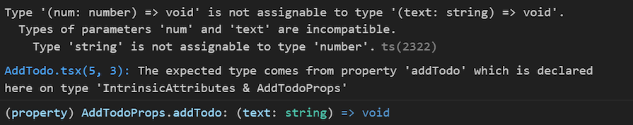
This helps us to make fewer mistakes while coding.
Lastly, for complex data structures like our todos.tsx, it contains multiple properties:
export interface Todo {
  id: number;
  text: string;
  completed: boolean;
}
When passing a todo between components, TypeScript ensures that all required properties are present and correctly typed. This takes us to our next section on passing components as props in TypeScript.
Typing the children prop in React becomes much simpler once you understand what React can actually render and which types map to those possibilities. ReactNode gives you maximum flexibility, PropsWithChildren lets you extend existing props cleanly, and ComponentProps keeps wrapper and library-style components perfectly in sync with what they wrap.
Modern React also favors being explicit. Older patterns that relied on implicit children through React.FC are no longer the default approach, especially when working with refs and reusable component APIs. Once you understand these trade-offs, typing children stops being guesswork and becomes a deliberate, maintainable design choice.
Install LogRocket via npm or script tag. LogRocket.init() must be called client-side, not
server-side
$ npm i --save logrocket

// Code:

import LogRocket from 'logrocket';
LogRocket.init('app/id');
// Add to your HTML:

<script src="https://cdn.lr-ingest.com/LogRocket.min.js"></script>
<script>window.LogRocket && window.LogRocket.init('app/id');</script>

Learn how next-browser gives AI agents runtime context for debugging Next.js apps, including React props, hydration, PPR, forms, and performance.

Build dynamic LLM routing in Next.js with OpenRouter, TanStack AI, task classification, model fallbacks, and cost-aware routing.

TSRX adds first-class control flow, conditional hooks, and scoped styles to React via a TypeScript compiler extension — no new framework required.

Learn how to build a full React Native auth system using Better Auth and Expo — with email/password login, Google OAuth, session persistence, and protected routes.
Would you be interested in joining LogRocket's developer community?
Join LogRocket’s Content Advisory Board. You’ll help inform the type of content we create and get access to exclusive meetups, social accreditation, and swag.
Sign up now

 Learn more →
