There are different types of user onboarding, including slideshows, checklists, product tours, and interactive guides. Regardless of the type of onboarding you provide, it is always going to be one of the most critical parts of your product experience.

Let’s unpack why smooth user onboarding is essential and, most importantly, how to design an outstanding onboarding experience.
In simple terms, user onboarding is the process of guiding new users to become familiar with and proficient in using a product or software. It involves introducing key features, benefits, and functionalities to help users understand how your product can solve their problems or meet their needs.
But user onboarding is more than just a process. It’s your chance to make a great first impression and set the tone for the rest of your relationship with your users. A successful onboarding experience can lead to higher user retention rates, increased user engagement, and ultimately, more revenue for your business.
User onboarding is one of the most critical parts of the product — period. There are a few reasons for that.
First of all, onboarding is the only part of your product experience that affects everybody. As renowned product expert Adam Fishman put it, “Onboarding is the only part of your product experience that 100 percent of people are going to touch. Good luck getting 100 percent adoption on anything else in your product.”
Any change you make to your product onboarding is a change that will affect every new user who comes to your product. This should already be a good enough reason to place plenty of focus there.
Even more importantly, onboarding is what sets your users up for success. It’s fantastic that your product solves a relevant pain point, but if no one knows that, you can’t actually deliver that value, can you?
And you can’t expect users to just figure it out on their own. If a user has already invested some time to try out your product, now the ball is in your court to show them how they can benefit from it.
A proper user onboarding showcases the product, explains how users can benefit from it, and helps users get the value quickly. The sooner they start experiencing the value, the higher the chance they’ll stick around.
If you let them be, odds are many of them will churn before even experiencing your value proposition. What a missed opportunity for both the user and the business.
It’s hard to give a universal recipe for a perfect onboarding experience. It depends on the type of product you build, the persona you target, and how your product works. However, there are some universal tips that can be applied in the vast majority of cases.
Without further ado, let’s look at how to create a smooth user onboarding and set both your users and yourself up for success:
If something is for everyone, it’s for no one. Odds are, you will attract more than one type of user to try out the product.
However, just like you shouldn’t build a product for everyone, you also shouldn’t design your onboarding for everyone.
The first step should always be to identify your ideal customer profile. This is the type of user who will absolutely love your product. They are getting most of the value from the product, are easy to sell to, engage with your product, and recommend it to their friends without even being prompted. Ideal customers stay longer and pay more.
If you already have a live product, dig through data and conduct interviews to find that group. If not, start with a hypothesis: who is your primary persona? Then refine as you learn more.
The point is to design your onboarding experience for that particular group. Your onboarding can target other groups of users, but never at the cost of your ideal customer profile. In the long run, activating and engaging 100 perfect-fit users will yield more value than activating 150 completely random users.
If you still don’t fully grasp the ideal customer concept, I strongly recommend you check out Obviously Awesome by April Dunford.
The goal of onboarding isn’t just to show users the list of features you have. It’s to push them to experience your aha moments.
An aha moment is when the user realizes the product’s value. These are also your most potent retention triggers.
Data is your best friend here. Look for patterns in your product. Can you spot any causation between user experience and retention/spending?
For example, at some point, Facebook discovered that people who added seven friends or more during their first 10 days on the platform tend to stick longer. What was the right course of action there? To push people to add as many friends as quickly as possible. The proper onboarding at that point would focus on encouraging users to add more friends.
If you can see a pattern such as, “People who use feature X 5 times or more are 300 percent more likely to retain/convert,” that’s an aha moment, and your onboarding should maximize the chance that your users will use feature X at least 5 times.
Your onboarding should always have specific goals in mind, and simply “showing the app’s value” is a poorly defined goal. Set these goals around your aha moments.
Although your onboarding should primarily focus on your ideal customer, even these profiles differ. If you can distinguish prominent segments of users that go through the onboarding, consider adding segmentation.
For example, you could provide different onboarding experiences for people coming from different entry points, or you could implement self-segmentation by asking users to answer a few questions about themselves.
Although it requires additional effort, sometimes it’s better to provide three tailor-made onboarding experiences than one general.
As an interesting example, my team once designed an after-download mobile app onboarding, assuming it was mostly for new users. But we realized after the fact that the vast majority of new downloads were from returning users. An onboarding experience for a returning user and a brand new user is a different cup of tea.
One of the solutions here would be to ask people to self-segment during onboarding — for example, by showing onboarding after the login/registration screen, not before, thus being able to distinguish a returning user (first app download to login) from a brand new user (first app download to registration) and serve them a tailor-made experience.
I often see onboarding experiences that prompt new users to do things for the developers. Examples of prompts a new user might see include:
.. and so on.
It’s so wrong. The user already did you a big favor: they invested their time to try your product. Now it’s your turn to do them a favor by showing them how you can help them.
If you need some data/permission for the product to be valuable, ask for it at the right moment and explain how they’ll benefit from it. For example, you can ask users for notification permission after they sign up for a free trial and send them a reminder once the trial expires. It’s a win-win.
Asking people to do things for you without first providing them with value and justification is a distraction because you end up spending less time walking users through aha moments. It’s also one of the best ways to encourage users to click “don’t allow” or “no thanks.”
If you need users to experience specific parts of the product quickly for them to understand the value you provide, consider incentivizing them.
For example, you could offer some bonus points or credits for fulfilling specific onboarding steps. A little paid gamification goes a long way.
If you invest in incentivizing your users, it may cost you more money upfront. However, the increased engagement from your users should help you recoup the cost quickly.
There will always be a group of users that want to explore the product on their own. Accept it as a fact of life.
Forcing unwilling users to go through onboarding will annoy them and lower their chance of experiencing aha moments.
Keep the onboarding as a default option, but don’t force them to go through it if they really don’t want to.
For the third time, onboarding is one of the most important parts of your product. Don’t treat it as a nice-to-have feature. It’s not.
Proper onboarding results in better activation and retention and, ultimately, higher revenue.
I have yet to find a team that decided to commit to improving/creating their onboarding experience and regretted the decision afterward.
Featured image source: IconScout

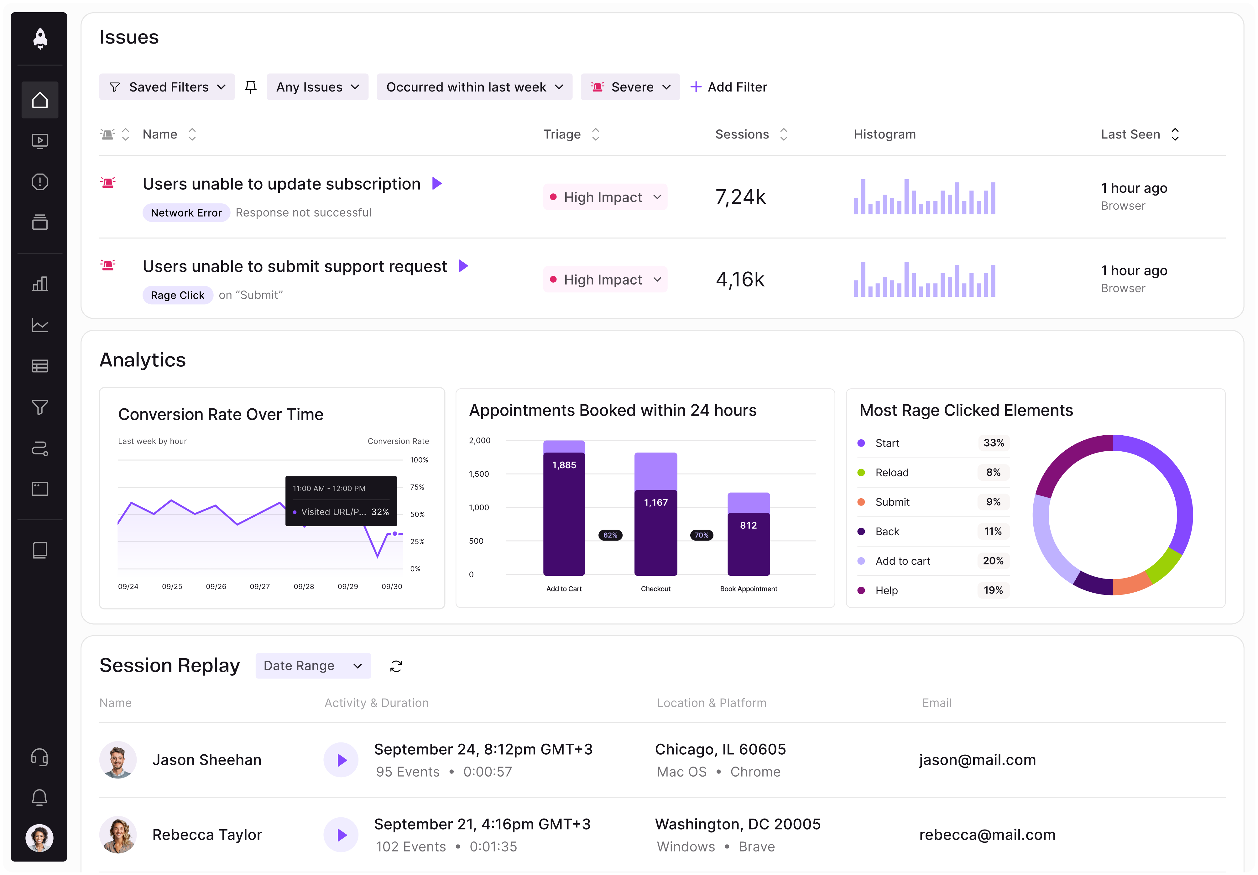
LogRocket identifies friction points in the user experience so you can make informed decisions about product and design changes that must happen to hit your goals.
With LogRocket, you can understand the scope of the issues affecting your product and prioritize the changes that need to be made. LogRocket simplifies workflows by allowing Engineering, Product, UX, and Design teams to work from the same data as you, eliminating any confusion about what needs to be done.
Get your teams on the same page — try LogRocket today.

AI can make PM thinking generic. Learn how to use it without losing judgment, user nuance, or product differentiation.

Learn a 3-lens framework that helps product managers shift stakeholder requests from feature ideas to real problems and outcomes.

CPO and PhD Jen Wang covers “The Zone of Absorption” and why product teams are struggling to build when AI is shifting faster than anyone can keep up.

Explore four product team structures, when each works best, and how to choose the right model for speed, ownership, and clarity.