Proper user activation is essential for long-term product success. More activated users lead to higher engagement and retention, eventually increasing revenue.

Let’s take a closer look at how you can measure various parts of your activation funnel and use the data to improve the product experience and corresponding business metrics.
In simple terms, activation is the process of turning new users into long-term, active users.
Whereas acquisition is all about bringing users to explore your product, activation is about making them understand, benefit from, and, eventually, stick to the product.
After all, even the most effective marketing campaigns can’t make much impact if 90 percent of newly acquired users churn after 10 minutes of using your product.
Data can help you greatly in improving your product activation. Some activation metrics worth tracking include:
Let’s take a look at what these metrics mean, how to calculate them, why they are important, and how you can improve them.
Onboarding conversion rate tells you how many users completed your product onboarding.
The formula to calculate onboarding completion rate is:
![]()
For more complex product onboarding experiences, you might replace the “users who finished onboarding” with more lenient criteria, like “users who completed 80 percent of the onboarding.”
This is especially useful if you have segments of users who are only interested in specific product capabilities rather than using the product as a whole.
User onboarding is one of the most impactful parts of the whole product experience.
According to Adam Fishman, “onboarding is the only part of your product experience that 100 percent of people are going to touch. Good luck getting 100 percent adoption on anything else in your product.”
Onboarding is one of the most powerful activation levers you have at your disposal. Not only does it impact all new users, but it also shapes a user’s first impression of your product.
If you want to improve your onboarding completion rate, consider the following strategies:
Not all users are the same. If you can identify why a particular user came to your product, try to onboard them only to features they are interested in.
This consideration is especially relevant for complex products with multiple use cases.
Give users an additional reason to complete the onboarding experience. For example, you might offer an extra trial or additional credits for people who go through the whole onboarding.
Users are not interested in your push notification request, ATT tracking, or high-level product details. They want to know how they can use the product to enhance their lives.
Focus the onboarding on delivering that value as quickly as possible. Walk users through your happy moments and nudge them to reap the benefits of using your product early and often.
Aha moment is a moment when the user experiences enough value to provoke a specific behavior.
For example, it might be when they realize they want to use the product long-term, buy a subscription or invite friends.
These are important activation milestones, so make sure to identify them and push as many users through them as feasible.
The simple version of the formula is to divide the number of active users by the number of users who experienced an aha moment:
![]()
However, for the activation purposes, a more reliable metric would be measuring only new users:
![]()
After all, first days are most crucial for the activation. Measuring how well you push people through aha moments during their first days will give you a more actionable and insightful picture.
By definition, aha moments are the key value driver for users.
As a result, it’s a powerful proxy measuring how much value you deliver to your users. And the more value you deliver early on, the higher the chance the users will stick with you long-term.
There are three main tactics to improve the aha moments completion rate:
Don’t leave it to luck. You can’t just expect users to “stumble upon” aha moments. Show them the aha moments during onboarding, and even incentivize them to try out the product in a way that will result in the aha moment.
Being the main value diver, the aha moments are the most important part of your product. Build your navigation, page layout, and information architecture to invite actions leading to aha moments.
It should be the default option users have when using your product. Seeing profile options or account interaction can be hidden in some dropdown menu. Your key actions can’t.
Achieving aha moments should be simple and straightforward. Work with your UX experts to review the usability of your user flow and make the process as intuitive as possible.
A free trial option can be a powerful activation tool, whether you are building a paid-only or freemium type of product. Make sure people who take that option actually get a premium experience.
Similar to aha moments completion, although you can measure it on a global level:
![]()
For activation purposes, I recommend focusing on new users:
![]()
Depending on the type of your product, you can measure “new users” as these who signed up within the last 24 hours, 3 days, a week, and so on.
A free trial is your best opportunity to win your users’ hearts.
You showcase the full value of your product to them and show them what they can get from becoming paying users without asking for money upfront.
You want to have this opportunity with as many users as you can.
Here are a few tactics you can experiment with to drive your free trial adoption rate:
Don’t be ashamed to push people to a free trial right after they sign up.
The moment they first try out your product is often when they are the most excited to explore full product capabilities. Worst case scenario, they’ll say no.
As an anecdote, I once significantly boosted a free trial CVR rate by adding a screen promoting it right after users signed up.
Proper communication goes a long way toward creating an impactful trial experience.
Experiment with various messaging, adding phrases like “you won’t be charged!” or “cancel anytime”.
A simple copy change can lead to a 20% increase in trial adoption. Trust me, been there and did that.
Adding credit card details is often a deal breaker for users.
It adds additional friction and creates a fear that they’ll be charged if they forget.
Removing the credit card details requirement is probably the most impactful boost to free trial adoption you can make.
However, it’s a double-edged sword. You don’t remove the friction of adding credit card details. You just push it in time.
Your trial experience is only as effective as the corresponding conversion to paying users. Otherwise, you are just giving away value for nothing.
The formula to calculate trial-to-paid conversion is rather straightforward:
![]()
The more free trial users convert to paying users, the better.
It’s hard to find a better definition of an activated user than someone who actually puts their money on the table.
It dramatically increases the chance they’ll stick around and explore the product and already contributes to your business results.
Your CVR from trial to paid depends primarily on your overall trial experience. There are a few tweaks you can implement in that area:
There’s a common behavior among users to cancel the free trial right after they start it. They do it to avoid the risk of being charged at the end of the trial.
Most trials allow users to keep experiencing free trials after that.
You can judge yourself whether it’s a dark pattern or not, but removing that possibility, that is, informing users they’ll lose trial benefits immediately after cancellation, is an effective tactic to keep them longer.
Even if they renew by accident, you buy yourself another chance to convince them to become long-term users. If they already paid for extended access, there’s a high chance they’ll keep exploring and possibly get hooked as a result.
A too-short trial doesn’t allow users to experience all benefits and get hooked.
A too-long trial doesn’t bring the pain point of not having a premium experience soon enough.
Experiment with various trial lengths. The most popular seven days period might not be most optimal for your product.
Consider additional onboarding showcasing newly acquired, premium-only features.
It’ll help your users get as many benefits of the trial as they can, consequently increasing their chance of falling in love with the experience.
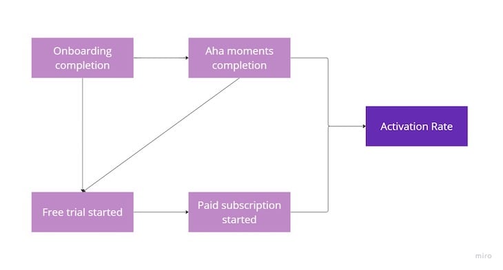
Activation rate is the ultimate metric that helps you determine whether a user has been activated or not.
What “activated user” really means depends heavily on a particular product. For smaller products, reaching an aha moment might already mean activation. More complex products might require more steps.
There’s also no rule that there has to be only one activation source. For example, you might define activation as any of the following:

Use the data to determine what moments lead to a significant increase in retention and create your own activation formula that fits your particular context.
Consequently, you improve the activation rate by improving all corresponding sub-metrics. For example, improving onboarding conversion leads to higher aha moment completion, which might lead to more free trials, and so on.
In the early stages, experiment with various activation rate formulas to develop a meaningful metric that can help you predict future user behavior. But don’t tweak it just to make it look good; optimizing metrics for the sake of optimizing metrics is a short-sighted approach.
Activation is a critical part of every product experience. Higher activation leads to higher retention and more engaged users, ultimately leading to better business outcomes.
While the exact activation formula depends heavily on the specificities of your products, the main drivers are usually:
Find your weak spot and use the tactics in the article to improve these sub-metrics to get the most out of your acquisition efforts.
Featured image source: IconScout

LogRocket identifies friction points in the user experience so you can make informed decisions about product and design changes that must happen to hit your goals.
With LogRocket, you can understand the scope of the issues affecting your product and prioritize the changes that need to be made. LogRocket simplifies workflows by allowing Engineering, Product, UX, and Design teams to work from the same data as you, eliminating any confusion about what needs to be done.
Get your teams on the same page — try LogRocket today.

Learn a 3-lens framework that helps product managers shift stakeholder requests from feature ideas to real problems and outcomes.

CPO and PhD Jen Wang covers “The Zone of Absorption” and why product teams are struggling to build when AI is shifting faster than anyone can keep up.

Explore four product team structures, when each works best, and how to choose the right model for speed, ownership, and clarity.

Learn how code-style reasoning helps product managers make sharper decisions, surface edge cases, and write clearer requirements.