In my over five years of product management, almost half was spent dealing with touch points. Basically every product that’s intended to be used by an individual, regardless if B2B, B2C, or B2B2C, has touch points at the core of its value proposition.

Knowing how and when to promote touch points goes a long way in ensuring you can grow the user base, reduce churn, and provide an overall superior experience for your users. No great product was ever conceived without great touch point management.
A “touch point” is an almost ubiquitous concept across business culture and depending on the type of specialist you ask, they’ll give you different answers.
To a traditional marketeer, a touch point is every interaction the product or service has with a potential user in order to convert a sale. A touch point can take the format of a sales person, a TV ad, a process automation, or anything that pushes the future buyer to close the deal.
In customer success, a touch point is a service channel between the brand, or product, and the client. Usually referred to as “support channels,” touch points can take very different shapes and formats: anything from a toll free number to an actual person positioned at the point of sale.
Most recently, martech has created a more objective definition of what a touch point is. Focusing on what both the classic marketeer and customer success specialists need in order to perform their jobs, engineers and product managers call touch points all the technical infrastructure necessary for a company to communicate with users: emails, in app notifications, push messages, SMSs, and whatnot.
Regardless of the definition, a common denominator across all specialties is that a touch point is a contact between the business and the user during the user’s journey, and therefore a priceless opportunity to elevate said journey.
Trying to list all possible types of touch points is a foolish exercise. Not only is the concept distributed across vastly different business disciplines, but they can also vary a lot from industry to industry. Sure, we could list here the most common ones like email, push notification, but we can do something way better.
By providing a framework organized across three axes, location, stance and customer status, you can identify everything that might or might not be a touch point without having to revert back to a long list:
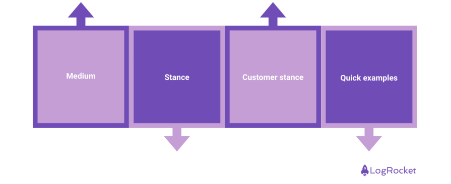
A touch point can be digital or human, but there’s no hard boundary between those two definitions. A totem on a conference with a representative available can be both digital and human, while an email is digital, and a sales person is human.
Medium is important to define what touch points are the most effective with your users. If your business sells a completely digital product, you probably won’t need a lot of human touch points. If your value proposition is mostly service oriented, you won’t be able to get away with digital touch points only.
It’s important to remark that since we’ve become a mostly digitalized society, a user journey without digital touch points is almost guaranteed to induce frustration.
Touch points can be divided between the active and passive categories. Active touch points mean that the business gets in contact with the user without previous input, while the passive touch points stand for a connection that’s dependent on the user’s initiative to take place. A warranty toll free number is a passive touch point, while an email newsletter is an active touch point.
Depending on the size of your business, how well known your product is, or how much it costs, you’ll have to invest more into passive or active touch points. It’s almost impossible to have a positive user journey unless you blend both stances across the sale and retention pipeline.
Evidently, a touch point is only considered one when it interacts with a user. The customer dimension is what essentially allows you to connect the marketeer with the customer success specialist. A touch point for a user that hasn’t purchased your value proposition, differs from one used with a client that has already onboarded, or a long time user.
Not only do their objectives differ, but users’ expectations vary a lot depending if they’re potential or current customers. Touch points that target users that have already converted, more often than not are thought out to either upsell or rapidly deal with potentially negative experiences. Potential customers’ touch points, on the other hand, are more interested in showing and proving value, in an effort to convince rather than to nurture.
An email newsletter is a digital (medium), active (stance), and potential user (customer status) touch point. For that reason, it has to take into consideration some factors such as optimal contact rate, to avoid overloading the potential user with annoying contacts, and effectiveness, to make sure it’s capable of converting users rather than just filling their spam boxes.
An online API documentation is a digital (medium), passive (stance), and potential and current user (customer status) touch point. In this case, the touch point must be comprehensive enough to care for the needs of new and current users, as well as be easy to find online and easy to read, since you won’t be able to actively guide the user during the touch point experience.
A phone outreach process following a complaint is a human (medium), active (stance), and current user (customer status) touch point. Rather than trying to convince the user about your value, the job here is to cut your losses and do your best to transform a low point in a user journey into a high point. Effective, quick, and sensitive support is one of the key values that users look for when acquiring services.
It’s common knowledge how important it is to map the user journey. Since touch points are an integral part of what makes a user journey, being able to accurately identify them makes sure that your mapping exercise is effective.
In an effort to identify all possible conversion bottlenecks, churn offenses, and value proposition highs, a good user journey should encompass all relevant touch points, together with user experiences and triggers that happen outside of your control.
An accurate understanding of what your touch points are allows you to have some measurable KPIs inside the, otherwise, highly subjective user journey. It’s also important to understand how those same touch points work and the impact they have allows you to tinker with them in order to influence said KPI.
In other words, in a lot of product management contexts such as growth or user satisfaction, touch points are your main lever for influencing KPIs.
Mapping touch points is one of those tasks that outputs as much as you put in it. You can say that a user journey for downloading an app has as little as one touch point: the mobile app store front. That’s the most fundamental touch point involved in acquiring the app.
With a little more effort, you can look beyond and incorporate the ads that the potential customer saw online, the interview they read on techcrunch about the app, the Trustpilot page they accessed to get information on the product.
And what about everything that comes after the app download? The onboarding experience inside the app itself, the engagement ruler that will automatically send push notifications to users’ device, the FAQ session and the user account configuration page…
As previously mentioned, any and all interactions with a user that your product has, and that you can pinpoint a medium, stance, and customer status, should be considered a touch point.
Building a truly complete user journey touch point mapping is not an easy endeavor and it’s definitely not something that can be done by a single person under a short notice. Rather than trying to do it all at once in perfection, do it as you go, focusing on what you need the most to drive whatever results you must.
Make sure you involve as many stakeholders as you can in order to see the user journey from multiple perspectives. The bigger your company is, the bigger your product is, the harder it is to come up with an accurate picture of every possible user journey and touch point you’re engaged with.
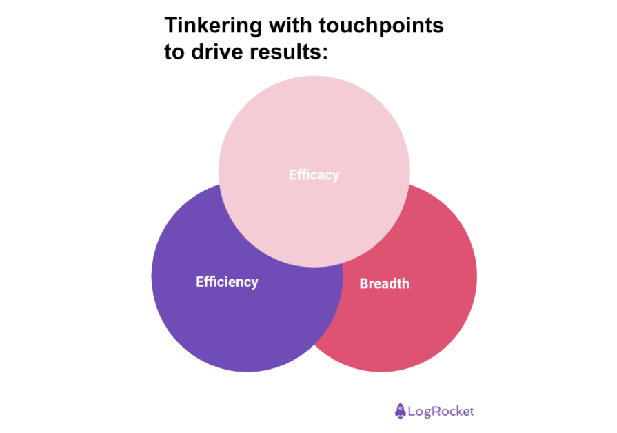
So now you know what a touch point is and you have an idea of how to map and categorize them. But, what should you do with them now? Let’s break it in three more axes: efficacy, efficiency, and breadth:
A touch point exists with a goal in mind. Regardless of medium, stance, or customer status, both businesses and users expect a change after they get in contact with a touch point. If the client has an issue, they expect that the customer support chat will fix it. If the business wants new customers, it expects that a cold call initiative will convert potential clients into users.
The first way to evaluate if a touch point is working or not is to measure its efficacy according to business or users expectations. A captured need that’s not being served by any touch point, either requires you to create a new one, or revisit an existing one that is lacking substance.
The second way to evaluate and improve a touch point is to measure how efficient it is. KPI improvements don’t always come from growing metrics. It’s common to see reducing costs or reduced negative indicators outputting net gains for users and businesses alike. A touch point that’s particularly expensive to provide, or that generates frustration due to poor performance, is a prime candidate to receive an efficient lift.
When mapping a user journey and its corresponding touch points, you might come across touch points that can be effective and inefficient, meaning they must be worked upon. It’s also possible you find ineffective and inefficient touch points, meaning they must be removed as soon as possible.
A touch point might be effective and efficient, but its application might be too niched, meaning you have an opportunity to expand its use. Alternatively, a touch point that’s ubiquitous might be an overstretch, and maybe it can be dialed down to serve only a portion of the population, or a specific step of the user journey.
Back in the day, demos were given only by sales specialists within the company, and it was a lengthy and expensive process for clients and sales people alike. During the late 2000s businesses started introducing self-service freemium tears to their products as a new touch point.
Demos were not limited to people involved in a commercial negotiation anymore, anybody could test and sales people were now free to focus on closing deals rather than doing demos. This touch point change was so successful that it jump started the entire PLG school of thought.
Discussing touch points is a very extensive subject, one that can hardly be condensed in a single blog post. You must pay attention to your email domain health, you must know if your app supports push notification hyperlinks or not, and you must be careful with toll free numbers regional availability…
Most of the nitty gritty surrounding touch points comes down to technical specifics. From a product perspective, knowing how to map a complete user journey, understanding what touch points look like inside said journey, and understanding how to manipulate them in order to drive results is more than enough to make you excel at user experience optimization.
Featured image source: IconScout
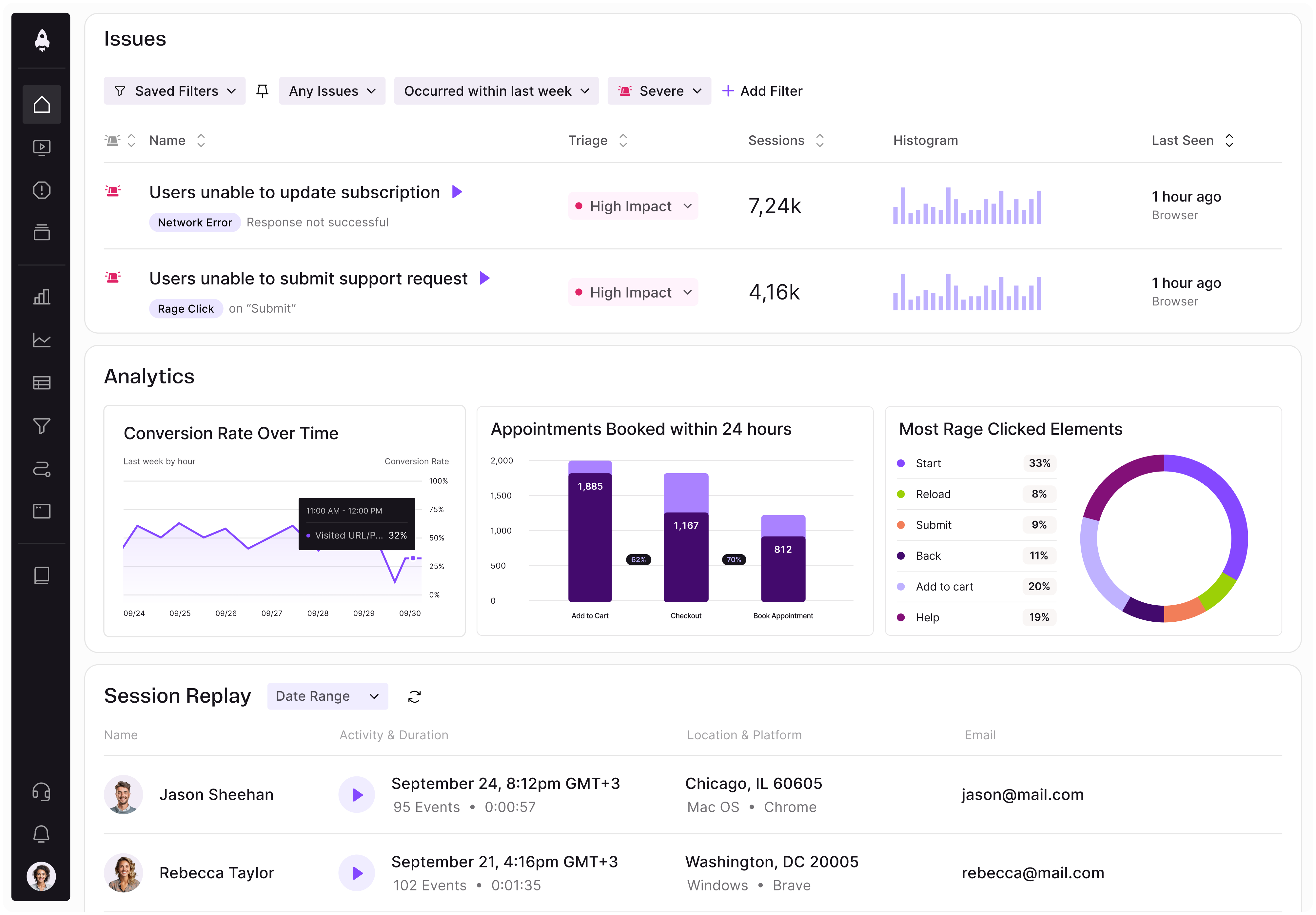
LogRocket identifies friction points in the user experience so you can make informed decisions about product and design changes that must happen to hit your goals.
With LogRocket, you can understand the scope of the issues affecting your product and prioritize the changes that need to be made. LogRocket simplifies workflows by allowing Engineering, Product, UX, and Design teams to work from the same data as you, eliminating any confusion about what needs to be done.
Get your teams on the same page — try LogRocket today.
Controlled scope creep can help PMs use capacity buffers, AI tools, and clear guardrails to turn new ideas into better outcomes.
According to SVP Julia Dalton, managing humans at scale and managing AI agents have a lot more in common than most people realize.

AI can make PM thinking generic. Learn how to use it without losing judgment, user nuance, or product differentiation.
Learn a 3-lens framework that helps product managers shift stakeholder requests from feature ideas to real problems and outcomes.