All digital products have a specific purpose. They are designed both to help the user accomplish a task and to sustain the business economically. For both of these, you want to guide the individual user to one or (in most cases) several actions that they should take.

Most interface elements are part of a basic navigation — for example, a header that contains a menu. Some key actions are critical for the user’s and for the business’s success. They can be displayed with a call to action (CTA). This might be a button or some other element, and in most cases, the related action is being monitored carefully and the product’s success depends heavily on it. The easiest example is a button on a website that says “buy now.”
In this article, we’ll talk about calls to actions (CTAs) and why they are so important in business.
A call to action (CTA) is a concise and compelling prompt that encourages the users, visitors, or target group of a digital product to take a specific action. Typically, this is presented as a very clear and direct statement and guides the user toward a desired outcome.
A call to action can take various forms, such as links, text, images, or buttons, and is strategically placed within the page to capture the user’s attention.
Examples of CTAs include “Buy now,” “Sign up now,” or “Download your free template.” The primary purpose of a call to action is to motivate users to proceed in the user journey and to support their interaction with the (digital) product or service:

In digital products or digital marketing, CTAs are commonly used to drive user engagement, promote conversion metrics, and help achieve business objectives. Well-crafted CTAs can support the success of your product in a number of ways.
Firstly, they can enhance the user experience. Of course, as a product manager, you want to optimize business outcomes — but you should always strive for a great user experience of your product. A CTA acts as a supportive element that helps the users find value in the product by guiding them. Since CTAs provide clear instructions, it makes it easy for users to convert.
Building off of that, CTAs act as a guide that help users through a desired user journey. Using them in strategic touchpoints, you can direct your users towards specific actions.
CTAs also create a sense of urgency. Effective CTAs use persuasive language and can create a sense of excitement that the user needs to act on right now.
Finally, CTAs are often associated with conversion goals, such as subscribing to a service, purchasing an item, or filling out a form. Well-crafted CTAs can motivate users to convert, by communicating the value proposition and benefits of taking the suggested action. They can encourage users and help them overcome hesitation, by clearly highlighting the value to be gained.
As a product manager, understanding the different types of CTAs is important for optimizing user engagement and conversions.
In this section, we’re going to look at the primary types of CTAs and their strengths. You’re probably going to work with your user experience and visual design colleagues here, but it’s good for you to know about the differences as well.
When selecting the type of CTA to use, you should consider the context and objective of your product. Button CTAs work well for clear and immediate actions and are quite versatile, while text CTAs can be used to embed the call to action in the content and maintain the flow. Image CTAs are great for visual impact because with images, you can capture attention or evoke specific emotions, especially in areas that are quite visually driven.
The three most common types of CTAs are button CTAs, text CTAs, and image CTAs. We’ll go over each of these below.

Button CTAs are very common. Now that you’re thinking about them, you’ll realize how many button CTAs are on every site you go to! They can come in many different shapes and sizes, but they:

The purpose of text CTAs is to encourage users to do something specific. The screenshot above is from The Replay, LogRocket’s newsletter for frontend developers.
Text CTAs:
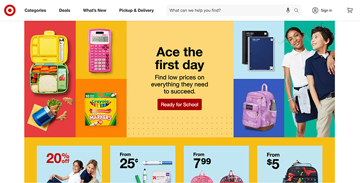
Image CTAs help bring the user’s eye to a certain point on the page. The photo above is from Target’s website — they are advertising their back to school sale right now and you can see there’s a big collage that goes across the screen. If you click anywhere in that area, you’ll go to their back to school collection page. There’s also a CTA button in the middle to make their point.
Using image CTAs:
Why do good CTAs work well? Because they are designed to help the user find the value of the product or service. And from a business perspective, they effectively drive user engagement and conversion rates.
But how can product managers create compelling and effective CTAs? Let’s look at some best practices.
Craft concise and action-oriented sentences that clearly communicate the desired action. Use strong, persuasive verbs to prompt users to take the desired action.
The language should not be generic (for example, “submit”) but really specific (for example, “claim your free trial”).
Ensure that the language of your CTAs is not only specific but also actionable. Don’t cut it short with a vague phrase like “Learn more” but provide more clarity by using phrases like “Learn how to boost your productivity.” This helps users understand what they can expect by clicking the CTA and makes it more likely for them to take action.
To motivate users to take immediate action, you can create a sense of urgency in your CTAs. This can be done by incorporating words like “Offer ends in X hours” or “Limited supply.”
This can create a feeling of FOMO (fear of missing out) and can increase the likelihood of conversions. You don’t want to create too much pressure though, and make sure the user feels safe by showing information about free refunds and a satisfaction guarantee.
To maximize visibility and engagement, position your CTA strategically, for example prominently above the fold, ensuring it is visible without the need for scrolling.
There are natural stopping points within the content where you can place your CTAs to capture user attention at the right moment or when they are engaged with the user journey already.
Design your CTAs to be attention-grabbing and visually appealing. Your UI/UX designer will know how to use contrasting colors that stand out from the surrounding area of the product. You can also use visual elements that guide the user’s eyes towards the CTA, such as arrows or icons or background colors.
Regarding design, you need to consider different device sizes and implement the call to action as a responsive element that works well on both large desktop and small mobile devices.
As with every design element in your product, CTAs should be consistent with your visual branding. Even though you want to make it stand out visually, you should ensure that your CTAs align with your overall brand messaging and visual identity. This is not only important because of the overall consistency with your design system, but it also makes sure that the user recognizes and trusts the CTA, increasing the likelihood of engagement.
This means, the fonts, colors, and overall design language should be in line across all CTAs and with your overall product.
Examples from the real world help us understand the importance of good CTAs even better and can serve as an inspiration. For inspiration regarding the design of button CTAs, check out this collection of buttons, with many different styles and emotions.
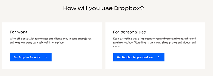
One great example of a call to action is with Dropbox. They use image CTAs to showcase their cloud storage services. They encourage users to take immediate action, by combining visually appealing graphics with clear text messages, such as “Get Dropbox for work” or “Get Dropbox for personal use:”
Another interesting example on the Dropbox website is a CTA button that says “Start your 30-day free trial.” Below, there’s a small note, “Cancel anytime during trial.”
This additional information reduces uncertainty for the potential customer and therefore improves the conversion rate of the CTA button.
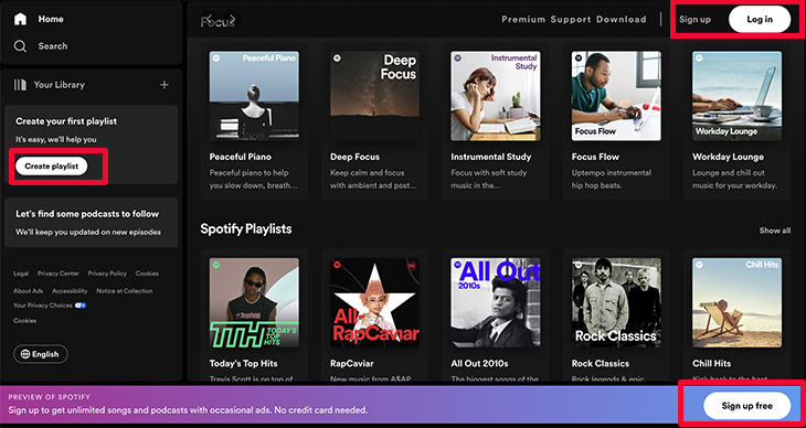
When visiting Spotify.com, users who are not logged in see a preview of the features and content that they offer. There are two main CTA buttons: one is for existing users and says “Log in,” and another for new potential users and says “Sign up free.”
In addition, there is a third CTA button that says “Create playlist,” which showcases a core feature and helps the user find value in the product right away. Clicking this button leads to another prompt for logging in:
Previously, Spotify had a more minimalistic landing page, featuring the two CTA buttons “Get Spotify Free” and “Get Premium,” targeted at different types of listeners. The change to the new landing page with preview and browsing options gives the user more insights and probably converts better.
The examples show that well-crafted CTAs don’t have to be special, but specific. You should consider the context of your product, your main objectives, the needs and habits of your target group, and the surrounding area of the CTA. That way, the call to action can drive user engagement and conversions.
How do you know if your CTA is “well-crafted” or if it could be more successful? There are a few different tools and methods to measure the effectiveness of CTAs.
Split your user base into two or more groups (it can be more than just A and B) and present each group with a different variation of the CTA. The variation might be the design, placement or copy/text. Let the test run in parallel for a certain time. Then, analyze the performance metrics, such as click-through and conversion rates, to determine which variation generates the best results.
It’s important to run all variants at the same time, because if you do it consecutively, external factors will change the performance results and you won’t be able to compare them with confidence.
Heatmap tools, such as LogRocket, provide a visual representation of user behavior on your website. They show where users move the cursor, scroll, click, and how they engage with your CTAs:

With this method, you gain more insights than if you just looked at the performance of a CTA button. Instead, you also see how users oriented themselves and what else is of interest to them. Heatmaps are a good way to find areas for improvement.
To track the performance of your CTAs, you should use analytics tools, such as Google Analytics or LogRocket. They let you monitor metrics like click-through rates, conversion rates, and other user behavior. This way, you will know how users interact with a call to action.
With A/B testing, analytics tools, and heatmaps, you won’t find out much about why users behave a certain way on your website. Did they find it easy to navigate? Which worry kept them from clicking a “Sign up now” button?
If you want answers to these questions, you can collect qualitative feedback from users through surveys, interviews, or user testing sessions. This can provide insights into their perception of the CTAs and will bring you more ideas for improvements.
Though CTAs are great and can bring a lot of value to your business, there are also some challenges to be aware of. Here are some tricks to avoid these challenges and traps that many fall into.
CTAs are a powerful tool. And just like with any knowledge about effective UX patterns and design elements, they can be used in a positive and ethical way, or they can be misused. The use of these techniques to manipulate users is called dark patterns.
You should always consider this ethical point of view, and focus on building a product that serves the customer well. When it’s valuable, it can also be successful for the business.
I can’t tell you how exactly to find the balance between user experience and business goals. But you should keep in mind that in some cases it might look like conflicting priorities. However, it’s possible to focus on great user experience and still build a profitable product. For example, CTAs can be seamlessly integrated into the user flow, without feeling intrusive or disruptive.
Strive to create CTAs that align with the overall experience of your product, providing clear value and enhancing the user journey, rather than interrupting it.
Another challenge is crafting clear and concise messaging, and at the same time it is essential for a powerful CTA. The limited space available for most CTAs requires careful consideration of the wording that conveys the intended action.
You want to find a balance between being concise and providing enough information to entice users to click. As described above, A/B testing can be extremely valuable to find a good solution that resonates with your target audience.
Many digital products cater to an international audience, so they need to consider localization and cultural factors when designing a CTA. It’s not only the language that varies across cultures and regions but also design and color preferences.
To craft a CTA that fits the regional conventions, you can work with local experts and conduct user research.
CTAs play a crucial role in driving user engagement and helping the business achieve its objectives by driving conversions.
Here are some key takeaways to consider as a product manager:
The power of CTAs lies in their ability to guide users, communicate the value of a product, and prompt engagement. Use this powerful tool wisely, to deliver a compelling user experience and drive product success.
Featured image source: IconScout
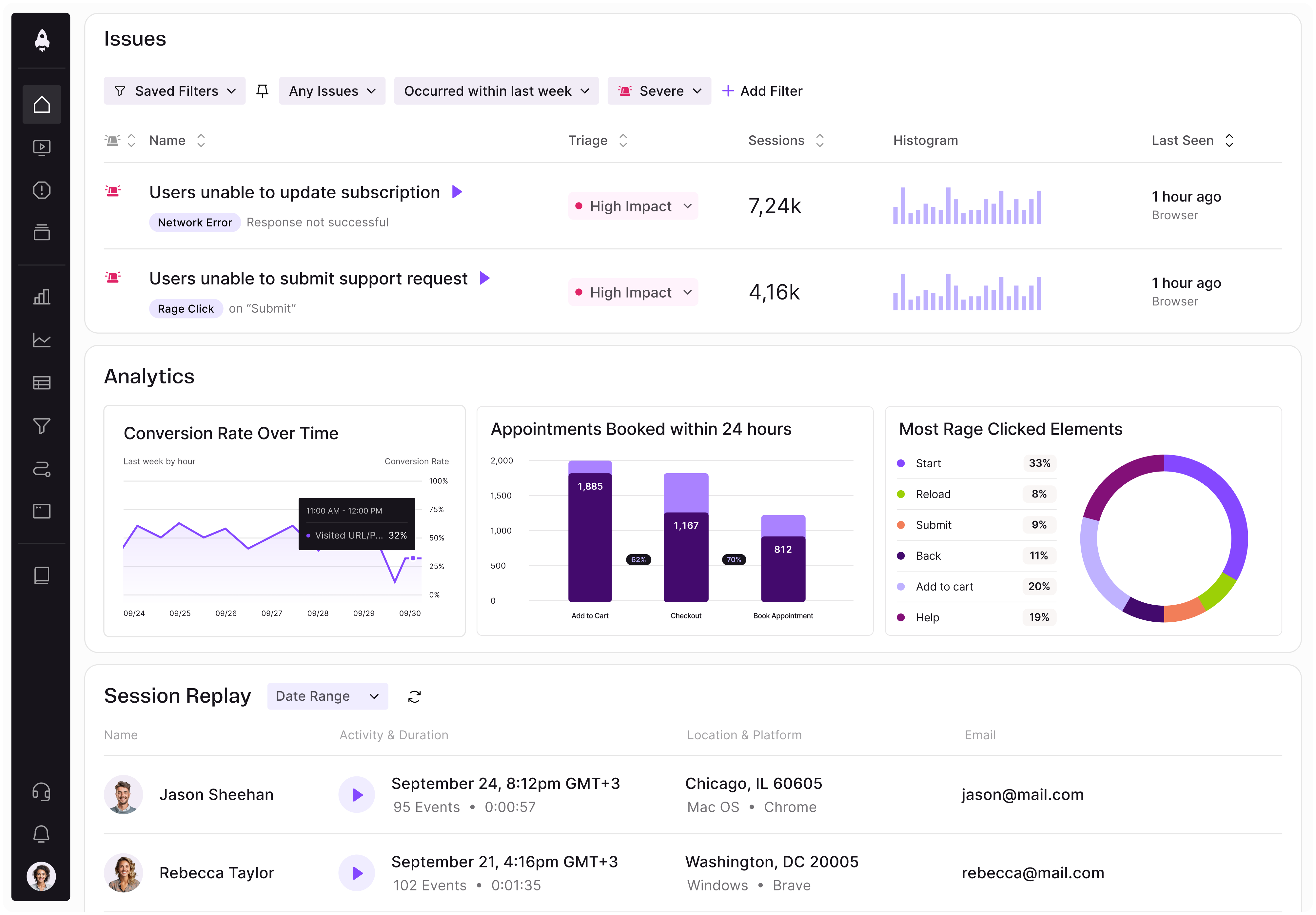
LogRocket identifies friction points in the user experience so you can make informed decisions about product and design changes that must happen to hit your goals.
With LogRocket, you can understand the scope of the issues affecting your product and prioritize the changes that need to be made. LogRocket simplifies workflows by allowing Engineering, Product, UX, and Design teams to work from the same data as you, eliminating any confusion about what needs to be done.
Get your teams on the same page — try LogRocket today.
Map AI data risks, vet vendors, run safer pilots, and build legal buy-in for AI tools without creating security gaps.

SVP of Product Sriram Iyer visits to chat about how he uses AI to launch the “thinnest slice of pizza” product and shift mindsets around AI.

Controlled scope creep can help PMs use capacity buffers, AI tools, and clear guardrails to turn new ideas into better outcomes.
According to SVP Julia Dalton, managing humans at scale and managing AI agents have a lot more in common than most people realize.