Tyler Stone is Associate Director, Product at Sensor Tower. He started his career as a software engineer at EMC Corporation (now Dell Technologies) before transitioning into the product management function. Tyler later joined Wayfair as a technical product manager before working his way up to own experience design for Wayfair’s marketing technology products. Before his current role at Sensor Tower, he served as a product management consultant for several startups and ran the product and design functions at Classify, a productivity app.
In our conversation, Tyler talks through how he’s led Sensor Tower through a complete product redesign. He discusses how to transition users to an entirely new platform design, as well as what resources and strategies to employ to get them comfortable with it. Tyler also shares how he aligned necessary teams like product, engineering, and design.
Sensor Tower has grown organically over its 10 years of existence. Through that growth, we’ve added new products, and it’s snowballed into a complex platform. Essentially, if you go into our UI, you’ll have a way to view data in a chart, table, or many other different options that can change how you view your results.
Early in the company’s history, the process was essentially a copy-and-paste approach for every new type of data and report. Coming into that, it was clear that there was an opportunity for us to consolidate into logical groups and make it easier for the customer to understand. There are over 90 different reports that someone could go to, so we needed to decide our strategy for consolidating that and trying to rationalize it for the customer.
We essentially realized that customers that buy the full suite of products have a hard time differentiating how different things are supposed to tie together and there’s no cohesive way to navigate between them. And when we started this project, our navigation was based on the products that you would buy rather than the use cases that the customers have. People who would buy all of our products would need to try to remember which product a certain page belonged to and try to navigate to that. It was just increasingly difficult for someone to accomplish a task that they needed to do. And with the navigation being representative of the products, it also prevented us from doing any sort of repackaging or repricing. This was another strategic reason for us to basically collapse that navigation into something simpler for the customer.
In terms of how we identified legacy behaviors, it’s like any re-platforming effort — it needs to function the same way as it does for the user today, but there should be additional benefits that come with the redesign. When designing for that, we had constraints, and the team relied a lot on domain knowledge and experience with these types of products. We applied a UX standard that got us 80 percent of the way there, and we applied these first steps to a small portion of the product. It was successful, and we liked where we were going with it, so we expanded it into our flagship product offering.
Through that major step, we realized that we needed to iterate on the design further. From there, we went through a major iteration and subsequent incremental iterations to ensure that we could keep the standard going.
We got a lot of anecdotes, specifically from account managers, to understand how their accounts were using the product and where they were struggling. They would tell us that customers didn’t know how to navigate the product, so they would create dashboards for customers with all of their key reports. We also used NPS scores and had people provide feedback there, like comments about navigation or being unable to find what they needed.
Further, we did a deep quantitative analysis on all of the different navigation items that we had, where people clicked, and the error rates across the product. We could actually see specific reports of where someone expected something that perhaps wasn’t there at all. That combined story was a major push for us to completely redesign the navigation.
We built alongside our customers early on. We had multiple iterations of the navigation design and worked extensively to train the group on the new navigation. Further, we underwent multiple iterations and user research sessions to validate our ideas. Our sales and account management teams were very helpful in telling us where friction points might be. By the time we implemented the new navigation, it was a tiered rollout plan.
We have different customer levels, so we would start with our lower tiers — free and logged-out users — and have them opt in. We’d advertise our new navigation, and they could switch to the new version if they wanted to. If we saw them revert to the old navigation, we’d ask why and collect feedback on what was missing with the new UI.
We were actively monitoring the transition of users who implemented the new navigation versus the old navigation, as well as organizations that had been forced to switch over. It was a major coordinated effort with our account management teams to ensure we weren’t putting too much stress on customers with the transition.
For as long as it took, it was a very smooth transition. Customers needed to relearn how to access these reports, but from what we saw, the learning was pretty clear. We could measure, from their starting point, all the way to weeks into the new navigation, how much time it took someone to access a report. We saw that those numbers decreased back to normal levels after about a month of using the new navigation.
Yes — we implemented a significant marketing communications discussion around this. A lot of internal communications rolled out to explain to our account managers why we’re doing this and why it was necessary for our growth. Externally, we communicated key reports at our top-level navigation. Essentially, we consolidated that into three nav items: app analysis, market analysis, and store marketing. We needed to explain what our philosophy was for each one, so someone who didn’t know could make an educated guess on which report of the three to choose.
We also put pretty detailed in-product messaging in place to communicate these metaphors to customers. Of course, we also had robust product documentation, which, in the absence of them reading the in-product messages, they could turn to for more info.
Yes. For newer accounts, once the new navigation was available, all of the account managers started those customers off with the new nav. They had no concept of the old navigation, so it was just going forward, the standard way to use our product. That was pretty successful overall.
For top-tier customers, especially the ones that have been with us for a long time, we spent a lot of time understanding their needs and validating the benefits of the new navigation with them. We also invited them to be a part of the design process so that they could feel comfortable with it.
We had the most success with the redesign by inviting in stakeholders who we thought would be most sensitive to it. By giving them a seat at the table, they had their voices heard and could give them advanced warnings about new changes. Overall, if you have someone who pays you a lot of money and they’re surprised by an update that majorly impacts their workflow, they’re not going to be happy. This validated that we needed to engage customers and give them the ability to transition on their own timeframe, in some way. Make them aware that this transition is coming and that they can still use the old version for some time.
A lot of it was us putting in the time to plan out how this transition was going to go. Luckily, our team had the flexibility to put in the time in advance to think about how we’d consolidate all of these different pages and make sense of them in the navigation. We also had the flexibility to think through how we could provide the same functionality within each report, but through a different means of interaction. That was really important for us to figure out for our customers.
Overall, if you’ve ever undergone a re-platforming effort before, you’ll know that it’s one of the harder projects to manage. I’ve been in this position multiple times, and you have to rebuild the same thing that already exists. There’s no room to necessarily do something with less scope or feature functionality before you fully release it. You could release something smaller, but it can’t fully replace what already exists — you can’t degrade the customer experience.
As a result, you have to prioritize the full scope of what already exists, try to make sure that you meet all of those use cases, and then try to prioritize how to incrementally develop something and show progress to the executive team. You want to get the customer to their goal as quickly as you can with as few features as possible. That extends out to feature development to contain more and more use cases over time.
In our case, we were highly incremental. We wanted to show value as quickly as possible to the executive team and get to a point where we had 95 percent of features, with the other 5 percent being non-urgent. That’s been our philosophy for all of the development that we’ve done. It can be hard to estimate the time it’s going to take because you need to do everything. The equation then becomes how to build something that is going to deliver value for customers, and also give the executive team the option to release.
Our approach to capturing all of the use cases was to start with a set of well-defined use cases, build that into our new experience, and prioritize it effectively.
This is a challenge for redesign and re-platforming efforts because there isn’t a clear business value to this type of work. There are definitely benefits for engineering and the customer, as well as an intrinsic benefit of improved user experience, but you can’t necessarily quantify revenue that’s tied to this improvement. So, we tie the project to smaller value-driving projects within it.
For example, for consolidating and redesigning reports, we had a plan in place already to leverage our new design system, redesign that page, and rebuild it from scratch. It was a slightly more involved process for us to say, “OK, if we want to introduce that to that page, we need to completely redesign it and rebuild it to meet our new design standard.” The older page used a completely different technology that very few engineers knew how to work with. As a result, we saw multiple benefits in going through this new approach and rebuilding it.
We’re still making progress on many pages in our legacy design system, and they’re all based on and prioritized by business needs. As those needs arise, we have a plan in place, and we can allocate and measure engineering resources for it. It becomes important to tie these types of investments to something that is strategically important to the business or has a clear dollar value. From there, you can treat it like a tech debt project that you need to address.
We had product design, engineering, and leadership involvement in all of this. In the early days, it was very design-heavy, so that team was the one most involved. I worked really closely with them to ensure that the use cases were met and to test the different design ideas they were working through.
As a product manager, it can be easy to have a strong opinion about a specific design direction. But the biggest mistake you can make as a product manager is not giving design the autonomy to identify the solution. I try to be the most respectful of design’s autonomy because everyone will have an opinion about it. Everyone’s seen design and the different patterns to apply, but the design team has the depth of time and experience to determine which patterns will work and which ones won’t.
So, my approach has been about enabling them to work autonomously and bringing different cases to test their designs. I want to walk through scenarios that a customer might run into without dictating a specific solution. A lot of that conversation ends up being pretty collaborative, and we usually arrive at a solution together.
From there, we review the design with the executive team, get feedback and iterate, sign off, and then hand it off to engineering for prioritization. I’ll work with the engineering team to break it out into work phases so they can deliver value incrementally. The benefit of our team is that there aren’t a lot of silos, so our design, engineering, and product teams will be in stand-up together and see constraints as they arise. Then, we can change specifications in real time and move forward from there. That’s been very successful across our projects.
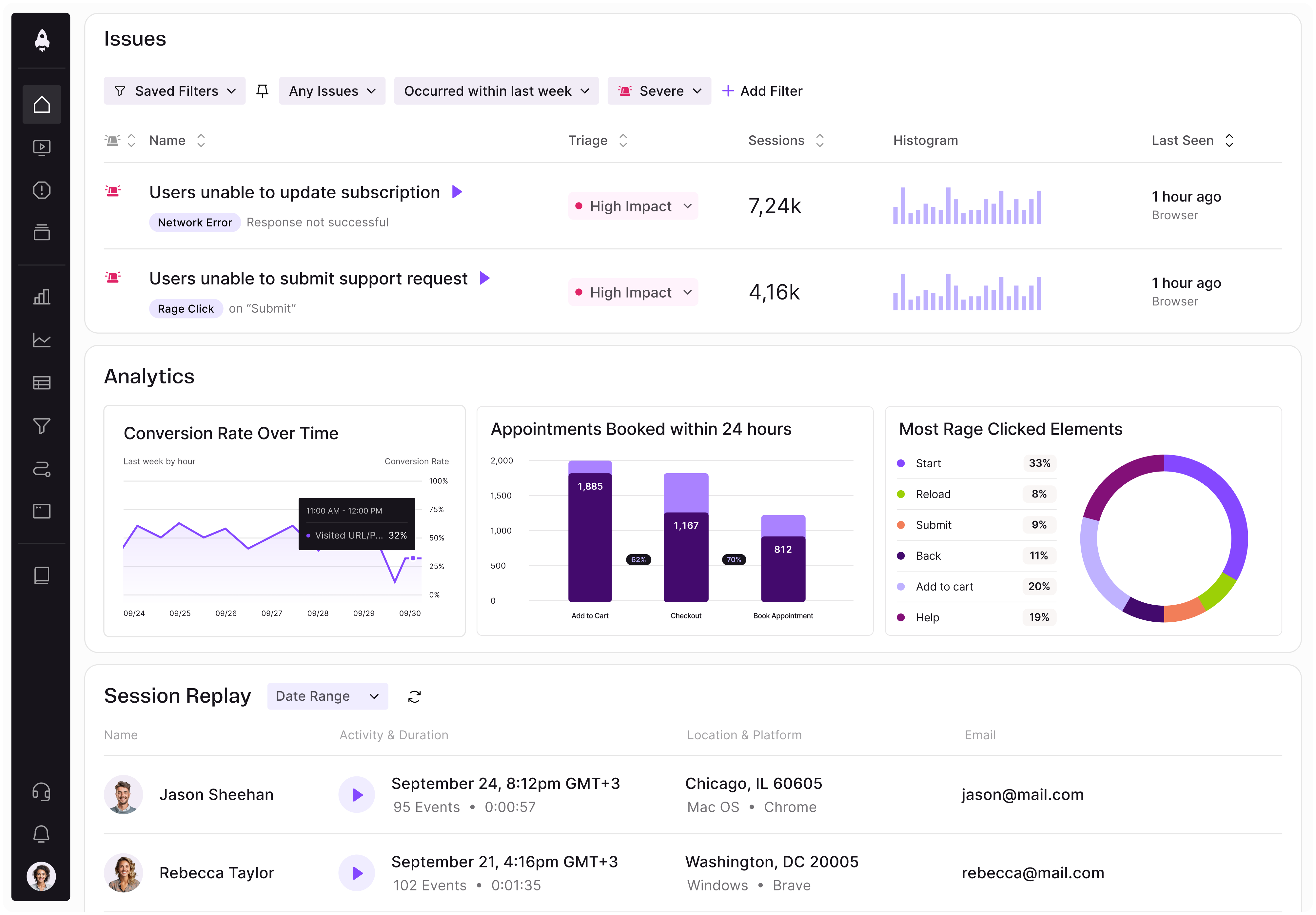
LogRocket identifies friction points in the user experience so you can make informed decisions about product and design changes that must happen to hit your goals.
With LogRocket, you can understand the scope of the issues affecting your product and prioritize the changes that need to be made. LogRocket simplifies workflows by allowing Engineering, Product, UX, and Design teams to work from the same data as you, eliminating any confusion about what needs to be done.
Get your teams on the same page — try LogRocket today.
A practical framework for product leaders to prioritize better, reduce noise, and focus teams on what matters most.
Explore how urban planning helps product managers think in systems, strengthen foundations, and build products that scale well.
Learn how product managers can move from output tracking to outcome-driven product management with metrics tied to user impact.
Learn how to spot PMF erosion early, diagnose the cause, and help your product recover before decline turns into panic.