Natalie Shaddick is VP of Ecommerce at Mizzen+Main, a men’s dress wear company. After beginning her career in the retail industry at Kendra Scott, she transitioned to an editorial studio supervisor role at Zulily. From there, Natalie became a site merchandiser and worked as an ecommerce merchandising manager at Mercatalyst. Prior to her current role, she held multiple positions at Mizzen+Main, including site merchandising manager, email marketing manager, director of ecommerce, and more.

In our conversation, Natalie talks about acting as a united front in terms of branding and messaging, and the importance of maintaining a larger, cohesive message across touch points. She discusses the process of switching to a headless website and the challenges that come with that. Natalie also shares her process for continuously changing and evolving customer experience components based on factors such as competition, customer behavior, and data.
We were founded in 2012 by Kevin Lavelle. He started the company after working in Washington, D.C., where he noticed men who looked very sweaty running into buildings to attend meetings. They were always wearing professional attire, and Kevin thought there had to be a better way to make a men’s dress shirt that was more comfortable, sweat-resistant, moisture-wicking, and had four-way stretch.
He took that challenge and created his own dress shirt, the Leeward dress shirt. Today, it’s our number one best-selling item and drives the majority of our revenue. It’s one of our hero products.
I’ve always been fascinated by human and consumer behavior. I love working with people and I wanted to explore that through nursing. I found that it wasn’t the right path for me, so when I was figuring out what I wanted to do, I applied for a part-time job at Kendra Scott, the jewelry company. When I joined, they only had nine locations, and I started off part-time. I slowly worked my way up to a store manager role and found that I found that I loved managing people, talking with customers and helping them find jewelry they love, and selling the product.
That translated nicely into the business side, where I became more curious about consumer behavior, why people buy certain items, why they return, etc. Ecommerce was taking off around this time and I moved to Bellevue, Washington. This area around Seattle is a tech hub, so I switched over to a different and more creative managerial role. I oversaw the creative team that shot imagery for the Zulily site and worked closely with merchandisers, buyers, and site staff.
I became interested in why people click on certain creative assets but not others. That led me to my position at Zulily, where I found a passion for ecommerce. I naturally fell into these roles out of my own curiosity — I was able to gain great experience and also feed my interests.
It’s really important to root yourself in the data. My process involves keeping a close eye on basic, daily KPIs such as units per transaction (UPT), average order value (AOV), conversion rate, etc. I work to understand what we did that day that made something increase or decrease, or what drove customers to add to their cart that day versus a different one. Paying attention to these things is crucial.
In general, it’s easy to think we need a big fancy dashboard to show these specific metrics, but I’ve found that some of the best findings we’ve surfaced have been from observing the day-to-day business. If something seems off, I jump right in and find a solution, as opposed to waiting to see an anomaly in a dashboard.
We work closely with our UI/UX designer every day. One example I can think of was when we created a card on the product landing pages that enabled us to double-expose a product. The first photo was the regular product detail page (PDP) image and the second was a lifestyle image. Our thought was that if the basic studio image didn’t resonate with the customer as they scrolled, the lifestyle image might inspire them to click the item instead.
On the PDP image, we left the product information — like name, price, reviews, etc. — the same. This image had the exact same name and details as the regular studio image, and we found that actually caused a lot of confusion for customers — especially if the images were close to each other on the landing page. Customers would think the images were different products, and would reach out asking what the difference was. The lifestyle image was meant to help the consumer, but it actually ended up causing more confusion.
We revisited this with our designer and he suggested removing the product information from the images. We still had that double exposure, but it was more from a creative point of view. The customer could still click it and make a purchase from there, but it was clearer that the second image was not a different item.
We learned an important lesson from this — it’s OK to revisit (and then revisit again) if something is confusing or doesn’t work. There are times when we feel like we’ve checked all the boxes and looked at competitors, customer behavior, data, etc., but we still need to change and evolve.
We run all A/B testing through a personalization tool called Dynamic Yield. It’s been really great for us. We can separate the test to make it a true 50/50 split so that every customer is part of it, irrespective of their behavior or segment.
What’s nice about this tool is that we can also test based on customer intent. We found that to be helpful because new customers behave so differently on our website compared to our high-intent returning customers. We try to use high-intent customers for testing because we want to keep them extra happy, but also because we’re able to get a statistically significant result faster.
I look to understand which touch points are affecting which audience. First, we look at which touch points will yield the highest ROI. Then, from a general customer frustration standpoint, we look at which one makes the most sense to prioritize first. For example, if users are having trouble logging in to the site, that issue is more pressing than if users are struggling to bookmark an item.
It also comes down to needs versus wants. Especially now that we have a headless site, we have to evaluate this often. Is this a customer need or is this a customer want? Is this something that’s going to differentiate us from our competitors in a good way or a bad way?
We haven’t really experienced any downside from going headless. It’s important to remember the reason behind the transition. It sounds big and complicated — which it was — but for Mizzen+Main, our brand personality is truly the core of who we are. That’s why the creative components and copy are very important to us. We want customers to invoke a certain feeling when they’re shopping with us and understand that they’re part of our team.
Additionally, we push out a lot of content that’s just for consumption — not to drive revenue. For example, we’ve posted witty articles about how to pack a suitcase properly or how to measure the inseam of your pants, because a lot of people don’t know how. For us, going headless was about how to make the personality of our brand come to life on the site, and we didn’t feel like we could do that through a templated design.
It’s allowed a level of flexibility that we didn’t know was possible. But with that, we do need to be careful. One thing that was a good learning experience for us was maintaining the blueprint. Our backend is Shopify, which acts as a blueprint for our hypothetical house, and our headless frontend is the fun, pretty stuff. We still need to maintain that blueprint because there are so many different tools and integrations we need to have for our site to work with other tools. We cannot abandon that piece of the setup process.
Seven or eight months in, we started building some additional things that were really neat, but soon after, I said, “Wait, we’re not even utilizing all of these new features.” If you build it, you have to maintain it — that was an important learning lesson for us. It’s easy to build up tech debt with a headless website, especially if you have a leaner team. Remember that someone has to maintain the thing you want to build.
We lean heavily on the reporting side. We talk weekly about the business and where it’s at, and monitor it constantly. I believe that if you are watching your business daily and maintain a natural curiosity about what your customers are doing, you can gather very valuable insights just from basic reporting. Of course, we also have in-depth reporting tools, but for the most part, I can tell what’s going on in my business just by looking at daily KPIs.
I’ve noticed that some people can get easily overwhelmed by data. So when I report findings from data insights, I try to remember my audience and keep it simple. For example, you could say “I saw a decline in AOV on this day. I think it could have been due to the free shipping promotion we were running.” Being very straightforward and simple is very helpful.
Another thing I’ve learned is that you don’t always need to find the silver lining. Instead, what is the truth? What is the good and the bad? Not everything is always going to work. Even when things are going really well, continue to dig in and try and understand why. Could performance be even better? Is there something that you’re still missing out on? It’s easy to lose sight of optimization when things are going well, but always look to see if there’s a different area that’s not working as well that you could focus on.
Lately, we’ve been very focused on making sure that all channels are firing on the same message at the same time to the right audience. We went through a period where we were all talking to our customers a bit differently on each channel. At the time, we thought, “If they see us in this outlet, then they’ll get this experience and this message. But if that doesn’t resonate, then maybe they will connect better to different messaging on another channel.”
But, what we’ve found works best is when we’re all holding hands as a united front. This is when email and SMS are amplifying the messaging that is on the home page, which also matches the direct mail piece they received in their mailbox. This is also the same thing they saw as an ad on Instagram. That point of reference across all those channels and touch points creates a larger, cohesive message.
Yes, and this is something that we now do very well. For example, we just launched our first formal suit. We co-hosted a launch party here in Dallas in partnership with an influencer. A lot of influential people within the area attended, as well as our CEO. From there, we put content on social media, wrote a blog post, issued press releases, and updated our home page and email ads. It’s important that every channel continues to talk to one another while still having one good home where all of the information lives.
Another thing that we’ve done well is truly look out for every channel. For example, although I own paid search and ecommerce, I’m still going to say something if I see an item on email, SMS, or social media that needs flagging. We take every single channel owner’s point of view into consideration because they’re a consumer as well. If it doesn’t make sense to them, then they are a potential consumer too. Working as a team and not staying too siloed is really important.

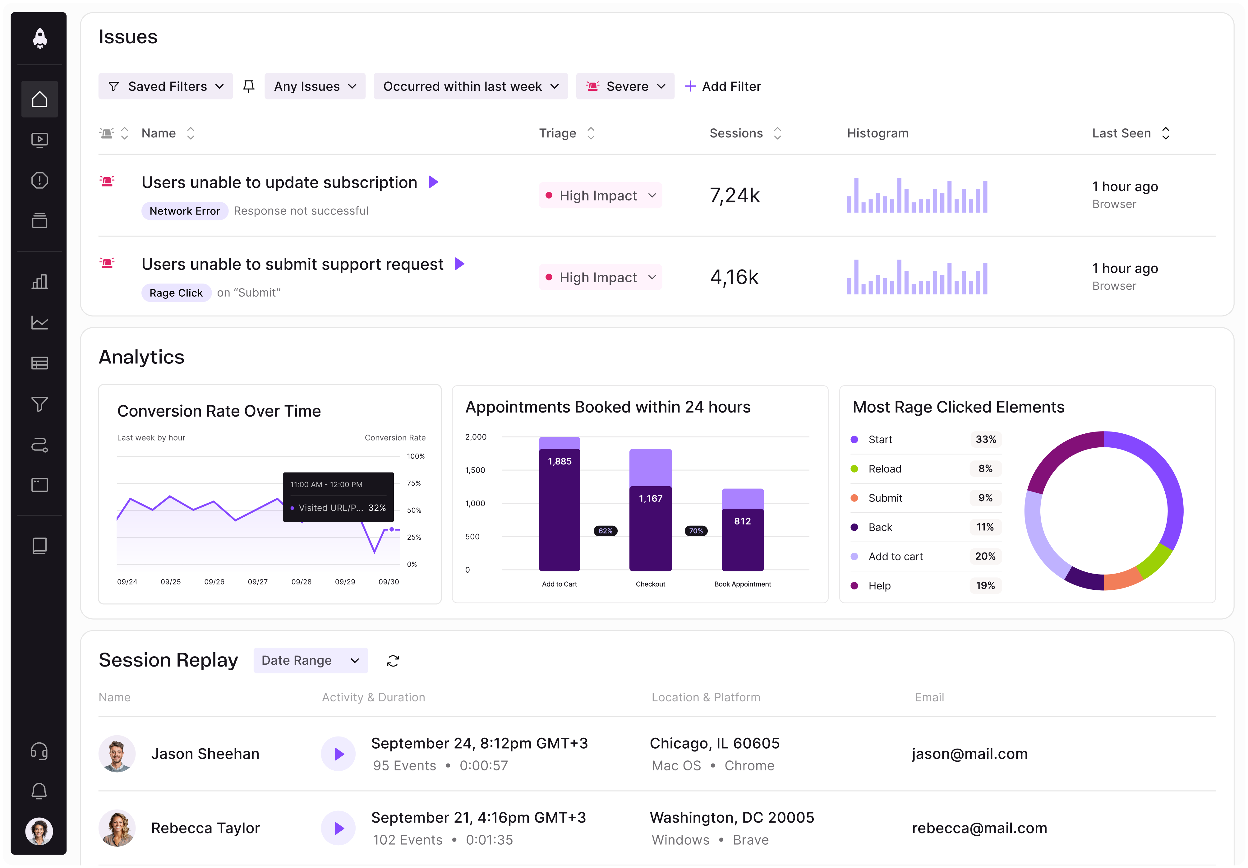
LogRocket identifies friction points in the user experience so you can make informed decisions about product and design changes that must happen to hit your goals.
With LogRocket, you can understand the scope of the issues affecting your product and prioritize the changes that need to be made. LogRocket simplifies workflows by allowing Engineering, Product, UX, and Design teams to work from the same data as you, eliminating any confusion about what needs to be done.
Get your teams on the same page — try LogRocket today.

Learn how code-style reasoning helps product managers make sharper decisions, surface edge cases, and write clearer requirements.

A practical framework for product leaders to prioritize better, reduce noise, and focus teams on what matters most.

Explore how urban planning helps product managers think in systems, strengthen foundations, and build products that scale well.
Learn how product managers can move from output tracking to outcome-driven product management with metrics tied to user impact.