Brad Ferringo is Director, Product Experience, Audio at Snap Inc. He began his career in music and production for Carnival Cruise Lines before joining Blackberry’s media design team, where he worked for more than a decade. Brad then transitioned to Meta, where he worked on product experience with a focus on interaction sound design. Before his current role at Snap, he spent three years directing product experience at MagicLeap as well as leading product at Aurmor.ai, an advanced wearable AI platform technology.
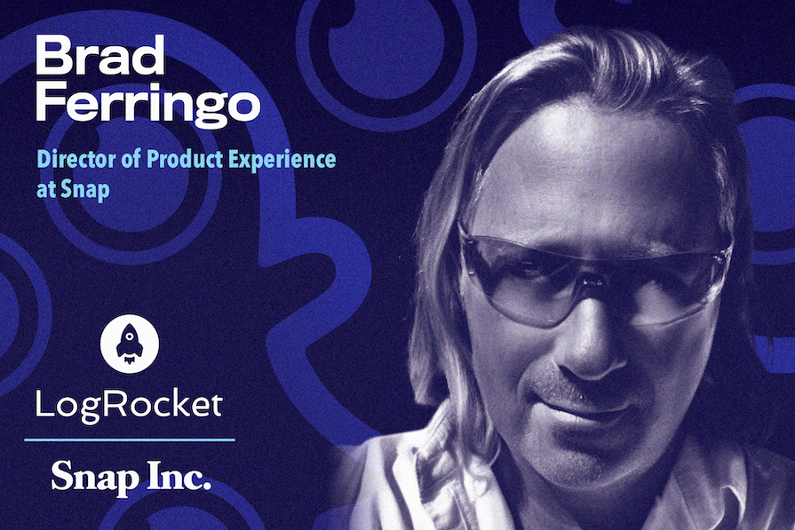
In our conversation, Brad talks about how he helped develop modern “earconography” — sound language that creates context-driven audio notifications — and promotes its importance within organizations. He discusses his process for educating stakeholders about sonic identity, as well as incorporating sound into the early stages of the product development process.
I love to draw. I started doing illustration as a young child, but at the same time, I loved music and enjoyed being a musician and producer. This actually involved a lot of your own product planning and design testing. I was always multidisciplinary and cross-functional. I got my real start in product working in electronic toys in a team of only two. That was a trial by fire for me.
As the saying goes, “You don’t eat if you don’t do it right.” I learned to separate myself from the deliverables because, as a producer, it’s not about you — it’s about the customer. It doesn’t matter how much you like it; the customer has to like it.
I also continued on a lifelong journey of learning. I worked with electronics, health sciences, and more, so by the time I found myself at BlackBerry in a small team working on the two-way pager, I became what I believe is more vision-led. I went on to work on what we know today as the smartphone.
Many mistakes later (and thanks to the leadership for putting that trust in me and the amazing people I got to work with), I landed in product management.
For me, product management has always been about the ability to bring new ideas to life. This zero-to-one is an amazing experience and feeling. Incremental improvements interested me more in the beginning. But what truly holds my interest now is the challenge of innovating. Causing a real disruption is difficult, and creating a paradigm shift is nearly impossible. I’ll quote Walt Disney — “It’s kind of fun to do the impossible.” I specialize in making the impossible happen.
In the early days of mobile phones, ringtones were simple and functional, limited by the basic piezo transducers that could produce only a single frequency at a fixed volume. As smartphones advanced, they allowed for more sophisticated audio capabilities, and we began loading devices with sound effects and short music clips. While this was fun at first, it quickly led to a problem — the cacophony of various sounds became overwhelming and annoying. It actually created negative brand impacts, particularly in professional environments like those of BlackBerry’s enterprise customers.
Recognizing that people were over-notified yet still under-informed, I decided to tackle the issue by developing “earconography,” a system of sound language designed to create meaningful, context-driven audio notifications. I began by categorizing notifications based on context and urgency, drawing inspiration from real-world sounds.
For example, I used the single ding of a hotel counter bell for text messages, a two-note ascending pattern for instant messages, and a more complex three or four-note pattern for emails. Timers were signaled by a familiar rapid three-note repetition. When video calling came about, I introduced more percussive, wooden sounds to mimic the psychoacoustic association of someone knocking on a door. My goal was to further enhance the user experience.
This methodical approach to sound design caught on, and soon other manufacturers and designers adopted the principles of earconography. This led to improved context and a universal understanding and association with certain sounds, and also significantly reduced the noise pollution that came with early smartphones.
Today, earconography is ubiquitous and seamlessly integrated into our daily lives. However, as we push toward more immersive audio experiences, the need to evolve our sound language continues. Yet again, we have an ongoing challenge to advance the art of earconography.
Editor’s note: Brad holds registered trademarks for Sound Language and Earconography, but openly encourages everyone to contribute to continual improvement in the global audio UX.
This is an ongoing challenge. While most organizations have a team of UX, they seldom work on other disciplines like haptics, sound, or other aspects of the customer experience. I’ve found that there is usually a bias toward visual design. Many of these folks lack the understanding of quality sound design because it’s not in their wheelhouse. But a brand, company, and product are about much more than visual design or interaction and motion. We are auditory creatures; the ear is the first organs to develop.
Moreover, audio is complex. It is hugely cross-functional, and there are so many dependencies. More than any other team, it touches all the parts — from the brand aesthetic and the sonic identity to the low-level parts of a software stack and having access to the OS to surface certain features and deliver sound. Having an overarching view is very challenging for all those teams involved.
If everything isn’t firing perfectly, something breaks. And that’s when people notice the sound. The intended experience, if it goes all right, is not celebrated because it’s expected.
Stakeholder education is huge when it comes to a sonic identity or sound language. People think sound is associated only with a visual asset or interaction. But there are a lot of sound-first experiences behind any UX design, such as alerts, push notifications, and other aspects of RTC communications, that they don’t think about.
In terms of universal design language, I make sure that all assets and deliverables work together and convey the same message. We don’t want a sound that suggests an error when the textual message signals success. We want a unified design. A lot of sonic designing is educating stakeholders on why we’re doing a design the way we’re doing it because it isn’t always intuitive to them. Once they start understanding the reasoning behind it, they begin appreciating this space.
The process tends to be very subjective. First, we look at a company’s mission, vision, and brand tenets to codify what the brand is about and who the customers are. This is an important aspect because it is something tangible we can refer back to.
For instance, with Snap, we focus a lot on our creator community, which is fun and playful. There’s more expressiveness, so we discover fun and bespoke sounds. But at Magic Leap, where the company had more of an enterprise audience, the sounds were a lot more austere and simple. Essentially, the brand’s persona tends to dictate where its sonic identity needs to be.
It’s also important to start as high in the chain as possible when seeking stakeholder approvals. One of the big goals is to talk about the aesthetic and the sonic identity with key stakeholders and establish a common ground about that on a brand level. Once that’s done, we move to product and actual design assets. This top-down approach is much better than pushing the water up. When we establish a baseline with guidelines and attributes, the sonic design forms itself all the way down to the product assets.
By far, the most common misconception I’ve come across is that sound is added later once everything else is done. I often hear, “We’re not ready for sound yet.” Well, this approach works for movie scores, where you need the director’s cut first and then add sound later. But when it comes to product development, it’s the opposite. For a platform to store and render audio files to deliver a sonic experience, sound must be included in the engineering scope from the beginning.
There are so many dependencies to consider, too. Many sonic interactions are bespoke. They’re not off the shelf or part of some software stack. For a sound to play when a button is pressed, specific hooks need to be built into each feature over and over again.
At Meta, we had two-week design sprints. But we rarely worked with the same engineers twice because so many different features and products were not versed in sound. If we waited until later in the process, the sound wouldn’t get done at all. We must get in early and push the brand to count sound as important as other parts of the process, like planning or QA.
A part of the education process, especially from a product management perspective, is to build an analogy with something stakeholders know and understand. Sound is like a black box — most people don’t understand it. To help stakeholders cross the bridge toward sonic design, I make it relatable and compare it with something they know.
One analogy I use is iconography. Just like creating a simple black-and-white icon involves a lot of thought and design work, the same level of design thinking goes into crafting a sound experience. That’s when I coined the term “earconography.”
Describing it to stakeholders like this means they understand that there’s a systematic process with interactive design and other aspects behind every sonic experience design. They know that sound is a part of the larger design system, not just an afterthought. This allows them to step out of their comfort zones using a baseline of something familiar. I try to make this education process fun by partnering with them in their designs to build and deliver the best experiences. This way, they feel like they’re part of something they understand and are not intimidated by it.
There are a few aspects to this. One is the subjective nature of a team. Someone on an interaction team quickly starts to understand how sound can be descriptive. They easily understand that there’s a sonic equivalent to the language they’re using in the interaction, and it can complement motion design. For other teams, understanding sonic designing is a bit more complicated.
One phenomenal thing that happens frequently is what I call producer’s love (or director’s love). This is when someone in a higher stakeholder position hears a temporary sound, like a temporary soundtrack for a movie. They get used to it, and it becomes the standard by which they’ll judge the actual deliverables. So, we have to be very careful when we put sounds in.
Sometimes, I use a simple, generic sound, like a click, to show that a feature is working well to avoid creating an attachment with the tester sound. This avoids situations where stakeholders fall in love with a placeholder sound and insist on its use everywhere. Other people tend to be more dramatic and use a laugh or other outlandish sounds to test a feature, so there’s no chance of stakeholders wanting that in the final design. To me, though, doing that takes away the experience of building the product.
Each team tends to have a little bit of subjectivity. But when we approach sonic designing with accessible design — when talking about ethnographically neutral or universal understanding — and start talking to teams about design principles, they all tend to align. Getting everyone aligned away from some of the subjectivity more to “Are we hitting the targets that we need to in the way we would with a visual design?” is probably the most successful.
At Meta, we were big on A/B testing. Some companies don’t do that much; they tend to either rely on intuition, which is often correct, so it works out, or they have a different way of gathering insights. But, with A/B testing, we found that directly asking users what they think about a sound will never yield actionable feedback. So, we focus not on what they say but on what they do.
We looked at keystrokes and usability patterns. We also hired folks to come in and observe them using products. We let them know there’s no right or wrong, that our goal was to just see if what we were doing was working, and that they were not being tested or evaluated. If they pointed out an issue, we’d know we needed to rework and improve our design.
So, a direct observation of people using actual devices and features helped us gauge how we were doing. We would even start by asking them to turn on a device. If they struggled, we’d know we had to fix it. We had large pools of users testing our samples (around 250,000 in each test), and we would quickly get actionable feedback. But, companies that don’t have access to large pools for A/B testing have to rely more heavily on experience and intuition to determine what is working and what isn’t.
Very few people are in a truly audio-focused UX role like this, and so this tribal knowledge isn’t well known. So, I encourage folks to start eating dog food early, work out as many bugs internally as possible, and avoid putting users through issues unnecessarily.
Sure. Generally, sound design is a fun and rewarding experience for all. If it’s not, you’re doing it wrong. But, you can’t master audio UX without first mastering the other disciplines.
If you’re a leader building a team of highly-efficient high-performing product experts, look no further than the audio UX expert. Counterintuitively, you’ll get all you need plus sound for free, as they have a massive body of understanding due to the multidisciplinary skill set, both technical and creative end-to-end scope, and cross-functional nature of the work.
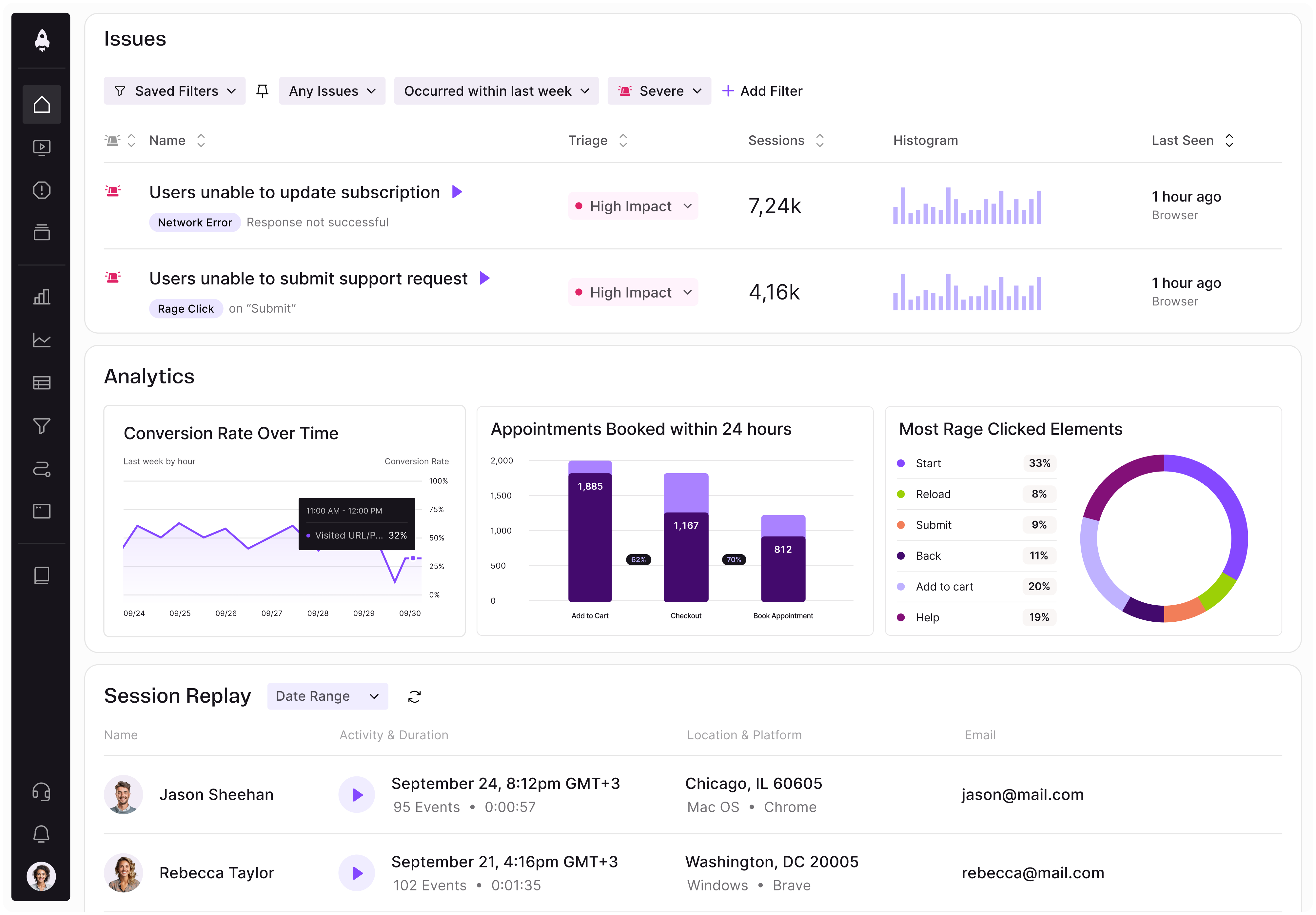
LogRocket identifies friction points in the user experience so you can make informed decisions about product and design changes that must happen to hit your goals.
With LogRocket, you can understand the scope of the issues affecting your product and prioritize the changes that need to be made. LogRocket simplifies workflows by allowing Engineering, Product, UX, and Design teams to work from the same data as you, eliminating any confusion about what needs to be done.
Get your teams on the same page — try LogRocket today.
Learn a 3-lens framework that helps product managers shift stakeholder requests from feature ideas to real problems and outcomes.
CPO and PhD Jen Wang covers “The Zone of Absorption” and why product teams are struggling to build when AI is shifting faster than anyone can keep up.
Explore four product team structures, when each works best, and how to choose the right model for speed, ownership, and clarity.
Learn how code-style reasoning helps product managers make sharper decisions, surface edge cases, and write clearer requirements.