Every product manager builds their products to appeal to users and solve their specific problems. However, it’s not just about resolving a pain point. You also need to make sure that the road to achieve it is great.

You want to create a product that users want to use again and again and crafting an excellent user experience is one of the keys to achieving that. But, how can you measure something as personal and biased as experience?
In this article, you’ll learn about what metrics measure user experience and the tools you can use to collect those metrics.
Customer experience metrics are metrics that you can use to determine how customers perceive their interaction with your product.
As a PM, you need to be able to choose the right set of metrics specific to your industry and use case. The following are some of the most common you might use:
When it comes to measuring customer experience, there are a range of tools you can use that target metrics geared towards a particular aspect of your customer journey:

With these products, you’re able to visualize the customer journey and quickly pinpoint the gaps in the experience. The goal here is to see where most of the users exit your product’s funnel and use this data to develop countermeasures that increase the number of users who stick with the product between different steps of the funnel.
This can take the form of a regular bar chart, similar to one you could do in Microsoft Excel, but you can also visualize users’ feelings with a so-called mood map, where you visualize user’s feelings across the journey. The key to making this effective is to focus on the right funnels and keep a regular watch on how they change.
With customer experience analysis tools, you aim to analyze user’s behavior by either looking at them using the product or through visual representation of their usage patterns. This can mean anonymously recording videos of them clicking through the product or storing heatmaps of them clicking through the funnel of your product.
I’ve used both and although heatmaps are more reliable, videos are beneficial on a more micro scale. Look at videos of the shortest and longest sessions and try to understand the reason for their unusual length. The short ones will help you notice any problems that cause users to bounce off prematurely, while the long ones can help you understand what makes those users stick around.
Remember to treat any conclusions drawn from these videos as the first step of wider research — a few confused users don’t make a bad product. However, it’s the heatmap that can help you confirm whether observed issues are widespread or you just witnessed someone who didn’t pay enough attention or used the product by accident.
These tools take the problem more literally and allow you to measure key metrics like CSAT, NPS, and CES to gauge customer satisfaction and loyalty. With those, you can track the impact of product changes on customer satisfaction and prioritize features that improve these metrics. However, the challenge here is always to ask at the right time.
You don’t want to ask too early, as you may cause the user to drop out of the user’s current funnel due to distraction and you don’t want to do it out of context as the user will likely ignore the survey or not remember how they felt during a particular interaction. That said, it’s super important to have visibility on those metrics and observe the trends.
Of course, the reading might fluctuate, but a constant negative trend will tell you that there’s something wrong happening with the product.
While putting a number on your user experience is helpful, it’s still just a number. The number won’t tell you what’s wrong, but direct customer feedback will! These tools allow you to gather direct feedback from customers through surveys, polls, and feedback forms.
Very often an ask for a rating will be followed by a feedback text box. I suggest showing it once the numeric rating is given (and stored) regardless of whether the number is high or low. If you do this only for unhappy customers, you’ll miss out on a little praise and hints on what is the strongest element of your product.
The bigger you grew, the more the feedback comments and the more difficult it became to catch trends and common complaints across the whole user base. However, with the rise of large language model (LLM) AIs, it’s getting easy to throw hundreds of thousands of comments to the AI bot and ask it to compile some sensible, actionable report.
Of course, in the past that was also possible with dedicated people going through gigabytes of unhappy statements (poor souls), but this is the beauty of well-applied automation. SurveyMonkey and Bucket.io might be just the right tools for the job!
User experience isn’t only about using the product and going through the funnels. It’s also about what happens when something breaks or the user is confused and needs help. This part is the client support aspect of the product.
While you can treat the support desk tools as a separate product and measure/analyze them with the tools above, you can also include them in your general user experience overview.
The number of new tickets in a unit of time and the time to successfully resolve will tell you if the users are happy and the product is stable. It can also be a great source of feedback for potential changes in your software, but this is a whole other story.
You need to keep the support top-notch if you want to keep users happy so that they renew their contracts. If you’re looking for a good support desk software provider, check out Zendesk!
While these tools aren’t built to measure user experience per se, it all comes down to asking the right questions. It’s up to you to define the success criteria of any release and whether they’re focused on user experience (i.e. do users complete the registration form and perform at least one desired action on the first launch) or product performance (i.e. time to load a page).
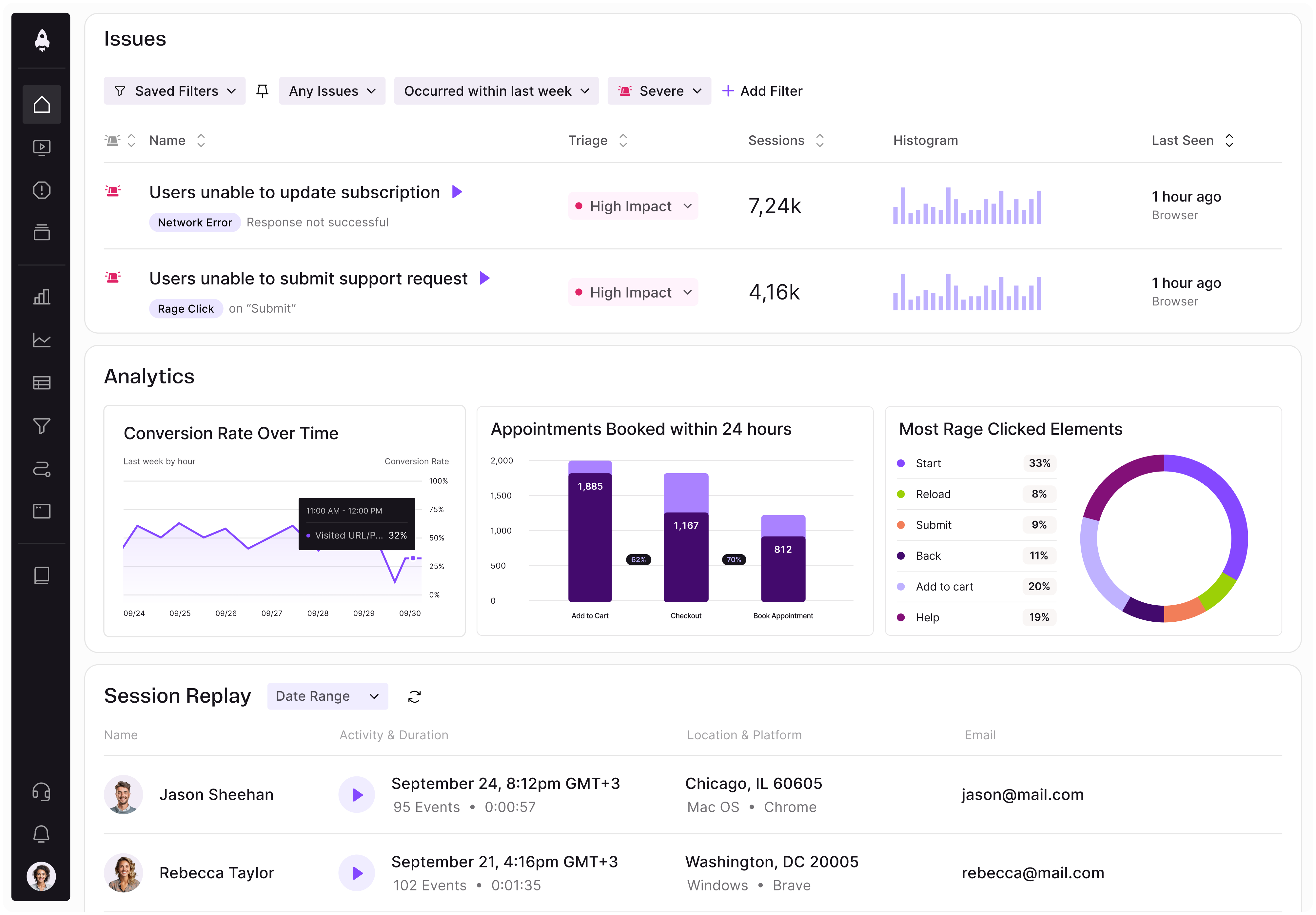
Now, of course, the world isn’t so neatly divided into those specific categories and different products can have functionalities of different types of tools. For example, LogRocket can help measure user experience with different functionalities, such as:
Polish OLX Autos’ brand 321sprzedane.pl aimed at making the car selling process for consumers digital, quick, and fair. As the price offered for cars would be lower than the market rate (it had to make a margin somewhere), the key to success was to offer a great client experience. The goal was to optimize the number of cars purchased every day and be able to do that, end to end within an hour.
Suffice it to say, buying the first car on launch day took… two and a half hours! But this was just an MVP. As there were IT products and dedicated purchasing locations live, it could start measuring what takes the most time and upsets the car owners the most. With that info, the development team could focus their efforts on counter-measures and making the process more and more impressive.
One of the biggest game changers was when it successfully automated written car purchase prices in the automatically generated purchasing deals. There were tons of such adjustments and within a few months the process indeed took around an hour. At the same time, the ratings on Google Maps were steadily growing.
Unfortunately, it was attempting to grow and scale just as COVID was hitting hardest and flipped the automotive market on its head by limiting access to new cars and thus, making used cars more valuable and in demand. I easily sold my 10-year-old Kia Rio within three hours of posting an ad for over 50 percent of the car’s original price.
So, since it was so easy to sell a car, the value 321 brought was simply no longer there. That is a sad product lesson: you can keep the user experience great and still fail as a product and business.
In the end, there isn’t a best metric or tool. There can be only the right tool and/or metric for your product! A selection that’ll work for a retail product, might completely misrepresent the user experience in a banking app.
Choosing right will allow you to best understand your clients, their behaviors, and expectations and craft better products for them. If you plan to improve your product based on stakeholders’ demands, you’ll likely drive the product to its premature irrelevance.
Featured image source: IconScout

LogRocket identifies friction points in the user experience so you can make informed decisions about product and design changes that must happen to hit your goals.
With LogRocket, you can understand the scope of the issues affecting your product and prioritize the changes that need to be made. LogRocket simplifies workflows by allowing Engineering, Product, UX, and Design teams to work from the same data as you, eliminating any confusion about what needs to be done.
Get your teams on the same page — try LogRocket today.

Learn a 3-lens framework that helps product managers shift stakeholder requests from feature ideas to real problems and outcomes.

CPO and PhD Jen Wang covers “The Zone of Absorption” and why product teams are struggling to build when AI is shifting faster than anyone can keep up.

Explore four product team structures, when each works best, and how to choose the right model for speed, ownership, and clarity.

Learn how code-style reasoning helps product managers make sharper decisions, surface edge cases, and write clearer requirements.