To truly build great products, you need to understand the thought process of customers before and after they purchase from you. However, sometimes product managers oversimplify this by assuming that you only need to know what the user wants/needs while they’re interacting with the product. The reality is it’s vital to have information that captures before, during, and after.

To do this, you’ll need to create a customer journey map. In this article, you’ll learn what a customer journey map is, what they’re useful for, and read examples of ones in practice.
A customer journey map is a flowchart that depicts the various stops that customers make before, during, and after purchasing.
Product teams can refer to their customer journey maps for various reasons. In fact, different roles have different uses for them — product designers can use them to identify and then solve customer/user problems, UX designers can use them to design smooth customer/user experiences, marketers can use them to plan effective marketing campaigns, and so on.
To better understand how you can use customer journey maps, as well as what you can gain from them, let’s take a look at some real-life examples from successful companies. While reading through these, try to make a mental note of things that you see that might be effective for your own product. Each case is specific, so seeing a number of different ones should illustrate some of the key similarities and differences.
My favorite customer journey map example is from Spotify. Although it doesn’t depict the entire customer journey like most customer journey maps do, it’s clean and easy to understand. The objective was to increase the number of users sharing music using Spotify, thus the purpose of the customer journey map was to learn where in the customer journey users would want to be able to do so.
Let’s break it down:
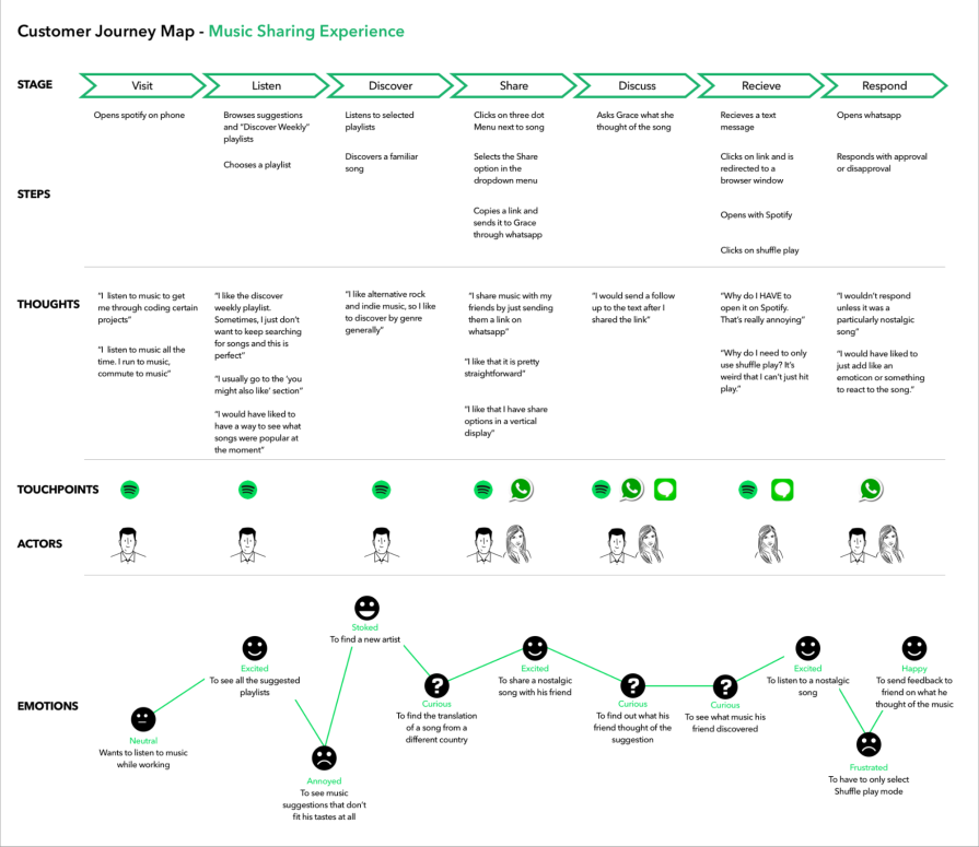
Most customer journey maps are segmented into stages, where each stage encapsulates a moment in the journey where customers do something significant. For example, the moment at which customers become aware of the brand or product might be labeled, “awareness stage.”
Next, what customers actually do at each stage is clearly described. This part is typically fueled by different types of research (e.g., the awareness stage might be fueled by a “Where did you first hear about us?” question in a survey). This particular customer journey map would’ve been fueled by session recordings exclusively since it focuses on what customers do on an app.
After that, customer journey maps usually declare the goals/expectations of customers. In this example, this has been replaced with their thoughts. Goals/expectations reveal intent whereas thoughts reveal needs, wants, outcomes, solutions, and other insights. Thoughts are useful but too vague by themselves — I recommend displaying both!
At this point it doesn’t really matter what comes next, but Spotify has opted to display the touchpoints. Touchpoints are where the steps of a stage take place. On this journey, most of the steps take place on the Spotify mobile app while a few others take place on WhatsApp and Messages.
Touchpoints are usually labeled or described (at the awareness stage you might even see an intangible “word of mouth” touchpoint), but since customers only touch down on apps on this journey, Spotify has chosen to display its app icons.
In addition, Spotify has combined the touchpoints with the ‘actors’ involved in them, providing an even clearer image of what’s happening at each stage. Displaying the actors isn’t as popular as it once was, but they’re nice to have if they don’t make the customer journey map look cluttered.
Other things that you might see on a customer journey map include general insights for added context, the customer emotions of each stage, the business objectives of each stage and any KPIs (key performance indicators) used to track them, any opportunities/plans to improve the customer experience of a stage, and NPSs (net promoter scores).
The most obvious thing about this customer journey map after having observed the Spotify customer journey map is that it’s not organized like a table. This layout makes it harder to pinpoint specific snippets of information:
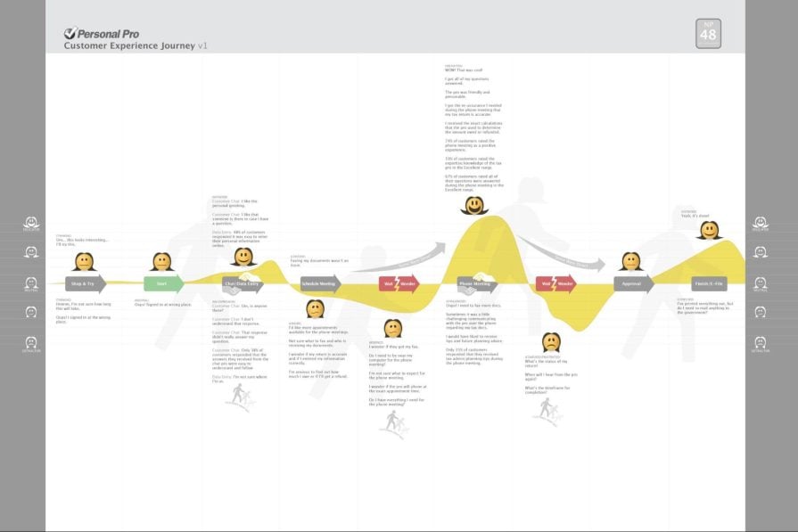
To add to the cognitive overload there are a few visual cues that are meant to symbolize something, but it’s not immediately clear what. This doesn’t mean that you should avoid visual cues, just that they need to be clear. Putting that aside though, showing where customers interact with customer service representatives, drop off, come to a halt, and skip stages is a nice touch and does present a richer story.
However, what’s missing from the story is the prologue and epilogue — how do they become aware of the product, what are their motivations for investigating it, and what do they feel and think after using it? For B2B (Business-to-Business) products where the customer isn’t necessarily a user, knowing what happens before and after can be even more critical than knowing what happens during.
To wrap this one up on a positive note though, I like that TurboTax displays the customer journey map’s NPS (that’s the number in the top-right corner). A customer journey map’s NPS represents how likely customers are to recommend the brand to friends, family, or colleagues based on the journey in question.
Right away you’ll see that some stages (e.g., “problem identification” and “problem analysis”) are categorized by an overarching stage (“define need— one to two weeks” in this case). This creates additional reference points and provides more clarity:
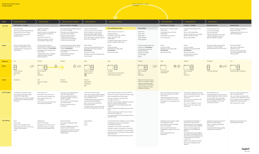
This particular example also specifies the timeframe of each “superstage,” since the customer journey takes place over several weeks. Keep in mind that your customer journey map might need something that no other or few other customer journey maps have.
“Relevance” refers to how important each stage is. Now I know what you’re thinking, shouldn’t they all be important? Well with a good customer experience the answer is yes, but to achieve that you’d first need to improve or even remove stages with low-to-medium relevance, and the first step towards doing that is identifying them.
I’m sure you’ve noticed that most customer journey maps depict the customer emotions using emojis, which is often the clearest way to do so. However, considering a retirement home for one’s parents can be a very emotional process not easily summarized by emojis, which is why this customer journey map explicitly puts the customer’s “thoughts” and “feelings” into words. You can also use words and emojis when it feels right to do so, like Spotify.
A bit further down on the customer journey map you’ll see “tactics”, which are basically the business objectives of each stage. It’s not enough to keep customers flowing, they must be converting or on their way to converting.
Rail Europe’s customer journey map is fairly ordinary, but what it includes before and after the actual map is noteworthy. At the top (so before the map) you’ll see “guiding principles” — these are essentially general insights for added context. At the bottom it lists “opportunities” for improvement, prompting investigation and thus another iteration of the customer journey map. These provide stakeholders with more of the story as they jump into the map and also opportunities to improve the story as they finish up with it:
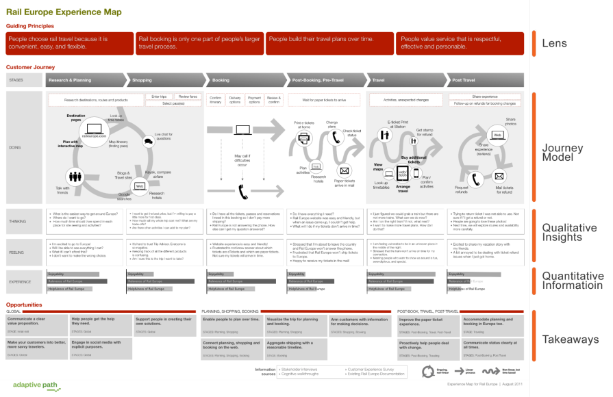
Without these, you risk the customer journey map becoming a static resource that goes out of date.
As you can see, customer journey maps provide a useful way of visually displaying the interactions a user has with your product. What works for one product doesn’t necessarily work for another, so it’s important to tailor your map to the goals that you have.
Is there a particular customer journey map that stands out to you? Or do you have a different example that you’d like to share? If so, please do so in the comment section below, and thanks for reading!
Featured image source: IconScout
LogRocket identifies friction points in the user experience so you can make informed decisions about product and design changes that must happen to hit your goals.
With LogRocket, you can understand the scope of the issues affecting your product and prioritize the changes that need to be made. LogRocket simplifies workflows by allowing Engineering, Product, UX, and Design teams to work from the same data as you, eliminating any confusion about what needs to be done.
Get your teams on the same page — try LogRocket today.

Map AI data risks, vet vendors, run safer pilots, and build legal buy-in for AI tools without creating security gaps.

SVP of Product Sriram Iyer visits to chat about how he uses AI to launch the “thinnest slice of pizza” product and shift mindsets around AI.

Controlled scope creep can help PMs use capacity buffers, AI tools, and clear guardrails to turn new ideas into better outcomes.
According to SVP Julia Dalton, managing humans at scale and managing AI agents have a lot more in common than most people realize.