The good news is that within agile methodologies there are metrics that you can use to demystify these with tangible figures. In this article, you’ll learn what agile metrics are, the different types of metrics, and how you can choose the right ones for your product.

Agile metrics are quantifiable figures used by PMs and stakeholders to define, track, and assess product performance. There are a range of agile metrics that each target a specific aspect of the product so that you have a holistic picture of its health.
By tracking metrics, you can also see how the product evolves over time in response to new features and development efforts.
Agile metrics can be categorized based on their usage of insights. The following are the different types of agile metrics:
Now that you have a sense of what agile metrics are and the different types of them, let’s turn our attention to some of the most popular ones.
Burndown charts are the most popular agile metric used by almost all the scrum practitioners. Burndown charts give you a visual representation of the amount of work remaining versus the total work planned. By examining a burndown, one can tell how many hours the team has burnt and how much work has been completed.
Scrum practitioners track mainly three different types of burndowns.
In a sprint burndown, you track the total work remaining for the sprint. It’s a chart showing hours burnt down or story points completed against the number of days in the sprint:
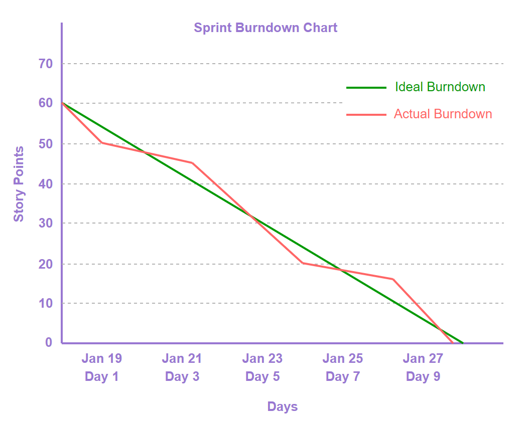
A sprint burndown chart is plotted with x-axis showing time (number of days in the sprint) against the y-axis showing the story points of hours planned in the sprint.
For example, if a scrum team of four people planned 256 hours or 32 story points for a sprint of 10 days, then the chart would show story points or hours on the y-axis and the 10 days on the x-axis.
An epic burndown chart tracks the total work items remaining to complete the epic. It shows the sprints burnt down against the total story points completed in the epic:
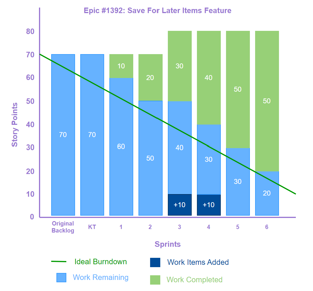
An epic burndown chart is plotted with x-axis showing sprints against the y-axis showing the story points planned in the epic.
For example, if a scrum team of four people planned to complete an epic having 40 user stories in eight sprints, then the chart would show story points of the 40 user stories on the y-axis and the eight sprints on the x-axis.
The chart would draw two slopes: the ideal burndown and the actual burndown. Unlike sprint burndown, an epic burndown tracks its progress across sprints, hence, there’s a need to visualize the work items or amount of work remaining in the epic to complete it and how many more sprints needed to complete the epic. The easiest way to visualize this would be to color code bars in the chart showing items completed in a sprint with one color and items remaining in another color.
A release burndown tracks the amount of work remaining to complete the release. The release burndown chart is similar to sprint or epic burndown where a chart is plotted showing number of story points completed or hours burnt against the sprints completed before the release. Similar to sprint burndown, the x-axis shows the time (sprints) completed before the release and the y-axis shows the story points (hours) which are burned against the sprint to complete the release.
A release burndown offers a broader perspective and is most effective when used in conjunction with sprint burndown.
The sprint velocity is the number of story points a team can complete in a given period of time. This helps scrum practitioners to know the capacity a team can take up and accomplish in a time-boxed sprint.
Sprint velocity is calculated by considering the story points completed by the team in the last few sprints (usually last three or five sprints) and calculating the average of it:
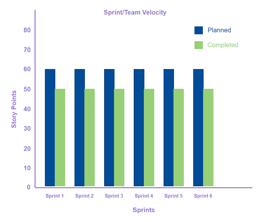
A sprint velocity chart helps to view the team’s performance in one view for the last couple of sprints. The y-axis shows the story points plotted against the sprints on the x-axis. The two bars in each sprint showcase planned vs the actual story points completed by the team.
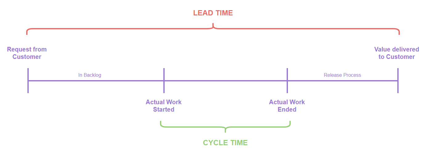
Lead time is one of the important metrics to track as it helps agile teams to measure efficiency and responsiveness. The lead time is the total time taken by a work item (user story, task, feature) from initiation (creation) to its completion.
Consider if a customer requested an issue to be fixed that started debugging on 25 Jan 2024 and was fixed on 30 Jan 2024. The lead time here is five days since it took five days to fix.
With lead time one can measure how much time it takes to complete a work item, whereas cycle time allows you to measure the actual time it takes to complete the work. It includes the subset of lead time where unlike lead time, the start point is considered from the actual start of implementation. For example, if the lead time of a user story is five days and on the third day the team has actually started implementing it, then the cycle time would be three days.
Any cycle time has two segments:
A control chart is a statistical tool that visually represents data points over a period, along with derived control limits (upper, lower, and center). Control charts helps to find:
Agile teams primarily use control charts to monitor the stability of lead and cycle time. They help agile teams to:
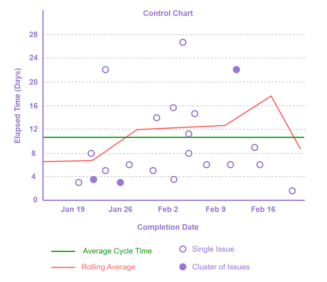
You plot a control chart with a y-axis showing the number of days it took to complete the user stories (work items) against the x-axis showing the date the work items was closed on. Each work item on the chart plain would be plotted visually as a dot representing both x and y axis.
For example, an issue that was completed on Jan 26 2024 and took five days to complete will have a dot representing it on the plain where x-axis (Jan 26) and y-axis (five days) intersect.
A cumulative flow diagram is a powerful visualization tool that offers agile teams the ability to understand the flow of work progresses through various stages of the development and the release process over time:
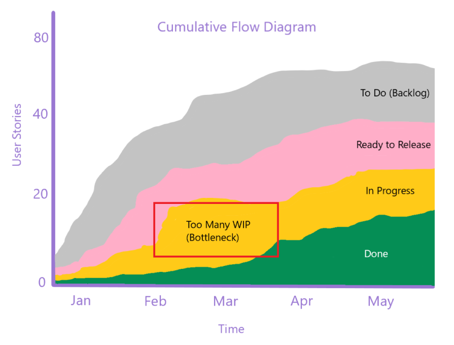
A CFD is a graph plotted with a y-axis showing user stories (cumulative work items) against the x-axis showing date range or sprints. The lines or areas in the chart plain show different stages being tracked.
For example, with a backlog of 100 user stories executed for around five months, each work item would go through three phases — to do, in progress, and done. The y-axis would plot the cumulative user stories, the x-axis would plot five months, and the three lines/areas would show items in different phases till completion.
It’s crucial for the success of your product to use the right metrics. Not all metrics are useful for any product. Follow these steps to ensure that you select the right ones:
Agile metrics are powerful visualization tools that help in tracking project progress, predicting timelines, as well measuring team health and customer satisfaction. If an agile team is facing collaboration issues, delays and unreliable deliveries, or dissatisfaction with team environment, you should define, track, and measure certain agile metrics which can help you take corrective measures to improve your performance and team happiness.
Based on the agile methodology adopted (scrum or Kanban) and the goals of a project, one should define certain metrics and also adopt common metrics per applicability. Keep evaluating the metrics along with project progress and add or remove metrics from board as per applicability.
Featured image source: IconScout
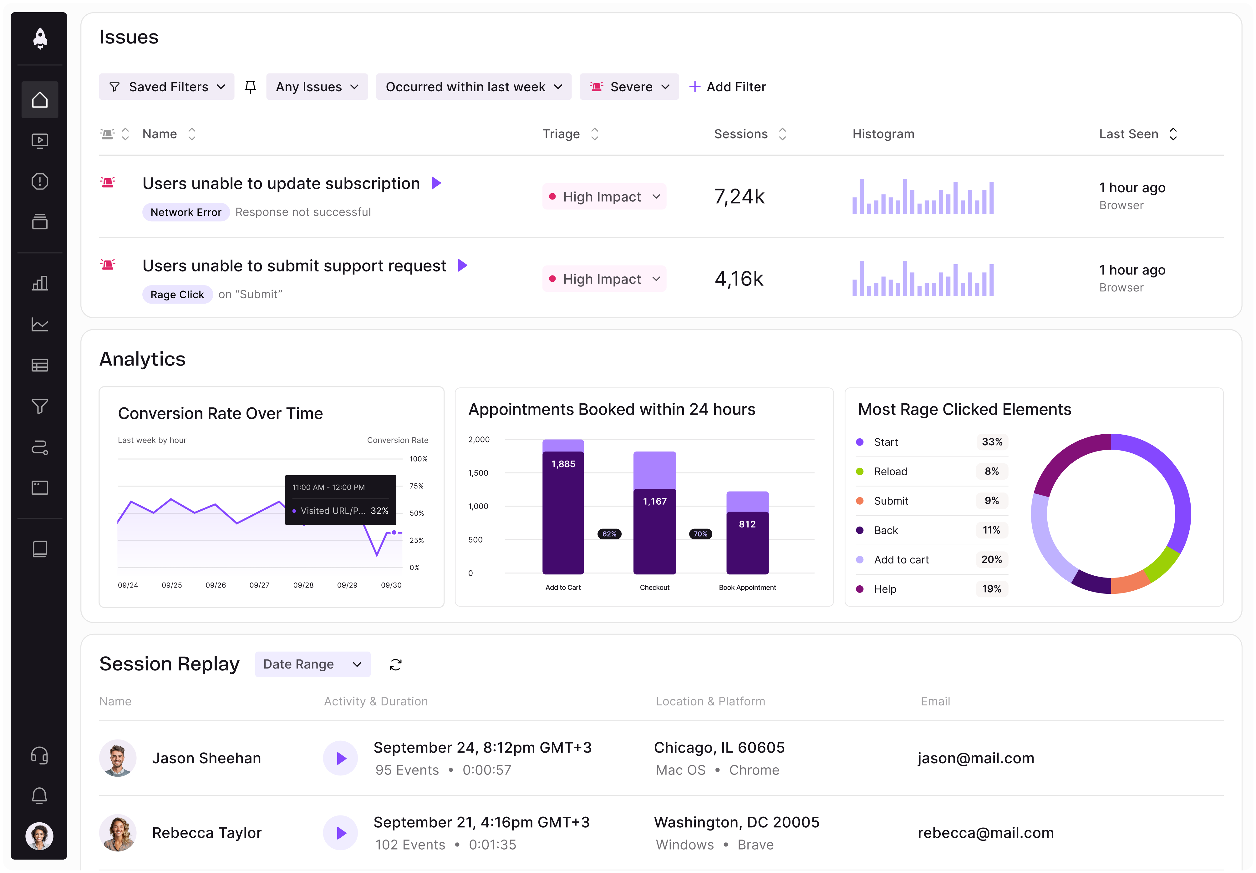
LogRocket identifies friction points in the user experience so you can make informed decisions about product and design changes that must happen to hit your goals.
With LogRocket, you can understand the scope of the issues affecting your product and prioritize the changes that need to be made. LogRocket simplifies workflows by allowing Engineering, Product, UX, and Design teams to work from the same data as you, eliminating any confusion about what needs to be done.
Get your teams on the same page — try LogRocket today.
Map AI data risks, vet vendors, run safer pilots, and build legal buy-in for AI tools without creating security gaps.

SVP of Product Sriram Iyer visits to chat about how he uses AI to launch the “thinnest slice of pizza” product and shift mindsets around AI.

Controlled scope creep can help PMs use capacity buffers, AI tools, and clear guardrails to turn new ideas into better outcomes.

According to SVP Julia Dalton, managing humans at scale and managing AI agents have a lot more in common than most people realize.