Having options is great, until you need to pick one. In product management, this applies to problems to solve, solutions to implement, or simply, things to do.

In this article, you’ll learn how affinity mapping is used to organize qualitative data such as feedback, ideas, and tasks so that it’s easier to understand. This’ll help you to make the right decisions quickly as opposed to the wrong decisions or the right decisions slowly.
Affinity mapping is the process of organizing qualitative data into groups in order to make more sense of it. The resulting affinity diagram should provide actionable insights that you can utilize to meet a specific objective.
The term is a combination of the words map and affinity, meaning “to visualize” and “the relationships between things” respectively.
The core principle of affinity mapping is organizing the data in a way that provides the actionable insights needed to meet a specific objective. In other words, you have to work backwards, first clarifying what the objective is, then deciding how to organize the data. If you don’t take this approach, you could end up organizing your data in a useless way.
Affinity mapping can be used in many scenarios: UX design, general product management, and even everyday life. Normally, affinity mapping is used for organizing user/customer/stakeholder feedback, not only to identify common problems but to prioritize them as well.
This is more effective than brainstorming and other decision-making methods because the feedback is quantified, surfacing the most concerning problems, whereas brainstorming often causes analysis paralysis (the inability to make a decision) and bias.
In short, affinity mapping cuts out the endless debates. It’s far more productive, and it’s the same process when picking solutions to implement. Both can be used to plan product roadmaps efficiently.
Affinity mapping can also be used to prioritize generic tasks.
You can even use affinity mapping as a UX research exercise, where the participants themselves create affinity diagrams to label and categorize a digital product’s navigation items in a way that makes sense to them, resulting in a navigational structure with a great user experience (quite literally handpicked by users). This is better known as “card sorting.”
To better understand how you can use affinity mapping, let’s take a look at four scenarios. Affinity mapping help you:
When it comes to synthesizing user/customer/stakeholder feedback, group instances of the same feedback together. This enables you to order the feedback by its modal value (i.e. how often it occurs), which is a signal of how critical it is to address it.
This process is fairly simple, however, be ultra mindful about what’s actually being said in the feedback. For example, “I couldn’t find [x] (a problem),” isn’t the same thing as “Make [x] bigger” (a potential solution) — although they appear to be communicating the same thing, in actuality the best solution might not be to make [x] bigger but to make [y] or [z] smaller.
In cases like this, it’s best to follow up with the respondent and clarify exactly what the problem is before creating the affinity diagram.
Ultimately, you’d end up with something that looks like this:
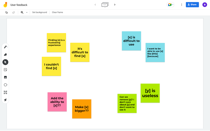
This example was made with Google Jamboard (which is free), but any diagramming tool with sticky note or sticky note-like features will do — there’s no need to use an affinity mapping tool since your product team probably already has a whiteboard tool or a wireframe tool with those features in their toolbox.
Identifying problems to solve is what I call a two-part affinity mapping exercise. It’s not enough to know which problems are the most critical from the respondent’s point of view; as a product manager, you also need to manage time, budgets, and business objectives. You must ask yourself:
This time around, the feedback might fall into any, all, or none of the groups, so you’ll want to create a venn diagram. Although venn diagrams aren’t affinity diagrams in the traditional sense, they enable you to sort data into multiple groups. In this case, you’ll sort the most common feedback (say, the top five) into the three groups mentioned above:
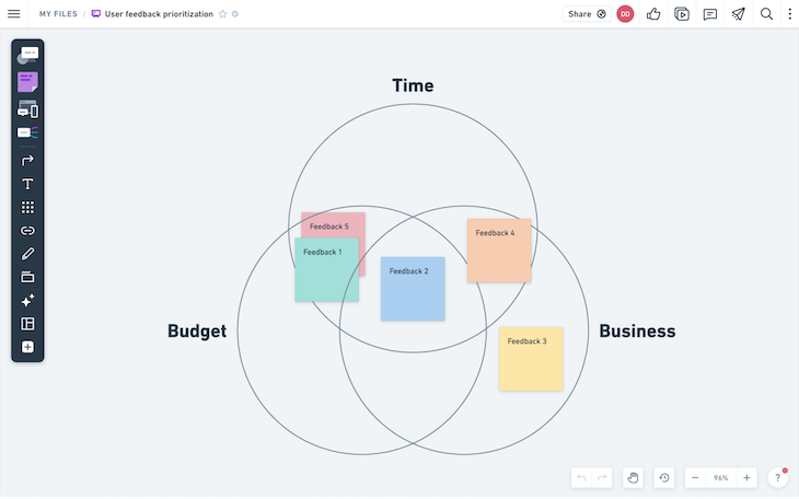
I used Whimsical for this because they have a venn diagram template (Whimsical isn’t free though).
What you’d end up with is the most common snippets of feedback visualized by how valuable they are as an opportunity. Hopefully you’ll see that some of the problems are quick to solve, cheap to solve, and have a high ROI.
It doesn’t really matter which feedback you address first. Remember, they’re all relatively high-priority, so you’ll probably want to address all of them eventually anyway. For better organization and tracking, you could use a project management tool such as Jira, Trello, or Asana, perhaps even creating a product roadmap.
Affinity mapping can also be used to group tasks by how quickly they can be completed, for the purpose of helping stagnant product teams become more productive. This can be especially refreshing for teams that have been working on particularly lengthy tasks, leaving them feeling burnt out and/or feeling as if they haven’t really progressed.
In this case, group each task into one of the following three categories:
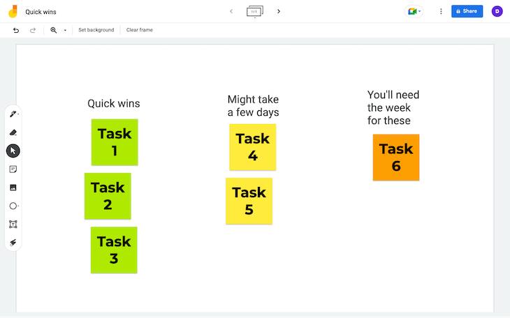
Naturally, if your product team was in need of a dopamine/motivation boost or if the overall number of pending tasks were making you feel overwhelmed, you’d want to focus on tasks that could be completed today (these are sometimes referred to as ‘quick wins’).
Avoid tackling tasks that’d take more than a day, as more often than not this sends people down a rabbit hole, causing them to completely lose focus on the primary objectives, especially if the weight of the heavier tasks have come to feel like a burden. This isn’t a strict rule though — well-organized product teams (particularly those that are lean-orientated) tend to be able to pivot business objectives with their energy levels a little better, so permit what feels right for your team.
This technique can also be used to prioritize tasks in other ways, for example by budget-friendliness.
Card sorting is a UX research exercise where participants are given a list of pages and functional requirements and are asked to label them (as a link or button), group them into navigation categories, and then label the categories. This helps UX designers craft the perfect navigation for an app or website. This particular card sort test is called open card sorting and is a formative type of UX research:
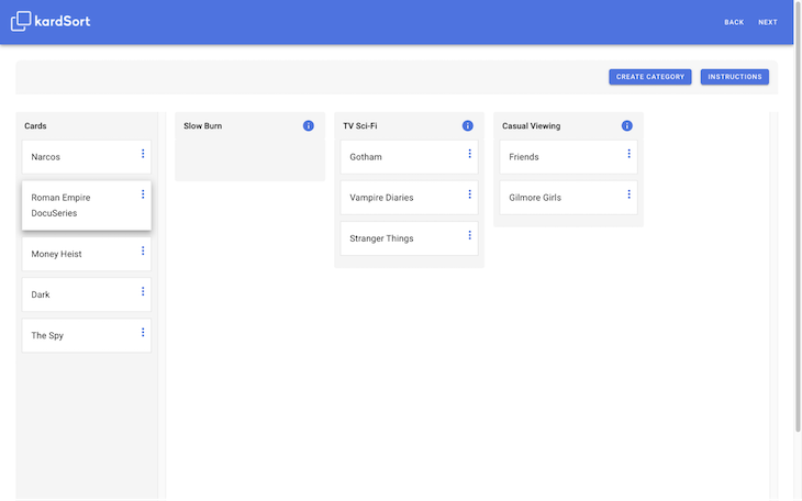
Closed card sorting is the same except that the navigation items and categories are already labeled. It’s a summative type of UX research used to confirm the hypothesis (i.e. that the end-result is in fact the best way to organize the navigation).
As you might’ve guessed, these exercises are basically affinity mapping exercises, except that it’s the UX research participants doing them.
That being said, card sorting can be an exercise for stakeholders too. For example, if you were in the solution phase but you’d like to present something better than an MVP, card sorting doesn’t take that long and is still quite lean.
Although you’d need a specific type of tool for card sorting with real research participants, card sorting internally can be done with any diagramming tool that has sticky note or sticky note-like features. That being said, kardSort (shown in the image above) is free and designed specifically for card sorting.
Affinity mapping is an incredible way of organizing data. Creating affinity diagrams makes it easier to synthesize the data, understand it, turn it into actionable tasks, and even prioritize said tasks. It reduces guesswork, so it’s more reliable than other methods such as brainstorming. It also makes the right choices feel obvious from the get go, so it shortens debates.
I’ve always thought of affinity mapping as a visual interface for the way that our brains naturally work
All-in-all, affinity mapping is lean and helps product teams to blaze right through key milestones without cutting any corners.
Featured image source: IconScout
LogRocket identifies friction points in the user experience so you can make informed decisions about product and design changes that must happen to hit your goals.
With LogRocket, you can understand the scope of the issues affecting your product and prioritize the changes that need to be made. LogRocket simplifies workflows by allowing Engineering, Product, UX, and Design teams to work from the same data as you, eliminating any confusion about what needs to be done.
Get your teams on the same page — try LogRocket today.

Controlled scope creep can help PMs use capacity buffers, AI tools, and clear guardrails to turn new ideas into better outcomes.
According to SVP Julia Dalton, managing humans at scale and managing AI agents have a lot more in common than most people realize.
AI can make PM thinking generic. Learn how to use it without losing judgment, user nuance, or product differentiation.

Learn a 3-lens framework that helps product managers shift stakeholder requests from feature ideas to real problems and outcomes.