React Native developers often have to use various form controls in their mobile apps. In some development scenarios, we may have to enable multi-selections in dropdown components.

For example, imagine you have an AI-based travel planner app and you want users to select their preferred destinations. You could list all available destinations in a multi-select dropdown to let the user choose multiple locations.
Besides inbuilt React Native form controls like buttons, switches, text inputs, and more, there are many open source community packages that offer pre-developed form controls. You can use existing multi-select dropdown packages or build one from scratch for your React Native app.
In this tutorial, we’ll use the popular react-native-sectioned-multi-select package — a better alternative to the react-native-multiple-select package. We’ll also explore how to build a multi-select dropdown from scratch with inbuilt React Native core components.
Let’s start by highlighting some standout features of the react-native-sectioned-multi-select package and then explore its customization options using practical examples, going from basic to advanced. You can follow along with the library implementation below and check out the code for the from-scratch dropdown demo that we’ll go over later.
The Replay is a weekly newsletter for dev and engineering leaders.
Delivered once a week, it's your curated guide to the most important conversations around frontend dev, emerging AI tools, and the state of modern software.
react-native-sectioned-multi-selectThe react-native-sectioned-multi-select library offers many useful features for adding cross-platform, customizable, and user-friendly multi-select dropdowns on Android and iOS platforms. Let’s explore some of its key features now.
This library offers a UI/UX-friendly, modal-based, fully-featured multi-select dropdown with a searchable sectioned multi-select list. It comes with inbuilt styles and reasonable behavioral defaults that let you satisfy your design requirements with less code.
The library also exposes numerous props to allow you to adjust the dropdown component’s default behavior and customize default styling.
This library’s multi-select dropdown component follows a better UI/UX-friendly design that improves user productivity. For example, the component offers an inbuilt feature that lets users select all items of a specific section by clicking on the particular section header.
Also, this multi-select dropdown component comes with a search box to help users find items quickly. Moreover, it renders the sectioned list on a modal to separate the multi-select UI from the main app screen.
The react-native-sectioned-multi-select project contains pure JavaScript code without native modules written in platform-specific languages like Kotlin, so it works with any mobile platform and Expo.
Additionally, this dropdown component renders the same visuals on Android and iOS mobile platforms since it uses cross-platform React Native core components.
react-native-sectioned-multi-selectWe discussed the highlighted features that the react-native-sectioned-multi-select library offers for creating multi-select dropdowns. Let’s use this library in a sample React Native project to explore its features and customizability options.
I’ll use an Expo project to demonstrate this library on the React Native framework. To get started with this tutorial, create a new Expo project like so:
npx create-expo-app MultiSelectDropdownDemo
cd MultiSelectDropdownDemo
You can also set up a new React Native project without Expo via the official React Native CLI and continue with the tutorial:
npx react-native init MultiSelectDropdownDemo
cd MultiSelectDropdownDemo
Next, we need to install the react-native-sectioned-multi-select npm package. This package needs an icon object from the react-native-vector-icons/MaterialIcons, so we have to install @expo/vector-icons as well. Install both packages into your newly created Expo with the following command:
npx expo install react-native-sectioned-multi-select @expo/vector-icons
If you don’t use Expo, you can install packages using the following commands:
npm install react-native-sectioned-multi-select react-native-vector-icons
# --- or ---
yarn add react-native-sectioned-multi-select react-native-vector-icons
Let’s create a basic multi-select dropdown by using only the required props. We’ll add a dropdown component to select multiple vehicle types.
Add the following code to your App.js file:
import React, { useState } from 'react';
import { StyleSheet, View } from 'react-native';
import SectionedMultiSelect from 'react-native-sectioned-multi-select';
import { MaterialIcons as Icon } from '@expo/vector-icons';

const items = [
  { name: 'Cars', id: 1},
  { name: 'Vans', id: 2},
  { name: 'SUVs', id: 3},
  { name: 'Motorbikes', id: 4 },
  { name: 'Trucks', id: 5},
];

export default function App() {
  const [selectedItems, setSelectedItems] = useState([]);
  console.log('Selected:', selectedItems);

  return (
    <View style={styles.container}>
      <View>
        <SectionedMultiSelect
          items={items}
          IconRenderer={Icon}
          uniqueKey="id"
          onSelectedItemsChange={setSelectedItems}
          selectedItems={selectedItems}
        />
      </View>
    </View>
  );
}

const styles = StyleSheet.create({
  container: {
    flex: 1,
    backgroundColor: '#fff',
    justifyContent: 'center',
    padding: 24,
  },
});
If you don’t use Expo, make sure to import the icon object from react-native-vector-icons as follows:
import Icon from 'react-native-vector-icons/MaterialIcons';
The above JSX code snippet creates a basic multi-select dropdown by importing the pre-developed SectionedMultiSelect component. Here, we used the selectedItems state field to hold an array of selected item indices, id as the unique key, and name as the display field.
You will see the following result when you run the above source code:

Once you press the Confirm button in the dropdown modal, you’ll see selected items on the console as follows:

As the library name suggests, the react-native-sectioned-multi-select library lets you group items into sections using child item arrays within dropdown item objects.
Create several vehicle models as sub-items using the items property:
const items = [
  { name: 'Cars', id: 1,
    items: [
        { name: 'Nissan Sunny', id: 100 },
        { name: 'Toyota Corolla', id: 101 },
        { name: 'Honda Civic', id: 102 },
      ]
  },
  { name: 'Vans', id: 2,
    items: [
        { name: 'Ford Transit', id: 200 },
        { name: 'Toyota Sienna', id: 201 },
      ]
  },
  { name: 'SUVs', id: 3,
    items: [
        { name: 'Toyota RAV4', id: 300 },
        { name: 'Ford Explorer', id: 301 },
      ]
  },
  { name: 'Motorbikes', id: 4,
    items: [
        { name: 'Kawasaki KX', id: 400 },
        { name: 'Ducati Panigale', id: 401 },
        { name: 'BMW Roadster', id: 402 },
      ]
  },
];
Next, activate sub-items using the subKey property of the SectionedMultiSelect component:
<SectionedMultiSelect
  items={items}
  IconRenderer={Icon}
  uniqueKey="id"
  subKey="items"
  onSelectedItemsChange={setSelectedItems}
  selectedItems={selectedItems}
/>
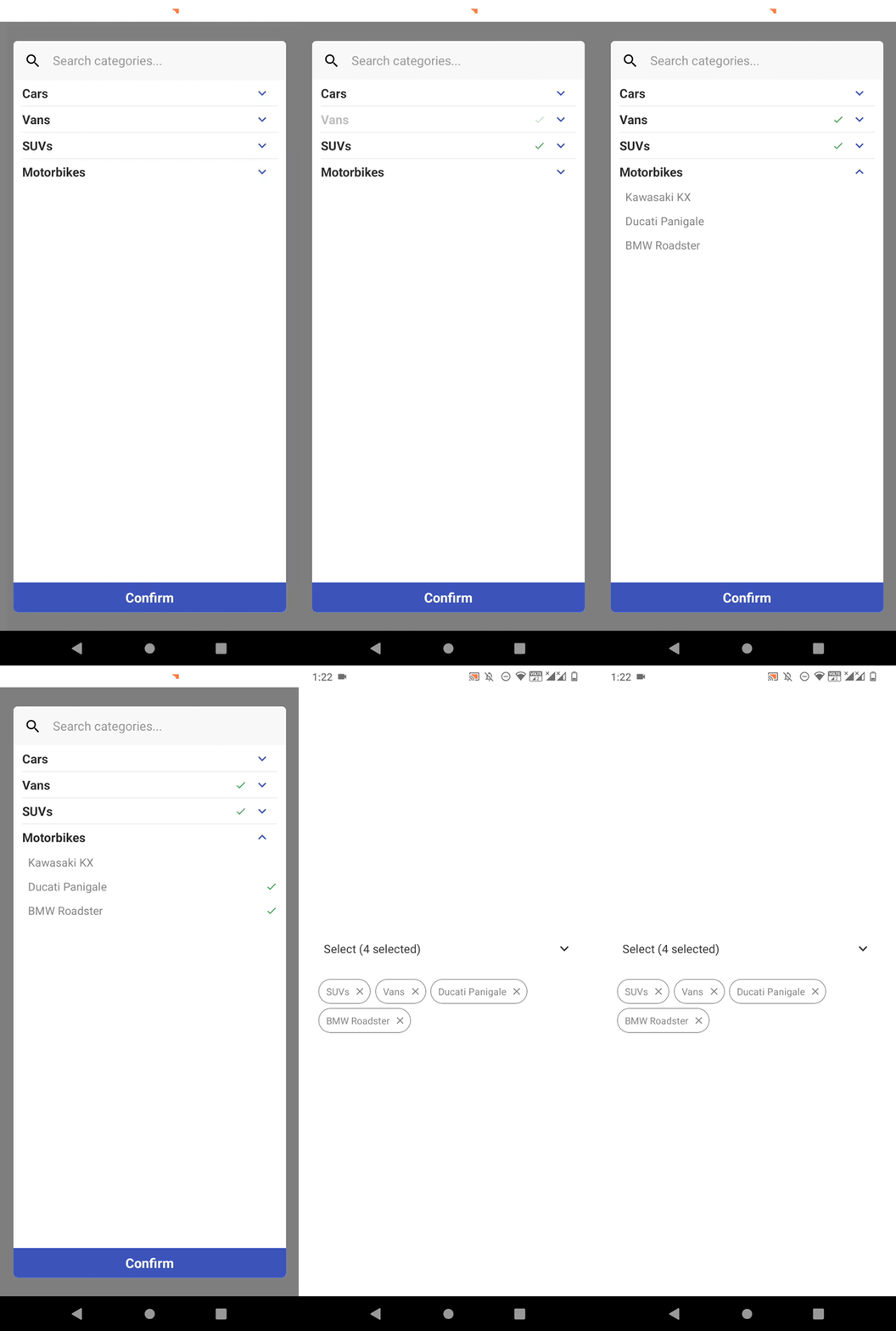
Earlier, we could select multiple vehicle types from the dropdown. Now, it’s possible to select both vehicle types and vehicle models using the new dropdown, as shown in the following preview:

As you can see in the above preview, by default, we can select vehicle types by tapping on the parent section header.
By default, the SectionedMultiSelect component displays selected items as tag elements, also called chips. Additionally, it shows several pre-defined text labels and implements some helpful control elements, like a Confirm button, search icon, and more, within the multi-select component.
You can customize these visuals using various props. For example, add the following component props to your app:
selectText="Choose some vehicles..."
searchPlaceholderText="Search vehicles..."
modalAnimationType="slide"
colors={{primary: '#c98422'}}
The above props use custom texts for select box and search placeholder labels, changes the default modal animation, and changes the primary theme color. Once you use the above props with the app code, you will see the following result:

In the previous code snippet, we used only the primary color key, but react-native-sectioned-multi-select offers many color keys to help developers implement custom color schemes for multi-select dropdowns. Browse all supported color props and defaults in the official docs.
The react-native-sectioned-multi-select library lets you add or modify child components within the main component with props. For example, headerComponent and footerComponent props let you embed extra components in the modal.
Use the following props in your multi-select component:
hideSearch={true}
expandDropDowns={true}
headerComponent={<MultiSelectHeader/>}
footerComponent={<MultiSelectFooter itemCount={selectedItems.length}/>}
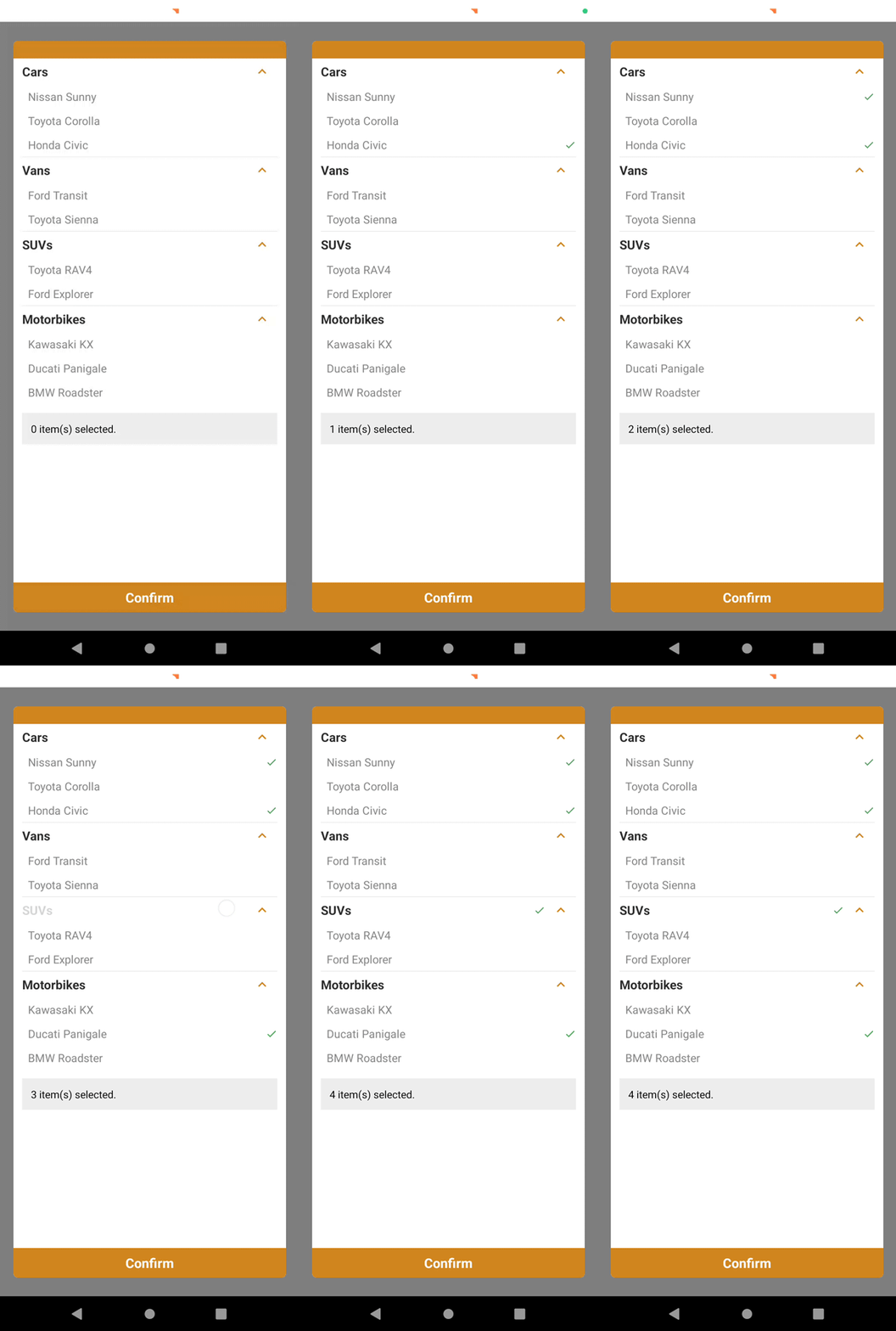
Here, we added a header and footer child components to the multi-select modal via props. Also, the hideSearch and expandDropDowns props hide the search box and auto-expand all sections, respectively.
Next, we need to define two new React functional components as follows:
function MultiSelectHeader() {
  return (
    <View style={styles.multiSelectHeader}></View>
  );
}

function MultiSelectFooter({ itemCount }) {
  return (
    <View>
      <Text
        style={styles.multiSelectFooterText}>
        {itemCount} item(s) selected.</Text>
    </View>
  );
}
The above child components use several styles from the stylesheet, so update your app stylesheet with the following definitions:
multiSelectHeader: {
  height: 24,
  backgroundColor: '#c98422'
},
multiSelectFooterText: {
  padding: 12,
  marginTop: 12,
  backgroundColor: '#eee'
},
Once you update your app source code, you will see a custom header and footer, as shown in the following preview:

Similarly, the multi-select component offers searchIconComponent, selectedIconComponent, unselectedIconComponent, and other props for customizing default visual segments of the component.
This multi-select library implements UI/UX-friendly defaults, but you can adjust them according to your app design standards and guidelines with component props.
These behavioral customizations help developers tweak their apps for better productivity and usability. For example, setting true for the readOnlyHeadings prop disables selecting parent sections as selectable items in your React Native app’s multi-select dropdown.
Consider using the following prop in the SectionedMultiSelect component for a demonstration:
readOnlyHeadings={true}
This prop disables selecting parent sections and expands or collapses section dropdowns as shown in the following preview:

On the other hand, you can use the highlightChildren prop to disable child item selections by auto-highlighting related child items once the parent section is selected.
If you make parent sections selectable in your multi-select dropdown, you can use parentChipsRemoveChildren to remove all child items once the user clicks on a specific parent tag’s remove icon:
parentChipsRemoveChildren={true}
The above multi-select configuration behaves as follows:

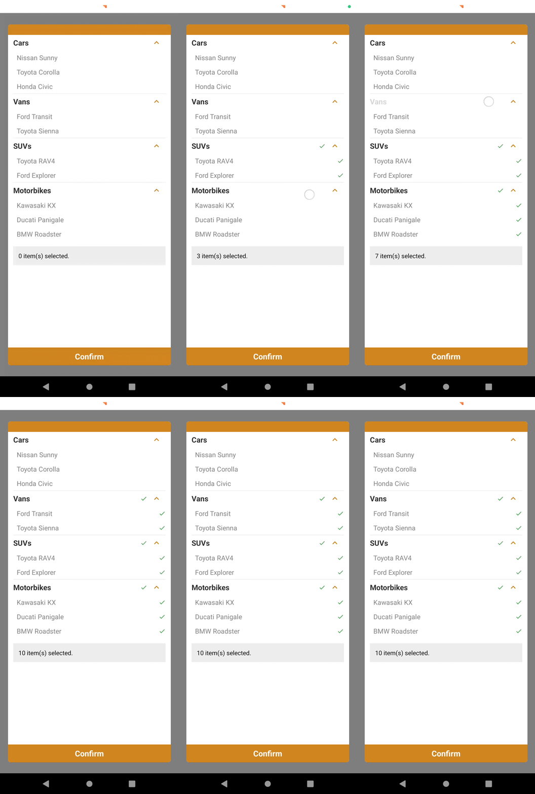
You can also configure the component to auto-select sub-items when you tap on a specific parent element by using the following setup:
selectChildren={true}
Now, it’s possible to select all sub-items of a parent element at once like so:

The multi-select component exposes several event handler props to let developers attach event callback functions. The onSelectedItemsChange event handler prop helped us in previous examples to get the currently selected item indices array.
SectionedMultiSelect triggers the following events:
| Event handler prop | Handler description |
|---|---|
onSelectedItemObjectsChange |
A function that returns the selected items as their original objects instead of an array of identifiers |
onCancel |
A function that runs when the cancel button is pressed |
onConfirm |
A function that runs when the confirm button is pressed |
onToggleSelector |
A callback function that runs when the selector is toggled. It receives a boolean for the open/close state of the modal |
As we learned in previous sections, the colors prop offers a way to set a custom color theme for multi-select dropdowns. This multi-select component also offers several props to use custom font families for labels.
However, customizing colors and font families is not enough to satisfy unique design requirements, so this library lets you override internal styles via the styles prop.
Assume that you need to customize the backdrop of the modal and the multi-select input box with custom styles. You can use a custom styles object as follows for this requirement:
styles={{
  backdrop: styles.multiSelectBackdrop,
  selectToggle: styles.multiSelectBox
}}
Here are the styling definitions that you need to add to your stylesheet:
multiSelectBackdrop: {
  backgroundColor: 'rgba(255, 183, 0, 0.2)',
},
multiSelectBox: {
  borderWidth: 1,
  borderRadius: 8,
  borderColor: '#bbb',
  padding: 12,
  marginBottom: 12
},
The above styles object customizes the backdrop and the input box as follows:

Assume that you need to customize selected item tags with a custom styling setup, as shown in the following preview:

To get the above multi-select style, you need to set custom styling definitions for chipContainer and chipText keys via the styles object:
styles={{
  backdrop: styles.multiSelectBackdrop,
  selectToggle: styles.multiSelectBox,
  chipContainer: styles.multiSelectChipContainer,
  chipText: styles.multiSelectChipText,
}}

// in stylesheet
multiSelectChipContainer: {
  borderWidth: 0,
  backgroundColor: '#ddd',
  borderRadius: 8
},
multiSelectChipText: {
  color: '#222',
  fontSize: 14.5
}
There are about 30 different style object properties to customize the styling properties of the multi-select component. Browse all supported style object keys from the official documentation on GitHub.
Earlier, we used custom static text for the select box placeholder and search box placeholder by sending strings to selectText and searchPlaceholderText props.
By default, this library sets a dynamic text for the select box based on the following cases:
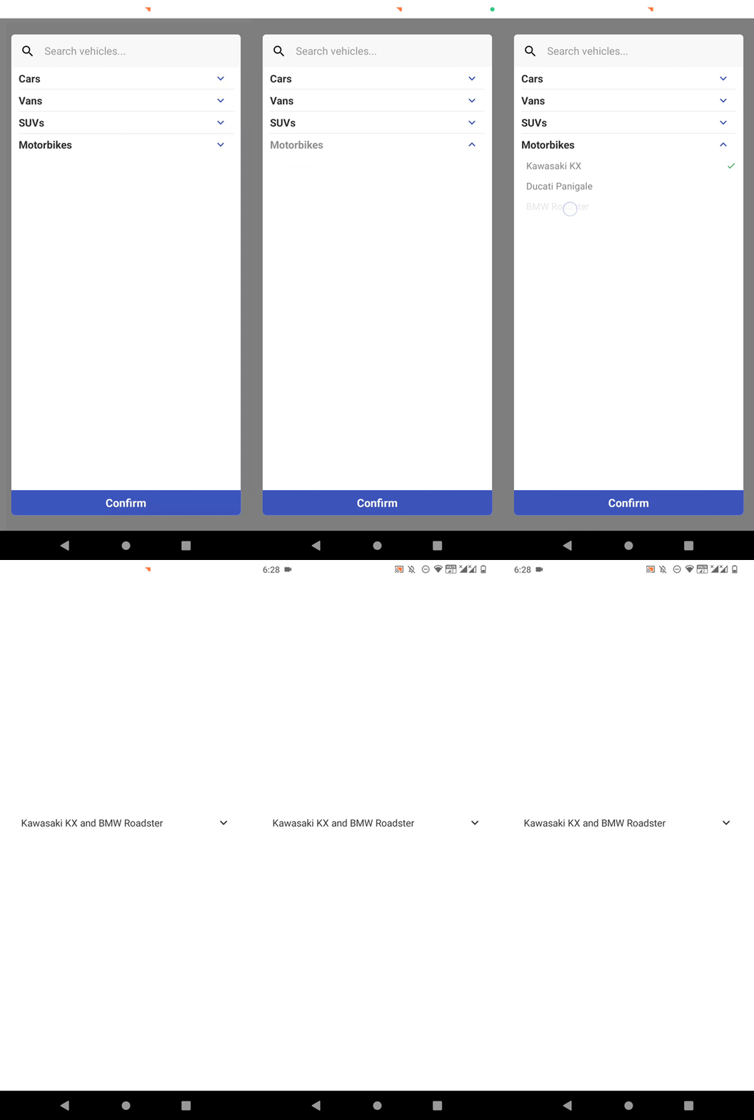
Assume that your UI/UX standards and guidelines need to adjust the above logic as follows:
, and and connectors (e.g., Kawasaki KX, Ducati Panigale, and BMW Roadster) only if the selected vehicle count is greater than zero and less than threeCustomizing select box text is possible with the renderSelectText prop. Look at the following App component code:
export default function App() {
  const [selectedItems, setSelectedItems] = useState([]);
  const [selectedItemObjects, setSelectedItemObjects] = useState([]);

  console.log('Selected:', selectedItemObjects);

  function renderSelectText() {
    let c = selectedItems.length;
    if(c <= 3) {
      return selectedItemObjects.map((item) => item.name).
            join(', ').replace(/, ([^,]*)$/, ' and $1')
    }

    if(c > 3) {
      return `${c} vehicle(s) selected`;
    }

    return 'Choose some vehicles...';
  }
  return (
    <View style={styles.container}>
      <View>
        <SectionedMultiSelect
          items={items}
          IconRenderer={Icon}
          uniqueKey="id"
          subKey="items"
          selectedItems={selectedItems}
          selectText="Choose some vehicles..."
          searchPlaceholderText="Search vehicles..."
          onSelectedItemsChange={setSelectedItems}
          onSelectedItemObjectsChange={setSelectedItemObjects}
          renderSelectText={renderSelectText}
          showChips={false}
          readOnlyHeadings={true}
        />
      </View>
    </View>
  );
}
Run the above code, select several items, and look at the development preview:

This multi-select dropdown offers an inbuilt clear-all-items feature via the showRemoveAll prop, which renders an additional tag for clearing all selected items without opening the modal. In some scenarios, we have to select or clear all items programmatically via other UI elements. This library offers two internal methods for this requirement.
Let’s implement two buttons to select and clear all items. To access these internal methods, first, you need to create a React ref as follows:
const ref = useRef(null);

...
<SectionedMultiSelect
  ref={ref}
...
...
Next, add the following JSX content after the SectionedMultiSelect component:
<View style={{paddingTop: 12}}>
  <Button title="Select all" onPress={() => ref && ref.current && ref.current._selectAllItems()}
/>
  <View style={{padding: 6}}/>
  <Button title="Remove all" onPress={() => ref && ref.current && ref.current._removeAllItems()}
/>
</View>
Make sure that showChips is set to {true} in the multi-select component. Now, it’s possible to select and clear all items with two buttons, as shown in the following preview:

Moreover, this multi-select dropdown component library exports the _toggleSelector internal method to programmatically open and close the dropdown modal.
Developers often use sectioned multi-select dropdowns to display items with categories, so adding icons for each category container becomes a common requirement. The react-native-sectioned-multi-select library lets you set category icons by sending icon identifiers of the selected icon collection.
Let’s add some icons for the sample app’s categories. First, add icon keys to the items object as follows:
const items = [
  { name: 'Cars', id: 1, icon: 'directions-car',
    items: [
        { name: 'Nissan Sunny', id: 100 },
        { name: 'Toyota Corolla', id: 101 },
        { name: 'Honda Civic', id: 102 },
      ]
  },
  { name: 'Vans', id: 2, icon: 'airport-shuttle',
    items: [
        { name: 'Ford Transit', id: 200 },
        { name: 'Toyota Sienna', id: 201 },
      ]
  },
  { name: 'SUVs', id: 3, icon: 'car-repair',
    items: [
        { name: 'Toyota RAV4', id: 300 },
        { name: 'Ford Explorer', id: 301 },
      ]
  },
  { name: 'Motorbikes', id: 4, icon: 'motorcycle',
    items: [
        { name: 'Kawasaki KX', id: 400 },
        { name: 'Ducati Panigale', id: 401 },
        { name: 'BMW Roadster', id: 402 },
      ]
  },
];
Next, activate icon rendering by mentioning the icon property name as follows, along with a custom style for itemText for better spacing:
<SectionedMultiSelect
  iconKey="icon"
  styles={{itemText: {marginLeft: 5, fontSize: 17}}}
  ...
  ...
Open the multi-select modal and look at category icons:
![]()
It’s possible to set icons for sub-items using the same icon property within sub-item objects. This library lets you use icons from imported local images, web URLs, and custom icon packages, as explained in the official documentation on GitHub.
We used a hard-coded static items list with previous examples, but in real-world development scenarios, we often load data from RESTful services over the internet. Let’s fetch some items from JSONPlaceholder.
Update the component source code as follows:
export default function App() {
  const [items, setItems] = useState(null);
  const [selectedItems, setSelectedItems] = useState([]);

  function loadUsers() {
    fetch('https://jsonplaceholder.typicode.com/users')
      .then(response => response.json())
      .then(users => setTimeout(() => setItems(users), 3000));
  }

  console.log('Selected:', selectedItems);

  return (
    <View style={styles.container}>
      <View>
        <SectionedMultiSelect
          items={items}
          IconRenderer={Icon}
          uniqueKey="id"
          subKey="items"
          selectedItems={selectedItems}
          selectText="Choose some users..."
          searchPlaceholderText="Search users..."
          onSelectedItemsChange={setSelectedItems}
          onToggleSelector={(opened) => opened && loadUsers()}
          loading={items === null}
        />
      </View>
    </View>
  );
}
Here we used the inbuilt fetch function to load users from the JSONPlaceholder RESTful web API. The loading prop helps us display a loading animation for the fake three-second network latency.
Look at the following preview:

The react-native-sectioned-multi-select package is a fully-featured external library. So, it increases your app bundle size, as any other npm module.
react-native-bundle-visualizer detects only ~30 kilobytes of JavaScript bundle increment for this multi-select library, which is negligible compared to the size of the React Native framework. However, you can also build your own, customizable multi-select dropdown component from scratch and avoid using multi-select libraries.
Let’s see how to do this now. Here is a preview of a minimal multi-select dropdown built with inbuilt React Native core components:

You can browse the complete source code of this multi-select dropdown implementation from this GitHub repository. This sample multi-select dropdown uses the following behavioral logic:
You’ll notice the following implementation details when you inspect the source:
MultiSelect reusable component exposes items and onSelectedItemsChange props for basic functionalityselectedItems array and calls the onSelectedItemsChange handler with the selected item identifiersThis multi-select dropdown is very minimal and has no animations, customization props, or advanced features like item search. You can extend it according to your design requirements by forking the GitHub repository.
Multi-select dropdown implementation is also possible with libraries like react-native-multiple-select and react-native-multi-selectbox. Let’s compare popular multi-select dropdown libraries and the from-scratch approach in a table:
| Comparison factor | react-native-sectioned-multi-select | react-native-multiple-select | Without a library (i.e., react-native-multi-select-minimal) |
|---|---|---|---|
| Rendering of items | Uses a modal, so the item list won’t interfere with other app controls | Doesn’t use a modal, so the item list can push down other form controls | Depends on the implementation method |
| Inbuilt features | Offers many, well-organized features with better flexibility | Offers many features, but not feature-rich as react-native-sectioned-multi-select | None |
| Pre-styled to boost developer-productivity | Yes | Yes | No |
| Customizability | Very good | Good | No customizability restrictions as when using an external library |
| Usage scenarios | Usable for creating multi-select dropdowns in any React Native app | Usable for creating multi-select dropdowns in any React Native app | When you need a minimal or domain-specific advanced multi-select dropdown |
According to the above comparison summary, react-native-sectioned-multi-select offers a better solution for implementing customizable multi-select dropdowns in almost all development scenarios. You can learn advanced customizations and upcoming features by browsing its GitHub repository.
However, implementing a multi-select from scratch improves your React Native skills and offers the maximum development flexibility. So, for implementing minimal or domain-specific advanced multi-selects, building your own multi-select is undoubtedly a better option.
In this tutorial, we learned how to create multi-select dropdowns in React Native apps with practical examples. We discussed the fully-featured react-native-sectioned-multi-select package and built one multi-select dropdown from scratch with React Native core components.
Regardless of the implementation method, consider using better UI/UX principles in multi-select components to offer better productivity for app users.

LogRocket's Galileo AI watches sessions for you and and surfaces the technical and usability issues holding back your React Native apps.
LogRocket also helps you increase conversion rates and product usage by showing you exactly how users are interacting with your app. LogRocket's product analytics features surface the reasons why users don't complete a particular flow or don't adopt a new feature.
Start proactively monitoring your React Native apps — try LogRocket for free.

A step-by-step guide to building your first MCP server using Node.js, covering core concepts, tool design, and upgrading from file storage to MySQL.

Using security headers in your Next.js apps is a highly effective way to secure websites from common security threats.

A deep dive into April 2026’s AI model and tool rankings. We break down performance, usability, pricing, and real-world capabilities across 50+ features to help you pick the right tools for your development workflow.

A practical guide to Agent Browser CLI. Learn how AI agents navigate, snapshot, and interact with web pages using stable references, enabling efficient automation and exploratory testing.
Would you be interested in joining LogRocket's developer community?
Join LogRocket’s Content Advisory Board. You’ll help inform the type of content we create and get access to exclusive meetups, social accreditation, and swag.
Sign up now