Editor’s note: This article was updated on 28 February 2022 to remove and correct any outdated information as well as add the Building a skeleton UI in React with Framer Motion section.

A skeleton screen is a UI that doesn’t contain actual content but instead offers a low-fidelity page wireframe before content completely loads. This way the user understands how to navigate within the page when content eventually loads.
Frontend developers use skeleton UIs for a variety of reasons, chief among them being the UI’s capacity to visually streamline the user experience, mimic content loading speeds, and progressively load content without requiring all content on a page is fetched at once.
Slack, Youtube, Facebook, Pinterest, and other big tech companies display skeleton screens while their content loads to boost UX.

In addition to skeleton screens, these user interfaces are commonly referred to as content placeholders, content loaders, and ghost elements.
In this article, we’ll review:
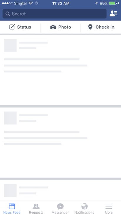
A skeleton screen is a user interface that mimics a page’s layout/structure when all its content loads. It usually has a grey or off-white background representing a specific type of element on the page.
Skeleton screens that leverage animations—like a shimmer or pulsating effect—tend to make the page’s load speed appear shorter in duration.
This approach is more beneficial than showing a blank screen to users while they wait. Let’s look at a comparison of the two screens:


Neither screen has loaded actual content, but the empty page feels slower to the user while the skeleton screen looks richer, seems faster, and gives a user a sense of how content looks, encouraging them to continue waiting.
Even though the actual content loads at the same speed for both screens, the skeleton screen offers a superior UX.
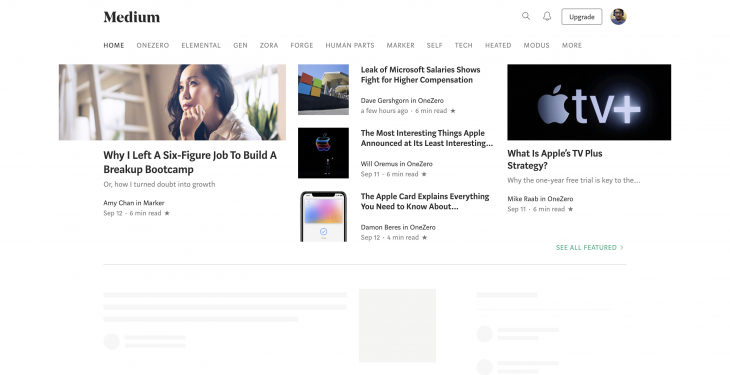
There are a few different kinds of skeleton UIs. The major ones are content placeholders and image (or color) placeholders. Companies like Medium, Slack, and YouTube use content placeholders in their skeleton UIs on their main pages.
Skeleton UIs are also easy to build because they don’t require any details about actual content data and only mimic the UI.
Meanwhile, Pinterest and Unsplash — two image-heavy websites — use color placeholders. Color placeholders are harder to build because they require details about actual content data.
First, load a skeleton instead of images (usually with a gray or off-white background). Once the data is fetched, load the actual color of the image from the image metadata.
This metadata is derived from the image while uploading through backend algorithms as well as processing on top of the images.
Finally, lazy load the images to allow the user to actually view the content using the Intersection Observer API.
In this tutorial, we’re going to explore three different packages for creating a Skeleton UI before creating our own UI with Framer-Motion which is an animation library for React.
These are the popular packages readily available for skeleton UI development in React:
These packages are pretty well-maintained but have their flaws. We’ll look at the pros and cons of each before deciding which to use for our application.
react-content-loaderreact-content-loader prosreact-content-loader is an SVG-based API where you can use any SVG shapes to create the skeleton elements. It also allows users to easily create animated placeholders, which shine from left to right using the pulse animation.
This package has a few prestyled content loaders, such as loaders for Facebook or Instagram, and can be used for any complex skeleton UI since SVG supports many shapes.
react-content-loader consWhen using react-content-loader, you must create custom skeleton components for all your components separately, which can be time-consuming.
Also, SVG is not the same as CSS elements, so creating custom elements with custom alignment requires a steep learning curve.
And finally, browser support might be inconsistent because of the SVG dependencies, so the skeleton might look and feel different on different browsers.
react-content-loader skeleton componentHere’s an example of a skeleton component using react-content-loader:
import ContentLoader from "react-content-loader";

// API support all SVG shapes - rect is a SVG shape for rectangle
const SkeletonComponent = () => (
  <ContentLoader>
    <rect x="0" y="0" rx="5" ry="5" width="70" height="70" />
    <rect x="80" y="17" rx="4" ry="4" width="300" height="13" />
    <rect x="80" y="40" rx="3" ry="3" width="250" height="10" />
  </ContentLoader>
)
react-content-loader provides a ContentLoader component which wraps the SVG elements. This component also has different props to adjust the width, height, backgroundColor, and even speed of the animation effect on the skeleton elements.
You can view the list of available props here.
react-placeholderreact-placeholder prosThis component-based API makes it easy to create custom skeleton UIs using placeholder components. It also supports pulse animation, which you can control through props.
react-placeholder consSimilar to react-content-loader, we need to maintain a skeleton component separately, so updating styles to a component requires possible updates to the skeleton component as well.
Similarly, the learning curve is not very linear, since there are multiple components for different needs.
react-placeholder skeleton componentThe following is an example of a skeleton component using react-placeholder:
import ReactPlaceholder from "react-placeholder";

export default function Skeleton() {
  return (
    <div>
      <ReactPlaceholder
        showLoadingAnimation={true}
        type="media"
        ready={false}
        rows={4}
      >
        Hello I am the inner content
      </ReactPlaceholder>
    </div>
  );
}
By using the ReactPlaceholder component provided to us, we have access to the type property, which displays a built-in skeleton layout, depending on its value. Other type options include rect, text, round, and more.
Note that the ready prop accepts a boolean. When set to false, it assumes the content has not loaded. Therefore, the skeleton screen displays. Conversely, the contents of the component render when its value is true.
react-placeholder also gives you the option to display your custom placeholder component using the customPlaceholder prop, which accepts a JSX element:
import { TextBlock, RectShape } from "react-placeholder/lib/placeholders";
import ReactPlaceholder from "react-placeholder";

const customPlaceholder = (
  <div>
    <RectShape color="blue" style={{ width: 30, height: 30 }} />
    <TextBlock rows={7} color="yellow" />
  </div>
);

export default function Skeleton() {
  return (
    <div>
      <ReactPlaceholder
        showLoadingAnimation={true}
        type="media"
        ready={false}
        customPlaceholder={customPlaceholder}
        rows={4}
      >
        Hello I am the inner content
      </ReactPlaceholder>
    </div>
  );
}
Notice the built-in components, TextBlock and RectShape, which helps us quickly create skeleton layouts.
react-loading-skeletonreact-loading-skeleton prosreact-loading-skeleton is a very simple API that has only one component with props for extra customization. Unlike the previous two, it’s easy to learn.
react-loading-skeleton can be used as a separate skeleton component and inside any component directly, so it’s flexible to use the way you want. It also supports animation and theming.
react-loading-skeleton consAlthough react-loading-skeleton is great for simple skeleton UI, it’s difficult for complex skeleton interfaces.
react-loading-skeletonThe following is an example of a react-loading-skeleton:
import Skeleton, { SkeletonTheme } from "react-loading-skeleton";

const SkeletonCompoent = () => (
  <SkeletonTheme color="#202020" highlightColor="#444">
    <section>
      <Skeleton count={3} />
      <Skeleton width={100} />
      <Skeleton circle={true} height={50} width={50} />
    </section>
  </SkeletonTheme>
);
For the full tutorial in this article, we’ll use react-loading-skeleton.
That said, all three libraries adequately satisfy simple use cases. Feel free to go through the documentation and choose the one you feel most comfortable using in your application.
With an understanding of how skeleton UIs work, we can now create our own skeleton UI with React and Framer Motion with a shimmer animation effect. The codebase for this project is available on CodeSandbox.
Before constructing the Skeleton UI, let’s first consider how content is structured on a fully-loaded version of the page. In this case, we’ll replicate the YouTube UI and create the skeleton UI for it:
import React from "react";

import CardList from "./components/CardList";

// Youtube fake data
import youtubeData from "./data";

// Styles for the layout
import "./App.css";

// App component - each section have multiple videos
 return (
    <div className="App">
      {youtubeData.map((list, index) => (
        <section key={index}>
          <h2 className="section-title">{list.section}</h2>
          <CardList list={list} />
          <hr />
        </section>
      ))}
    </div>
  );
}

export default App;
Here, we import a data.js file which is an array of mock YouTube data:
// data.js
const youtubeData = [
  {
    section: "JavaScript Tutorials by freeCodeCamp",
    channel: "freeCodeCamp.org",
    items: [
      {
        id: "PkZNo7MFNFg",
        image: "https://img.youtube.com/vi/PkZNo7MFNFg/maxresdefault.jpg",
        title: "Learn JavaScript - Full Course for Beginners",
        views: "1.9M views",
        published: "9 months ago"
      },
      {
        id: "jaVNP3nIAv0",
        image: "https://img.youtube.com/vi/jaVNP3nIAv0/maxresdefault.jpg",
        title: "JavaScript, HTML, CSS - Rock Paper Scissors Game",
        views: "216K views",
        published: "1 year ago"
      }
    ]
  },
  {
    section: "Small steps on React",
    channel: "Learn with Param",
    items: [
      {
        id: "ylbVzIBhDIM",
        image: "https://img.youtube.com/vi/ylbVzIBhDIM/maxresdefault.jpg",
        title: "useState example by building a text-size changer",
        views: "148 views",
        published: "3 days ago"
      }
    ]
  }
];
export default youtubeData;
We can then map over this data and render JSX for the section element displaying a heading and the CardList component.
Considering that our data is fetched locally, we must mock a request to a backend by using setTimeout:
// App.js
import React, { useState, useEffect } from "react";
import CardList from "./components/CardList";
import youtubeData from "./data";
import "./App.css";

const App = () => {
  const [videos, setVideos] = useState([]);

  // Load this effect on mount
  useEffect(() => {
    const timer = setTimeout(() => {
      setVideos(youtubeData);
    }, 5000);
    // Cancel the timer while unmounting
    return () => clearTimeout(timer);
  }, []);

  return (
    <div className="App">
      {videos.map((list, index) => {
        ...
      })}
    </div>
  );
};
By using state and the useEffect Hook, we can render CardList after a 5-second mock backend request.
Let’s now see how CardList visually represents the YouTube data
CardList componentCardList is a ul element that takes the YouTube data as a value for the list prop and maps over the list of videos to produce a subsequent Card component:
// CardList.js
import Card from "./Card";

const CardList = ({ list }) => {
  return (
    <ul className="list">
      {list.items.map((item, index) => {
        return <Card key={index} item={item} channel={list.channel} />;
      })}
    </ul>
  );
};

export default CardList;
Card is an li element that displays the details of each YouTube video:
// Card.js
const Card = ({ item, channel }) => {
return (
<li className="card">
<a
href={`https://www.youtube.com/watch?v=${item.id}`}
target="_blank"
rel="noopener noreferrer"
className="card-link"
>
<img src={item.image} alt={item.title} className="card-image" />
<h4 className="card-title">{item.title}</h4>
<p className="card-channel">
<i>{channel}</i>
</p>
<div className="card-metrics">
{item.views} • {item.published}
</div>
</a>
</li>
);
};
export default Card;
At this point, our application displays a white screen before rendering CardList. Let’s create our own skeleton UI to replace the blank screen.
Skeleton componentTo begin creating our Skeleton component, let’s create a Skeleton.js file in the components folder and a skeleton.css style sheet in the project’s root:
// Skeleton.js
import "../skeleton.css";
const Skeleton = ({ type }) => {
  const classes = `skeleton ${type}`;
  return <div className={classes}></div>;
};

export default Skeleton;
Skeleton.js is the base Skeleton component that accepts a type prop in which we specify the type of skeleton element needed. The prop’s value is then appended to the class list:
// skeleton.css
.skeleton {
  --skeleton-title-height: 20px;
  --skeleton-title-width: 60%;
  --skeleton-text-height: 12px;
  --skeleton-text-width: 90%;
  --skelton-text-half: 50%;
  --skeleton-avatar-height: 70px;
  --skeleton-avatar-width: 70px;
  --skeleton-thumbnail-height: 180px;
  --skeleton-thumbnail-width: 100%;

  background: #ddd;
  overflow: hidden;
  margin: 10px 0;
  border-radius: 4px;
}
.skeleton-wrapper {
  position: relative;
  overflow: hidden;
}
.skeleton.title {
  height: var(--skeleton-title-height);
  width: var(--skeleton-title-width);
  margin-bottom: 1rem;
}
.skeleton.text {
  height: var(--skeleton-text-height);
  width: var(--skeleton-text-width);
}
.skeleton.avatar {
  height: var(--skeleton-avatar-height);
  width: var(--skeleton-avatar-width);
  border-radius: 50%;
}
.skeleton.thumbnail {
  height: var(--skeleton-thumbnail-height);
  width: var(--skeleton-thumbnail-width);
}
.skeleton.half-text {
  height: var(--skeleton-text-height);
  width: var(--skelton-text-half);
}
.shimmer {
  position: absolute;
  background: rgba(255, 255, 255, 0.3);
  top: 0;
  left: 0;
  width: 30%;
  height: 100%;
}
With this setup, you can now create full skeleton UIs by piecing these micro components together. I created a skeleton-screens folder that stores the YouTube.js file for the skeleton UI of a YouTube page.
When creating this page, we’ll use Framer Motion to animate the shimmer effect of the skeleton UI. If you’re unfamiliar with to Framer Motion, you can read this post for a beginner introduction.
By using the motion function from framer-motion, we’re able to animate the Skeleton component.
In Framer Motion, the initial prop specifies the starting point of the animation while the animate prop determines the final state of the animation. By altering the opacity, we can create a fade-in effect on the skeleton UI:
// youtube.js
import { motion } from "framer-motion";
import Skeleton from "../components/Skeleton";
import Shimmer from "../components/Shimmer";

const Youtube = () => {
  return (
    <motion.section
      initial={{ opacity: 0 }}
      animate={{ opacity: 1 }}
      className="skeleton-wrapper"
    >
      <h2 className="section-title">
        <Skeleton type="title" />
      </h2>
      <ul className="list">
        {Array(9)
          .fill()
          .map((item, index) => (
            <li className="card" key={index}>
              <Skeleton type="thumbnail" />
              <h4 className="card-title">
                <Skeleton type="title" />
              </h4>
              <p className="card-channel">
                <Skeleton type="text" />
              </p>
              <div className="card-metrics">
                <Skeleton type="half-text" />
              </div>
            </li>
          ))}
      </ul>
      <Shimmer />
    </motion.section>
  );
};

export default Youtube;
Notice the Shimmer component within. We can also animate this component with Framer Motion to create the desired loading effect:
// Shimmer.js
import { motion } from "framer-motion";

const Shimmer = () => {
  return (
    <motion.div
      initial={{ x: -600 }}
      animate={{ x: 1000 }}
      transition={{
        duration: 1.5,
        repeat: Infinity,
        repeatDelay: 1
      }}
      className="shimmer"
    ></motion.div>
  );
};

export default Shimmer;
From our skeleton.css stylesheet, we can see that the rules applied to .shimmer creates a transparent element positioned at the left side of skeleton-wrapper.
We then use initial to set the initial position of the screen’s shimmer element and animate 1000px to the right. The transition prop then offers extra options to modify the repetition and duration of the animation.
At this point, the skeleton interface is complete. Now, let’s see how to use the Youtube skeleton before loading actual data.
Youtube skeletonNext, let’s create an isLoading state to conditionally render the Youtube skeleton:
// App.js
import { useEffect, useState } from "react";
import { AnimatePresence, motion } from "framer-motion";
import CardList from "./components/CardList";
import YoutubeSkeleton from "./skeleton-screens/Youtube";
import youtubeData from "./data";

export default function App() {
  const [videos, setVideos] = useState([]);
  const [isLoading, setIsLoading] = useState(true);

  useEffect(() => {
    // activate loading state when component mounts
    setIsLoading(true);
    const timer = setTimeout(() => {
      setVideos(youtubeData);
      // disable loading after 5 seconds
      setIsLoading(false);
    }, 5000);
      // Cancel the timer while unmounting
    return () => clearTimeout(timer);
  }, []);

  return (
    <div className="App">
        {isLoading && <YoutubeSkeleton />}
        {!isLoading && (
          {videos.map((list, index) => (
            <section key={index}>
              <h2 className="section-title">{list.section}</h2>
              <CardList list={list} />
              <hr />
            </section>
          ))}
        )}
    </div>
  );
}
We now have a fully-functional example of a skeleton UI. But, you’ll notice an abrupt flicker when the Skeleton UI unmounts the application. We can use the AnimatePresence component from framer-motion to create an exit animation for the Skeleton UI.
AnimatePresenceWrapping AnimatePresence around a motion component enables us to use an exit prop that we can specify how we want to animate the component—much like in initial and animate.
In our case, we want the YouTube skeleton to fade out by setting its opacity to 0:
// App.js
import { useEffect, useState } from "react";
import { AnimatePresence, motion } from "framer-motion";
import CardList from "./components/CardList";
import YoutubeSkeleton from "./skeleton-screens/Youtube";
import youtubeData from "./data";

export default function App() {
  const [videos, setVideos] = useState([]);
  const [isLoading, setIsLoading] = useState(true);

  useEffect(() => {
    setIsLoading(true);
    const timer = setTimeout(() => {
      setVideos(youtubeData);
      setIsLoading(false);
    }, 5000);
    // Cancel the timer while unmounting
    return () => clearTimeout(timer);
  }, []);

  return (
    <div className="App">
      <AnimatePresence>
        {isLoading && <YoutubeSkeleton exit={{ opacity: 0 }} />}
        {!isLoading && (
          <motion.div initial={{ opacity: 0 }} animate={{ opacity: 1 }}>
            {videos.map((list, index) => (
              <section key={index}>
                <h2 className="section-title">{list.section}</h2>
                <CardList list={list} />
                <hr />
              </section>
            ))}
          </motion.div>
        )}
      </AnimatePresence>
    </div>
  );
}
Because we can’t append motion directly to YoutubeSkeleton, its props will destructure in YouTube.js, and spread into the parent section element, which is a motion element:
// youtube.js
import { motion } from "framer-motion";
import Skeleton from "../components/Skeleton";
import Shimmer from "../components/Shimmer";

const Youtube = ({ ...props }) => {
  return (
    <motion.section
      initial={{ opacity: 0 }}
      animate={{ opacity: 1 }}
      className="skeleton-wrapper"
      {...props}
    >
      {/* code... */}
    </motion.section>
  );
};

export default Youtube;
This way, we can see a smooth fade-out animation as the skeleton screen exits the CardList component’s screen.
And here is the final skeleton UI with the shimmer animation:

Skeleton screens significantly improve UX by mitigating the user frustrations associated with entirely blank screens and giving users an idea of what content will look like before it loads.
And, it’s easy to use skeleton UI in your React applications.
If you don’t want to use an existing package, you can also create your own skeleton UI pretty easily by creating div elements that mimic skeletons by creating rectangle and circle elements.
Share your experience with using skeleton UI in the comment section.
Install LogRocket via npm or script tag. LogRocket.init() must be called client-side, not
server-side
$ npm i --save logrocket

// Code:

import LogRocket from 'logrocket';
LogRocket.init('app/id');
// Add to your HTML:

<script src="https://cdn.lr-ingest.com/LogRocket.min.js"></script>
<script>window.LogRocket && window.LogRocket.init('app/id');</script>
Hey there, want to help make our blog better?
Join LogRocket’s Content Advisory Board. You’ll help inform the type of content we create and get access to exclusive meetups, social accreditation, and swag.
Sign up now
Learn how OpenAPI can automate API client generation to save time, reduce bugs, and streamline how your frontend app talks to backend APIs.

Discover how the Interface Segregation Principle (ISP) keeps your code lean, modular, and maintainable using real-world analogies and practical examples.

<selectedcontent> element improves dropdowns

Learn how to implement an advanced caching layer in a Node.js app using Valkey, a high-performance, Redis-compatible in-memory datastore.