The “State of CSS 2019” report offers a glimpse into the future of frontend development — more specifically, the future of CSS. In this article, we’ll review the report, break down key features of CSS, and explore how they are being perceived in the CSS community. Then, we’ll use these insights to speculate about what’s to come in the world of CSS.

First issued in 2019, the “State of CSS” is an annual survey that, similar to the “State of JavaScript,” records and beautifully illustrates the opinions of CSS users around the world. The data points cover CSS libraries and frameworks, features, units and selectors, and a whole lot more.
In my opinion, the “State of CSS” report is the premier CSS-only developer survey, and I’m hopeful that it will be a staple of the frontend developer community for years to come.
In this piece, we’ll examine the CSS features that will be in high demand in 2020 and discover what the approximately 11,000 survey respondents had to say about major CSS concepts such as typography, layouts, interactions, animations, shapes, and graphics.

Knowing how to place your boxes in the right place in relation to both the viewport and one another is crucial to your presentation, look, and feel. Although CSS is roughly two decades old, we’ve seen myriad innovations designed to help frontend developers create more and more stunning layouts in CSS, many of which have gained widespread adoption.
Let’s zoom in on the top CSS layouts developers are using in 2020.
The Flexbox layout is a one-dimensional CSS module that is used to design interfaces and lay out boxes in a presentation within a container. You can flex the boxes in any direction, expand them to fill up unused space, or shrink them to avoid overflowing. Flexbox lets you make all kinds of alignment adjustments. Think of it as an extension of the grid.
According to the survey, virtually all CSS users have heard of Flexbox. Even more impressive, 94.43 percent of respondents have actually used the layout in their projects.
CSS Grid Layout is a straightforward, two-dimensional layout system for the web. With the grid, you can divide your presentation into columns and rows. You can also define relationships of the parts of your webpage in size or position.
Almost everyone has heard of CSS grids, but only 54.4 percent of respondents have actually used this layout. This may suggest that users are finding the CSS Grid Layout more difficult to use than Flexbox.
The Multi-column Layout specification enables you to arrange content into columns, similar to a newspaper layout. You can choose the number of columns, customize how they flow from one column to another, and adjust the size of the gaps between columns.
Although nearly 41 percent percent of survey respondents (including myself) are unfamiliar with the Multi-column Layout, 30.9 percent of respondents have actually used it before. This likely reflects an awareness gap in the market, since the majority of developers who do know about the Multi-column Layout tend to use it in practice.
CSS Writing Modes is a CSS module that defines international writing modes, such as left-to-right (e.g., Latin scripts), right-to-left (e.g., Hebrew scripts), vertical (e.g., Chinese scripts), and bi-directional modes. This is a niche offering, which explains the low awareness scores in the survey.

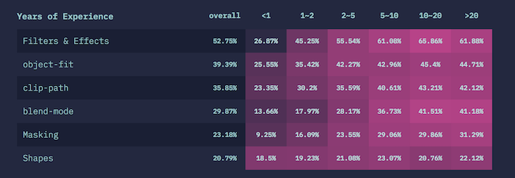
As CSS has matured, it has become easier to create graphics and shapes with pure CSS. Today, if you really master the shapes and graphics features of CSS, you can build stunning graphics without using a separate editing app. With support for filters and effects and other features such as blend, CSS makes the job easier and more streamlined.
Another advantage of using CSS has to do with accessibility. Writing in pure CSS and HTML is always conducive to accessibility because screen readers and other assistive devices can easily interpret pure CSS.
Just like the editing software on your phone’s camera or any social media application today, the filter property applies graphical effects, such as color shifts, to an element. It is used to adjust image renderings and backgrounds. Almost everyone who uses CSS knows about it, and according to the “State of CSS,” more than two-thirds of CSS developers use it in practice.
This property is used for the content of a replaced element, such as an image. It defines how the content should be resized to fit the parent container. Just like filters and effects, more than 67 percent of CSS users leverage this property.
You can apply geometric shapes available in CSS to floating elements in your presentation. This property follows the rules outlined in the level 1 specifications. Twenty percent of the survey respondents use the shapes property. Other shapes and graphics features, such as blend mode, masking, and clip-path, also enjoy widespread use in the CSS community.

JavaScript used to be the only language for controlling browser behavior. As CSS matured, features that enable you to influence browser behavior, such as scroll snap, became available. Let’s see what the “State of CSS” survey respondents had to say about some of these properties.
This CSS module provides scroll snap positions for ports of scroll containers just after scrolling an element. Although half of the survey participants are aware of this feature, only 11 percent are currently using it.
overscroll-behavioroverscroll-behavior defines an element’s behavior when it reaches a scroll while being scrolled. Forty percent of developers use it, according to the survey data, while 19 percent actually use the feature.
overflow-anchorWith this CSS property, you can disable the default browser’s scroll anchor, which automatically adjusts the scroll position to reduce the frequency of content shifts. According to the “State of CSS,” very few people have heard about overflow-anchor and even fewer in the CSS community use it.

In CSS typography, variable fonts are in high demand. As we await true responsive type, let’s look at the most-used typography features in 2019.
This CSS at-rule defines a custom font. You can load it from your local storage or on a remote server. Every CSS developer has heard of it, according to the survey, and 92 percent currently use it.
Variable fonts enable you to use many variations of a typeface in a single file, thereby eliminating separate font files for every weight or style. You can access all those variations through a simple font face reference.
This CSS property is used to style the initial letters of texts in your presentation to designs such as sunken, raised, or even dropped. About 70 percent of CSS users know about this property, and 28 percent use it.

Every CSS developer has used animations in one way or another, from a mouse hover to really complex animations, such as on the “State of CSS” homepage. The three most-used features are transitions, transforms, and animations.
This CSS module enables you to build gradual transitions between values of CSS properties. You can control things such as the duration and timing function of the transition. According to the survey, 93 percent of CSS users have used transitions.
Transforms are CSS modules that specify how CSS-styled elements can be transformed in both two- and three-dimensional space. Like transitions, 93 percent of CSS users have used transform.
You can animate the values of CSS properties you define over time using keyframes with the CSS module called animations. By specifying the timing function, duration, and number of times it should be repeated, animation is achieved and controlled. According to the “State of CSS,” 89 percent of CSS users have used this module in their work.
The “State of CSS” survey revealed valuable insights about the properties and modules that are poised to take the CSS community by storm in 2020. The fact that Flexbox was the most-adopted feature of the year, followed by transitions and transforms, suggests that CSS users are focusing more on animations. The survey data also revealed an increased interest among developers in CSS modules, and it will be fascinating to see how this trend progresses in 2020.
What were your favorite CSS features of 2019? What are you most excited for in 2020?
As web frontends get increasingly complex, resource-greedy features demand more and more from the browser. If you’re interested in monitoring and tracking client-side CPU usage, memory usage, and more for all of your users in production, try LogRocket.

LogRocket lets you replay user sessions, eliminating guesswork around why bugs happen by showing exactly what users experienced. It captures console logs, errors, network requests, and pixel-perfect DOM recordings — compatible with all frameworks.
LogRocket's Galileo AI watches sessions for you, instantly identifying and explaining user struggles with automated monitoring of your entire product experience.
Modernize how you debug web and mobile apps — start monitoring for free.
Would you be interested in joining LogRocket's developer community?
Join LogRocket’s Content Advisory Board. You’ll help inform the type of content we create and get access to exclusive meetups, social accreditation, and swag.
Sign up now
This guide walks you through creating a web UI for an AI agent that browses, clicks, and extracts info from websites powered by Stagehand and Gemini.

This guide explores how to use Anthropic’s Claude 4 models, including Opus 4 and Sonnet 4, to build AI-powered applications.

Which AI frontend dev tool reigns supreme in July 2025? Check out our power rankings and use our interactive comparison tool to find out.

Learn how OpenAPI can automate API client generation to save time, reduce bugs, and streamline how your frontend app talks to backend APIs.
2 Replies to "The future of CSS features in 2020"
Arabic ia a Right To Left language not a vertical one as stated
You’re right, thanks. Made the correction.