Editor’s note: This React toast component tutorial was last updated on 21 June 2023 to include a more concise code project that runs faster on less code. For more information, learn about how to style your toast messages using React-Toastify.

Toast notifications are modal-like elements that display information to a user, often in the form of buttons or another call to action. The messages displayed are brief and can be removed via user action or automatic expiration. Most importantly, toast notifications do not interfere with the user’s interaction with your app, whether they are using a desktop or mobile device. Developers commonly use toast notifications to display, among other things:
In this tutorial, I’ll demonstrate how to create a custom toast component with React. We’ll use React hooks such as useState and useEffect. After creating the toast component, we’ll add simple buttons to demonstrate the toast on our page. We’ll also demonstrate how to auto-delete toast notifications.
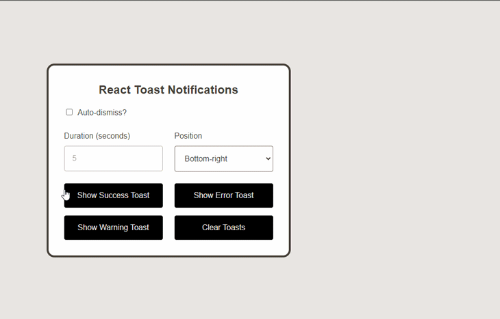
Here’s what the toast notifications will look like after we create and call them:
You can reference the full source code for this tutorial in the GitHub repo. Now, let’s dive in and get started!
Jump ahead:
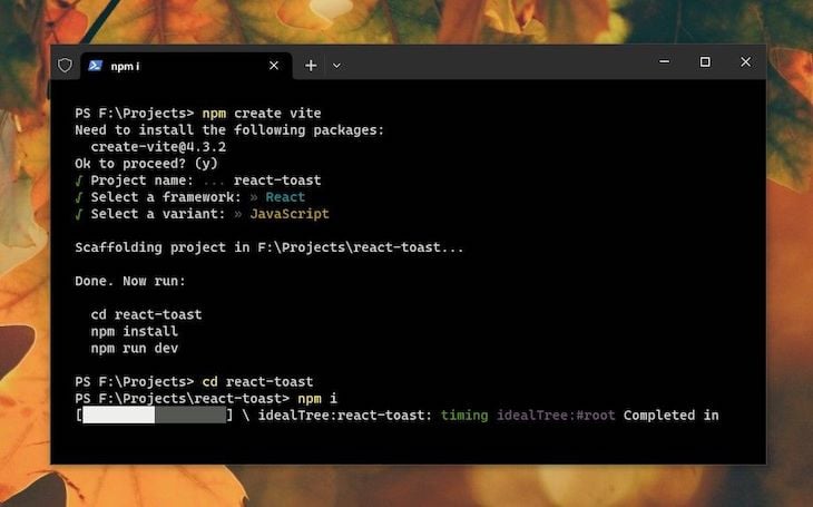
ToastList component in ReactToastList componentsshowToast methodTo demonstrate how to create custom toast components, we must first create a React application. I’ll assume that Node.js is already installed on your computer. Node.js comes with npm, and we’ll use Vite to build our React app.
First, open a terminal, navigate to the location where you want your app folder to be, and type the following command there:
npm create vite
Next, simply follow the Vite instructions: name your project folder, choose React as the framework, and make sure to pick JavaScript as the variant. After the installation finishes, just CD into the project folder and install the required dependencies by typing npm install or npm i:
You can name the project whatever you want. We won’t install any other module inside the project; we’ll simply use the default modules. The default folder structure is as follows:
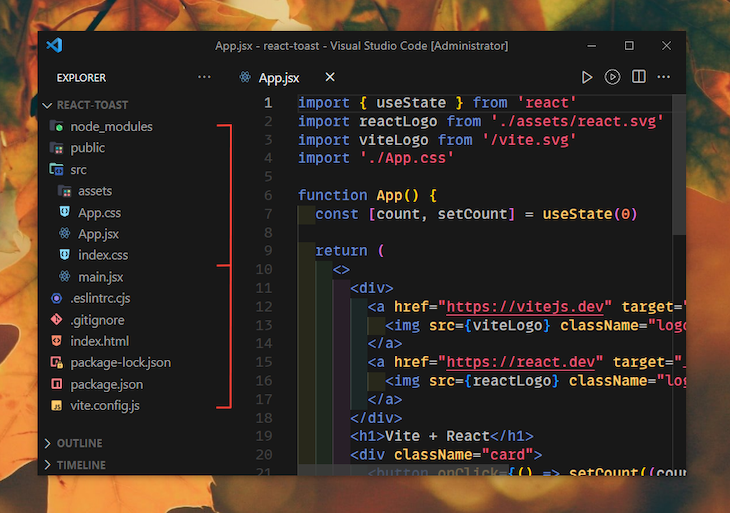
The src folder is where we’ll do most of our work. Inside src, create a new folder called components. We’ll add our toast and button components to this folder.
In React, you can either use class components, which requires you to extend a React.Component and create a render function that returns a React element, or functional components, which are plain JavaScript functions that accept props and return React elements. We will use functional components throughout this tutorial, which is also recommended by the React team.
Inside the App.js component, you should remove or adjust the existing contents of the JSX according to the project’s needs. The parent element class should be changed to app and include a heading that describes our project. Additionally, we’ll change the function to an arrow function. This is just my personal preference; feel free to use the default function if you prefer:
import React from 'react';
import './App.css';

const App = () => {
  return (
    <div className="app">
      <h1 className="app-title">React Toast Component</h1>
    </div>
  );
};

export default App;
Next, empty the contents of App.css and leave it blank for now. Similarly, clear the contents of index.css and keep it empty. We will gradually incorporate these styles as we make progress. App.css will contain styles specific to the app layout, while index.css will serve as the global CSS reset.
Before delving into the main part of the code, let’s plan the icons we will use for the toast notifications. We need SVG icons that correspond to the different types of notifications, as well as a close button for each toast notification.
To begin, we’ll create a new folder called Icons within the components directory. Inside this folder, we’ll create a React component named Icons.css. This file controls the icon sizing and presentation and looks like this:
.icon {
  width: 1em;
  height: 1em;
  fill: currentColor;
}

.icon--lg {
  width: 1.5em;
  height: 1.5em;
}
The .icon class essentially maintains the default size of the SVG icons wrapped inside it at 1em. Additionally, I’ve included a larger variant of the same class to size the notification icons a bit larger than this default size.
Next, create another file inside the Icons directory and name it Icons.jsx. Let’s import React and the above-defined CSS into it first:
import React from "react";
import "./Icons.css";
Now, let’s select some SVG icons from the FontAwesome free icon pack and enclose them within four different components. We will export these components by name.
Feel free to choose the icons you like from your favorite icon sources. Here is an example that demonstrates how the remaining portion of the Icons.jsx file will appear:
...

const CloseIcon = () => (
  <svg>...</svg>
);

const SuccessIcon = () => (
  <svg>...</svg>
);

const FailureIcon = () => (
  <svg>...</svg>
);

const WarningIcon = () => (
  <svg>...</svg>
);

export { CloseIcon, SuccessIcon, FailureIcon, WarningIcon };
That’s it for the icons. You may view the finished Icons.jsx file here. In the next segment, we will learn how to create our toast component, import our icons into it, and use the .icon class and its variant to size them appropriately.
To create a toast component, first create a folder called toast inside the components directory and add two files: Toast.js and Toast.css. We are using the .jsx extension for our JavaScript files and using the traditional CSS. Optionally, you can use SCSS files as well.
Let’s discuss the structure of the Toast UI and prepare some basic markup before we move on to the steps for styling and componentizing.
The first element to consider is the toast, which will contain and wrap up the contents of every toast notification that will be displayed. Let’s also provide it with a role attribute to make the notifications ARIA-friendly:
<div className="toast" role="alert">
</div>
Inside the toast element, we will add other elements to display the close button, notification icon, and toast notification message. The following is the markup:
<div className="toast" role="alert">
  <div className="toast-message">
    <div className="icon icon--lg icon--thumb">...</div>
    <p>...</p>
  </div>
  <button className="toast-close-btn" onClick={onClose}>
    <span className="icon">...</span>
  </button>
</div>
The button in the code above will be used to close a particular toast notification. An image icon will display depending on the type of toast. We will turn this markup into JSX later on as we approach the creation of the toast component in React.
Before moving on to the React part, let’s now discuss the styling. Inside the Toast.css file, we’ll add CSS custom properties that contain color and spacing information. These properties will be used in various parts of our toast component:
:root {
  --toast-success-hue: 150;
  --toast-failure-hue: 20;
  --toast-warning-hue: 205;
  --toast-padding: 1.5em;
  --toast-margin: 0.5em;
  --toast-bg-color-fallback: hsl(var(--secondary-hue) 15% 100%);
  --toast-text-color-fallback: hsl(var(--secondary-hue) 10% 25%);
  --toast-opacity: 0.99;
  --toast-content-gap: 1em;
}
Next, let’s enhance the appearance of our toast component by applying basic coloring and shadows. We can add rounded corners to give it a more appealing look and make it slightly opaque to create a notification-like effect. When hovered, we will increase its opacity to 100%.
We’ll also position the component relatively to align the close button as desired. Additionally, we’ll add a small margin between toast siblings to create a grouped appearance while allowing them some breathing space:
.toast {
  background-color: var(--toast-bg-color-fallback);
  padding: var(--toast-padding);
  box-shadow: hsl(var(--secondary-hue) 10% 10% / 10%) 0px 1px 3px 0px,
    hsl(var(--secondary-hue) 10% 10% / 5%) 0px 1px 2px 0px;
  border-radius: 0.5em;
  position: relative;
  color: var(--toast-text-color-fallback);
  opacity: var(--toast-opacity);
}

.toast:hover {
  opacity: 1;
  box-shadow: hsl(var(--secondary-hue) 10% 10% / 30%) 0px 1px 3px 0px,
    hsl(var(--secondary-hue) 10% 10% / 15%) 0px 1px 2px 0px;
}

.toast + .toast {
  margin-top: var(--toast-margin);
}
To enhance the alignment of the toast contents, we can apply flexbox properties to the toast message element. Additionally, we can position the close button absolutely and place it at the top-right corner:
.toast-message {
  display: flex;
  gap: var(--toast-content-gap);
  align-items: top;
}

.toast-close-btn {
  position: absolute;
  top: 0.5em;
  right: 0.5em;
  padding: 0;
  line-height: 1;
  height: 1em;
  width: 1em;
  background: none;
  border: none;
  cursor: pointer;
  color: inherit;
}
Let’s wrap up the toast stylesheet by adding color themes for the different types of toast notifications that we will be adding to the toast components. To make coloring simple and relatable, I have initially defined some hue values, which I’m using below with the CSS HSL function to declare the success, failure, and warning variants of the toast:
.toast--success {
  color: hsl(var(--toast-success-hue) 97% 3%);
  background-color: hsl(var(--toast-success-hue) 98% 99%);
}

.toast--success .icon--thumb {
  color: hsl(var(--toast-success-hue) 90% 40%);
}

.toast--failure {
  color: hsl(var(--toast-failure-hue) 97% 3%);
  background-color: hsl(var(--toast-failure-hue) 98% 99%);
}

.toast--failure .icon--thumb {
  color: hsl(var(--toast-failure-hue) 90% 40%);
}

.toast--warning {
  color: hsl(var(--toast-warning-hue) 97% 3%);
  background-color: hsl(var(--toast-warning-hue) 98% 99%);
}

.toast--warning .icon--thumb {
  color: hsl(var(--toast-warning-hue) 90% 40%);
}
Taking the above defined CSS styles and HTML structure into account, let’s now work on the React part. Inside the Toast.jsx file, create an arrow function called Toast and set the export function as default. Set the parent element to empty tags for now:
import React from 'react';

const Toast = () => {
  return (
    <>
    </>
  )
};

export default Toast;
The function above will always return a React element. As already discussed, our toast will essentially have three types: success, failure, and warning. The toast can only be one of these three types at a time. The toast notification icon will be added based on the selected type. Additionally, the toast should have a customizable message and a button to close it.
Now, let’s return to Toast.jsx and add some props. Import React above the previously discussed Toast.css file, as well as the SVG icons we defined in the first segment:
import React from "react";
import "./Toast.css";

import {
  SuccessIcon,
  FailureIcon,
  WarningIcon,
  CloseIcon,
} from "../Icons/Icons";
In addition to the toast type, the toast component should receive a message and callback function as props. The callback will be invoked when the close button is clicked. We will use the callback function to handle the deletion of the toast from a parent component at a later stage.
Note: Props, or properties, are used for passing data from one component to another in React.
I’m declaring the props in the function component itself using ES6 object destructuring in the parameter list:
...
const Toast = ({ message, type, onClose }) => {
  ...
};
Consider the type values you would provide when using this component. Based on these inputs, create a lookup table that uses each input as a key and assigns the corresponding icon component as its value.
By passing the type as an index to this lookup table, we can effortlessly access the appropriate icon:
...
const Toast = ({ message, type, onClose }) => {
  const iconMap = {
    success: <SuccessIcon />,
    failure: <FailureIcon />,
    warning: <WarningIcon />,
  };

  const toastIcon = iconMap[type] || null;
};
Now, building upon the markup we discussed in the previous segment and incorporating the props we just added to the toast component, we can easily construct the component and export it for future use:
...
const Toast = ({ message, type, onClose }) => {
  const iconMap = {
    success: <SuccessIcon />,
    failure: <FailureIcon />,
    warning: <WarningIcon />,
  };

  const toastIcon = iconMap[type] || null;

  return (
    <div className={`toast toast--${type}`} role="alert">
      <div className="toast-message">
        {toastIcon && (
          <div className="icon icon--lg icon--thumb">{toastIcon}</div>
        )}
        <p>{message}</p>
      </div>
      <button className="toast-close-btn" onClick={onClose}>
        <span className="icon">
          <CloseIcon />
        </span>
      </button>
    </div>
  );
};

export default Toast;
As shown above, the toast receives a CSS class dynamically through the type prop. Additionally, a condition is added to the .toast-message wrapper to render the toastIcon only when an icon match is available for the provided type in the iconMap lookup table.
Furthermore, the onClick event handler for the close button is passed through onClose callback, which will be utilized in the parent components of our toast component.
You may use PropTypes to set the prop types and their default values, which you have to install additionally. However, this isn’t strictly required in our project. I have used it in the GitHub repository to demonstrate it for React beginners.
Now that we’ve completed our toast component, we need to create a container component that can act as a list of multiple toast components, hold them together, and intelligently managing their positioning.
The toast notifications should be flexible enough to be put across all four corners of the viewport. We’ll have four different positions for the toast elements, which will be determined by a container list that will be wrapping up all our toast notifications:
The positions will be added dynamically, depending on the position props added to the toast list component that we are going to define in this segment.
The basic structure of our toast list will consist of a wrapper element that acts as a list of toast messages. It would look something like the following:
<div class="toast-list toast-list--top-left" aria-live="assertive">
  <div class="toast ...">...</div>
  <div class="toast ...">...</div>
  <div class="toast ...">...</div>
  <div class="toast ...">...</div>
</div>
If you notice, we are also using the aria-live attribute for our toast list, just to indicate to the screen reader that the list will update with time. Later on, we will use this structure to construct the JSX for the toast list component.
Let’s create another folder inside the components directory named ToastList. Inside it, create a CSS file named ToastList.css, which is responsible for styling, structuring, and positioning our ToastList component, as well as adding appropriate animations to the toast notifications.
First, let’s define some CSS custom properties to centralize the configuration and customization of various settings such as sizing, spacing, and more:
:root {
  --toast-speed: 250ms;
  --toast-list-scrollbar-width: 0.35em;
  --toast-list-width: 400px;
  --toast-list-padding: 1em;
}
The toast list needs to remain fixed to the viewport, regardless of the scroll position of the document contents. This is essential to ensure a consistent display of toast notifications to the user. The container should have its contents positioned slightly inward from the edges of the viewport, and its width should be limited on larger screens.
To avoid requiring the user to scroll the document to see the notifications, the toast list should be restricted to a maximum height equal to the viewport height. The list can be scrolled vertically to access the notifications as needed. The following CSS setup for the toast list can help us achieve all of that:
.toast-list {
  position: fixed;
  padding: var(--toast-list-padding);
  width: 100%;
  max-width: var(--toast-list-width);
  max-height: 100vh;
  overflow: hidden auto;
}
Next, we need to define various positional variations for the toast list. These variations can be dynamically added later, depending on the position prop in the React component to ensure its proper functioning:
.toast-list--top-left {
  top: 0;
  left: 0;
}
.toast-list--top-right {
  top: 0;
  right: 0;
}
.toast-list--bottom-left {
  bottom: 0;
  left: 0;
}
.toast-list--bottom-right {
  bottom: 0;
  right: 0;
}
The next CSS styles are for animations to slide the toast either left or right of the page based on the list’s position. We are going to use the CSS keyframes rule and the animation and transition properties to add the appropriate slide-in and slide-out animations:
@keyframes toast-in-right {
  from {
    transform: translateX(100%);
  }
  to {
    transform: translateX(0);
  }
}

@keyframes toast-in-left {
  from {
    transform: translateX(-100%);
  }
  to {
    transform: translateX(0);
  }
}

.toast-list--top-left .toast,
.toast-list--bottom-left .toast {
  animation: toast-in-left var(--toast-speed);
}

.toast-list--top-right .toast,
.toast-list--bottom-right .toast {
  animation: toast-in-right var(--toast-speed);
}

.toast-list .toast {
  transition: transform var(--toast-speed), opacity var(--toast-speed),
    box-shadow var(--toast-speed) ease-in-out;
}
For the additional scrollbar decorations, check out the full ToastList.css file here.
ToastList component in ReactLet’s define the list component now and add some props. The ToastList component takes in three props: data, position, and removeToast. The data prop represents an array that will contain objects, position determines the placement of the toast list on the page, and removeToast acts as a callback to be provided to the onClose attribute of the Toast component:
import React from "react";
import Toast from "../Toast/Toast";
import "./ToastList.css";

const ToastList = ({ data, position, removeToast }) => {
  ...
};

export default ToastList;
To use the position prop, add it to the element with a className of toast-list as shown below:
const ToastList = ({ data, position, removeToast }) => {
  return (
    <div
      className={`toast-list toast-list--${position}`}
      aria-live="assertive"
    >
      ..
    </div>
  );
};
Whatever position prop is passed into the toast component, it will be added as a class to those elements (recall that we already set the CSS position properties in the CSS file). Because data is an array, we can loop through it directly in the JSX.
First, import the useRef and useEffect Hooks from React where the useRef will be used to get the reference of the toast list without relying on traditional Web API methods in JavaScript. The useEffect Hook will be called when re-rendering is required:
import React, { useRef, useEffect } from 'react';
Add this after the props destructuring:
const listRef = useRef(null);
As already discussed, the structure of our ToastList is a simple wrapper element with Toast components as its contents. The position prop determines the dynamic CSS classes, which dictate the position of the ToastList on the screen.
Within its contents, we can iterate over the data prop and include a Toast component for each item in data, ensuring that the appropriate props are passed. For instance, we will assign the removeToast callback to the onClose prop of each Toast component and decide the toast-removal logic later on in the app component:
const ToastList = ({ data, position, removeToast }) => {
  return (
    data.length > 0 && (
      <div
        className={`toast-list toast-list--${position}`}
        aria-live="assertive"
      >
        {data.map((toast) => (
          <Toast
            key={toast.id}
            message={toast.message}
            type={toast.type}
            onClose={() => removeToast(toast.id)}
          />
        ))}
      </div>
    )
  );
};
Before proceeding, it’s important to consider the correct ordering and scrolling of toast notifications based on the position of ToastList. While it may appear sufficient at first glance, there are some crucial aspects to address.
By default, toast notifications are added to the list from top to bottom. Each new notification is placed at the bottom, and if the list exceeds the maximum height limit, a scrollbar appears. However, the scrollbar currently doesn’t adjust and jumps to the latest notification. This can be improved for a better user experience.
Moreover, when the ToastList is positioned at the bottom-left or bottom-right, the flow of toast notifications should be reversed. In other words, the most recent toast should be displayed at the top rather than the bottom. This simple adjustment is crucial for creating a position-intuitive toast list that enhances the overall user experience.
To fix the scrolling issue, we can use the Element.scrollTo method from the JavaScript Web API. Additionally, we will use the useRef and useEffect Hooks from the React library. This will allow us to obtain a reference to the toast list without relying on Document.getElementById, and enable us to adjust the scroll whenever there are changes to the position or data props:
import React, { useEffect, useRef } from "react";

const ToastList = ({ data, position, removeToast }) => {
  const listRef = useRef(null);

  const handleScrolling = (el) => {
    const isTopPosition = ["top-left", "top-right"].includes(position);
    if (isTopPosition) {
      el?.scrollTo(0, el.scrollHeight);
    } else {
      el?.scrollTo(0, 0);
    }
  };

  useEffect(() => {
    handleScrolling(listRef.current);
  }, [position, data]);

  ...
};
Additionally, the data reversal process can be simplified by using the spread operator on the data array and subsequently applying the reverse() method. These steps should be performed after checking if the current position of the ToastList is either bottom-left or bottom-right:
const ToastList = ({ data, position, removeToast }) => {
  ...

  const sortedData = position.includes("bottom")
    ? [...data].reverse()
    : [...data];

  return (
    sortedData.length > 0 && (
      <div
        className={`toast-list toast-list--${position}`}
        aria-live="assertive"
        ref={listRef}
      >
        {sortedData.map((toast) => (
          <Toast
            ...
          />
        ))}
      </div>
    )
  );
};
This concludes our ToastList component. You can view its full code here. If you are wondering what kind of data would be passed to ToastList, here’s the structure of the object array that will be provided to the data prop:
[
  {
    id: 1,
    message: "This is a success toast component",
    type: "success"
  },
  {
    id: 2,
    message: "This is a failure toast message.",
    type: "failure"
  },
  {
    id: 3,
    message: "This is a warning toast message.",
    type: "warning",
  }
];
ToastList componentsTo achieve a consistent display across all browsers, let’s incorporate a global stylesheet that establishes default settings and normalizes the appearance of specific elements. We can accomplish this by modifying the index.css file, which we cleared at the start of the tutorial.
Feel free to include a CSS base or reset of your preference; for simplicity, I’ll be using a basic reset combined with a few custom properties:
:root {
  --secondary-hue: 25;
  --input-radius: 0.25em;
  --input-margin: 0.5em;
  --input-padding: 1em;
  --input-border-width: 1px;
  --paragraph-margin: 1em;
  --text-leading: 1.5;
  box-sizing: border-box;
}

*,
*::before,
*::after {
  box-sizing: inherit;
}

body {
  margin: 0;
  font: 1em / var(--text-leading) sans-serif;
  background-color: hsl(var(--secondary-hue) 15% 90%);
  color: hsl(var(--secondary-hue) 10% 25%);
}

p {
  margin: 0;
}

p + p {
  margin-top: var(--paragraph-margin);
}

input,
select,
button {
  padding: var(--input-padding);
  border: var(--input-border-width) solid hsl(var(--secondary-hue) 10% 45%);
  border-radius: var(--input-radius);
  font: inherit;
  line-height: 1;
  background-color: hsl(var(--secondary-hue) 10% 95%);
  color: inherit;
}

input,
select {
  background-color: hsl(var(--secondary-hue) 0% 100%);
}

label + input,
label + select,
label + button {
  margin-top: var(--input-margin);
}

input[type='checkbox'] + label {
  margin-left: var(--input-margin);
}

button {
  cursor: pointer;
  border-style: solid;
  border-color: hsl(var(--secondary-hue) 0% 0%);
  background-color: hsl(var(--secondary-hue) 0% 0%);
  color: hsl(var(--secondary-hue) 10% 90%);
}

[disabled] {
  opacity: 0.5;
}
The CSS above functions as a style reset for the application, normalizing default styles and providing optimized spacing and sizing for elements such as the body, paragraphs, and form inputs. Additionally, we use CSS variables to control most of the customizable aspects.
For the app-specific layout settings, I’m using the following CSS to align and size up different settings and inputs, which you may ignore if you are implementing toast notifications in an existing project:
:root {
  --app-width: 500px;
  --app-spacing: 2em;
  --app-title-size: 1.5em;
  --app-group-gap: 1em;
  --app-group-gap-lg: 1.5em;
}
#root {
  display: flex;
  min-height: 100vh;
  padding: var(--app-spacing);
}
.app {
  margin: auto;
  padding: var(--app-spacing);
  max-width: var(--app-width);
}
.app-title {
  margin-top: 0;
  text-align: center;
  font-size: var(--app-title-size);
}
.app-row + .app-row {
  margin-top: var(--app-group-gap-lg);
}
.app-row input:not([type="checkbox"]),
.app-row select,
.app-row button {
  width: 100%;
}
.app-row--group {
  display: grid;
  gap: var(--app-group-gap) var(--app-group-gap-lg);
}
@media only screen and (min-width: 650px) {
  .app-row--group {
    grid-template-columns: repeat(2, 1fr);
  }
}
Let’s begin by importing React and the useState Hook into our App.jsx file. By using the useState Hook, we can establish state variables to effectively manage and track various data states within our application:
import React, { useState } from "react";
import ToastList from "./components/ToastList/ToastList";
import "./App.css";

const App = () => {
  return (
    <div className="app">
      <h1 className="app-title">React Toast Notifications</h1>
    </div>
  );
};

export default App;
Create a function called showToast and pass two parameters called message and type:
const showToast = (message, type) => {}
After importing the useState Hook, create a bunch of state variables to manage an array of toast messages, their automatic closing, the duration of automatic closing, and the ToastList position:
const [toasts, setToasts] = useState([]);
const [autoClose, setAutoClose] = useState(true);
const [autoCloseDuration, setAutoCloseDuration] = useState(5);
const [position, setPosition] = useState("bottom-right");
You may modify the default states of these state variables, based on your requirements and considering the defaults you supplied to the PropTypes, if you’re using them. Our plan is to display the appropriate toast when a specific button is clicked, based on the position selected by the user. If no position is selected, the default position (bottom-right) will be used.
showToast methodIn the showToast method, we will create a new object with the showToast parameter and add it to the toasts using the setToasts state method. Additionally, we will check for the autoClose value, which is essentially a checkbox state. If enabled, the toast will be automatically removed after the specified autoCloseDuration:
const showToast = (message, type) => {
  const toast = {
    id: Date.now(),
    message,
    type,
  };

  setToasts((prevToasts) => [...prevToasts, toast]);

  if (autoClose) {
    setTimeout(() => {
      removeToast(toast.id);
    }, autoCloseDuration * 1000);
  }
};
In the JSX, we can use native HTML buttons and pass the showToast method to their onClick event handlers in order to trigger a specific type of toast with a designated message. Furthermore, we can include a button that, when clicked, removes all available toasts at once. Here’s an example to illustrate this functionality:
<div className="app-row app-row--group">
  <button onClick={() => showToast("A success message", "success")}>
    Show Success Toast
  </button>
  <button onClick={() => showToast("A failure message", "failure")}>
    Show Error Toast
  </button>
  <button onClick={() => showToast("A warning message", "warning")}>
    Show Warning Toast
  </button>
  <button onClick={removeAllToasts}>Clear Toasts</button>
</div>
Removing an individual toast notification is a relatively straightforward task, especially when compared to displaying a toast notification. To accomplish this, we can make use of a function that accepts an id parameter. By filtering the array of toast notifications, we can quickly identify and remove the notification that doesn’t correspond to the given id, and then apply this filtered array using the setToasts method:
const removeToast = (id) => {
  setToasts((prevToasts) => prevToasts.filter((toast) => toast.id !== id));
};
Removing all notifications is even simpler. Just use the setToasts state method and pass an empty array as its current state:
const removeAllToasts = () => {
  setToasts([]);
};
Later, we will use these two methods as prop values or click events in order to clear the notifications.
Before addressing the auto-close duration input for the toasts, we need to handle the auto-close checkbox input, which enables or disables the duration input.
Additionally, whenever the value of this checkbox changes, we should clear all existing toasts to ensure their display remains synchronized. We can take advantage of the removeAllToasts method here that we defined in the last step:
const handleAutoCloseChange = () => {
  setAutoClose((prevAutoClose) => !prevAutoClose);
  removeAllToasts();
};
We can manage the duration input with the help of the target property of the JavaScript e``vent object for input elements. By grabbing the currently selected value from the event target, we can then set it as the current state for the duration state variable:
const handleDurationChange = (event) => {
  setAutoCloseDuration(Number(event.target.value));
};
To change the default auto-delete duration, simply modify the default value of the autoCloseDuration state variable from five to your desired duration.
Let’s proceed to the JSX part and add two app rows to encompass the input checkbox responsible for toggling the auto-close duration input and the duration input itself.
The checked state of this checkbox is controlled by the autoClose state variable, and its change is managed by the handleAutoCloseChange function that we defined in one of the previous steps:

The availability of the duration input depends on the current value of autoClose. The state of this input is managed by the autoCloseDuration state variable, and its change is handled by the handleDurationChange function, which we discussed in one of the previously mentioned steps:
<div className="app-row">
  <input
    id="toggleDuration"
    type="checkbox"
    checked={autoClose}
    onChange={handleAutoCloseChange}
  />
  <label htmlFor="toggleDuration">Auto-dismiss?</label>
</div>

<div className="app-row">
  <label htmlFor="duration">Duration (seconds)</label>
  <input
    id="duration"
    type="number"
    min="1"
    max="5"
    value={autoCloseDuration}
    onChange={handleDurationChange}
    disabled={!autoClose}
  />
</div>
Once again, we can retrieve the position inputs from a select combo box (which we will define shortly) by utilizing the target event property. Setting the current position requires just a single line of code:
const handlePositionChange = (event) => {
  setPosition(event.target.value);
};
We can define an object to iterate over and populate our select combo box, which is responsible for showing different positions for ToastList:
const positions = {
  "top-right": "Top-right",
  "top-left": "Top-left",
  "bottom-right": "Bottom-right",
  "bottom-left": "Bottom-left",
};
Adding options to the select box is now easy by looping over the positions using the Object.keys and providing the value as well as the label, as shown below:
<div className="app-row">
  <label htmlFor="position">Position</label>
  <select
    id="position"
    value={position}
    onChange={handlePositionChange}
  >
    {Object.keys(positions).map((position) => (
      <option key={position} value={position}>
        {positions[position]}
      </option>
    ))}
  </select>
</div>
The state of the position combo box is handled by the position state variable, while the change of this input is managed by the handlePositionChange function, which we discussed in the last few steps.
ToastList componentFinally, we conclude our app component file by adding ToastList at the end. We’ll use the toast and position state variables that we declared in the app component above. Additionally, we’ll pass the removeToast function as the removeToast prop of ToastList before exporting it as a default module:
const App = () => {
  ...
  return (
    <div className="app">
      <h1 className="app-title">React Toast Component</h1>
      ...

      <ToastList data={toasts} position={position} removeToast={removeToast} />
    </div>
  );
};

export default App;
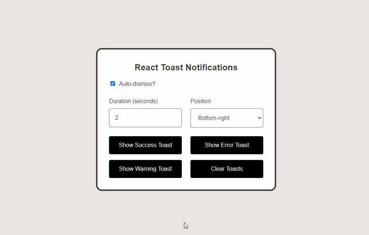
Below is a live working demonstration of our final output. You can view it in a different tab using this link. Alternatively, you can also find all of the code on GitHub:
vitejs-vite-qhqmg5 – StackBlitz
Next generation frontend tooling. It's fast!
This tutorial should give you a solid understanding of how to create a simple yet intuitive toast component that is capable of displaying multiple notifications. You should now know how to use React and its popular hooks like useState and useEffect to create, display, and dismiss toast notifications and customize the components as per the requirements of your project.
Install LogRocket via npm or script tag. LogRocket.init() must be called client-side, not
server-side
$ npm i --save logrocket

// Code:

import LogRocket from 'logrocket';
LogRocket.init('app/id');
// Add to your HTML:

<script src="https://cdn.lr-ingest.com/LogRocket.min.js"></script>
<script>window.LogRocket && window.LogRocket.init('app/id');</script>

Learn how to detect unused and ghost dependencies in JavaScript projects using Knip, a project-level linter that keeps your dependency graph accurate.

Learn how Storybook MCP enables AI agents to understand your component library, generate accurate UI, and validate code using documentation, stories, and automated tests.
Debug RSC hydration mismatches in production with Next.js instrumentation, Suspense isolation, HTML diffing, and CI smoke tests.

Explore why npm dependencies are a major supply chain security risk and how to protect JavaScript apps from compromised packages and transitive threats.
Hey there, want to help make our blog better?
Join LogRocket’s Content Advisory Board. You’ll help inform the type of content we create and get access to exclusive meetups, social accreditation, and swag.
Sign up now

 Learn more →
