There are several toast libraries in the React ecosystem. In this article, we will explore how to use React-Toastify in a React project.
Toast notifications, or toast messages, are unobtrusive, in-app pop-up messages that provide users with feedback about an operation. Toasts usually disappear after a given time; therefore, removing them doesn’t require any user action. However, you can also close a toast notification before the expiration of the timeout.
The styling and positioning of a toast largely depend on the purpose and nature of the user feedback. For example, a notification that indicates success is styled differently from a warning or an error notification.
The feedback that toast notifications provide can be messages of success, warning, or error, as shown in the image below:
React-Toastify is a free, popular, and MIT-licensed package that you can use to add toast notifications to your React application. There are several other similar toast libraries in the React ecosystem.
Editor’s note: This article was last updated by Chizaram Ken in April 2025 to introduce changes related to React-Toastify v11 and provide additional real-world use cases for React-Toastify.
Use any of the commands below to install React-Toastify in a React project:
# npm
npm install react-toastify

# yarn
yarn add react-toastify
After installation, import the ToastContainer component and the toast object as shown in the example below. React-Toastify also has a CSS file that you must import:
import { ToastContainer, toast } from 'react-toastify';
import 'react-toastify/dist/ReactToastify.css';
In this section, you will learn how to use React-Toastify to style toast messages. If you haven’t, start by creating a React app.
As toast messages are notifications you can use to provide feedback to the user, they can be displayed on user login success, login error, or when a network request succeeds, fails, or times out.
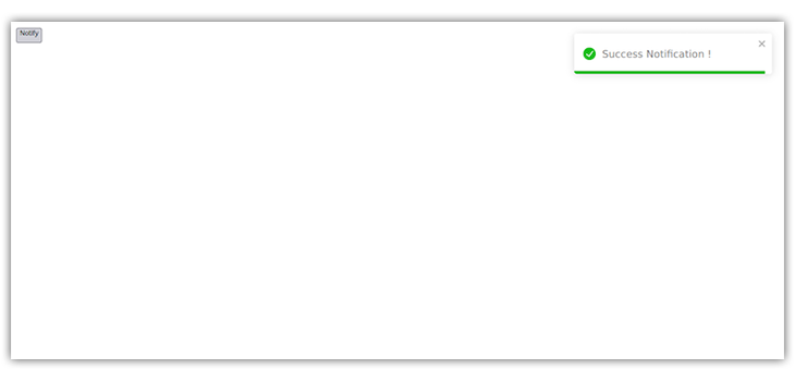
In your App.js file, import react-toastify and its CSS file and invoke the toast.success function with the notification message like so:
import React from "react";
import { ToastContainer, toast } from "react-toastify";
import "react-toastify/dist/ReactToastify.css";

function App() {
  const showToastMessage = () => {
    toast.success("Success Notification !", {
      position: "top-right"
    });
  };

  return (
    <div>
      <button onClick={showToastMessage}>Notify</button>
      <ToastContainer />
    </div>
  );
}

export default App;
Notice we also rendered the ToastContainer in the code above. This container wraps our toast pop-ups. Without it, the toast pop-ups won’t be displayed.
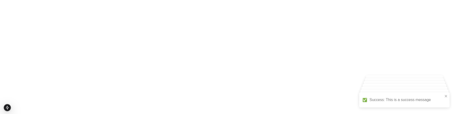
When you click the Notify button, the code above will display a toast similar to what you see below:
By default, all toasts are positioned at the top right of the page. This position can be changed by assigning a new position to the toast. React-Toastify allows for six positions:
top-righttop-centertop-leftbottom-rightbottom-centerbottom-leftDepending on where you want the toast message, you can set its position like so:
toast.success("Success Notification !", {
  position: "top-right",
});

toast.success("Success Notification !", {
  position: "top-center",
});

toast.success("Success Notification !", {
  position: "top-left",
});

toast.success("Success Notification !", {
  position: "bottom-right",
});

toast.success("Success Notification !", {
  position: "bottom-left",
});

toast.success("Success Notification !", {
  position: "bottom-center",
});
The image below shows a toast message in all six possible locations on the webpage:
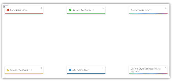
Similarly to setting your toast message’s position, you can use React-Toastify to specify different types of toast messages to better understand the information displayed and improve user experience.
This technique uses different styling for each message type to make it easier to quickly understand the information and its intent. For example, a red-colored toast UI typically implies a warning or error message, and a green-colored message typically implies a successful response.
You can use specific toast functions for the different toast message variants. Add the following changes in the click event handler in your App.js file:
toast.success("Success Notification !", {
  position: "top-right",
});

toast.error("Error Notification !", {
  position: "top-center",
});

toast.warning("Warning Notification !", {
  position: "top-left",
});

toast.info("Information Notification !", {
  position: "bottom-center",
});

toast("Default Notification !", {
  position: "bottom-left",
});

toast("Custom Style Notification with css class!", {
  position: "bottom-right",
  className: "foo-bar",
});
The code above should display the toast messages below:
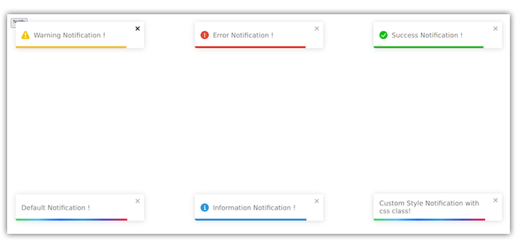
The last toast notification at the bottom right of the image above is a custom toast. Unlike the others, we added a className to it. Let’s learn more about custom toast messages in React-Toastify.
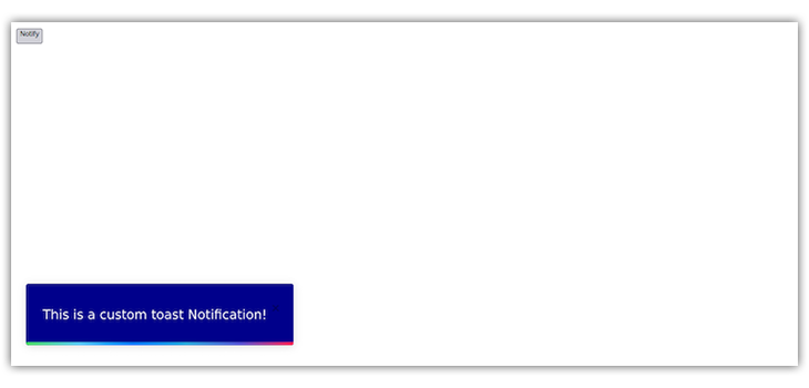
A custom toast allows you to implement the toast UI styling that matches your brand color, website, or application theme.
To style your toast message, first assign it a className as in the example below:
toast("This is a custom toast Notification!", {
  position: "top-left",
  className: "toast-message",
});
Next, use the className selector to apply the styles in your CSS file:
.toast-message {
  background: darkblue;
  color: #fff;
  font-size: 20px;
  width: 34vw;
  padding: 30px 20px;
}
With the styles specified in the example above, you should see the following result:
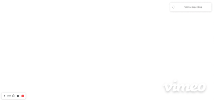
Promise-based toasts in React-ToastifyIn addition to the toast variants highlighted above, you can also use React-Toastify to create and display Promise-based notifications. You can perform asynchronous operations such as network requests, and use these toast notifications to display a success or error message when the operation is complete.
To create Promise-based toasts, add the following to your App.js file:
useEffect(() => {
  const myPromise = new Promise((resolve) =>
    fetch("https://jsonplaceholder.typicode.com/posts/1")
      .then((response) => response.json())
      .then((json) => setTimeout(() => resolve(json), 3000))
  );

  toast.promise(myPromise, {
    pending: "Promise is pending",
    success: "Promise  Loaded",
    error: "error",
  });
}, []);
In the toast.promise function call, we set the pending, success, and error messages. The pending message will display as the fetch executes. Depending on the outcome, either a success or error message will display afterward:
You can also add a custom icon to your toast notification depending on the type. To add a custom icon, let’s look at the code below:
const CustomIcon = ({ isLoading, type }) => {
  if (isLoading) return <Spinner />;

  switch (type) {
    case "success":
      return <span>✅</span>;
    case "error":
      return <span>❌</span>;
    case "warning":
      return <span>⚠️</span>;
    case "info":
      return <span>ℹ️</span>;
    default:
      return <span></span>;
  }
};
The function above accepts three props: theme, isLoading, and type. With these props, we can assign different icons to our toast types. We can also change the icon color if you see fit. isLoading checks if toast.promise is true and active.
Finally, pass the CustomIcon function to the icon props in ToastContainer:
<ToastContainer icon={CustomIcon} />
As you can see from our previous sections and examples, the toast notifications are displayed vertically when a new toast notification is active. We can make them overlap or stack for a better user experience. This way, the notifications won’t take up much space on our viewport.
To do this, add the stacked prop to the ToastContainer:
<<ToastContainer
        stacked
        hideProgressBar
        icon={CustomIcon}
        position="bottom-right"
        style={{ width: "20vw" }}
      />
I added the hideProgressBar prop so that the toasts look better and less chaotic when they are stacked:
useNotificationCenter HookThe useNotificationCenter Hook is a React-Toastify addon introduced in React-Toastify v9. You can use it to build a notification center on top of React-Toastify.
Whenever you invoke any toast variant function — like toast.update, toast.promise, toast.info, etc. — while using the useNotificationCenter Hook, the toast notification will get added to the toast center.
Before using this Hook, first, import it from react-toastify addons. You can use it in your component like any other React Hook:
import { useNotificationCenter } from "react-toastify/addons/use-notification-center";

const App = () => {
  const { notifications } = useNotificationCenter();
  return null;
};
The useNotificationCenter Hook returns several methods and properties. Some of these methods include notifications, clear, markAllAsRead, markAsRead:
notifications — Gives us access to all the notification items or toast messages that we have in our center. Each notificationItem in the notifications array contains data such as the id, read status (Boolean), theme, isLoading status (Boolean), etc.clear — Removes all the notifications from the notification centermarkAllAsRead — Marks all the notifications as read. It changes the value of the read Boolean property of every notificationItem from false to true. In comparison, markAsRead only changes the read Boolean property of one notificationItem to trueReact-Toastify v11 included many exciting updates, but the big focus was on customization. The idea is to show how React-Toastify can be a holistic tool for almost all your notification needs. These aren’t just random ideas; they’re the kind of features that make users stick around. Here are a few other important updates that stand out:
v11 finally adds proper accessibility support, which is a big win for inclusivity. You can now slap an ariaLabel prop on both ToastContainer and individual toasts to make them screen-reader-friendly.
Plus, there’s built-in keyboard navigation. Press Alt+T, and the first visible toast gets focus, letting users tab through its elements (like buttons in a custom toast).
This does make a lot of sense; accessibility shouldn’t just be a box to check. The ariaLabel also helps with testing (e.g., finding toasts in Cypress), and the keyboard nav is a nice touch for power users. Here’s a quick one from the docs:
toast('Hello!', {
  ariaLabel: 'Greeting notification',
});

<ToastContainer
  hotKeys={(e) => e.ctrlKey && e.key === 'n'} // Custom hotkey: Ctrl+N
  ariaLabel="Notifications Ctrl+N"
/>;
In my opinion, this now makes React-Toastify feel more mature and ready for serious apps where accessibility matters.
onClose callbackThe onClose callback now tells you why a toast was closed. Did the user click it away (reason: true), or did it auto-close? You can even pass custom reasons from a custom component, which is super handy for complex toasts with multiple actions.
This gives you good control to react differently based on user behavior. For example, if a toast has Reply and Ignore buttons, you can trigger different logic depending on what the user picks. Check this out:
"use client";
import { toast, ToastContainer } from 'react-toastify';
function CustomNotification({ closeToast }) {
  return (
    <div className="flex items-center gap-4 p-4 bg-gray-800 rounded-lg">
      <span className="text-white text-base font-medium">New message! ✉️</span>
      <div className="flex gap-2">
        <button
          onClick={() => closeToast('reply')}
          className="bg-blue-600 text-white py-1.5 px-3 rounded-md text-sm font-medium hover:bg-blue-700 transition-all hover:-translate-y-0.5 active:translate-y-0 focus:outline-none focus:ring-2 focus:ring-blue-500 focus:ring-offset-2 focus:ring-offset-gray-800"
        >
          Reply
        </button>
        <button
          onClick={() => closeToast('ignore')}
          className="bg-gray-500 text-white py-1.5 px-3 rounded-md text-sm font-medium hover:bg-gray-600 transition-all hover:-translate-y-0.5 active:translate-y-0 focus:outline-none focus:ring-2 focus:ring-gray-400 focus:ring-offset-2 focus:ring-offset-gray-800"
        >
          Ignore
        </button>
      </div>
    </div>
  );
}
function NotificationTrigger() {
  const triggerToast = () => {
    toast(CustomNotification, {
      onClose: (reason) => {
        if (reason === 'reply') {
          console.log('User wants to reply!');
        } else if (reason === 'ignore') {
          console.log('User ignored the message.');
        }
      },
    });
  };
  return (
    <div className="min-h-screen flex items-center justify-center bg-gradient-to-br from-gray-100 to-gray-200 p-4">
      <div className="bg-white rounded-2xl shadow-xl p-8 w-full max-w-md text-center">
        <h1 className="text-2xl font-bold text-gray-800 mb-4">Test Notification</h1>
        <p className="text-gray-600 mb-6">Click below to see the custom toast!</p>
        <button
          onClick={triggerToast}
          className="bg-indigo-600 text-white py-3 px-6 rounded-lg text-lg font-medium hover:bg-indigo-700 transition-all hover:-translate-y-0.5 active:translate-y-0 focus:outline-none focus:ring-2 focus:ring-indigo-500 focus:ring-offset-2"
        >
          Show Notification
        </button>
      </div>
      <ToastContainer
        ariaLabel="Custom notification"
        position="top-right"
        autoClose={5000}
        newestOnTop
        closeOnClick={false}
        pauseOnHover
        className="mt-4"
      />
      <style jsx global>{`
        .Toastify__toast {
          background: transparent;
          box-shadow: none;
          padding: 0;
          min-height: auto;
          border-radius: 0;
        }
        .Toastify__toast-body {
          margin: 0;
          padding: 0;
          width: 100%;
        }
      `}</style>
    </div>
  );
}
export default NotificationTrigger;
This is what it looks like:
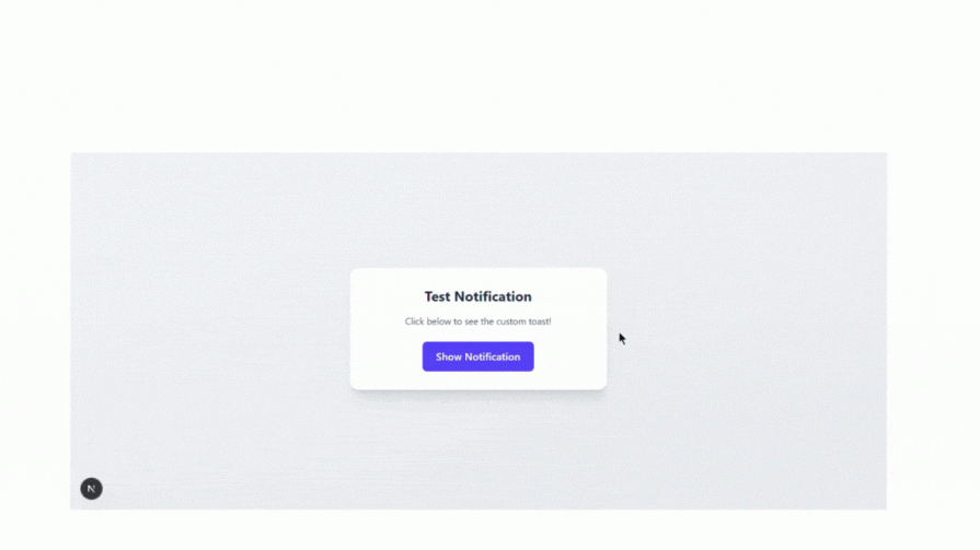
This is a great update. It’s like you giving your notifications their own little decision options.
v11 lets you roll up your own progress bar to your taste, without losing features like autoClose, pauseOnHover, or pauseOnFocusLoss. You simply pass customProgressBar: true and render your component, which gets an isPaused prop to sync animations.
This is cool because progress bars are a great way to show time-sensitive actions (like a toast disappearing). Now you can make them match your app’s style perfectly. The docs show how easy it is:
function CustomComponent({ isPaused, closeToast }) {
  return (
    <div>
      <span>Processing...</span>
      <div
        style={{
          width: isPaused ? '100%' : '0%',
          transition: 'width 8s linear',
          background: 'limegreen',
        }}
        onTransitionEnd={() => closeToast()}
      />
    </div>
  );
}

toast(CustomComponent, {
  autoClose: 8000,
  customProgressBar: true,
});
This wasn’t even planned for v11, but it’s such a fun addition!
In v11, there are some breaking changes to watch for. The useToastContainer and useToast Hooks are gone (they were too fiddly anyway), and onClose/onOpen callbacks no longer get children props. The minimal CSS file and SCSS support are out, and some class names (like Toastify__toast-body) have been axed to simplify the DOM.
These changes make the library leaner and easier to customize, even if they mean a bit of migration work. The simplified DOM structure is a big reason why Tailwind works so well now. The docs warn you upfront, which is nice:
// Old way (v10)
import 'react-toastify/dist/ReactToastify.css'; // No longer needed!

// New way (v11)
import { ToastContainer } from 'react-toastify';
// CSS is auto-injected, just use <ToastContainer />
If you’re upgrading, check your custom styles and Hooks. But honestly, the trade-off is worth it for how much cleaner everything feels.
Now that we understand the useNotificationCenter Hook along with toast message positions, types, and customization, let’s see how we can use them together in an application.
First, destructure the methods returned by the useNotificationCenter Hook we went over in the previous sections in your App.js file:
import React from 'react';
import { useNotificationCenter } from 'react-toastify/addons/use-notification-center';
import { toast, ToastContainer } from 'react-toastify';
import 'react-toastify/dist/ReactToastify.css';

const App = () => {
const { notifications, clear, markAllAsRead, markAsRead } = useNotificationCenter();
}
In the example above, we also imported toast and ToastContainer with its CSS file. Let’s declare an event handler that will create a toast when a button is clicked:
import React from "react";
import { useNotificationCenter } from "react-toastify/addons/use-notification-center";
import { toast, ToastContainer } from "react-toastify";
import "react-toastify/dist/ReactToastify.css";

const App = () => {
  const { notifications, clear, markAllAsRead, markAsRead } =
    useNotificationCenter();

  const showToast = () => {
    toast("Hello World", {
      data: {
        title: "Hello World Again",
        text: "We are here again with another article",
      },
    });
  };

  return (
    <div>
      <p>{notifications.length}</p>
      <button onClick={showToast}>Click me</button>
      <ToastContainer />
    </div>
  );
};

export default App;
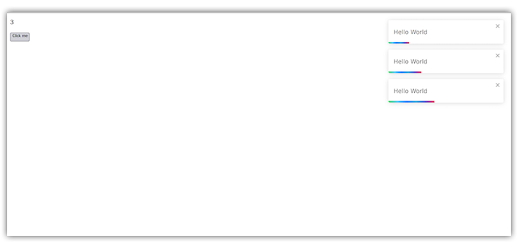
In the code above, we added a paragraph tag to display the number of toast messages added to the notification center.
Clicking the button will create a new toast, and the paragraph text will display the number of toast messages we’ve created:
Cool, right? Let’s see what else we can do. As mentioned earlier, you can perform sorting, mapping, and other actions on the notifications array returned by the useNotificationCenter Hook.
Copy and paste the code below into the the App.js file:
import React from "react";
import { useNotificationCenter } from "react-toastify/addons/use-notification-center";
import { toast, ToastContainer } from "react-toastify";
import "react-toastify/dist/ReactToastify.css";

const App = () => {
  const { notifications, clear, markAllAsRead, markAsRead } =
    useNotificationCenter();

  const showToast = () => {
    toast("Hello World", {
      data: {
        title: "Hello World Again",
        text: "We are here again with another article",
      },
    });
  };

  const showSuccessToast = () => {
    toast.success("Hello World", {
      data: {
        title: "Success toast",
        text: "This is a success message",
      },
    });
  };

  const showErrorToast = () => {
    toast.error("Hello World", {
      data: {
        title: "Error toast",
        text: "This is an error message",
      },
    });
  };

  return (
    <div>
      <p>{notifications.length}</p>
      <button onClick={showToast}>Default</button>
      <button onClick={showSuccessToast}>Success</button>
      <button onClick={showErrorToast}>Error</button>
      <br />
      <br />
      <button onClick={clear}>Clear Notifications</button>
      <button onClick={() => markAllAsRead()}>Mark all as read</button>
      <ul>
        {notifications.map((notification) => (
          <li
            onClick={() => markAsRead(notification.id)}
            key={notification.id}
            style={
              notification.read
                ? { background: "green", color: "silver", padding: "0 20px" }
                : {
                    border: "1px solid black",
                    background: "navy",
                    color: "#fff",
                    marginBottom: 20,
                    cursor: "pointer",
                    padding: "0 20px",
                  }
            }
          >
            <span>id: {notification.id}</span>
            <p>title: {notification.data.title}</p>
            <p>text: {notification.data.text}</p>
          </li>
        ))}
      </ul>
      <ToastContainer />
    </div>
  );
};

export default App;
Let’s break down the code above.
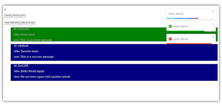
First, we are mapping through the notifications array, which is an array of notification items, and getting the id, title, and text of our toast messages.
Then, we register onClick event handlers on the notification items. When a notification item gets clicked, we use the markAsRead function to mark the item as read. We also change the background color of a notification item to differentiate between read and unread notifications.
The Mark all as read button uses the markAllAsRead function to change the read status of all notification items to true. When this button is clicked, all item backgrounds will change color.
Lastly, the “Clear Notifications” button uses the clear function to delete or remove all items from the notification center.
Remember, when you invoke any toast variant method — whether toast.success, toast.error, toast.update, or any other type — the toast will be added to the notification center, like so:
Let’s visualize what we are about to build: You’ve got an app where users submit forms, and this creates a kind of post. We will be using the JSON Placeholder API to post our data. When we do this, we want to get updates on whether it was successful or if we ran into errors, using React Toastify.
Here is the code for that:
"use client"
import { toast, ToastContainer } from 'react-toastify';
import { useState, useEffect } from 'react';
function Posts() {
  const [title, setTitle] = useState('');
  const [isSubmitting, setIsSubmitting] = useState(false);
  const [posts, setPosts] = useState([]);
  const handleSubmit = async (e) => {
    e.preventDefault();
    if (!title.trim()) {
      toast.warning('Please enter a post title!', { ariaLabel: 'Empty title warning' });
      return;
    }
    setIsSubmitting(true);
    const toastId = toast.loading('Creating your post...');
    try {
      const response = await fetch('https://jsonplaceholder.typicode.com/posts', {
        method: 'POST',
        headers: { 'Content-Type': 'application/json' },
        body: JSON.stringify({ title, body: 'Post content goes here', userId: 1 }),
      });
      const data = await response.json();
      if (response.ok) {
        toast.update(toastId, {
          render: `Post created with ID: ${data.id} 🎉`,
          type: 'success',
          isLoading: false,
          autoClose: 3000,
          ariaLabel: 'Post creation success',
        });
        setTitle('');
        setPosts([data, ...posts]);
      } else {
        toast.update(toastId, {
          render: `Error: ${response.status} - ${response.statusText}`,
          type: 'error',
          isLoading: false,
          autoClose: 3000,
        });
      }
    } catch (error) {
      toast.update(toastId, {
        render: `Network error: ${error.message}`,
        type: 'error',
        isLoading: false,
        autoClose: 3000,
      });
    } finally {
      setIsSubmitting(false);
    }
  };
  useEffect(() => {
    const fetchPosts = async () => {
      try {
        const response = await fetch('https://jsonplaceholder.typicode.com/posts?_limit=5');
        if (response.ok) {
          const data = await response.json();
          setPosts(data);
        } else {
          toast.error('Failed to load posts', { ariaLabel: 'Fetch posts error' });
        }
      } catch (error) {
        toast.error('Failed to load existing posts');
      }
    };
    fetchPosts();
  }, []);
  return (
    <div className="min-h-screen bg-gray-100 py-12 px-4 sm:px-6 lg:px-8">
      <div className="max-w-md mx-auto bg-white rounded-xl shadow-md overflow-hidden md:max-w-2xl mb-8">
        <div className="p-8 w-full">
          <div className="uppercase tracking-wide text-sm text-indigo-500 font-semibold mb-1">Create New Post</div>
          <h2 className="block mt-1 text-lg leading-tight font-medium text-black mb-6">Share something with the community</h2>
          <form onSubmit={handleSubmit} className="space-y-6">
            <div>
              <label htmlFor="title" className="block text-sm font-medium text-gray-700">
                Post Title
              </label>
              <input
                type="text"
                id="title"
                value={title}
                onChange={(e) => setTitle(e.target.value)}
                placeholder="Enter your post title"
                className="shadow-sm focus:ring-indigo-500 focus:border-indigo-500 block w-full sm:text-sm border-gray-300 rounded-md p-2 border"
                required
              />
            </div>
            <button
              type="submit"
              disabled={isSubmitting}
              className={`w-full flex justify-center py-2 px-4 border border-transparent rounded-md shadow-sm text-sm font-medium text-white bg-indigo-600 hover:bg-indigo-700 focus:outline-none focus:ring-2 focus:ring-offset-2 focus:ring-indigo-500 ${isSubmitting ? 'opacity-75 cursor-not-allowed' : ''}`}
            >
              {isSubmitting ? 'Submitting...' : 'Create Post'}
            </button>
          </form>
        </div>
      </div>
      <div className="max-w-md mx-auto md:max-w-2xl">
        <h3 className="text-xl font-bold text-gray-800 mb-4">Recent Posts</h3>
        <div className="space-y-4">
          {posts.length > 0 ? (
            posts.map((post) => (
              <div key={post.id} className="bg-white rounded-xl shadow-md p-6 hover:shadow-lg transition-shadow duration-300">
                <h4 className="font-semibold text-lg text-gray-800">{post.title}</h4>
                <p className="mt-2 text-gray-600">{post.body}</p>
                <div className="mt-4 flex justify-between items-center">
                  <span className="text-xs text-gray-500">Post ID: {post.id}</span>
                  <span className="text-xs text-gray-500">User ID: {post.userId}</span>
                </div>
              </div>
            ))
          ) : (
            <div className="bg-white rounded-xl shadow-md p-6 text-center text-gray-500">
              No posts available. Create your first post above!
            </div>
          )}
        </div>
      </div>
      <ToastContainer
        position="top-right"
        autoClose={3000}
        newestOnTop
        closeOnClick
        rtl={false}
        pauseOnFocusLoss
        draggable
        pauseOnHover
        ariaLabel="Post notifications"
      />
    </div>
  );
}
export default Posts;
When submitting a post, toast.loading displays Creating your post… to indicate progress, and toast.update switches to a success message (Post created with ID: X 🎉) or an error message (Error: …) based on the API response, using toastId for precise updates.
If the title is empty, toast.warning alerts Please enter a post title! to guide the user:

On component mount, failed post fetches trigger toast.error with messages like Failed to load posts. The ToastContainer is configured with position top-right, newestOnTop, and draggable, leveraging v11’s accessibility with ariaLabel and flexible options to ensure notifications are clear and interactive. This complements the form and post list UI.
We will use React-Toastify, to display more friendly notifications like Welcome back! or You’re logged out, see ya!.
It’s a small touch that makes your app feel more friendly. It’s an easy thing to pull off, but you have to write a lot of CSS for that.
Here is how you will implement that using React-Toastify:
"use client";
import { toast, ToastContainer } from 'react-toastify';
import { useState } from 'react';
function AuthComponent() {
  const [isLoggedIn, setIsLoggedIn] = useState(false);
  const handleLogin = async () => {
    try {
      await new Promise((resolve) => setTimeout(resolve, 1000)); // Simulate login
      setIsLoggedIn(true);
      toast.success('Welcome back, you’re in! 😎', {
        ariaLabel: 'Login success',
      });
    } catch (error) {
      toast.error('Login failed, check your credentials! 😕', {
        ariaLabel: 'Login error',
      });
    }
  };
  const handleLogout = async () => {
    try {
      await new Promise((resolve) => setTimeout(resolve, 800));
      setIsLoggedIn(false);
      toast.info('Logged out—see you soon! 👋', {
        ariaLabel: 'Logout confirmation',
        onClose: (reason) => {
          if (reason === true) {
            console.log('User manually closed the logout toast');
          }
        },
      });
    } catch (error) {
      toast.error('Logout failed, try again!', {
        ariaLabel: 'Logout error',
      });
    }
  };
  return (
    <div className="min-h-screen flex items-center justify-center bg-gradient-to-br from-blue-50 to-gray-100 p-4">
      <div className="bg-white rounded-2xl shadow-xl p-8 w-full max-w-md">
        <h1 className="text-3xl font-bold text-gray-800 mb-4 text-center">
          {isLoggedIn ? 'Welcome!' : 'Sign In'}
        </h1>
        <p className="text-gray-600 mb-6 text-center">
          {isLoggedIn ? 'Ready to explore? Or take a break.' : 'Log in to get started!'}
        </p>
        <div className="flex justify-center">
          {isLoggedIn ? (
            <button
              onClick={handleLogout}
              className="flex items-center gap-2 bg-red-500 text-white py-3 px-6 rounded-lg font-medium text-lg hover:bg-red-600 transition-all hover:-translate-y-0.5 active:translate-y-0 focus:outline-none focus:ring-2 focus:ring-red-500 focus:ring-offset-2 disabled:opacity-50 disabled:cursor-not-allowed"
              disabled={false}
            >
              <span>🚪</span> Log Out
            </button>
          ) : (
            <button
              onClick={handleLogin}
              className="flex items-center gap-2 bg-blue-600 text-white py-3 px-6 rounded-lg font-medium text-lg hover:bg-blue-700 transition-all hover:-translate-y-0.5 active:translate-y-0 focus:outline-none focus:ring-2 focus:ring-blue-600 focus:ring-offset-2 disabled:opacity-50 disabled:cursor-not-allowed"
              disabled={false}
            >
              <span>🔑</span> Log In
            </button>
          )}
        </div>
      </div>
      <ToastContainer
        ariaLabel="Auth notifications"
        position="top-right"
        autoClose={3000}
        newestOnTop
        closeOnClick
        pauseOnHover
        className="mt-4"
      />
      <style jsx global>{`
        .Toastify__toast {
          border-radius: 0.5rem;
          font-size: 1rem;
          font-weight: 400;
          color: #ffffff;
          padding: 0.75rem 1rem;
          min-height: 48px;
          display: flex;
          align-items: center;
          box-shadow: 0 4px 12px rgba(0, 0, 0, 0.15);
          font-family: -apple-system, BlinkMacSystemFont, 'Segoe UI', Roboto, sans-serif;
        }
        .Toastify__toast-body {
          margin: 0;
          padding: 0;
          flex: 1;
          line-height: 1.4;
        }
        .Toastify__toast--success {
          background: #2f855a;
        }
        .Toastify__toast--error {
          background: #c53030;
        }
        .Toastify__toast--info {
          background: #2b6cb0;
        }
        .Toastify__toast-icon {
          margin-right: 0.5rem;
          display: flex;
          align-items: center;
        }
      `}</style>
    </div>
  );
}
export default AuthComponent;
In the code above, when a user clicks Log In, toast.success shows Welcome back, you’re in! 😎 with a green background.
A logout triggers toast.info with Logged out, see you soon! 👋 in blue.
Errors during either process trigger toast.error with messages like Login failed, check your credentials! 😕:

The onClose callback in the logout toast captures manual dismissals (reason === true), showcasing v11’s enhanced callback functionality. The ToastContainer uses ariaLabel, position: "top-right", and pauseOnHover, ensuring accessibility and smooth integration, with custom CSS styling the toasts to match the component’s aesthetic.
When running async operations like uploading a file or syncing data, you really do not want to leave your users wondering what’s happening. That would be a bad experience; I’d personally leave that app in this scenario.
In order to keep people like me, you’ll want to display a toast that says, Hang tight, we’re processing! or All done, you’re good to go! while the operation runs. Here is how we implement this using React-Toastify:
"use client";
import { toast, ToastContainer } from 'react-toastify';
function ImageUploader() {
  const handleUpload = async (file) => {
    const uploadToast = toast.loading('Uploading your image...', {
      ariaLabel: 'Image upload in progress',
    });
    try {
      await new Promise((resolve) => setTimeout(resolve, 2000));
      toast.update(uploadToast, {
        render: 'Image uploaded successfully! 🖼️',
        type: 'success',
        isLoading: false,
        autoClose: 3000,
        ariaLabel: 'Image upload success',
      });
    } catch (error) {
      toast.update(uploadToast, {
        render: 'Upload failed, try again!',
        type: 'error',
        isLoading: false,
        autoClose: 3000,
      });
    }
  };
  return (
    <div className="min-h-screen flex items-center justify-center bg-gradient-to-br from-gray-100 to-gray-200 p-4 font-sans">
  <div className="bg-white rounded-xl shadow-lg p-8 w-full max-w-md text-center">
    <h2 className="text-2xl font-semibold text-gray-900 mb-2 leading-tight break-words">Upload Your Image</h2>
    <p className="text-base text-gray-600 mb-6 leading-relaxed opacity-90">Choose a file to share with the world!</p>
    <label
      htmlFor="file-upload"
      className="inline-flex items-center gap-2 bg-indigo-600 text-white py-3 px-6 rounded-lg cursor-pointer text-base font-medium hover:bg-indigo-500 transition-all hover:-translate-y-0.5 active:translate-y-0"
    >
      <span className="text-lg">📁</span>
      Select Image
    </label>
    <input
      id="file-upload"
      type="file"
      className="hidden"
      onChange={(e) => handleUpload(e.target.files[0])}
      accept="image/*"
    />
  </div>
  <ToastContainer
    ariaLabel="Upload notifications"
    position="top-right"
    autoClose={3000}
    newestOnTop
    closeOnClick
    pauseOnHover
    className="toast-container"
  />
  <style jsx global>{`
    .Toastify__toast {
      border-radius: 0.5rem;
      font-size: 1rem;
      font-weight: 400;
      color: #fff;
      padding: 0.75rem 1rem;
      min-height: 48px;
      display: flex;
      align-items: center;
      box-shadow: 0 4px 12px rgba(0, 0, 0, 0.15);
    }
    .Toastify__toast-body {
      margin: 0;
      padding: 0;
      flex: 1;
      line-height: 1.4;
    }
    .Toastify__toast--success {
      background: #2f855a;
    }
    .Toastify__toast--error {
      background: #c53030;
    }
    .Toastify__toast--loading {
      background: #4a5568;
    }
    .Toastify__toast-icon {
      margin-right: 0.5rem;
    }
  `}</style>
</div>
  );
}
export default ImageUploader;
In the ImageUploader component above, the toast.loading method displays an Uploading your image… notification when a file is selected.
Upon completion, toast.update dynamically updates the toast to either a success message (Image uploaded successfully! 🖼️) with a green background or an error message (Upload failed, try again!) with a red background, using type: success or type: error :

The ariaLabel props enhance accessibility, and the ToastContainer is configured with options like position="top-right", autoClose={3000}, and pauseOnHover to ensure the toasts are user-friendly
This section is focused on responding correctly to Google’s People Also Ask (PAA) questions about React-Toastify v11.
To install React-Toastify, run:
npm i react-toastify
Go ahead to import ToastContainer and toast from 'react-toastify', as seen in the example below:
import { ToastContainer, toast } from 'react-toastify';

function App() {
  return (
    <div>
      <button onClick={() => toast("Hello!")}>Notify</button>
      <ToastContainer />
    </div>
  );
}
The example above sets up a simple toast notification system.
Change the position of toasts by setting the position prop on <ToastContainer /> to values like "top-right", "bottom-left", or "top-center".
For individual toasts, pass position to the toast() function, e.g., toast("Hi!", { position: "bottom-right" }).
For animations, import transitions (Bounce, Slide, Zoom, Flip) from 'react-toastify' and set the transition prop on <ToastContainer /> or per toast, as seen in the code example below:
import { ToastContainer, toast, Slide } from 'react-toastify';

function App() {
  return (
    <div>
      <button onClick={() => toast("Hi!", { position: "bottom-left", transition: Slide })}>
        Notify
      </button>
      <ToastContainer position="top-center" transition={Zoom} />
    </div>
  );
}
This places toasts at the top-center with a Zoom animation by default, or bottom-left with a slide for the specific toast.
The top best use cases for React-Toastify are form submissions, user actions, and any form of alerts.
To update Recat-Toastify to the latest version (e.g., v11.0.5), run:
npm install react-toastify@latest

//in your project's terminal.
Make sure you check your current version in package.json under "dependencies". After updating, verify the compatibility, as v11 will require your React project to be React 18+.
Test your app to ensure toasts render correctly. v11 simplified the DOM and removed some props like enableMultiContainer. If issues arise, consult the official changelog for breaking changes:
npm install react-toastify@latest
I will advise you to always back up your project before updating to avoid disruptions.
In this tutorial, we learned how to style toast messages using React-Toastify. We also explored how to style custom toast notifications to suit our preferences, and how to use the useNotificationCenter Hook to create a cool notification center where we can display all our toast notifications. We also looked at real-world examples and saw the new improvements that come with version 11.
React-Toastify is a useful React toast library because it is highly customizable and provides many toast variants. Other tools are available if you need even more functionality, such as implementing animated toasts in React.
Install LogRocket via npm or script tag. LogRocket.init() must be called client-side, not
server-side
$ npm i --save logrocket

// Code:

import LogRocket from 'logrocket';
LogRocket.init('app/id');
// Add to your HTML:

<script src="https://cdn.lr-ingest.com/LogRocket.min.js"></script>
<script>window.LogRocket && window.LogRocket.init('app/id');</script>
Hey there, want to help make our blog better?
Join LogRocket’s Content Advisory Board. You’ll help inform the type of content we create and get access to exclusive meetups, social accreditation, and swag.
Sign up now
A breakdown of the wrapper and container CSS classes, how they’re used in real-world code, and when it makes sense to use one over the other.

This guide walks you through creating a web UI for an AI agent that browses, clicks, and extracts info from websites powered by Stagehand and Gemini.

This guide explores how to use Anthropic’s Claude 4 models, including Opus 4 and Sonnet 4, to build AI-powered applications.

Which AI frontend dev tool reigns supreme in July 2025? Check out our power rankings and use our interactive comparison tool to find out.

 Learn more →
