TLDR: Although still in beta, Lynx.js is a promising new JavaScript framework for building responsive, cross-platform apps with native performance, React compatibility, and multithreaded rendering. This tutorial walks through building a simple meal planner app using Lynx.js from setup to deployment.
Users are always looking for applications that can deliver seamless user experiences across all platforms. Keeping within UI and UX guidelines when working across different platforms can be challenging; each one has different design guidelines, screen resolutions, and user interactions that need to be taken into account. Because of this, some cross-platform frameworks are forced to compromise on performance or native aesthetics.
This is where the Lynx JavaScript library excels. Released in March 2025, Lynx.js is a family of technologies that have native rendering capabilities, ensuring that components have a look and feel that is native for both iOS and Android. It also has a multithreaded engine that can separate UI rendering from the business logic, which helps applications run much smoother and with better overall responsive interfaces.
Lynx.js is also JavaScript and React-based, with similarities to React Native, so developers won’t need to learn a new language to use it.
In this article, we will explore how to use Lynx.js to build cross-platform mobile applications that are robust and responsive, and then we’ll put all of our knowledge to use by building a simple meal-planning mobile application.
The Replay is a weekly newsletter for dev and engineering leaders.
Delivered once a week, it's your curated guide to the most important conversations around frontend dev, emerging AI tools, and the state of modern software.
Responsive design means designing and developing applications that deliver an optimal user experience across varying devices and screen sizes. In the case of Lynx.js, this means the creation of apps that look identical on Android, iOS, and the web and also perform correctly on different screen sizes and orientations. Lynx.js has complete support for current web technologies like Flexbox and CSS Grid, so it’s simple to build layouts that adjust dynamically to altering environments.
Lynx.js supports Flexbox, which is a popular flexible layout system that is useful for arranging items in rows or columns and managing space dynamically. This makes it very good at creating responsive designs with minimal effort, as you can see in this code snippet:
/* Example: A simple Flexbox layout */
.container {
  display: flex;
  justify-content: center;
  align-items: center;
}
For more details on Flexbox, check out the Lynx Flexbox guide.
Lynx.js also supports CSS Grid, which is a two-dimensional layout tool that is ideal for building structured, grid-based designs that can adjust to various screen sizes. A basic code example is shown below:
/* Example: A basic CSS Grid layout */
.grid-container {
  display: grid;
  grid-template-columns: 1fr 100px;
  gap: 10px;
}
Similarly, for more information on CSS Grid, check out the Lynx CSS Grid guide documentation.
Lynx.js takes cross-platform and responsive mobile app design to the next level with web-based technology, which is well optimized alongside native rendering features. The native rendering ensures that user interface components are native, as if they were built specifically for Android, iOS, or the web. With the multithreaded engine, the UI rendering is separated from the business logic, which results in smoother rendering performance.
Another bonus feature worth talking about is that platform-specific modifications in Lynx.js are provided with APIs that can detect the current platform, enabling developers to adapt styles, like Android material design or iOS guidelines, in one codebase. It also simplifies touch events and gestures for natural, intuitive user interactions across devices.
Some other Lynx.js enhancements include:
Creating mobile apps that work flawlessly on Android, iOS, and the web is a basic requirement for all modern applications. The two have differences in navigation and visual styling; Android uses a physical back button and follows material design, while iOS uses swipe gestures and follows human interface guidelines.
Web platforms, on the other hand, rely more on browser functionality to impact their performance and responsiveness. These differences cause inconsistencies, which is why tools like Lynx.js aim to bridge the gap by incorporating platform detection APIs with optimized rendering pipelines to enable a consistent look and feel based on each platform’s capabilities.
To tackle these kinds of common challenges while also maintaining consistency, developers have to adopt best practices that are suited for cross-platform development with Lynx.js. These include:
Now, let’s learn how to set up a development environment using Lynx.js. It is worth mentioning that we need to have a Mac because we will be using an iOS simulator, which is only available on Macs.
Check out the Quick Start documentation for an in-depth tutorial on how to set up Lynx.js. I will give a quick run-through of the process and mention some important things about using the iOS simulator.
Creating a Lynx.js project is very simple because it uses Rspeedy, which is an Rspack-based Lynx build tool. The first step is to run one of the following commands to create a project depending on which package manager you use:
# npm
npm create rspeedy@latest

# yarn
yarn create rspeedy

# pnpm
pnpm create rspeedy@latest

# bun
bun create rspeedy@latest
That’s all it takes to set up a Lynx.js project!
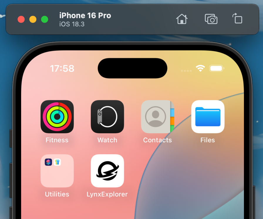
Next, you have to download LynxExplorer. There are two versions, so choose the one that relates to your operating system:
After you have downloaded a version, extract the zip file, and you should have a file like this: LynxExplorer-arm64. Now, open the Simulator file on your Mac. You can do this in a couple of ways:
With the Simulator up and running, just drag the LynxExplorer-x86_64.app into it, and the app will install on the Simulator. You might also want to install the Lynx DevTool for debugging the application and codebase.
Now you should see the app installed like this example:
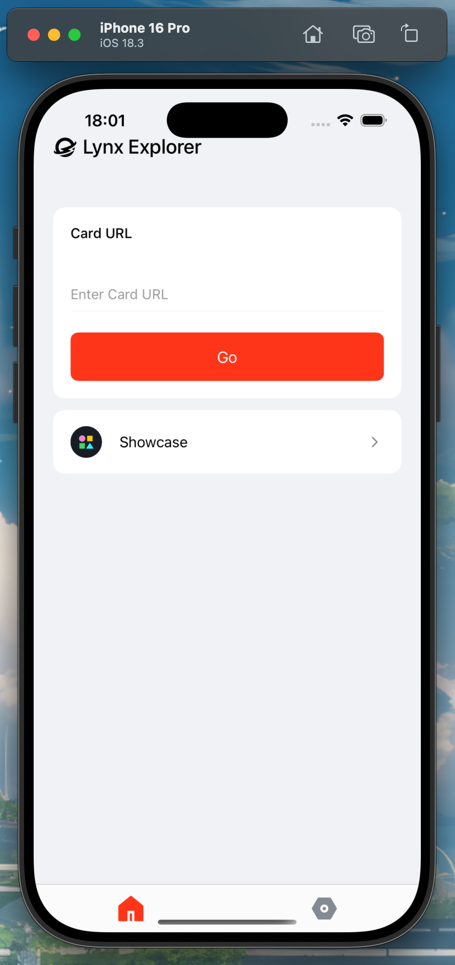
Clicking on the icon will open the Lynx.js app home screen:
We can run our app by going to the project folder, for example, rspeedy-project, and then running the usual command to start our app. If you use a package manager other than npm, use the appropriate command:
# npm
npm run dev

# yarn
yarn run dev

# pnpm
pnpm run dev

# bun
bun run dev
Now, you should see a barcode and a web URL that looks similar to this:
http://111.111.11.11:3004/main.lynx.bundle?fullscreen=true
Copy and paste the URL that you have generated into the Lynx Explorer app on your iOS simulator and use it as the Card URL. Then click the Go button. Now, you will see the home screen for your project:
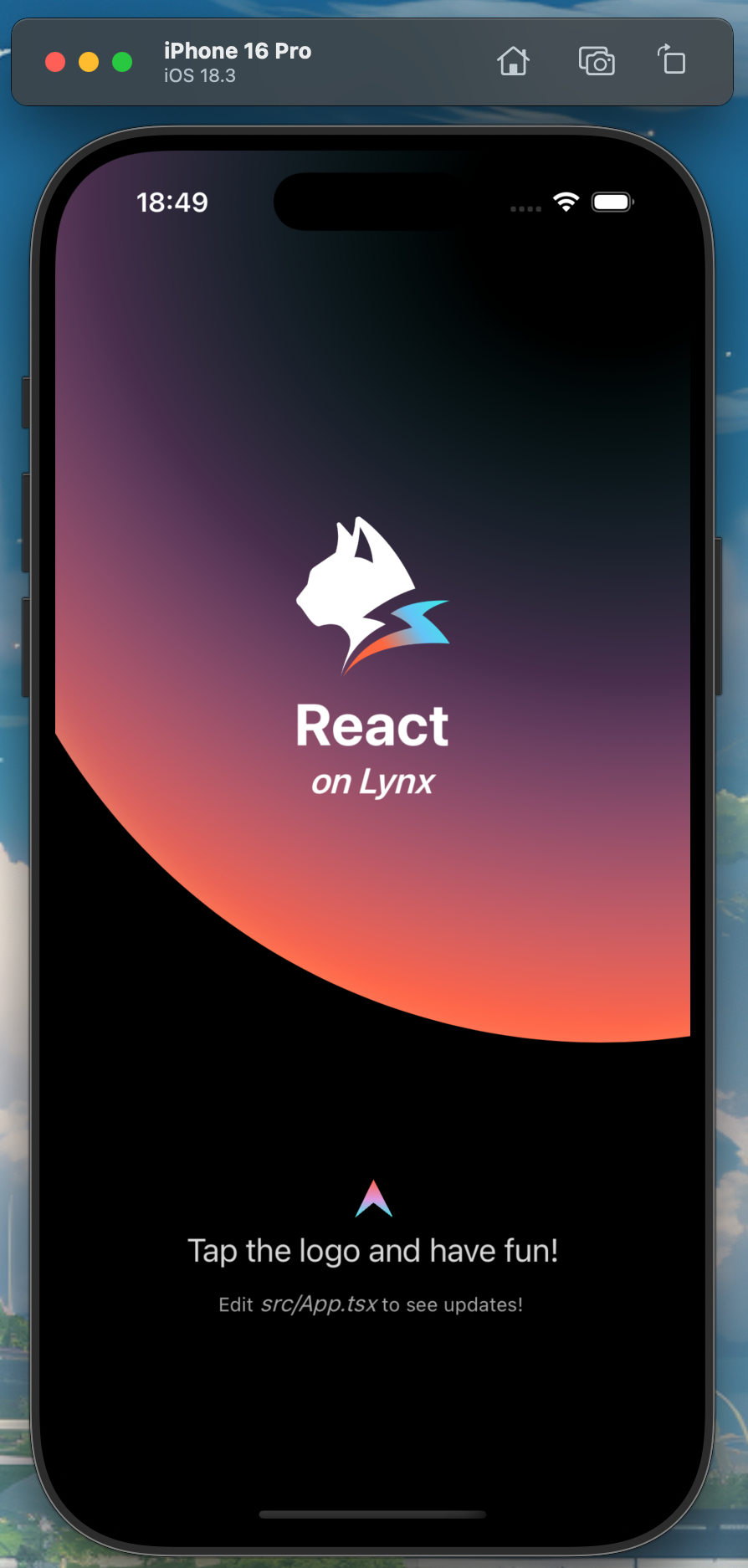
Open the codebase in your code editor and make updates and changes like any other project, and you will see the changes in real time.
If, for any reason, you have problems with your application making updates, there are a few things you can do to resolve them. There is a piece of code that does hot reloading, i.e., real-time changes. You can find it here:
if (import.meta.webpackHot) {
  import.meta.webpackHot.accept();
}
This is how to enable Hot Module Replacement (HMR) in a JavaScript module when using webpack. You can also restart the emulator by going to the Simulator and then Device > Restart.
Alternatively, you can close and re-run the app by opening the Simulator, accessing the App Switcher using the same URL, and swiping the app off the screen like you would on a physical iOS device.
If all else fails, then delete the app from the Simulator by long pressing on it and then removing the app. Then, you can repeat the process and drag and drop that LynxExplorer-x86_64.app back onto the Simulator to install it again.
Currently, Lynx.js lacks support for CSS media queries, which are heavily used in responsive layouts that dynamically change based on screen dimensions and orientation. At the moment, developers have to use Flexbox and CSS Grid to make their applications responsive.
This can be achieved by programmatically resizing styles and layouts with JavaScript based on viewport size and orientation data, allowing the user interface to respond dynamically. By detecting and responding to screen size and orientation changes in code, developers can build adaptive, user-friendly apps that deliver an optimal experience across a wide range of devices.
Check out the Lynx Blog to see their roadmap for development and future feature requests in this area.
When building cross-platform mobile applications, it’s important to deal with platform differences to ensure a seamless user experience on Android, iOS, and the web. Designs need to adapt to mobile interactions like taps and swipes (with a touch target size of at least 44×44 pixels) as compared to mouse input on the web.
Layout modifications need to be done for varying status bar heights; iOS will have taller bars due to notches, and web interfaces are browser-dependent. Safe areas need to be respected in all ecosystems. Navigation behaviors also differ, with Android offering a back button, iOS using swipe gestures, and the web using browser controls, which need to be implemented in customized forms, so refining these factors with device testing enables developers to deliver an intuitive, consistent experience across platforms.
Layout adjustments are necessary to account for differences in status bar heights — for example, iOS devices often have taller bars due to notches, while web interfaces vary based on the browser. Safe areas must be respected across all ecosystems. Navigation behaviors also differ: Android uses a back button, iOS uses swipe gestures, and web apps rely on browser controls. These patterns often require custom implementations, so thorough device testing is essential for enabling developers to deliver a consistent, intuitive experience across platforms.
Performance optimization that allows for smooth, fluid experiences on different mobile devices and browsers is important because devices need to be able to support different responsive designs. Optimized CSS properties like transform and opacity, utilized for animation and preventing expensive layout recalculations, can be used by developers to minimize reflows and repaint requirements when trying to maintain smooth UI interactions.
Additionally, efficient resource utilization is critical, especially on devices with low bandwidth and on processing-capable mobile devices. Lazy loading images postpones non-critical resource loading until needed, reducing initial loads.
As we mentioned earlier, Lynx.js has a multi-threaded engine, and native rendering enables these techniques to be even more effective, maintaining interfaces that are responsive and fast on all platforms.
To guarantee that your Lynx.js app delivers a unified and responsive experience on Android, iOS, and the web, you must test and debug it thoroughly. Since physical devices aren’t always possible, emulators and simulators can be good alternatives.
The Android Emulator included in Android Studio allows you to emulate varying Android devices and screen sizes. Xcode’s Simulator offers a range of iPhone and iPad models that can be used to test an app’s versatility.
In testing web applications, web browser debug tools like Chrome DevTools or Firefox Developer Tools are also useful. They give developers a way to test screen sizes, orientations, and even networks to toggle between mobile and desktop mode or test items for layout issues.
Lynx DevTool is another debugging tool, this one specifically meant for debugging Lynx.js applications. It offers features like element tree inspection, console log viewing, and JavaScript debugging. It is designed mainly to work in collaboration with Lynx.js’ built-in rendering engine, which enables you to diagnose framework-specific issues that other tools are not able to identify. For more details, refer to the Lynx DevTool documentation.
If you want to make sure that apps are responsive, here are some common debugging techniques worth taking into account:
In these types of situations, a systematic approach is usually recommended. Start with the smallest screen and gradually test bigger screens, checking for layout, usability, and performance issues along the way. Using emulators, simulators, browser developer tools, and the Lynx DevTool can make it easier to ensure that a Lynx application is responsive and high-performance on all the devices you are running it on.
Before we begin, remember that this tutorial works best if you have macOS because we need to use the iOS simulator application for testing, which is only available on Mac. You should have gone through the Setting Up Your Development Environment section prior to this section, so hopefully, you are already set up and good to go.
Let’s build a simple meal planner application using Lynx.js to implement what we’ve learned so far. Find a location on your computer where you want to create this project, and then create a folder named meal-planner-app. Then, cd into the folder and run the following command to set up our Lynx.js project:
npm create rspeedy@latest
This command will set up our Lynx.js project. These are the settings I chose:
After this part of the setup is complete, run this command to create the files and folders needed for our project codebase:
cd rspeedy-project
npm install
npm install react-router@6
cd src
mkdir -p data screens styles types
touch data/mealDatabase.ts && touch screens/HomeScreen.tsx && touch screens/SearchScreen.tsx
touch styles/HomeScreen.css && touch styles/SearchScreen.css
touch types/lynx.d.ts
Our project should now have all of the main folders and files required for our application, with the exception of the images, which you can download from the assets folder of this GitHub repository.
Download and copy all the images from this repo into your local assets folder for this project.
Now, we can start on the codebase, which shouldn’t take too long because it’s a simple application with only six files to work on.
But first, let’s take a look at what our application looks like:
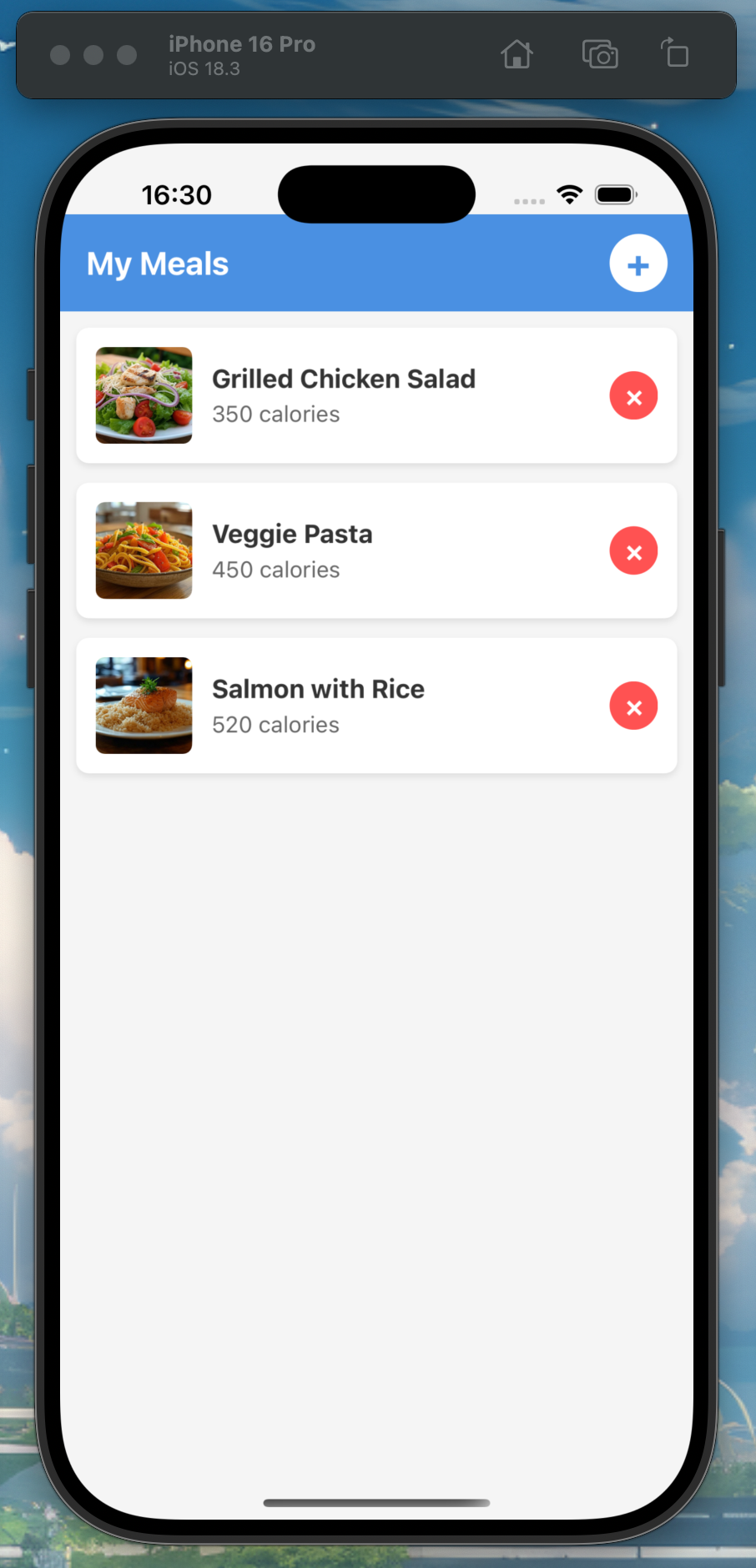
This is what our home screen will look like. As you can see, it displays the meals we have chosen with an image and their respective calories. There is also a delete button to remove a meal. At the top of the screen is an add button, which takes us to the search screen, where we can search and add meals:
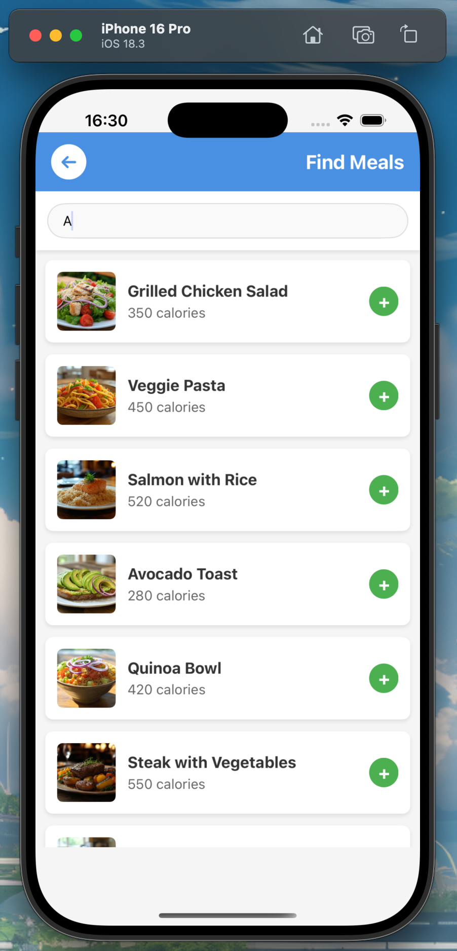
This is the search screen that allows us to search for different meals.
All of the meals are hardcoded, and in a production application, the meals would likely come from a database or server. On this screen, you can scroll and search for meals by typing in some letters based on their names. When you click on the add (+) button, you are automatically redirected back to the home screen, where you can view the meal you added. You can also use the back button to navigate back to the home screen. The navigation uses the React Router library.
And that’s the basic functionality of this simple meal planner app. Now, let’s build it!
The first file to work on will be the mealDatabase.ts file, which requires this code:
import avocadoToast from '../assets/avocado-toast.jpg';
import capreseSalad from '../assets/caprese-salad.jpg';
import chickenBurritoBowl from '../assets/chicken-burrito-bowl.jpg';
import eggBreakfastSandwich from '../assets/egg-breakfast-sandwich.jpg';
import greekYogurt from '../assets/greek-yogurt.jpg';
import grilledChickenSalad from '../assets/grilled-chicken-salad.jpg';
import lentilSoup from '../assets/lentil-soup.jpg';
import mediterraneanHummusPlate from '../assets/mediterranean-hummus-plate.jpg';
import mushroomRisotto from '../assets/mushroom-risotto.jpg';
import oatmealWithFruit from '../assets/oatmeal-with-fruit.jpg';
import peanutButterBananaToast from '../assets/peanut-butter-banana-toast.jpg';
import proteinSmoothie from '../assets/protein-smoothie.jpg';
import quinoaBowl from '../assets/quinoa-bowl.jpg';
import salmonWithRice from '../assets/salmon-with-rice.jpg';
import steakWithVegetables from '../assets/steak-with-vegetables.jpg';
import tofuVegetableCurry from '../assets/tofu-vegetable-curry.jpg';
import tunaSandwich from '../assets/tuna-sandwich.jpg';
import turkeyWrap from '../assets/turkey-wrap.jpg';
import vegetableStirFry from '../assets/vegetable-stir-fry.jpg';
import veggiePasta from '../assets/veggie-pasta.jpg';

export interface Meal {
  id: string;
  name: string;
  calories: number;
  image: string;
}

// Create a mock meal database with 20 food items
export const mealDatabase: Meal[] = [
  {
    id: '1',
    name: 'Grilled Chicken Salad',
    calories: 350,
    image: grilledChickenSalad,
  },
  {
    id: '2',
    name: 'Veggie Pasta',
    calories: 450,
    image: veggiePasta,
  },
  {
    id: '3',
    name: 'Salmon with Rice',
    calories: 520,
    image: salmonWithRice,
  },
  {
    id: '4',
    name: 'Avocado Toast',
    calories: 280,
    image: avocadoToast,
  },
  {
    id: '5',
    name: 'Protein Smoothie',
    calories: 320,
    image: proteinSmoothie,
  },
  {
    id: '6',
    name: 'Quinoa Bowl',
    calories: 420,
    image: quinoaBowl,
  },
  {
    id: '7',
    name: 'Greek Yogurt with Berries',
    calories: 180,
    image: greekYogurt,
  },
  {
    id: '8',
    name: 'Steak with Vegetables',
    calories: 550,
    image: steakWithVegetables,
  },
  {
    id: '9',
    name: 'Vegetable Stir Fry',
    calories: 380,
    image: vegetableStirFry,
  },
  {
    id: '10',
    name: 'Tuna Sandwich',
    calories: 420,
    image: tunaSandwich,
  },
  {
    id: '11',
    name: 'Chicken Burrito Bowl',
    calories: 650,
    image: chickenBurritoBowl,
  },
  {
    id: '12',
    name: 'Mushroom Risotto',
    calories: 480,
    image: mushroomRisotto,
  },
  {
    id: '13',
    name: 'Egg Breakfast Sandwich',
    calories: 390,
    image: eggBreakfastSandwich,
  },
  {
    id: '14',
    name: 'Lentil Soup',
    calories: 250,
    image: lentilSoup,
  },
  {
    id: '15',
    name: 'Caprese Salad',
    calories: 310,
    image: capreseSalad,
  },
  {
    id: '16',
    name: 'Turkey Wrap',
    calories: 430,
    image: turkeyWrap,
  },
  {
    id: '17',
    name: 'Oatmeal with Fruit',
    calories: 290,
    image: oatmealWithFruit,
  },
  {
    id: '18',
    name: 'Tofu Vegetable Curry',
    calories: 410,
    image: tofuVegetableCurry,
  },
  {
    id: '19',
    name: 'Mediterranean Hummus Plate',
    calories: 360,
    image: mediterraneanHummusPlate,
  },
  {
    id: '20',
    name: 'Peanut Butter Banana Toast',
    calories: 340,
    image: peanutButterBananaToast,
  },
];
This file is quite easy to understand. It is essentially our mock meal database, which contains 20 food items. As I mentioned earlier, if this were a production application, all of this data would be in a database or on a server, but for our quick example, it’s easier to just hardcode it. All of the images should be in the assets folder.
Next, we are going to work on the HomeScreen.tsx file, so copy and paste the code into this file:
import React from 'react';
import '../styles/HomeScreen.css';
import type { Meal } from '../data/mealDatabase.js';

interface HomeScreenProps {
  navigateTo: (screen: string) => void;
  meals: Meal[];
  removeMeal: (id: string) => void;
}

export function HomeScreen({ navigateTo, meals, removeMeal }: HomeScreenProps) {
  const navigateToSearch = () => {
    navigateTo('search');
  };

  return (
    <view
      className="home-screen"
      style={{
        width: '100%',
        height: '100%',
        paddingBottom: '80px',
        boxSizing: 'border-box',
      }}
    >
      <view
        className="header"
        style={{ position: 'sticky', top: 0, zIndex: 10 }}
      >
        <text className="title">My Meals</text>
        <view className="add-button" bindtap={navigateToSearch}>
          <text>+</text>
        </view>
      </view>

      {meals.length === 0 ? (
        <view className="empty-state">
          <text>No meals added yet. Tap + to add a meal.</text>
        </view>
      ) : (
        <scroll-view
          className="meals-list"
          style={{
            width: '100%',
            height: 'calc(100% - 60px)',
            paddingLeft: '10px',
            paddingRight: '10px',
          }}
          scroll-orientation="vertical"
        >
          {meals.map((meal) => (
            <view key={meal.id} className="meal-item">
              <image src={meal.image} className="meal-image" />
              <view className="meal-details">
                <text className="meal-name">{meal.name}</text>
                <text className="meal-calories">{meal.calories} calories</text>
              </view>
              <view
                className="remove-button"
                bindtap={() => removeMeal(meal.id)}
              >
                <text>×</text>
              </view>
            </view>
          ))}
        </scroll-view>
      )}
    </view>
  );
}
Our homepage is created from this file, and this is where all of our meals will be displayed once we have added them. There is some basic CRUD (create, read, update, delete) functionality, as we can delete meals after they have been added. In a more advanced version of this app, it could be possible to create and update meals, but that is beyond the scope of this tutorial.
Now for our SearchScreen.tsx file, which gets this upcoming code:
import { useCallback, useState } from '@lynx-js/react';
import React from 'react';
import '../styles/SearchScreen.css';
import { mealDatabase } from '../data/mealDatabase.js';
import type { Meal } from '../data/mealDatabase.js';

interface SearchScreenProps {
  navigateTo: (screen: string) => void;
  addMeal: (meal: Meal) => void;
}

export function SearchScreen({ navigateTo, addMeal }: SearchScreenProps) {
  const [searchTerm, setSearchTerm] = useState('');
  const [searchResults, setSearchResults] = useState<Meal[]>([]);

  const handleSearch = useCallback((value: string) => {
    setSearchTerm(value);
    if (value.trim() === '') {
      setSearchResults([]);
      return;
    }

    const results = mealDatabase.filter((meal: Meal) =>
      meal.name.toLowerCase().includes(value.toLowerCase())
    );
    setSearchResults(results);
  }, []);

  const handleBack = () => {
    navigateTo('home');
  };

  return (
    <view
      className="search-screen"
      style={{
        width: '100%',
        height: '100%',
        paddingBottom: '80px',
        boxSizing: 'border-box',
      }}
    >
      <view
        className="header"
        style={{ position: 'sticky', top: 0, zIndex: 10 }}
      >
        <view className="back-button" bindtap={handleBack}>
          <text>←</text>
        </view>
        <text className="title">Find Meals</text>
      </view>

      <view
        className="search-container"
        style={{ position: 'sticky', top: '60px', zIndex: 9 }}
      >
        <input
          className="search-input"
          type="text"
          placeholder="Search for meals..."
          value={searchTerm}
          bindinput={(e: any) => handleSearch(e.detail.value)}
        />
      </view>

      <scroll-view
        className="search-results"
        style={{
          width: '100%',
          height: 'calc(100% - 120px)',
          paddingLeft: '10px',
          paddingRight: '10px',
        }}
        scroll-orientation="vertical"
      >
        {searchResults.length === 0 && searchTerm !== '' ? (
          <view className="no-results">
            <text>No meals found. Try a different search term.</text>
          </view>
        ) : (
          searchResults.map((meal) => (
            <view
              key={meal.id}
              className="meal-item"
              bindtap={() => addMeal(meal)}
            >
              <image src={meal.image} className="meal-image" />
              <view className="meal-details">
                <text className="meal-name">{meal.name}</text>
                <text className="meal-calories">{meal.calories} calories</text>
              </view>
              <view className="add-icon">
                <text>+</text>
              </view>
            </view>
          ))
        )}
      </scroll-view>
    </view>
  );
}
This screen gives us the ability to search our hardcoded mealDatabase.js file and then add our meals to the home screen. The search box makes it fairly easy to find the meals we want because we can search by letters and names.
Now, we have to work on the styling for our two screens, so let’s start with HomeScreen.css and add this code to the file:
.home-screen {
  display: flex;
  flex-direction: column;
  height: 100%;
  background-color: #f5f5f5;
  position: relative;
  padding-top: env(safe-area-inset-top);
  padding-bottom: env(safe-area-inset-bottom);
}

.header {
  display: flex;
  justify-content: space-between;
  align-items: center;
  padding: 16px;
  background-color: #4a90e2;
  height: 60px;
  box-sizing: border-box;
}

.title {
  color: white;
  font-size: 20px;
  font-weight: bold;
}

.add-button {
  width: 36px;
  height: 36px;
  border-radius: 18px;
  background-color: white;
  display: flex;
  justify-content: center;
  align-items: center;
}

.add-button text {
  color: #4a90e2;
  font-size: 24px;
  font-weight: bold;
}

.empty-state {
  flex: 1;
  display: flex;
  justify-content: center;
  align-items: center;
  padding: 20px;
}

.empty-state text {
  color: #888;
  text-align: center;
}

.meals-list {
  flex: 1;
  padding: 10px;
}

.meal-item {
  display: flex;
  align-items: center;
  margin-bottom: 12px;
  padding: 12px;
  background-color: white;
  border-radius: 8px;
  box-shadow: 0 2px 4px rgba(0, 0, 0, 0.1);
}

.meal-image {
  width: 60px;
  height: 60px;
  border-radius: 6px;
  margin-right: 12px;
}

.meal-details {
  flex: 1;
}

.meal-name {
  font-size: 16px;
  font-weight: bold;
  color: #333;
  margin-bottom: 4px;
}

.meal-calories {
  font-size: 14px;
  color: #666;
}

.remove-button {
  width: 30px;
  height: 30px;
  border-radius: 15px;
  background-color: #ff5252;
  display: flex;
  justify-content: center;
  align-items: center;
  min-width: 30px;
}

.remove-button text {
  color: white;
  font-size: 18px;
  font-weight: bold;
}
It’s pretty straightforward; these styles are used to style all of the components on this screen.
Let’s finish the styling by adding the CSS for the SearchScreen.css file next:
.search-screen {
  display: flex;
  flex-direction: column;
  height: 100%;
  background-color: #f5f5f5;
  position: relative;
  padding-top: env(safe-area-inset-top);
  padding-bottom: env(safe-area-inset-bottom);
}

.header {
  display: flex;
  align-items: center;
  padding: 16px;
  background-color: #4a90e2;
  height: 60px;
  box-sizing: border-box;
}

.back-button {
  width: 36px;
  height: 36px;
  border-radius: 18px;
  background-color: white;
  display: flex;
  justify-content: center;
  align-items: center;
  margin-right: 12px;
  min-width: 36px;
}

.back-button text {
  color: #4a90e2;
  font-size: 20px;
  font-weight: bold;
}

.title {
  color: white;
  font-size: 20px;
  font-weight: bold;
}

.search-container {
  padding: 12px;
  background-color: white;
  box-shadow: 0 2px 4px rgba(0, 0, 0, 0.1);
  height: 60px;
  box-sizing: border-box;
}

.search-input {
  width: 100%;
  height: 36px;
  border-radius: 18px;
  border: 1px solid #ddd;
  padding: 0 16px;
  font-size: 16px;
  background-color: #f9f9f9;
}

.search-results {
  flex: 1;
  padding: 10px;
}

.no-results {
  padding: 20px;
  display: flex;
  justify-content: center;
  align-items: center;
}

.no-results text {
  color: #888;
  text-align: center;
}

.meal-item {
  display: flex;
  align-items: center;
  margin-bottom: 12px;
  padding: 12px;
  background-color: white;
  border-radius: 8px;
  box-shadow: 0 2px 4px rgba(0, 0, 0, 0.1);
}

.meal-image {
  width: 60px;
  height: 60px;
  border-radius: 6px;
  margin-right: 12px;
}

.meal-details {
  flex: 1;
}

.meal-name {
  font-size: 16px;
  font-weight: bold;
  color: #333;
  margin-bottom: 4px;
}

.meal-calories {
  font-size: 14px;
  color: #666;
}

.add-icon {
  width: 30px;
  height: 30px;
  border-radius: 15px;
  background-color: #4caf50;
  display: flex;
  justify-content: center;
  align-items: center;
  min-width: 30px;
}

.add-icon text {
  color: white;
  font-size: 18px;
  font-weight: bold;
}
And that takes care of the user interface design for both of our screens! Only two files remain, and then we can run our application.
Our first file will be lynx.d.ts, so add this code to the file:
declare namespace JSX {
  interface IntrinsicElements {
    view: any;
    'scroll-view': any;
    input: any;
    image: any;
    text: any;
  }
}
In this file, we have our TypeScript type definitions for Lynx.js components.
OK, good. Just one final file to complete, and our project will be ready. Replace all of the code in the App.tsx file with this code:
import { useState } from '@lynx-js/react';
import type { Meal } from './data/mealDatabase.js';
import { mealDatabase } from './data/mealDatabase.js';
import { HomeScreen } from './screens/HomeScreen.js';
import { SearchScreen } from './screens/SearchScreen.js';

// Use the first two meals from the database as default meals
const defaultMeals: Meal[] = [mealDatabase[0], mealDatabase[1]];

export function App() {
  const [currentScreen, setCurrentScreen] = useState('home');
  const [savedMeals, setSavedMeals] = useState<Meal[]>(defaultMeals);

  const navigateTo = (screen: string) => {
    setCurrentScreen(screen);
  };

  const addMeal = (meal: Meal) => {
    if (!savedMeals.some((savedMeal) => savedMeal.id === meal.id)) {
      setSavedMeals([...savedMeals, meal]);
    }
    setCurrentScreen('home');
  };

  const removeMeal = (id: string) => {
    setSavedMeals(savedMeals.filter((meal) => meal.id !== id));
  };

  return (
    <view style={{ width: '100%', height: '100%', overflow: 'hidden' }}>
      {currentScreen === 'home' ? (
        <HomeScreen
          navigateTo={navigateTo}
          meals={savedMeals}
          removeMeal={removeMeal}
        />
      ) : (
        <SearchScreen navigateTo={navigateTo} addMeal={addMeal} />
      )}
    </view>
  );
}
Our App.tsx file serves as the main component for our Lynx.js application and is set up to have the navigation between our home and search screens. It also holds our application state and passes down the functions to the child components, which can change the state.
Great — our project codebase is complete! Just run the command below to start the mobile application and copy and paste the web URL into the Lynx iOS simulator app:
npm run dev
Building cross-platform mobile applications with a responsive and consistent user interface doesn’t have to be a time-consuming experience. With Lynx.js, developers have a tool that can provide native rendering, a multithreaded engine, and a flexible UI design philosophy.
While still in beta at the time of this article’s writing, Lynx.js has all the hallmarks of a true cross-platform contender, competing alongside Flutter for mobile app development as well.
Hopefully, this article encourages you to learn more about Lynx.js and start building your own fun and innovative mobile applications!
There’s no doubt that frontends are getting more complex. As you add new JavaScript libraries and other dependencies to your app, you’ll need more visibility to ensure your users don’t run into unknown issues.
LogRocket is a frontend application monitoring solution that lets you replay JavaScript errors as if they happened in your own browser so you can react to bugs more effectively.
LogRocket works perfectly with any app, regardless of framework, and has plugins to log additional context from Redux, Vuex, and @ngrx/store. Instead of guessing why problems happen, you can aggregate and report on what state your application was in when an issue occurred. LogRocket also monitors your app’s performance, reporting metrics like client CPU load, client memory usage, and more.
Build confidently — start monitoring for free.

Build dynamic LLM routing in Next.js with OpenRouter, TanStack AI, task classification, model fallbacks, and cost-aware routing.

TSRX adds first-class control flow, conditional hooks, and scoped styles to React via a TypeScript compiler extension — no new framework required.

Learn how to build a full React Native auth system using Better Auth and Expo — with email/password login, Google OAuth, session persistence, and protected routes.

Compare the top AI development tools and models of June 2026. View updated rankings, feature breakdowns, and find the best fit for you.
Would you be interested in joining LogRocket's developer community?
Join LogRocket’s Content Advisory Board. You’ll help inform the type of content we create and get access to exclusive meetups, social accreditation, and swag.
Sign up now

 Learn more →
