

Most accessible theming systems follow a similar pattern: they use JavaScript to calculate relative luminance, then toggle a class or set a CSS variable based on the result. This approach works, but it can cause problems with SSR hydration mismatches, design tokens that don’t convert easily to hex, or performance issues when colors change often.

With the CSS contrast-color() function and container style queries, you can let the browser handle this logic for you. In this article, you’ll learn how to build a reusable card component that automatically chooses WCAG-compliant text and border colors for any background color it gets. There’s no need for JavaScript calculations, SCSS mixins, or class toggling.
The standard approach looks something like this: take a background color, compute its relative luminance, compare it against a threshold, and return #000 or #fff. In SCSS, you’d write a color-contrast() mixin. In JavaScript, it’s a utility function that gets called wherever a dynamic background is applied.
Here’s what that typically looks like:
function getRelativeLuminance(hex: string): number {
  const [r, g, b] = hexToRgb(hex).map((val) => {
    const s = val / 255;
    return s <= 0.03928 ? s / 12.92 : Math.pow((s + 0.055) / 1.055, 2.4);
  });
  return 0.2126 * r + 0.7152 * g + 0.0722 * b;
}

function getContrastColor(background: string): "#000000" | "#ffffff" {
  const luminance = getRelativeLuminance(background);
  return luminance > 0.179 ? "#000000" : "#ffffff";
}
This method works well on its own, but issues start to appear in real-world production environments.
When rendering a card component on the server, background colors may originate from user preferences, CMS fields, or runtime design tokens, which are unavailable at build time. You must either skip server-side contrast calculations and accept a color mismatch during hydration or duplicate logic across environments to maintain consistency.
Each time the background changes, the calculation runs again. On a dashboard with many cards, or in a design tool where users adjust colors often, this happens repeatedly. While it’s not a heavy task by itself, it’s extra work that the browser could manage on its own.
If your token system uses HSL, LCH, or oklch() color values, you need to convert them before using a hex-based luminance function. This adds extra steps or limits how you format your tokens, and neither option works well as your design system grows.
The main issue isn’t the math. It’s that you’re rebuilding something the browser can now handle, and you have to update your setup every time your color system changes.
contrast-color()?contrast-color() is a CSS function that takes a color and returns either white or black, depending on which one has a higher contrast ratio. The browser handles the luminance calculation automatically when it draws the page.
The basic syntax:
.card {
  background-color: var(--card-bg);
  color: contrast-color(var(--card-bg));
}
That’s all you need. You don’t need a utility function, class toggling, or any server-side calculation.
contrast-color() calculate contrast?The specification uses the WCAG 2.1 relative luminance formula, which is the same calculation you might use in JavaScript. The key difference is that the browser applies it after all color transformations, so it works with oklch(), hsl(), color-mix(), and other modern color functions. You don’t need to adjust anything before using it.
contrast-color() WCAG compliant?Yes, but with limitations. contrast-color() chooses whichever of black or white provides higher contrast against the background, which often meets WCAG AA requirements for large text. However, it doesn’t guarantee a 4.5:1 contrast ratio for every background color. For example, medium grays or muted mid-tone colors might pass AA for large text (3:1) but not for body text (4.5:1).
In practice, contrast-color() works well for UI elements where the background color comes from a controlled set, such as a design token palette, theme configuration, or curated color picker. If users can choose arbitrary colors, you should verify the contrast ratio separately.
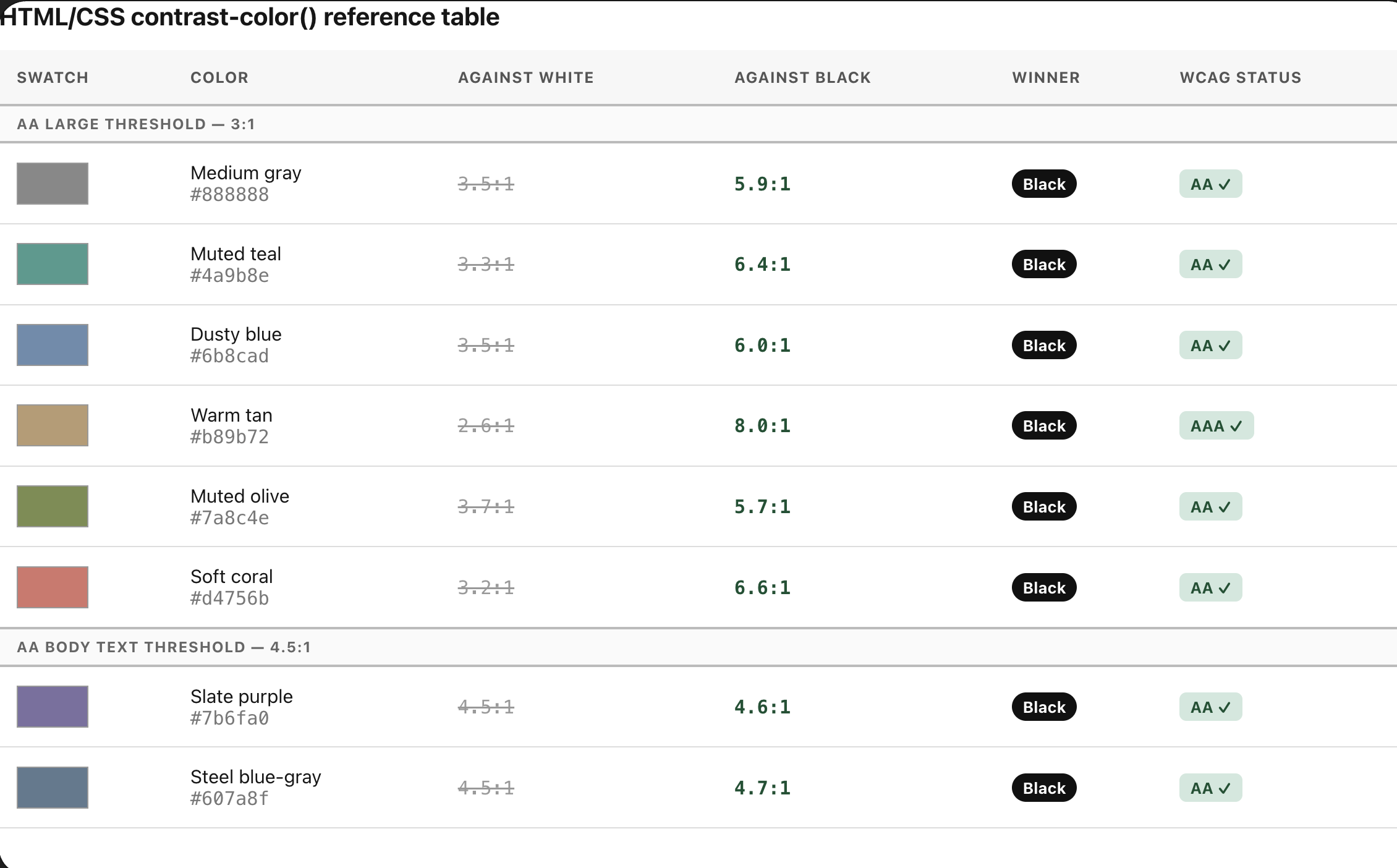
contrast-color()?The current specification doesn’t let you see the contrast ratio, set a custom threshold, or pick more than two color options. The original color-contrast() proposal, which let you rank several colors and set a minimum ratio, was removed during standardization. The version that shipped is simpler and handled by the browser. It covers most use cases, but it’s helpful to know its limits.
Design system note: contrast-color() only returns black or white. It can’t target off-black (#1a1a1a) or off-white (#fafafa) text tokens, even if your system uses them. If your palette uses custom text colors instead of pure black and white, you’ll still need a CSS custom property override for each surface, or a JS fallback for those specific tokens.
contrast-color()?contrast-color() automatically sets the text color, but for surface variants like different borders, background tints, or icon colors based on the card’s type (brand, neutral, or destructive), you need another approach. This is where container style queries help.
You’re probably familiar with size container queries. Style queries use the same @container rule, but instead of querying dimensions, you query the computed value of a custom property on the container:
@container style(--surface: brand) {
  .card__border {
    border-color: oklch(from var(--card-bg) calc(l - 0.1) c h);
  }
}
You don’t need to set a container-type for style queries; that’s only needed for size queries. If you want to target a specific ancestor, you’ll need a container-name. For a component that queries its own custom properties, anonymous containers are enough.
The alternative is something like this:
<div className={`card card--${surface}`} style={{ background: brandColor }} />
With this setup, your component ends up with two sources of truth: the inline style sets the color, while the class name controls the variant logic. These can get out of sync. For example, if you rename a token but forget to update the class condition, the border style might break without warning.
With style queries, the custom property becomes the single source of truth. To be clear, .card is the container, and the @container card style() blocks target its descendants. The card itself doesn’t query its own properties; it owns them.
It’s important to be clear about browser support for container style queries. There are two main levels of support:
@container style(--my-prop: value) is the supported subset. It works in Chrome 111+, Safari 18+, and Firefox 129+. This is what the component in this article uses.font-style or color on a container is still experimental and not reliably supported across browsers. Don’t use it in production yet.You can depend on this feature when querying custom properties that you define.
Every style decision in the card flows from two custom properties: --card-bg for the background color, and --surface for the variant flag. Set both on the card element with defaults:
.card {
  --card-bg: #764abc;
  --surface: neutral;

  background-color: var(--card-bg);
  container-name: card;
  border-radius: 14px;
  padding: 1.25rem;
  transition: background-color 0.4s cubic-bezier(0.4, 0, 0.2, 1);
}
Setting container-name: card establishes an explicit name for our style container. Naming the container ensures your @container card style() blocks target this specific component context rather than accidentally querying an unrelated container higher up the DOM tree.
The HTML for a single instance:
<div class="card" style="--card-bg: #764abc; --surface: brand">
  <span class="card__tag">brand</span>
  <h3 class="card__title">Dynamic card</h3>
  <p class="card__body">Text color adjusts automatically as background changes</p>
  <div class="card__border"></div>
</div>
The only thing that changes between instances is the inline style. There are no extra classes or JavaScript needed.
.card__title,
.card__body {
  color: contrast-color(var(--card-bg));
}
The browser reads --card-bg when it draws the page, calculates the luminance, and returns either black or white, depending on which has better contrast with the background. This works with hex, oklch(), hsl(), and color-mix() values. You don’t need to adjust anything yourself.
/* neutral: subtle border, outlined tag */
@container card style(--surface: neutral) {
  /* Targets descendants of .card, not .card itself */
  .card__tag {
    color: contrast-color(var(--card-bg));
    background: transparent;
    border: 1px solid oklch(from var(--card-bg) calc(l + 0.15) c h / 0.4);
  }
  .card__border {
    background: oklch(from var(--card-bg) calc(l + 0.1) c h / 0.5);
    height: 1px;
  }
}

/* brand: filled tag, prominent border */
@container card style(--surface: brand) {
  .card__tag {
    color: oklch(from var(--card-bg) calc(l - 0.2) c h);
    background: oklch(from var(--card-bg) calc(l + 0.3) c h / 0.25);
    border: 1px solid transparent;
  }
  .card__border {
    background: oklch(from var(--card-bg) calc(l - 0.15) c h);
    height: 2px;
  }
}

/* destructive: high-contrast tag, heaviest border */
@container card style(--surface: destructive) {
  .card__tag {
    color: #fff;
    background: oklch(from var(--card-bg) calc(l - 0.1) c h / 0.6);
    border: 1px solid transparent;
  }
  .card__border {
    background: oklch(from var(--card-bg) calc(l + 0.2) c h);
    height: 3px;
  }
}
The oklch(from var(--card-bg) ...) relative color syntax is important here. Instead of hardcoding border and tag colors, it creates them from --card-bg by adjusting the lightness channel. This way, the border always stands out from the surface, no matter what color you use. If you change --card-bg, the related colors update automatically.
Here’s the full component CSS:
.card {
  --card-bg: #764abc;
  --surface: neutral;

  background-color: var(--card-bg);
  container-name: card;
  border-radius: 14px;
  padding: 1.25rem;
  transition: background-color 0.4s cubic-bezier(0.4, 0, 0.2, 1);
}

.card__title,
.card__body {
  color: contrast-color(var(--card-bg));
}

@container card style(--surface: neutral) {
  /* Targets descendants of .card, not .card itself */
  .card__tag {
    color: contrast-color(var(--card-bg));
    background: transparent;
    border: 1px solid oklch(from var(--card-bg) calc(l + 0.15) c h / 0.4);
  }
  .card__border {
    background: oklch(from var(--card-bg) calc(l + 0.1) c h / 0.5);
    height: 1px;
  }
}

@container card style(--surface: brand) {
  .card__tag {
    color: oklch(from var(--card-bg) calc(l - 0.2) c h);
    background: oklch(from var(--card-bg) calc(l + 0.3) c h / 0.25);
    border: 1px solid transparent;
  }
  .card__border {
    background: oklch(from var(--card-bg) calc(l - 0.15) c h);
    height: 2px;
  }
}

@container card style(--surface: destructive) {
  .card__tag {
    color: #fff;
    background: oklch(from var(--card-bg) calc(l - 0.1) c h / 0.6);
    border: 1px solid transparent;
  }
  .card__border {
    background: oklch(from var(--card-bg) calc(l + 0.2) c h);
    height: 3px;
  }
}
To display the three variants side by side, just like in the demo, you only need to change the inline style for each instance:
<!-- Brand -->
<div class="card" style="--card-bg: #764abc; --surface: brand"> ... </div>

<!-- Neutral -->
<div class="card" style="--card-bg: #1d9e75; --surface: neutral"> ... </div>

<!-- Destructive -->
<div class="card" style="--card-bg: #d85a30; --surface: destructive"> ... </div>
The text color, tag style, and border weight all come from those two properties. You only need one component and no JavaScript.
See the Pen
Auto-Contrast Component with Modern CSS by Miracle Jude (@JudeIV)
on CodePen.
@supports?contrast-color() and container style queries don’t fail silently. Browsers that don’t support them just ignore the rules, which leaves elements unstyled. That can mean unreadable text on any background. The fix is simple: write safe base styles first, then add the enhanced behavior on top.
contrast-color()?To protect users on older browser engines, we declare an accessible solid background fallback text color before introducing the feature query block:
/* base: safe for all browsers */
.card__title,
.card__body {
  color: #fff;
}

/* enhanced: use native contrast calculation where supported */
@supports (color: contrast-color(red)) {
  .card__title,
  .card__body {
    color: contrast-color(var(--card-bg));
  }
}
White is the right default if your token palette skews dark. If your palette includes light backgrounds, swap it for #000 or pick the safer value per surface type.
Style queries need no @supports wrapper. Browsers that don’t support @container style() skip those blocks entirely and leave your base styles untouched. So write your fallback as plain base rules:
/* base: neutral treatment for all variants, all browsers */
.card__border {
  background: rgba(255, 255, 255, 0.3);
  height: 1px;
}

.card__tag {
  color: #fff;
  background: transparent;
  border: 1px solid rgba(255, 255, 255, 0.4);
}

/* enhanced: style query blocks override base styles where supported */
@container card style(--surface: neutral) { ... }
@container card style(--surface: brand) { ... }
@container card style(--surface: destructive) { ... }
Browsers that support style queries apply the @container overrides. Browsers that don’t keep the base styles. No feature detection needed.
When we pull both techniques together into a unified stylesheet, our baseline styles naturally dictate the layout, allowing modern browser enhancements to apply safely on top:
.card {
  --card-bg: #764abc;
  --surface: neutral;

  background-color: var(--card-bg);
  container-name: card;
  border-radius: 14px;
  padding: 1.25rem;
}

/* fallbacks */
.card__title,
.card__body { color: #fff; }

.card__border {
  background: rgba(255, 255, 255, 0.3);
  height: 1px;
}

.card__tag {
  color: #fff;
  border: 1px solid rgba(255, 255, 255, 0.4);
}

/* enhanced: contrast-color() */
@supports (color: contrast-color(red)) {
  .card__title,
  .card__body {
    color: contrast-color(var(--card-bg));
  }
}

/* enhanced: style queries */
@container card style(--surface: neutral) { ... }
@container card style(--surface: brand) { ... }
@container card style(--surface: destructive) { ... }
Older browsers get a clean, readable card. Browsers that support one feature but not the other get partial enhancement. For example, you might get contrast-color() without style queries, or style queries without contrast-color(). Both combinations still give you a usable result.
The approach in this article isn’t just about two new CSS features. It’s about noticing when JavaScript is solving a problem that the browser can now handle. CSS now handles relative luminance calculations and class-based variant switching. contrast-color() does the contrast math natively at paint time and supports modern color spaces. Container style queries let you keep all variant logic in one place, managed by the same custom property that sets the color.
The result is a card component that:
As web frontends get increasingly complex, resource-greedy features demand more and more from the browser. If you’re interested in monitoring and tracking client-side CPU usage, memory usage, and more for all of your users in production, try LogRocket.
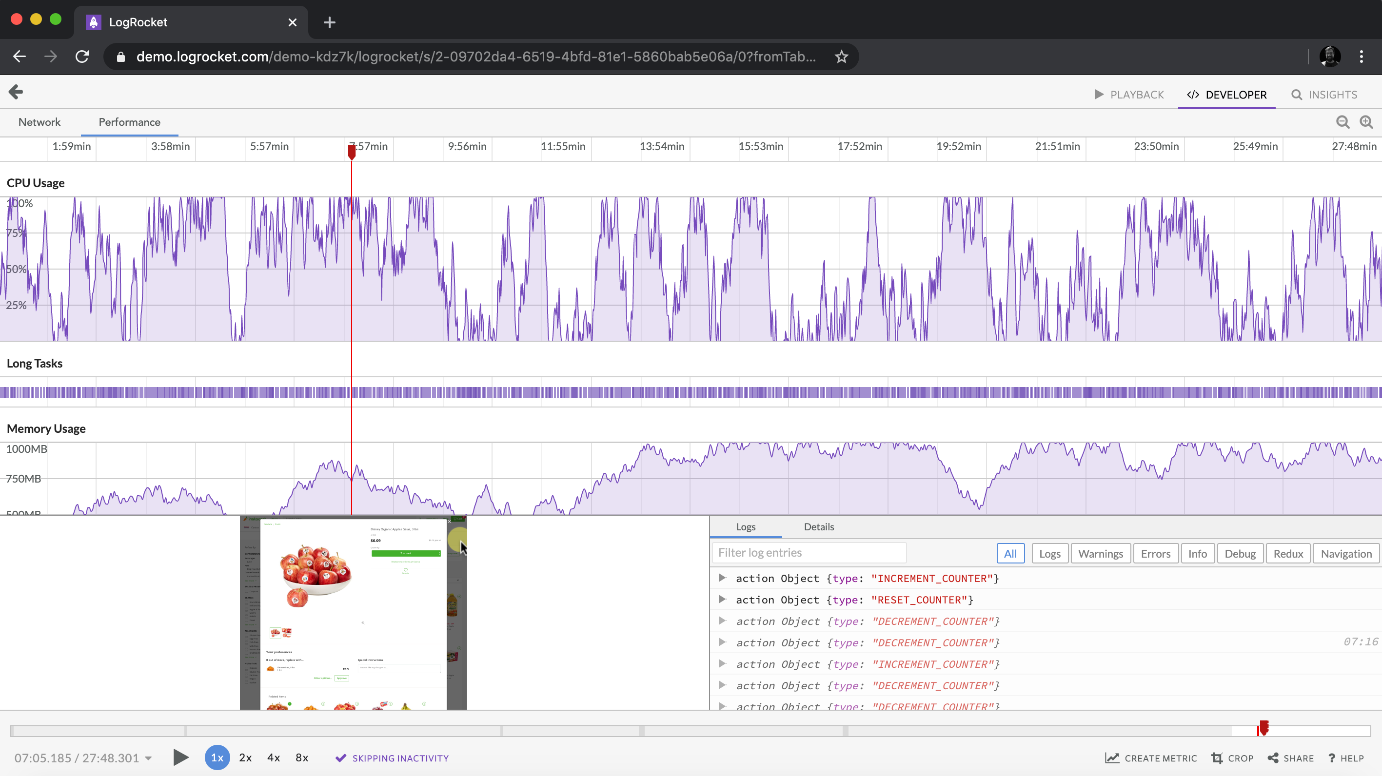
LogRocket lets you replay user sessions, eliminating guesswork around why bugs happen by showing exactly what users experienced. It captures console logs, errors, network requests, and pixel-perfect DOM recordings — compatible with all frameworks.
LogRocket's Galileo AI watches sessions for you, instantly identifying and explaining user struggles with automated monitoring of your entire product experience.
Modernize how you debug web and mobile apps — start monitoring for free.

Compare five React toast libraries for features, bundle size, accessibility, performance, and React 19 compatibility.

See how Tecovas built a patching agent that turns LogRocket’s Galileo AI issue analysis into GitHub PRs, with a developer reviewing every fix before it ships.

Explore OctaneJS, a compiler-first alternative to React. Build a task dashboard and learn about rendering, hooks, asynchronous UI, and React compatibility.

Explore Vercel’s vgpu, a WebGPU library for AI agents. Learn to build a dynamic shader in Next.js and validate rendering output with headless testing in Node.js.
Hey there, want to help make our blog better?
Join LogRocket’s Content Advisory Board. You’ll help inform the type of content we create and get access to exclusive meetups, social accreditation, and swag.
Sign up now

 Learn more →