
Have you ever set out to build a layout and found that once you shrink the screen, some elements are missing because they had fixed widths or unoptimized images? Why does this happen? Well, in simple words, this means that your layout was not responsive. If you fail to keep mobile users in mind when building layouts, you will have to adjust your designs. You may not need to start from scratch, but it will be stressful.
You can save yourself the headache in two ways. Your first plan of attack could be fixing your widths, optimizing your images, and using media queries. However, you could also remedy this annoying situation using a framework like Pure.css.
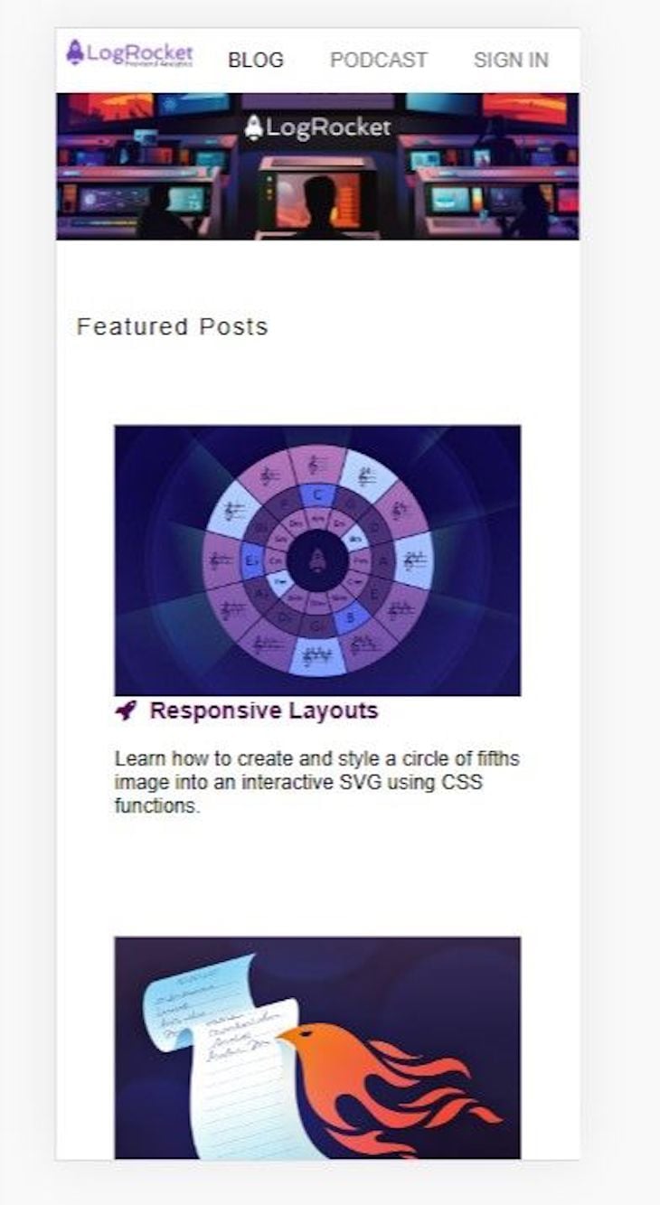
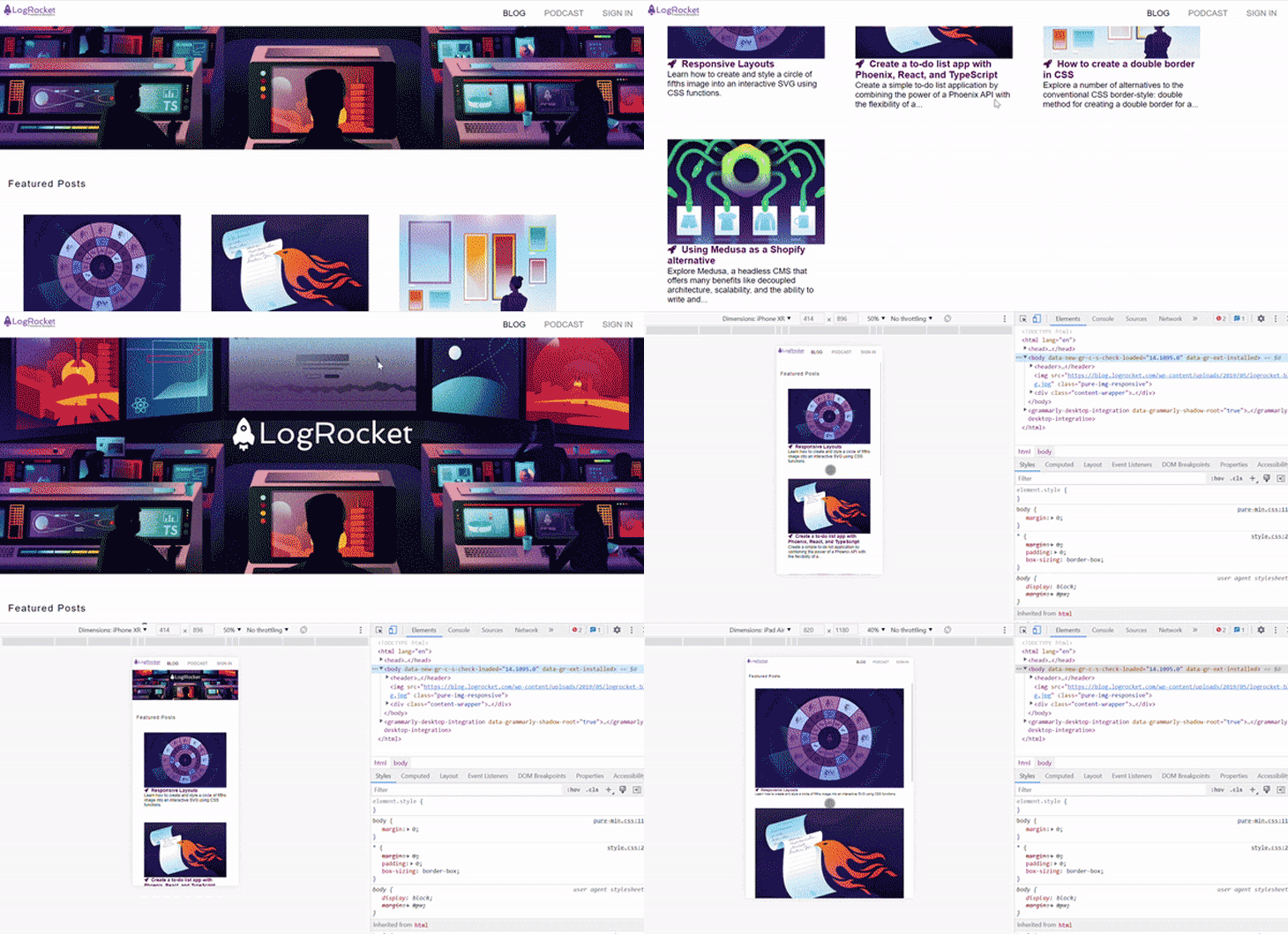
This article will focus on creating responsive mobile layouts with Pure.css. However, before getting started, you will need a fundamental knowledge of CSS and its frameworks, an understanding of HTML, media queries, and a code editor installed on your machine. Using Pure.css, we will recreate a demo of LogRocket’s blog interface, and at the end of the article, we should have the image below:
Jump ahead:
The Replay is a weekly newsletter for dev and engineering leaders.
Delivered once a week, it's your curated guide to the most important conversations around frontend dev, emerging AI tools, and the state of modern software.
Pure.css is an open source CSS framework developed by Yahoo. It is a minimalist CSS framework that provides basic styles for HTML elements, making it easier to create clean, fast-loading websites. It is designed to be incredibly small, and the entire set of modules does not exceed three and a half kilobytes. Pure.css was also designed with mobile layouts in mind, making it responsive and modular — enabling developers to include the styles they need in their projects.
With minimal styling and low specificity, Pure.css is easy to override, making it an excellent choice for building custom styles. According to a general rule about responsiveness, “it is a good practice to create for mobile displays first, then move on to medium screen sizes like the iPad mini or air, and then move on to large screen sizes like the monitor or laptop.”
Because some features are not required for mobile users, building for desktop first could involve a lot of responsive work. This is where CSS frameworks like Bootstrap CSS, Bulma CSS, Tailwind CSS, and Pure.css shine. With Pure.css, you can easily handle mobile-first designs.
Below are lists of the main modules in Pure.css, along with a brief explanation of each:
inputs, labels, and form fieldsThese are the main modules in Pure.css, and they are all made to be responsive.
Every framework has its distinct qualities and strengths. Pure.css strength covers three significant features making it important to use. Pure.css excels because of its cross-browser compatibility, mobile responsiveness, and speed.
Cross-browser compatibility refers to the ability of a website or web application to function correctly on different web browsers. Pure.css modules were built on top of normalize.css, which helps the framework maintain cross-browser consistency.
Pure.css’ key feature is its ability to be responsive. Its use of a mobile-first approach prioritizes the design and styles for smaller screens, such as those found on smartphones. Then it expands those styles to accommodate larger screens, such as those on desktop computers.
As mentioned earlier, the entirety of Pure.css modules does not equal five kilobytes. The small size of the framework means that it loads quickly, reducing the time it takes for your website to become usable. Prioritizing the design for smaller screens and then expanding to accommodate larger screens ensures that the framework is optimized for fast performance on devices with limited processing power, such as smartphones.
This section covers the classes that contributed to building our responsive mobile layout, and we’ll start with the grid system. The grid system in Pure.css is a responsive layout system used to create dynamic layouts. For example, it allows you to divide your webpage into rows and columns. To use the grid system, you will need to include Pure.css’ grids-responsive.css on your page:
<link rel="stylesheet" href="https://cdn.jsdelivr.net/npm/[email protected]/build/grids-responsive-min.css">
Grids are implemented using Pure.css classes in your elements:
|
Pure.css classes
|
Screen size
|
Classes for columns
|
Number of columns
|
pure-u- |
Small (min-width: 35.5em)
Example: Mobile phones
|
pure-u- pure-u-1-2 pure-u-1-3 |
One column
Two columns
Three columns
|
pure-u-md- |
Medium (min-width: 48em)
Example: Tablets
|
pure-u-md-pure-u-md-1-2pure-u-md-1-3 |
One column
Two columns
Three columns
|
pure-u-lg- |
Large (min-width: 64em)
Example: Desktop
|
pure-u-lg-1pure-u-lg-1-2pure-u-lg-1-3pure-u-lg-1-4 |
One column
Two columns
Three columns
Four Columns
|
Next, we’ll look at the image classes in Pure.css. Pure image classes are added to <img> tags for responsivity. Below is the implementation:
<img class="pure-img" src="...">.
Lastly, Pure.css menus can be vertical or horizontal and are very responsive. Check out this reference post to see the various implementations and how it was used in this article.
In this section, we will build a responsive mobile layout starting from the menu. Before you start, you will need to set up the development area. Pure can be installed in two ways. You can follow the steps below or visit the documentation to learn more.
The recommended way to integrate Pure.css in a project is by installing it via package managers:
$ npm install purecss --save
To integrate Pure.css into your webpage, you can use the free jsDelivr CDN. Just add the following <link> element to your page’s <head> before adding your project’s style sheets. Here’s what that should look like:
<link rel="stylesheet" href="https://cdn.jsdelivr.net/npm/[email protected]/build/pure-min.css" integrity="sha384-X38yfunGUhNzHpBaEBsWLO+A0HDYOQi8ufWDkZ0k9e0eXz/tH3II7uKZ9msv++Ls" crossorigin="anonymous">
Here, we will build our horizontal menu containing the LogRocket logo, Podcast, Blog, and Sign In texts. This can be quickly done with Pure.css with the following code:
//Implementing our Menu
  <header>
    <div class="header">
        <div class="home-menu pure-menu pure-menu-horizontal pure-menu-fixed">
            <img width="100em" height="100%" src="https://blog.logrocket.com/wp-content/uploads/2022/09/logrocket-logo-frontend-analytics.png" alt="" class="pure-img-responsive">

            <ul class="pure-menu-list">
                <li class="pure-menu-item pure-menu-selected"><a href="#" class="pure-menu-link">BLOG</a></li>
                <li class="pure-menu-item"><a href="https://podrocket.logrocket.com/" class="pure-menu-link">PODCAST</a></li>
                <li class="pure-menu-item"><a href="https://blog.logrocket.com/tech-meetups/" class="pure-menu-link">SIGN IN</a></li>

            </ul>
        </div>
    </div>
  </header>
The HTML code above creates a header for a website. It includes a LogRocket logo (image tag) and a navigation menu (unordered list) with three menu items: BLOG, PODCAST, and SIGN IN.
The logo and the menu are contained within a div with the class header. These have a fixed position at the top of the page and are horizontally aligned using the pure-menu-horizontal class from the Pure.css framework.
However, we will need to add our styles for a preferred look. Add the following code:
CSS
.home-menu {
    padding: 0.5em;
    text-align: left;
    background: white;
}
.home-menu ul {
        float: right;
    }
At the end of this, we should have the desktop and mobile images:
![]()

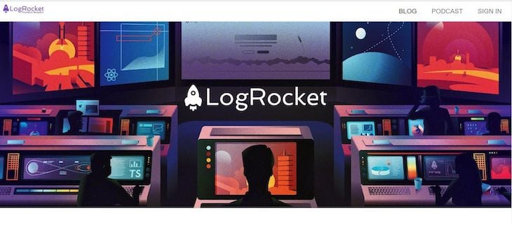
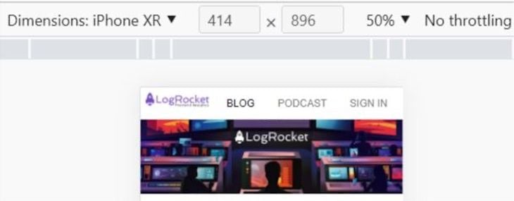
Looking at our demo above, we had an image below the menu. Let’s copy the image URL from the LogRocket blog and use Pure.css class to make it responsive. Copy the code below:
HTML
IMAGE RIGHT BELOW THE MENU.
<img src="https://blog.logrocket.com/wp-content/uploads/2019/05/logrocket-blog.jpg" class="pure-img-responsive">
This is what it looks like for desktop and mobile users:
Hanging in there? Don’t worry; we’re almost done.
To make our featured post section responsive with Pure.css, our code should resemble the code block below:
HTML
  <div class="content-wrapper">
        <div class="content">
            <h3 class="content-head is-center">Featured Posts</h3>

            <div class="pure-g ">
                <div class="l-box  pure-u-lg-1-4  ">

                        <h3 class="content-subhead">
                            <img  class="pure-img" src="https://blog.logrocket.com/wp-content/uploads/2023/01/creating-interactive-svg-circle-fifths-nocdn.png" alt="">
                            <i class="fa fa-rocket"></i>
                            Responsive Layouts
                        </h3>
                        <p>
                            Learn how to create and style a circle of fifths image into an interactive SVG using CSS functions.
                        </p>

                </div>
                <div class="l-box  pure-u-lg-1-4">

                        <h3 class="content-subhead">
                            <img class="pure-img" src="https://blog.logrocket.com/wp-content/uploads/2023/01/phoenix-react-typescript-to-do-list-nocdn.png" alt="">
                            <i class="fa fa-rocket"></i>
                            Create a to-do list app with Phoenix, React, and TypeScript
                        </h3>
                        <p>
                            Create a simple to-do list application by combining the power of a Phoenix API with the flexibility of a...
                        </p>


            </div>
            <div class="l-box  pure-u-lg-1-4">

                    <h3 class="content-subhead">
                        <img class="pure-img" src="https://blog.logrocket.com/wp-content/uploads/2023/01/how-create-double-border-css-nocdn.png" alt="">
                        <i class="fa fa-rocket"></i>
                        How to create a double border in CSS
                    </h3>
                    <p>
                        Explore a number of alternatives to the conventional CSS border-style: double method for creating a double border for a...
                    </p>

        </div>
        <div class="l-box  pure-u-lg-1-4">

                <h3 class="content-subhead">
                    <img class="pure-img" src="https://blog.logrocket.com/wp-content/uploads/2023/01/medusa-shopify-alternative-nocdn.png" alt="">
                    <i class="fa fa-rocket"></i>
                    Using Medusa as a Shopify alternative
                </h3>
                <p>
                    Explore Medusa, a headless CMS that offers many benefits like decoupled architecture, scalability, and the ability to write and...
                </p>


    </div>
        </div>
The HTML code above contains four posts, each represented by a box. Each box contains an image, a title with an icon, and a short description of the post. The titles and descriptions are wrapped in a content-subhead class, which styles the text, and an image is included in each box with the pure-img class.
The boxes are set up using the Pure.css grid modules and are evenly spaced across the page like a grid layout. The layout is divided into four columns, with each box occupying a quarter of the page width. The titles of the posts each have an icon represented by the fa fa-rocket class, which styles a rocket icon next to the text. The images are loaded from LogRocket.
Here is a little tweak using the grid class in Pure.css. If pure-u- or pure-u-md- were used, you may not end up with a responsive website. For example, if pure-u-1-3 were used, the bigger screen would have three columns. However, when we get to the smaller screen, it will have three columns. This means it’s not entirely responsive because the bigger screen should have four columns when the screen shrinks and be left with one for the sake of mobile users.
It’s advisable to use a large grid class (pure-u-lg-) for a large screen, so the responsivity goes to a smaller screen size when it shrinks. Let’s style our app a bit:
CSS
.pure-u-lg-1-4{
    margin:30px;

}
.div1{
    width: 100%;
}
.content {
    padding: 1em 1em 3em;
}
/* This is the class used for the main content headers (<h2>) */
.content-head {
    font-weight: 200;
    letter-spacing: 0.10em;
    margin: 2em 0 1em;
}
/* This is the class used for the content sub-headers (<h3>) */
.content-subhead {
    color: rgb(81, 9, 81);
}
.content-subhead i {
    margin-right: 5px;
}
At this point, we should have our mobile layout in our demo up and running:
In this article, we learned how to build a responsive mobile layout with Pure.css. Using Pure.css is an excellent option for those who want to create basic layouts for websites quickly and easily, focus on content and functionality over styling, or have a minimalistic design aesthetic.
It is also designed with mobile-first responsiveness in mind. However, it’s important to consider the specific requirements of your projects and choose the framework or library that is the best fit.
As web frontends get increasingly complex, resource-greedy features demand more and more from the browser. If you’re interested in monitoring and tracking client-side CPU usage, memory usage, and more for all of your users in production, try LogRocket.

LogRocket lets you replay user sessions, eliminating guesswork around why bugs happen by showing exactly what users experienced. It captures console logs, errors, network requests, and pixel-perfect DOM recordings — compatible with all frameworks.
LogRocket's Galileo AI watches sessions for you, instantly identifying and explaining user struggles with automated monitoring of your entire product experience.
Modernize how you debug web and mobile apps — start monitoring for free.
When should you move API logic out of Next.js? Learn when Route Handlers stop scaling and how ElysiaJS helps.

Explore how Dokploy streamlines app deployment with Docker, automated builds, and simpler infrastructure compared to traditional CI/CD workflows.
A side-by-side look at Astro and Next.js for content-heavy sites, breaking down performance, JavaScript payload, and when each framework actually makes sense.

AI-generated tests can speed up React testing, but they also create hidden risks. Here’s what broke in a real app.re
Hey there, want to help make our blog better?
Join LogRocket’s Content Advisory Board. You’ll help inform the type of content we create and get access to exclusive meetups, social accreditation, and swag.
Sign up now