Editor’s note: This guide to creating responsive web layouts with CSS grid was last updated by Cristian Díaz on 7 June 2023 to better showcase a responsive web layout and include new sections on the benefits of using CSS grid and improving accessibility. To get up to speed, check out our guide to getting started with CSS grid.
The logic behind CSS grid is simple. If a developer takes an element like a div and displays a grid in it, they can then split the element into columns and rows — collectively known as tracks — where items can be taken and placed in the grid. With CSS grids, this can all happen without the extra work of using positioning properties (top, right, left, bottom).
There are instances where one would use CSS frameworks and others where one would use CSS grid, but as with most things in web development, it depends on your use case. In this article, we’ll focus on basic design using rows, columns, and areas to build a simple responsive web application using CSS grid.
Jump ahead:
The Replay is a weekly newsletter for dev and engineering leaders.
Delivered once a week, it's your curated guide to the most important conversations around frontend dev, emerging AI tools, and the state of modern software.
To answer this question, we need to first define what responsive design is. Responsive design is a design approach that allows us to create websites that adapt to all kinds of devices based on different aspects like screen size, user preferences, or device capabilities. A responsive layout applies the same principle.
The idea is to create a layout design that adapts well to different devices. The main concern is creating a layout that adapts to different screen sizes. There are two approaches to this: you can either adapt a layout in an explicit way by using media queries to adjust it to a specific screen size (that’s often called a breakpoint). Or, you can also create a set of rules that create a layout that arranges content by itself.
It’s important to notice this because CSS grid can help us create a responsive layout by using both media queries and by letting you set a set of rules that make the layout by itself. This article will cover CSS grid’s potential to create responsive layouts by using both approaches.
CSS grid is a two-dimensional grid system designed to help web developers divide elements into columns and rows to create a consistent and seamless layout for web applications. The CSS Grid Layout Module was added to the CSS specs to allow us to create a two-dimensional layout that lets developers create a series of rows and columns.
These rows and columns can be used to either position elements explicitly (that means you decide in which column and row you want to position an element) or implicitly (that means you give a set of rules and you let the browser decide where to position each element).
That makes of CSS grid a powerful tool for layout creation because being able to set a set amount of columns and rows and define its dimensions gives you a huge amount of control to create your layouts. This is very important, as we’ll see later in this article. For more on CSS grid, I recommend checking out the W3 CSS grid Layout Module and the MDN CSS grid web docs.
Let’s start by taking a few moments to understand some of the core fundamentals of CSS grid:
grid-template-columns and grid-template-rows propertiesgrid-template-columns and grid-template-rowsGrid’s capacity to create a two-dimensional layout and position each element inside a grid in a specific column and row gives it a huge advantage over other layout alternatives like CSS flex. CSS grid gives a developer granular control that opens a lot of possibilities to create complex layouts.
If you can imagine any layout, you will likely use a grid to make it. If you want to know the possibilities, take a quick look at Grid by Example, and you’ll notice the possibilities. But, what if you need to create a layout pattern that adapts the content by itself?
Well, grid can help us with this task as well! There are some properties we’ll discuss later that create automatic layouts, and with little to no instructions, the content will adapt to any screen size. You can do that with flex as well, but grid requires less setup to do this.
The grid container is the starting point for displaying a grid on an element. To get going with grid, we must first display the grid on the container using the syntax below:
display: grid;
In CSS grid, the relationship between the grid container and its items (elements) is that of parent and children, respectively. Every grid has a container that contains items, and every element placed on a grid is a grid item. When you make a container a grid ( display: grid;), all of its direct children become grid items automatically, as shown here:
<div class="container"> <div class ="item item1">1</div> <div class = "item item2">2</div> </div> .container{ display: grid; }
But, displaying items as a grid does not do much on its own. This is where other concepts like grid-template-columns and grid-template-rows come into play.
fr unit and repeat() notationWhile we can always use fixed units of measurement like px in defining grids, CSS grid layout also introduces a new unit of measurement called the fr unit. The fr unit represents a fraction of the available space in the grid and can be used to create flexible grid tracks. Here’s an example:
.container {
display: grid;
grid-template-columns: 2fr 1fr 1fr;
}
The above code snippet will split the available space into four parts: two parts will be assigned to the first track, while the remaining two parts will be assigned one track each according to the available space left.
This helps maintain consistency when building your grid. The repeat() notation also helps ensure consistency and can be used to repeat all or part of a track listing like so:
.container {
display: grid;
grid-template-columns: repeat(3, 1fr);
}
auto-fit and auto-fillIt has been said before that you can create a grid that adapts to the container’s width to position elements by itself. Two very important tools to achieve that are the keyboards auto-fit and auto-fill.
When you create columns with grid-template-columns, you can use those keyboards and set a minimum and maximum value with the minmax function to set the minimum and maximum values of the columns.
After that, the browser will decide how many columns it’ll create based on that input. That lets you create a layout that positions elements by itself. Let’s look at this example:
.grid {
  display: grid;
  gap: 1rem;
  grid-template-columns: repeat(auto-fit, minmax(min(20rem, 100%), 1fr));
}
In this example, we’re telling the browser to create columns that, as a minimum, have 20rem of width and a maximum of 1fr. We’re using the min function inside the minmax function just to make sure it creates a column of 100% of the container’s width in case the container itself is less than 20rem in width.
Setting a maximum of 1fr means it’ll create even columns if there is enough space for them. Now, auto-fit and auto-fill have a crucial difference — auto-fit will fit the currently available columns to the container’s width.
On the other hand, auto-fill will create as many columns as it can, regardless of how many elements are available in the container. For example, let’s suppose a container can create five columns, but the container itself only has three inner elements.
With auto-fit, it’ll expand the remaining space to keep the three columns because that’s the amount of elements it has. With auto-fill, it’ll create the space for five columns, regardless of how many elements the container element has.
More often than not, you’ll be using auto-fit. However, it’s important to keep in mind the difference. And, it’s also very important to keep this tool in mind because it’ll be our main way to create an automatic layout without using media queries.
Now, let’s get into building a web app with CSS grid. Here’s what it will look like:
See the Pen
Responsive Grid Demo (Updated fork) by Cristian Diaz (@ItsCrisDiaz)
on CodePen.
First, we will create a simple HTML template and fill it with some dummy text to help establish some structure. Here’s the code:
<header>
<nav>
<ul role="list">
<li><a href="#">Home</a></li>
<li><a href="#">About</a></li>
<li><a href="#">Contact</a></li>
</ul>
</nav>
</header>
<main>
<h1>A Demo Site showcasing CSS Grid</h1>
<!-- Content -->
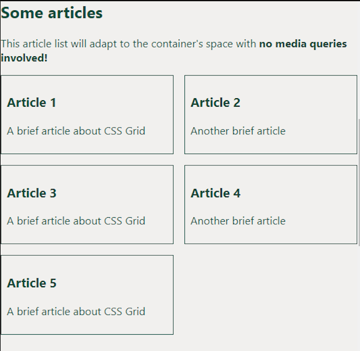
<h2>Some articles</h2>
<p>This article list will adapt to the container's space with <strong>no media queries involved!</strong></p>
<ul role="list">
<li>
<article>
<h3>Article 1</h3>
<p>A brief article about CSS Grid</p>
</article>
</li>
<li>
<article>
<h3>Article 2</h3>
<p>Another brief article</p>
</article>
</li>
<li>
<article>
<h3>Article 3</h3>
<p>A brief article about CSS Grid</p>
</article>
</li>
<li>
<article>
<h3>Article 4</h3>
<p>Another brief article</p>
</article>
</li>
<li>
<article>
<h3>Article 5</h3>
<p>A brief article about CSS Grid</p>
</article>
</li>
</ul>
</main>
<aside class="sidebar img">
<h2>Find Me on Social Media</h2>
<p><a href="https://twitter.com/charliecodes">Twitter</a></p>
<p><a href="https://www.linkedin.com/in/charleseteure/">LinkedIn</a></p>
</aside>
<section class="about">
<h2>About </h2>
<!-- Content -->
</section>
<section class="contact">
<h2>Contact</h2>
<!-- Content -->
</section>
<footer>
<!-- Content -->
</footer>
Now, we will link the CSS style sheet to our HTML template and implement the layout using CSS grid. We have added some comments with the code snippets to help with clarity:
body{
  background: #F1F0EE;
  margin: 0;
  /* Crates a grid container */

  display: grid;

  /* define the amount and size of each column. Here we define 4 columns with equal fractions  */

  grid-template-columns: repeat(4, 1fr);


/* define where each element will be in the grid. We achieve this with grid-template-areas */

  grid-template-areas:
    "nav nav nav nav"
    "main main main sidebar"
    "about about about sidebar"
    "contact contact contact sidebar"
    "footer footer footer footer";

/* we can set gaps - gutters between the rows and columns*/

  gap: 0.5rem;
  color: #004d40;
  font-family: -apple-system, BlinkMacSystemFont, "Segoe UI", Roboto, Helvetica, Arial, sans-serif, "Apple Color Emoji", "Segoe UI Emoji", "Segoe UI Symbol";
}
 /* Styling the Nav starts here */

header {
  background-color: #3770F6;
  grid-area: nav;
}

/* Removes list's styles while keeping screen reader's semantics */
ul[role="list"] {
  list-style: none;
  padding: 0;
}

header {
  background-color: #3770F6;
  grid-area: nav;
}

header ul{
  font-weight: bolder;
}

nav li{
  display: inline-block;
}

li a{
  color: #ffffff;
}
  /* Styling the Nav ends here */

a:hover{
  color: #FF7F50;
}

main {
  grid-area: main;
}

main h2 {
  font-weight: bolder;
}

main p{
  text-align: left;
}

article {
  border: 1px solid currentColor;
  padding: 0.5rem;
}

.sidebar {
  background: #D3D4D7;
  grid-area: sidebar;
}

.about {
  background: #D7D6D3;
  grid-area: about;
}

.contact {
  background: #BDBCBB;
  grid-area: contact;
}


footer {
  background-color: #3770F6;
  grid-area: footer;
  color: #ffffff;
}

footer a {
  color: #ffffff;
}

a {
  text-align: center;
  display: block;
  font-family: inherit;
  text-decoration: none;
  font-weight: bold;
  margin: 1rem;
}

/* For smaller screens */

@media only screen and (max-width: 550px) {
  .container {
    grid-template-columns: 1fr;
    grid-template-areas:
      "nav"
      "sidebar"
      "main"
      "about"
      "contact"
      "footer";
  }
}
This general layout looks good, but now it’s time to create an inner layout for the article list. We could use a similar approach, but in this case, it’s preferable to check the container’s width instead. This is where using auto-fit comes in handy to create this layout. Check out the code below:
main ul {
  display: grid;
  gap: 1rem;
  grid-template-columns: repeat(auto-fit, minmax(min(14rem, 100%), 1fr));
}
Now, let’s check the results. When the screen is about 500px in width, this is what it looks like:
And, this is what happens when the layout changes to put the sidebar section on the right side of the screen:
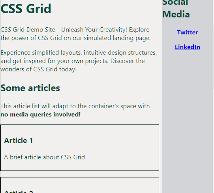
As you can tell from this example, the browser can calculate and create a layout automatically with no media queries involved, which is helpful in adapting the content to the changing general layout of the website. This shows how CSS grid is a great tool for creating responsive layouts, both by media queries and by giving a set of rules and letting the browser do the layout by itself.
CSS grid is a powerful tool that allows us to arrange the elements of the screen in the order and position we want. However, we need to remember that this can also bring accessibility issues if misused. It’s very important to remember that a screen reader reads the elements on the screen in the order they appear in the HTML, ultimately creating a mismatch between visual and reading order.
This can violate WCAG Success Criterion 1.3.2: Meaningful Sequence, which affects screen reader users and magnifying glass users because it can make navigation confusing. Suppose you also create a mismatch between visual and reading order with interactive elements like form fields, buttons, or links.
In that case, you’ll also violate WCAG Success Criterion 2.4.3: Focus order. If you want to see an example, check this demo I created, where I rearranged this list of buttons with grid. Navigate it using the Tab key, and you’ll notice how chaotic keyboard navigation (and, by extension, screen reader navigation) looks:
See the Pen
Focus order demo by Cristian Diaz (@ItsCrisDiaz)
on CodePen.
Accessibility is essential in web design. To learn more about improving accessibility with CSS, check out our guide to improving web accessibility with CSS and how to boost accessibility for high-contrast users with CSS.
There are many ways to achieve similar objectives in CSS. Using CSS grid is just one way to place elements into rows and columns to design consistent, seamless web applications with user-friendly interfaces.
As web frontends get increasingly complex, resource-greedy features demand more and more from the browser. If you’re interested in monitoring and tracking client-side CPU usage, memory usage, and more for all of your users in production, try LogRocket.

LogRocket lets you replay user sessions, eliminating guesswork around why bugs happen by showing exactly what users experienced. It captures console logs, errors, network requests, and pixel-perfect DOM recordings — compatible with all frameworks.
LogRocket's Galileo AI watches sessions for you, instantly identifying and explaining user struggles with automated monitoring of your entire product experience.
Modernize how you debug web and mobile apps — start monitoring for free.

Write agent-friendly API documentation with OpenAPI, clear schemas, workflow guidance, and llms.txt for safer AI automation.

Local AI proxy tutorial for detecting, masking, and rehydrating PII before prompts reach cloud LLMs.

Learn how Graph RAG uses connected knowledge structures to improve retrieval beyond simple text similarity.
Learn how sibling-index() enables clean, JavaScript-free stagger animations using native CSS.
Hey there, want to help make our blog better?
Join LogRocket’s Content Advisory Board. You’ll help inform the type of content we create and get access to exclusive meetups, social accreditation, and swag.
Sign up now

 Learn more →
