Infinite scrolling images are used in many different ways in the applications and websites we use on a daily basis. For example, we often see moving backgrounds on websites like the example below.

See the Pen
Pure css infinite background animation by kootoopas (@kootoopas)
on CodePen.
In this post, we’ll learn two ways of creating an infinite scrolling effect using background images with some basic HTML markup and CSS, including:
For both of these methods, we need an image to use as a background. The first effect ideally needs an image that has similar left and right sides; the image for the second effect does not need any specific specifications.
Both sides of the image should be a solid color that is identical (or, very close) to each other. This allows the loop to proceed without the user becoming aware, giving the impression that the image continues infinitely.
If you don’t have an image and don’t wish to create a custom one, I highly recommend using the website Unsplash. Unsplash provides high-resolution, royalty-free images, all they ask is for you to provide a credit to the author.
Here is the image I’ll use for this tutorial.

Now, with the image source step out of the way, let’s move on to creating the effects in CSS.
The Replay is a weekly newsletter for dev and engineering leaders.
Delivered once a week, it's your curated guide to the most important conversations around frontend dev, emerging AI tools, and the state of modern software.
Let’s take a look at scenario one. First, we need a container to house the image that must be larger than the image itself; this can be twice as large or more, as long as the width of the container is evenly divisible into the width of the image to create a seamless effect.
This container enables us to repeat the image with CSS to create the looping effect we’re after.
Let’s start by creating the base HTML markup for our scrolling image. As mentioned previously, we first need our container followed by the image within it:
<div class="scrolling-image-container">
 <div class="scrolling-image"></div>
</div>
Now, with our base markup completed for the scrolling image, let’s add in the styles we need.
As our image must exceed the width of the page for it to loop, we must ensure the container hides the overflow, which we can easily do using the following:
.scrolling-image-container {
  overflow: hidden;
}
With this sorted, we can turn our attention to the actual image. For this, let’s add the image using the background property in CSS. This also allows us to repeat the image easily by using the repeat-x value with background when we define the image.
Following this, we must define the width and height of our image div. The height can be arbitrary and whatever you want to set it as for the image you are using.
The width, however, as mentioned earlier, must be a multiple of the width of the image. Since our image from Unsplash has a width of 3840px, let’s set the div to twice the amount at 7680px:
.scrolling-image {
  background: url("./background-image.jpg") repeat-x;
  height: 750px;
  width: 7680px;
}
Now that we have the container hiding the overflow and the image set up to repeat within the container at a given height and width, we can create the animation that moves the repeated image within the container to create the illusion that the image is infinite.
For the animation, let’s use standard CSS animations and translate the image div from a start point of 0 to a finishing point of the image width. So, in this case, the final point of the animation must be -3840px:
@keyframes slide {
  0% {
    transform: translate(0);
  }
  100% {
    transform: translate(-3840px); /* The image width */
  }
}
After creating the animation, all we must add is the animation to our image div using the standard animation syntax for CSS:
.scrolling-image {
  background: url("./background-image.jpg") repeat-x;
  height: 750px;
  width: 7680px;
  animation: slide 3s linear infinite;
}
We also defined that the animation must last 3 seconds, have a linear timing function, and repeat infinitely. This allows us to create the effect that the image scrolls horizontally forever with little to no signs that it is an image looping multiple times.
A key part of this method is giving a good experience to the viewer. We do this by ensuring the sides of the images line up with no differences so the viewer can’t detect the loop.
With the CSS animations method sorted, let’s take a look at another way of creating an infinite scrolling effect for background images in CSS: the parallax effect.
A parallax image is an image that moves within a container. Typically, it moves as the user scrolls on the page and doesn’t ever reach the end of the image, which is helpful because it creates the illusion that the image is infinite.
Below is a CodePen that contains a few examples of parallax images.
See the Pen
Background Parallax by yiteng jun (@yitengjun)
on CodePen.
While it’s not technically infinite because the method provides scrolling up and down on the same image, there is no way for the user to reach the top or bottom of the image (provided we set it up correctly). This, in turn, gives the illusion of the infinite scroll.
Using the same image as the first method, let’s create a parallax image container that gives the desired illusion to the user.
For this method, we don’t need a container hiding the overflow like the previous method because we won’t overflow the container. Instead, we’ll contain the image within the confines of a single element.
Let’s start by defining a div on the page with a class name we can later add styles to:
<div class="parallax-image"></div>
Now in CSS, let’s add our image like we did before using the background property:
.parallax-image {
  background: url("./background-image.jpg");
}
At this point, we have an element on the page with the background image set on it. But, it isn’t showing on the page. For this to happen, we must define a minimum height for the element; let’s add that next:
.parallax-image {
  background: url("./background-image.jpg");
  min-height: 600px;
}
We now have the image displayed on the page, and depending on the image used, there may be an issue with the image overflowing the container because the width of the image is greater than the width of the container. Let’s fix this now using background-size:
.parallax-image {
  background: url("./background-image.jpg");
  min-height: 600px;
  background-size: cover;
}
The image should now be constrained to the width of the element on the page.
Now, for the parallax effect to work to its full potential, we need an image that has more height than the height of the element we are displaying it within.
So, in my case, the image I’m using has a height of 2160px and the height of the element I’m displaying it within is 600px, so I have plenty of room to use.
If this isn’t the case for you, then you can either:
To ensure we also have an equal height to use on the top and bottom, let’s center our image by using background-position. And, while we are at it, let’s also ensure the image doesn’t repeat by using the background-repeat property:
.parallax-image {
  background: url("./background-image.jpg");
  min-height: 600px;
  background-position: center;
  background-repeat: no-repeat;
  background-size: cover;
}
After all of this, our image should be centered with no repeating, displaying it using the full width of the element. But, we still have no parallax effect. Let’s fix that now by using the background-attachment property:
.parallax-image {
  background: url("./background-image.jpg");
  min-height: 600px;
  background-attachment: fixed;
  background-position: center;
  background-repeat: no-repeat;
  background-size: cover;
}
By adding in the background-attachment property, we fix the background to not move relative to the viewport. In other words, the image won’t move when we scroll, in turn creating the parallax effect we are after.
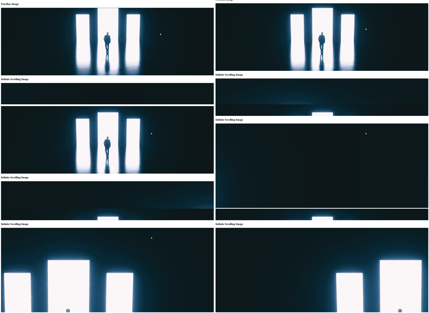
And with that, we have two methods of creating an infinite scrolling background image using CSS. Below are both methods we created today:

In this post, we covered two ways of giving the illusion of an infinitely scrolling image on a website using various CSS properties. First, was the method using CSS animation to loop an image, and then we looked at creating a parallax effect using various background properties.
There is no right or wrong way to create an infinitely scrolling image; the method you use should depend on the effect you desire. I hope you found this helpful. If you did, please consider following me over on Twitter.
As web frontends get increasingly complex, resource-greedy features demand more and more from the browser. If you’re interested in monitoring and tracking client-side CPU usage, memory usage, and more for all of your users in production, try LogRocket.

LogRocket lets you replay user sessions, eliminating guesswork around why bugs happen by showing exactly what users experienced. It captures console logs, errors, network requests, and pixel-perfect DOM recordings — compatible with all frameworks.
LogRocket's Galileo AI watches sessions for you, instantly identifying and explaining user struggles with automated monitoring of your entire product experience.
Modernize how you debug web and mobile apps — start monitoring for free.

AI companies are buying developer tools as coding agents turn runtimes, package managers, and linters into strategic infrastructure.

Learn how AI-assisted development governance uses rules, agents, hooks, and protocols to help AI coding tools produce safer, more consistent code.

A step-by-step guide to building your first MCP server using Node.js, covering core concepts, tool design, and upgrading from file storage to MySQL.

Using security headers in your Next.js apps is a highly effective way to secure websites from common security threats.
Would you be interested in joining LogRocket's developer community?
Join LogRocket’s Content Advisory Board. You’ll help inform the type of content we create and get access to exclusive meetups, social accreditation, and swag.
Sign up now