
When working with CSS, we think of page elements as boxes, and the arrangement of these boxes presents the concept of the CSS layout.
Naturally, every page element has a normal position inside the document layout flow. But oftentimes, we alter the default behavior to create the exact layout that we want. This occurs when we want to center objects inside another object within our document.
This is a common task during development, and yet, over the years, this task seems to have become difficult and complex, especially when it comes to centering on the vertical axis.
This makes developers resort to all sorts of unmanageable hacks and workarounds, like using CSS table properties that cause inconsistencies in browsers and fail on screen readers or using absolute positioning with negative margins that only centers objects of a specified width.
Another trick is using position: absolute; and the transform property to center elements in a container. But, this method can create awkward layouts and only allows one element per container without additional work.
In essence, developers use different hacks to center objects depending on the task, which is where the pain of centering objects comes from: there are too many workarounds.
In modern CSS, however, we don’t need to go through this stress any longer because we now have more control over how we center objects in bidirectional layouts.
In this guide, we will look at the modern bidirectional centering techniques in CSS while following best practices to center objects that scale nicely across devices and screens.
The Replay is a weekly newsletter for dev and engineering leaders.
Delivered once a week, it's your curated guide to the most important conversations around frontend dev, emerging AI tools, and the state of modern software.
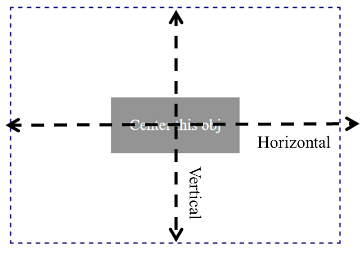
As the name implies, bidirectional centering literally means “two-directional centering.”
In the context of CSS, it’s interpreted as centering objects in two directions, that is, both the horizontal direction, also called the main axis, and the vertical direction also called the cross axis.
We can also think of bidirectional as anything that functions in two opposite directions and is unaffected by the flow’s direction.
By applying this concept in the context of CSS, bidirectional centering centers objects that are not affected by changing the layout flow’s direction.
In other words, the object remains in the center irrespective of the layout flow, that is, whether the writing direction is left to right, ltr, like English text; rtl, like Arabic text; or when the writing mode is set to vertical-*, like Japanese and Mongolian.
Unidirectional centering involves one-directional centering, meaning centering an object either horizontally or vertically. In this case, the object’s center alignment is dependent on the direction of the layout’s flow.
Let’s take a look at how unidirectional centering works to better understand how bidirectional centering works.
Here, we have an HTML markup that generates the following layout:
<div class="container">
  <div class="obj">Center this obj</div>
</div>
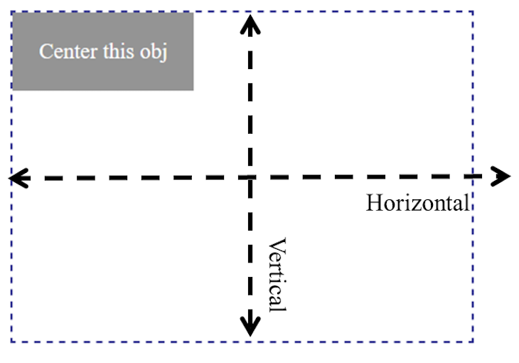
We styled the object to see the initial position in the document layout flow considering an ltr writing direction. Now, by centering the object vertically inside its container, we have the following:
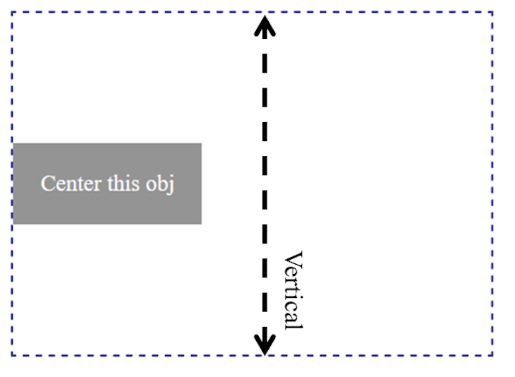
Here, we can use the CSS flex to center the object vertically:
.container {
  display: flex;
  align-items: center;
  /* ... */
}
For now, ignore the code and focus on the object positioning. If we change the writing mode or the writing direction of this document, the object’s vertical center alignment tends to be affected.
The code below changes the writing mode to vertical-*, as we would find in Mongolian text:
.container {
  /* ... */
  writing-mode: vertical-lr;
}
This additional style produces a new layout:
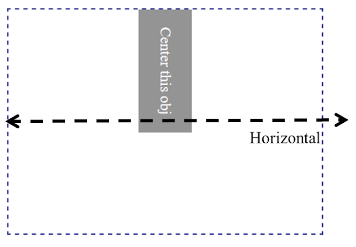
As we can see, the object’s center alignment depends on the direction of the layout flow, which is unidirectional centering.
On the other hand, with bidirectional centering, an object must remain in the center no matter the direction of the layout flow, as seen below.
Next, let’s see how to achieve this type of object centering.
position and transform propertiesAs mentioned earlier, using the position: absolute; method is considered a legacy technique. But the essence of using this trick is for us to see the limitations and to better appreciate the modern techniques that we will cover afterward.
Let’s revisit our earlier markup:
<div class="container">
  <div class="obj">Center this obj</div>
</div>
To center the child element within the container, we can simply apply this code:
.container {
  position: relative;
  /* ... */
}

.obj {
  position: absolute;
  top: 50%;
  left: 50%;
  transform: translate(-50%, -50%);
  /* ... */
}
By making the container a position: relative; and the element to center a position: absolute; means we can move the element to the center of the container (see at CodeSandbox).
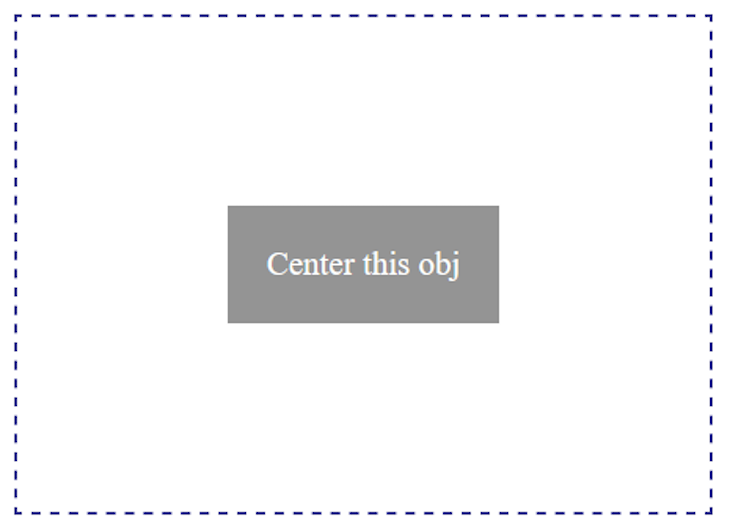
One limitation of using this method is that it usually only allows one element per container without additional styles. It can also cause an awkward layout due to overlapping text.
So, instead of using this hack or any of the others, we will learn the modern techniques.
With CSS flexbox, we can easily control the placement of objects inside another object. When we apply display: flex to a parent element, it means we want the direct children to become flex items so we can apply the alignment properties to control the items.
Again, let’s use the earlier HTML markup:
<div class="container">
  <div class="obj">Center this obj</div>
</div>
By making the container element a flex container and applying the alignment properties, as seen below, we have the child element perfectly centered in the container (see at CodeSandbox):
.container {
  display: flex;
  align-items: center;
  justify-content: center;

  /* ... */
}

The align-items:center; applied to the flex container centers the child element vertically while the justify-content: center; centers the element in the main axis, that is, horizontally.
One of the advantages of this method over the traditional techniques is flexibility. We can center more than one object seamlessly within a container, and that alone encourages code maintainability.
We can find real-life examples when dealing with the hero section of a page, a pop-up message, or centered overlays.
In this section, we will see how we can perfectly center the hero contents of a page. Let’s consider the following markup:
<section class="hero">
  <h1>
    <!-- ... -->
  </h1>
  <p>
    <!-- ... -->
  </p>
  <button>Contact us</button>
</section>
We’ve removed the content from the code for brevity (see at CodeSandbox).
By applying the flex and the alignment properties on the parent container element, section, we have the children elements perfectly centered in the container:
.hero {
  display: flex;
  align-items: center;
  justify-content: center;
  flex-direction: column;

  /* ... */
}
We then get the following result:
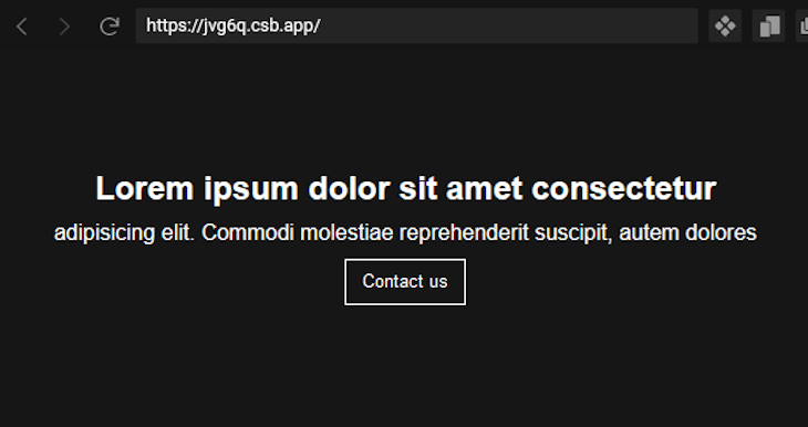
In the CSS code, we added a flex-direction: column; alongside the alignment properties to make the content position along the cross axis.
This is because flexbox is a one-dimensional layout model, meaning it processes layouts in one dimension at a time, either row or column. And, by default, the flex-direction is set to row, making the content position along the main axis.
By adding the flex-direction: column;, we change the default to align vertically.
This method does not only work for centering text blocks as we’ve seen above; we can also center images and inline elements like the anchor text link.
In a real-life project, we might want to add an image and a text link alongside other text blocks to the center. So, let’s see the markup for that and implement the flexbox method to center the content:
<section class="hero">
  <img src="..." alt="" />
  <h1>...</h1>
  <p>...</p>
  <a href="#">...</a>
</section>
Again, we removed the elements’ content for brevity (see at CodeSandbox). Using the same flexbox properties, we have our content perfectly centered, like so:
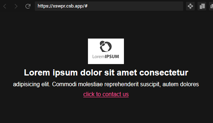
As we can see with flexbox, centering objects is simple and manageable. This method is so flexible that we can add or remove content to/from the flex container and still have perfect centering without additional styles.
In almost all cases in our real-life project, we will often use this method for centering objects.
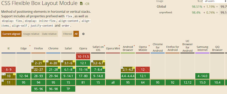
Flexbox is supported by all modern browsers, so we can confidently use it for centering objects in our layout. See the current browser support here.
Like flexbox, we can also apply a display: grid; to a container element so the direct children become grid items. Then, we can use the alignment properties to center the content within the container.
The following CSS code centers objects within a container:
.container {
  display: grid;
  place-content: center;

  /* ... */
}
This CSS produces the same center alignment as that of the flexbox example (see at CodeSandbox).
Here, we are only using two lines of CSS. The place-content CSS property controls how the content is aligned and justified at the same time. And, by assigning a center value, the items will centrally align within the container.
The place-content is shorthand for align-content and justify-content, meaning we can rewrite the above CSS to look like this:
.container {
  display: grid;
  align-content: center;
  justify-content: center;
  /* ... */
}
Using the same hero example as covered in the flexbox section, let’s apply the following grid styles instead:
.hero {
  display: grid;
  place-content: center;
  /* ... */
}
We then have the following output (see at CodeSandbox):
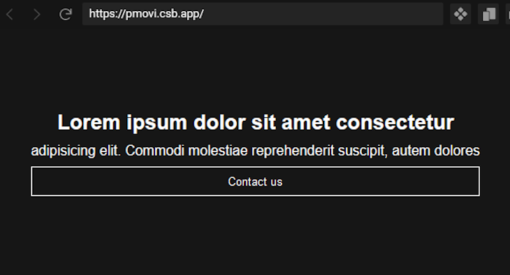
As seen in the image, the Contact us button takes the width of the surrounding content. This is because when the CSS place-content property applies to a grid container, the grid items immediately take the size of the item with the largest width.
This effect brings the differences when compared to the flexbox method. And now, depending on the layout that we want, we can easily decide which of these methods to use.
But again, in most cases, we will use the flexbox to center objects because it can seamlessly produce any centered layout that we want.
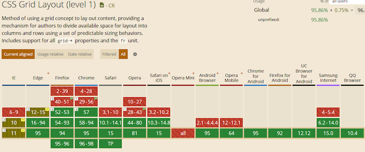
The grid, unlike flexbox, has less browser support.
Instead of going through tens of techniques including the unnecessary legacy hacks to center objects, we now have modern ways we can use to center any type of object.
We also covered real-life examples and best practices so we know how to apply them in our own projects.
I hope you enjoyed reading this guide. If you have questions or contributions, please share them in the comment section. And lastly, endeavor to share this guide around the web.
As web frontends get increasingly complex, resource-greedy features demand more and more from the browser. If you’re interested in monitoring and tracking client-side CPU usage, memory usage, and more for all of your users in production, try LogRocket.

LogRocket lets you replay user sessions, eliminating guesswork around why bugs happen by showing exactly what users experienced. It captures console logs, errors, network requests, and pixel-perfect DOM recordings — compatible with all frameworks.
LogRocket's Galileo AI watches sessions for you, instantly identifying and explaining user struggles with automated monitoring of your entire product experience.
Modernize how you debug web and mobile apps — start monitoring for free.
Write agent-friendly API documentation with OpenAPI, clear schemas, workflow guidance, and llms.txt for safer AI automation.

Local AI proxy tutorial for detecting, masking, and rehydrating PII before prompts reach cloud LLMs.

Learn how Graph RAG uses connected knowledge structures to improve retrieval beyond simple text similarity.
Learn how sibling-index() enables clean, JavaScript-free stagger animations using native CSS.
Hey there, want to help make our blog better?
Join LogRocket’s Content Advisory Board. You’ll help inform the type of content we create and get access to exclusive meetups, social accreditation, and swag.
Sign up now