CSS is growing in scope and power with each passing year. It’s a great time to be a web developer, but it can be challenging to stay up-to-date with the latest features.
CSS does not have definite versions like JavaScript. So, how do you find out what the latest features are?
The World Wide Web Consortium (W3C) produces an annual snapshot that has all of the current specs in a single document. Unfortunately, it doesn’t itemize what’s new. You need to read through each of the specs to see what has changed. And who wants to do that? Not me!
It’s up to the browser vendors to implement the features outlined in the specs. They act independently to decide when they will implement the features. They have their own roadmaps, so they tend to do it at different times. In an ideal world, there would be a unified source to follow this, but right now, there isn’t.
To save you the trouble, I’ve gathered the major features that have been added to at least one browser in the last year or so.
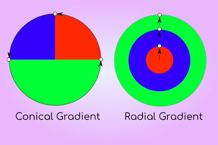
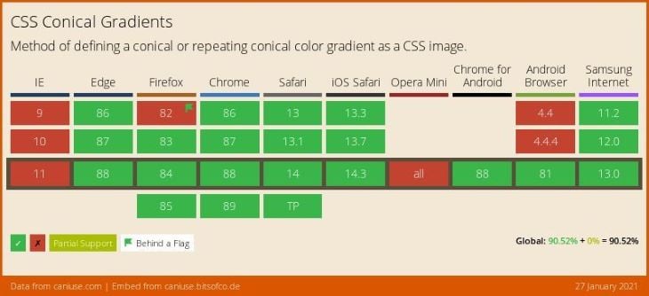
The conic-gradient function can be used to create an interesting range of image patterns such as conical shapes, pie charts, color wheels, and glossy surfaces.
Conical gradients rotate color-stops around a central point (rather than radiate from a central point like a radial gradient). Conical gradient color-stops are placed around the circumference of a circle.
To create a pie chart, we use color-stops that overlap (have abrupt transitions).
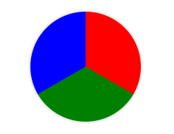
.pie-chart{
    background: conic-gradient(red 120deg, green 120deg 240deg, blue 240deg);
}
The repeating-conic-gradient() function offers the possibility to create impressive repeating patterns with a short list of parameters.
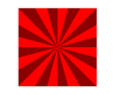
.sunburst{
    background: repeating-conic-gradient(red 0 15deg,darkred 0 30deg);
}
You can see further examples in this codepen.
If you want to learn more, you can check out the following resources.
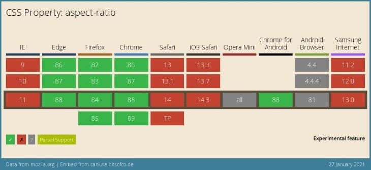
Another new feature is aspect ratio, which is the proportional relationship between width and height. Maintaining a consistent aspect ratio is important in creating responsive layouts and for preventing cumulative layout shift (a web vital performance metric).
Some examples of where aspect ratio is usually used:
This property allows you to fix the aspect ratio on any element. Images and videos have an intrinsic aspect ratio, but other elements don’t.
The syntax is very simple. The value is: the width ratio, a forward slash, and the height ratio.
.widescreen {
  aspect-ratio: 16 / 9;
}
It’s important to note that elements won’t respect aspect-ratio if both a height and width is defined for an element.
See the Pen
aspect-ratio (Chrome only) by Rob (@robjoeol)
on CodePen.
You can start using the property straight away and use a feature query to provide a fallback, as below.
.standard {
  aspect-ratio: 4 / 3;
}

@supports not (aspect-ratio: 4 / 3) {
  .standard {
    width: 16rem;
    height: 9rem;
  }
}
If you want to learn more, you can check out the following resources.
Content-visibility propertyThe content-visibility property is a new CSS property that can improve page rendering performance. It enables the browser to skip an element’s rendering work until it is needed (when an element is in view). If a large portion of your content is off-screen, leveraging this property can reduce the initial loading time of a page drastically.
Reaping the benefits of content-visibility requires you to consider which content must be loaded initially, and which content could potentially be deferred. The property has an auto option that lets the browser decide if it can skip the rendering of an element.
There are some important considerations when using this property such as:
content-visibility: auto or content-visibility: hidden invisible by making its height zero until it is rendered. This changes the page height and scrolling.You can use the contain-intrinsic-size property to give an explicit height for the element to compensate for this, this is likely to be a guess on your part, but you don’t need to be exact! Orkan discusses this topic in this article.content-visibility on a section that has headings and landmarks, screen readers won’t be able to access these when the page loads. Unfortunately, this degrades the accessibility of your content. Marcy Sutton discusses this use case for a recent a pull request she reviewed for Dev.to.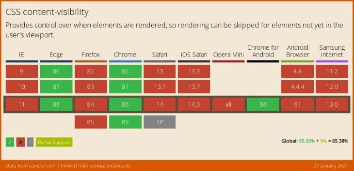
If you want to learn more, you can check out the following resources.
Logical properties are writing mode equivalents of physical properties. They offer a way to describe the layout of webpages in an universal vocabulary that is unambiguous across different languages.
For example, you would use margin-block-start instead of margin-left for left-to-right text.
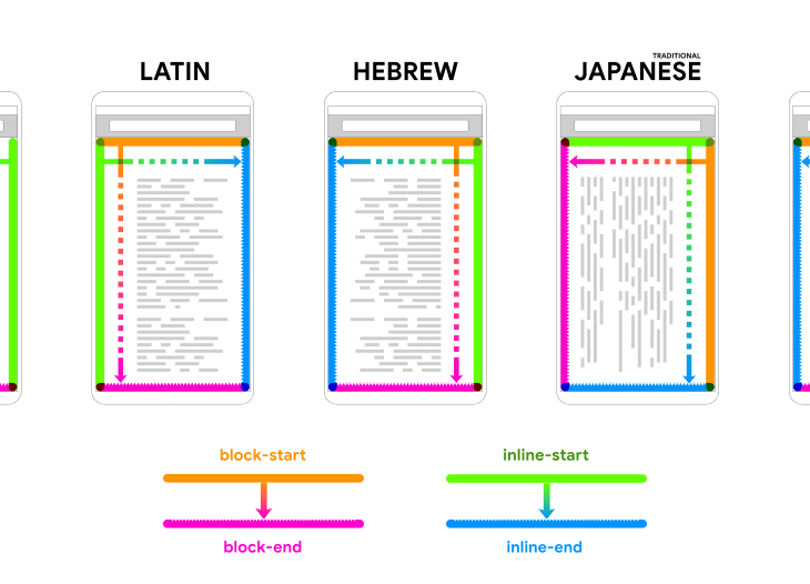
Adam Argyle has a nice of way of describing logical properties:
A logical property is one that references a side, corner, or axis of the box model in context of the applicable language direction. It’s akin to referencing someone’s
strongarm, rather than assuming it’s theirrightarm. “Right” is a physical arm reference, “strong” is a logical arm reference, contextual to the individual.
Logical properties have been around for quite some time, but support was minimal in most browsers. Now, the support is a lot better across the board.
However, some shorthand versions of properties are still considered experimental. Until these properties are supported widely, it is tricky to use logical properties wholesale. Elad Schether discusses this topic in his article.
More progress has been made since he wrote that article (shorthand properties were not implemented when he wrote the article), but we are still not quite there yet for going all-in!
margin, border and padding are supported in all the major browsers. Shorthand versions of these properties are available as experimental features. Logical border properties are pending in most browsers.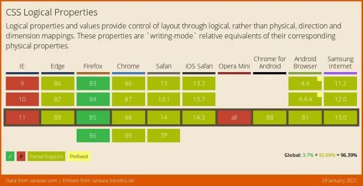
If you want to learn more, you can check out the following resources.
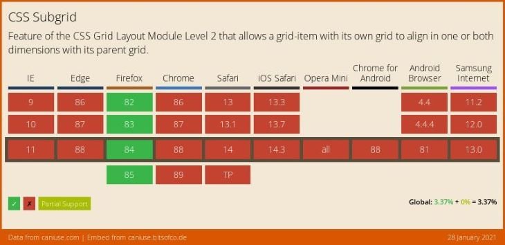
CSS Subgrid makes a number of difficult layout patterns much simpler to pull off. It’s the icing and cherry on top of the CSS Grid cake.
If you already know CSS grid, it will not require much effort to learn CSS subgrid. The new syntax is short and sweet.
Conceptually, a grid defined as a subgrid is pretty much the same as a regular nested grid, but it shares the tracks of the parent grid. The payoff is that it provides a way to align a nested grid with its parent grid.
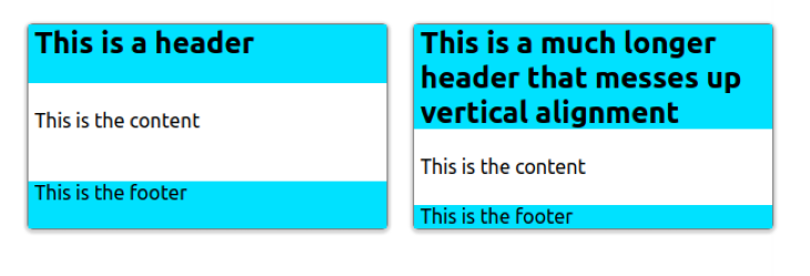
A common example would be a card layout that has different sections. These sections can vary in size depending on the content. With a regular nested grid, you cannot maintain vertical alignment of the same sections between different cards (see below).
.container {
    display: grid;
    grid-template-columns: repeat(2, 1fr);
    gap: 20px;
}

.card {
    display: grid;
}
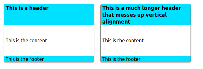
If we change the card to be a subgrid, we can get the sections perfectly aligned vertically.
.card {
    display: grid;
    grid-template-rows: subgrid;
    grid-row: auto / span 3;
}
You can start using the property straight away, and use a feature query to provide a fallback for any browser where it is not supported.
@supports not (grid-template-rows: subgrid) {
  .card {
    /* ..alternative layout */
  }
}
You can explore the example above in this codepen.
If you want to learn more, you can check out the following resources.
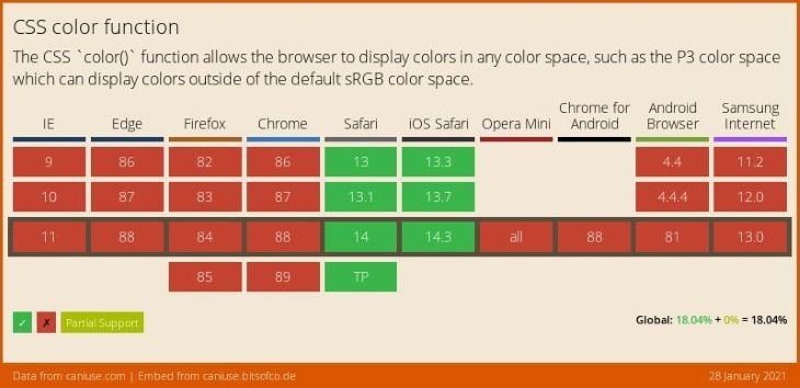
color functionThe color() function allows a color to be specified in a particular colorspace, rather than the implicit sRGB colorspace that most of the other color functions operate in. This will allow web developers to specify a much bigger range of colors going forward.
Real physical devices cannot yet produce every possible color that the human eye can see. The range of colors that a given device can produce is termed the gamut. The gamuts of different colorspaces may be compared by looking at the volume (in cubic Lab units) of colors that can be expressed. The following table shows the pre-defined colorspaces available in CSS.
| Colorspace | Volume (million Lab units) |
|---|---|
| sRGB | 0.820 |
| display-p3 | 1.233 |
| a98-rgb | 1.310 |
| prophoto-rgb | 2.896 |
| rec2020 | 2.042 |
| lab | 6.578 |
The takeaway is that display-p3 is around 35% larger than sRGB. Many modern displays cover 100% of the display-p3 colorspace now.
You can start using the color function straight away and provide a backward compatible sRGB color via a feature query as below.
/* sRGB color. */
:root {
    --bright-green: rgb(0, 255, 0);
}

/* Display-p3 color, when supported. */
@supports (color: color(display-p3 1 1 1)) {
    :root {
        --bright-green: color(display-p3 0 1 0);
    }
}

header {
    color: var(--bright-green);
}
If you want to learn more, you can check out the following resources.
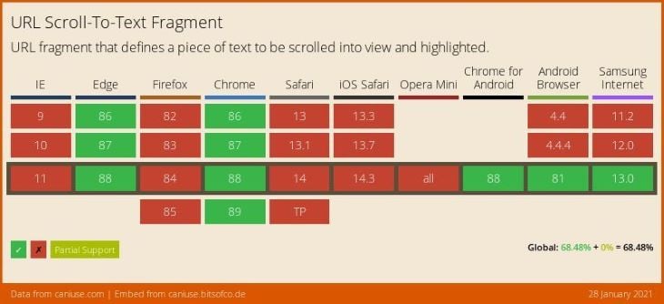
This is a HTML feature, really, but I will include it here, otherwise you might not hear about it at all soon!
Scroll-to-text fragments (also known as text fragments) append a text query to a URL. Upon clicking the link, the browser finds the text in the webpage, scrolls it into view, and highlights the matched text. They enable links to specify which portion of the page is being linked to, without relying on the page-author annotating the page with id attributes.
The fragment format is: #:~:text=\[prefix-,]textStart[,textEnd\][,-suffix].
Here is a simple example you can test in your browser.
You can begin using scroll-to-text fragments immediately without any ill-effects in browsers that do not support them.
If you want to learn more, you can check out the following resources.
I hope this article has given you a clear overview of the latest major CSS features to make it to browsers, and identified clear use cases for them. In the age of evergreen browsers and feature queries, there are no barriers to adopting new features early. The challenge is to know what new features have actually landed in browsers, finding the time to learn about them, and making them part of your web design arsenal over time. I hope the web community can find a better way to publicize this information in the future.
As web frontends get increasingly complex, resource-greedy features demand more and more from the browser. If you’re interested in monitoring and tracking client-side CPU usage, memory usage, and more for all of your users in production, try LogRocket.

LogRocket lets you replay user sessions, eliminating guesswork around why bugs happen by showing exactly what users experienced. It captures console logs, errors, network requests, and pixel-perfect DOM recordings — compatible with all frameworks.
LogRocket's Galileo AI watches sessions for you, instantly identifying and explaining user struggles with automated monitoring of your entire product experience.
Modernize how you debug web and mobile apps — start monitoring for free.

A guide for using JWT authentication to prevent basic security issues while understanding the shortcomings of JWTs.

Discover how to build, render, and automate product demo videos with Remotion, replacing traditional screen recordings with reusable React code.

Chrome’s Modern Web Guidance embeds modern web platform skills into AI coding agents, helping them choose native HTML, CSS, and browser APIs over legacy patterns.

Learn how to use Fallow to analyze AI-generated code, detect dead code, duplicate logic, and complexity issues, and integrate automated code quality checks into your AI-assisted development workflow.
Would you be interested in joining LogRocket's developer community?
Join LogRocket’s Content Advisory Board. You’ll help inform the type of content we create and get access to exclusive meetups, social accreditation, and swag.
Sign up now

 Learn more →
