
When it comes to mobile applications, first impressions count a lot. Normally, first impressions happen during the onboarding process where users set up the app on their phones. However, because onboarding is simply configuring the app to work for the first time, it can very easily become a boring process.

Onboarding must also cater to a large swath of users, ranging from users brought in from a marketing campaign, word of mouth, or seeing an app in the app store.
Regardless of how a user got to the app, the onboarding process must provide enough information for an informative but interesting process while retaining the new user.
A good onboarding process:
In this post, we’ll look at how we can create a suitable onboarding experience for an app called “Synergy Travel.” In many parts of the world, we can’t travel anywhere at the moment, so let’s channel all our travel desires into making a great onboarding experience instead! ✈
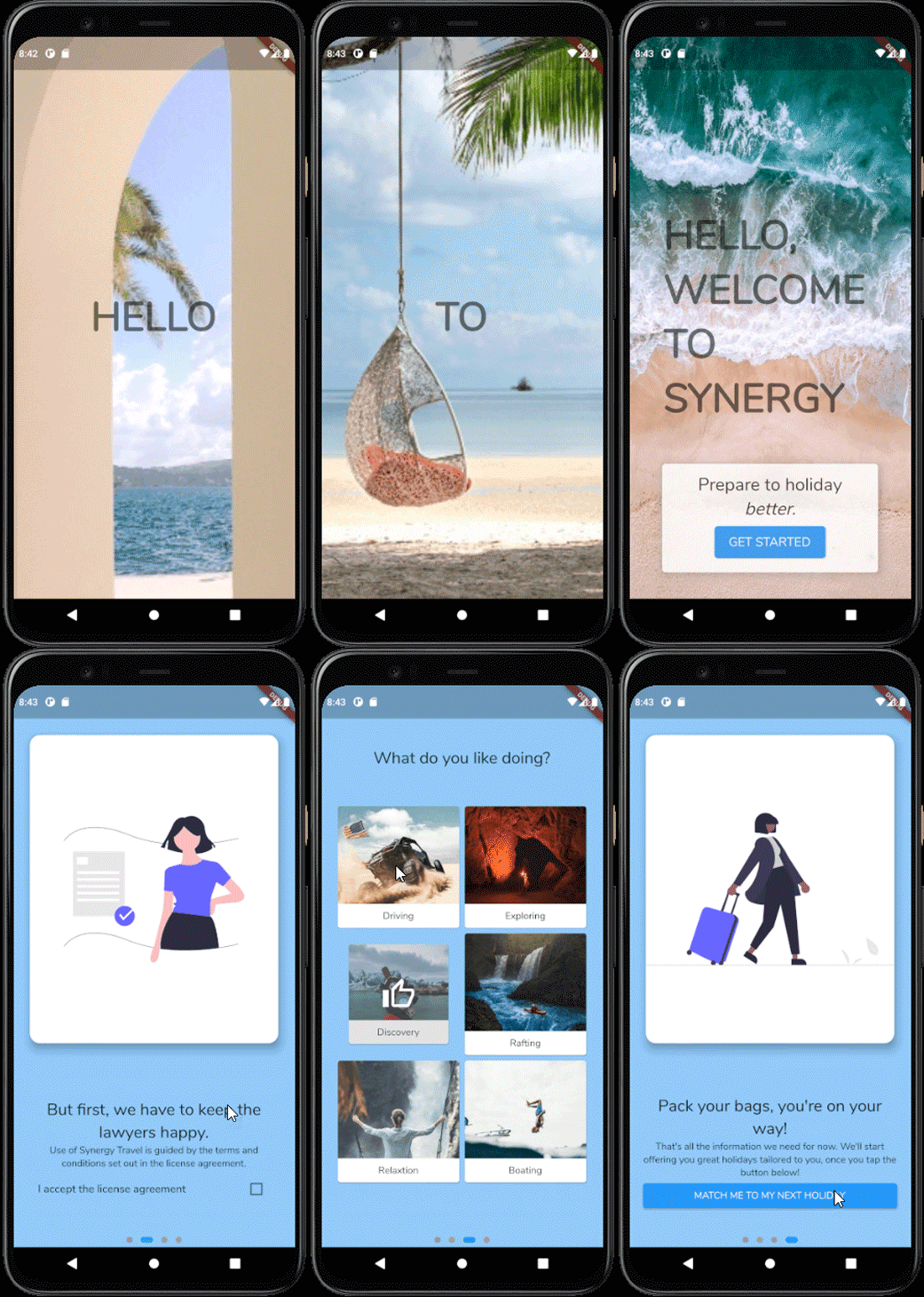
This is what our finished onboarding screen will look like. When opening the app, users see a travel-themed slideshow that scales and fades to draw them in, followed by the main onboarding process with a license agreement and a screen to select their interests.
Through our use of motion, we can create an engaging and interesting experience for our users.
So how do we accomplish this? Let’s find out.
The Replay is a weekly newsletter for dev and engineering leaders.
Delivered once a week, it's your curated guide to the most important conversations around frontend dev, emerging AI tools, and the state of modern software.
First things first, we must plan what our onboarding process looks like. In this case, let’s have the opening slideshow play and have the users’ view scroll down vertically into the main onboarding process.
If we imagine the light blue boxes are what the user can see on their phone, our onboarding process looks like this:
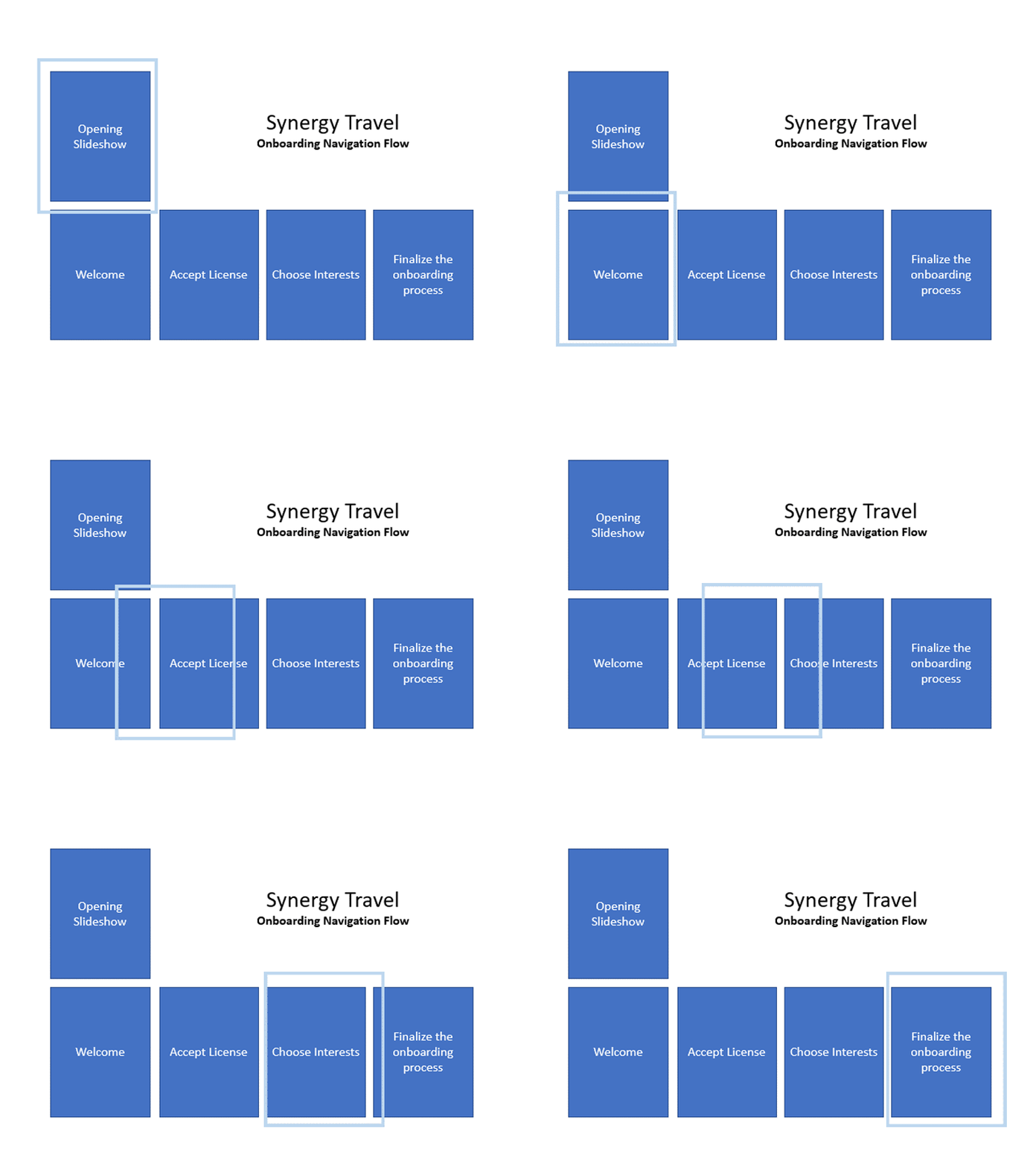
Effectively planning the look that we are going for is important because we know what we are working towards. If we don’t know what we are aiming for, our code can become a mess.
Because we want our app to look good as soon as the user opens it, the first step in this onboarding process is to create an engaging opening slideshow.
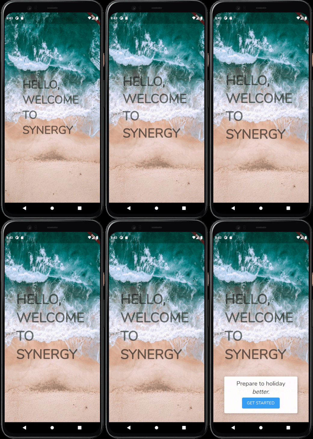
Our opening slideshow consists of several pictures overlaid with a single word and our final slide shows all the words together.
While we could use a video to accomplish this without playing it on the device at runtime, we would probably encounter some compression artifacts and depend on another package, increasing the overall size of the app.
Instead, we’ll give Flutter what it needs to render the slideshow on the device to maintain a reduced installation package size and ensure the best visual presentation for our app.
To start creating this, let’s specify the words we want to show over the top of our opening slideshow:
final List<String> textOpeners = ['HELLO', 'WELCOME', 'TO', 'SYNERGY', 'HELLO,\r\nWELCOME\r\nTO\r\nSYNERGY'];
Right now, this is just a simple list of words. Our last value in this array uses line returns to space these words out when they display visually. However, we want our opening images to change every 2 seconds and display a button to begin the onboarding process on the last image.
Fortunately, Flutter ships with Timer.periodic that makes this kind of work a breeze:
void initState() {
  Timer.periodic(
    Duration(seconds: 2),
    (timer) {
      setState(() {
        if (index == 5) { // if we're at the end of the slideshow...
          timer.cancel(); //...stop running the timer
          setState(() {
            showStartCard = true; //...and show the button to begin the onboarding process
          });
        } else {
          index++; // otherwise, show the next slide
        }
      });
    },
  );
  super.initState();
}
Because we have our index incrementing by one every 2 seconds while calling setState, this triggers a rebuild of our widget to show the next image in our slideshow. This is referenced by AnimatedSwitcher that switches between the referenced images:
Widget build(BuildContext context) {
  return AnimatedSwitcher(
    duration: const Duration(milliseconds: 2000),
    child: Container(
      child: Stack(
        children: [
          Center(
            child: Text(
              textOpeners[index - 1],
              style: Theme.of(context).textTheme.headline3!.copyWith(
                    fontWeight: FontWeight.w900,
                    // color: Colors.white,
                  ),
            ),
          ),
          if (index == 5) // only on the last page
            AnimatedOpacity(
              duration: Duration(milliseconds: 400),
              opacity: showStartCard ? 1 : 0,
              child: Align(
                child: Padding(
                  padding: const EdgeInsets.all(80.0).copyWith(bottom: 120),
                  child: BottomTextInvite(
                    getStartedPressed: widget.getStartedPressed,
                  ),
                ),
                alignment: Alignment.bottomCenter,
              ),
            )
        ],
      ),
      key: ValueKey<int>(index),
      height: double.maxFinite, // occupy the entire screen
      width: double.maxFinite, // occupy the entire screen
      decoration: BoxDecoration(
        image: DecorationImage(
          fit: BoxFit.cover,
          image: AssetImage(
            'assets/opener/slide${index}.jpg',
          ),
        ),
      ),
    ),
  );
}
Using an AnimatedSwitcher, a Stack, and an AnimatedOpacity widget leads to a pretty good experience as each new slide fades in. But, while the opening slideshow looks okay, it doesn’t feel like a great experience yet; the colors blend together and the words aren’t very clear.
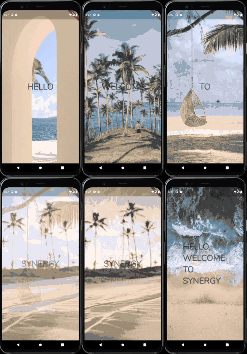
Ideally, we want to find a way to improve the visual appeal and an easy way to do that is to introduce some form of motion that is pleasing to the eye.
It’s easy to overdo this, however, and to throw the user from screen to screen until they feel queasy is never optimal, so we need to add a level of nuance to ensure it adds to the experience but doesn’t take away from it.
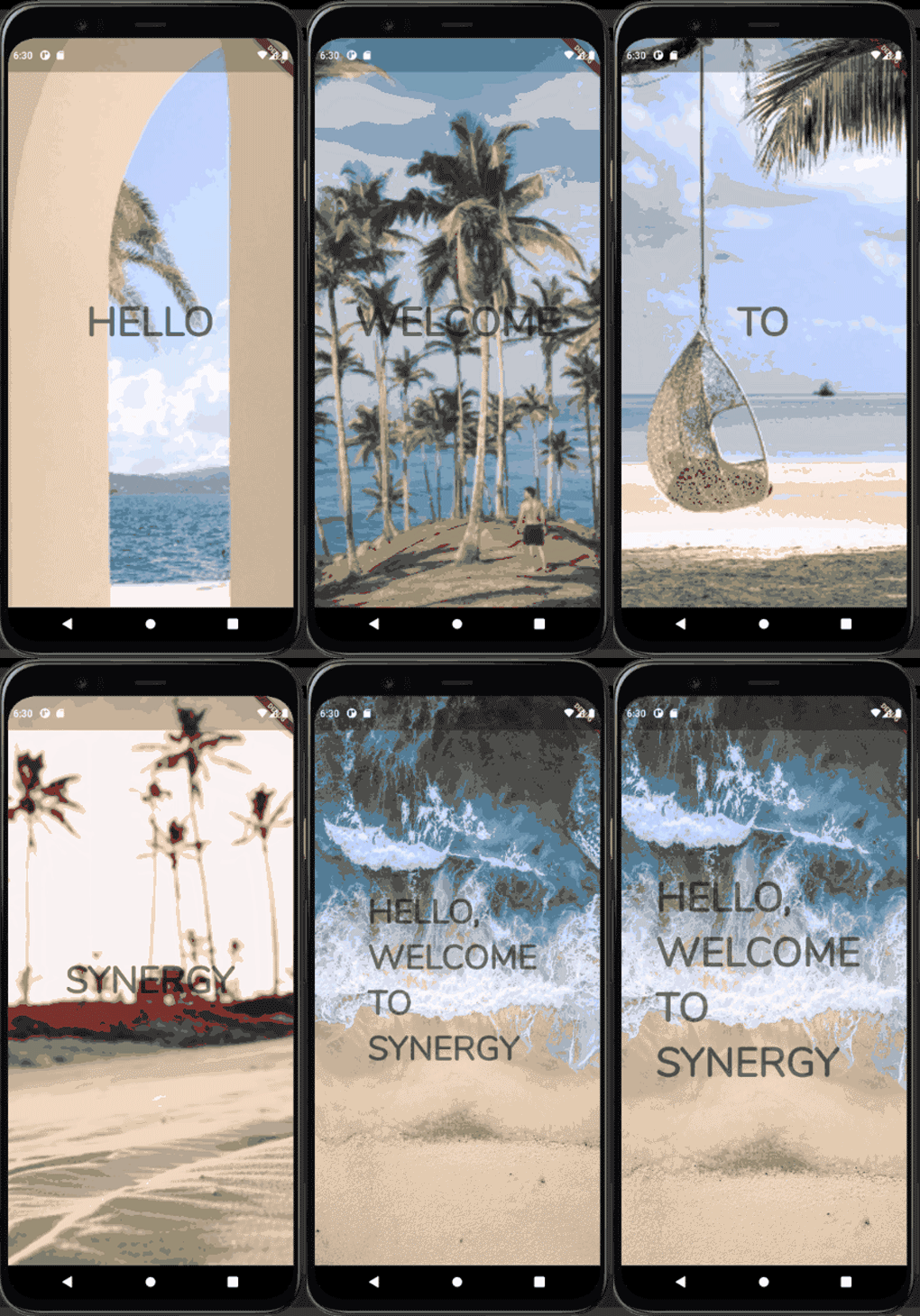
To achieve this, we can combine a ScaleTransition and FadeTransition to produce an effect that looks good. Within our AnimatedSwitcher, we use the transitionBuilder to specify exactly how our changes to these widgets should take place:
transitionBuilder: (widget, animation) {
  final zoomAnimation = Tween(begin: 1.0, end: 1.3).animate(animation);
  final fadeAnimation = Tween(begin: 0.0, end: 1.0).animate(
    CurvedAnimation(
      parent: animation,
      curve: Interval(0.0, 0.2, curve: Curves.ease),
    ),
  );
  return FadeTransition(
    opacity: fadeAnimation,
    child: ScaleTransition(
      scale: zoomAnimation,
      child: widget,
    ),
  );
},
Note that we must consider some points when using zoomAnimation and fadeAnimation.
When using zoomAnimation, begin at 1.0 and end at 1.3. This is because the image begins filling 100% of the screen and ends at 130% of its original size to give the zoom effect. Also note that it runs for the entire duration of the page change operation.
When using fadeAnimation, begin at 0.0 and end at 1.0, making our transition go from completely transparent to completely opaque. We also use Interval to specify that this animation begins at the same time as the parent animation, but completes by the time the parent animation is only 20% completed. If we didn’t do this, our slideshow would be a perpetual scaling and fading mess.
Now that we’ve specified how we want to build our transitions, our opening slideshow looks more like this:
The last thing we need to do is add an AnimatedOpacity widget to fade the box in at the end after the opening slideshow completes. When the index of our image is 5 (the last image), we want to switch the opacity of our widget from completely transparent to completely opaque, like so:
  if (index == 5) // only on the last page
            AnimatedOpacity(
              duration: Duration(milliseconds: 400),
              opacity: showStartCard ? 1 : 0,
              child: Align(
                child: Padding(
                  padding: const EdgeInsets.all(80.0).copyWith(bottom: 120),
                  child: BottomTextInvite(
                    getStartedPressed: widget.getStartedPressed,
                  ),
                ),
                alignment: Alignment.bottomCenter,
              ),
            )
This gives us the fade-in result as we expect to see:
PageView widgetsTo finish our opener, we require two configured PageView widgets. The first must operate on the vertical axis and move the viewport vertically after a user taps the button.
The user won’t be able to swipe this PageView widget to move around because it doesn’t logically make sense for the user to swipe back up into our opening slideshow.
The second widget must operate on the horizontal axis and move the viewport as the user swipes to move in a certain direction.
Because we have two PageView widgets nested inside of each other, either PageView can try to receive and process touch events, which is not what we want. Instead, we must set our outer ScrollView to use NeverScrollableScrollPhysics, and scroll it manually by using a ScrollController.
So, our root PageView and our child PageView look like this:
Widget build(BuildContext context) {
  return Scaffold(
    body: PageView( // Root PageView
      controller: outerScrollController, // The scroll controller that is used to programatically scroll the PageView
      physics: NeverScrollableScrollPhysics(), // Prevent the user from swiping
      scrollDirection: Axis.vertical,
      children: [
        ClipRect( // Prevent children from overflowing from the container
          child: EnticerOpenerPage(
            getStartedPressed: () => outerScrollController.animateToPage(
              1, // When the user presses the button, scroll down to the onboarding process.
              duration: Duration(seconds: 1),
              curve: Curves.fastOutSlowIn,
            ),
          ),
        ),
        Stack(
          children: [
            PageView( // The child PageView
              onPageChanged: (val) {
                setState(() {
                  // Update the scroll position indicator at the bottom
                  innerScrollPosition = val.toDouble();
                });
              },
              children: [...onboarding widgets...]
              ),
              Align(
                alignment: Alignment.bottomCenter,
                child: DotsIndicator( // Shows the user their progress
                  dotsCount: 4,
                  position: innerScrollPosition,
                  decorator: DotsDecorator(
                    size: const Size.square(9.0),
                    activeSize: const Size(18.0, 9.0),
                    activeShape: RoundedRectangleBorder(borderRadius: BorderRadius.circular(5.0)),
    ),
  ),
)
Because our onboarding steps all commonly show some text and an image, we must declare a OnboardStep widget that accepts a list of children that we want to show in each step and show an image. If the image isn’t present, then the children render to the full size of the container:
class OnboardStep extends StatelessWidget {
  final Widget? image;
  final List<Widget> children;

  OnboardStep(
    this.children, {
    this.image,
  });

  @override
  Widget build(BuildContext context) {
    return Container(
      color: Colors.blue.shade200,
      child: Column(
        children: [
          if (image != null)
            Expanded(
              child: SafeArea(
                child: Padding(
                  padding: const EdgeInsets.all(20.0),
                  child: Card(
                    elevation: 10,
                    child: image!,
                    shape: RoundedRectangleBorder(borderRadius: BorderRadius.circular(15)),
                  ),
                ),
              ),
              flex: 2, // occupy 2/3 of available space
            ),
          Expanded(
            child: Padding(
              padding: const EdgeInsets.all(20.0),
              child: Column(
                crossAxisAlignment: CrossAxisAlignment.stretch,
                mainAxisSize: MainAxisSize.max,
                mainAxisAlignment: MainAxisAlignment.center,
                children: children,
              ),
            ),
            flex: 1 // occupy 1/3 of available space,
          ),
        ],
      ),
    );
  }
}
An OnboardStep created with this widget is consistent in visual design across every step. To create our initial step, we just need to supply the text we want to show in this particular step and give an image to use. Invoking this widget is easy to do:
OnboardStep(
  [
    Text(
      'Get ready for the trip of a lifetime.',
      style: Theme.of(context).textTheme.headline5,
      textAlign: TextAlign.center,
    ),
    Text(
      'Synergy Holidays is a way for you to holiday, and really enjoy it.',
      textAlign: TextAlign.center,
    ),
  ],
  image: Padding(
    padding: const EdgeInsets.all(50.0),
    child: Image.asset('assets/explore.png'),
  ),
),
This code then produces these results:
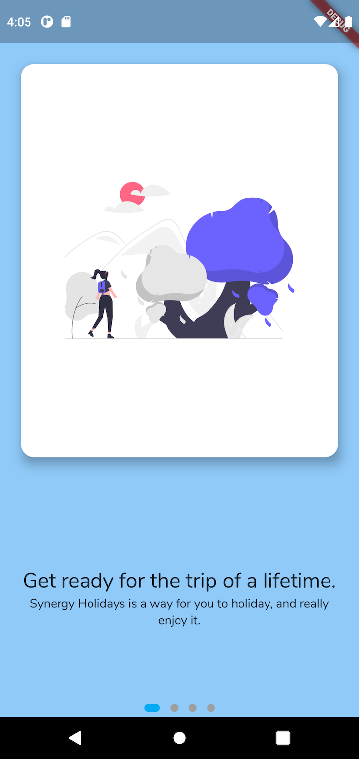
As long as we have some text to display with an optional image, we can easily display whatever we want at this particular stage of the onboarding process.
Usually, during an onboarding process, developers want to gather some sort of information from the customer, such as their email address or name.
In this case, we want to know what the user is interested in doing on their holidays so our app can make appropriate suggestions. Again, the subtle use of motion and feedback to the user can make this process feel enjoyable and high quality.
Our final interest selection screen looks like this:
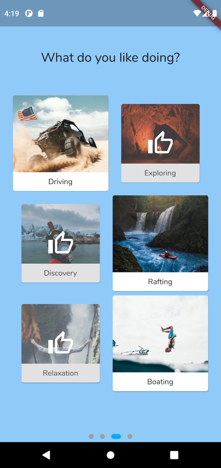
To begin building this page, we must construct a list of possible activities for the user to select from. We must also declare a Set to track what’s selected (we use a Set because items must be unique, unlike a List that allows duplicates):
final holidayTypes = [
  HolidayType('buggy.jpg', 'Driving'),
  HolidayType('cave_diving.jpg', 'Exploring'),
  HolidayType('exploration.jpg', 'Discovery'),
  HolidayType('rafting.jpg', 'Rafting'),
  HolidayType('relaxation.jpg', 'Relaxation'),
  HolidayType('water.jpg', 'Boating'),
];

final selectedHolidayTypes = <String>{};
As the user taps on the interests, the interests shrink in size and are overlaid with a thumbs-up icon. To achieve this, we must lay out our interests on a grid by using a GridView.
Again, we’ll use AnimatedContainer and AnimatedOpacity to handle the items shrinking and adding the thumbs-up icon display. When interests are tapped on, they are added or removed from the selectedHolidayTypes:
GridView.count(
  physics: NeverScrollableScrollPhysics(),
  shrinkWrap: true,
  crossAxisCount: 2,
  children: [
    ...holidayTypes.map(
      (e) => AnimatedContainer(
        duration: Duration(milliseconds: 100),
        padding: selectedHolidayTypes.contains(e.name) ? EdgeInsets.all(16) : EdgeInsets.zero, // Implicitly animate between full size, or shrunk size, depending if selected
        child: Card(
          clipBehavior: Clip.antiAlias, // Clip the overflow
          child: InkWell( // Display the inkwell splash when the user taps on an item
            onTap: () {
              setState(() {
                if (selectedHolidayTypes.contains(e.name)) {
                  // If the interest is already on the list, remove it
                  selectedHolidayTypes.remove(e.name);
                } else {
                  // Otherwise, add it
                  selectedHolidayTypes.add(e.name);
                }
              });
            },
            child: Ink.image(
              image: AssetImage(
                'assets/holidaytypes/${e.asset}',
              ),
              fit: BoxFit.cover, // Cover the entire container with the image
              child: Stack(
                alignment: Alignment.center,
                fit: StackFit.expand, // Expand children items to fit parent size
                children: [
                  // Align the label to the bottom center of the card.
                  Align(
                    child: Container(
                      padding: EdgeInsets.zero,
                      child: Padding(
                        padding: const EdgeInsets.all(8.0),
                        child: Text(
                          e.name,
                          textAlign: TextAlign.center,
                        ),
                      ),
                      width: double.maxFinite,
                      color: Colors.white,
                    ),
                    alignment: Alignment.bottomCenter,
                  ),
                  // The 'thumbs-up' icon
                  AnimatedOpacity(
                    // If selected, show the thumbs-up icon
                    opacity: selectedHolidayTypes.contains(e.name) ? 1.0 : 0.0,
                    duration: Duration(milliseconds: 100),
                    child: Container(
                      height: double.maxFinite,
                      width: double.maxFinite,
                      // Overlay the image with a slight grey color
                      color: Colors.grey.withOpacity(0.3),
                      child: Icon(
                        Icons.thumb_up_alt_outlined,
                        color: Colors.white,
                        size: 50,
                      ),
                    ),
                  )
                ],
              ),
            ),
          ),
        ),
      ),
    )
  ],
)
The result of this code is an interactable button that looks like this:

It’s important to wow your users from the get-go, and having an effective onboarding process can go a long way in accomplishing that. Fortunately, through the use of some basic motion and Flutters’ inbuilt implicit animations, it’s not difficult to achieve the exact result that you want.
As always, a link to the source for this example can be found here. I hope you make a really great onboarding process for your app! 🚀😊
Install LogRocket via npm or script tag. LogRocket.init() must be called client-side, not
server-side
$ npm i --save logrocket

// Code:

import LogRocket from 'logrocket';
LogRocket.init('app/id');
// Add to your HTML:

<script src="https://cdn.lr-ingest.com/LogRocket.min.js"></script>
<script>window.LogRocket && window.LogRocket.init('app/id');</script>

AI-generated tests can speed up React testing, but they also create hidden risks. Here’s what broke in a real app.re

Why the future of DX might come from the web platform itself, not more tools or frameworks.

A hands-on test of Claude Code Review across real PRs, breaking down what it flagged, what slipped through, and how the pipeline actually performs in practice.

CSS art once made frontend feel playful and accessible. Here’s why it faded as the web became more practical and prestige-driven.
Would you be interested in joining LogRocket's developer community?
Join LogRocket’s Content Advisory Board. You’ll help inform the type of content we create and get access to exclusive meetups, social accreditation, and swag.
Sign up now