Radio button elements are crucial when it comes to letting the client choose between multiple options. For example, assume that you own a successful app and want to get the user’s theme preferences (for dark and light mode). In this case, it would be sensible to display all available options in a radio button group.

A notorious use-case for radio group usage is Google’s search settings:

In this guide, you will learn how to build a radio button form using the React Native library. Furthermore, we will also be writing some code to style our radio elements.
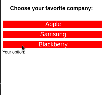
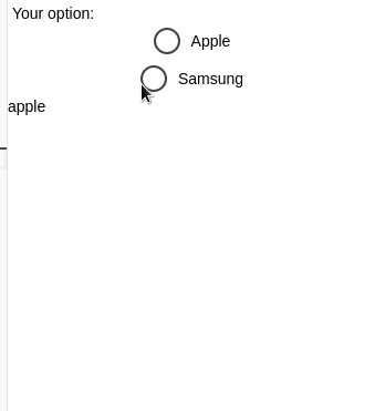
This will be the outcome:
We’ll be covering these topics:
Before writing some code, we need to first initialize our app repository. To scaffold a React Native project using Expo, execute this Bash command:
expo init radio-button-tutorial
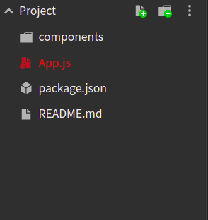
Next, create a components folder in the root of your project directory. In this folder, we will store our custom React modules. This will help in code organization:
#in your project dir
mkdir components
In the end, your project folder structure should look like so:
In this part of the article, we will write some code to display a list of the user’s available choices.
First, navigate to your components folder. There, create a file called RadioButton.js.
In the RadioButton.js file, write the following snippet:
import React from 'react';
import { View, Text } from 'react-native';

export default function RadioButton({ data, onSelect }) {
  return (
    <View>
      {data.map((item) => {
        return <Text> {item.value}</Text>;
      })}
    </View>
  );
}
A few inferences from this code:
RadioButton module will accept two props: data and onSelect. Here, data will be our array of user options. Moreover, onSelect will be a handler function that will run if the user makes a selectionmap function on our data arraymap method will help us display the value field of each item in the arrayLet’s test it out!
In App.js, replace all the code with the following:
import React from 'react';
import { Text, View, StyleSheet } from 'react-native';
import RadioButton from './components/RadioButton';
export default function App() {
const data = [
{ value: 'Apple' },
{ value: 'Samsung' },
{ value: 'Blackberry' },
];
return (
<View style={styles.container}>
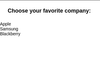
<Text style={styles.paragraph}>Choose your favorite company: </Text>
<RadioButton data={data} />
</View>
);
}
In the above code, we created an array called data. This variable contains the user’s list of choices. Later on, we passed in this variable into the data prop of the RadioButton component. As a result, this will render our list.
In this section, we will use React Native’s Pressable API to make our list interactive.
To do so, go to RadioButton.js and modify the return block to the following:
import {Pressable} from 'react-native'; //additional import.
//code to change of 'return' block in RadioButton.js
return (
  <View>
    {data.map((item) => {
      return (
        <Pressable onPress={() => alert("Your choice: " + item.value)}> {/* onPress handler runs when item is clicked.*/}
          <Text> {item.value}</Text>
        </Pressable>
      );
    })}
  </View>
);
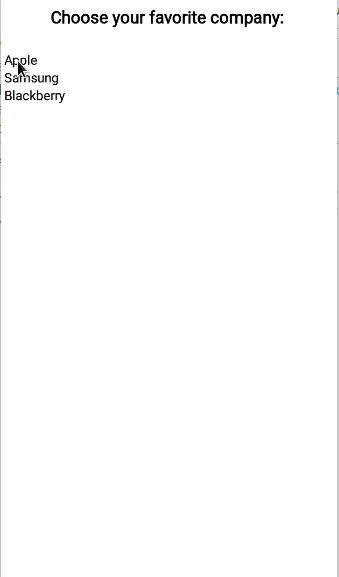
In this code, we used the Pressable component to tell React Native that if the user taps on any item, it should display the user’s selection in a separate popup window.
In the RadioButton.js file, append the following snippet:
import { useState } from "react";

const [userOption, setUserOption] = useState(null);

return (
  <View>
    {data.map((item) => {
      return (
        /*Change the 'onPress' handler here */
        <Pressable onPress={() => setUserOption(item.value)}>
          <Text> {item.value}</Text>
        </Pressable>
      );
    })}
    <Text> User option: {userOption}</Text>
  </View>
);
Here’s a breakdown of this block:
userOption Hook. This will store the user’s current selection. Its initial value will be nullonPress handler to tell React to update the value of userOption to the user’s current choiceuserOption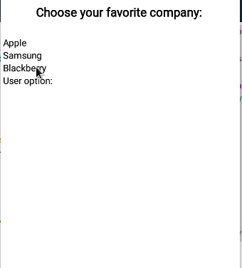
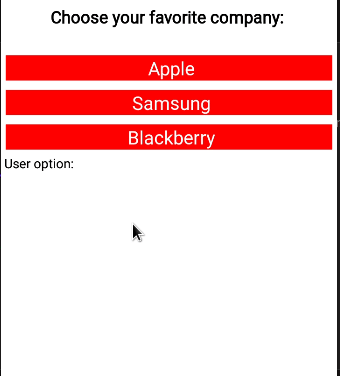
Here, our plan is to use the StyleSheet API to decorate our radio form. This will help in improving our app’s user experience.
To make this possible, in your components folder and create a new file called styles.js. Here, write the following code:
import { StyleSheet } from 'react-native';
const styles = StyleSheet.create({
  option: {
    fontSize: 20,
    color: 'white',
    textAlign: 'center',
  },
  unselected: {
    backgroundColor: 'red',
    margin: 5,
  },
  selected: {
    backgroundColor: 'blue',
    margin: 6,
    padding: 10,
    borderRadius: 10,
  },
});
export default styles;
Here’s a brief explanation:
option property will be responsible for styling the text that displays the user’s options. Here, we are increasing its font size and changing its color and alignment valuesunselected will decorate the elements that are not selected. Here, we are modifying its background colorselected style will be applied on the item that the user has chosen. In this case, we are changing its padding and using the borderRadius property to round the element’s bordersWhen that’s done, it’s now time to apply our style.
To do so, write this piece of code in RadioButton.js:
//code to change in 'return' block
data.map((item) => {
  return (
    <Pressable
      style={ //Line 5
        item.value === userOption ? styles.selected : styles.unselected
      } /*Add style here */ //Line 7
      onPress={() => setUserOption(item.value)}
    >
      {/* add style here */}
      <Text style={styles.option}> {item.value}</Text>
    </Pressable>
  );
});
Notice that in lines 5–7, we are first checking whether the user has clicked on a particular element. If this condition is met, React Native will use the selected style.
Otherwise, the unselected style will be applied.
onSelect handlerIn RadioButton.js, edit your code like so:
//extra code removed for brevity.
const selectHandler = (value) => {
  onSelect(value);
  setUserOption(value);
};

return (
  <View>
    {data.map((item) => {
      return (
        <Pressable onPress={() => selectHandler(item.value)}>
        {/* Further code... */}
        <Text> User option: {userOption}</Text> {/* remove this line */}
Here, notice that we have changed the onPress handler to run the selectHandler function. As a result, this will run the onSelect method and update the value of the userOption state.
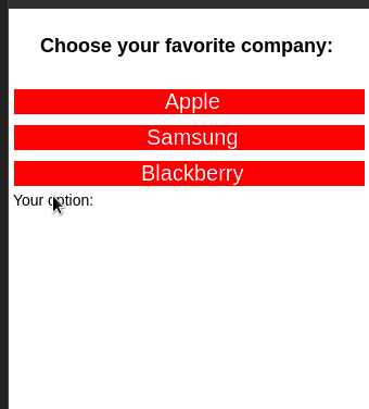
It’s now time to use our custom handler function. To do so, navigate back to App.js and append this block:
import { useState } from "react";
const [option, setOption] = useState(null);
return (
<View style={styles.container}>
<Text style={styles.paragraph}>Choose your favorite company: </Text>
{/* add 'onSelect' handler */}
<RadioButton data={data} onSelect={(value) => setOption(value)} />
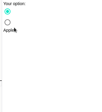
<Text> Your option: {option}</Text>
</View>
);
In this piece of code, we first declared an option state. Later on, we used the onSelect hook to tell React to update the value of option if the user taps on any item. In the end, React will display the value of option to the UI.
Congrats! You’ve now built a custom radio button!
In the end, your RadioButton.js file should look like this:
import React, { useState } from 'react';
import { View, Text, Pressable } from 'react-native';
import styles from './styles';

export default function RadioButton({ data, onSelect }) {
  const [userOption, setUserOption] = useState(null);
  const selectHandler = (value) => {
    onSelect(value);
    setUserOption(value);
  };
  return (
    <View>
      {data.map((item) => {
        return (
          <Pressable
            style={
              item.value === userOption ? styles.selected : styles.unselected
            }
            onPress={() => selectHandler(item.value)}>
            <Text style={styles.option}> {item.value}</Text>
          </Pressable>
        );
      })}
    </View>
  );
}
And App.js should have this code:
import React, { useState } from 'react';
import { Text, View, StyleSheet } from 'react-native';
import RadioButton from './components/RadioButton';

export default function App() {
  const [option, setOption] = useState(null);
  const data = [
    { value: 'Apple' },
    { value: 'Samsung' },
    { value: 'Blackberry' },
  ];
  return (
    <View style={styles.container}>
      <Text style={styles.paragraph}>Choose your favorite company: </Text>
      <RadioButton data={data} onSelect={(value) => setOption(value)} />
      <Text> Your option: {option}</Text>
    </View>
  );
}
const styles = StyleSheet.create({
  paragraph: {
    margin: 24,
    fontSize: 18,
    fontWeight: 'bold',
    textAlign: 'center',
  },
});
If you don’t want to build your own radio button solution, the React Native community offers pre-built radio components that allow for high customization.
To install this package in your project, use this terminal command:
npm i react-native-simple-radio-button
This code sample renders a radio group via the react-native-simple-radio-button library:
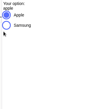
import RadioForm from 'react-native-simple-radio-button';

export default function ReactSimpleButton() {
  const [chosenOption, setChosenOption] = useState('apple'); //will store our current user options
  const options = [
    { label: 'Apple', value: 'apple' },
    { label: 'Samsung', value: 'samsung' },
  ]; //create our options for radio group
  return (
    <View>
      <Text> {chosenOption}</Text>
      <RadioForm
        radio_props={options}
        initial={0} //initial value of this group
        onPress={(value) => {
          setChosenOption(value);
        }} //if the user changes options, set the new value
      />
    </View>
  );
}
You can incorporate radio-buttons-group in your app via npm or Yarn like so:
npm i react-native-radio-buttons
To draw a radio button group using this module, write this block of code:
import RadioGroup from 'react-native-radio-buttons-group';
export default function App() {
  //create our options
  const radioButtonsData = [
    {
      id: '1', // acts as primary key, should be unique and non-empty string
      label: 'Apple',
      value: 'apple',
    },
    {
      id: '2',
      label: 'Samsung',
      value: 'samsung',
    },
  ];
  const [radioButtons, setRadioButtons] = useState('apple'); //pass in our data to this state. This will store the current user's choice
  const setValue = (value) => {
    var newArray = value.filter((item)=>item.selected===true); //get the items that are selected
    setRadioButtons(newArray[0].value); //set the selected value in this Hook
  };
  return (
    <View>
      {/* The onPress handler tells React to change the value of the radioButtons Hook*/}
      <RadioGroup
        radioButtons={radioButtonsData} //pass in our array
        onPress={(value) => setValue(value)}
      />
      <Text>{radioButtons}</Text> {/*Display the value of the current user choice */}
    </View>
  );
}
React Native Paper is one of the most widely used component libraries in the React Native ecosystem. Other than radio buttons, they provide appbars, badges, and more.
The following terminal command will install React Native Paper for your project:
npm install react-native-paper
To display a couple of simple radio buttons:
import { RadioButton } from 'react-native-paper';

export default function ReactPaper() {
  const [checked, setChecked] = React.useState('Apple'); //initial choice
  return (
    <View>
    {/*Create first radio button */}
      <RadioButton
        value="Apple"
        status={ checked === 'Apple' ? 'checked' : 'unchecked' } //if the value of checked is Apple, then select this button
        onPress={() => setChecked('Apple')} //when pressed, set the value of the checked Hook to 'Apple'
      />
      <RadioButton
        value="Samsung"
        status={ checked === 'Samsung' ? 'checked' : 'unchecked' }
        onPress={() => setChecked('Samsung')}
      />
      <Text> {checked}</Text>
    </View>
  );
};
You can access this project’s Expo Snack here.
In this article, you learned how to build a custom radio button in React Native that not only looks good, but is also extremely fast and stable. Don’t want to build your own radio element? No problem! You can use the SegmentedControl library or even React Native Paper’s RadioButton component. They are great alternatives that help you get up and running in a short span of time.
Thank you for reading!

LogRocket's Galileo AI watches sessions for you and and surfaces the technical and usability issues holding back your React Native apps.
LogRocket also helps you increase conversion rates and product usage by showing you exactly how users are interacting with your app. LogRocket's product analytics features surface the reasons why users don't complete a particular flow or don't adopt a new feature.
Start proactively monitoring your React Native apps — try LogRocket for free.
Install LogRocket via npm or script tag. LogRocket.init() must be called client-side, not
server-side
$ npm i --save logrocket

// Code:

import LogRocket from 'logrocket';
LogRocket.init('app/id');
// Add to your HTML:

<script src="https://cdn.lr-ingest.com/LogRocket.min.js"></script>
<script>window.LogRocket && window.LogRocket.init('app/id');</script>

Explore 15 essential MCP servers for web developers to enhance AI workflows with tools, data, and automation.

Learn how contrast-color() automatically picks accessible text colors using native CSS, without JavaScript.

Learn how to build a harness-style AI workflow using Claude Code with specialized Dev, QE, and Ops subagents, gated handoffs, MCP telemetry, and LEARNING.md.

Learn how to build smooth staggered animations in CSS using modern features like sibling-index(), complete with practical examples, fallbacks, and accessibility tips.
Would you be interested in joining LogRocket's developer community?
Join LogRocket’s Content Advisory Board. You’ll help inform the type of content we create and get access to exclusive meetups, social accreditation, and swag.
Sign up now

 Learn more →
