One of the most recent additions to web standards is the Popover API, which appears somewhat similar to the HTMLDialogElement API. In certain instances, the distinction between these two can be rather unclear, making it confusing for developers to choose the right one for a given task.
This article aims to address the key similarities and differences between the Popover and HTMLDialogElement APIs. We will briefly describe each API, cover some of their different use cases, implement the APIs to create some common utilities seen on the web, and discuss when to use each API.
A dialog UI pattern can serve as a means to display information to users and gather their input. “Dialog” here describes the communication process where the app requests user input using this particular element. The user may need to respond before proceeding with the app, or they can choose to dismiss the dialog.
To craft dialogs that are semantically rich and accessible for the web, the HTML standard supports the HTMLDialogElement API. This API enables the creation of purposeful dialogs with improved accessibility.
The <dialog> element provided by the API is specifically designed for components that require user interaction or input, and it can operate in both modal and non-modal manners.
In a modal dialog, users need to handle the dialog first before they can continue using the app. This means they can’t do anything else in the app until they close or cancel the dialog.
Modal dialogs are usually used for important tasks like confirming actions or showing errors, which need the user’s complete focus.
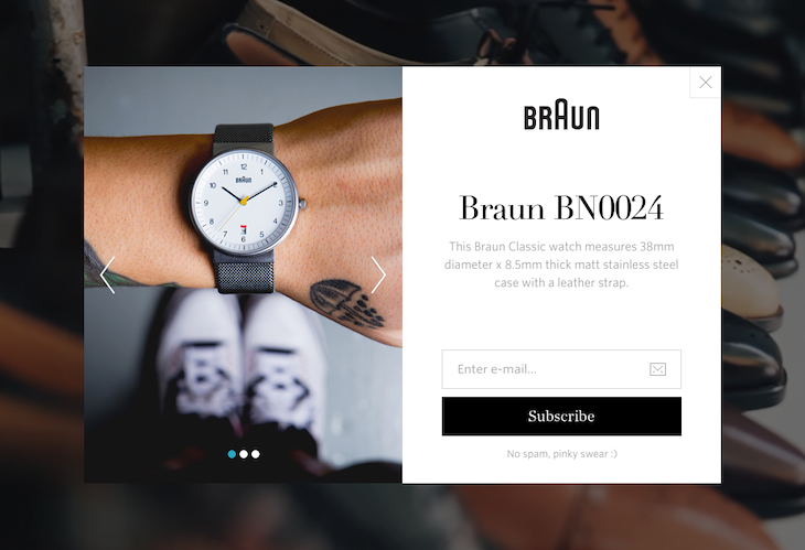
A common example of modal dialogs is a newsletter subscription prompt. The modal behavior is particularly useful in this case for grabbing the user’s full attention, as shown in this example from Dribbble:
Another excellent example, though less common, is when a website presents a dialog asking the user for permission to show ads. Here’s an example from the How-To Geek website:
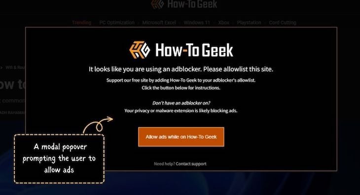
In this scenario, the user’s access to the app or website is restricted until they include it in their ad blocker program’s whitelist.
Non-modal dialogs allow users to keep using the app even when the dialog is open. This makes them less bothersome for users, but it also means they might not immediately notice the dialog.
They’re typically used for features like tooltips or menus that don’t need all of the user’s focus.
Interestingly, dialogs with non-modal behavior are frequently categorized as popovers. This is where the distinction between dialogs and popovers starts to blur, making it difficult for developers to choose between the two.
For a clearer perspective, you may think of the dialog vs. popover debate as modals vs. non-modals.
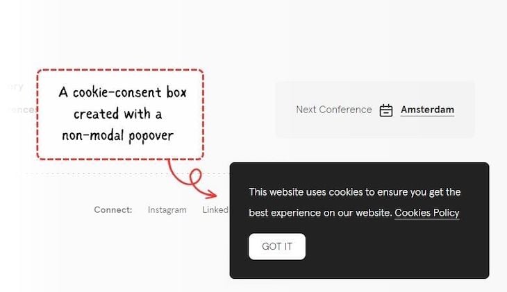
A frequent situation where non-modal dialogs come into play is with the cookie-consent banners often seen on websites and apps these days:
The recommended way to create and control dialogs in HTML is to use the <dialog> element in conjunction with its HTMLDialogElement API. This approach gives the element an inherent dialog role, which allows the browser to accurately interpret the element and provide appropriate accessibility features.
In the upcoming segment, we will go over the specifics of the dialog API and see how to use it to create comprehensive and functional dialogs.
HTMLDialogElement APIConstructing a functional HTML dialog requires a solid understanding of how to structure the markup correctly and utilize the HTMLDialogElement API for various dialog-related tasks.
Furthermore, there are certain new CSS features available that can be employed to style, optimize, and enhance accessibility for HTML dialogs.
We will address the process of declaring a dialog through markup, adding functionality to it using JavaScript, and enhancing its appearance with CSS, one step at a time.
When you add the <dialog> element to your HTML, it will not appear immediately on the frontend as a proper dialog. To make it visible, you can add the open attribute to it:
<dialog id="dialog" open>
  <p>...</p>
</dialog>
The result, which you can see below, doesn’t quite look like a dialog at the moment. It currently operates as a non-modal dialog and also lacks a close button:
See the Pen Example Non Modal Dialog Opened By Default by Rahul C (@_rahul)
on CodePen.
To enhance the functionality of this dialog, you can employ the HTMLDialogElement API to programmatically manage its display, closure, and interaction using JavaScript.
HTMLDialogElement APIWe can create both modal and non-modal dialogs using the JavaScript capabilities of the HTMLDialogElement API. The JavaScript support within this API offers various methods, events, and properties to effectively handle the behaviors and functionalities of the dialog element.
Here are some JavaScript methods supported by the API to manage different states of the dialog element:
show(): Opens the dialog non-modallyshowModal(): Opens the dialog modallyclose(): Closes the dialog and optionally returns a value to the callerIt also supports specific events that you can listen to whenever the dialog closes:
close event fires when the dialog closescancel event fires when the user cancels the dialog by pressing the Escape keySome instance properties are also available with the API, which are listed below:
open: A boolean value that indicates whether the dialog is open (true) or closed (false)returnValue: A property that can be used to set or get the return value for the dialog elementA modal dialog is supposed to perform critical tasks and therefore appears on the top layer of the stacking context, which means you can’t manage its stacking using the CSS z-index property. Instead, it will always appear on top of every element that is not in the top layer.
Note that the stacking of the elements in the top layer is managed in last-in, first-out (LIFO) order. This means that the last element that is added to the top layer will be the topmost element.
On the other hand, non-modal dialogs let you control stacking with CSS. The comparison is shown in the example below:
See the Pen Demo Of Two Non Modal Dialogs Stacked With CSS by Rahul C (@_rahul)
on CodePen.
With the HTMLDialogElement API, we have access to dialog-specific CSS pseudo-selectors, which can be used to apply styles or target specific dialog components.
When a dialog behaves modally, it should display a full-screen click trap in the background. This indicates that the rest of the application is currently inactive.
The ::backdrop pseudo-element, which is also used in user-agent styles to provide a pre-existing default click trap for modal dialogs, can be used to customize the click trap appearance:
.my-modal::backdrop {
  background: hsl(240deg 50% 50% / 25%);
}
We can also use the :modal CSS class to ensure that the dialog we are targeting exhibits modal behavior and style it accordingly:
.my-dialog:modal {
  ...
}
HTMLDialogElement APIYou can start implementing the HTMLDialogElement API by getting a reference to a button element that triggers the dialog. When the user interacts with the button, you can execute the Dialog.show() method. This will cause the dialog to show up when the button is clicked:
const openDialogBtn = document.querySelector("#open-dialog-btn");
const dialog = document.querySelector("#dialog");

openDialogBtn?.addEventListener("click", () => {
  dialog?.show();
});
At this point, the dialog is non-modal, which means that the user can still interact with the rest of the application while the dialog is open.
If you want to make the dialog modal, you can use the Dialog.showModal() method instead of Dialog.show(). This will cause the dialog to operate in a modal behavior, which means that the user will not be able to interact with the rest of the application until the dialog is closed:
openDialogBtn?.addEventListener("click", () => {
  dialog?.showModal();
});
Closing dialog elements can be readily achieved by utilizing Dialog.close(), as shown below. This method constitutes an explicit dismissal:
closeDialogBtn?.addEventListener("click", () => {
  dialog?.close();
});
Soft dismissal of dialogs is not natively supported by the HTMLDialogElement API. The Popover API provides a superior way to create non-modal dialogs with soft dismissal capabilities.
Both triggering and dismissing, whether softly or explicitly, are much simpler using the Popover API than the dialog API. We will discuss this topic further in the next section.
Here is a demonstration of both modal and non-modal dialogs, implemented based on the explanations given earlier:
See the Pen Demo Of Dialog Element And Dialog API Used To Create Modal And Non Modal Dialogs by Rahul C (@_rahul)
on CodePen.
The modal dialog is neatly centered thanks to the applied user agent styles. The non-modal counterpart, on the other hand, does not quite achieve centered alignment and is visible around its anchor or trigger.
Feel free to fork this code, try to fix the non-modal positioning, or create your own variations of dialog elements.
As we previously discussed, dialog elements are suitable for presenting users with important action-related information. However, for less crucial scenarios, we now have the newly introduced Popover API. Let’s explore it in the next section.
A popover can be any transient window-like component that emerges when triggered within a webpage or app. Usually, this happens when a user interacts with an element that serves as the trigger for the popover. It is typically used to provide additional information or functionality to the user.
The Popover API provides the advantage of utilizing in-browser features to create accessible and native popover utilities. We will discuss more about the API later on.
Popovers exhibit non-modal behavior and are not suitable for elements displaying modal properties. They are frequently used for tasks such as:
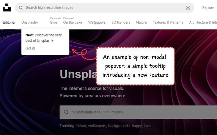
Tooltips that appear when hovering over buttons or icons, or are added when a new feature is introduced, are good examples of non-modal popovers. These unobtrusive popovers provide quick insights without disrupting the user’s flow, like this Unsplash popover shown below:
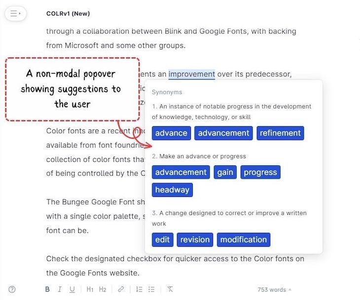
Another practical use case of popovers is providing context-specific information. For instance, when a user clicks on a term or phrase within an article, a popover might appear, offering a brief definition or explanation.
These popovers are designed to enhance the user’s understanding without taking them away from the main content, like this example from the Grammarly website:
Now, let’s delve further into the Popover API, exploring its capabilities and functionalities in more detail.
To handle non-modal behavior beyond dialogs in web browsers, the HTML standard has introduced popover attributes with the corresponding Popover API.
Unlike the HTMLDialogElement API, the Popover API doesn’t involve creating a new element tag in the markup. Instead, it utilizes different attributes that can be added to various elements. These attributes establish a relationship between the popover and its triggering element.
The HTMLDialogElement API is specifically linked to dialogs. In contrast, the Popover API can be attached to any element to provide it with a non-modal behavior.
This new approach may eliminate the need for an external library in the future to achieve non-modal behavior. It also enhances the user experience by incorporating native semantics and providing relevant information in a non-modal manner.
By default, popovers created using this approach have a light-dismissing behavior that can also be controlled through API features.
As mentioned before, popovers exhibit non-modal behavior. Popovers generated using the Popover API strictly adhere to this non-modal behavior and are placed at the top-most layer in the stacking context. This implies that they will consistently appear above other elements, irrespective of their z-index property.
popover attributeThe popover attribute is a global attribute that designates an element as a popover element. It can take one of two values: auto or manual.
The default value of this attribute is auto, which indicates that the popover will automatically display when the user interacts with the triggering element.
The manual value indicates that the popover will only be shown when the user explicitly clicks on the triggering component.
popovertarget attributeThe popovertarget attribute is used to specify which element will trigger the popover. The ID of the trigger element must be in the same tree as the element with the popover attribute. The popover will be displayed relative to the triggering element, like so:
See the Pen Demo Of Auto And Manual Popover Behavior by Rahul C (@_rahul)
on CodePen.
popovertargetaction attributeThe popovertargetaction attribute is used to specify the action that will be performed when the popover is triggered. It can take one of three values:
show — Interacting with the triggering element will display the popoverhide — Interacting with the triggering element will hide the popovertoggle — Interacting with the triggering element will display the popover if it is hidden and hide it if it is displayedBelow, you can interact with two triggering elements. The Show popover button uses the show value, while the Hide popover button uses the hide value:
See the Pen Demo Of Popover Target Action Attribute Using Show And Hide Values by Rahul C (@_rahul)
on CodePen.
In terms of JavaScript support, there are three instance properties that prove useful for acquiring the attribute values discussed earlier:
popover — Facilitates retrieving and setting an element’s popover state using JavaScript, which can be either auto or manual. It serves not only for functional purposes but also for feature detection, reflecting the value of the popover global HTML attributepopoverTargetElement — Enable getting and setting the popover element controlled by the corresponding control triggers. They correspond to the JavaScript counterparts of the popovertarget HTML attributepopoverTargetAction — Employed to obtain and modify the action to be executed (hide, show, or toggle) on the popover element under the control of the respective button. They mirror the value of the popovertargetaction HTML attributeIn addition, the API supports three instance methods:
hidePopover() — Conceals a popover element by removing it from the top layer and applying the display: none styleshowPopover() — Reveals a popover element by adding it to the top layertogglePopover() — Toggles a popover element between its visible and hidden statesFurthermore, two instance events are available for use with the API:
beforetoggle — Triggered just prior to a popover element’s state transition between showing and being hidden, or vice versatoggle — Fired just after a popover element’s state changes between showing and being hidden, or vice versaPopover elements — specifically, those that use the popover attribute — are intended to be displayed above other elements. Thus, like modal dialog elements, they are placed in the top layer of the stacking context.
Since we’ve previously addressed the finer points of stacking with top-layer elements, there’s no need to reiterate them here.
With the Popover API, we have the :popover-open CSS pseudo-class that enables you to target a popover element when it’s in an open state:
.tooltip:popover-open {
  /* Do something */
}
As popover elements reside at the topmost level of the stacking context, they also support the ::backdrop pseudo-element. This feature can be highly advantageous for emulating effects such as lightbox image galleries, introduction tooltips during app tours, walkthroughs, onboarding, and more:
.lightbox::backdrop {
  /* Do something */
}
The Popover API imparts popover behavior through its attributes. However, unlike the HTMLDialogElement API, it does not inherently include the associated semantics. Thus, it becomes your responsibility to incorporate semantics into your popovers by utilizing distinct role attributes.
For example, when creating a custom <select> list box, you would include the role attribute with the value listbox to indicate that the element functions as a list box. You should also apply appropriate ARIA states and properties, which will signal the browser to identify it as such:
<div
  role="listbox"
  aria-labelledby="..."
  aria-activedescendant="..."
  popover>
  ...
</div>
Alternatively, if an element possesses sufficient inherent semantics, you can simply add the popover attribute. Let’s take the <dialog> element as an example to illustrate how easily we can trigger and dismiss it using the Popover API.
We can easily establish a functional dialog using the aforementioned popover attributes, as discussed earlier, to mimic a cookie-consent box:
<dialog id="cookie-box" popover="manual">
   ...
   <button
     id="accept-cookies"
     popovertarget="cookie-box"
     popovertargetaction="hide">Accept Cookies</button>

   <button
     id="close-cookie-box"
     popovertarget="cookie-box"
     popovertargetaction="hide">Close</button>
</dialog>

<button
  id="open-cookie-box"
  popovertarget="cookie-box"
  popovertargetaction="show">Open Cookie box</button>
After tweaking the position and appearance of the dialog element with CSS, we are good to add more functionality to our cookie-consent box. Check how flawlessly the trigger and dismissal of the dialog popover work in the demo below:
See the Pen Demo Of Smooth Trigger And Dismissal Of Dialog Popover Styled With CSS by Rahul C (@_rahul)
on CodePen.
Typically, websites display the cookie-consent box in an initially opened state. You can achieve this in JavaScript by obtaining a reference to the dialog box and subsequently utilizing the Popover.showPopover() method:
const cookieBox = document.querySelector("#cookie-box");
cookieBox.showPopover();
You may now take it a step further by defining actions and setting up event listeners to incorporate additional functionalities into the cookie-consent box. Here’s how the final demonstration looks:
See the Pen Demo Of Non Modal Popover With Additional Actions And Event Listeners by Rahul C (@_rahul)
on CodePen.
As an assignment, consider expanding on this example to create a comprehensive cookie-consent feature.
With your current understanding of dialogs and popovers, you may venture into developing something new too. Some ideas include a basic image lightbox, a simple tooltip, or any other idea that comes to mind when considering a popover-like interaction.
You now possess a sufficient technical understanding of dialogs and popovers. However, there are a few additional non-technical aspects you should consider when choosing between dialogs and popovers. Take the following factors into account:
Keeping these in mind can help you determine whether a dialog or popover is best for your needs.
HTMLDialogElement APIsThe Popover API is presently in an experimental phase across most browsers, except for Chrome 116+ and the Safari 17 technical preview. However, it is expected to be available in most major browsers soon. You can refer to CanIUse for more details about its support.
The HTMLDialogElement API is now well-supported and available in nearly all modern web browsers. You can find additional information about support for <dialog> elements on CanIUse.
The difference between dialogs and popovers can be subtle and challenging to discern. In this guide, we talked about both their differences and similarities. For example, non-modal dialogs can work like popovers, and the Popover API can be used flexibly with <dialog> elements.
We also explored some UI patterns that are similar to these two concepts and completed some coding exercises. As the popover feature is still in its early stages, it may continue to evolve, potentially making the distinction between these two APIs clearer.
I hope you found the explanations helpful. Feel free to share any thoughts, suggestions, or ideas you might have.
Install LogRocket via npm or script tag. LogRocket.init() must be called client-side, not
server-side
$ npm i --save logrocket

// Code:

import LogRocket from 'logrocket';
LogRocket.init('app/id');
// Add to your HTML:

<script src="https://cdn.lr-ingest.com/LogRocket.min.js"></script>
<script>window.LogRocket && window.LogRocket.init('app/id');</script>
Would you be interested in joining LogRocket's developer community?
Join LogRocket’s Content Advisory Board. You’ll help inform the type of content we create and get access to exclusive meetups, social accreditation, and swag.
Sign up now
Learn how OpenAPI can automate API client generation to save time, reduce bugs, and streamline how your frontend app talks to backend APIs.

Discover how the Interface Segregation Principle (ISP) keeps your code lean, modular, and maintainable using real-world analogies and practical examples.

<selectedcontent> element improves dropdowns

Learn how to implement an advanced caching layer in a Node.js app using Valkey, a high-performance, Redis-compatible in-memory datastore.