In frontend development, stacking is the concept of ordering HTML elements in priority order based on their values in an imaginary z-axis. The stacking order is often influenced by the value of some CSS properties such as position, z-index, opacity, and others.

In this tutorial, we’ll demonstrate some best practices for using the stacking technique to build stunning UIs in HTML.
To follow along with this tutorial, you’ll need:
Before we really get going, let’s consider two scenarios:
position of the first element to relative and the latter to the absolute, right?navbar to your webpage. For this, you’d simply set its z-index to a value higher than all other elements.Between these two scenarios lies the power of stacking in CSS. With this clue in mind, let’s dive deeper and explore how to build both simple and complex overlapping UIs using the CSS stacking technique.
The Replay is a weekly newsletter for dev and engineering leaders.
Delivered once a week, it's your curated guide to the most important conversations around frontend dev, emerging AI tools, and the state of modern software.
position propertyIn this section, we’ll build three overlapping divs with HTML and CSS using the position property.
To begin, create a new folder named stacking_with_position_property in your work directory. Navigate into the folder and create two files: index.html and styles.css.
Next, open up index.html in your code editor and add the code below:
<html lang="en">
  <head>
    <meta charset="UTF-8" />
    <meta http-equiv="X-UA-Compatible" content="IE=edge" />
    <meta name="viewport" content="width=device-width, initial-scale=1.0" />
    <title>Stacking with Position Property</title>
  </head>
  <body></body>
</html>
Next, let’s link the stylesheet to the index.html. Add the code below within the head section of the HTML file:
<head>
...
<link rel="stylesheet" href="styles.css">
...
</head>
Now let’s begin building the HTML elements. Add the code below to the body tag to create the three divs:
<div class="rectangle_wrapper">
      <div class="rectangle1">Div 1</div>
      <div class="rectangle2">Div 2</div>
      <div class="rectangle3">Div 3</div>
</div>
Here, we created a wrapper to hold the three divs with class names rectangle1, rectangle2, and rectangle3.
Next, open styles.css, add the code below to override the browser’s default padding and margin:
* {
  padding: 0;
  margin: 0;
  box-sizing: border-box;
}
body {
  max-width: 1100px;
  margin: 0 auto;
}
Here we use the * keyword to set all default margin and padding to 0. We then use the body keyword to set the max-width of the webpage to 1100px to ensure all elements within the browser viewport do not overflow to the extreme.
Next, add the CSS below to styles.css to style the divs:
...
.rectangle_wrapper {
  height: 50px;
  width: 200px;
  position: relative;
}
.rectangle1,
.rectangle2,
.rectangle3 {
  position: absolute;
  width: 100%;
  height: 100%;
  border-radius: 10px;
}
.rectangle1 {
  top: 20px;
  background: #6b9080;
}
.rectangle2 {
  top: 30px;
  background: #eaf4f4;
}
.rectangle3 {
  top: 40px;
  background: #cce3de;
}
Now, if you open up index.html in your browser, the webpage should look like the screenshot below:
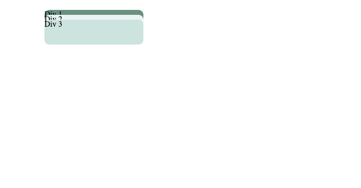
Now you know how to stack multiple elements in HTML using the CSS position property.
This example was made possible because we added position: relative to our parent element. Whenever an element is set to a position: relative, every other element within that div with position: absolute will be placed absolutely relative to that unit.
This is an old concept of stacking elements, but it works consistently well across all browsers, so it is highly recommended.
CSS grid is a common method of stacking elements in modern-day web development. It allows for easy placement of elements in a webpage with minimal code using a grid layout. In this section, we’ll demonstrate how to stack elements using a CSS grid by enhancing the elements we created in the previous section.
Once again, navigate into the stacking_with_position_property folder you created in the previous section. Make a copy of both the HTML and CSS files, and remove all CSS except the * and body keyword.
Now let’s add the code below to styles.css:
.rectangle_wrapper{
    height: 100%;
    display: grid;
    grid-template-columns: repeat(1fr, 3);
    grid-template-areas: "rec1 rec2 rec3";
    border: 3px dotted brown;
    padding: 20px;
    margin: 30px;
}
.rectangle1{
    width: 100%;
    grid-area: rec1 ;
    background: #6b9080;
}
.rectangle2{
    width: 100%;
    grid-area: rec2 ;
    background: #eaf4f4;
}
.rectangle3{
    width: 100%;
    grid-area: rec3 ;
    background: #cce3de;
}
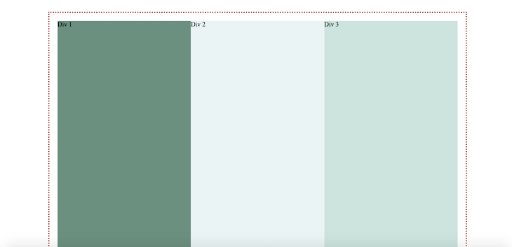
First, we set the rectangle_wrapper class to display: grid. We then set the grid-template-column to repeat(1fr, 3), which repeats one fragment in three columns. Next, we defined the grid columns (rec1 rec2 rec3) with grid-template-areas, then set each rectangle class grid-area to its corresponding column.
With this styling in place, each rectangle class becomes the direct child of the rectangle_wrapper, allowing the rectangles to be stacked in a horizontal line.
Open up index.html in your browser. The webpage should look similar to the screenshot below:
Note that the parent class needs to be given a relative position because it automatically allows for its descending elements to overlap. CSS grid can be used to create three-dimensional layouts, and all elements within the parent will be relatively absolute to the parent unit.
In this section, we’ll use the techniques demonstrated above to build a 3D button. Here’s what the final button will look like:
You may be wondering why we haven’t used properties like box-shadow or border to style the examples above. The reason is that animating those properties is expensive and does not make room for smooth transitioning.
Make a copy of the index.html file, and replace the code within the body tag with the code below:
<button class="clickable">
      <span class="front"> Click Me </span>
</button>
Next, replace the code in styles.css with the code below:
* {
  padding: 0;
  margin: 0;
  box-sizing: border-box;
}
body {
  max-width: 1100px;
  display: flex;
  justify-content: center;
  align-items: center;
  justify-items: center;
}
Here, we set the body pseudo-class to display:flex, justify-content: center, align-items: center, and justify-items: center. This will ensure all its descendants will be positioned in the center of the webpage.
Next, add the following code to styles.css to create the button MVP:
...
.clickable {
  background: #2d6a4f;
  border-radius: 12px;
  border: none;
  padding: 0;
  cursor: pointer;
  outline-offset: 4px;
}
.front {
  display: block;
  padding: 12px 42px;
  border-radius: 12px;
  font-size: 1.4rem;
  color: #fff;
  background: #52b788;
  transform: translateY(-6px);
}
.clickable:active .front {
  transform: translate(-2px);
}
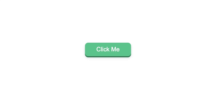
The button element has a dark-green background that represents the button’s bottom layer. We’ve removed the button’s default border by indicating border:none. The .front class represents the foreground layer of the button, which has a lighter shade of green color as the background.
We use the transform: translate CSS property to create a sliding effect each time the button is in its :active state. The resulting MVP for the button should look similar to the screenshot below:

The button is already looking 3D! Next, let’s add a hover state to the button. Add the code below to styles.css to create a hover effect:
...
.front{
  ...
  will-change: transform;
  transition: transform 250ms;
}
.clickable:hover .front {
  transform: translateY(-8px);
}
Note that we added the will-change:transform property. This is a best practice that allows the hover animation to be hardware-accelerated. The end result should look similar to the following gif:

Next, let’s add shadow to the button to enhance the 3D effect. To achieve this, we’ll have to restructure the markup in index.html:
<button class="clickable">
      <span class="shadow"></span>
      <span class="edge"></span>
      <span class="front"> Click Me </span>
</button>
Previously, the .clickable class was the edge layer. With the introduction of two layers, it is imperative that we make the .clickable class the parent of the .shadow, .edge, and .front classes using position: relative.
Replace the code for the .clickable and .front classes with the code below:
.clickable {
  position: relative;
  background: transparent;
  border: none;
  padding: 0;
  cursor: pointer;
}
.front {
  display: block;
  padding: 12px 42px;
  border-radius: 12px;
  font-size: 1.4rem;
  color: #fff;
  background: #52b788;
  transform: translateY(-4px);
  will-change: transform;
  transition: transform 250ms;
}
We’re simply using the stacking techniques we reviewed earlier to stack the button layers by setting the .clickable class to position: relative. In so doing, we’re implying that each descending element should be placed on top of it.
Let’s add the .shadow and .edge classes and their hover effects:
.shadow {
  position: absolute;
  top: 0;
  left: 0;
  width: 100%;
  height: 100%;
  border-radius: 12px;
  transform: translateY(2px);
  background: #ced4da;
}
.edge {
  position: absolute;
  top: 0;
  left: 0;
  width: 100%;
  height: 100%;
  border-radius: 12px;
  background: #2d6a4f;
}
.clickable:hover .front {
  transform: translateY(-6px);
}
.clickable:hover .shadow {
  transform: translateY(4px);
}
.clickable:active .front {
  transform: translate(-2px);
}
.clickable:active .shadow {
  transform: translate(1px);
}
Here, we forced the .shadow and .edge classes to take 100% of both the width and height of their parent, which, in this case, is the .clickable class. We also set their top:0 and left:0 to ensure they are positioned in the center of their parent class, with no default margins.
Each time a user hovers the button, the .shadow class moves 4px downward and the .front class moves 6px upwards, revealing the .edge class. The button should now look like the gif below when hovered:
We’ve relied solely on DOM order to stack the HTML elements — no need for z-index. This has revealed a fair share of best practices for stacking and positioning overlapping elements in CSS.
We can finish the button by adding a blur effect to the .shadow class to make it look softer and more appealing. Add the code below to the .shadow class:
.shadow {
...
  filter: blur(4px);
}
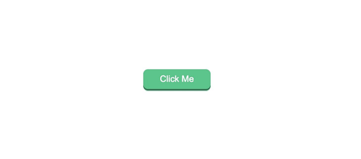
The final result of the button should look like this:
You can take a look at the complete source code for this section here. The entire project is available in this GitHub repo.
With the techniques you’ve learned in this tutorial, you can implement complex overlapping elements with 3D effects in your new and existing web applications using only CSS and HTML.
If you want to build on the principles we covered today, you may want to try implementing a sticky header, or two overlapping wheels, with one rotating clockwise and the other counterclockwise. The guidelines covered in this tutorial are your best bet — let me know how it goes.
As web frontends get increasingly complex, resource-greedy features demand more and more from the browser. If you’re interested in monitoring and tracking client-side CPU usage, memory usage, and more for all of your users in production, try LogRocket.

LogRocket lets you replay user sessions, eliminating guesswork around why bugs happen by showing exactly what users experienced. It captures console logs, errors, network requests, and pixel-perfect DOM recordings — compatible with all frameworks.
LogRocket's Galileo AI watches sessions for you, instantly identifying and explaining user struggles with automated monitoring of your entire product experience.
Modernize how you debug web and mobile apps — start monitoring for free.

A step-by-step guide to building your first MCP server using Node.js, covering core concepts, tool design, and upgrading from file storage to MySQL.

Using security headers in your Next.js apps is a highly effective way to secure websites from common security threats.

A deep dive into April 2026’s AI model and tool rankings. We break down performance, usability, pricing, and real-world capabilities across 50+ features to help you pick the right tools for your development workflow.
A practical guide to Agent Browser CLI. Learn how AI agents navigate, snapshot, and interact with web pages using stable references, enabling efficient automation and exploratory testing.
Would you be interested in joining LogRocket's developer community?
Join LogRocket’s Content Advisory Board. You’ll help inform the type of content we create and get access to exclusive meetups, social accreditation, and swag.
Sign up now

 Learn more →
