Have you ever designed a navigation menu from scratch only to discover an unexpected error, such as mobile compatibility issues, broken keyboard navigation, or misbehaving dropdowns?

We’ve all been there!
The truth is that these types of errors are extremely common, even among seasoned developers. In this article, I’ll walk through seven common navigation menu mistakes and how to fix them cleanly, responsively, and accessibly — using only CSS.
The Replay is a weekly newsletter for dev and engineering leaders.
Delivered once a week, it's your curated guide to the most important conversations around frontend dev, emerging AI tools, and the state of modern software.
When users navigate through dropdown menus, they often need to move their cursor diagonally to reach submenu items. Now, imagine you have a dropdown menu with no delay mechanism, just running the following code:
.dropdown {
  display: none;
}
.dropdown-parent:hover .dropdown {
  display: block;
}
Your dropdown would look something like this:
See the Pen
No delay in the dropdown by oyedeletemitope (@oyedeletemitope)
on CodePen.
Notice that the dropdown disappears very quickly when the cursor briefly leaves the menu area. Ideally, it is recommended that the menu stay open for between 0.3 to 1 seconds. A small delay before hiding the dropdown gives users some breathing room; the goal is to make the experience feel smooth, not like a test of your mouse accuracy.
On a normal day, you would use JavaScript to handle this. But you can add a delay using just CSS transitions:
.dropdown {
  opacity: 0;
  visibility: hidden;
  transition:
    opacity 0.3s ease,
    visibility 0s linear 0.3s;
}

.dropdown-parent:hover .dropdown {
  opacity: 1;
  visibility: visible;
  transition:
    opacity 0.3s ease,
    visibility 0s linear 0s;
}
Now, the dropdown will look something like this:
See the Pen
Adding a delay to your dropdown by oyedeletemitope (@oyedeletemitope)
on CodePen.
This gives users a 300ms grace period to move their cursor to the dropdown before it disappears, significantly improving the usability of the navigation.
When building nav menus with dropdowns, the first thing that comes to mind is position: absolute.
This feels like the obvious way to drop a submenu below its parent, and sure, it works. But if you rely on it too much without solid constraints, you’ll run into dropdowns flying off-screen, messy alignment on resize, and completely broken layouts on mobile.
By “solid constraints,” we mean establishing a proper positioning context by setting position: relative on the parent element, so the absolutely positioned dropdown has a clear reference point.
Let’s say, for example, you have a setup like this in your CSS:
.nav-dropdown {
    position: absolute;
    top: 50px;
    left: 10px;
    width: 200px;
    background: white;
    z-index: 999;
}
.nav-item:hover .nav-dropdown {
    display: block;
}
The one major flaw here is the disconnect between parent and child elements. The dropdown won’t know where its trigger element is located, which can lead to positioning chaos.
The solution shouldn’t be to abandon absolute positioning entirely, but to use it intelligently within a proper positioning context using position: relative on the parent and top: 100%; and left: 0; on the children:
.nav-item {
    position: relative;
    display: inline-block;
}
.nav-dropdown {
    position: absolute;
    top: 100%;
    left: 0;
    min-width: 200px;
    background: white;
    box-shadow: 0 4px 12px rgba(0,0,0,0.15);
    border-radius: 4px;
    opacity: 0;
    visibility: hidden;
    transform: translateY(-10px);
    transition: all 0.3s ease;
    z-index: 1000;

    max-width: calc(100vw - 40px);
}
.nav-item:hover .nav-dropdown,
.nav-item:focus-within .nav-dropdown {
    opacity: 1;
    visibility: visible;
    transform: translateY(0);
}
This creates a proper parent-child relationship. Additionally, ensure dropdown menus stay within viewport boundaries using modern CSS techniques like transform and viewport units, or JavaScript for more complex scenarios:
See the Pen
setting solid contraints by oyedeletemitope (@oyedeletemitope)
on CodePen.
:hover for interactionA lot of developers lean on :hover as the only way to trigger dropdowns in nav menus:
.dropdown {
  display: none;
  position: absolute;
  background: white;
  border: 1px solid #ccc;
}
.nav-item:hover .dropdown {
  display: block;
}
This works fine with a mouse, but what about touch devices? There’s no hover on mobile, so the dropdown never shows. It’s like you built a party and forgot to invite half the guests. Bad UX.
Instead of just using :hover, make your dropdowns respond to both the mouse and keyboard:
.nav-item:focus-within .dropdown,
.nav-item:hover .dropdown {
  display: block;
}
And don’t forget keyboard users, so add some visible focus styles so they know where they are:
.nav-item button:focus-visible {
  outline: 2px solid dodgerblue;
}
Now your menu works for keyboard, touch, and pointer users. Everyone gets in!
When building navigation menus, it’s easy to focus on the layout and forget how users physically interact with the elements. A common issue is making links or buttons too small to tap comfortably, especially on mobile. Let’s say, for example, your nav menu looks like this:
    <nav>
     <ul class="nav-list">
    <li><a href="#" class="nav-link">Home</a></li>
    <li><a href="#" class="nav-link">Products</a></li>
    <li><a href="#" class="nav-link">Services</a></li>
    <li><a href="#" class="nav-link">About</a></li>
    <li><a href="#" class="nav-link">Contact</a></li>
    </ul>
   </nav>
nav {
  background-color: #f1f1f1;
  padding: 10px;
  margin-bottom: 20px;
}

.nav-list {
  list-style: none;
  display: flex;
  margin: 0;
  padding: 0;
}

.nav-link {
  padding: 4px 8px;
  font-size: 14px;
  display: inline-block;
  text-decoration: none;
  color: #333;
  margin-right: 10px;
  background-color: rgba(255, 0, 0, 0.2);
  border: 1px dashed red;
}
In this example, the red dashed box shows the actual clickable area, which is uncomfortably small:
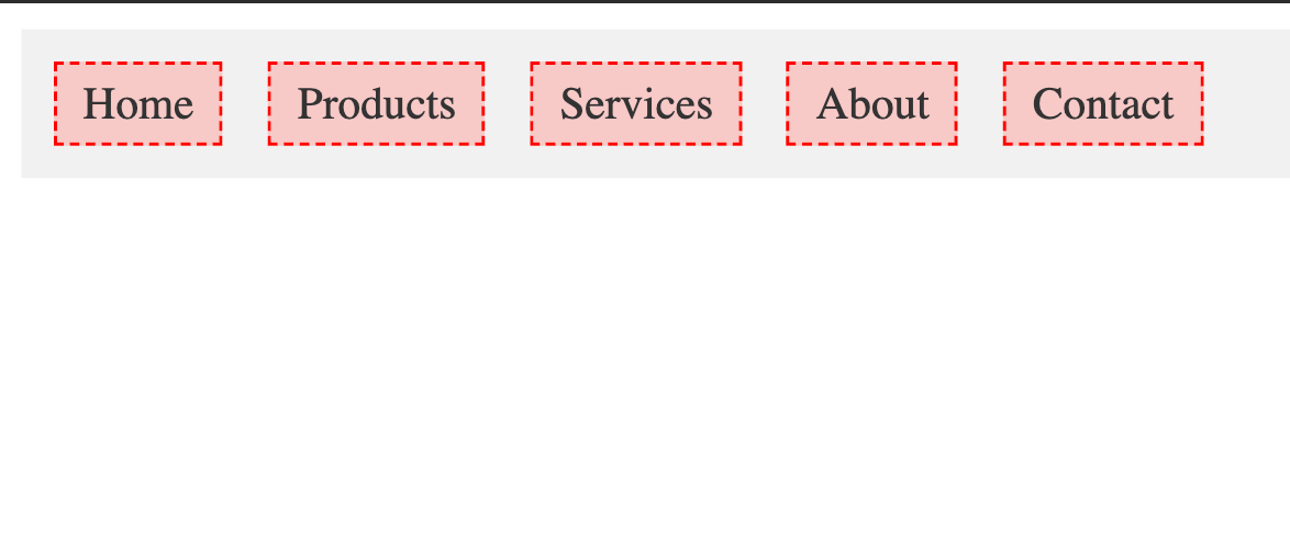
It looks clean, but the touch area is tiny. On mobile devices, this makes it frustrating or error-prone to tap the link, especially for users with larger fingers or accessibility needs.
The recommended minimum target size is 44×44 CSS pixels according to WCAG 2.1 AA guidelines, with many platforms recommending 48×48 pixels for optimal usability:
.nav-link {
  padding: 12px 16px;
  font-size: 16px;
  min-height: 44px;
  min-width: 44px;
  display: inline-flex;
  align-items: center;
  justify-content: center;
  text-decoration: none;
  color: #333;
  margin-right: 8px;
  background-color: rgba(0, 128, 0, 0.2);
  border: 1px dashed green;
  box-sizing: border-box;
}
This change may feel subtle, but it significantly increases usability on touchscreens.
N.B., don’t just rely on padding. Make sure the actual clickable area (i.e., the button or link) meets the minimum size, even if the visible text looks small.
display: noneA lot of us developers use this classic pattern, which is display:none:
.dropdown {
  display: none;
  position: absolute;
  background: white;
  border: 1px solid #ccc;
}

.nav-item:hover .dropdown {
  display: block;
}
On the surface, this seems fine because the dropdown is hidden by default and only shows on hover. But it causes some issues.
When you use display: none, screen readers can’t detect the element at all. It’s like it never existed. So if someone is navigating with a keyboard or screen reader, they won’t know there’s a dropdown there, much less be able to access it.
A better approach is to hide the dropdown visually but not semantically, using opacity and visibility:
.dropdown {
  opacity: 0;
  visibility: hidden;
  transform: translateY(-10px);
  transition: opacity 0.3s ease, visibility 0.3s ease, transform 0.3s ease;
  position: absolute;
  top: 100%;
  left: 0;
  background: white;
  border: 1px solid #ccc;
  border-radius: 4px;
  box-shadow: 0 4px 8px rgba(0,0,0,0.1);
  z-index: 1000;
}

.nav-item:hover .dropdown,
.nav-item:focus-within .dropdown {
  opacity: 1;
  visibility: visible;
  transform: translate(0);
}
This keeps the element in the DOM and readable by screen readers while still hiding it from sight.
If you want to go further, you can combine it with ARIA-hidden in JavaScript for even more control, especially when toggling via click events.
Below is an example of how it’s used:
See the Pen
using opacity and visibility by oyedeletemitope (@oyedeletemitope)
on CodePen.
Poor stacking context management is a common mistake developers make when building navigation menus, and it occurs most especially in dropdowns. You write the markup, apply your styles, and everything seems fine until the dropdown ends up behind other elements or disappears completely. So you start throwing z-index values at it: 1000, 9999, 999999.
Still no luck.
That’s when you realize: this isn’t a z-index issue, it’s a stacking context issue.
A stacking context is like a mini 3D world inside your page. Elements are layered within that world, and they can’t overlap elements outside of it unless the context itself is layered correctly in the DOM.
Stacking contexts get created all the time, often without you realizing it. Some of the most common triggers include:
position (relative, absolute, or fixed) combined with a non-auto z-indexopacity less than onetransform, filter, will-change, or perspectivecontain and isolation: isolateEven if your dropdown has a massive z-index, it won’t matter if it’s stuck inside a stacking context that’s rendered below something else in a different context. It’s boxed in — and no amount of z-index inflation will get it out.
To avoid stacking context issues, try not to place dropdowns inside containers that create new stacking contexts unless you have a very specific reason to do so. These hidden layers often cause more harm than good when it comes to overlapping elements like menus.
Modern browser dev tools can help you track down the problem. Firefox and Chrome allow you to inspect computed styles and layout properties that indicate stacking contexts. And if you want a full visual breakdown, there’s a great browser extension called CSS Stacking Context Inspector that shows exactly how stacking contexts are nested and why your element might be stuck.
Finally, treat z-index with intention. Throwing large numbers around only works if you actually understand the stacking order on the page. Without that, you’re just guessing, and that rarely ends well.
One of the most overlooked issues with navigation menus is failing to make them responsive. A menu might look perfect on a desktop, but on smaller screens, items can overflow or disappear off-screen entirely:
See the Pen
unresponsive by oyedeletemitope (@oyedeletemitope)
on CodePen.
This layout works fine on wide screens. But once the viewport becomes more narrow, the links don’t wrap or resize, and the layout breaks or causes horizontal scrolling.
One approach to making your menu adaptable to different screen sizes is to use flex-wrap, max-width, clamp(), or even media queries like so:
See the Pen
responsive-viewport by oyedeletemitope (@oyedeletemitope)
on CodePen.
Navigation menus are generally the first thing consumers come into contact with on a website, and they are also one of the simplest to get wrong. From hover-only interactions to broken mobile layouts, small CSS errors can cause major usability concerns.
Hopefully, this list will help you avoid some of the most common mistakes while creating dropdowns and responsive navigation menus.
What CSS navigation menu mistake do you think I missed? Let me know in the comments!
As web frontends get increasingly complex, resource-greedy features demand more and more from the browser. If you’re interested in monitoring and tracking client-side CPU usage, memory usage, and more for all of your users in production, try LogRocket.

LogRocket lets you replay user sessions, eliminating guesswork around why bugs happen by showing exactly what users experienced. It captures console logs, errors, network requests, and pixel-perfect DOM recordings — compatible with all frameworks.
LogRocket's Galileo AI watches sessions for you, instantly identifying and explaining user struggles with automated monitoring of your entire product experience.
Modernize how you debug web and mobile apps — start monitoring for free.

Learn what vinext is, how Cloudflare rebuilt Next.js on Vite, and whether this experimental framework is worth watching.

Memory leaks in React don’t crash your app instantly, they quietly slow it down. Learn how to spot them, what causes them, and how to fix them before they impact performance.

Build agent-ready websites with Google Web MCP. Learn how to expose reliable site actions for AI agents with HTML and JavaScript.

Build a CRUD REST API with Node.js, Express, and PostgreSQL, then modernize it with ES modules, async/await, built-in Express middleware, and safer config handling.
Hey there, want to help make our blog better?
Join LogRocket’s Content Advisory Board. You’ll help inform the type of content we create and get access to exclusive meetups, social accreditation, and swag.
Sign up now

 Learn more →
