Editor’s note: This article was last updated by Njong Emy on 11 June 2024 to add information about customizing dropdown elements using CSS pseudo-classes like first-child, last-child, and nth-child, and enhancing dropdown menus for improved accessibility and SEO.

Dropdown menus are a design pattern that allows users to hide or reveal a dropdown box, making it easy to navigate websites and applications. With a click or hover, this menu will gracefully display predefined content or a list of items.
In this guide, we’ll explore the art of creating captivating dropdown menus that can seamlessly integrate into a navigation bar (navbar) or any section of a web project. We’ll begin with CSS-only solutions, the :focus and :focus-within pseudo-classes and a checkbox hack. Then, we’ll delve into the realm of JavaScript, addressing the limitations of CSS-only approaches.
We’ll discuss building dropdown menus for differently sized screens, and using semantic HTML elements and ARIA attributes to improve accessibility. By the end of this tutorial, you’ll be able to create amazing, responsive, and accessible dropdown menus for both keyboard and mouse users.
Let’s get started!
The Replay is a weekly newsletter for dev and engineering leaders.
Delivered once a week, it's your curated guide to the most important conversations around frontend dev, emerging AI tools, and the state of modern software.
:focus pseudo-classTo start, let’s use the CSS :focus selector to create a dropdown menu that looks like this:
See the Pen
CSS dropdown menu using :focus by Bingeh 🦄🌤 (@afumbom_bingeh)
on CodePen.
Building an accessible dropdown menu begins with using semantic and interactive HTML5 elements where appropriate.
The following code snippet establishes a simple menu button along with its associated dropdown items:
<div class="dropdown">
  <button class="dropdown-btn">
    <span>Framework</span>
    <span class="arrow"></span>
  </button>
  <ul class="dropdown-content">
    <li><a href="#">React</a></li>
    <li><a href="#">Angular</a></li>
    <li><a href="#">Vue</a></li>
    <li><a href="#">Svelte</a></li>
  </ul>
</div>
The <button> element is an interactive component that we’ll use to initiate the opening of the dropdown. To ensure accessibility, we use an unordered list for the dropdown items; this enables screen readers to identify the number of links within the dropdown.
Now, let’s apply the following base CSS styling to the markup:
/* base styles */
* {
    box-sizing: border-box;
    margin: 0;
    padding: 0;
}

/* Dropdown styles */

.dropdown {
  max-width: 13em;
  margin: 80px auto 0;
  position: relative;
  width: 100%;
}
.dropdown-btn {
  background: #1d1f24;
  font-size: 18px;
  width: 100%;
  border: none;
  color: #fff;
  display: flex;
  justify-content: space-between;
  align-items: center;
  padding: 0.7em 0.5em;
  border-radius: 0.5em;
  cursor: pointer;
}
.arrow {
  border-left: 5px solid transparent;
  border-right: 5px solid transparent;
  border-top: 6px solid #fff;
  transition: transform ease-in-out 0.3s;
}
.dropdown-content {
  list-style: none;
  position: absolute;
  top: 3.2em;
  width: 100%;
}
.dropdown-content li {
  background: #2f3238;
  border-radius: 0.5em;
}
.dropdown-content li:hover {
  background: #1d1f24;
}
.dropdown-content li a {
  display: block;
  padding: 0.7em 0.5em;
  color: #fff;
  margin: 0.1em 0;
  text-decoration: none;
}
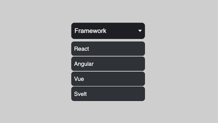
The styling rules are configured to position the dropdown box below the menu button. This is achieved by applying a position: relative property to the container element and a position: absolute to the actual dropdown.
We also implement other various CSS styles to enhance the overall aesthetics of the dropdown. The final appearance should resemble the following:
Next, let’s implement a way to hide the dropdown until the menu button receives a focus due to the user’s action — either with a click, tap, or press of the keyboard’s tab key.
We’ll update the styles with the following:
.dropdown-content {
  /* ... */
  visibility: hidden;
}
.dropdown-btn:focus + .dropdown-content {
  visibility: visible;
}
.dropdown-btn:focus > .arrow {
  transform: rotate(180deg);
}
Here we’ve added a style rule that causes the dropdown indicator to rotate when the button is clicked.
Let’s now add a smooth sliding effect when opening or closing the dropdown menu. This is achieved by applying the following rules:
.dropdown-content {
  /* ... */
  overflow: hidden;
}
.dropdown-content li {
  /* ... */
  position: relative;
  left: 100%;
  transition: 0.5s;
}
.dropdown-btn:focus + .dropdown-content li {
  left: 0;
}
Applying a position: relative; and a left property to the dropdown items causes them to shift toward the left from their default position. Subsequently, when the button receives focus, the dropdown items will smoothly transition back to their original position.
Here’s what our dropdown currently looks like with the slide effect:

To enhance the visual flow of the dropdown menu, let’s add a delay when the menu items slide in and out.
To implement this, we’ll update the menu items to include a style attribute with a custom property:
<div class="dropdown">
  <!-- ... -->
  <ul class="dropdown-content">
    <li style="--delay: 1;"><a href="#">React</a></li>
    <li style="--delay: 2;"><a href="#">Angular</a></li>
    <li style="--delay: 3;"><a href="#">Vue</a></li>
    <li style="--delay: 4;"><a href="#">Svelte</a></li>
  </ul>
</div>
In the CSS style sheet, we can access the CSS variables and apply a delay using the transition-delay property, like so:
.dropdown-content li {
  /* ... */
  transition-delay: calc(60ms * var(--delay));
}
var(--delay) represents the multiplier for our base delay time (which is 60ms in this case), and we specified that multiplier on each list element in our markup file. With this in mind, we can see that each list element slides in with a delay slightly more than the element before it, thereby making our transition much smoother:

:focus-within pseudo-classIf we carefully observe the dropdown implementation with the :focus pseudo-class, we notice that it is only applied to the focused element — in this case, the menu button. Whenever the focus shifts to any other element, including the dropdown items, the dropdown closes.
To provide a more user-friendly experience, we’d like the dropdown to remain open as we click within the active menu area. This is where the :focus-within pseudo-class comes into play. By applying :focus-within to an element, the associated style rules will apply when any of its child elements, or the element itself, receives focus.
In this case, we’ll apply the :focus-within to the .dropdown container class. This way, when child elements such as the button or the dropdown items receive focus, the corresponding rules will be applied.
Let’s replace :focus with :focus-within in our CSS, resulting in the following:
/* .dropdown-btn:focus + .dropdown-content li {
  left: 0;
} */
.dropdown:focus-within .dropdown-content li {
  left: 0;
}

/* .dropdown-btn:focus + .dropdown-content {
  visibility: visible;
} */
.dropdown:focus-within .dropdown-content {
  visibility: visible;
}

/* .dropdown-btn:focus > .arrow {
  transform: rotate(180deg);
} */
.dropdown:focus-within .dropdown-btn > .arrow {
  transform: rotate(180deg);
}
If we test the dropdown, it should function correctly. After opening the dropdown menu, the only way to close it would be to click on any area aside from the button or elements.
By default, using the tab key for navigation is disabled in Safari. We can enable it by opening our Safari Preferences by opening the Advanced settings and checking the “Press Tab to highlight each item on a webpage” checkbox in the Accessibility section.
Sometimes, clicking the menu button may not result in the dropdown displaying in Safari. An element on Safari will get a :focus-within if it has a tabindex="0". To address the issue, let’s add a tabindex to the element on which we applied the pseudo-class:
<div class="dropdown" tabindex="0">
  <button class="dropdown-btn">
    <!-- ... -->
  </button>
  <ul class="dropdown-content">
    <!-- ... -->
  </ul>
</div>
The dropdown should now work as expected:
See the Pen
CSS dropdown menu using :focus-within by Ibaslogic (@ibaslogic)
on CodePen.
With the previous methods, the dropdown could only be closed when the button or dropdown items lost focus. However, by utilizing CSS selectors cleverly, we can take advantage of the checked state of an HTML checkbox to toggle the dropdown.
Based on our HTML structure, let’s replace the button element with an input checkbox:
<div class="dropdown">
  <input type="checkbox" id="dropdown" />
  <label for="dropdown" class="dropdown-btn">
    <span>Framework</span>
    <span class="arrow"></span>
  </label>

  <ul class="dropdown-content">
    <li><a href="#">React</a></li>
    <li><a href="#">Angular</a></li>
    <li><a href="#">Vue</a></li>
    <li><a href="#">Svelte</a></li>
  </ul>
</div>
Then, in addition to the base styles, let’s add the following CSS:
input[type="checkbox"] {
  opacity: 0;
  position: absolute;
}
input[type="checkbox"]:focus + label {
  box-shadow: 0 0 20px rgb(83, 83, 83);
}
Here, we use opacity: 0; to hide the input checkbox instead of a display: none; property and also add styles to ensure that the button receives a focus when a user interacts with it.
Now, let’s replace the style rules for :focus or :focus-within with the :checked CSS pseudo-selector:
/* .dropdown-btn:focus + .dropdown-content {
  visibility: visible;
} */
input[type="checkbox"]:checked ~ .dropdown-content {
  visibility: visible;
}

/* .dropdown-btn:focus > .arrow {
  transform: rotate(180deg);
} */
input[type="checkbox"]:checked + label > .arrow {
  transform: rotate(180deg);
}
After that, we’ll modify the style rules on the li element and remove the sliding effect transition:
.dropdown-content li {
  background: #2f3238;
  border-radius: 0.5em;
/*   position: relative;
  left: 100%;
  transition: 0.5s;
  transition-delay: calc(60ms * var(--delay)); */
}

/* .dropdown-btn:focus + .dropdown-content li {
  left: 0;
} */
Now let’s implement another transition effect.
transform effectLet’s add a smooth transition effect that repositions the dropdown vertically. We’ll update the styles for .dropdown-content before and after the dropdown is active:
.dropdown-content {
  /* ... */
  transform: translateY(-1em);
  transition: transform ease 0.3s;
}
input[type="checkbox"]:checked ~ .dropdown-content {
  visibility: visible;
  transform: translateY(0);
}
The dropdown should now behave as expected:
See the Pen
CSS dropdown menu toggle with checkbox by Ibaslogic (@ibaslogic)
on CodePen.
Up until now, we’ve only used CSS to create dropdown menus. Now, let’s use JavaScript to toggle the dropdown instead of the checkbox hack. We’ll begin by making modifications to the CSS:
/* .dropdown-btn:focus + .dropdown-content li {
  left: 0;
} */
.dropdown-content.menu-open li {
  left: 0;
}

/* .dropdown-btn:focus + .dropdown-content {
  visibility: visible;
} */
.dropdown-content.menu-open {
  visibility: visible;
}

/* .dropdown-btn:focus > .arrow {
  transform: rotate(180deg);
} */
.arrow.arrow-rotate{
    transform: rotate(180deg);
}
In this approach, we move away from using the CSS pseudo-classes and instead employ custom class names that we will add to the target elements using JavaScript.
The JavaScript code snippet below demonstrates the process. It begins by selecting the button, caret, and dropdown elements. Then, it listens for a click event on the button and dynamically adds classes to the caret and dropdown elements:
const dropdownBtn = document.querySelector(".dropdown-btn");
const dropdownCaret = document.querySelector(".arrow");
const dropdownContent = document.querySelector(".dropdown-content");

// add click event to dropdown button
dropdownBtn.addEventListener("click", () => {
  // add rotate to caret element
  dropdownCaret.classList.toggle("arrow-rotate");
  // add open styles to menu element
  dropdownContent.classList.toggle("menu-open");
});
Let’s test the dropdown and ensure it works! See the project on CodePen:
See the Pen
Dropdown menu with CSS and JS by Ibaslogic (@ibaslogic)
on CodePen.
To improve accessibility for screen reader users, let’s add ARIA attributes that effectively convey the behavior, functionality, and state of the dropdown. Here are the ARIA attributes we will implement:
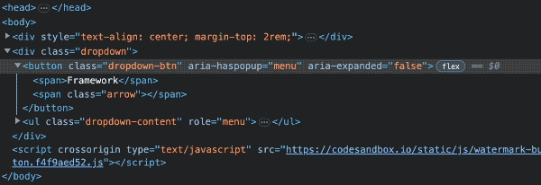
aria-label: Add this attribute to interactive elements, like the menu button, to provide a clear description of its purpose; this attribute allows screen reader software to correctly announce the controlaria-haspopup and role: Apply these attributes to the menu button and dropdown respectively, to inform the screen readers that there is a popup. Both must match the type of dropdown — in our case, menuaria-controls: Maps the controlling element to the expanded widget; we’ll set the id of the expanded widget to the value of the aria-controls attribute on the controlling elementaria-expanded: Indicates whether the dropdown is currently hidden or visible; this attribute’s value should toggle between true and false based on the state of the dropdown. We’ll dynamically update the value using JavaScript to reflect the current state of the dropdownLet’s update the HTML markup to include the ARIA attributes:
<div class="dropdown">
  <button
    class="dropdown-btn"
    aria-label="menu button"
    aria-haspopup="menu"
    aria-expanded="false"
    aria-controls="dropdown-menu"
  >
    <!-- ... -->
  </button>
  <ul class="dropdown-content" role="menu" id="dropdown-menu">
    <!-- ... -->
  </ul>
</div>
Then, with JavaScript, let’s dynamically update the aria-expanded attribute based on the current state:
dropdownBtn.addEventListener("click", () => {
  //...
  dropdownBtn.setAttribute(
    "aria-expanded",
    dropdownBtn.getAttribute("aria-expanded") === "true" ? "false" : "true"
  );
});
If we toggle the button, the attribute should also update:
Using the knowledge we have acquired thus far, let’s integrate a dropdown menu within a navigation bar using CSS. By the end of the process, we’ll have successfully developed a responsive CSS dropdown menu:
See the Pen
CSS dropdown menu in Navbar by Ibaslogic (@ibaslogic)
on CodePen.
We will employ a CSS-only solution by using the input checkbox to toggle the main dropdown on smaller screens and the :focus-within pseudo-class to activate the Services dropdown.
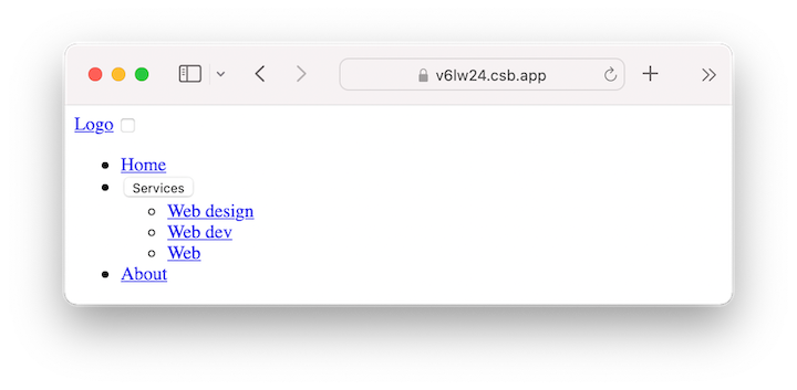
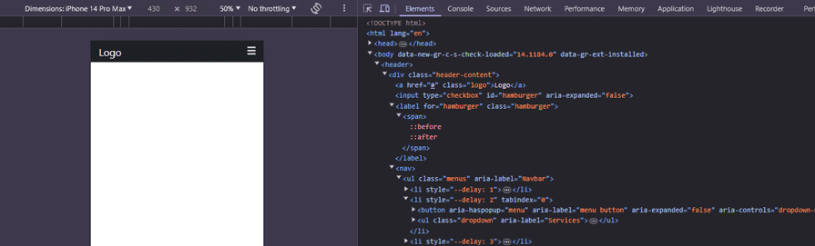
The code below establishes a basic navigation structure comprised of three primary menu items: Home, Services, and About. The Services item includes a dropdown feature with three nested ul submenu items:
<header>
  <div class="header-content">

    <a href="#" class="logo">Logo</a>

    <input type="checkbox" id="hamburger">
    <label for="hamburger" class="hamburger">
      <span></span>
    </label>

    <nav>
      <ul class="menus">
        <li style="--delay: 1;"><a href="#">Home</a></li>
        <li style="--delay: 2;" tabindex="0">
          <button>
            <span>Services</span>
            <span class="arrow"></span>
          </button>
          <ul class="dropdown">
            <li><a href="#">Web design</a></li>
            <li><a href="#">Web dev</a></li>
            <li><a href="#">Web</a></li>
          </ul>
        </li>
        <li style="--delay: 3;"><a href="#">About</a></li>
      </ul>
    </nav>
  </div>
</header>
The output should look like this:
We’ll start by styling the navigation for smaller screens. In the CSS file, we’ll add the following styles:
header {
  position: relative;
  background: #1d1f24;
  color: #fff;
}

.header-content {
  align-items: center;
  max-width: 1200px;
  margin: 0 auto;
  padding: 10px 20px;
}

.logo {
  text-decoration: none;
  font-size: 25px;
  color: inherit;
  margin-right: 20px;
}

input[type="checkbox"] {
  opacity: 0;
  position: absolute;
  right: 0;
}

.hamburger {
  padding: 23px 20px;
  position: absolute;
  cursor: pointer;
  right: 0;
  top: 0;
}

.hamburger span {
  width: 20px;
  height: 3px;
  display: block;
  background: #fff;
  position: relative;
}

.hamburger span::before,
.hamburger span::after  {
  content: "";
  position: absolute;
  display: block;
  background: inherit;
  width: inherit;
  height: inherit;
}

.hamburger span::before {
  top: 8px;
}

.hamburger span::after {
  bottom: 8px;
}

input[type="checkbox"]:focus + .hamburger {
  box-shadow: 0 0 20px rgba(0,0,0,.45);
}

ul {
  list-style: none;
}

ul li {
  font-size: 18px;
}

ul li a {
   display: block;
   text-decoration: none;
}

ul li a, ul li button {
  padding: 0.7rem 1rem;
  text-align: left;
  color: inherit;
}

.menus {
  position: absolute;
  top: 3.2rem;
  left: 0;
  right: 0;
  background: #2f3238;
}

.dropdown {
  padding: 2px 1.5rem;
}

button {
  font-size: inherit;
  border: none;
  background-color: transparent;
  cursor: pointer;
  width: 100%;
  display: flex;
  align-items: center;
  gap: 1em;
}

.arrow {
  border-left: 5px solid transparent;
  border-right: 5px solid transparent;
  border-top: 6px solid #fff;
  transition: transform ease-in-out 0.3s;
}

/* base styles */
* {
  box-sizing: border-box;
  margin: 0;
  padding: 0;
}
body {
  font-family: "Segoe UI", sans-serif;
  color: #333;
}
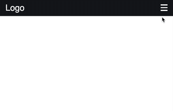
Now we should have a dropdown menu that looks like this:
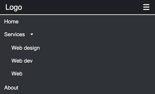
As expected, using the CSS position: absolute; on the dropdown element places it relative to the navigation bar, as seen in the image above. We then used the ::before and ::after pseudo-classes to transform the input checkbox into a custom hamburger menu to activate a dropdown on smaller screens. Subsequently, several other CSS styles were applied to elevate the overall visual appeal.
To hide the main dropdown, we’ll use the CSS visibility property and specify height: 0 for the Services dropdown:
.menus {
  /* ... */

  visibility: hidden;
  transform: translateY(-1em);
  transition: transform ease 0.5s;
}

.dropdown {
  /* ... */

  height: 0;
  overflow: hidden;
  transition: height ease 0.2s;
}
We’ve included additional CSS properties to ensure a seamless transition effect here.
Next, we’ll use the :checked CSS pseudo-selector and the :focus-within pseudo-class to toggle the main dropdown and activate the Services dropdown, respectively:
input[type="checkbox"]:checked ~ nav .menus {
  visibility: visible;
  transform: translateY(0);
}

li:focus-within .dropdown {
  height: 135px;
}

li:focus-within .arrow {
  transform: rotate(180deg);
}
Similar to our previous approach, let’s add animation using the following style rules:
.menus li {
  position: relative;
  left: 100%;
  transition: 0.2s;
  transition-delay: calc(60ms * var(--delay));
}

input[type="checkbox"]:checked ~ nav > ul li {
  left: 0;
}
The dropdown should now behave like this:
Now, let’s use CSS media queries to define the style rules for a screen width of 640px and above:
/* MEDIA QUERIES  */
@media (min-width: 640px) {

  .header-content {
    display: flex;
  }

  .menus {
    position: static;
    visibility: visible;
    background: transparent;
    display: flex;
    transform: initial;
  }

  .menus li {
    font-size: 14px;
    left: auto;
  }

  .hamburger, input[type="checkbox"] {
    display: none;
  }

  ul li a:hover,
  ul li button:hover {
    background-color: #2f3238;
  }

  .dropdown {
    position: absolute;
    top: 48px;
    right: 0;
    left: auto;
    z-index: 99;
    min-width: 10rem;
    padding: 0;
    background-color: #1d1f24;
    border-radius: 0 0 0.5rem 0.5rem;
  }

}
In this CSS code, we added a display: flex; to the header content to position the logo and navigation menus side-by-side. Then, we added a position: static; declaration on the navigation content to override the absolute positioning we used for mobile design and place the nav items in the normal flow of the page.
Say we wanted to apply specific styles to each element in our menu. We can do this with CSS pseudo-classes like first-child, last-child , and nth-child. In our markup, we have unordered lists, and each list element is considered a child.
Knowing this, we can add a simple underline style for each child. We can add the following to our CSS to achieve this:
/* Style for the first child link when focused */
.menus > li:first-child > a:focus,
.dropdown li:first-child a:focus {
  text-decoration: underline;
  text-decoration-color: pink; /* Unique color for the first child */
}

/* Style for the last child link when focused */
.menus > li:last-child > a:focus,
.dropdown li:last-child a:focus {
  text-decoration: underline;
  text-decoration-color: yellow; /* Unique color for the last child */
}

/* Style for the nth child (e.g. 2nd child) link when focused */
.menus > li:nth-child(2) > a:focus,
.dropdown li:nth-child(2) a:focus {
  text-decoration: underline;
  text-decoration-color: red; /* Unique color for the nth child */
}
The first child (or the first list element) assumes a pink underline when clicked, the last child assumes red, and the nth-child (the second, in this case) takes on a yellow underline. With pseudo-classes like these, you can target child elements of any parent and apply specific styles to them.
This is what our navbar will look like now:

You can check out the Pen CSS dropdown menu in navbar to access the code for this example.
Just like we improved the dropdown’s accessibility for screen readers, we can also enhance our navbar’s accessibility. In our markup, we’ll add ARIA attributes to the checkbox that opens the navbar, and then to the button that opens the Services dropdown. Additionally, we’ll add a focus on the burger menu so that it is highlighted when the spacebar is pressed.
Our markup will be modified as follows:
<input type="checkbox" id="hamburger" aria-expanded="false"/>
        <label for="hamburger" class="hamburger">
          <span></span>
        </label>
        <nav>
          <ul class="menus" aria-label="Navbar">
            <li style="--delay: 1"><a href="#">Home</a></li>
            <li style="--delay: 2" tabindex="0">
              <button
                aria-haspopup="menu"
                aria-label="menu button"
                aria-expanded="false"
                aria-controls="dropdown-menu"
                id="services-btn"
              >
                <span>Services</span>
                <span class="arrow"></span>
              </button>
              <ul class="dropdown" aria-label="Services">
                <li tabindex="0"><a href="#" tabindex="-1">Web design</a></li>
                <li tabindex="0"><a href="#" tabindex="-1">Web dev</a></li>
                <li tabindex="0"><a href="#" tabindex="-1">About</a></li>
              </ul>
            </li>
            <li style="--delay: 3"><a href="#">About</a></li>
          </ul>
        </nav>
We have aria-expanded on the input and button tags and the default value is false. With JavaScript, we can toggle the values to true when the navbar and dropdown are open, and back to false when they are not.
This is what the code in the JavaScript file looks like:
document.getElementById("hamburger").addEventListener("change", function () {
  const hamburger = document.getElementById("hamburger");
  const expanded = hamburger.checked;
  hamburger.setAttribute("aria-expanded", expanded);
});

document.addEventListener("DOMContentLoaded", function () {
  const servicesBtn = document.getElementById("services-btn");
  servicesBtn.addEventListener("click", function () {
    const isExpanded = this.getAttribute("aria-expanded") === "true";
    this.setAttribute("aria-expanded", !isExpanded);
  });
});
Inspecting the site in our browser will show that the attribute toggles when we open and close the navbar and dropdown:
Another aspect that is just as important as accessibility is making our site easy to index and crawl by search engines. When we made the navbar responsive above, this would improve SEO because search engines like Google use mobile-first indexing.
Because we are working with a simple HTML navbar, we need to ensure that every anchor tag has a good description text and that the href tags lead to another page that the search engine can follow. Search engines like Google can find pages best when linked to or from another page:
<ul class="dropdown" aria-label="Services">
    <li tabindex="0"><a href="/web-design" tabindex="-1">Web design</a></li>
    <li tabindex="0"><a href="/web-dev" tabindex="-1">Web dev</a></li>
    <li tabindex="0"><a href="/about" tabindex="-1">About</a></li>
</ul>
This article demonstrated how to create an impressive dropdown menu using CSS. Our sample menu is designed to be accessible to users who rely on keyboards, mice, and screen readers. Additionally, we explored how to enhance the dropdown functionality using JavaScript. Dropdown menus are a common design pattern in modern apps. To learn more about them, you can check out building a multilevel dropdown menu in React.
If you have questions or contributions, please share your thoughts in the comment section. And don’t forget to share this article!
As web frontends get increasingly complex, resource-greedy features demand more and more from the browser. If you’re interested in monitoring and tracking client-side CPU usage, memory usage, and more for all of your users in production, try LogRocket.

LogRocket lets you replay user sessions, eliminating guesswork around why bugs happen by showing exactly what users experienced. It captures console logs, errors, network requests, and pixel-perfect DOM recordings — compatible with all frameworks.
LogRocket's Galileo AI watches sessions for you, instantly identifying and explaining user struggles with automated monitoring of your entire product experience.
Modernize how you debug web and mobile apps — start monitoring for free.

useEffect breaks AI streaming responses in ReactSee why useEffect breaks AI streaming in React, and how moving stream state outside React fixes flicker and stale updates.

A real-world debugging session using Claude to solve a tricky Next.js UI bug, exploring how AI helps, where it struggles, and what actually fixed the issue.

CSS wasn’t built for dynamic UIs. Pretext flips the model by measuring text before rendering, enabling accurate layouts, faster performance, and better control in React apps.

Why do real-time frontends break at scale? Learn how event-driven patterns reduce drift, race conditions, and inconsistent UI state.
Would you be interested in joining LogRocket's developer community?
Join LogRocket’s Content Advisory Board. You’ll help inform the type of content we create and get access to exclusive meetups, social accreditation, and swag.
Sign up now

 Learn more →
