In this tutorial, we’ll dive into vanilla-extract’s main features and demonstrate how to create zero-runtime style sheets by building an example app with React and webpack.

The Replay is a weekly newsletter for dev and engineering leaders.
Delivered once a week, it's your curated guide to the most important conversations around frontend dev, emerging AI tools, and the state of modern software.
vanilla-extract is all about zero-runtime style sheets in TypeScript (or JavaScript). If you’ve used Sass or Less in the past, you already know how powerful they can be for things like theming, organization, and preprocessing of your app’s styles.
Just like these CSS preprocessors, vanilla-extract generates all styles during your build. Among its benefits, you’ll find locally scoped class names, CSS variables, CSS rules, support for simultaneous themes (without globals), calc utility expressions, and more.
To demonstrate how to use vanilla-extract, I created a scaffolded simple project with React and webpack already added. You may clone/fork it locally and use it as a starting point for the next things we’ll try out on vanilla-extract.
Once you’re done, make sure to run the npm install command to download all the Node packages required.
Then, run the next command to add the main dependencies for vanilla-extract (webpack integration):
npm install @vanilla-extract/css @vanilla-extract/babel-plugin @vanilla-extract/webpack-plugin
When the command’s finished, you’ll see the newly added dependencies in your package.json file:
"dependencies": {
    "@vanilla-extract/babel-plugin": "^1.0.1",
    "@vanilla-extract/css": "^1.2.1",
    "@vanilla-extract/webpack-plugin": "^1.1.0",
    ...
}
As for the vanilla-extract webpack/Babel configurations, you’ll also need to upgrade the webpack.config.js file with the following three changes:
const { VanillaExtractPlugin } = require("@vanilla-extract/webpack-plugin");
The first change above must be added to the beginning of the file, in the imports section. This line represents the webpack plugin to deal with vanilla-extract-related operations.
It’s going to be used along with the plugins section in the file with a simple instantiation as follows:
plugins: [
    new HtmlWebpackPlugin(),
    new MiniCssExtractPlugin(),
    new VanillaExtractPlugin(),
],
Finally, you need to add the vanilla-extract Babel plugin to the “js|ts|tsx” test rule for the babel-loader loader, as shown below:
{
  test: /\.(js|ts|tsx)$/,
  ...
  use: [
    {
      loader: "babel-loader",
      options: {
        ...
        plugins: ["@vanilla-extract/babel-plugin"],
      },
    },
  ],
},
One of the warnings in the official vanilla-extract docs refers to the need for CSS handling by your webpack configs. Don’t worry about this; we’re already dealing with CSS files in the scaffolded default project settings.
If you wish to verify that everything is set properly, just run the npm run start command and check the results in your browser.
vanilla-extract works as a preprocessor but, instead of the usual Less or Sass, you get TypeScript.
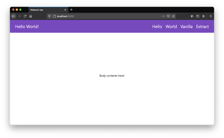
Let’s see vanilla-extract in action by creating a very simple stylized theme to help to build the following page:

Let’s start with the styles. To write them, first create a new file under the src folder named styles.css.ts. This type of file is evaluated at build time and, as you’ll see when you add the following code to it, it’s TypeScript:
import { createTheme, style } from "@vanilla-extract/css";

export const [themeClass, vars] = createTheme({
  color: {
    primary: "#764abc",
    secondary: "white",
  },
  font: {
    menu: "1.5em",
  },
});

export const menuStyle = style({
  backgroundColor: vars.color.primary,
  fontSize: vars.font.menu,
  display: "block",
  width: "100%",
  color: "white",
  padding: 20,
});

export const menuItemsStyle = style({
  float: "right",
});

export const menuItemStyle = style({
  backgroundColor: vars.color.primary,
  color: vars.color.secondary,
  margin: 10,
  ":hover": {
    cursor: "pointer",
    color: "orange",
  },
});

export const sectionStyle = style({
  display: "inline-block",
  width: "100%",
  textAlign: "center",
  marginTop: "20%",
});
The styles are always referred to by the style function, which receives the object with all the CSS properties needed for that particular style object. They must always be exported since they’ll be preprocessed by vanilla-extract before being injected into the final output.
The createTheme function is a very useful resource you may use from the lib whenever you need more generic, centralized style management. You may need to switch themes, for example, so this is a perfect scenario of how the themes can help.
Each style is using the themed variables, but they can also be accessed from the outside TypeScript files because we’re exporting them as well.
Check out how easy it is to add a hover effect to a style. Feel free to increment the theme as you wish.
Now’s time to make use of our styles. For this, create another file under the src folder named App.tsx (the main React application component) and add the following content to it:
import {
  themeClass,
  menuStyle,
  menuItemsStyle,
  menuItemStyle,
  sectionStyle,
} from "./styles.css";

export const App = () => (
  <div className={themeClass}>
    <header className={menuStyle}>
      <h1 className={menuItemStyle}>Hello World!</h1>
      <ul className={menuItemsStyle}>
        <li>
          <a className={menuItemStyle} href="#">
            Hello
          </a>
        </li>
        <li>
          <a className={menuItemStyle} href="#">
            World
          </a>
        </li>
        <li>
          <a className={menuItemStyle} href="#">
            Vanilla
          </a>
        </li>
        <li>
          <a className={menuItemStyle} href="#">
            Extract
          </a>
        </li>
      </ul>
    </header>

    <section className={sectionStyle}>
      <p>Body contents here!</p>
    </section>
  </div>
);
Again, feel free to break it down into more components if you wish. We’ll keep it centralized, though, for the sake of simplicity.
It’s interesting to note that the styles being imported are added as CSS classes rather than inline style. This happens because the entire process is done statically, which wouldn’t be possible if you were to inline stuff in.
However, vanilla-extract supports a dynamic API for dynamic runtime theming, in case you’re curious.
You can also use the globalStyle function from the css package to determine whether your app must follow a global style for general elements such as the page body. To do this, create another file named global.css.ts and put the following content into it:
import { globalStyle } from "@vanilla-extract/css";

globalStyle("body, body *", {
  all: "unset",
  boxSizing: "border-box",
  fontFamily: "Segoe UI",
  color: "black",
  padding: 0,
  margin: 0,
});
The example can’t yet be tested until you’ve gathered everything together into the index.tsx file, as follows:
import { render } from "react-dom";
import { App } from "./App";
import "./global.css";

const root = document.createElement("div");
document.body.appendChild(root);

render(<App />, root);
To test it out, simply re-execute the npm run startcommand and refresh your browser. You should see the same page as shown in the image above.
But how does this style mapping to classes end up being represented in the browser?
If you use your browser to inspect the HTML/CSS elements on the page, you may see that the first div in which we injected the themeClass class has the following properties:

Their further usage can be found after inspecting the rest of the elements, such as in one of the menuItemStyle:

At this point, you should understand what vanilla-extract is about and how you can use it to create your static styles and themes.
However, the styles are still a bit messy and repetitive. Let’s fix that by introducing Sprinkles, the zero-runtime atomic CSS framework for vanilla-extract.
Sprinkles provides a set of utility classes that can be customized and composed into reusable styles along with atoms. If you’ve used Styled System or Tailwind CSS before, then you’ll feel familiar with its approach.
Start by adding the package dependency to your project:
npm install @vanilla-extract/sprinkles
Next, we’ll centralize the many variables our app is using so far. This will facilitate reuse, especially for the most generic base values.
Create another file named vars.css.ts under the src folder and place the following content into it:
import { createGlobalTheme } from "@vanilla-extract/css";

export const vars = createGlobalTheme(":root", {
  space: {
    none: "0",
    small: "4px",
    medium: "8px",
    large: "16px",
    "1/2": "50%",
    "1/5": "20%",
  },
  color: {
    white: "#fff",
    black: "#000",
    orange: "#FFA500",
    primary: "#764abc",
  },
  fontFamily: {
    body: '-apple-system, "Segoe UI", Verdana, Arial',
  },
  fontSize: {
    small: "1em",
    medium: "1.4em",
    large: "1.8em",
  },
  gridRepeat: {
    "4x": "repeat(4, 1fr)",
  },
});
The createGlobalTheme function helps to establish the CSS variables, eliminating the need to do that manually (as we were doing in the previous version of the app).
Here, you may add whatever vars you think can be reused throughout the app styles, whether they’ll be placed in your CSS files or directly into the React components.
In this example, we’re setting basic global values for font size and family, colors, and overall spaces (for padding, margin, etc.).
Keep in mind that the names you assign to them are up to you; there’s no rigid syntax system here, so be sure to give meaningful names that explain what each value does.
Now’s time to create the custom atoms to be placed into a new file called sprinkles.css.ts. Paste in the following content:
import { createAtomicStyles, createAtomsFn } from "@vanilla-extract/sprinkles";
import { vars } from "./vars.css";

const responsiveStyles = createAtomicStyles({
  conditions: {
    mobile: {},
    tablet: { "@media": "screen and (min-width: 768px)" },
    desktop: { "@media": "screen and (min-width: 1024px)" },
  },
  defaultCondition: "mobile",
  properties: {
    display: ["none", "flex", "block", "inline", "grid"],
    flexDirection: ["row", "column"],
    gridTemplateColumns: vars.gridRepeat,
    justifyContent: [
      "stretch",
      "flex-start",
      "center",
      "flex-end",
      "space-around",
      "space-between",
    ],
    textAlign: ["center", "left", "right"],
    alignItems: ["stretch", "flex-start", "center", "flex-end"],
    paddingTop: vars.space,
    paddingBottom: vars.space,
    paddingLeft: vars.space,
    paddingRight: vars.space,
    marginTop: vars.space,
    marginRight: vars.space,
    marginLeft: vars.space,
    marginBottom: vars.space,
    fontFamily: vars.fontFamily,
    fontSize: vars.fontSize,
    // etc.
  },
  shorthands: {
    padding: ["paddingTop", "paddingBottom", "paddingLeft", "paddingRight"],
    paddingX: ["paddingLeft", "paddingRight"],
    paddingY: ["paddingTop", "paddingBottom"],
    placeItems: ["justifyContent", "alignItems"],
  },
});

const colorStyles = createAtomicStyles({
  conditions: {
    lightMode: {},
    darkMode: { "@media": "(prefers-color-scheme: dark)" },
  },
  defaultCondition: "lightMode",
  properties: {
    color: vars.color,
    background: vars.color,
    // etc.
  },
});

export const atoms = createAtomsFn(responsiveStyles, colorStyles);
Take some time to go through the entire content of this file — I promise, it’ll be worth it. The createAtomicStyles function helps to configure the set of predefined properties around:
conditions — whether the style must be applied to mobile, desktop, or tablet-only devicesproperties — the list of known React style props and their respective values (or tuples extracted from the previously created vars file)shorthands — as the name suggests, this will help to create shortcuts for various properties that have similar values to be applied all at onceNote that the final function, createAtomsFn, receives two atomic styles, the second being related to themed light/dark modes (many apps deal with it nowadays). For the sake of simplicity, let’s keep this part short and apply only the light mode as default.
Now that there’s no theme in the style.css.ts file anymore, we need to update it to handle the newly created sprinkles. Below is the new code to use in the file:
import { composeStyles, style } from "@vanilla-extract/css";
import { atoms } from "./sprinkles.css";

export const menu = composeStyles(
  atoms({
    display: "flex",
    justifyContent: "space-between",
    padding: "large",

    // Conditional atoms:
    flexDirection: {
      mobile: "column",
      desktop: "row",
    },
    fontSize: {
      desktop: "large",
      mobile: "medium"
    },
    background: {
      lightMode: "primary",
    },
  })
);

export const menuItems = composeStyles(
  atoms({
    display: {
      desktop: "flex",
      mobile: "grid",
    },
    gridTemplateColumns: {
      mobile: "4x",
    },
    paddingX: {
      desktop: "small",
      mobile: "none",
    },
    paddingY: {
      mobile: "medium",
    },

    flexDirection: {
      mobile: "column",
      desktop: "row",
    },
  })
);

export const menuItem = composeStyles(
  atoms({
    display: "flex",
    alignItems: "center",
    paddingX: "medium",
    color: "white",

    flexDirection: {
      mobile: "column",
      desktop: "row",
    },
  }),
  style({
    ":hover": {
      cursor: "pointer",
      color: "orange",
    },
  })
);
Let’s go through it. The composeStyles function can be used whenever you need to join multiple styles into a single one.
For the first styles created in the code file, we have only a single atom being added. However, as you navigate down, the last style related to the item menu also adds some extra properties via the style function.
This is useful whenever you need to add custom CSS properties that don’t belong to the current theme atoms. If you feel that it’s a very specific case and that property shouldn’t belong to the theme, using the style function is helpful.
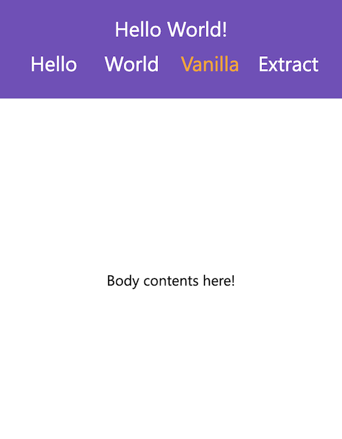
Take a look at the conditional atoms for things like flexDirection, fontSize, and more. Since we’ve configured the conditions for desktop vs. mobile in the Sprinkles file, now, every time you need to set up different styles depending on the device size, you can define it via the desktop and mobile properties, respectively.
For example, for our menuItems arrangement, the mobile disposition of the elements should use a CSS grid display rather than flex so that we can show it, as in the figure below:

The same applies to the font size, which is smaller on mobile devices.
You might be wondering what happened to the section style we had before in the style.css.ts file. Well, we moved it to the App.tsx file, just to demonstrate how Sprinkles deals with inline atoms.
Let’s see how the file content is like now:
import * as styles from "./styles.css";
import { atoms } from "./sprinkles.css";

export const App = () => (
  <main>
    <header className={styles.menu}>
      <h1 className={styles.menuItem}>Hello World!</h1>
      <ul className={styles.menuItems}>
        <li>
          <a className={styles.menuItem} href="#">
            Hello
          </a>
        </li>
        <li>
          <a className={styles.menuItem} href="#">
            World
          </a>
        </li>
        <li>
          <a className={styles.menuItem} href="#">
            Vanilla
          </a>
        </li>
        <li>
          <a className={styles.menuItem} href="#">
            Extract
          </a>
        </li>
      </ul>
    </header>

    <section
      className={atoms({
        display: "block",
        marginTop: {
          desktop: "1/5",
          mobile: "1/2",
        },
        textAlign: "center",
      })}
    >
      <p>Body contents here!</p>
    </section>
  </main>
);
The first change we made to this file is the imports. Now, rather than importing each one (a list that can quickly grow too large), we’re importing them all into the styles constant. Then, you can directly call each one in the class names.
Pay attention to the new section component. Yes, it’s perfectly fine to customize your atoms directly into the components and Sprinkles will take care of that for you.
Notice that we’re repeating the desktop/mobile usage — this time for the margin-top values because they change when viewed from different device sizes.
Lastly, there’s a slight change to the global.css.ts file due to the new centralized repository for the app’s vars. This is its updated content:
import { globalStyle } from "@vanilla-extract/css";
import { vars } from "./vars.css";

globalStyle("body, body *", {
  all: "unset",
  boxSizing: "border-box",
  fontFamily: vars.fontFamily.body,
  color: vars.color.black,
  padding: 0,
  margin: 0,
});
Time to test it again! You’ll see that the presentation has barely changed, which’s the goal. However, we managed to improve the code significantly in terms of reusability and organization.
There are many more things to explore about vanilla-extract, however, I’m confident we established a strong foundation of knowledge to help you get started using it.
You can read more about vanilla-extract’s dynamic API for dynamic runtime theming, as well as its excellent utility functions for things such as calculation expressions.
You can find the final version of our example project on GitHub.
Have you tried vanilla-extract already? If so, what are your thoughts so far?

LogRocket lets you replay user sessions, eliminating guesswork by showing exactly what users experienced. It captures console logs, errors, network requests, and pixel-perfect DOM recordings — compatible with all frameworks, and with plugins to log additional context from Redux, Vuex, and @ngrx/store.
With Galileo AI, you can instantly identify and explain user struggles with automated monitoring of your entire product experience.
Modernize how you understand your web and mobile apps — start monitoring for free.
Install LogRocket via npm or script tag. LogRocket.init() must be called client-side, not
server-side
$ npm i --save logrocket

// Code:

import LogRocket from 'logrocket';
LogRocket.init('app/id');
// Add to your HTML:

<script src="https://cdn.lr-ingest.com/LogRocket.min.js"></script>
<script>window.LogRocket && window.LogRocket.init('app/id');</script>

When should you move API logic out of Next.js? Learn when Route Handlers stop scaling and how ElysiaJS helps.

Explore how Dokploy streamlines app deployment with Docker, automated builds, and simpler infrastructure compared to traditional CI/CD workflows.

A side-by-side look at Astro and Next.js for content-heavy sites, breaking down performance, JavaScript payload, and when each framework actually makes sense.

AI-generated tests can speed up React testing, but they also create hidden risks. Here’s what broke in a real app.re
Hey there, want to help make our blog better?
Join LogRocket’s Content Advisory Board. You’ll help inform the type of content we create and get access to exclusive meetups, social accreditation, and swag.
Sign up now