The introduction of component-based libraries and frameworks like React, Angular, and Vue has led to a growth in the adoption of the CSS-in-JS styling technique. CSS-in-JS lets us:

One of the most popular implementations of CSS-in-JS is styled-components, a library that enables us to create components with local styles.
In this article, we’ll focus on styling a React Native application using styled-components and Styled System, a utility-first styling library that works in tandem with CSS-in-JS libraries.
The Replay is a weekly newsletter for dev and engineering leaders.
Delivered once a week, it's your curated guide to the most important conversations around frontend dev, emerging AI tools, and the state of modern software.
To follow along, you need the following:
Before we get started on the tutorial, let’s cover some background on CSS-in-JS and look at a few of its advantages. For one, CSS-in-JS enables us to solve CSS problems such as name collision, which is caused by global namespacing when using JavaScript. CSS-in-JS also allows us to use normal CSS naming conventions instead of the camelCase used in React Native, for example, backgroundColor is background-color.
There are some additional benefits derived from using CSS-in-JS with library integrations like styled-components, particularly for mobile apps.
Styled-components allows us to use CSS properties like media queries and pseudo-classes inline. It’s impossible to use these with normal inline CSS in React Native. We can get native mobile support by importing components from the native module styled-components/native.
Let’s get started styling our React Native application. Follow the steps below to add style props to React components using Styled System.
Create a new React Native application using Expo CLI:
# Install the expo command line tool
npm install --global expo-cli

# bootstrap a new project
expo init <-- your app name -->

## cd <-- your app name -->
Install dependencies:
npm install styled-system styled-components
The code snippet above installs both Styled System and styled-components.
Start your application:
#Expo
expo start
# you can not run and Android or iOS emulator to view your application
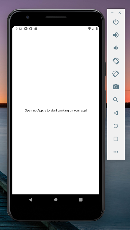
Now, you should get a starter application like the one seen below:
Styled System gives us a set of functions called style functions that add style props to our components. These style props provide inline styles to our React Native components:
import styled from 'styled-components/native'
import { color } from 'styled-system'
const Card = styled.View`
  ${color}
`
export default Card
The code above imports the color function from Styled System and adds it to the card component, mapping the bg and the color style props to the card component. See how these props are used below:
...
<Card color="#FFFFFF" bg="black">
  <Text>Hello World!</Text>
</Card>
...
You should now receive an output like the one below:
Styled System has a very rich API that includes functions for most CSS properties. Each function provides a group of style props. When the function is added to the component, the style props are also mapped to the component.
The style props use shorthand syntax akin to those in Bootstrap and Tailwind CSS, facilitating rapid prototyping of UI and a great development experience overall.
To elaborate on this, let’s add more code to our example:
import styled from 'styled-components/native'
import { color, space, layout, position, border, flexbox } from 'styled-system'
const Card = styled.View`
  ${color}
  ${space}
  ${layout}
  ${position}
  ${border}
  ${flexbox}
`
export default Card
As you can see, I have added more style functions to the card component, which also maps more style props. The Flexbox function adds flex properties as style props to our components. The other style functions have done the same, giving us a component with a rich collection of style props.
Next, create a text component like the one below:
import styled from 'styled-components/native'
import { color, space, typography } from 'styled-system'
const Title = styled.Text`
  ${color}
  ${space}
  ${typography}
`
export default Title
This code gives us a reusable text component with several styling options:
import React from 'react';
import Title from './component/Text';
import Card from './component/Card'

const App = () => {
  return (
    <Card
        width={"100%"}
        height={"100%"}
        alignItems={"center"}
        justifyContent={"center"}
    >
      <Card
            color="#fff"
            width={400}
            height={400}
            alignItems={"center"}
            justifyContent={"center"}
            bg="tomato" p={6}
      >
        <Title fontSize={20} fontWeight={'bold'}>Hello World</Title>
      </Card>
    </Card>
  );
}
export default App;
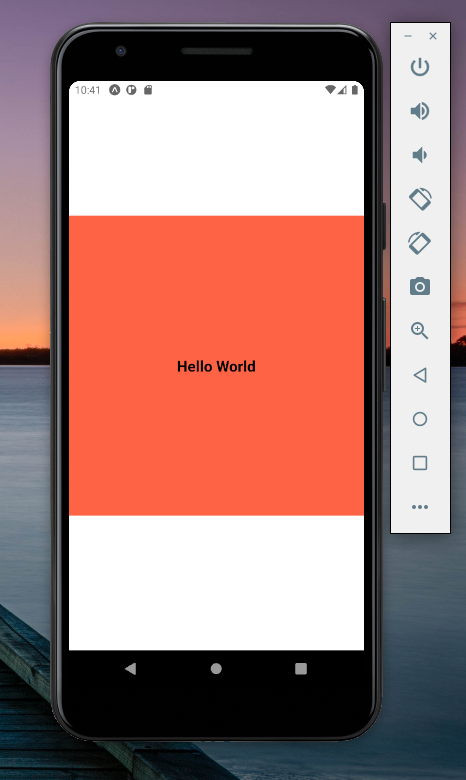
From the code above, we see that we can reuse both the card and text components with different styling to meet our layout needs. This is great for rapid UI prototyping.
Your React Native app should now look like the image below:
Now, let’s put everything together by building a Notification layout.
Now that we’ve started a new React Native application using Expo CLI, create a components folder in the root directory with these three files: Notifications.js, Card.js, and Text.js.
Add the following code to our Card.js file:
import styled from 'styled-components/native'
import { color, space, layout, position, border, flexbox } from 'styled-system'
const Card = styled.View`
  ${color}
  ${space}
  ${layout}
  ${position}
  ${border}
  ${flexbox}
`
export default Card
Now, add the code below to our Text.js file:
import styled from 'styled-components/native'
import { color, space, typography } from 'styled-system'
const Title = styled.Text`
  ${color}
  ${space}
  ${typography}
`
export default Title
So far, there is nothing new. Next, add the code below to the Header.js file:
import React from 'react';
import Title from './Text';
import Card from './Card';
const Header = ({title}) => {
  return (
    <Card
        width={400}
        height={150}
        alignItems={"center"}
        justifyContent={"center"}
        bg={"#36b8c9"}
        mb={3}
        py={6}
        px={4}
    >
        <Title fontSize={25} fontWeight={'bold'} color={"#FFFFFF"}>{title}</Title>
    </Card>
  );
}
export default Header;
Our App.js file should now look like this:
import React from 'react';
import Card from './component/Card';
import Header from "./component/Header.js";

const App = () => {
  return (
    <Card width={"100%"} height={"100%"} bg={"#efefef"}>
      <Header title="Notification" />
    </Card>
  );
}
export default App;
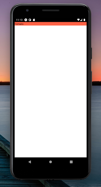
Now, our application looks like this screenshot:
Next, we’ll add the following code to the Notification.js file:
import React from 'react';
import Title from './Text';
import Card from './Card'
const Notification = ({ status, message }) => {
    return (
      <Card
          width={"100%"}
          height={"auto"}
          alignItems={"center"}
          justifyContent={"center"}
          bg={"#FFFFFF"}
          my={2}
          px={4}
          py={3}
      >
        <Title
              fontSize={25}
              fontWeight={'bold'}
              color={status === "success" ? "#36b8c9" : "#f6244d"}
              mb={2}
        >
              {message}
        </Title>
        <Card
              flexDirection={"row"}
              justifyContent={"space-between"}
              width={"100%"}
        >
            <Title fontSize={16} color={"#36b8c9"}>2020-09-4</Title>
            <Title fontSize={16} color={"#36b8c9"}>9:20</Title>
        </Card>
      </Card>
    );
  }

export default Notification;
The codes above create a reusable Notification component that takes two props, namely, status and message. The status prop is used to conditionally style our text depending on the status of the order:
color={status === "success" ? "#36b8c9" : "#f6244d"}
The message prop displays the notification message to the view. We can use the message prop in our App.js file to get our final view:
import React from 'react';
import Card from './component/Card';
import Header from "./component/Header.js";
import Notification from "./component/Notification";

const App = () => {
  return (
    <Card
          width={"100%"}
          height={"100%"}
          bg={"#efefef"}
    >
      <Header title="Notification" />
      <Notification
            status="success"
            message="your order was successfully accepted!"
      />
      <Notification
            status="success"
            message="your order was successfully accepted!"
      />
      <Notification  message="your order was not accepted!" />
    </Card>
  );
}
export default App;
Building reusable components makes our code clean and DRY. By creating reusable components with Styled System, we have provided each component with access to the necessary style props passed to it by the style functions.
Consequently, we can easily build our layout by using these props to manipulate the display of the component. When compared with React Native style objects, our code is easier to read and maintain.
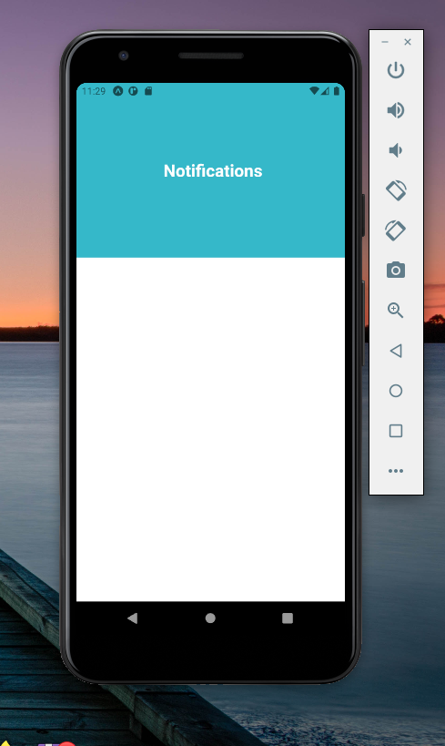
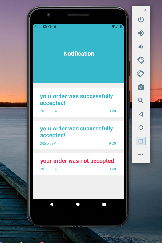
Our final app should look like this:
Lastly, it is important to note that Styled System also supports the use of themes. Let’s create a theme.js file that holds an object defining all our styles. We’ll use the theme.js file with the ThemeProvider provided via context by most CSS-in-JS libraries:
import React from 'react'
import { ThemeProvider } from 'styled-components'
import theme from './theme'

const App = props => (
  <ThemeProvider theme={theme}>{/* application elements */}</ThemeProvider>
)

export default App
All our components nested within the ThemeProvider would have access to our styles defined in the theme object. This makes our styling more consistent and maintainable.
Styled System is great. Not only does it allow us to rapidly prototype our UI, but it also works with several CSS-in-JS libraries like styled-components.
Styled System is a revolutionary way of styling React Native components that uses a simple approach. We add style props used for providing inline styles to a component by passing Style functions to the component. Without a doubt, Styled System is a great way to build a React Native layout. I hope that you’re ready to try it out on your next project!

LogRocket's Galileo AI watches sessions for you and and surfaces the technical and usability issues holding back your React Native apps.
LogRocket also helps you increase conversion rates and product usage by showing you exactly how users are interacting with your app. LogRocket's product analytics features surface the reasons why users don't complete a particular flow or don't adopt a new feature.
Start proactively monitoring your React Native apps — try LogRocket for free.

When should you move API logic out of Next.js? Learn when Route Handlers stop scaling and how ElysiaJS helps.

Explore how Dokploy streamlines app deployment with Docker, automated builds, and simpler infrastructure compared to traditional CI/CD workflows.

A side-by-side look at Astro and Next.js for content-heavy sites, breaking down performance, JavaScript payload, and when each framework actually makes sense.

AI-generated tests can speed up React testing, but they also create hidden risks. Here’s what broke in a real app.re
Hey there, want to help make our blog better?
Join LogRocket’s Content Advisory Board. You’ll help inform the type of content we create and get access to exclusive meetups, social accreditation, and swag.
Sign up now

 Learn more →
