Making mistakes is all part of being human. But when users stumble on your site, it’s your job as a UX designer to ensure those missteps don’t turn into dead ends. Instead, with the right error messages and helpful guidance, you can quickly steer users back on track.
Error messages aren’t just a functional necessity — they’re a key part of the user experience that can build trust, reduce frustration, and even strengthen your brand’s connection with its audience.
In this article, we’re going to look at why getting error messages right is so important to a site’s UX design and how you can create error messages that enhance rather than detract from the user’s experience with your brand. Jump ahead to explore some great examples of real-world error messages done right and how to fix common mistakes!
Editor’s note: This post was updated on 31 January 2025 to include additional examples of effective error messages, before-and-after comparisons of poorly written vs. well-crafted messages, and best practices for improving accessibility and industry-specific messaging. We’ve also expanded the section on common mistakes to avoid, with a focus on clarity, timeliness, and user-friendly design.
For a visual guide to designing error messages the right way, check out our YouTube tutorial here:
Error messages might seem like minor details in the grand scheme of a site’s design, but they’re much more impactful than you’d think. The way your site communicates errors can either solve problems effectively or frustrate users enough to leave. It also says a lot about your brand’s approach to the user experience as a whole.
Let’s take a look at some other important reasons why clear error messages should be a UX design priority:
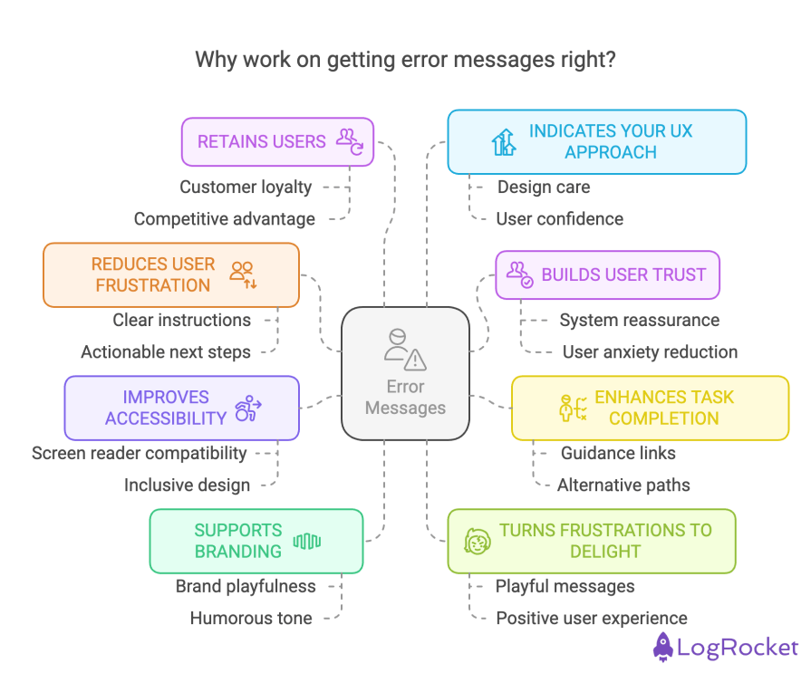
Clear, friendly, and instructive error messages can help reduce user frustration by leading users to a solution that helps them reach their goals.
For instance, if a user enters a search term that yields no results, an unhelpful message like “No results found. Try again.” only adds to their frustration. Instead, use something like this — “We couldn’t find anything for ‘[search term]’. Check your spelling or try a different keyword.”
This small change acknowledges the issue while giving users actionable next steps, reducing their likelihood of abandoning your site.
Error messages that are transparent and empathetic reassure users that the system is working as intended, even when something goes wrong.
For example, if a login attempt fails, compare “Login failed. Invalid credentials.” to something more helpful like “We couldn’t log you in. Please double-check your login details or reset your password if you’re stuck.”
This not only reduces user anxiety but fosters trust in your platform. A clear, actionable message shows users that you care about their experience — even when things go wrong.
Good error messages keep users from hitting dead ends. They offer clear guidance, prevent unnecessary drop-offs, and open alternate paths when the main flow is blocked.
I’m thinking here of links to reset passwords, help articles, or even direct contact with support. These small touches ensure users can quickly recover and stay engaged with your product.
Accessible error messages aren’t just a nice-to-have — they’re essential. For visually impaired users who rely on screen readers, a well-crafted message can make or break their experience.
Providing links to helpful resources, such as password reset pages, help articles, or contact information, allows all users to navigate quickly to the next step without additional frustration.
Accessibility-focused design ensures no one gets left behind.
Error messages are opportunities to reinforce your brand, even in moments of user frustration and confusion. While you shouldn’t distract from solving the issue at hand, injecting some on-brand playfulness or humorous tone of voice can work well in these instances to diffuse tension and keep the mood light while the user is on the error page.
Done well, these messages can leave users thinking, “Hey, this brand gets me.”
Clever UX designers will use an error message to soften the blow.
Instead of a generic 404 page, why not use a playful message like “Looks like we’ve lost our way — just like you! Let’s get back on track.” This can turn an otherwise frustrating moment into one that feels human and even enjoyable.
A poorly crafted error message can send users running to your competitors, even if everything else on your site has been great. But when users encounter clear, kind, and actionable messages, they’re more likely to stick around — and maybe even turn into loyal customers.
Error messages are a great indicator of how much thought and care a brand puts into its design.
Companies that prioritize clear, compassionate messaging in their error handling likely extend the same attention to other touchpoints. Users notice these details, and it builds confidence in the brand’s overall experience.
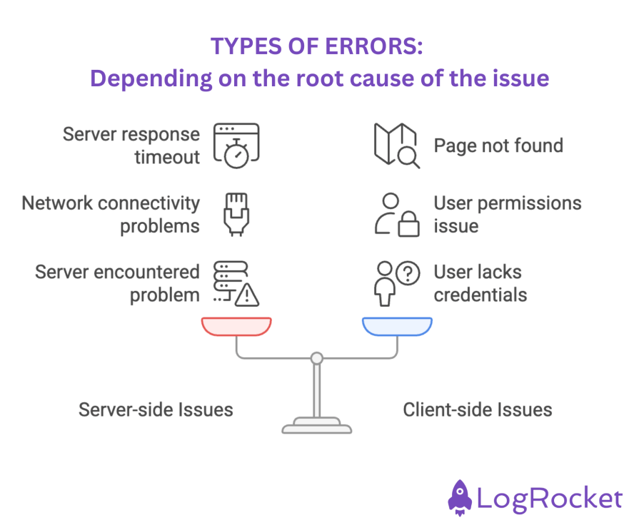
Users might encounter error warnings or error pages for various reasons. Something as simple as a typo in a URL can lead to the dreaded 404 page. However, most error messages stem from one of these three situations:
Error pages go beyond simple messages or warnings — they’re HTTP status indicators that reflect the server’s response to the user’s in-browser request. Common error page examples are 401, 403, 404, 500, 502, 503, and 504 errors.
These errors can be divided, depending on the root cause of the issue, into two categories:
By understanding the root causes of errors and providing clear, actionable messages, you can prevent user frustration and keep them moving toward their goals.
When users encounter errors, it’s important to recognize that not all mistakes are the same. Errors typically fall into two categories:
A slip occurs when a user unintentionally performs the wrong action, often due to inattention or a lapse in focus. For example, when filling out a form, a user might accidentally select the wrong option or misclick a button. Since the user’s goal hasn’t changed, slips are usually easy to resolve and typically involve a minor adjustment.
Handling slips:
A mistake, on the other hand, happens when the user’s understanding of how the system works doesn’t align with the system’s design. For example, a user might attempt to upload a file that exceeds the maximum allowed size because they weren’t made aware of the limit.
Mistakes are trickier to resolve because they involve a fundamental misunderstanding of the system’s requirements.
Preventing mistakes:
A well-designed error message doesn’t just tell users something went wrong — it helps them fix it quickly and with minimal frustration. Follow these best practices to keep error messages clear, solution-focused, and user-friendly:
What to do — Write error messages in plain language and a conversational tone that anyone can understand.
Avoid — Jargon, technical terms, or vague statements that leave users confused.
Example — Instead of “Authentication failed due to invalid credentials,” say, “Oops! That password doesn’t match. Try again or reset it.”
What to do — Get to the issue quickly. Users should grasp the error and how to fix it within seconds.
Avoid — Lengthy explanations or unnecessary details.
Example — Instead of “We encountered an unexpected issue while processing your request,” say, “Something went wrong. Try refreshing the page.”
What to do — Guide users toward fixing the issue. Offer actionable next steps or multiple solutions if needed.
Avoid — Error messages that simply state the problem without suggesting what to do next.
Example — Instead of “Invalid credit card number,” say, “That card number doesn’t look right. Check for typos or try another card.”
What to do — Assume the user made an honest mistake and offer help in a reassuring way.
Avoid — Blaming or condescending language.
Example — Instead of “You entered your email incorrectly,” say, “That email doesn’t look right. Want to try again?”
What to do — Use color, icons, and text hierarchy to ensure errors stand out but aren’t overwhelming.
Avoid — Relying solely on red text (colorblind users may not notice it).
Example — Highlight form fields with a red border and provide a short inline error message like “Password must be at least 8 characters.”
What to do — Position error messages as close as possible to the source of the problem.
Avoid — Placing all errors at the top of the page, forcing users to search for the issue.
Example — In a form, show an inline error next to the specific field instead of displaying a generic message at the top.
What to do — Provide instant feedback in the form of validation before users submit a form to prevent frustration.
Avoid — Letting users complete an entire form only to show multiple errors after submission.
Example — While typing a password, indicate “Weak password” in real time instead of waiting until they submit.
What to do — Let users clear error states once they correct the issue.
Avoid — Keeping red error indicators even after a user fixes the problem.
Example — If a user updates their email address correctly, remove the error highlight automatically.
What to do — Tailor error messages to your industry and user expectations.
Example — In e-commerce, suggest alternative payment methods if a card is declined. In healthcare apps, use reassuring wording like “Looks like some details are missing. Let’s get them sorted!”
What to do — Ensure all users can understand and interact with error messages.
Avoid — Relying only on color cues.
Example — Use both color and an icon or bold text to indicate errors. Screen reader users should hear helpful instructions, like “Please enter a valid phone number in the format (123) 456-7890.”
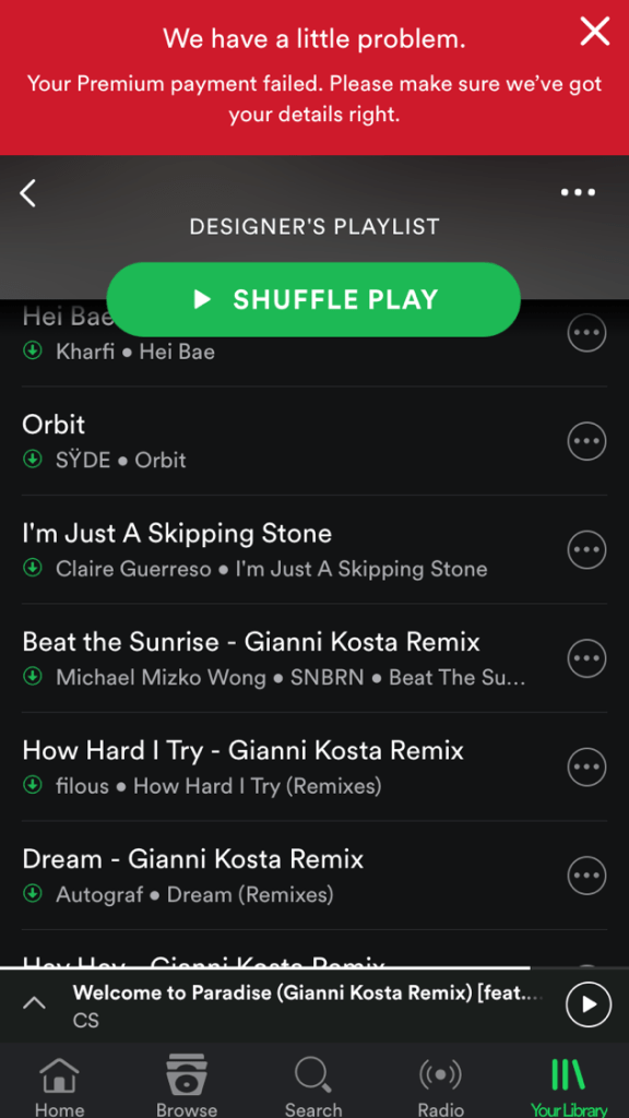
When a user’s payment fails, frustration is almost inevitable — especially if they’re at risk of losing access to their favorite playlists. Spotify’s error message is a great example of how to handle this smoothly while keeping users engaged:
Uploading images should be seamless, but when there’s an issue, the error message shouldn’t feel like a roadblock. Slack keeps things lighthearted and easy to fix:

Network failures are frustrating, but this error messaging ensures users aren’t met with overly technical jargon or confusing instructions:
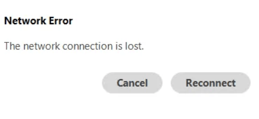
If I had to suggest an improvement here, I’d say we could allow an auto-retry after a few seconds to reduce manual effort.
When users mistype their email, a vague error message like “Invalid credentials” can be frustrating. Dropbox’s approach removes ambiguity and makes it clear how to fix the issue:
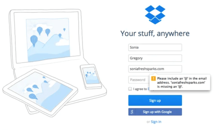
If I were asked, though, I’d suggest an improvement — Could highlight the incorrect part of the input (e.g., missing “@” or domain name).
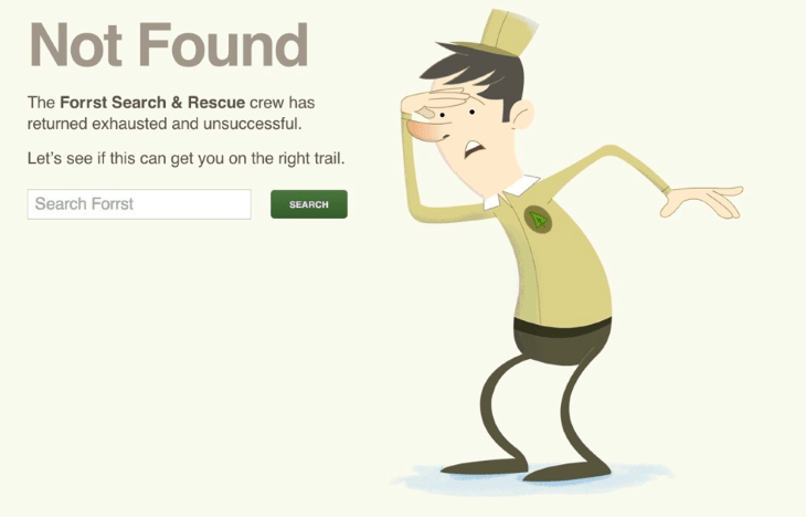
Hitting a 404 page is never ideal, but a well-designed error message can turn it into a positive experience. Forrst’s Search & Rescue page makes the best out of a frustrating situation:
We’ve all seen them — those confusing, long, and jargon-heavy error messages that make things worse instead of better.
Here’s what not to do and how to fix it with clear, user-friendly messaging:
A common mistake is using jargon-heavy language that assumes users have technical expertise. Instead, keep it simple and accessible.
| Before (too technical) ❌ | After (user-friendly) ✅ |
| “Error 0x800704CF: The network location cannot be reached. Please check the network connection and try again.” | “You’re not connected to the internet. Check your Wi-Fi or try reconnecting to your network, then refresh the page.” |
Error messages should guide, not scold. Avoid language that makes users feel at fault.
| Before (blaming the user) ❌ | After (supportive and clear) ✅ |
| “You entered an invalid password. You should have followed the password requirements.” | “Oops! Your password doesn’t meet the requirements. It must include at least 8 characters, one uppercase letter, and one special character.” |
Vague errors leave users stuck. Provide specific guidance on how to fix the issue.
| Before (too generic) ❌ | After (specific and actionable) ✅ |
| “Something went wrong. Please try again.” | “We couldn’t process your request because the file format isn’t supported. Try uploading a .jpg or .png instead.” |
Ambiguous error messages confuse users. Tell them why something is wrong and how to fix it.
| Before (unclear) ❌ | After (addresses root cause) ✅ |
| “You can’t use that password.” | “Your password must include at least 8 characters, one uppercase letter, and one special character.” |
Humor can work in error messages, but timing matters. If a user is frustrated, jokes might push them to abandon the task.
| Before (inappropriate humor in a serious context) ❌ | After (addresses root cause) ✅ |
| “Oopsie! Looks like you really messed this one up. Try again, champ!” | “We couldn’t process your request. Double-check your details and try again, or contact support if you need help.” |
Users should be able to clear resolved errors without refreshing the page.
| Before (persistent and annoying) ❌ | After (dismissible and responsive) ✅ |
| “Error: Incorrect email format. Please enter a valid email.” (Error stays even after correction.) | (Error disappears automatically once the user enters a correctly formatted email.) |
A well-crafted error message is more than just a notification — it’s an opportunity to support users, reduce friction, and reinforce trust in your product.
In this guide, we’ve covered the essential elements of clear, effective error messaging, common pitfalls to avoid, and real-world examples of what works. Here’s what you should take away:
By refining your approach to error messages, you’re not just preventing user frustration — you’re enhancing user experience, improving conversions, and building trust in your product.

LogRocket's Galileo AI watches sessions and understands user feedback for you, automating the most time-intensive parts of your job and giving you more time to focus on great design.
See how design choices, interactions, and issues affect your users — get a demo of LogRocket today.

AI has made polished, confident content easy to generate, but that does not make it trustworthy. This article explains how UX teams can design stronger quality signals using source transparency, validation, confidence communication, and reputation.
Inclusive design is evolving beyond accessibility alone. This guide explains how UX designers can create more inclusive products through usability, accessibility, neurodiverse UX, adaptive personalization, multimodal design, and culturally aware product experiences.

I was working with an intern on a UX research project, and before we even started, we both had private […]

AI has accelerated design execution, but speed can come at the expense of intentionality. Learn how UX teams can preserve product thinking and judgment.

 Learn more →
