As much as we’d love to remove complexity in UX design entirely, it’s not always possible — or even beneficial. Some problems demand intricate solutions rather than oversimplified fixes. In the 1980s, Larry Tesler explored this idea, leading to what’s now known as Tesler’s Law — the notion that complexity in a system is conserved and can only be shifted, not eliminated. Around the same time, Larry Wall introduced a similar perspective, calling it the Waterbed Theory, highlighting how reducing complexity in one area often inflates it elsewhere.

In this article, you’ll learn what Tesler’s Law is, and how to handle unavoidable complexity in UX design with care, rather than trying to eliminate it altogether.
Tesler’s Law, also known as the Law of Conservation of Complexity (or Waterbed Theory), states that every product has an inherent degree of complexity. Trying to simplify it beyond that point often makes things more complex rather than simpler.
For example, you’ve probably encountered websites where clicking “Contact us” automatically opens your default email client, pre-filling an email address. Sounds convenient, right? Not if you don’t use that email client. Instead of streamlining the process, it creates friction — you close the unwanted window, manually copy the email, and switch to your preferred platform.
A better UX strategy? Just provide a functional contact form.
This example illustrates why oversimplification doesn’t always work. Complexity doesn’t disappear — it just shifts elsewhere, much like how pressing down on a waterbed makes the displaced water pop up somewhere else.
One common UX mistake is splitting content into too many separate pages because it feels “simpler”. While this may make the design process more manageable, it often forces users to jump between pages unnecessarily.
Some examples of unnecessary complexity:
Instead of fragmenting content, a well-structured single page can be more effective. If designed correctly, it won’t feel cluttered — it will feel intuitive. To achieve this:
Sanne Wijbenga’s website (pictured below) does all of that really well:

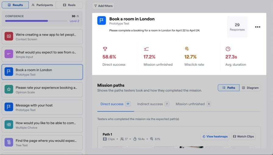
Of course, A/B testing + UX benchmarking will tell you which option is best of all the options that you want to try (including multi-page navigation if you truly think that it’s a good option):
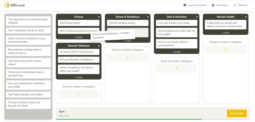
That being said, start with card sorting to determine the best structure. This UX research technique helps you understand how users naturally group related content, ensuring your information architecture makes sense.
Clarity is king in UX writing, but oversimplifying for the sake of brevity can strip away important details. The key is to cut clutter, not context. So to ensure your content is informative and easy to digest:
Just because a solution seems straightforward doesn’t mean it’s the best choice. The easiest implementation isn’t always the easiest to use.
For example:
So basically, just utilize some critical thinking skills to evaluate every possible solution thoroughly. And keep in mind that designing a more complex solution is better than having to design patches for half-baked simple solutions.
Interestingly, when a website or app feels simple, users tend to attempt more complex tasks. This most likely stems from a desire to maximize value from the product without inducing too much cognitive strain. This suggests that people prefer to push their cognitive function to the limit if it means getting more done, and these behaviours, as you can imagine, are quite common today.
Think of spreadsheets. While simple calculations are easy, users often create complex formulas, pull real-time data, and even write scripts, making them harder to use over time.
This principle applies to social media too — frictionless scrolling leads to digital burnout, as users engage beyond their cognitive limits. UX designers must strike a balance — instead of oversimplifying, they should help users pace themselves with subtle friction, like:
Even designers fall into the oversimplification trap, especially when creating personal projects. Many over-prioritize visual appeal, resulting in stylish but frustrating websites. Awwwards showcases many of these — sites with elaborate animations but poor usability.
Tesler’s Law reminds us that while simplification is essential, there’s a limit. Going beyond that limit can create more complexity, not less.
Oversimplification often leads to:
To prevent this:
Simply being mindful about UX decisions can go a long way as well.
The trick to this is asking yourself, “Does this approach truly offer a better user experience, or is it just easier for me as a UX designer/easier for engineers to implement/easier for administrators to manage/etc.?” You’ll almost invariably incur a technical debt of some kind by going down what seems like the easier routes, so it’s important to prioritize the long-term ROI of any decisions over the short-term ROI of any corners cut.
At the end of the day, great UX design isn’t about making everything as simple as possible — it’s about making things as simple as they can be, but no simpler.

LogRocket's Galileo AI watches sessions and understands user feedback for you, automating the most time-intensive parts of your job and giving you more time to focus on great design.
See how design choices, interactions, and issues affect your users — get a demo of LogRocket today.

AI tools can generate beautiful UI concepts in minutes, but most teams struggle to integrate those outputs into real design systems. This guide explores why AI drifts toward generic patterns and how to build governed workflows that keep speed without sacrificing brand consistency.

Adaptive interfaces personalize experiences using behavioral signals and machine learning. But when personalization becomes autonomous, systems can reinforce patterns, limit discovery, and shape user behavior in ways designers didn’t intend.

Security requirements shouldn’t come at the cost of usability. This guide outlines 10 practical heuristics to design 2FA flows that protect users while minimizing friction, confusion, and recovery failures.

2FA failures shouldn’t mean permanent lockout. This guide breaks down recovery methods, failure handling, progressive disclosure, and UX strategies to balance security with accessibility.


