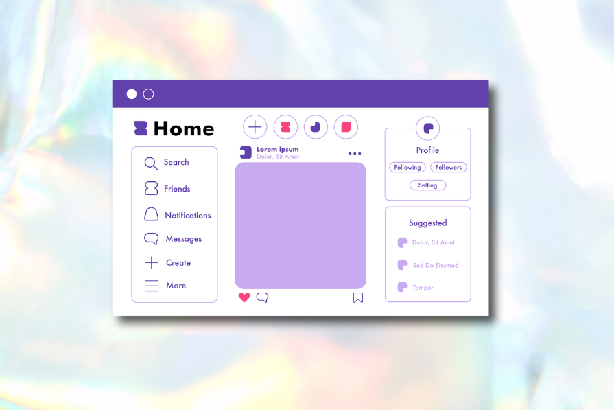
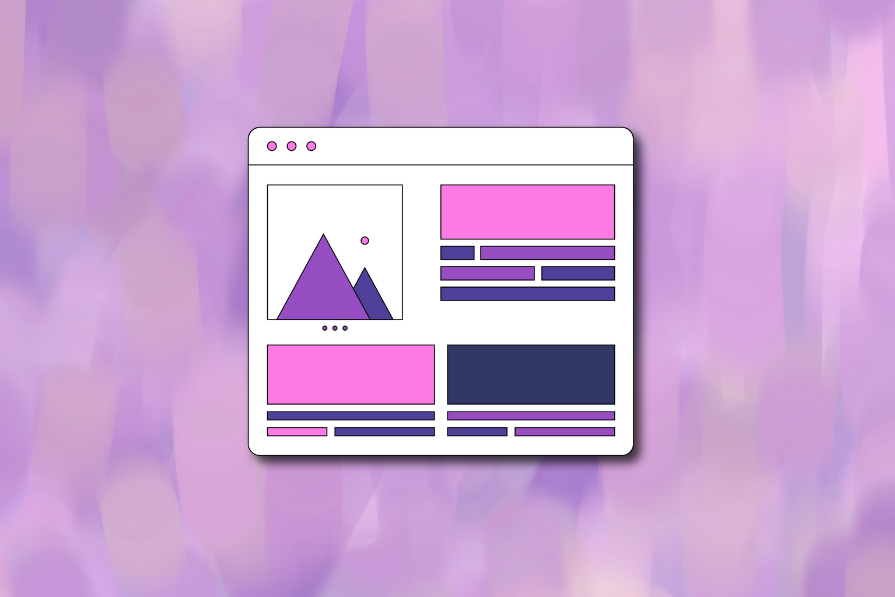
Linear design is a minimalist SaaS aesthetic inspired by Linear. Here’s what to use to recreate it — from Radix UI + shadcn/ui ecosystems to Linear-style Figma kits — plus how to structure pages using modular components and an 8px spacing scale.

Teams often use “customer” and “user” interchangeably — until it breaks alignment. Here’s how separating the two clarifies research, prioritization, and messaging across B2C, B2B, and B2B2C products.
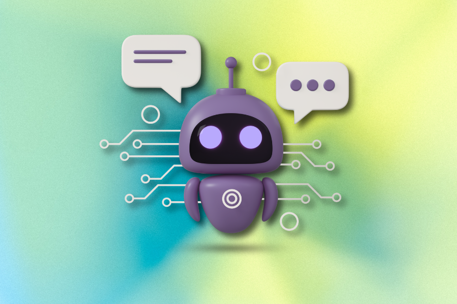
AI is great at producing copy fast. UX writing isn’t about speed. It’s about meeting users where they are. Here’s how to use AI to support your UX writing workflow and where human judgment remains non-negotiable.

A well-designed multi factor authentication system enhances security without slowing users down. Let’s explore how to make authentication feel effortless.
Most design specs break down in development because they’re built for designers, not developers. This article shows how to write specs that reflect real-world logic, states, constraints, and platform behavior — not just pixels.

Scaling MFA in large organizations is more than a technical task. Teams must navigate user hesitation, older devices, legacy systems, and the ongoing operational burden of training, documentation, and compliance. Balancing security with usability and efficiency is key to a successful rollout.
A practical guide to AI in UX design, covering predictive UX, generative assistance, personalization, automation, and the risks of overusing AI.

Multi-factor authentication methods affect users differently depending on devices and abilities. This article explores the accessibility trade-offs of biometrics, OTPs, magic links, and more, helping you design inclusive MFA flows.
I don’t start research from a blank page anymore. These 19 ChatGPT prompts help me move faster across recruitment, interviews, surveys, and synthesis.

There’s no universally “best” authentication method. The right choice depends on the risks you’re protecting against, your users’ needs, and the data your product handles. This article breaks down modern authentication options and the factors that should guide your decision.
AI wireframe tools are everywhere but they don’t all work the same way. I tested Visily, UX Pilot, Uizard, Mokkup AI, and Figma Make to see which tools are best for non-designers, fast iteration, and serious UX work.

MFA improves security, but design choices matter. This article examines common MFA risks and practical ways to balance protection, cost, and user experience.