
Explore the core principles of GUI design and learn how consistency, simplicity, feedback, accessibility, and user testing contribute to better digital experiences.

After five years in UX, I revisited the Daily UI challenge to reconnect with hands-on design. Along the way, I learned that great interfaces come from thoughtful briefs, sound judgment, and user feedback, not just better AI tools.

Learn what makes a great login screen through real-world examples and UX best practices for creating secure, accessible, and low-friction authentication flows.

Skeuomorphism helped define early digital interfaces by mimicking real-world objects to make technology more intuitive. Learn how it compares with flat design and neumorphism, why it declined, and where it still has a place in modern UX.

Memos don’t have to be complicated. Just keep them clear, concise, and focused on actionable items. More on that in this blog.

AI has made polished, confident content easy to generate, but that does not make it trustworthy. This article explains how UX teams can design stronger quality signals using source transparency, validation, confidence communication, and reputation.
Inclusive design is evolving beyond accessibility alone. This guide explains how UX designers can create more inclusive products through usability, accessibility, neurodiverse UX, adaptive personalization, multimodal design, and culturally aware product experiences.

I was working with an intern on a UX research project, and before we even started, we both had private […]

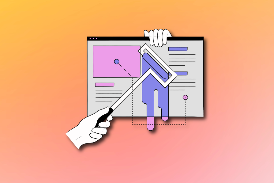
AI has accelerated design execution, but speed can come at the expense of intentionality. Learn how UX teams can preserve product thinking and judgment.

UX testing is not limited to layouts, copy, and visual design. Full-stack and server-side experiments help teams evaluate how backend logic, APIs, algorithms, and product flows affect the overall user experience.

In A/B, A/B/n, or multivariate testing scenarios, using p-value with traditional null-hypothesis-based statistical analysis is so common, and most designers […]

Traditional A/B testing splits traffic evenly, but multi-armed bandits dynamically send more users to the better-performing version. Here’s how the method works, where it helps, and when UX teams should use it over classic A/B testing.