Doctors, nurses, and other medical professionals study for years to master their craft. Yet, when I first worked on redesigning a medical CRM, I saw a doctor delegate all computer-related tasks to his secretary — despite strict data privacy rules. If someone with over a decade of education and experience couldn’t navigate the software, the issue wasn’t with him — it was with the system.
Healthcare has traditionally been a conservative field. While new technologies were gradually accepted, UX and UI were rarely priorities in medical software, machines, and apps. Like many B2B applications, these tools were built for functionality, not usability. since they were designed primarily for professionals — all devices or apps were for “serious business” — UI took the back seat. Raw data, clunky interfaces, and complex workflows were the norm.
But the landscape is shifting. The rise of consumer health apps — especially in fitness and wellness — has raised expectations. Today, good UX for medical apps isn’t just a nice-to-have; it’s a crucial factor in the success of medical innovations that impact millions.
We can think of medical professionals as early users (or adopters) who will tolerate inefficiencies for the sake of necessity, while the general public requires intuitive, well-designed UX to fully embrace health tech.
Unlike other industries where UX focuses on a single user type with multiple personas, healthcare UX must balance the needs of three distinct groups:
These groups aren’t mutually exclusive. A nurse might also be a patient. A doctor may need to navigate administrative tasks. And so, understanding these overlapping roles is essential, for you, as a designer for healthcare UX, to design effective healthcare solutions.
For simplicity, I’ll group doctors, nurses, and physiotherapists together as “medical professionals”. Their main goal? Providing care. They need tools that help them diagnose and treat patients quickly. They’ll put up with complexity if it means better accuracy, but poor UX slows them down, leaving less time for patients.
Patients want instant, clear insights about their health. Whether they’re tracking heart rate, sleep patterns, or calorie intake, apps must present data in a way that’s easy to understand and integrate into daily life. Devices like smartwatches allow passive monitoring, while AI-driven apps simplify tasks like estimating calorie intake from a photo.
Often overlooked, administrative UX plays a massive role in healthcare efficiency. From appointment scheduling to medical record management, well-designed systems free up time for doctors and improve patient experiences.
The best healthcare UX solutions will minimize paperwork and streamline workflows — all to allow healthcare providers to focus on patient care instead of administrative burdens.
Since each of these user groups has different priorities, defining the app’s core audience is crucial to building a strongly cemented UX roadmap.
Unlike other industries, healthcare UX has a direct impact on people’s well-being — sometimes even their survival.
Medical tech isn’t just about convenience; it’s about adherence, or observance. In healthcare, that refers to how closely patients follow medical advice — taking prescribed medication, following treatment plans, or using medical devices correctly. And good UX can improve adherence, while bad UX can lead to serious consequences.
For example, a poorly designed pill bottle might frustrate a patient enough to skip doses. An invasive diagnostic tool might discourage someone from seeking medical care altogether. That’s why modern thermometers provide instant readings instead of requiring uncomfortable, time-consuming procedures.
Even something as simple as booking an appointment plays a role in observance. If my doctor isn’t available, I don’t want to spend hours calling around — I need an intuitive system (like Doctolib) that lets me book an alternative in three clicks.
Data accuracy is also capital, of course. When tracking health metrics like temperature or hormone levels, small discrepancies can trigger unnecessary alarms, or, worse, cause serious health issues to be overlooked.
And, unlike missing a Duolingo streak, missing a health tracking streak could have real medical consequences.
Healthcare UX is about bridging the gap between traditional medical processes and new digital behaviors. Historically, people waited until they felt sick before seeing a doctor. Now, technology allows proactive health monitoring — but only if the UX makes it accessible. Great healthcare UX must support every stage of someone’s medical journey:
And through all that, the challenge for us, UX designers, lies in designing systems that work for both — medical professionals who need in-depth data, and patients who need simple, actionable insights.
Healthcare has seen rapid evolution over the last few years. The shift from a doctor-centric model to self-care-driven behavior presents = new opportunities for UX designers in healthcare.
So, if you’re considering a career in healthcare UX, what challenges and innovations can you work on?
Let’s explore some of the key areas where UX design is making a difference:
Mobile health apps are made for preventive healthcare, promoting healthier lifestyles through calorie counting, step tracking, and weight monitoring. The challenge? These apps must be nearly invisible in day-to-day life while providing valuable insights through a seamless user experience.
Take Google Fit, for example. It runs quietly in the background on my Pixel phone, and when I want to check my step count, it’s just a tap away. It also estimates the calories burned, so I can decide if I can take a second dessert or not.
Calorie-tracking apps face a major UX hurdle, though. Logging every meal is tedious and time-consuming. Some apps tried a clever approach — they referenced packaged food labels, much like an online shopping cart. But AI-powered healthcare UX solutions are taking things further. Apps that estimate calorie intake from a simple food photo are emerging, making tracking effortless. And I’m sure their accuracy’s improving.
The takeaway’s clear — lowering user effort increases adoption in UX healthcare. The less UI friction users experience, the more likely they are to engage in self-care habits.
EHRs are the backbones of modern healthcare, but their UX has historically been an afterthought. These systems, designed for healthcare professionals, often feature cluttered interfaces and unintuitive workflows. However, UX improvements are transforming EHRs into more efficient tools for both providers and patients.
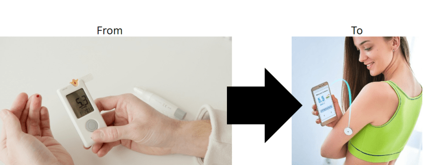
The ones people know the most about are those for diabetic people — continuous glucose monitoring for diabetics. Early devices required patients to prick their fingers multiple times a day for blood sugar readings. Now, wearable patches allow users to scan these arm patches with a smartphone and instantly receive glucose levels, trends, and recommendations. The data is not only more accessible, but also visually intuitive, with graphs and alerts that can be shared with doctors in real time.
The shift to remote work has also influenced healthcare. Telemedicine has surged in popularity, offering patients an alternative to in-person visits. The UX challenge? Making virtual consultations as smooth and effective as face-to-face interactions.
We’ve all been there — you wake up with flu symptoms, need a quick prescription renewal, or have to get a medical evaluation for work. But do you really need to sit in a waiting room for that?
A well-designed telemedicine platform can cut the hassle for both patients and doctors. Imagine booking an appointment in seconds, pulling up your medical records with ease, and having a secure chat with your doctor — that’s the kind of seamless experience UX designers can create to make virtual healthcare feel even more effortless.
Ooh, and telemedicine can also play a massive role in mental health care. Many people prefer remote therapy sessions for convenience and privacy, but then the current platforms often lack the warmth and human touch of in-person interactions. UX designers, again, can bridge this gap by focusing on elements like empathetic UI design, intuitive video call interfaces, and seamless session transitions.
If you’ve ever visited a hospital, you’ve likely noticed the overwhelming array of machines — many of which have horribly outdated UIs.
Unlike consumer apps, these devices were built for functionality over usability, often requiring months of training before medical staff can confidently operate them.
But expectations are shiting now. Doctors and nurses use well-designed apps in their personal lives, so why should their professional tools be any different? Clunky, inefficient UIs increase cognitive load, slow down workflows, and can even lead to errors in patient care.
As UX designers step into the B2B healthcare space, the challenge is twofold:
OK — I’ll condense down all of that in a few words:
The future of healthcare UX isn’t just about aesthetics — it’s about creating systems that work seamlessly for both professionals and patients. Whether it’s simplifying self-care apps, improving EHR usability, refining telemedicine experiences, or modernizing hospital equipment interfaces, there’s no shortage of impactful challenges for UX designers in this field.
Healthcare UX must navigate strict data privacy laws like HIPAA in the U.S., GDPR in Europe, and PIPEDA in Canada. Non-compliance risks hefty penalties, making privacy a core design priority.
Security measures — end-to-end data encryption, role-based access, session timeouts, and audit logs — must be built into every layer. Clear consent flows, intuitive error messages, and plain language explanations let users control their data. Visual design also reinforces trust, ensuring security doesn’t come at the cost of usability.
And of course, collaboration is key — that, between designers, developers, and legal teams — to maintain compliance. Regular security audits, penetration testing, and user education further strengthen data protection. Adopting a privacy-by-design approach not only ensures legal adherence, but also builds long-term user confidence.
Health apps serve users in vulnerable states — temporary impairments (like illness) and permanent disabilities. Accessibility isn’t an afterthought; it’s a necessity.
Clear typography, high contrast, adaptive layouts, and voice-command compatibility ensure usability across different needs. Large touch targets, alternative navigation methods (touch, voice, keyboard), and informative error messages enhance the experience for all users.
Testing with real users — not just automated tools — identifies gaps that could exclude people. Meeting WCAG standards isn’t just about compliance; it’s about creating a healthcare experience that’s truly inclusive, improving engagement and outcomes.
Healthcare UX faces a unique challenge — users must engage, but they’re often wary of sharing sensitive data. And trust isn’t given; it’s earned.
Transparent design means users understand what data is collected, why, and who has access. Platforms should prioritize consent-driven data sharing, with clear, user-friendly explanations. Unlike e-commerce, healthcare results unfold over time, making progress visualization essential. Milestones, streaks, and subtle encouragement help users stay engaged despite delayed gratification.
Empathy in design goes beyond functionality. Thoughtful microcopy (“We know this is tough”) and easy access to support channels foster reassurance. A patient-first approach — one that respects privacy, validates emotions, and reinforces progress — builds lasting trust.
Designing healthcare apps comes with high stakes — users may be stressed, unwell, or making critical decisions, and providers are always on a time crunch. Here’s how you can create intuitive, effective healthcare UX:
Focus on ensuring that patients and providers can find what they need instantly:
Remember — the goal is to reduce user frustration such that they can focus on their health, not on figuring out the app.
Try to translate medical metrics into easy-to-understand insights:
Here, the goal is to let users understand and act on their health data without needing medical expertise.
Use smarter defaults, and more adaptive UIs to provide only relevant, and non-intrusive guidance. I mean:
Mistakes in healthcare UX apps can have serious consequences, so design in a way that you can prevent them:
Problem — Traditionally, doctors relied on heavy reference books or clunky desktop software to check drug interactions. This process was time-consuming and mentally exhausting, increasing the risk of prescription errors.
Solution — Vidal’s streamlined UX. The Vidal app digitizes the pharmaceutical dictionary, making drug interaction checks fast and seamless. Healthcare professionals can input multiple medications and instantly receive clear, actionable feedback on interactions. Look:
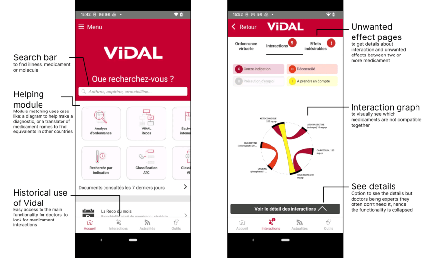
Key UX features:
I can’t say it enough — in healthcare UX, even small design flaws can lead to frustration, delays, or life-threatening mistakes. So here are the most common pitfalls to avoid:
The future of digital healthcare UX is all about the intersection of innovation and empathy. By focusing on accessibility, clarity, and thoughtful personalization, you can create products that support both patients and providers.
And at its best, great UX in healthcare isn’t just convenient — it saves lives.

LogRocket's Galileo AI watches sessions and understands user feedback for you, automating the most time-intensive parts of your job and giving you more time to focus on great design.
See how design choices, interactions, and issues affect your users — get a demo of LogRocket today.

Explore the core principles of GUI design and learn how consistency, simplicity, feedback, accessibility, and user testing contribute to better digital experiences.

After five years in UX, I revisited the Daily UI challenge to reconnect with hands-on design. Along the way, I learned that great interfaces come from thoughtful briefs, sound judgment, and user feedback, not just better AI tools.

Learn what makes a great login screen through real-world examples and UX best practices for creating secure, accessible, and low-friction authentication flows.

Skeuomorphism helped define early digital interfaces by mimicking real-world objects to make technology more intuitive. Learn how it compares with flat design and neumorphism, why it declined, and where it still has a place in modern UX.


