Marcus Bruzzo Marcus holds a Master Degree in Semiotics of Culture and in Media and Audiovisual Processes. Graduate degrees in Social History of Art and Communication and Semiotics. Marcus is Coordinator of Design and Digital Experience (UX) at FTD Educação, one of the biggest educational publishing companies in the world.

Recognition vs. recall: Leveraging cognitive processes in user interfaces

7 min read 2151 106

Recognition vs Recall

There are two main types of mnemonic manifestations — meaning, memory is not a homogeneous phenomenon. We have recognition and recall.

We’ve discovered relevant publications dating back to 1913, like the study “Characteristic Differences between Recall and Recognition.” It highlights how, until then, scientists concentrated on recall, ignoring recognition. Since then, both terms were solidified as types of memory: Google Scholar notes over 83,000 studies on recognition and recall.

How can we apply these studies to UX design? We can leverage the correct modality of memory for our users to guide them to make decisions. Let me show you what I mean.

Recognition vs. recall: What do these terms mean?

We nowadays settle on the definition that recognition is the ability to say that something is familiar while recall is the ability to remember specific information about it.

Another way of putting this is that recognition is the ability to distinguish something as having been experienced before while recall is the ability to remember specific details about that experience, and it focuses on the sixth point of the 10 Usability Heuristics for User Interface Design.

The keys to recognition and recall: Speed and cognitive load

While considering recognition and recall for designing good digital products, keep in mind (no pun intended) that they are influenced by speed and cognitive load. We can easily track speed and cognitive load with UX KPIs because they impact aspects such as:

  • Response time: Recognition is often faster than recall because it requires less effort to simply identify something as familiar. This can lead to faster response times for tasks that rely on recognition, such as searching for an item on a website or completing a form
  • Fatigue: Recall can be more mentally demanding than recognition because it requires more effort to retrieve information straight from memory. This can lead to fatigue, especially for tasks that require repeated actions of recall, such as learning a new menu or memorizing a list of items
  • Attention retention: Recognition can help keep users’ attention focused on a task because it provides a sense of familiarity and understanding. This can be especially important for tasks that are complex. Recognition can reduce cognitive load and prevent users from getting lost
  • Error rate: Recognition can reduce error rates because it helps users avoid making mistakes by identifying familiar items. This can be especially important for tasks that involve making decisions or completing complex forms

In addition to these KPIs related to speed and cognitive load, the proper use of techniques that trigger recognition and make good use of recall can positively affect:

  • Completion rates: Your user experience can be more pleasant or friendly and less intimidating depending on what you prioritize
  • Conversion rates: Naturally, a more familiarized flow renders a more statistically success-prone conversion system, such as making all steps of a purchase at once, or signing up for a service because it feels simple and familiar

Recognition rather than recall

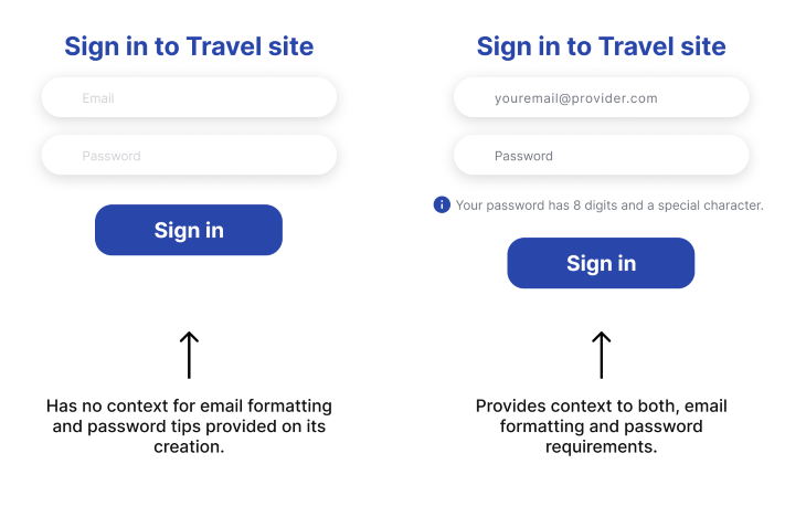
In the Usability Heuristics for User Interface Design, we read, “Recognition rather than recall,” and reasons abound. When users are faced with a task to perform, the less context they have to reconstruct through the process, the easier is the usability of such interfaces. This means that one of the most important aspects of the role of a UX designer is to provide users with signs that remind them of familiar experiences, rather than forcing them to remember (recall) contexts on how to make something.

Users should not have to be demanded to recall information because it means to build context and transfer it into action by itself. In the two-stage theory of memory (research and retrieve), it can be summarized as follows:

  1. Information must first be researched; that is, sought on the memory storage and discerned between an indefinite number of other discrete mnemonic elements. Then…
  2. Information is retrieved, meaning it has to be brought back into manifestations, such as language or thought

After that, it will be subjected to context, and a user will make a decision.

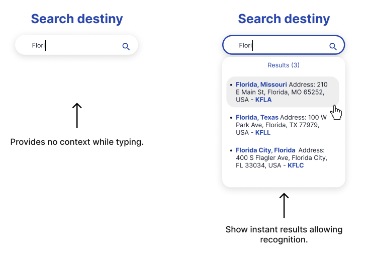
To recognize something, on the other hand, is to acknowledge that something is known because you are presented with partial elements of that one thing. We all know that feeling of “I know this,” even if you can’t remember how you know this. That is recalling in action.

A UX utopia would be a world in which designed applications are so friendly that they didn’t require retrieving information but only reacting to natural impulses. This is why natural language interfaces such as voice assistants are so highly valuable and, at the same time, so difficult to achieve.

In natural language, we reach a task starting from any familiarized phrase I have on my mind. For example, John and Mary both want to buy new shoes online:

  • John asks his assistant: “What are the shoes that you recommend to me?”
  • Mary asks her assistant: “Remind me what were the last 5 pairs of shoes I bought.”

For both, the system would consider purchase history in order to perform the task, but the inputs were highly personal approaches to the same question.

The characteristics of recognition

You can apply recognition techniques in user interfaces by good use of semiotics. Semiotics is the science that deals specifically with the forms of relations of things in cognitive processes. In semiotics, there are three main modes of relations:

  • Icon: When something resembles something else. Example: A picture of someone is an icon of the person, or the icon of the bin is the icon of a real life trash can
  • Symbol: When the relation between things is culturally constructed. For example, the white dove is a symbol of peace; it does not resemble peace, but its relation was culturally established instead. The bin icon is an icon of a real trash can, but in an interface, it is a symbol of deleting something
  • Index: When something directly causes something else. Though not so common for usability, indexes are signs that something happened, such as footprints. In UX, indexical signs can be elements that show that a form field was adequately filled, or a success message after submitting information, as well as other signifiers of states of the system that were directly caused by user actions

If the UX designer knows its users, he or she can easily define which signs will be at the user’s disposal in order to provide instant recognition of known contexts.

Contextualizing an interface with cues or signs guides users to your intended behaviors. Let’s see some ways you can use recognition to evoke a response in users.


How to apply recognition to UX design

  • Context images: These bring to mind popular hero images. Those first impression images on the top of interfaces are valuable elements that set the mood of what is to come, the level of seriousness or relaxed engagement. The openness of a fintech company or the rigidness of a state service website can be communicated via images that show certain modes of conduct, thus allowing the user to recognize its context of expected behavior.

Hero Image Examples

  • Illustrations: They can be in any stylistic variation, but the main point of using illustrations is to demonstrate collective imaginary situations that contextualize what is expected from the user.
  • Colors: While the objective impact of colors on cognition is a matter of endless discussion, we know for a fact that colors relate to specific cultural circumstances; thus, colors are symbolic signs (conventionalized). Bright, colorful interfaces and elements are great ways to relate to children, fun, leisure, vacation and other contexts, thus allowing the user to recognize past experiences with such colors. Every industry has culturally established common colors, and though they change over time and geographic context, studying and employing such trends is a way for UX/UI designers to increase recognition.
  • Typography: Similarly to the case of colors above, typographical elements also culturally relate to contexts and help recognition, setting expectations and triggering desired behaviors.
  • Icons: As the term itself implies, icons are the fundamental particle of recognition, as they are the simplest form of relation between image and thought. Icons operate through similarity, meaning that I show something that resembles something else, so the recognition is instant.

Icons Example

  • Text: Well placed texts such as small paragraphs or tooltips allow users to recognize contexts and comply with demands, such as identifying form fields, uses of tools, next steps, and providing guidance.
  • Walkthroughs: Walkthroughs are great techniques for user onboarding, demonstrating key elements of the app that summarize its functioning core. Utilizing images and texts, these features familiarize users with a new app, because they bring elements from other apps, known or established mechanics, and other everyday, friendly elements.

Walkthrough Example

  • Tutorials: For more complex forms of interaction, such as new immersive technologies and games, a great way to create instant familiarization is to start any experience with a preliminary simple task that gradually teaches the basic mechanics with recall actions, such as moving, grabbing something, looking around. Generally, these introductory lessons are embedded in the experience with ludic context that folds the actions into the original narrative. The narrative may be new to the user, but the actions I have to perform are a blend of previously known actions that I only need context to recall.

The characteristics of recall

To recall is to build up information without context being given. In other words, recall asks you to retrieve information from memory without any cues being provided. We’ve spoken about why this is less ideal than recognition, but sometimes it’s necessary.

Examples of recall in UX design

In user interfaces, recall is commonly related to open fields in forms, where the interface cannot provide sufficient information and it is fully dependent on the user’s memory. Open fields such as:

  • Passwords: When users are expected to remember their own passwords, these open fields are extremely prone to problems. Users themselves set personal strategies to help recalling passwords (or simply save them through their browser), but considering the level of difficulty to retrieve such information, UX designers commonly place hints beside the password fields as a technique to move from recall to recognition and thus simplify the retrieval of information. For example: if I remind you that this password is the one that requires eight digits, one number, and one special character, you probably have one for this context. With the context I provide, recall becomes recognition.

Travel Site Sign-in

  • Search bars: These are especially interesting. Naturally, they are open fields that expect the user to type anything on them, and anything is a lot of possible things. Though ever more rare, there are search bars that still do not provide autocomplete predictions (which, again, transforms recall into recognition) and thus expect the user to recall the exact terminology that may display a successful search result.One curious aspect of search bars being a recall feature is that a menu can be considered as its correspondent feature, but for recognition. Because menus provide contexts with hierarchization (sections like the aisles of a supermarket), they guide through constant lines of recognition. The list of departments on a supermarket list are ordinated with big semantic fields such as home, sports, and personal care that are familiar to everyone, and inside each of these larger fields, we find ever narrower options until you find a specific product.

Search Results Example

Usability testing and evaluation

In order to register the effectiveness of using techniques for recognition instead of recall, we must center our KPIs around time to completion as a metric. We can subdivide “completion rate” as the percentage of people capable of finishing a proposed user journey (funneling) by measuring:

  • Time they take for each task: the flow consists of several smaller tasks that must be individually measured in duration. Strategies of enriching contextualization must be applied to each discrete task
  • The error rate: the loops in journey versus the predominance of “straight” journeys
  • Metrics acquired through qualitative analysis such as in-depth interviews

Your project needs clear usability tasks defined as tags to be tracked. Apart from that, developing systems that aim on recognition recall instead are hypotheses that can be evaluated with usability testing, more specifically A/B tests.

Conclusion and key takeaways

We can securely say that recognition and recall are fundamental cognitive processes in designing user interfaces. Prioritizing recognition over recall can lead to more efficient and user friendly digital products.

By understanding the importance of contextual cues, semiotics, and mental models, UX designers can create interfaces that facilitate recognition, ultimately enhancing the overall user experience. Usability testing and evaluation are crucial for validating the impact of recognition techniques and guiding future design decisions based on proven insights.

LogRocket: Analytics that give you UX insights without the need for interviews

LogRocket lets you replay users' product experiences to visualize struggle, see issues affecting adoption, and combine qualitative and quantitative data so you can create amazing digital experiences.

See how design choices, interactions, and issues affect your users — .

Marcus Bruzzo Marcus holds a Master Degree in Semiotics of Culture and in Media and Audiovisual Processes. Graduate degrees in Social History of Art and Communication and Semiotics. Marcus is Coordinator of Design and Digital Experience (UX) at FTD Educação, one of the biggest educational publishing companies in the world.

Leave a Reply