Subscriptions are everywhere these days.
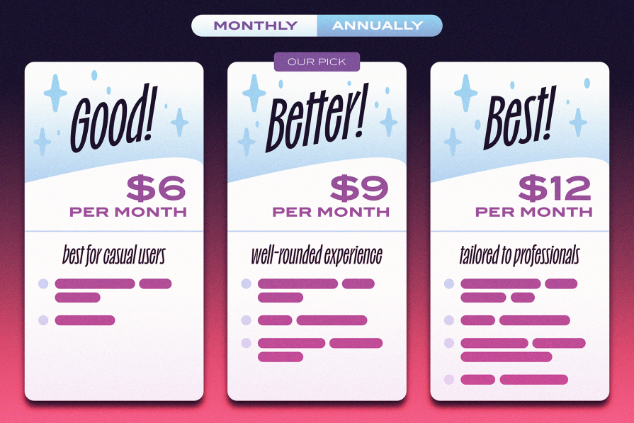
From the big names like Netflix, HelloFresh, and Amazon Prime to the more niche ones, like car features unlocked by a monthly fee or olive oil delivered to your door — companies are leaning into subscriptions over single purchases, and it’s easy to see why. The model provides predictable revenue, fosters loyalty, and builds long-term relationships — all driving profitability.
Chances are, you’re subscribed to at least one service, be it for streaming, meals, or personal care.
What does this mean for you?
It means that as subscriptions become a fundamental revenue stream, businesses need to focus on designing excellent user experiences that keep subscribers engaged and satisfied.
A well-designed subscription flow can simplify decision-making, boost retention, and build loyalty, while poor design can frustrate users, leading to cancellations and churn. After all, it’s cheaper to keep current customers than to attract new ones. And the market is already saturated with subscription services. So, good ecommerce subscription UX design is no longer just a nice-to-have; it’s a critical factor in standing out from competitors.
Potential customers will simply walk away if the process is too complicated or unclear. There’s plenty of competition out there, so why wouldn’t they? On the other hand, a well-designed page that communicates the benefits clearly will keep users engaged, build trust, and encourage them to complete their purchase.
As more businesses join the subscription bandwagon, it’s important to stand out with a smooth, clear, and user-friendly experience. It’s not just about getting sign-ups; it’s about keeping people hooked for the long run.
Are there ethical considerations when designing a subscription experience? I think so.
As businesses aim to increase subscriptions, I think it’s important that designers act as the bridge between the interests of the business and the interests of the user.
Some might say that to be an empathetic designer who creates ethical experiences, you’ve got to consider all angles — delivering a service that’s transparent, fair, and respects privacy. Are you a user experience designer if you don’t?
That doesn’t stop some companies from using certain tactics to extract as much revenue as possible from users.
Dark patterns involve manipulative tactics to trick users into subscribing or making it difficult to cancel. Examples include hiding cancellation options deep in settings or, even worse, expecting the user to email or call to cancel.
I recently had an experience with a small SaaS platform that left me questioning their approach. Instead of focusing on how the service could benefit me professionally, I found myself frustrated by how difficult it was to cancel.
Was this just an oversight on their part, or something more deliberate? It almost felt like they hoped I’d give up and stay subscribed, keeping the payments rolling in. It’s hard to say if it was intentional, but it certainly left a bad impression.
The concept of dark patterns within UX is a well-studied field, with various examples showing how design can be manipulated to trick or pressure users into actions they might not intend.
Let’s have a look at some of those tricks:
This happens when signing up for a service is simple, but canceling it is a frustrating, complicated process. My bad experience with that SaaS platform likely falls into this category. These services bury the cancel option in settings or add unnecessary steps to complete the process.
It’s one of the most common dark patterns out there.
A common trick where free trials automatically roll into paid subscriptions without clear reminders, making it hard to opt out before you’re charged.
It’s only when an outgoing transaction appears in your banking app that you realize you forgot to cancel that pesky subscription!
Users are caught off guard and pressured to complete the purchase when extra fees (like shipping, taxes, or additional charges) are only revealed at the last step of checkout. This is a form of entrapment, especially after long checkout processes.
Are you likely to accept the additional costs or abandon your purchase entirely?
When interface design intentionally draws your attention to one action while hiding or minimizing the less profitable option.
An example is using bold, bright colors for the “upgrade” button while making the “continue with basic” option tiny or gray. This practice is likely as prevalent as the roach motel dark pattern and is often seen as standard behavior.
Guilt-tripping users into taking a particular action by framing the decline option in a way that makes them feel bad. For example, a pop-up with options like “Yes, I want to save money” and “No, I like wasting my money.”
When additional items or services are automatically added to your cart without your explicit consent. For instance, pre-checking options for add-ons, like product insurance or donations.
Tricking users into sharing more information than they realize, often by hiding privacy settings behind convoluted menus or using vague language that misleads users into thinking they’re keeping their data private.
Ads that are made to look like part of the content, such as search results or articles, trick users into clicking on them without realizing they’re ads.
These unethical practices can damage user trust over time.
When users feel manipulated, it harms their relationship with the brand. Trust is essential for building long-term loyalty. Ethical design means being upfront about pricing, giving clear instructions on canceling, and respecting user choices.
It means, as a designer, having the courage to point out when these tactics are used and to advocate for fairness over slippery, deceitful patterns.
These tactics might lead to quick financial wins for companies, but they’re not sustainable. Frustrated users will eventually seek out alternatives. By prioritizing ethical principles, businesses can foster stronger customer relationships and reduce churn.
From a business perspective, designing an effective subscription page is all about conversion. It’s not just about attracting visitors but converting them into paying customers. A well-optimized subscription page must grab attention quickly, clearly communicate value, and guide users through the sign-up process seamlessly.
This means using catchy headlines, convincing copy, and attractive visuals that showcase the perks of subscribing. Adding social proof, like customer testimonials or user reviews, can boost credibility and nudge potential subscribers to subscribe.
To create high-converting subscription pages, it’s key to have clear and upfront pricing, showcase the benefits of subscribing, and make the sign-up process as simple as possible to reduce friction. The more transparent and user-friendly the design, the higher the conversion rates.
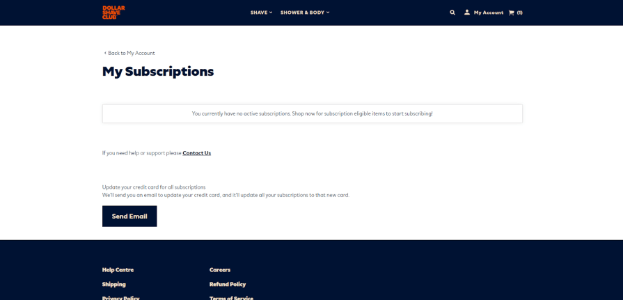
A great real-world example is Dollar Shave Club:
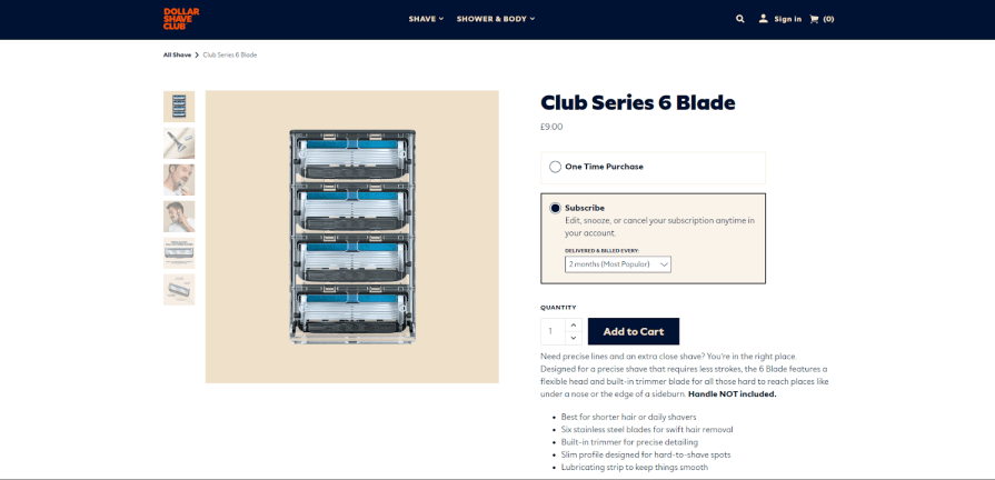
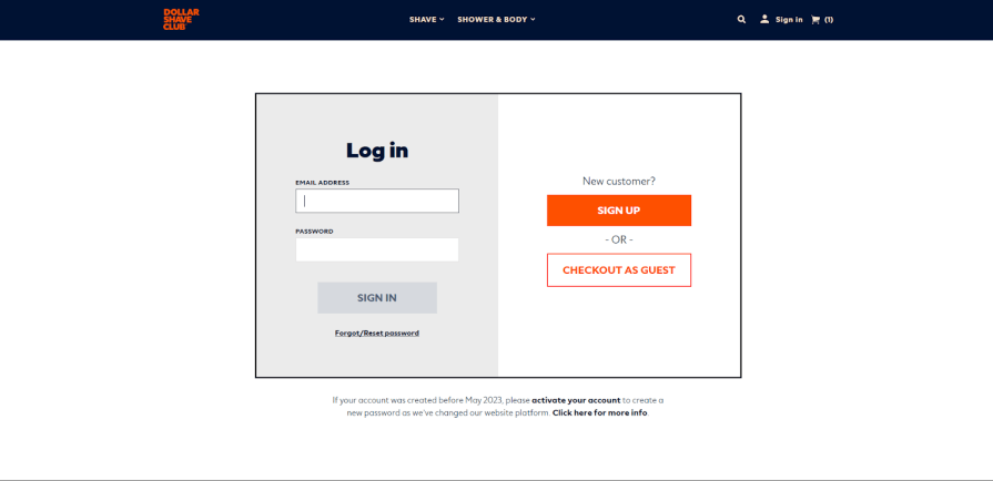
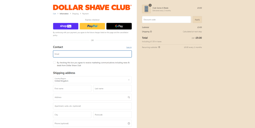
Their subscription page is simple and straightforward and highlights the benefits of subscribing, such as convenience and savings. They also make it clear what users will pay and what they’ll get in return. By focusing on the user’s experience and minimizing confusion, they boost conversions and customer satisfaction. It’s all about providing a service that is more empathetic and more enjoyable than buying razor blades in your local convenience store.
If you want to create a good subscription experience, here’s what you need to do:
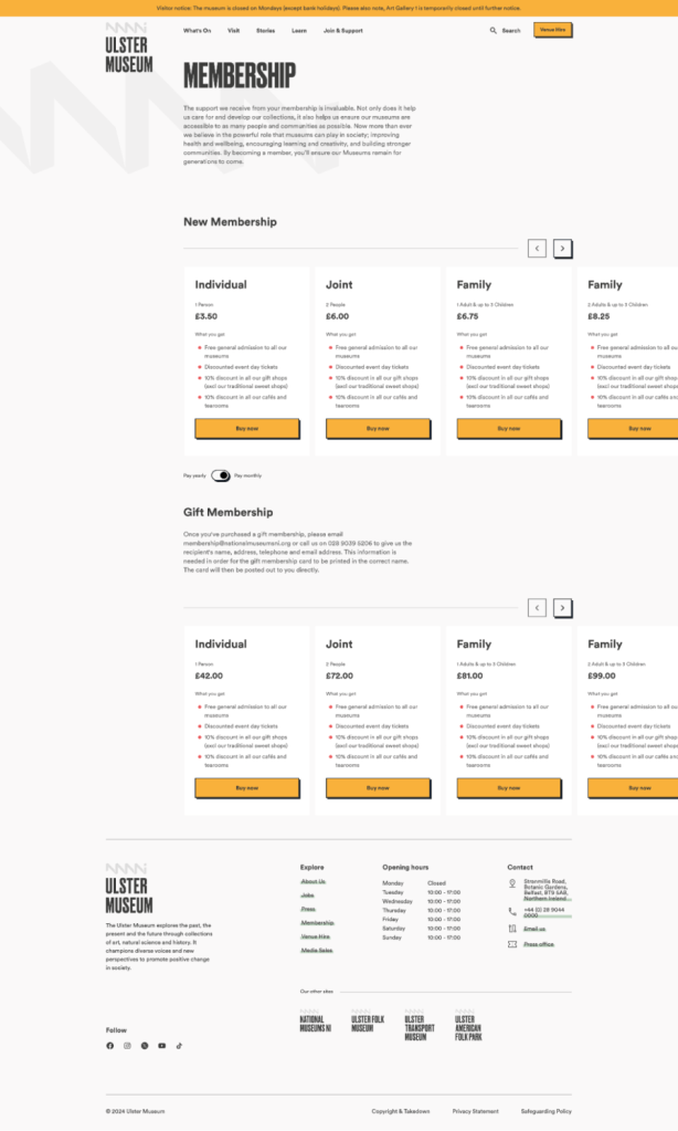
The Ulster Museum is a good example of this. Notice how the tiers are denoted, along with clear calls to action. Users can toggle to pay yearly or monthly.
Avoid unnecessary redirects and ensure the page loads quickly, especially on mobile devices. Slow load times can kill conversions.
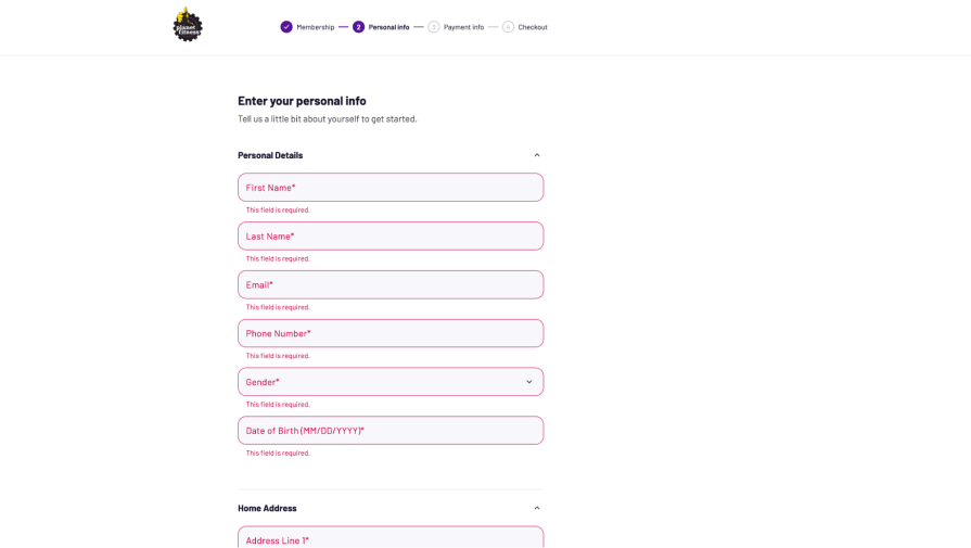
Planet Fitness’s sign-up process uses inline validation, guiding users to any fields with incorrect information as they go.
Inline validation is usually more effective than validation that appears only after submitting the form because it provides immediate feedback, helps users correct mistakes right away, and reduces frustration by preventing multiple submission attempts.
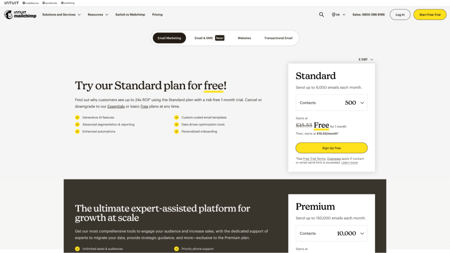
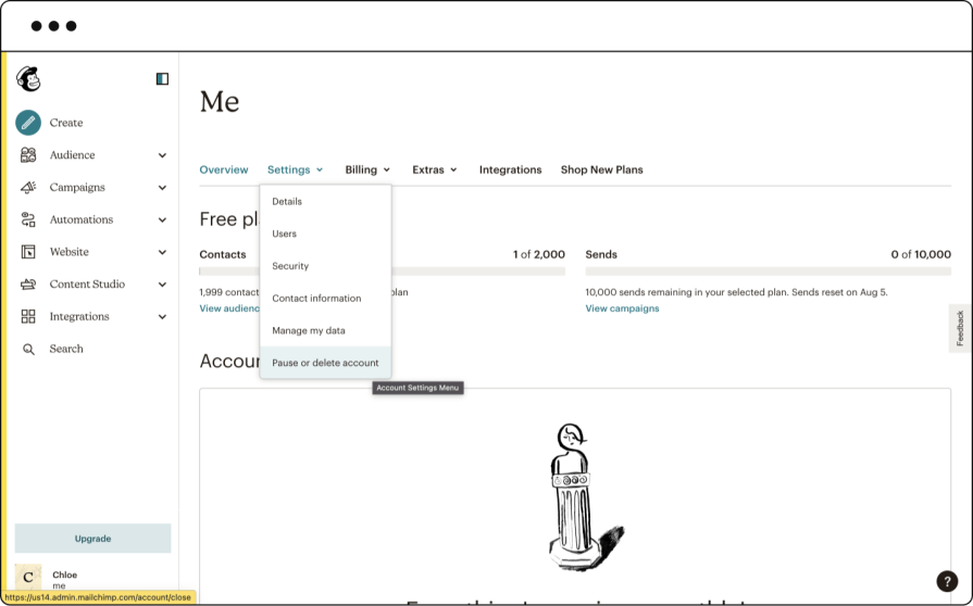
Mailchimp is another excellent example of a subscription process that’s easy to understand from the beginning because it uses clear, actionable CTAs that stand out against the rest of the page. Their cancellation policy is also easy to understand, with the implication of doing so clearly explained within the settings tab of the control panel.
There is no manipulative copy persuading you to stay, no tactics that require you to contact sales and just a straightforward cancellation process. Making it easy to cancel a subscription is super important—read on to find out why.
How often have you signed up for a trial subscription service, ready to give it a fair shot, only to find there’s no easy way to cancel? While it’s becoming less common, it still happens — and it completely shifts a user’s mindset from wanting to explore the service to losing all interest.
We’re long past the ’90s when canceling a service often meant making a phone call or sending an email. A crucial aspect of subscription UX today is ensuring the cancellation process is straightforward — as frictionless as signing up.
In fact, the US Federal Trade Commission (FTC) has implemented a ‘click to cancel’ rule to simplify the process of ending subscriptions. This regulation will require companies to ensure that both signing up for and canceling subscriptions are equally straightforward.
Businesses may worry about losing subscribers, but making cancellation difficult can lead to frustration, negative reviews, and, ultimately, higher churn rates. Users who feel trapped in a subscription are less likely to return.
This is where Reactance Theory comes into play. It suggests that people value their freedom to choose. When they feel that freedom is threatened, they become uncomfortable and often resist those restrictions, sometimes doing the opposite of what’s imposed.
Companies like Amazon or even Mailchimp, as shown above, get this right by offering a simple cancellation process, allowing users to manage their subscriptions in just a few steps.
This fosters trust. When customers know they can cancel easily, they’re more likely to subscribe in the first place, confident they won’t be locked into something they can’t escape.
Users want to let users cancel easily because:
Businesses fall into several pitfalls when designing subscription pages. These can include unclear pricing models, excessive options that overwhelm users, or hidden fees that only become apparent after sign-up.
It’s important to clarify that these issues should not be confused with dark UX patterns, as they can erode trust and deter potential subscribers.
Nothing kills a potential sign-up faster than a form that feels like it’s asking for your life story.
When users have to click through multiple pages or fill out a lot of required fields (especially ones that feel unnecessary), they’ll likely think, ‘Forget this!’ and bail.
Think about it. How many times have you quit signing up for something because it just felt like too much work?
Keep it simple. Ask for just the essential info upfront — usually email, password, and maybe a name. You can always collect more details later when users are actually invested in using your product.
Let’s be real. Nobody likes feeling tricked about money.
When companies bury their pricing in fine print or play games like hiding the ‘real’ cost until you’re deep in checkout, it’s a major trust-killer. You’ve probably been there before — thinking you’re signing up for $9.99/month, only to discover random fees, minimums, or that the price triples after some ‘special intro period.’
Sneaky stuff like this might hook a few customers short-term, but they’ll probably feel burned and tell their friends about it, too. Be upfront about your pricing from the get-go — display it clearly, explain any terms in plain English, and skip the “Gotcha!” moments. Sure, you might get fewer initial sign-ups, but the customers you get will stick around and trust you.
When customers have to jump through hoops to cancel a subscription — whether it’s buried settings, forced phone calls with retention teams, or complicated multi-step processes — it creates lasting damage.
While these friction points might temporarily keep some subscribers, they ultimately backfire. Frustrated customers often resort to disputing charges, leaving scathing reviews across platforms, and warning others away from the service.
This negative word-of-mouth can far outweigh any short-term retention benefits. Instead, a clear, straightforward cancellation process shows respect for customers and often leads to better long-term outcomes. Some may even return later or recommend the service to others, specifically because they had a positive experience from start to finish.
Remember, dark patterns are deceptive on purpose. If that’s the case in a situation like this, you’re dealing with a roach motel or forced continuity.
While offering choices is good, overwhelming customers with too many subscription tiers and complex feature matrices can backfire. When faced with a wall of options, pricing tables, and feature comparisons, many customers freeze up — it’s called analysis paralysis.
Consider a customer staring at six different plans, each with slightly different features, limits, and price points. Instead of making a choice, they’re more likely to postpone the decision or abandon it entirely.
The solution?
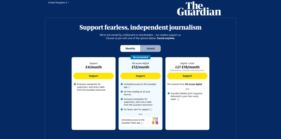
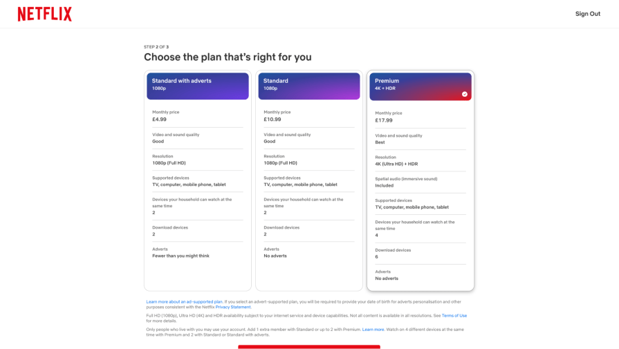
Streamline options to 2–3 clear tiers, highlight a recommended choice, and communicate the key differences between plans. Think about how Netflix keeps it simple with Basic, Standard, and Premium — each with obvious differences in video quality and number of screens. This makes the decision process smoother and helps customers feel confident in their choices.
With over half of web traffic now coming from mobile devices, a subscription flow that is not mobile-friendly is leaving serious money on the table.
Mobile users face unique challenges — smaller screens, touch interfaces, and often spotty connections. When they encounter tiny text, forms that don’t fit their screen, hard-to-tap buttons, or keyboard types that don’t match the required input (like showing a full keyboard for a numbers-only field), they’re likely to give up.
An optimized mobile subscription flow accounts for these limitations. It features larger touch targets, simplified forms that minimize typing, appropriate keyboard types, clear error messages, and a streamlined process that works smoothly even on slower connections.
When they get this right, some successful companies even report 40–50 percent of their subscriptions coming from mobile users.
When customers hit a snag during subscription sign-up, not having readily available support can quickly turn interest into frustration.
Consider someone ready to subscribe but has questions about plan features, encounters a payment error, or needs help with account setup. They’re likely to abandon the process entirely if they can’t find immediate assistance — whether through live chat, clear contact information, or well-placed help resources.
Effective support during subscription sign-up isn’t just about having a help center link buried in the footer. It means providing contextual help at key decision points, offering real-time assistance for technical issues, and making support options visible throughout the process.
Companies that excel at this often see higher conversion rates and start their customer relationships on a positive note, setting the stage for longer-term loyalty.
When asking customers to commit to a subscription, especially for a new or unfamiliar service, social proof and security indicators play a crucial role in building confidence. Potential subscribers often look for validation that others have had positive experiences and that their personal and payment information will be secure.
Missing these trust elements — whether verified customer reviews, testimonials from recognized names, security certificates, payment protection badges, or money-back guarantees — can create hesitation at a critical moment.
Research shows that displaying trust indicators can increase conversion rates by 40 percent or more. Particularly effective are specific, detailed reviews that address common concerns, industry-standard security badges (like SSL certificates and secure payment icons), and testimonials from relatable customers rather than just big-name clients.
A clean, intuitive interface serves as the foundation for successful subscription conversions. When users encounter a messy layout, confusing navigation, or excessive elements competing for attention, they can quickly become overwhelmed or frustrated.
Think of it like walking into a disorganized store — if you can’t easily find what you need or understand the pricing, you’ll likely walk out.
The most effective subscription interfaces follow a clear visual hierarchy, with essential information and actions prominently displayed. They guide users through a logical sequence: present the value proposition, show pricing options, collect necessary information, and complete the transaction.
Each step should flow naturally to the next, with unnecessary elements removed and important details (like pricing, features, and calls-to-action) standing out clearly against a clean background. Data shows that streamlined interfaces can improve conversion rates by 20 percent or more.
User feedback, even when critical, provides invaluable insights for improving subscription services. When companies dismiss or fail to systematically analyze customer complaints, suggestions, and usage patterns, they miss crucial opportunities to enhance their offering and prevent subscriber loss.
Common patterns in user feedback often reveal systemic issues that might not be obvious internally — whether confusion about billing cycles, feature requests that keep surfacing, or friction points in the user journey. Smart companies treat this feedback as a goldmine of product development insights.
They establish clear channels for collecting design feedback, regularly analyze patterns in customer communications, and — most importantly — act on these insights to refine their subscription experience. Particularly valuable are exit surveys from canceling subscribers, as these often highlight specific pain points that drive customers away.
Companies that actively engage with user feedback typically see higher retention rates and can often turn frustrated customers into loyal advocates by demonstrating they’re listening and responding to concerns.
Good subscription UX is about balance.
Businesses want to increase subscribers, but this shouldn’t come at the cost of transparency or user experience. The best designs are user-first, ethical, and clear, creating a smooth path for customers to subscribe while feeling in control of their choices.
Subscription ecommerce sites that follow strong design principles tend to be the most successful, reflecting a commitment to fairness and real value across the company.
Long-term success in ecommerce subscription models comes from building trust and loyalty through design choices that prioritize the user, not just the bottom line. A well-designed subscription page can lead to happier customers and more sustainable growth.
As a UX designer, that’s a notion that I can subscribe to.
LogRocket's Galileo AI watches sessions and understands user feedback for you, automating the most time-intensive parts of your job and giving you more time to focus on great design.
See how design choices, interactions, and issues affect your users — get a demo of LogRocket today.

The checkbox is one of the most common elements in UX design. Learn all about the feature, its states, and the types of selection.

Optimization fatigue is real. Here’s why designing only for metrics drains creativity, and how to bring the human back into UX.

Let’s explore why and when to use drag and drop, discussing real-world examples, platform-specific considerations, and accessibility tips.

We’re told to reduce friction, but sometimes friction builds value. This blog explores how scarcity, when designed well, sharpens focus and strengthens user trust.