What do registration pages and gift boxes have in common? They both represent a gateway to valuable and exclusive content. And just as you would choose an appealing container for a precious gift, your registration page should reflect the value of the content users will gain access to.

However, it’s not always that easy. Without a solid idea of what makes a compelling registration page, attempts to get it right might fall flat.
This article will explore some common reasons why registration pages fail. But that’s not all — we’ll also analyze examples of successful registration pages from prominent companies to uncover valuable lessons in their design.
So you’ve put a lot of effort into designing your product. Naturally, you expect users to scramble through the gateway. But instead, you get crickets.
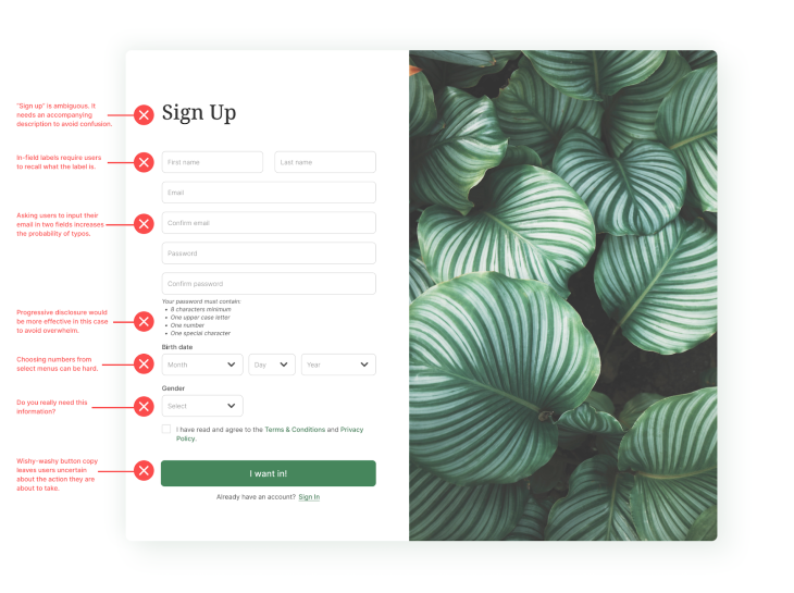
Conversions are trickling rather than pouring in, and you’re wondering why. Well, it’s most likely that you’ve made one — or more — of the following rookie mistakes:
There’s hardly ever a scenario where you genuinely need users to list their life history before signing up for a product. So why put them through the hassle? Asking for excessive information can overwhelm and frustrate potential users, leading to form abandonment. Therefore, it is crucial to stick to a minimalist approach. Only ask for what is necessary to start with. You can always ask for additional information later on.
Users shouldn’t struggle to figure out how to gain access to your product. That’s what CTA buttons are for. So, place CTA buttons at that level of importance — visually and hierarchically. Also, ensure the button copy is clear and action-oriented, leaving no room for ambiguity.
Users don’t like to puzzle over how things work. Without clear instructions during the sign-up process, you risk raising question marks in their minds. Make the sign-up process easy for your users by letting them know the necessary steps, password requirements, and specific formatting guidelines.
A sign-up form without effective error prevention and correction measures can frustrate and confuse users. And a frustrated user would most likely drop off. To minimize this, provide users with concise, clear, and specific error messages that guide users on how to resolve the issue.
Many users prefer quick and hassle-free sign-up methods. If you don’t include social login options, you might be limiting the convenience of your platform. Always give users options to sign up with Google, Facebook, etc.
Okay, we’ve looked at some things you shouldn’t be doing. But what are the things you should actually be doing? We can learn that by looking at registration page examples from some companies that have nailed it. So, let’s dive right in!
First on our list of sign-up pages that hit the right notes is Medium. Their registration process is as simple as it gets. Little wonder more than 63 million people have been through the sign-up process.
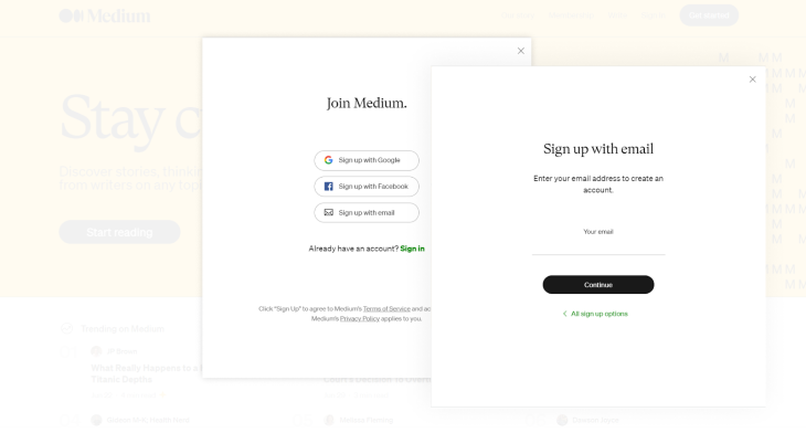
Once you click the Get Started button on the homepage, a registration form pops up. The form’s headline is clear and straightforward: Join Medium, and the layout is minimalistic. But wait, there’s more.
What’s most interesting about the registration process is that the first element you interact with is a call-to-action, not an input field like most registration forms. You have three options: signing up with Google, Facebook, or using your email. This immediate call to action helps capture your attention, increasing your likelihood of signing up. What’s more, if you choose the email route, you’ll only need to fill out one input field: your email.
Nice one, Medium! No one likes filling out long forms. We only wish other companies take a cue from you.
The designers at Adobe sure know a thing or two about reducing the cognitive load on users, and this is evident in the simplicity of their registration process. They use simplified forms, progressive profiling, and social media login options to avoid information overwhelm. To understand how they do this, let’s analyze a screenshot of their registration process:
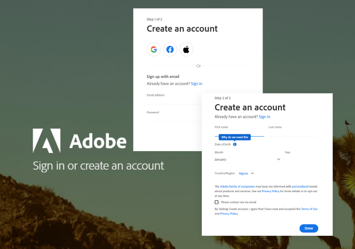
The first thing they offer is an option to sign up via socials. Users can save time by signing up with their Google, Facebook, or Apple accounts. But if a user chooses to go through the traditional route, registration is still a breeze.
The registration process consists of two steps. Each step features a simple form with only a handful of input fields. By dividing the process into these smaller steps, they prevent users from being overwhelmed by the sight of multiple input fields — this technique is called progressive disclosure.
Also, did you notice how they answer questions regarding why they need some sensitive information? Adobe sure has a lot to teach us about creating excellent registration pages.
With almost 233 million paid subscribers globally, Netflix must be doing something right. And it’s safe to say their registration process is one of the many things they’re doing right. From the visuals to copy, Netflix’s registration process is spot on.
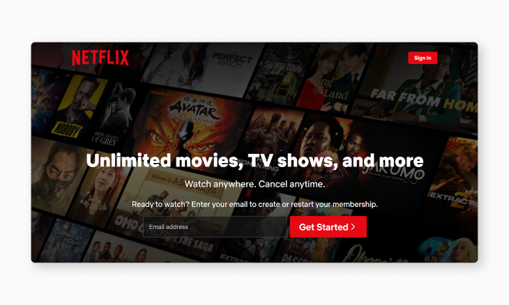
First off, this platform’s value proposition is as clear as day: “Watch unlimited movies, TV shows, and more.” To motivate users to take action, they also use persuasive copywriting such as, “Ready to watch? Enter your email to create or restart your membership.”
And it doesn’t end there. As you go further into the registration process, you’ll see playful statements like, “We hate paperwork too.” Talk about empathizing with the user. And, oh! Did we forget to mention the posters of some of the most sought-after movies and shows in the registration page background?
It’s safe to say that Netflix has a knack for engaging potential users.
Another company that we all need to learn from is Slack. Every day, a staggering 1.5 billion messages are sent on the platform. But that doesn’t come as a surprise. With a registration process as smooth as Slack’s, who wouldn’t want in on the action?
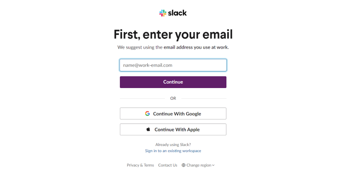
Slack’s registration page uses a clean, minimalistic design that prioritizes clarity and simplicity. Without any unnecessary elements to distract users, they can focus on the task at hand: signing up. And that’s not all.
The registration process is streamlined, eliminating any unnecessary steps. The first form you see requires only one input: your email. They also provide clear instructions to minimize the chances of errors.
There’s also the option to skip filling out any form. You can sign up with your Google or Apple accounts. Now, that’s as frictionless as a registration process can get.
So we’ve looked at the registration pages of four prominent companies. But what do all these pages have in common? A whole lot, actually. Let’s look at some of them:
All four registration pages prioritize simplicity in their layout and information architecture. Some common themes include clean design, minimal input fields, and a clear information hierarchy. As a result, there is less cognitive load on users, and the registration process is as easy as possible.
Almost all the examples we discussed offer social media login options. By including these options, they reduce friction by leveraging existing user credentials.
Notice how none of the registration pages use vague headlines like “Sign up.” Instead, they opt for clear, specific headlines that convey the purpose and value of signing up.
And above all, they put the users front and center. Every good design starts with empathy. Always keep that in mind.
Take a cue from these prominent companies. Optimize your registration processes by reducing cognitive load and cutting friction to the barest minimum. By eliminating these possible barriers to entry, you can improve conversion rates and create a seamless onboarding experience for all users. Leave the gateway open and watch users troop in.
Header image source: IconScout
LogRocket's Galileo AI watches sessions and understands user feedback for you, automating the most time-intensive parts of your job and giving you more time to focus on great design.
See how design choices, interactions, and issues affect your users — get a demo of LogRocket today.

I’ve spent enough time designing with WCAG 2.2 to know it’s not enough. Here’s why I’m skeptical and cautiously hopeful about WCAG 3.0.

I learned this lesson the hard way. Good UX doesn’t survive endless approval loops. Here’s what went wrong — and how to protect your vision.

I’ve reviewed “final” designs more times than I can count — and the copy almost always gives users a reason to hesitate.

The checkbox is one of the most common elements in UX design. Learn all about the feature, its states, and the types of selection.