When designing a streamlined UX, sometimes you need to provide additional information to your users that isn’t immediately visible from the main page. This helps reduce the amount of clutter a user sees, while also ensuring that they know how to use the various elements you provide. One way to do this is through tooltips.
Tooltips display contextual information about UI elements when users interact with them. A user typically triggers one by hovering over or clicking/tapping on UI elements. The tooltip then disappears once the user moves away from the target location.
To help you get the most out of tooltips, this post covers:
Editor’s note: This article was updated by Oscar Jite-Orimionoon on 23 April 2025 to cover best practices, show real-world examples, and offer detailed comparisons of tooltip use cases in different UI contexts.
Tooltips display additional or contextual information about a specific UI element and are always paired with the associated element. They are sometimes described as popovers but are mostly considered a separate component.
There are two forms of tooltips:
Plain tooltips contain only text and briefly describe the function or actions of unlabeled icon buttons. For example, plain tooltips label the icons on the Windows taskbar when you hover over them on a desktop:
Rich tooltips have more detail and can describe the value of a feature:
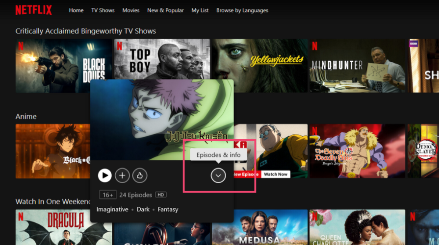
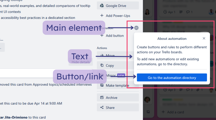
Rich tooltips can also contain a title, links, and buttons. They’re typically triggered by clicking/tapping rather than hovering over the main element and tend to be persistent:
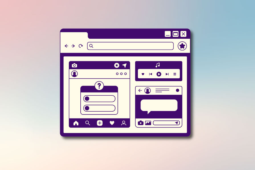
Tooltips are primarily used for unlabeled icon-only buttons. They can be used for labeled buttons only to provide more context:
On desktop applications, hovering over an icon is the most common method to trigger a tooltip. You can also trigger them with the tab key or by clicking an icon. On mobile, you tap or long-press an icon to trigger a tooltip.
Tooltips are easy to dismiss by moving away from the UI element or triggering another tooltip. On mobile devices and with persistent tooltips, you might need a second click or tap to dismiss.
Tooltips help users navigate an interface, so they must be designed properly to avoid confusion. Let’s explore some best practices for designing better tooltips.
Tooltips are easy to miss or ignore because they’re transient and don’t interrupt a user’s flow or task. They typically disappear 1.5 seconds after you move away from them. Don’t use tooltips for critical information, warnings, or anything vital for task completion.
Critical information should always be prominently visible on the screen for users and shouldn’t be hidden in a tooltip. Examples include error messages when you enter the wrong password, confirmation messages when you make a payment, security warnings, and more.
Make sure to use an interruptive modal dialog or alert instead for these kinds of scenarios.
Tooltips should contain as little information as possible. The content should be in sentence case, concise, direct, and in clear, simple language. Users should immediately understand the purpose of the triggering element.
Avoid wrapping the text in plain tooltips into multiple lines and don’t include too much information in rich tooltips. If it has a title, it should be brief and on a single line.
Don’t include obvious information in a tooltip, like repeating the text on a button or adding it to a recognizable icon, like social media icons. Only use them to provide additional information in scenarios where the user could misinterpret an element’s function.
Adding redundant information in a tooltip can waste users’ time:
Only one tooltip should be displayed at a time. Triggering another tooltip should immediately close any active tooltip.
Tooltips should always be placed close to the element that triggered it. It shouldn’t obstruct the element or other UI elements on the page:
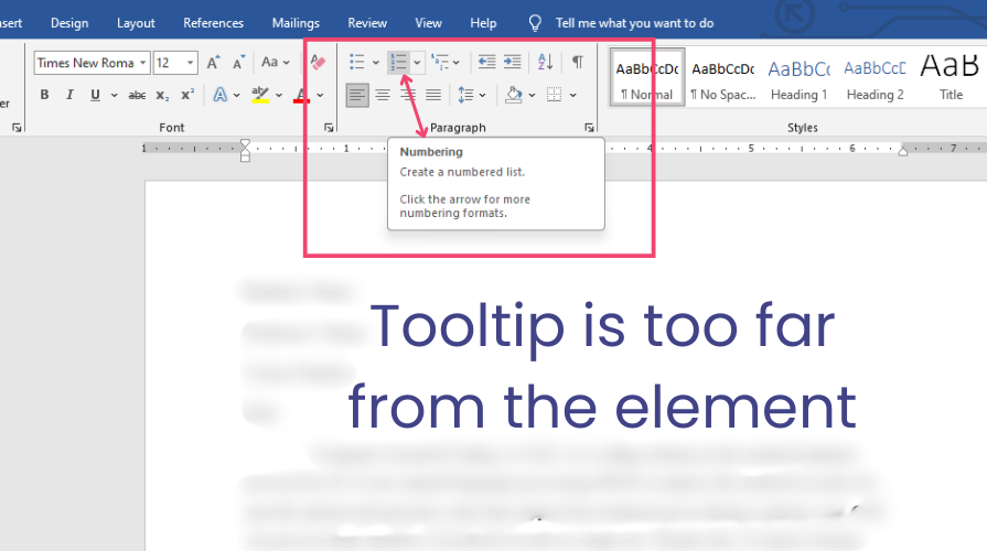
If you use arrows on the tooltip, ensure they point directly to the triggering element. It should always be clear where a tooltip came from.
Tooltips should be dynamically positioned to avoid going off the screen and appear directly below the element if it’s on a topbar or directly above if it’s on the bottom. Ensure the tooltip adjusts its position to the top-right, bottom-right, and so on if the element is positioned at a corner.
Try to limit tooltips to icon-only buttons. If you require many tooltips, consider clarifying the design so it’s less confusing. Over-reliance on tooltips can clutter the UI.
Tooltips should appear immediately but not disappear too quickly. They should stay on the screen long enough for the user to receive the information. Avoid excessive delays and use simple and smooth fade animations to enhance UX. Extra or excessive motion can be distracting.
A tooltip should only be as big as its content. It should contrast well with the background without obstructing other UI elements. Use readable fonts for the tooltip’s content to ensure proper visibility.
Now that you know some best practices and mistakes to avoid when designing tooltips, let’s compare use cases in different scenarios. Tooltips have the same general function but can serve many purposes depending on where they’re used.
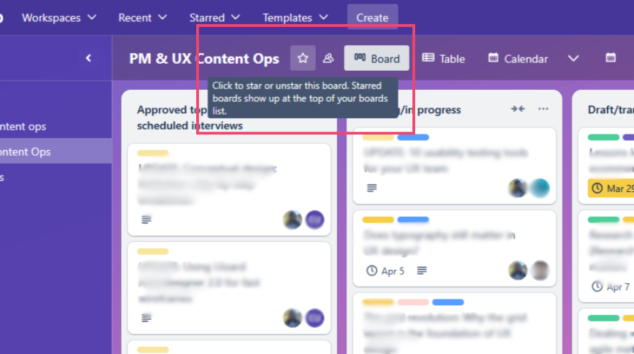
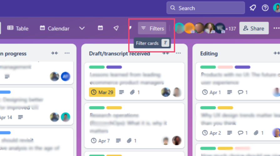
You’ve already seen some examples of tooltips from Trello that fall under this category. Other popular management apps include Asana and Airtable. Tooltips can show information about tasks and deadlines.
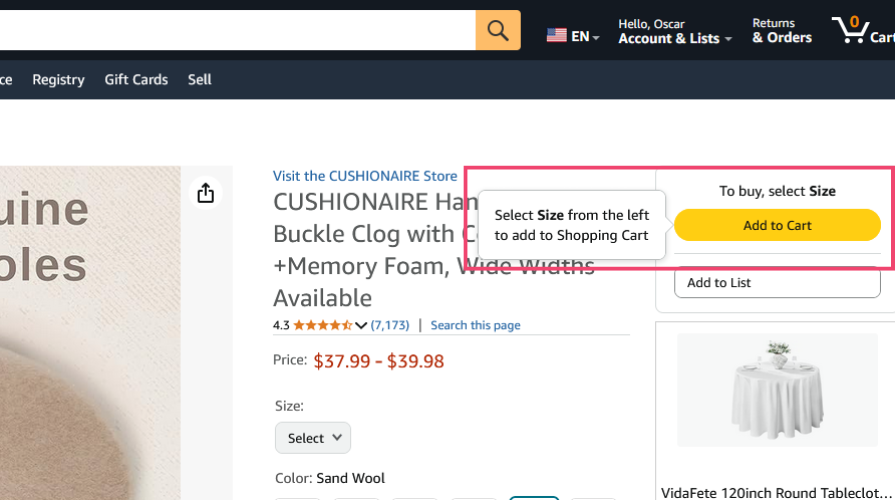
Tooltips can display product highlights, sizes, or descriptions. They can also show information about items in your cart:
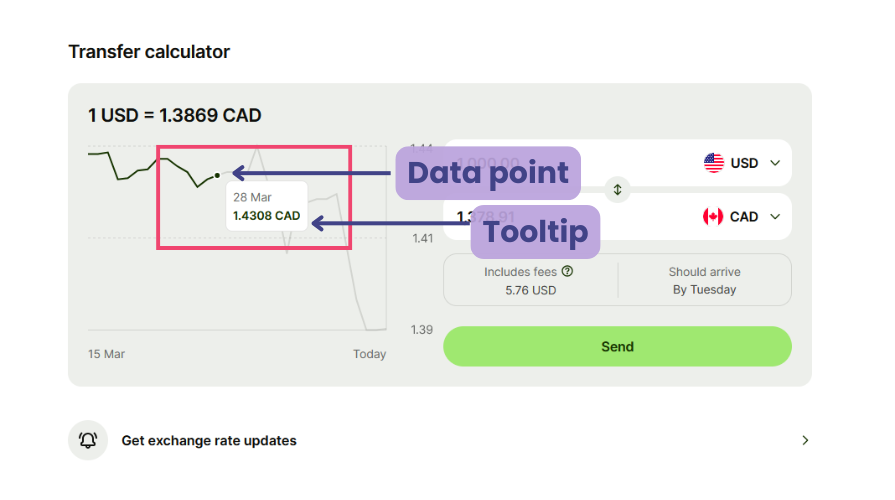
Tooltips can explain data points and reveal specific values when interacting with a graph or chart without cluttering the UI:
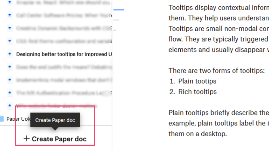
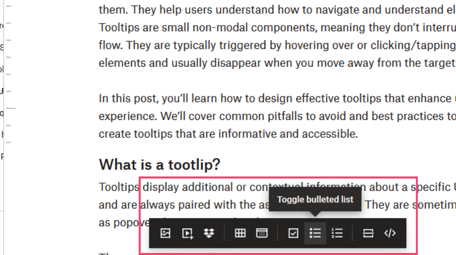
The toolbars on applications like Dropbox Paper, Google Docs, and Microsoft Word contain various editing and formatting icons for modifying a text document.
You can use tooltips in toolbars to label icon-only buttons, like the example below from Dropbox:
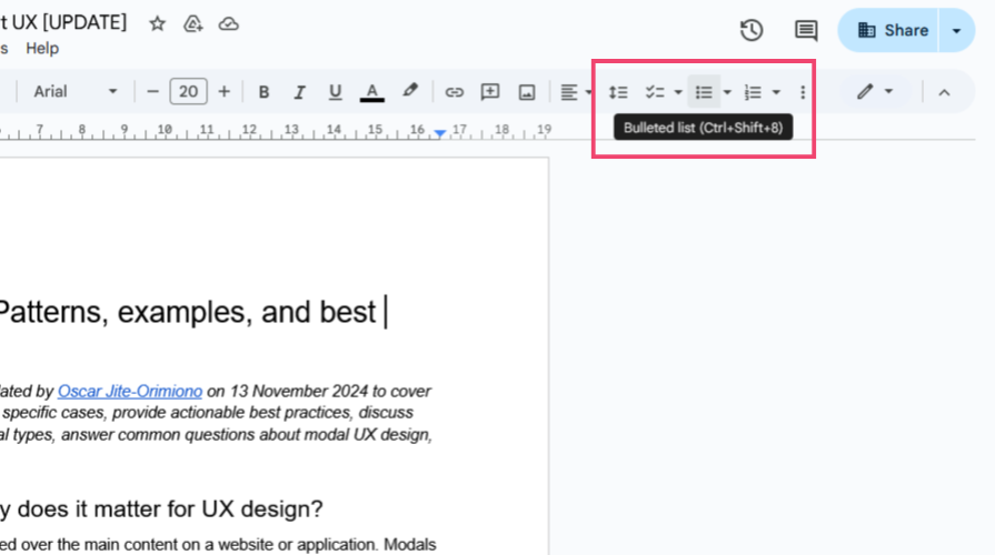
They are commonly used to show keyboard shortcuts, as seen on Google Docs and Microsoft Word. Here’s an example of a tooltip from Google Docs labeling an icon and showing its keyboard shortcut:
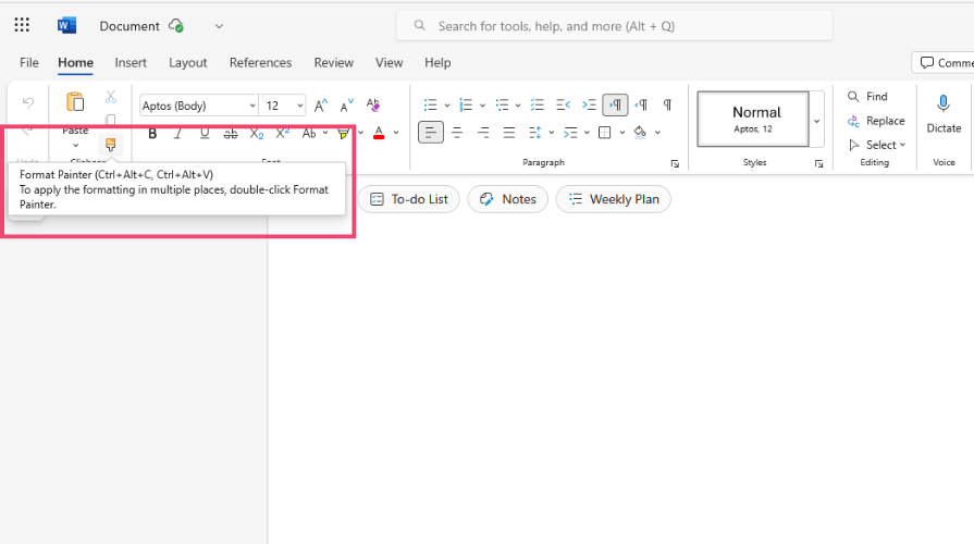
Some tooltips provide a bit more information if the button has a complex function. Here’s an example from Microsoft Word showing a button with two keyboard shortcuts:
Other scenarios where you can use tooltips include onboarding/walkthroughs to guide users through a UI for the first time.
It’s crucial to ensure that tooltips are accessible to every user when designing them. Here are some accessibility practices to consider:
role = 'tooltip' to elements that trigger tooltips. Ensure each tooltip is closely associated with its trigger and add clear descriptionsTooltips are small non-modal elements that provide additional information to help users navigate a UI. Plain tooltips contain only a small amount of text, while rich tooltips contain more details and can have a title and buttons.
Because tooltips are typically small and non-intrusive, they’re easy to miss or ignore, so make sure you don’t use them for critical information. Tooltips should be used sparingly, mostly for icon-only buttons. Avoid repeating the text of a button in a tooltip; use it for extra contextual information only.
Tooltips should be accessible to every user. Ensure they can be triggered with the keyboards and screen readers can access them. Use sufficient contrast and eligible fonts for tooltips so they’re distinguishable and readable.
They may seem minor, but when designed carefully and thoughtfully, tooltips can have a massive impact on UX.

LogRocket's Galileo AI watches sessions and understands user feedback for you, automating the most time-intensive parts of your job and giving you more time to focus on great design.
See how design choices, interactions, and issues affect your users — get a demo of LogRocket today.
Skeuomorphism helped define early digital interfaces by mimicking real-world objects to make technology more intuitive. Learn how it compares with flat design and neumorphism, why it declined, and where it still has a place in modern UX.
AI has made polished, confident content easy to generate, but that does not make it trustworthy. This article explains how UX teams can design stronger quality signals using source transparency, validation, confidence communication, and reputation.
Inclusive design is evolving beyond accessibility alone. This guide explains how UX designers can create more inclusive products through usability, accessibility, neurodiverse UX, adaptive personalization, multimodal design, and culturally aware product experiences.

I was working with an intern on a UX research project, and before we even started, we both had private […]

 Learn more →
