Dark mode isn’t just some trendy new design fad — it’s actually been around longer than light mode. Yep, early computer screens were all dark backgrounds with glowing green text, kind of like Karen from SpongeBob. Those old-school monochrome monitors used green phosphor coatings to display text and graphics.
And as computers evolved — I’m talking of when graphical user interfaces (GUIs) emerged in the 80s — designers and developers applied a skeuomorphic approach. They wanted screens to feel more familiar — so they mimicked white printed paper.
That’s how light mode became the default. It ruled for decades, until dark mode made a comeback in the 2010s. Why? Because users wanted it. Turns out, dark mode isn’t just easy on the eyes — it comes with real benefits, which we’ll get into.
Dark mode UI is exactly what it sounds like — a design where the background is dark (not necessarily black), and the text and interface elements are light (not necessarily white). It’s a carefully designed alternative to light mode, not just an inverted color scheme.
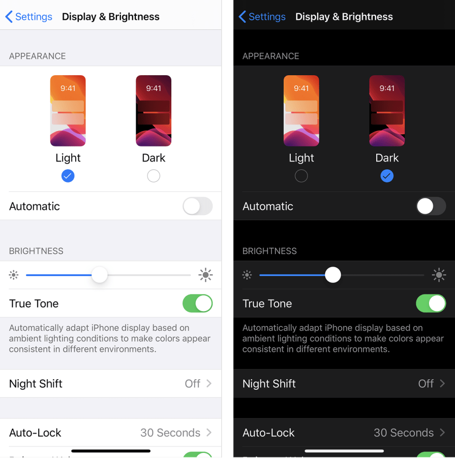
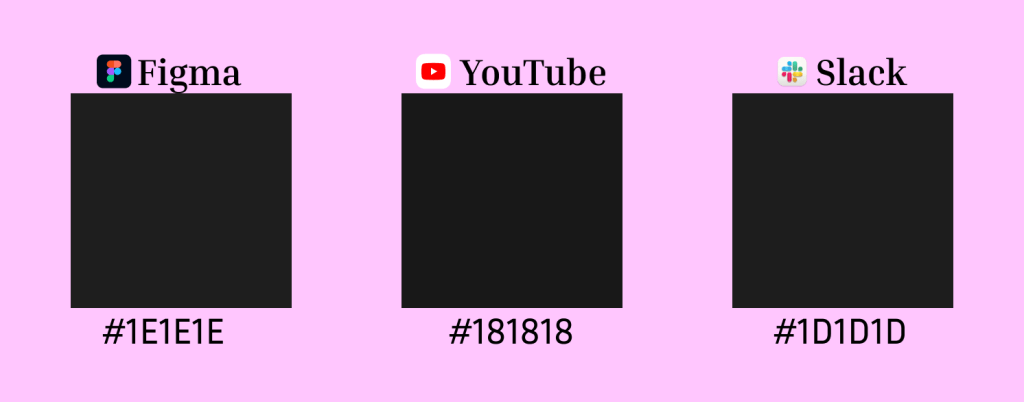
Dark mode backgrounds don’t necessarily have to be pure black (#000000). Many brands opt for unique, carefully chosen shades to enhance user experience.
For instance, Figma uses a dark shade of gray, almost black (#1E1E1E). YouTube employs a very dark gray, slightly lighter than pure black (#181818). And Slack uses a very dark shade of gray, extremely close to black (#1D1D1D):
First off, dark mode isn’t some secret interface for the dark web. And no, it’s not just light mode flipped inside out. If you’ve ever used an auto-invert setting, you know it’s a mess — colors get weird, images look off, and the whole thing feels unnatural.
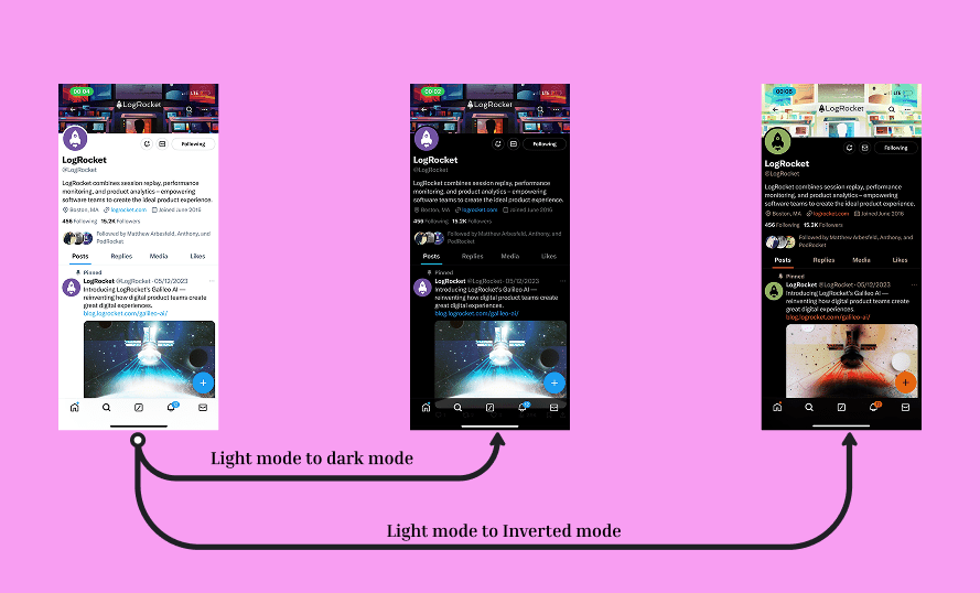
Take X, for example. When switching from light to dark mode, images remain consistent, and the interface still feels intentional. But if you use an auto-invert filter, everything looks… wrong. That’s because dark mode needs to be thoughtfully designed, not just reversed.
Many also perceive dark mode as inherently “sleek” or “premium.” While it has worked for certain brands, like Apple and Chanel, that doesn’t mean every dark-themed interface automatically means luxury. Platforms like Discord, for example, use dark mode for better readability, rather than as a luxury aesthetic. Similarly, developer tools like Visual Studio Code and GitHub’s dark mode prioritize functionality over premium appeal.
Different design systems have their own best practices for implementing dark mode. Below is a comparison of how Material Design, Apple’s Human Interface Guidelines, and other major design frameworks approach it:
| Design system | Color strategy | Contrast guidelines | Adaptive behavior |
|---|---|---|---|
| Material Design | Uses a dark theme surface hierarchy with elevation overlays. Ensures accessible contrast. | Minimum contrast ratio of 4.5:1 for text. Uses elevation to modify shades. | Supports auto-toggling based on system settings. Encourages seamless transitions. |
| Apple Human Interface Guidelines | Encourages pure black backgrounds for OLED devices but allows dark gray for readability. | Minimum contrast ratio of 7:1 for body text. Prioritizes legibility in low-light settings. | Integrates with system-wide dark mode settings. Adapts iconography and depth accordingly. |
| Fluent Design (Microsoft) | Uses ‘mica’ and ‘acrylic’ materials to create depth while maintaining contrast. | Uses contrast-friendly tints to ensure readability across Windows devices. | Supports dynamic theming based on Windows settings. Uses transparency effects. |
| IBM Carbon Design | Applies a layered color system with specific token-based theming for consistency. | Focuses on high contrast while maintaining brand identity and color accessibility. | Emphasizes modular UI components that adapt based on user preferences and accessibility needs. |
As we’ve already established, dark mode isn’t just about looking cool. It actually has some solid perks, and here’s why UX designers should care:
Dark mode isn’t perfect, and it’s not for everyone. Here are some things designers need to keep in mind:
The effectiveness of dark mode isn’t just about personal preference — it also depends on time of day, location, and device type:
To create a well-designed dark mode experience, follow these best practices:
Dark mode shouldn’t be forced. Offer a toggle so users can switch between light and dark mode based on their preference.
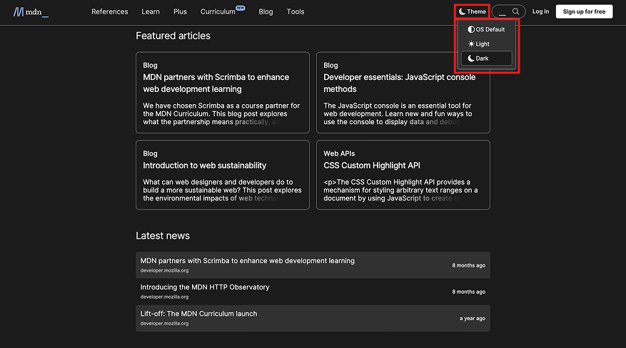
Websites like MDN Web Docs use a dropdown menu to let users pick:
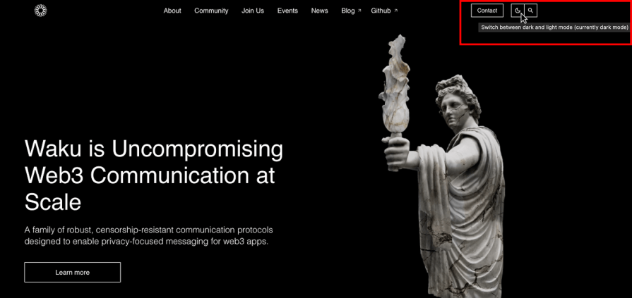
Other sites, like WAKU, use a simple sun/moon icon toggle — clean, intuitive, and user-friendly.
When hovering over the moon icon, it brings up a tooltip letting you know you can switch between dark and light mode, and still tells you which mode you are currently on. It’s amazing:
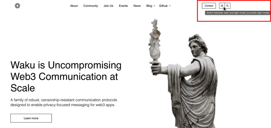
When switched to light mode, the moon switches to a sun icon, and when hovering over the sun, it brings on a similar tooltip as when it did with the moon:
Both MDN Web Docs and WAKU provide a seamless way to switch themes, but they approach it differently — one through a structured dropdown, the other with a minimalist icon toggle.
Regardless of the method, the key takeaway is clear. Give users control.
One thing that can make your dark mode design look off is using a single solid background. This would make the UI elements blend — and reduce depth and readability.
That’s why I prefer using color surface variants to create visual separation and hierarchy. I’ll talk about them now.
Color surface variants are different shades of the base background color used to create depth, contrast, and clarity in an interface. Instead of everything sitting on the same flat background, you’d use subtle variations in color to help distinguish different UI elements without needing strong borders or dividers.
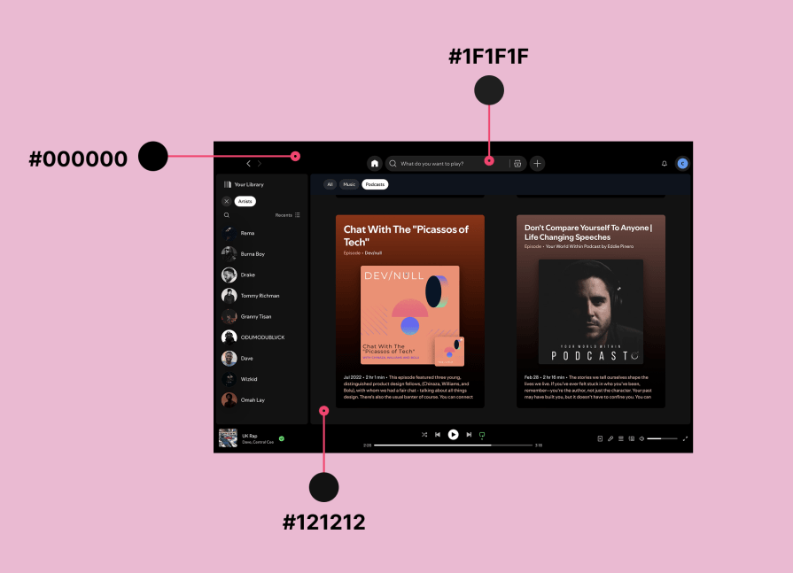
For dark mode, specifically, this would mean using different shades of dark rather than a single black background. So, instead of making everything pure black (#000000), designers should apply slightly different dark tones to separate UI elements and improve readability.
Look at how Spotify uses three different shades of black to create depth and contrast:
Dark mode shouldn’t completely change your brand’s identity. Adjust color shades to maintain consistency, ensure logos and icons stand out, and keep typography styles the same.
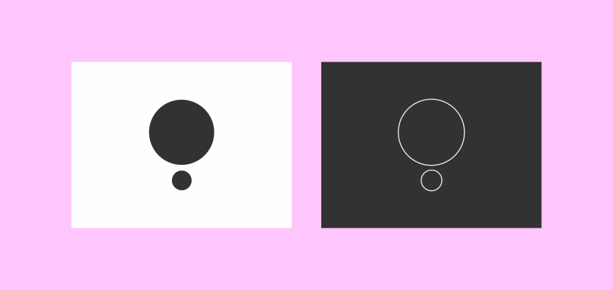
Icons and images should be visible in both light and dark modes. If an image fades into the background, add a subtle border or tweak the color to maintain visibility.
For example, this circle icon below would have faded in the dark background if I had not added a white border around it:
The white border does not change the fact that it’s still a circle icon, it just made it stand out. I could have also changed the icon colour to white in the dark background, but I wanted to maintain its colour, so the white border was the best option. So, always find a way to make sure whatever image or icon you use on either mode is visible and optimized.
I see a lot of dark mode UI designs using highly saturated colors, which can cause visual discomfort and reduce readability. Bright, neon-like colors on dark backgrounds can feel harsh and create excessive contrast, making text and interface elements harder to read.
Instead, desaturated colors — which are slightly muted versions of vibrant hues — help create a more visually balanced and accessible experience.
Material Design recommends using colors that are slightly toned down when designing for dark mode to ensure legibility and prevent eye strain.
When it comes to dark mode UI design, there are four points of focus for you as a UI/UX designer:
And certain industries naturally benefit more from dark mode.
Entertainment and gaming platforms, for example, leverage dark interfaces to create immersive experiences that draw users deeper into their digital worlds. Financial apps and dashboards also benefit, as dark backgrounds effectively highlight critical data, graphs, and numbers, reducing cognitive load and improving readability during prolonged usage.
Ultimately, dark mode UI design isn’t a one-size-fits-all solution. It’s about designing intentionally, understanding your users, and making informed decisions to enhance usability and aesthetics.

LogRocket's Galileo AI watches sessions and understands user feedback for you, automating the most time-intensive parts of your job and giving you more time to focus on great design.
See how design choices, interactions, and issues affect your users — get a demo of LogRocket today.
Skeuomorphism helped define early digital interfaces by mimicking real-world objects to make technology more intuitive. Learn how it compares with flat design and neumorphism, why it declined, and where it still has a place in modern UX.
Memos don’t have to be complicated. Just keep them clear, concise, and focused on actionable items. More on that in this blog.

AI has made polished, confident content easy to generate, but that does not make it trustworthy. This article explains how UX teams can design stronger quality signals using source transparency, validation, confidence communication, and reputation.
Inclusive design is evolving beyond accessibility alone. This guide explains how UX designers can create more inclusive products through usability, accessibility, neurodiverse UX, adaptive personalization, multimodal design, and culturally aware product experiences.

 Learn more →
