If asked to picture a great website, most people would focus on its visual design. No doubt, aesthetics are crucial for a positive user experience. However, it’s the website’s content that truly delivers value and drives action.

Think of it this way: a website’s primary goal is to communicate a message or offer value to a user. And as a result, the effectiveness of its design is directly tied to the quality and clarity of the content it presents. Given how important content is, it’s only logical to prioritize its creation and organization before making layout decisions.
This article covers why content should precede UX design, focusing on how a content-first approach can help ensure a seamless user experience. Let’s dive in!
Say you want to buy a new outfit online. Which approach makes the most sense:
The first approach makes more sense because no matter how beautiful an outfit is, it won’t have the right effect if it doesn’t fit. This also applies to website design. Writing copy for a predesigned website is like picking a wrong-sized outfit and struggling to make it fit.
Of course, it can be tempting to dive right into the visuals when starting a design project. After all, the more stunning the visuals are, the more attractive the website will be to prospective users.
But here’s the thing: while aesthetics can attract a user, your website’s content determines if they stay. If the content is high-quality and offers value, users will want to return. Confusing content, on the other hand, can frustrate the users and make them abandon the website. So, if it comes down to choosing between prioritizing content or design, content should come first.
But let’s be clear: a content-first approach doesn’t mean neglecting design. On the contrary, it ensures that the design and content fit together seamlessly to create a positive user experience.
Here are some key benefits of a content-first strategy:
These are just a few ways a content-first strategy can enhance your digital product. To truly appreciate the impact of this strategy, you need to understand the role of copywriting in UX.
Copywriting plays a major role in shaping the user experience of a product. It acts as a bridge between a user and an interface, helping them navigate the product and achieve their goals.
Beyond the interface’s design, the copy elicits action and helps achieve business goals. That’s why your UX copy needs to be:
When it comes to developing your UX content strategy, remember the following three principles:
Clarity serves as the foundation of effective UX copy. Clear UX copy makes it easier for users to navigate a website or app, understand what’s being offered, and take the desired actions. To achieve clarity, keep your writing as close to speech as possible, avoid jargon, and be direct about what you want users to know or do.
Consistent language helps reduce the cognitive load on users as there are fewer things for them to remember. To maintain consistency, use the same terms to refer to the same items across all touchpoints. Also, maintain a uniform tone of voice, style, and messaging throughout your content. This makes it easier for users to understand the different parts of your website and find what they’re looking for.
Clarity and consistency alone aren’t enough; your content must be relevant to your users. Relevance means making sure your content meets the users’ needs and expectations. This could be achieved through addressing specific pain points, answering common questions, or providing value that aligns with your users’ goals.
Before starting your content-first design project, you need to know what you want your website or app to achieve. To define this, you need to answer questions like:
Once you have a clear goal, you can follow these steps for a content-first approach:
If you’re working on an existing website, start by auditing its content. Evaluate its quality, relevance, and performance. Find out what information is missing and what needs to be improved on.
It’s a good idea to know what your competitors are doing. How are they positioning themselves with their content? What are the key features of their website or app? How do they communicate their value? Make a note of the positive and negative aspects.
While competitive analysis can tell you how other businesses communicate with their customers, it can’t tell you how to communicate with yours. To know this, learn about your customers through research methods such as interviews, surveys, etc.
A user flow defines the steps users take to achieve their goals on a website or app. By sketching it out, you can identify the type of information they need at various steps in their journey.
When creating wireframes, prioritize the layout and flow of content. Map out areas where key information appears, define their structure, and how users will interact with them.
Instead of the traditional placeholder text, incorporate real or near-final content into your prototypes. This helps you make more informed decisions about typography, spacing, and visual hierarchy.
Conduct usability tests that focus on how users interact with the content. This helps reveal areas that need to be improved to enhance clarity, engagement, and the overall user experience.
By following these steps, you can put content at the forefront of your design process. But of course, for this process to work, you must involve UX writers and content strategists from the start of your project.
Now that you have the basics down, let’s turn our attention to examples of companies that implement successful content-first design:
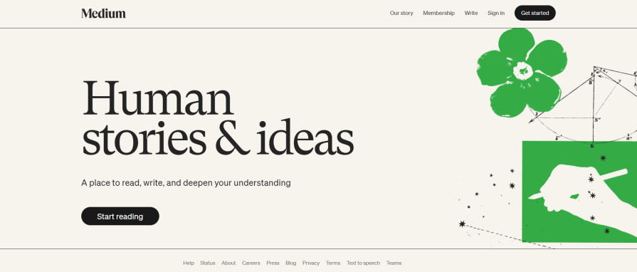
Medium, a popular social publishing platform, uses a content-first strategy to ensure the focus remains on the written word:

Upon visiting Medium, you’re immediately greeted by a clean, minimalistic design that’s content-focused, with the platform’s core message front and center. It retains its consistency throughout the entire platform, with design enhancing the content rather than distracting from the reading experience.
Medium now attracts over 100 million active users per month.
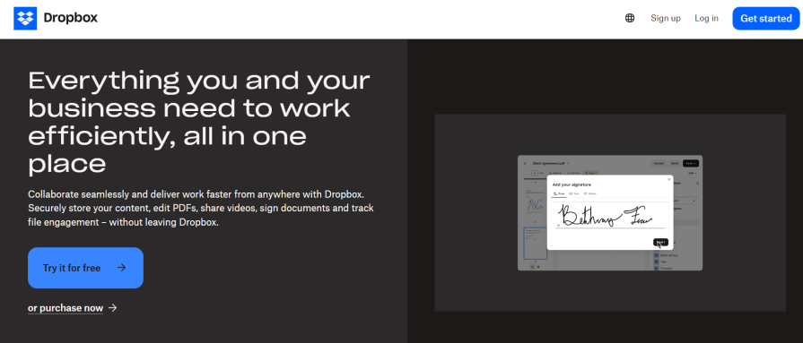
Dropbox, a popular file hosting and cloud storage service, uses a content-driven onboarding process to enhance understanding and drive conversions:

Once you visit Dropbox, you’re greeted by a minimalistic design that puts the platform’s value proposition at the forefront. The onboarding process uses clear, concise content that focuses on the value to the customer.
By prioritizing clear and engaging content, users can easily understand the platform’s value, which leads to higher conversion rates. This approach is a key reason the platform can boast $2.5 billion in annual revenue.
Duolingo, one of the world’s most popular language-learning platforms, uses a content-first approach to drive user engagement:

A new user visiting Duolingo will find it easy to interact with the app due to its high-quality, engaging content and minimalistic design. This approach contributes to the success of the platform, which has up to 74.1 million active users monthly.
Content shouldn’t be an afterthought in the design process. Instead, think of it as the driving force that shapes the design. By starting with content, you ensure that your core message is clear, engaging, and aligned with user needs.
So, if you want the best possible experience for your users, start with content. Not only will you be making your users happy, but you’ll also boost engagement and drive better results for your business.
LogRocket's Galileo AI watches sessions and understands user feedback for you, automating the most time-intensive parts of your job and giving you more time to focus on great design.
See how design choices, interactions, and issues affect your users — get a demo of LogRocket today.

Multimodal UX goes beyond designing for screens. Learn how context-aware systems, progressive modality, failover modes, and accessibility-first design create better digital product experiences.

Learn how context-aware mode prioritization and seamless transitions improve multimodal UX and reduce mode confusion.

Research is becoming more democratized, product cycles are accelerating, and AI is transforming synthesis and ResearchOps. Here are the three trends shaping UX research in 2026.

Voice support is not the same as multimodal UX. Here’s how to design systems with true mode continuity and context-aware interactions.