Creating harmonious color palettes is more of an art and less of a science. And when it comes to choosing colors that work well together, there is no perfect approach. You might find a color wheel or palette generator helpful for creating harmonious combinations — but some might like a color combination that others find clashing.
Clashing colors happen when two colors simply don’t resonate or work together due to their unrelated color properties. They might compete for attention or create a jarring or harsh effect on the eyes. Using clashing colors in your designs can greatly affect UX, as the visual aspect of the UI is where users interact with a product or website. If users feel unsettled by the colors used in the design, they may find it frustrating to use, leading to churn and negative reviews.
So, as designers, we must handle color clashes mindfully, not just for creative impact but for digital accessibility, especially for users with low vision or color blindness.
This article will explore what causes colors to clash, how they impact user experiences, and best practices for balancing contrast and harmony.
There are a few types of color combinations that many get mixed up — there are complementary, vibrating, and contrasting colors. They all tend to have similar results to clashing colors on the surface.
But if you were to know what creates these combinations, you’d be able to easily figure out their differences. Let’s do such an analysis together:
Colors that clash typically have greatly differing color properties like tone, saturation, hue, or brightness. All of that means that they lack harmony — they’re chaotic and unsettling, deterring users from interacting with them.
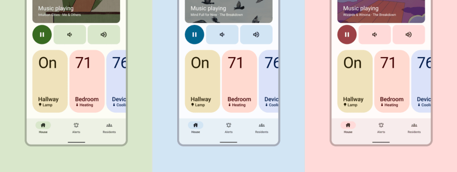
I’ll take a quick example from this smart home app. The yellow, red, and blue colors were selected to represent the respective lighting, heating, and cooling features. But they can clash with the app’s customizable color theme, making it difficult for any element to stand out, resulting in a confusing UI.
Each color fights for attention and doesn’t contribute to a harmonious color palette:
Two colors are complementary if they are on opposite sides of a color wheel. Combining two complementary colors cancels each other out, creating white or black.
In general, complementary colors refer to the hue of the color, such as yellow and purple. They can overlap with clashing colors if the properties of the colors don’t have a visual balance.
Complementary colors are also contrasting, as they have high contrast when placed next to each other. They can create a visually engaging effect but can also be overdone.
Without sufficient whitespace and neutrals surrounding the complementary colors, the elements may have a jarring effect on the viewer’s eyes. It also can confuse users as to where they should focus their attention.
However, complementary colors can work well together and produce a visually appealing effect.
The brand predominantly uses purple and yellow in this Los Angeles Lakers app example:

Purple is consistently used for the header, and yellow is used for accents like active state tabs, icons, and other highlighted information. Neutrals like gray, black, and white create space between the purple and yellow to avoid clashing.
This well-thought-out design proves that complementary colors can work together in a cohesive UI.
In color theory, contrast refers to the difference in brightness or hue between an element and its background, which results in the element’s visibility level. Simply put, bright colors appear well on dark backgrounds but less so on other bright backgrounds.
Colors on the same end of the color wheel have less contrast than ones on opposite ends, making complementary colors a high-contrast color combination.
An example of contrasting colors applied effectively in UX design is Hubspot’s website, which features a high contrast mode:

Without the mode turned on, the website uses its brand color, orange, for CTA buttons and checklist icons.
However, some users may want a UI with higher contrast for easier readability and scanability. With the high contrast mode turned on, its CTA buttons and checklist icons turn blue.
Blue and orange are complementary colors, which makes them perfect for high contrast, as their hues are farthest apart on a color wheel. The website uses whitespace and a muted orange background so that the two colors do not clash or overpower each other.
The orange continues to shine through as a brand element, but the blue takes dominance in high contrast mode to draw the user’s attention.
Clashing colors can negatively affect readability and the overall usability of a product or website. A subset of clashing colors are vibrating colors.
When two contrasting hues with high levels of saturation and similar brightness levels are placed next to or on top of each other, they create an aggressive visual effect known as color vibration. Since the two colors are both fighting for attention, the edges appear to blur together, creating an uncomfortable illusion of vibrating colors. This can cause eye strain for viewers, leading to churn and user dissatisfaction.
They may also be inaccessible to users with low vision or color blindness. Complementary colors can create a vibrating effect, so to avoid it in your design, try adjusting their saturation or brightness levels to tone them down.
This example shows text in different colors that contrast highly with their backgrounds:

Both text and backgrounds are also highly saturated, creating a vibrating effect. It’s difficult to look at some of these blocks of text, let alone focus your eyes to read them.
Avoid such color combinations in your designs so your users don’t have to face the pain of viewing vibrating colors.
Clashing colors can be unsettling to look at and create interfaces that aren’t visually aesthetic. Some viewers may actually find certain clashing color combinations pleasing, while others may find them distracting or even painful, so there is some degree of subjectivity in certain cases.
But generally, colors clash with each other due to some key elements, including their hue, saturation, and brightness.
The key to a well-designed UI is balance.
An example of creating visual balance is using large, bold sans-serif fonts for headers paired with smaller, thinner serif fonts for body text. Having too much boldness on the page can be overwhelming.
The same concept applies to colors.
Depending on the hue, using two colors with high saturation or brightness can lead to clashing colors. If two colors with contrasting hues, such as complementary colors, are used, they can become clashing colors if the saturation and brightness are both strong.
If you refer to the RGB color wheel, most often used by UI designers, it’s clear that complementary colors such as red and cyan, green and magenta, or yellow and blue have a strong contrast. Using these color combinations in a UI design can lead to clashing colors if their saturation and brightness are intense. It would not be a good idea to overlay complementary colors on top of each other, as they can create a vibrating color effect.
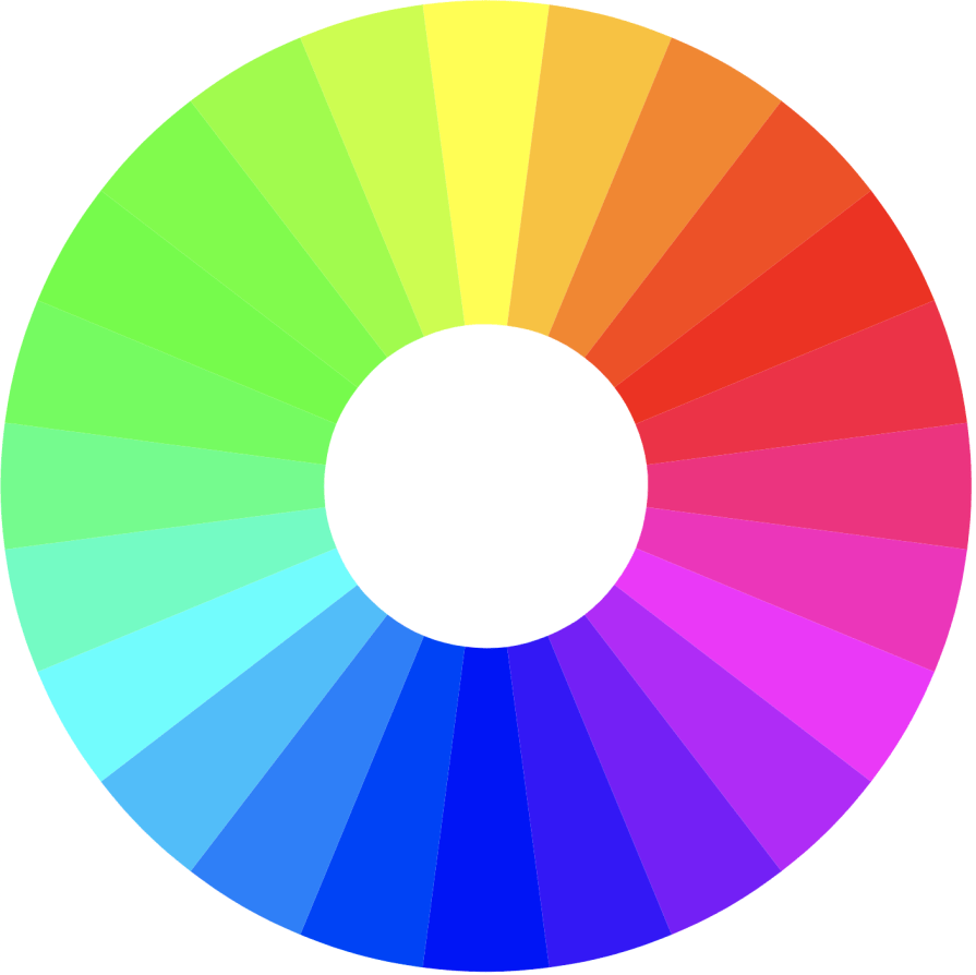
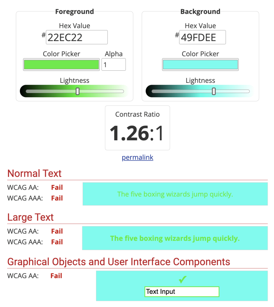
Other colors that can potentially clash are analogous or colors that sit next to each other on the color wheel. Color pairs like red and magenta, green and cyan, or orange and red can also be vibrating colors if their hues are too close and have the same saturation and brightness levels. Using these color combinations can lead to inaccessible designs as they would fail the accessible color contrast tests.
The visual component of a design is just as important for the UX as the functionality. A well-balanced UI design can contribute to overall user satisfaction and engagement.
Depending on the intent, clashing colors in a UI can negatively or positively impact UX.
Generally, clashing colors harm usability, impacting things like readability, focus, and navigation. Users typically have difficulty reading text when colors clash due to low contrast or the vibrating color effect. Unbalanced colors can also create distractions for users, as they may need guidance on where to focus on the screen, making it hard to locate information or navigate around.
A well-designed UI may use one or two strong colors simply as accents to highlight important information or buttons.
BeLanguageSchool’s website uses several clashing colors:

Each color has a high brightness level, creating a busy and cluttered UI. The saturated orange on the blue background creates a high-contrast environment, which can have a positive effect by attracting users’ attention.
But due to the other strong colors in the illustration, the orange CTA buttons don’t stand out and get lost in the mess of clashing colors. The color choices for the illustration hinder the ability to focus on what’s important, such as the CTA buttons. The viewer’s eyes are drawn all over the place, making navigating the rest of the page difficult.
Another example of a website that uses clashing colors is Sesame Street:
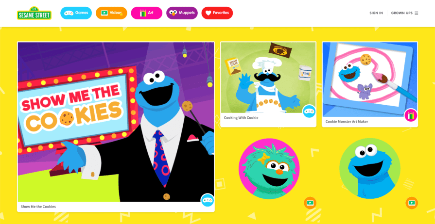
While this website uses just about every color in the color wheel, it’s important to remember that its target audience is children. Therefore, the website is designed to allow the user to wander around and explore the interface. Children may lose focus or get bored quickly on a typical adult interface, as they typically have less patience.
Designing interfaces for children is all about user engagement, and although clashing colors may seem overwhelming to an adult, they are engaging and fun.
Younger children respond well to bright, primary colors. They are still developing their eyesight, and the bright contrast helps them process information quickly. The white borders around each tile also create a bit of separation between the background, providing an intuitive interactive layout.
There are many ways to combine colors, including clashing ones, but it can be challenging for designers to achieve a perfect blend of contrast and harmony.
Tweaking color properties like brightness or saturation can improve the effectiveness of user-friendly designs. Designers shouldn’t hesitate to explore different variations of a design to test different brightness and saturation levels, especially with users.
A/B testing can be a great way to understand which color combination your users respond better to. It allows you to gather feedback and iterate based on the data.
Using color palette tools, such as Adobe Color or the Generative Recolor tool in Adobe Illustrator, can help you create harmonious combinations that even work with clashing colors. Designers can quickly and easily test out different color palettes for their designs without manually selecting different colors and adjusting their properties. These tools are massive time-savers for designers and can help deliver multiple design options that would normally take hours.
For example, in Adobe Color, the Color Harmony selector allows you to choose a type of color palette that you’d like to create.
A complementary color palette can include clashing colors due to the high contrast between them. However, the tool also selects secondary and tertiary colors that align with the color palette. You can adjust their brightness levels to achieve different effects.
In this first color palette, the purples and yellows don’t have much variance in brightness and contrast, leading to colors that would clash if used together in a UI:
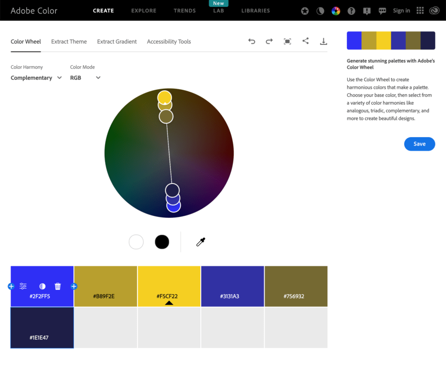
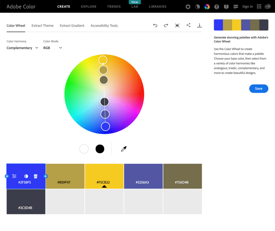
Adjusting the distance between all the selected colors on the color wheel helps designers create a balanced and harmonious color palette. This ensures that if the primary colors are clashing, the remaining colors have enough variance in brightness and contrast to contribute to a well-rounded palette.
In this second color palette, the colors are evenly spaced out, giving bright and dull tones of yellow and purple, which is perfect for using highlights and background colors in a UI:
User experience is equally about usability as it is about visual aesthetics.
The interface that users interact with creates a lasting impression and can affect the entire experience of a product or website. Color plays a huge role and can make or break a design.
Balancing usability with creative expression and brand recognition is a challenge, especially when it comes to using clashing colors. Designers need to work to adjust the properties of their colors, like hue, saturation, and brightness, and explore various options for their designs.
Testing your designs with users can help you decide on your color palette, especially regarding accessibility. Ensure your color palette has enough color contrast for readability while avoiding clashing or vibrating colors that create unsettling experiences.
Color palettes have endless possibilities, but knowing how to achieve harmony with colors can go a long way in UX design.
LogRocket's Galileo AI watches sessions and understands user feedback for you, automating the most time-intensive parts of your job and giving you more time to focus on great design.
See how design choices, interactions, and issues affect your users — get a demo of LogRocket today.

Zero UI works well for screenless, voice-first experiences, but most digital products still require visual interaction. Here’s why multimodal UX offers a more scalable foundation for the future of design.
Multimodal UX goes beyond designing for screens. Learn how context-aware systems, progressive modality, failover modes, and accessibility-first design create better digital product experiences.
Learn how context-aware mode prioritization and seamless transitions improve multimodal UX and reduce mode confusion.

Research is becoming more democratized, product cycles are accelerating, and AI is transforming synthesis and ResearchOps. Here are the three trends shaping UX research in 2026.